Design style guide设计风格指南
What is Bluesky AT Protocol 2024?什么是 Bluesky AT Protocol 2024?
Bluesky proved that open infrastructure and warm, inviting design are not opposites — its pale sky canvas and soft cloud cards made decentralization feel like home.Bluesky 证明了开放协议与温暖宜人的设计并不矛盾——浅天蓝底色与柔云白卡片,让去中心化感觉像回家。
Bluesky AT Protocol 2024 in briefBluesky AT Protocol 2024 速览
Bluesky AT Protocol 2024 is the visual design language of the Bluesky social network, built on the AT Protocol — a federated, open-source framework for social media. It emerged as an alternative to closed corporate platforms, and its aesthetic makes that mission visible: the interface feels welcoming and human rather than imposing or industrial, projecting openness not as a technical specification but as a sensory promise.Bluesky AT Protocol 2024 是 Bluesky 社交网络的视觉设计语言,该平台建立在 AT 协议之上——一套联邦式、开源的社交媒体框架。它作为封闭企业平台的替代方案而出现,其美学让这一使命变得可见:界面感觉亲切而有人情味,而非压迫性或工业化,将开放性表达为一种感官承诺,而非技术规格。
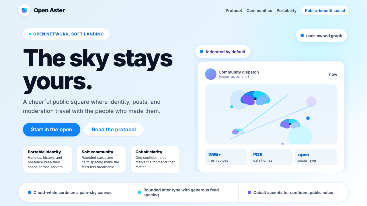
The design system centers on a light, airy palette anchored by a pale sky blue and soft cloud white, with a single cobalt accent that carries authority without aggression. Cards have generous rounding that softens each container into something approachable. The brand mark — a stylized flock of butterflies — reinforces the social and distributed nature of the platform; it is motion, plurality, and lightness simultaneously.这套设计系统以浅天蓝和柔云白为核心,辅以唯一一抹钴蓝强调色,兼具权威感而不失温度。卡片拥有圆润的大圆角,将每个容器软化为亲近可触的形态。品牌标志——一群程式化的蝴蝶——强化了平台社交与分布式的本质,同时传递出运动感、多元性与轻盈感。
What distinguishes this style from other tech-platform aesthetics is its refusal of the cold precision often associated with infrastructure products. The Bluesky visual language does not perform power or scale; it performs community and trust. Rounded forms, airy spacing, and a warm near-white ground all communicate that the technology serves the people on it, not the other way around.这种风格与其他科技平台美学的区别,在于它拒绝了基础设施产品常见的冷峻精确。Bluesky 的视觉语言不炫耀权力或规模,而是传递社群与信任。圆润的形态、通透的间距、温暖的近白底色,共同传达出一个信息:技术服务于使用它的人,而非相反。
See the Bluesky AT Protocol 2024 design system →查看 Bluesky AT Protocol 2024 完整设计系统 →
Where does Bluesky AT Protocol 2024 come from?Bluesky AT Protocol 2024 从何而来?
Bluesky's origins trace back to 2019, when Twitter co-founder and then-CEO Jack Dorsey announced a small research initiative aimed at developing open, decentralized standards for social media. The project operated under the name Bluesky — framing the work as aspirational and directional rather than product-oriented. Jay Graber, a developer with a background in decentralized technologies, was hired to lead the team in 2021.Bluesky 的起源可追溯至 2019 年,当时 Twitter 联合创始人兼时任 CEO 杰克·多西宣布启动一项小型研究计划,旨在为社交媒体开发开放、去中心化的标准。这个项目以 Bluesky 命名,将工作定性为具有理想主义和方向性,而非产品导向。具有去中心化技术背景的开发者 Jay Graber 于 2021 年受聘领导该团队。
In 2022, Bluesky Social PBC was incorporated as a public benefit company, deliberately separating the organization from Twitter's corporate structure and affirming its nonprofit-adjacent mission. The AT Protocol — the underlying technical standard — was designed with portability as a core value: users could carry their identity and social graph across different servers and applications, a direct repudiation of the silo model that defines most commercial social platforms.2022 年,Bluesky Social PBC 以公益公司形式注册成立,刻意将自身与 Twitter 的企业结构切割,确认了其近似非营利的使命。底层技术标准 AT 协议将可携带性作为核心价值:用户可以跨不同服务器和应用携带自己的身份与社交关系图谱,这是对大多数商业社交平台信奉的孤岛模式的直接否定。
The public launch came in February 2024, when Bluesky opened registration to all users after a period of invite-only access. The timing coincided with widespread anxiety about centralized social media following ownership changes at major platforms. Journalists, scientists, academics, and community organizers arrived in significant numbers, bringing the user count past twenty-five million. These communities valued transparency, portability, and moderation tools they could control — and the visual design was shaped to serve them.公开上线发生在 2024 年 2 月,Bluesky 在邀请制试用期结束后向所有用户开放注册。这一时间节点恰逢主要平台易主引发的广泛社会焦虑。记者、科学家、学者和社区组织者大批涌入,将用户数推过两千五百万。这些群体重视透明度、数据可携带性以及可自主掌控的内容审核工具——视觉设计正是为服务这些诉求而塑造的。
The design identity was developed alongside the product rather than handed down from brand guidelines alone. Paul Frazee, Daniel Holmgren, and Aaron Goldman were among the technical architects of the AT Protocol, and the engineering culture of building for openness filtered into the design sensibility. The butterfly-flock mark, the sky-blue palette, and the rounded card system all emerged from the desire to make a platform that felt genuinely different from the corporate platforms it positioned itself against — friendlier, lighter, more willing to admit the humans inside.设计身份随产品一同演进,而非仅由品牌手册自上而下规定。Paul Frazee、Daniel Holmgren 和 Aaron Goldman 是 AT 协议的核心技术架构师,这种为开放性而构建的工程文化渗透进了设计感性。蝴蝶群飞标志、天蓝色调、圆角卡片系统,都源于一个愿望:打造一个与它所对标的企业平台真正不同的产品——更友好、更轻盈、更愿意承认平台里的每一个人。
What defines the Bluesky AT Protocol 2024 look?Bluesky AT Protocol 2024 的视觉特征是什么?
Palette色彩体系
The palette is built on three layers: a pale sky blue that serves as the primary brand color and can wash the entire background, soft cloud white used for card surfaces and content containers, and a single cobalt blue accent reserved for interactive elements, calls to action, and emphasis moments. This hierarchy — background wash, surface, accent — keeps compositions legible without needing secondary colors or decorative hues. The overall effect is cool but not clinical, open rather than austere.色彩体系由三个层次构成:浅天蓝作为主品牌色,可用于整体背景底色;柔云白用于卡片表面与内容容器;唯一一抹钴蓝强调色专属于交互元素、行动号召与重点时刻。这种层次——底色、表面、强调——无需借助辅助色或装饰性色彩便能保持构图清晰可读。整体效果清凉而不冰冷,开阔而非严峻。
Shape and Rounding形态与圆角
Generous corner rounding appears on every container — cards, buttons, input fields, modal sheets, and avatar frames. This is not merely a style preference but a communicative choice: rounded forms are psychologically associated with approachability, safety, and social warmth, in direct contrast to the sharp rectangles that signal corporate efficiency. The rounding is consistently applied across all element sizes, creating a visual system that feels coherent at any scale.圆润的大圆角贯穿每一个容器——卡片、按钮、输入框、模态浮层与头像框。这不仅是风格偏好,更是传达性选择:圆润形态在心理上与亲近感、安全感和社交温暖相关联,与传达企业效率的锐利矩形形成直接对比。圆角统一地应用于所有尺寸的元素,在任何比例下都呈现出连贯的视觉系统。
Surface Depth表面层次
Rather than using hard-edged contrasts or heavy borders, the Bluesky visual language creates depth through soft layering. Card surfaces sit above the background wash without a harsh dividing line; shadows are diffuse and elevation-suggesting rather than graphic and structural. This softness extends to the treatment of media — images and embedded content are contained within rounded frames that feel native to the interface rather than dropped in from outside.Bluesky 的视觉语言不依赖硬边对比或粗重边框,而是通过柔和的层叠创造纵深感。卡片表面浮于背景底色之上,没有生硬的分割线;阴影漫射而富层次感,暗示高度而非强调结构。这种柔和感延伸至媒体内容的处理——图像与嵌入内容被包裹在圆角框内,感觉是界面的原生组成部分,而非从外部植入。
Typography字体排印
The type system draws on humanist sans-serif letterforms — particularly the proportions and openness associated with Inter — that prioritize reading comfort over graphic assertion. Headlines are set with restraint rather than dramatic scale contrast; the type voice is conversational and clear, not commanding. Text hierarchy is achieved through weight and spacing rather than size extremes, which keeps the interface readable in the dense, high-frequency reading context of a social feed.字体系统采用人文主义无衬线字形——尤其是 Inter 所具有的比例与字形开放性——将阅读舒适度置于视觉张扬之上。标题排版克制,而非追求戏剧性的大小对比;字体语调如实地对话式,而非命令式。文字层级通过字重与间距实现,而非依赖极端尺寸对比,这让界面在社交信息流高频密集阅读的场景中保持清晰可读。
Icon and Mark System图标与标志系统
The butterfly-flock logomark operates as both brand identity and semantic key: the distributed formation of individual marks coming together into a recognizable whole mirrors the AT Protocol's architecture of federated servers and portable identities. Interface icons are simple, friendly, and slightly rounded at their stroke ends, maintaining tonal consistency with the rounded card system. Nothing in the icon vocabulary is aggressive or angular; every mark softens at its extremities.蝴蝶群飞标志同时充当品牌标识与语义密钥:单个个体聚合为可辨识整体的分布式形态,映射了 AT 协议联邦服务器与可携带身份的架构逻辑。界面图标简洁友好,笔画末端略带圆润,与圆角卡片系统保持调性一致。图标体系中没有任何攻击性或棱角分明的形态,每个标记都在端点处趋于柔和。
Whitespace and Breathing Room留白与呼吸空间
Generous internal padding within cards, comfortable line height in feed text, and deliberate vertical rhythm between posts all contribute to a sense of spaciousness unusual in social media design, where density is often treated as a proxy for activity and engagement. Bluesky's spacing choices communicate the opposite: that each piece of content deserves attention, and that the platform is not trying to overwhelm or addict but simply to host.卡片内部充裕的内边距、信息流文字舒适的行高、帖子之间刻意保持的垂直节奏,共同营造出一种在社交媒体设计中罕见的宽敞感——在那类设计中,密度往往被视为活跃度与参与度的代名词。Bluesky 的间距选择传递出截然相反的信息:每一条内容都值得被关注,平台的目标不是让人沉溺或上瘾,而只是提供一个驻留之所。
Warmth as Principle温暖作为设计原则
The cumulative effect of the palette, rounding, spacing, and typographic restraint is a quality that can be named precisely: warmth. This is not accidental ornamentation but a principled stance. Bluesky's design communicates that its technology exists in service of human connection, not in spite of it. The visual system is an argument against the cold, surveillance-adjacent aesthetic that characterizes many attention-economy platforms — and that argument is made through form, not through copy.色彩、圆角、间距与字体克制的累积效果,产生了一种可以精确命名的品质:温暖。这不是偶然的装饰,而是一种有原则的立场。Bluesky 的设计传达出一个信息:它的技术存在是为了服务人与人之间的连接,而非与之相悖。这套视觉系统是对许多注意力经济平台那种冰冷、带有监控气息的美学的反驳——而这场反驳,是以形式而非文案完成的。
See the Bluesky AT Protocol 2024 design system →查看 Bluesky AT Protocol 2024 完整设计系统 →
Who shaped Bluesky AT Protocol 2024?谁塑造了 Bluesky AT Protocol 2024?
Graber was appointed to lead the Bluesky project in 2021 and guided the transition from research initiative to operational public benefit company. Under her leadership, the AT Protocol was developed and stabilized, and the network moved from invite-only access to public launch in February 2024. Her background in decentralized technology and her commitment to building infrastructure that resists corporate capture shaped both the technical architecture and the design philosophy — the user-controlled, portable identity system is as much a product of her direction as the visual identity that reflects it.Graber 于 2021 年受命领导 Bluesky 项目,引导其从研究计划转型为运营中的公益公司。在她的领导下,AT 协议得以开发与稳定,网络于 2024 年 2 月从邀请制迈向公开上线。她在去中心化技术领域的背景,以及对构建能够抵御企业收编的基础设施的坚守,塑造了技术架构与设计哲学——用户可控、可携带的身份系统,既是她决策方向的产物,也是体现这一逻辑的视觉身份的内在根基。
Frazee was a core technical architect of the AT Protocol and a key figure in defining the concepts of decentralized identity, personal data servers (PDS), and the lexicon system that allows different AT Protocol applications to share data structures. His earlier work on peer-to-peer systems informed the protocol's design, and his presence in the team's public technical writing helped communicate to developers why the architecture was structured as it was — a kind of transparency that mirrors the platform's visual openness.Frazee 是 AT 协议的核心技术架构师,在定义去中心化身份、个人数据服务器(PDS)以及允许不同 AT 协议应用共享数据结构的词汇表系统等概念上发挥了关键作用。他早期在点对点系统领域的工作为协议设计提供了思路,他在团队公开技术写作中的参与,帮助开发者理解了这套架构为何如此构建——这种透明度,与平台视觉上的开放感相互映照。
Holmgren contributed significantly to the AT Protocol's implementation, working on the repository model and cryptographic identity system that allows users to own and port their data across the network. His engineering work on the underlying infrastructure is part of what makes the platform's promise of openness technically credible — without the cryptographic foundations, the warm visual design would be marketing language rather than a structural commitment.Holmgren 对 AT 协议的实现贡献显著,他参与开发了仓库模型与密码学身份系统,使用户能够在整个网络中拥有并携带自己的数据。他在底层基础设施上的工程工作,是平台“开放”承诺在技术上得以可信的重要原因——没有密码学基础,温暖的视觉设计不过是营销语言,而非结构性承诺。
Goldman worked on the AT Protocol's technical foundations during its development phase, contributing to the infrastructure that enables the federation model. The collective engineering team behind Bluesky represents a unusual concentration of developers with ideological commitments to open systems — an orientation that filtered into product and design decisions, ensuring that the visual warmth of the interface was backed by genuinely open technical architecture.Goldman 在 AT 协议开发阶段参与了其技术基础的建设,为联邦模型的基础设施作出了贡献。Bluesky 背后的工程师团队汇聚了一批对开放系统有理念认同的开发者,这种取向渗透进了产品与设计决策,确保界面的视觉温暖背后,有真正开放的技术架构作为支撑。
How do you use Bluesky AT Protocol 2024 today?今天怎么用 Bluesky AT Protocol 2024?
The Bluesky AT Protocol 2024 style is most effective when the product it represents genuinely shares the values the aesthetic communicates: openness, accessibility, community, and trust. Applied to the right context — collaborative tools, community platforms, civic technology, open-source product marketing — the design language reads as authentic. Applied cynically to a closed or surveillance-adjacent product, it reads as contradictory. Understanding this limits the style's appropriateness, but also clarifies where it works exceptionally well.Bluesky AT Protocol 2024 风格在产品真正认同其美学所传达的价值观时最为有效:开放、可及、社群与信任。应用于正确的场景——协作工具、社区平台、公民科技、开源产品营销——这套设计语言读来真实可信。若将其讽刺性地套用于封闭或具有监控性质的产品,则会读出矛盾感。认识到这一点,既限制了该风格的适用范围,也明确了它真正大放异彩的场所。
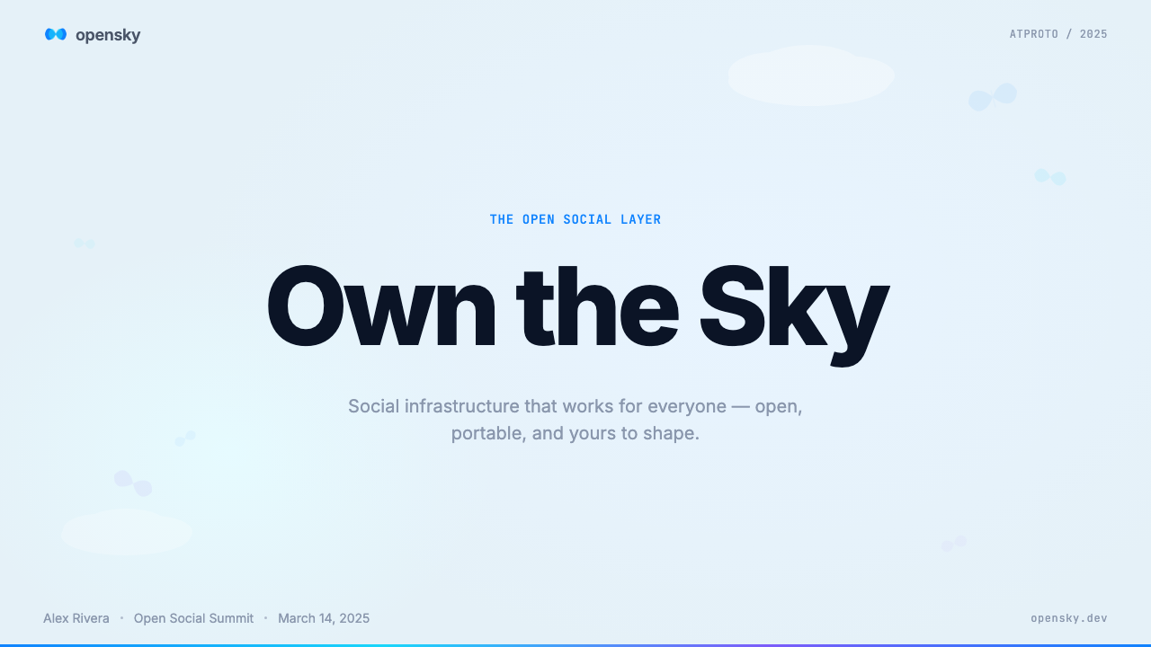
For presentation slides, this style suits covers and section dividers more than dense data pages. A cover in this language: pale blue field, cloud-white card inset with generous rounding, humanist type set at a moderate scale contrast, and the cobalt accent used on a single word or element. Content slides should feel spacious — one key idea per slide, ample padding, line-height that invites rather than rushes reading. Data visualizations can carry the palette by assigning the cobalt accent to the primary data series and using the sky blue as background fill for chart areas, keeping everything legible without harshness.在演示文稿中,这种风格更适合封面与章节隔断页,而非密集的数据页面。这套语言的封面:浅蓝底色铺面,圆角充裕的云白卡片内嵌其中,人文主义字体以适度比例对比排印,钴蓝强调色点亮单个词语或元素。内容页应保持宽松感——每页聚焦一个核心概念,充裕的内边距,行高营造出邀请而非催促阅读的节奏。数据可视化可以通过将钴蓝分配给主要数据系列、以天蓝色作为图表区背景填充来延续色彩体系,在清晰可读的同时避免视觉刺激。
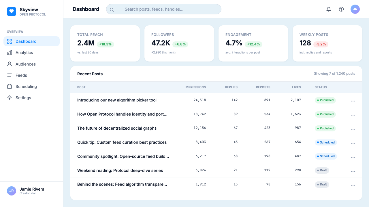
For web interfaces, the style is well-matched to community dashboards, open-source project landing pages, and platforms positioning themselves as alternatives to existing corporate products. The approach: use the pale blue as the page background rather than pure white, which immediately signals that this is not a standard corporate interface. Cards on top of the blue ground carry the cloud white surface, with the cobalt accent used for primary buttons and link states only. Navigation should be typographically light and the overall density should stay lower than a traditional SaaS dashboard — breathing room is part of the message.对于网页界面,该风格适合社区仪表板、开源项目落地页,以及将自身定位为现有企业产品替代方案的平台。方法:以浅蓝作为页面背景而非纯白,这立刻传递出一个信号:这里不是标准的企业界面。蓝色底色上的卡片承载云白表面,钴蓝仅用于主按钮与链接状态。导航应在字体上保持轻盈感,整体密度应低于传统 SaaS 仪表板——留白是这套信息本身的一部分。
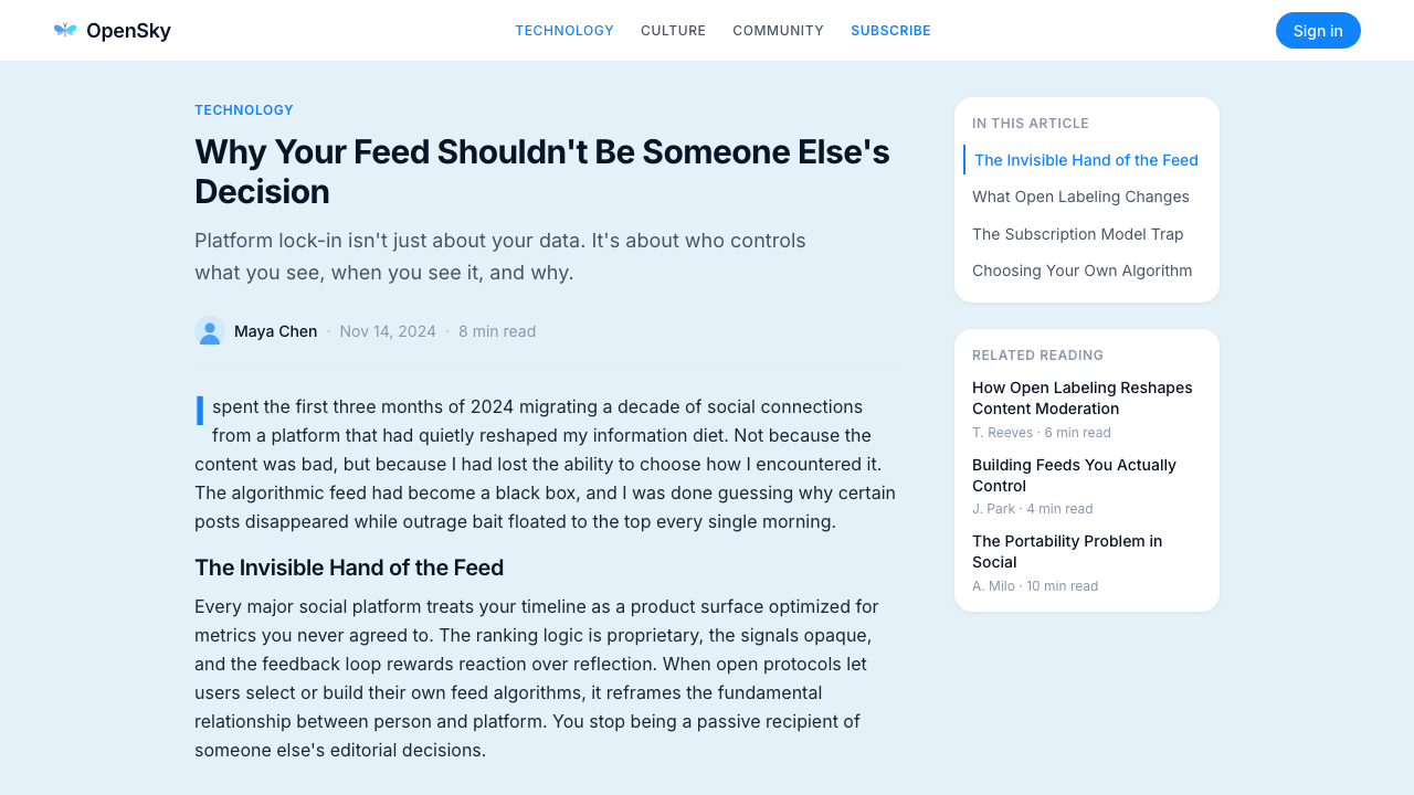
For editorial and marketing work, the style supports thought leadership, open-source announcements, and community updates where the relationship between platform and user is presented as collaborative rather than transactional. Hero sections can use the full sky-blue wash with a centered cloud-white card containing the headline and summary. Body sections return to near-white for extended reading. The butterfly-flock motif, or abstracted distributed network patterns built from individual small marks, can serve as background texture without breaking the palette or adding noise.对于编辑与营销内容,该风格支持思想领导力文章、开源公告和社区动态,在这些场景中,平台与用户的关系被呈现为协作式而非交易式。英雄区可使用完整的天蓝色底色,中央放置一张包含标题与摘要的云白卡片。正文部分回归近白底色以支持延伸阅读。蝴蝶群飞图形,或由单个小元素构成的抽象分布式网络图案,可作为背景纹理,既不破坏色彩体系,也不增加视觉噪音。
A common mistake when applying this style is using too many blues simultaneously — sky blue and cobalt are distinct roles, and conflating them produces a monotone palette that loses the warmth the design depends on. A second frequent error is defaulting to sharp corners on any element to save time; even a modest rounding on buttons and inputs is essential to maintaining the system's psychological tone. The third mistake is overdensing the layout out of habit — the spaciousness of this style is structural, not decorative, and compressing it strips away the core message.应用这种风格时最常见的错误,是同时使用过多蓝色——天蓝与钴蓝承担各自独立的角色,将两者混同会产生单调的色调,丧失设计所依赖的温暖感。第二个常见错误是为了省事而在所有元素上保留直角;即便是按钮和输入框上适度的圆角,对于维持系统的心理调性也不可或缺。第三个错误是出于习惯压缩版面密度——这种风格的宽敞感是结构性的,而非装饰性的,一旦压缩,核心信息也随之消失。
See the Bluesky AT Protocol 2024 design system →查看 Bluesky AT Protocol 2024 完整设计系统 →
Bluesky AT Protocol 2024 — FAQBluesky AT Protocol 2024 · 常见问题
How does the Bluesky style differ from other tech-platform design systems?Bluesky 风格与其他科技平台设计系统有何不同?
Most large tech platforms use their visual design to project scale and authority — sharp edges, high contrast, dense information, and a palette that signals efficiency over warmth. Bluesky deliberately inverts this: the rounded forms, airy spacing, and sky-blue palette position the platform as human-scale and community-oriented rather than corporate and surveilling. The closest visual relatives are newer consumer social products that also prioritize approachability, but Bluesky's design is further distinguished by its explicit connection to open infrastructure values — the warmth is not just aesthetic positioning, it is an argument about what the technology is for.大多数大型科技平台利用视觉设计来传达规模与权威感——锐利边缘、高对比度、密集信息,以及强调效率而非温暖的色调。Bluesky 刻意颠覆了这一逻辑:圆润形态、通透间距与天蓝色调,将平台定位为人性化、社区导向,而非企业化与监控性的。视觉上最接近的参照是同样将亲近感置于首位的新兴消费社交产品,但 Bluesky 的设计进一步以对开放基础设施价值观的明确呼应加以区分——温暖不仅是美学定位,更是一个关于技术为何而存在的论点。
Can this style work for dark-mode interfaces?这种风格适合深色模式界面吗?
The style's natural mode is light — the pale sky blue and cloud white are foundational, and the warmth depends substantially on the light ground. A dark mode adaptation is possible but requires care. A deep navy or near-black background can substitute for the sky blue, with a slightly lighter surface for cards, and the cobalt accent intensified slightly to maintain contrast. The key is preserving the spatial hierarchy: background, surface, accent — without that layering, the interface loses the sense of depth that the original system uses to feel warm and inhabitable rather than flat and cold.这种风格的自然状态是浅色——浅天蓝与云白是基础,温暖感在很大程度上依赖于浅色底面。深色模式的适配是可能的,但需要谨慎处理。深海军蓝或近黑色背景可以替代天蓝,略浅的卡片表面在其上浮起,钴蓝强调色可适度加深以维持对比度。关键在于保留空间层次感:底色、表面、强调——没有这种层叠关系,界面便会失去原有系统赋予其温暖感与可居住感的深度,沦为平坦而冰冷的外观。
Is this style appropriate for productivity or data-heavy tools?这种风格适合生产力工具或数据密集型产品吗?
The style can work in productivity contexts, but its spaciousness creates a practical tension. Dense data environments — analytics dashboards, financial tables, developer tooling — typically rely on tight grid layouts and high information density, which conflicts with the generous padding and breathing room this aesthetic depends on. The most successful application would be in a tool that handles complexity without trying to display all of it simultaneously: a focused writing environment, a lightweight project tracker, or a community data tool where the warmth signals approachability rather than cutting-edge analytical power. For tools where density is a feature, a more neutral system design language would be more honest.这种风格可以在生产力场景中发挥作用,但其宽敞感会带来实际张力。数据密集型环境——分析仪表板、财务表格、开发者工具——通常依赖紧凑的网格布局与高信息密度,这与该美学所依赖的充裕内边距和呼吸空间相冲突。最成功的应用场景,是那些处理复杂性但无需同时呈现所有内容的工具:专注写作环境、轻量项目追踪器,或是社区数据工具——在这些场景中,温暖感传递的是亲近可及,而非尖端的分析能力。对于以密度为核心特性的工具,更中性的系统设计语言会更为诚实。
What makes this style feel different from general rounded or friendly design?是什么让这种风格有别于一般的圆润友好设计?
Many contemporary interfaces use rounding and light palettes without producing the specific character of the Bluesky design language. What makes the style coherent rather than generic is the combination of three specific properties: the pale sky blue ground (not just light gray or white), the butterfly-flock mark that carries ideological weight about distributed systems, and the deliberate choice to restrict the accent to a single cobalt. Remove any one of these — replace the sky blue with neutral gray, add a second accent, or genericize the mark — and the design becomes a pleasant but undifferentiated rounded-friendly interface. The specificity is the style.许多当代界面使用圆角与浅色调,却未能产生 Bluesky 设计语言的特定气质。让这种风格连贯而非泛化的,是三个具体属性的组合:浅天蓝底色(而非仅仅是浅灰或白色)、蕴含分布式系统理念重量的蝴蝶群飞标志,以及将强调色刻意限定为单一钴蓝的主动选择。去掉其中任何一个——以中性灰替换天蓝、添加第二种强调色,或将标志泛化——设计就会变成一个令人愉悦但无差异的圆润友好界面。正是这种具体性,构成了这种风格的本质。
How should the cobalt accent be used to avoid overuse?如何使用钴蓝强调色才能避免滥用?
The cobalt accent is effective precisely because it is rare. On any given screen, it should appear in only one or two locations: typically the primary action button, a link in active or hover state, or a single highlighted data point. When cobalt appears on every interactive element, every status indicator, and every heading, it loses its ability to direct attention and becomes background noise. The discipline required is treating cobalt as a pointer — it says 'this is what you do next' or 'this is what matters' — not as decoration or brand application. The rest of the interface should be doing its work in sky blue, cloud white, and near-black type, with cobalt arriving only when there is something worth pointing at.钴蓝强调色之所以有效,正是因为它的稀缺。在任意一个屏幕上,它应只出现在一到两处:通常是主行动按钮、悬停或激活状态的链接,或单个高亮数据点。当钴蓝出现在每个交互元素、每个状态指示符和每个标题上时,它就失去了引导注意力的能力,沦为背景噪音。所需的自律是将钴蓝视为一根指针——它说的是“这是你接下来要做的事”或“这是重要的内容”——而非装饰或品牌应用。界面的其余部分应在天蓝、云白与近黑文字中完成自身的工作,钴蓝只在有值得指向的事物时才出现。
Related design styles相关设计风格
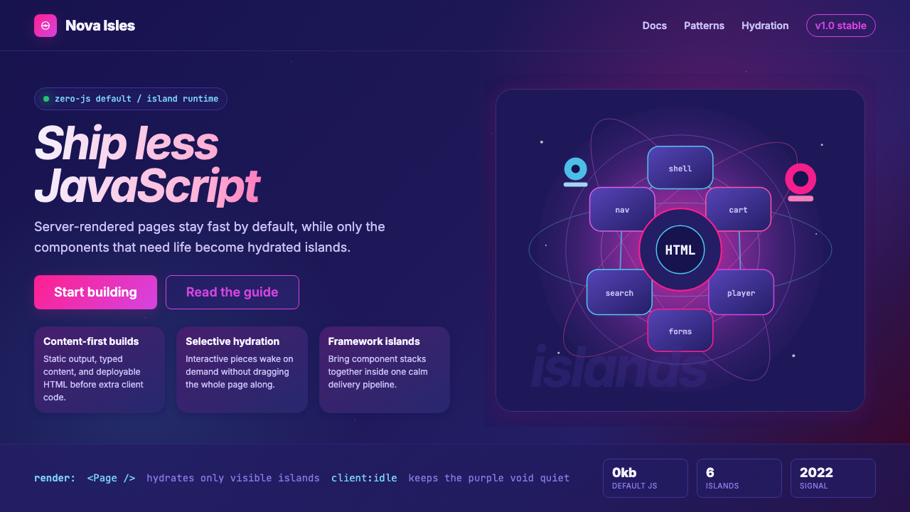 Astro Islands Architecture 2022Warm cosmic devtools. Deep violet, magenta glow, Inter clarity, and island ge…温暖的宇宙开发感:深紫底、洋红光、Inter 字体与岛屿几何。
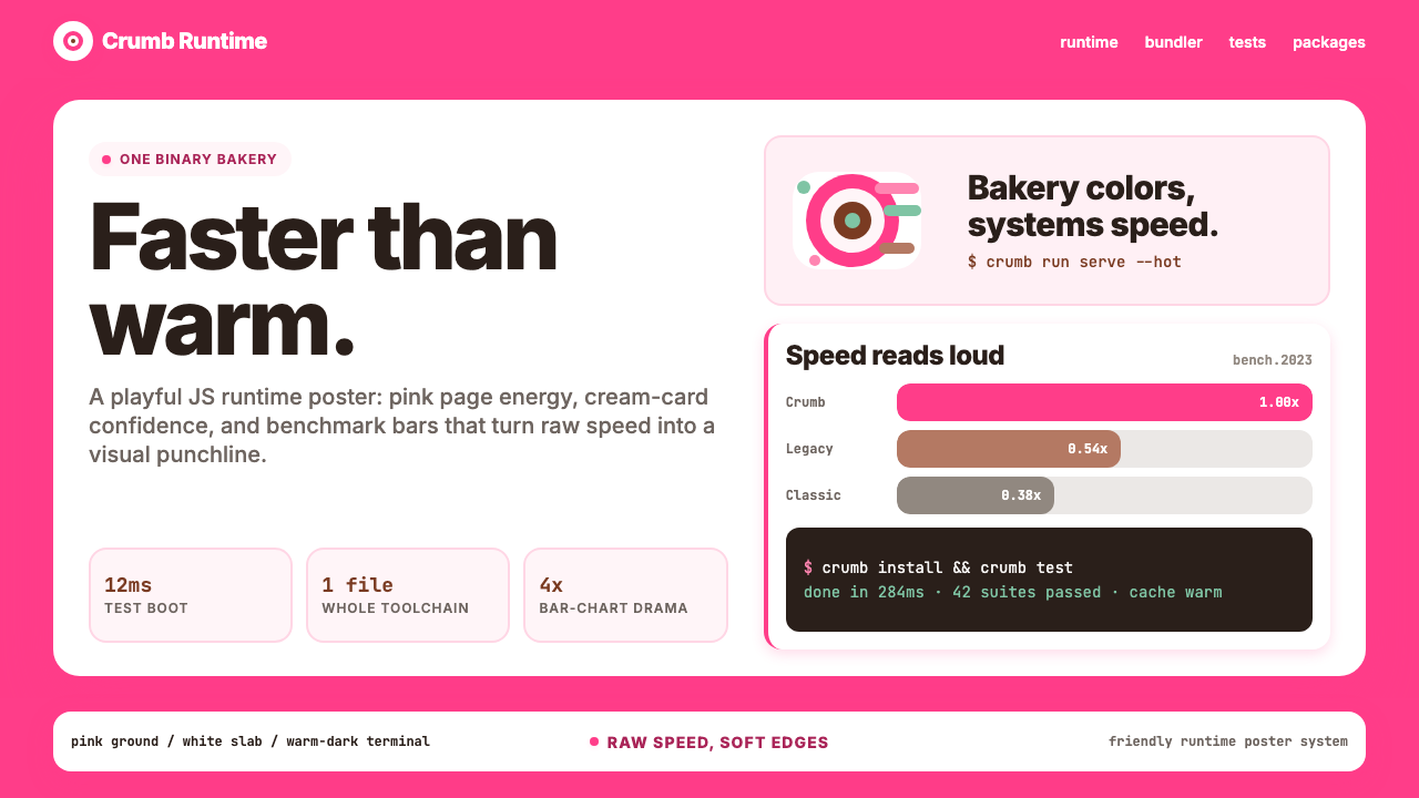 Bun JS Runtime Pink 2023Dev speed gets bakery-bright. Hot pink grounds white slabs, mono bars, and wa…开发速度像烘焙店一样明亮:热粉底、白卡片、等宽基准条与暖黑终端。
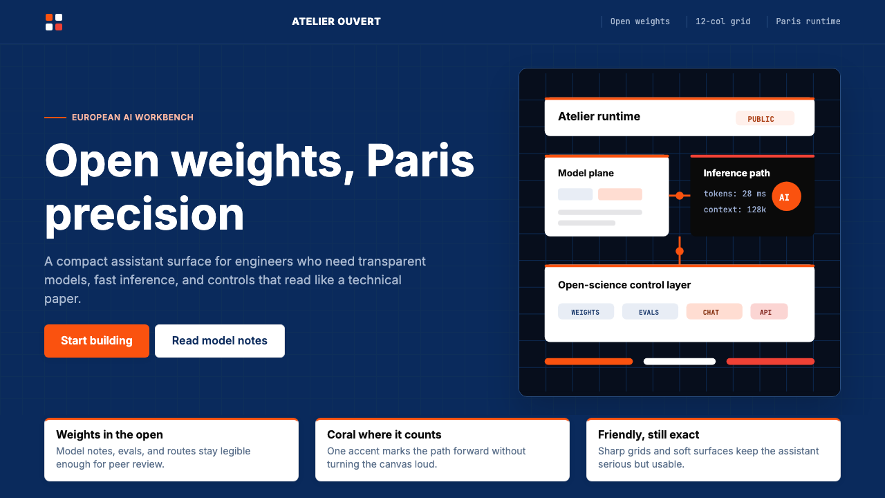 Mistral Le Chat French AIOpen science feels engineered. Navy panels, Inter grids, and coral stripes ke…开放科学也很精密:海军蓝面板、Inter 栅格与珊瑚橙细线定调。
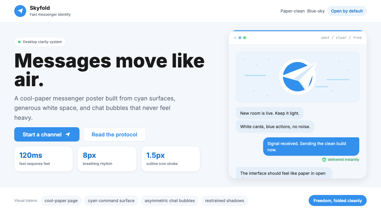 Telegram Blue Paper PlanePaper-clean speed. Cyan planes, white cards, and chat bubbles carry the ident…纸面般清爽快速:青蓝飞机、白卡片与气泡撑起识别度。
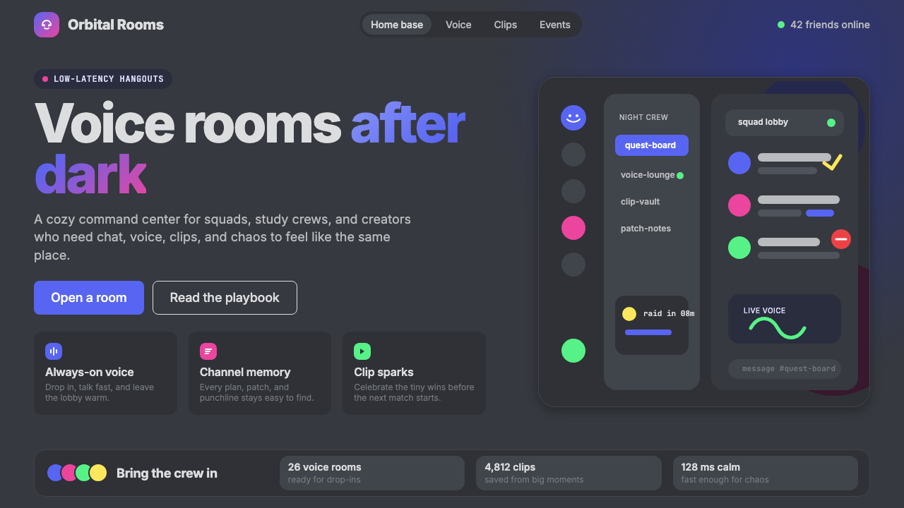 Discord 2024Blurple cozy. Charcoal grounds, illustrated characters — every surface says '…刻意去企业化的语音聊天:blurple 蓝紫、深炭灰底、俏皮插画角色——每个界…
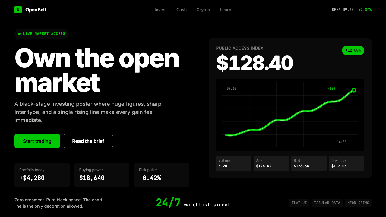 Robinhood 2023Markets feel immediate. Pure black, Inter numbers, and one neon-green line do…市场触手可及:纯黑底、Inter 数字与霓虹绿曲线完成表达。