What is Robinhood 2023?什么是 Robinhood 2023?
Robinhood 2023 proves that a pitch-black canvas, one neon-mint accent, and numbers set at billboard scale can make a retail brokerage feel as inevitable as the market itself.Robinhood 2023 用一块纯黑画布、一抹霓虹薄荷绿与巨幅数字证明:散户券商也可以像市场本身一样不可阻挡。
Robinhood 2023 in briefRobinhood 2023 速览
Robinhood 2023 is the visual identity language adopted by the American commission-free brokerage Robinhood during its post-meme-stock-era brand maturation. It is defined by a small number of decisions held with absolute conviction: a near-total black field, a single signature green used exclusively for upward momentum and calls to action, Inter set at extreme scale, and an almost total removal of decoration. The result is a fintech aesthetic that reads less like a bank and more like a flagship consumer-technology launch.Robinhood 2023 是美国免佣金券商 Robinhood 在 Reddit 散户热潮退去、品牌进入成熟期后所采用的视觉识别语言。它由少数几个被绝对坚守的决定构成:近乎全黑的底面、仅用于向上动能与行动号召的单一签名绿、以极端尺寸排列的 Inter 字体,以及几乎彻底的零装饰。最终呈现的金融科技美学,读来不像银行,更像一场旗舰消费科技发布。
At its core, the system is built around legibility under pressure. Financial data — prices, percentages, portfolio values — is the primary content, and every typographic and chromatic choice is made to serve that data rather than compete with it. The black background eliminates ambient distraction. The neon-mint green communicates gain, movement, and possibility without requiring any explanatory copy. Numbers do not need to be explained when the environment is designed to make them impossible to ignore.这套系统的核心是在压力下保持可读性。金融数据——价格、百分比、投资组合价值——是主要内容,所有排印与色彩选择都服务于这些数据,而非与之竞争。黑色背景消除了周围的干扰。霓虹薄荷绿传递涨势、动势与可能性,无需任何文字解释。当环境被设计成让数字无法被忽视时,数字本身就不需要被解释。
The aesthetic descends from the broader wave of consumer-fintech design that swept Silicon Valley in the 2010s — the conviction that personal finance could be made as immediate and emotionally resonant as a social media feed. But where earlier fintech brands often softened this premise with gradients, friendly illustration, and warm color palettes, Robinhood 2023 strips the premise to its hardest edge: confidence as a visual fact, delivered through darkness and light.这种美学源自席卷硅谷的消费级金融科技设计浪潮——个人理财可以像社交媒体动态一样即时而富有情感共鸣的信念。但相比早期金融科技品牌常以渐变、插图与暖色系来软化这一前提,Robinhood 2023 将其削至最硬的边缘:信心作为一个视觉事实,通过明与暗来传递。
See the Robinhood 2023 design system查看 Robinhood 2023 完整设计系统
Where does Robinhood 2023 come from?Robinhood 2023 从何而来?
Robinhood was founded in 2013 in Menlo Park, California, by Stanford roommates Vlad Tenev and Baiju Bhatt, both children of immigrants who wanted to democratize access to financial markets. The founding product — a mobile-first, commission-free stock trading app — launched publicly in 2015 and grew explosively, reaching millions of accounts within its first few years. The original visual identity was deliberately approachable: softer greens, rounded forms, and a consumer-friendly affect that positioned the app as the antithesis of Wall Street's imposing architecture.Robinhood 由斯坦福室友弗拉德·特涅夫(Vlad Tenev)和拜久·巴特(Baiju Bhatt)于2013年在加利福尼亚州门洛帕克创立,两人均为移民子女,希望让普通人平等进入金融市场。核心产品——一款以移动端为主、免佣金的股票交易应用——于2015年公开上线,用户数在最初几年爆发式增长。原始视觉识别刻意显得亲和:更柔和的绿色、圆润的形态,以及消费友好的气质,将这款应用定位为华尔街威严建筑的反面。
The visual identity underwent significant pressure testing between 2020 and 2022. The meme-stock episode of early 2021 — in which Robinhood halted trading in GameStop and other heavily shorted securities during a retail-investor short squeeze — brought the company intense public scrutiny and exposed a tension at the heart of its brand promise. The democratic, populist identity suddenly had to coexist with regulatory realities and institutional scrutiny. The brand needed to mature without abandoning its core claim of access.2020年至2022年间,视觉识别经历了重大压力测试。2021年初的「模因股」事件——Robinhood 在散户空头逼仓潮中暂停了 GameStop 等股票的交易——使公司遭受强烈的公众审视,也暴露了其品牌承诺核心处的张力。民主、民粹式的身份认同突然需要与监管现实和机构审查共存。品牌需要成熟,却不能放弃其关于普惠金融的核心主张。
The 2022–2024 visual refresh, developed by Robinhood's internal brand team, answered that tension by doubling down on confidence rather than charm. The softer, more approachable early palette was replaced by a system built on absolute black. The green signature color — always present in the brand's history as the color of a rising chart line — was pushed to its most saturated, most neon expression. Inter, a typeface engineered for screen clarity at a wide range of sizes, was adopted as the system typeface and deployed at sizes that turned financial data into visual statements.2022至2024年间由 Robinhood 内部品牌团队主导的视觉刷新,通过押注自信而非魅力来回应这一张力。更柔和、更亲和的早期色板被一套以绝对黑色为基础的系统所取代。品牌历史中始终存在的签名绿——一条向上攀升的股价曲线的颜色——被推向了最饱和、最霓虹的表达。Inter,一款为宽范围字号的屏幕清晰度而工程化设计的字体,被选用为系统字体,并以将金融数据转化为视觉陈述的尺度部署。
The movements informing the 2023 identity are clearly legible: retail trading apps competing for attention on home screens, the gamification conventions of fintech broadly, and the post-Reddit-WSB reality that retail investors had demonstrated they could move markets. The design responded not by softening that reality but by embodying it — making the interface feel as serious and immediate as the consequences it represented. The Menlo Park origin matters too: the aesthetic has more in common with how Apple, Stripe, and Linear present software than with how JPMorgan or Fidelity present finance.2023年视觉识别背后的运动清晰可辨:争夺主屏注意力的零售交易应用、金融科技领域的游戏化惯例,以及 Reddit-WSB 事件后散户投资者已能撼动市场的后实事。设计的回应不是软化这一现实,而是体现它——让界面感觉与它所代表的后果一样严肃而即时。门洛帕克的出身同样重要:这种美学与苹果、Stripe 和 Linear 呈现软件产品的方式更为接近,而非 JPMorgan 或 Fidelity 呈现金融服务的方式。
What defines the Robinhood 2023 look?Robinhood 2023 的视觉特征是什么?
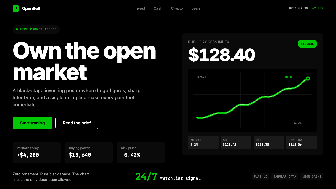
The Black Field黑色底面
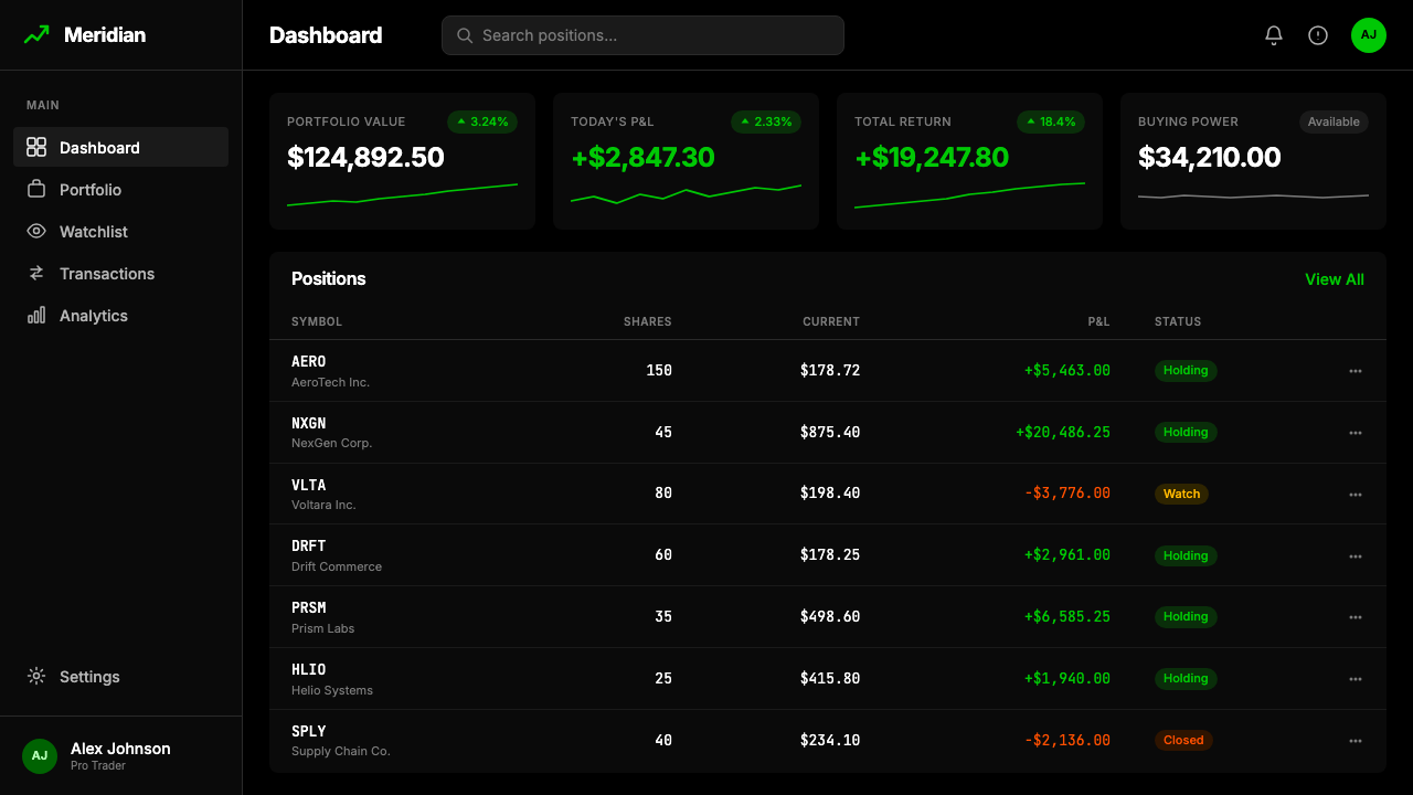
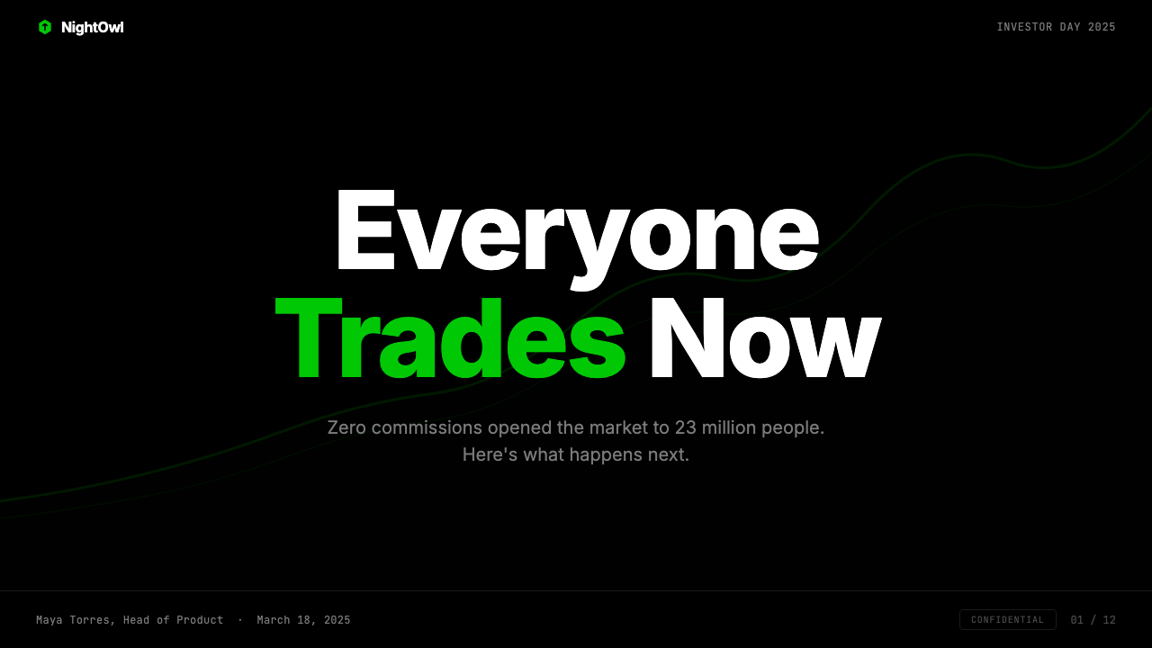
The dominant surface in Robinhood 2023 is an uncompromising, flat black — not charcoal, not near-black, but a pitch-black ground that absorbs all ambient distraction and makes every element placed upon it feel like a statement. This is not darkness for mood or luxury signaling; it is darkness as a functional decision. Against a black field, neon green reads at maximum intensity without needing increased saturation, and white type achieves the highest possible contrast ratio. The black is the silence from which numbers speak.Robinhood 2023 的主要底面是不妥协的平面黑——不是深炭灰,不是近黑,而是一块吸收所有周围干扰的纯黑底面,让置于其上的每个元素都感觉像一句陈述。这不是为了情绪或奢华信号而使用的黑暗;它是一个功能性决定。在黑色底面上,霓虹绿无需提高饱和度便能以最大强度呈现,白色文字获得最高可能的对比度。黑色是数字发言的寂静。
Neon-Mint Green as the System Accent霓虹薄荷绿作为系统强调色
The signature green in Robinhood 2023 is unlike the conventional financial-green of stock tickers — it reads as neon, electric, alive. It is used with strict discipline: applied to chart lines representing upward movement, to calls to action, and to moments where the design needs to say something is happening now. It never diffuses or gradients; it appears as a flat, fully-saturated stroke or fill, then stops. Outside of this accent, the palette is entirely achromatic — only black, white, and the greens and grays that fall between them. The restraint makes every appearance of the accent color feel like an event.Robinhood 2023 的签名绿与行情软件中惯常的金融绿截然不同——它读来是霓虹的、电流般的、有生命的。它被严格地使用:应用于代表向上动能的图表线条、行动号召,以及设计需要传达「现在有事发生」的时刻。它从不漫散或渐变;它以平面、完全饱和的笔触或填充出现,然后停止。在这个强调色之外,色板完全消色——只有黑、白,以及介于两者之间的绿调灰。这种克制使强调色每一次出现都感觉像一个事件。
Type at Extreme Scale极端尺度的排印
Robinhood 2023 deploys its system typeface at sizes that feel almost confrontational — portfolio totals and price figures that span most of the screen width, headlines that crowd into the frame like billboard copy. The size hierarchy is steep: the largest numbers are many times the scale of supporting labels, which themselves are tightly set and small. This extreme contrast in scale communicates priority without requiring any decorative framing — the size is the hierarchy. It also signals that the information is the product, not the chrome around it.Robinhood 2023 以几乎具有对抗性的尺寸部署其系统字体——投资组合总额与价格数字横跨屏幕大部分宽度,标题像广告牌文案一样挤满画框。字号层级十分陡峭:最大的数字是辅助标签的数倍,而标签本身则紧凑且偏小。这种极端的尺度对比无需任何装饰框架便能传达优先级——尺寸本身就是层级。它同时传达:信息本身是产品,而非围绕它的界面装饰。
The Stock-Chart Line as Sole Ornament股价曲线作为唯一装饰
In a system that otherwise eliminates all decoration, the single permitted ornament is the stock-chart line — a continuous stroke rendered in the signature green, sweeping upward through the composition. It functions simultaneously as data visualization and brand signature: it carries the informational message of a portfolio gaining value while also serving as the visual centerpiece of the identity. The line is never used ironically or downward; its role is exclusively aspirational. This limitation gives it unusual potency — every appearance reinforces the brand's fundamental promise.在一套在其他地方彻底消除装饰的系统中,唯一被允许的装饰是股价曲线——一条以签名绿渲染、在构图中向上扫掠的连续笔触。它同时承担数据可视化与品牌签名两重功能:既传递投资组合增值的信息内容,又充当视觉识别的中心件。这条线从不被讽刺性地或向下使用;它的角色是纯粹向上的。这一限制赋予了它不寻常的力量——每一次出现都强化了品牌的根本承诺。
Radical Subtraction of Decoration装饰的激进消减
No gradients, no shadows, no illustrations, no ambient textures, no iconographic ornament. The negative space in Robinhood 2023 is not empty; it is load-bearing. Every element that is absent creates room for the elements that are present to carry maximum weight. The absence of gradients means edges are decisions — a boundary between black and white is sharp and absolute. The absence of illustration means photography and data visualization carry the full representational burden, with nothing decorative mediating between the user and the content. The style's severity is its argument: this is what serious looks like.没有渐变,没有阴影,没有插图,没有环境纹理,没有图标装饰。Robinhood 2023 中的负空间并非空洞;它是承重的。每一个缺席的元素都为在场的元素创造了携带最大分量的空间。渐变的缺席意味着边缘是决定——黑与白之间的边界是锐利而绝对的。插图的缺席意味着摄影与数据可视化承担全部表征负担,没有任何装饰性成分介于用户与内容之间。这种风格的严肃性就是它的论点:严肃就是这个样子。
Achromatic Supporting Palette消色的辅助色板
Beyond the signature green and the black field, the system's supporting palette is entirely achromatic — a range of grays and whites used for secondary text, card backgrounds, dividers, and inactive states. These intermediate tones never compete with the green accent and never suggest warmth or decoration on their own. They are structural — their job is to define depth and hierarchy within the monochromatic ground before the accent color arrives. This restraint is deliberate: a second color accent would dilute the neon green's signal value and introduce visual noise into a system designed around signal clarity.在签名绿与黑色底面之外,系统的辅助色板是完全消色的——一系列灰度与白色用于次级文字、卡片背景、分割线与非激活状态。这些中间色调从不与绿色强调竞争,也从不独自暗示温暖或装饰。它们是结构性的——它们的工作是在强调色到来之前,在消色底面内定义层次与层级。这种克制是刻意的:第二种强调色会稀释霓虹绿的信号价值,并在一个围绕信号清晰度设计的系统中引入视觉噪声。
Consumer-Technology Confidence, Not Financial Caution消费科技式自信,而非金融式谨慎
Traditional financial design signals stability through restraint, heritage through serif type, and trustworthiness through institutional blue and gold. Robinhood 2023 rejects all three conventions. Its confidence is not institutional — it is the confidence of a company that believes it has already disrupted its category and is now daring the user to keep up. The visual language borrows from product launches, keynote presentations, and premium consumer hardware more than from any financial predecessor. This is a deliberate positioning signal: Robinhood is not a brokerage that learned to look like a tech company; it is a tech company that trades stocks.传统金融设计通过克制传递稳定感,通过衬线字体传递传承感,通过机构蓝与金色传递可信度。Robinhood 2023 拒绝了这三种惯例。它的自信不是机构式的——它是一家相信自己已经颠覆了所在行业、并正在邀请用户跟上节奏的公司的自信。其视觉语言更多地借鉴于产品发布会、主题演讲与高端消费硬件,而非任何金融前辈。这是一个刻意的定位信号:Robinhood 不是一家学会看起来像科技公司的券商;它是一家交易股票的科技公司。
See the Robinhood 2023 design system查看 Robinhood 2023 完整设计系统
Who shaped Robinhood 2023?谁塑造了 Robinhood 2023?
Co-founder and CEO of Robinhood, Tenev is the primary public voice of the company's mission to democratize finance. His communications and product decisions have consistently pushed the brand toward the conviction that financial markets are not inherently complex — they have been made to appear so by incumbents with an interest in keeping retail investors at arm's length. This premise is inseparable from the visual language Robinhood adopted: if markets belong to everyone, the interface should look like it knows that.Robinhood 联合创始人兼首席执行官,特涅夫是公司普惠金融使命的主要公众代言人。他的传播与产品决策始终推动着一个信念:金融市场并非天然复杂——它们被既得利益者人为地复杂化,以将散户投资者拒之门外。这个前提与 Robinhood 采用的视觉语言密不可分:如果市场属于所有人,界面应当看起来知道这一点。
Co-founder of Robinhood and architect of its original product vision alongside Tenev, Bhatt represented the engineering and systems thinking that made zero-commission trading technically viable at scale. The clean, precise aesthetic of Robinhood 2023 — its refusal of excess, its confidence in reduction — carries the DNA of that original engineering philosophy: remove what is unnecessary and what remains will be powerful.Robinhood 联合创始人,与特涅夫共同构建了原始产品愿景。巴特代表了使零佣金交易在大规模上技术可行的工程思维与系统思维。Robinhood 2023 整洁而精准的美学——对多余的拒绝,对简化的自信——承载着那种原始工程哲学的 DNA:去除一切不必要的,留下的便是有力量的。
The 2022–2024 visual identity was developed internally, a notable choice in an era when brand transformations of this scale typically involved large external agencies. The in-house nature of the work meant the visual language was built by people who understood the product deeply — who knew where numbers appeared, at what scale, under what conditions of user stress or excitement. That intimacy is legible in the result: the system does not look designed for a pitch deck; it looks designed for real screens at real moments.2022至2024年的视觉识别由内部团队开发——在这种规模的品牌转型通常需要大型外部机构的时代,这是一个值得注意的选择。这种内部开发的方式意味着视觉语言由深刻理解产品的人构建——他们知道数字在哪里出现,以何种尺度,在用户何种压力或兴奋的条件下。这种亲密性在结果中清晰可读:这套系统看起来不像为提案幻灯片设计的;它看起来像为真实屏幕上的真实时刻设计的。
Though a typeface is not a person, Inter — the open-source typeface designed by Rasmus Andersson and released in 2017 — functions as a key creative collaborator in the Robinhood 2023 system. Designed specifically for screen readability across a wide range of sizes, Inter performs equally well at the microscale of a trading label and the macro-scale of a portfolio total displayed as a headline. Its neutral, precise letterforms carry numbers without competing with them — a design virtue that makes it particularly suited to a system where numerical content is the primary communication.尽管字体不是人,Inter——由拉斯穆斯·安德森(Rasmus Andersson)设计并于2017年发布的开源字体——在 Robinhood 2023 系统中扮演着关键创意协作者的角色。专为宽范围字号的屏幕可读性而设计,Inter 在交易标签的微型尺度与以标题形式展示的投资组合总额的宏观尺度上表现同样出色。其中性、精准的字形承载数字而不与之竞争——这种设计美德使其特别适合一个以数字内容为主要传达的系统。
Not a designer but an event: Robinhood's decision to halt trading in GameStop and other volatile securities in January 2021 during the Reddit-driven short squeeze became the most significant pressure test in the company's brand history. The backlash forced a reckoning with what democratic finance actually meant under institutional constraint. The subsequent visual identity refresh can be read in part as a design response to that crisis — a choice to lean into confidence and directness rather than institutional softness, as if the brand itself was daring critics to misread its intentions again.这不是一位设计师,而是一个事件:2021年1月,在 Reddit 驱动的空头逼仓期间,Robinhood 决定暂停 GameStop 等波动性证券的交易,这成为公司品牌历史上最重大的压力测试。随之而来的强烈反弹迫使公司正视普惠金融在机构约束下究竟意味着什么。随后的视觉识别刷新,在某种程度上可以被解读为对那场危机的设计回应——选择押注自信与直接,而非机构式的柔和,仿佛品牌自身在邀请批评者再次误读它的意图。
How do you use Robinhood 2023 today?今天怎么用 Robinhood 2023?
Robinhood 2023 is most naturally at home in presentation contexts that need to project confidence and urgency simultaneously — product pitches, investor decks, and executive briefings where being taken seriously is a precondition of the conversation. A cover slide in this style leads with darkness: the full slide field is black, a single line of neon-mint green or white type sets the thesis at maximum scale, and nothing else competes. The title is the slide. For content slides, the approach is equally spare — one key number or claim displayed at headline scale, supporting detail set tightly below in a smaller weight, and a horizontal divider rendered as a fine white or green rule rather than a decorative graphic.Robinhood 2023 最自然地栖居于需要同时投射自信与紧迫感的演示场景——产品推介、投资人路演与高管简报,在那里被认真对待是对话的前提。这种风格的封面幻灯片以黑暗开场:整张幻灯片底面为黑色,一行霓虹薄荷绿或白色文字以最大尺度呈现核心论点,没有任何其他元素与之竞争。标题即幻灯片。对于内容幻灯片,方法同样简洁——一个关键数字或主张以标题尺度展示,支撑细节以更小字重紧凑地排列在下方,水平分割线以细白色或绿色线条而非装饰图形呈现。
Data visualization is where the style earns its keep most distinctly. Line charts become brand statements when rendered in the signature green against a black field — the visual vocabulary of a rising portfolio directly applied to whatever data is being presented. Bar charts and area charts should follow the same logic: use the neon accent for the primary series and an achromatic tone for comparison series. Avoid introducing additional accent colors for secondary data; the system's power comes from the green being singular. When negative trends must be shown, white or light gray serves as the contrast color — the system deliberately avoids red, which would introduce a competing emotional register.数据可视化是这种风格最鲜明地体现其价值的领域。折线图在黑色底面上以签名绿渲染时成为品牌陈述——上涨投资组合的视觉词汇被直接应用于所呈现的任何数据。柱状图和面积图应遵循相同逻辑:将霓虹强调色用于主系列,将消色调用于对比系列。避免为次要数据引入额外的强调色;这套系统的力量来自绿色的唯一性。当必须展示负面趋势时,白色或浅灰色作为对比色——系统刻意回避红色,红色会引入一种竞争性的情感频道。
For web interfaces and dashboards, the Robinhood 2023 approach requires disciplined application of the dark-field logic. A full-black background works at the product or marketing level but may create accessibility and readability challenges in dense information environments. The practical adaptation is to carry the spirit rather than the letter: use very dark near-black surfaces for primary panels, reserve the neon accent for interactive states and key metrics, and let secondary panels lift slightly toward dark gray to create depth without introducing color. Navigation should be typographic and unadorned — labels only, no icon decoration except where a geometric indicator is genuinely functional.对于网页界面和仪表板,Robinhood 2023 的方法要求对黑色底面逻辑进行有纪律的应用。全黑背景在产品或营销层面有效,但在信息密集的环境中可能带来可及性与可读性挑战。实际的适配是承载精神而非字面:将极深的近黑表面用于主面板,将霓虹强调色保留给交互状态与关键指标,让次要面板向深灰色略微提亮以创造层次感而不引入色彩。导航应当是纯字体性的、无装饰的——仅使用标签,除非几何指示符在功能上真正必要,否则不使用图标装饰。
For editorial and marketing content, the style has strong poster energy that suits campaign headers, social cards, and out-of-home advertising. A full-bleed black background with a single data point — a return figure, a percentage, a date — set in maximum-scale white or green type communicates with the visual grammar of a financial headline. Supporting copy should be set small and secondary; competing with the hero number at any scale breaks the system's logic. For longer editorial formats, consider a light-on-dark treatment for hero sections and a conventional light-background treatment for body-text sections — the contrast between the two registers reinforces the primacy of the data display panels.对于编辑与营销内容,这种风格具有强烈的海报能量,适合活动大标题、社交卡片与户外广告。以全出血黑色背景配合单一数据点——收益数字、百分比、日期——以最大尺度的白色或绿色文字呈现,以金融头条的视觉语法传达信息。辅助文案应设置得小而次要;以任何尺度与主体数字竞争都会破坏系统逻辑。对于更长的编辑格式,考虑对主图区域使用浅色于深色的处理,对正文区域使用常规浅色背景处理——两种基调之间的对比强化了数据展示面板的首要地位。
A common mistake when applying this style is treating the neon-mint green as a general accent that can appear anywhere emphasis is needed. In authentic Robinhood 2023, green carries one specific meaning — gain, momentum, the thing that is happening in the user's favor — and diluting that by using it for headers, decorative elements, or secondary labels destroys the system's signal clarity. A second common mistake is warming the black field toward dark gray or dark navy in the belief that softening will improve reception; this typically just produces an undistinguished dark-mode aesthetic without the stark force of a true black ground. The style requires commitment to its most extreme positions to function as intended.应用这种风格时最常见的错误是将霓虹薄荷绿视为可在任何需要强调之处出现的通用强调色。在真实的 Robinhood 2023 中,绿色承载一个特定含义——涨势、动能、对用户有利的事情——通过将其用于标题、装饰元素或次级标签来稀释它,会摧毁系统的信号清晰度。第二个常见错误是将黑色底面暖化为深灰或深海军蓝,相信软化会改善接受度;这通常只会产生一种平庸的深色模式美学,而不具备真正黑色底面那种严峻的力量。这种风格需要对其最极端的立场做出承诺,才能按预期发挥作用。
See the Robinhood 2023 design system查看 Robinhood 2023 完整设计系统
Robinhood 2023 — FAQRobinhood 2023 · 常见问题
Is Robinhood 2023 a dark mode, or is darkness its default and only mode?Robinhood 2023 是一种深色模式,还是以黑暗作为其默认且唯一的模式?
It is the latter. Robinhood 2023 was not conceived as a dark-mode variant of a light-mode system — the black field is the primary and canonical surface, not an inversion. This distinction matters when applying the style: a true dark-mode system is designed to function equivalently in light and dark contexts, with the same hierarchy and the same weight of accent. Robinhood 2023 functions only in darkness — the neon-mint green's intensity is calibrated specifically for a black ground, and the removal of all supporting color means there is no light-mode equivalent that preserves the system's logic. If you need a light-mode version for accessibility or context reasons, you are effectively designing a related-but-distinct system.是后者。Robinhood 2023 并非作为浅色模式系统的深色模式变体而构建——黑色底面是主要且标准的表面,而非反转。在应用这种风格时,这一区别至关重要:真正的深色模式系统被设计为在浅色和深色语境中等效运作,具有相同的层级和相同的强调分量。Robinhood 2023 只在黑暗中运作——霓虹薄荷绿的强度专为黑色底面而校准,所有辅助色彩的移除意味着不存在能保留系统逻辑的浅色模式等效版本。如果出于可及性或语境原因需要浅色模式版本,你实际上是在设计一个相关但截然不同的系统。
How does Robinhood 2023 handle negative data — losses, downward trends, warnings?Robinhood 2023 如何处理负面数据——亏损、下行趋势、警示?
This is one of the more interesting constraints of the system. Conventional financial interfaces use red for losses and green for gains — the red-green binary is deeply embedded in trading culture. Robinhood 2023 leans heavily into green as its sole chromatic accent, which means the system must find other strategies for communicating negative states. In practice, the brand uses red sparingly and only where functional necessity clearly outweighs the system's chromatic restraint. For many downward or negative states, the approach is achromatic — white or gray text, a downward-sloping chart line in a muted tone — rather than introducing red as a systematic accent. This keeps the visual field clean but requires careful calibration to avoid making losses feel visually insignificant.这是这套系统更有趣的约束之一。传统金融界面用红色表示亏损、绿色表示盈利——红绿二元对立深深植根于交易文化。Robinhood 2023 大量押注绿色作为其唯一的彩色强调,这意味着系统必须找到其他策略来传达负面状态。在实践中,品牌对红色的使用极为克制,仅在功能必要性明显超过系统的色彩约束时才使用。对于许多向下或负面的状态,处理方式是消色的——白色或灰色文字、以柔和色调呈现的向下倾斜图表线——而非将红色引入为系统性强调色。这保持了视觉场域的干净,但需要仔细校准以避免让亏损在视觉上显得无足轻重。
Can this style work for a brand that is not in fintech or investing?这种风格能用于金融科技或投资领域之外的品牌吗?
Yes, but the translation requires understanding what the style is actually communicating beyond its surface vocabulary. Robinhood 2023 projects conviction, immediacy, and the claim that data speaks for itself. Those are values that transfer well to any domain where expertise and directness are the primary brand virtues: enterprise software, professional tools, data analytics platforms, performance hardware, and high-stakes consumer products like premium audio or gaming peripherals. The style struggles in contexts that call for warmth, approachability, or organic quality — food and wellness brands, children's products, community platforms, and any context where the user experience depends on the brand feeling human rather than precise. The test is whether the brand's core promise benefits from severity or is undermined by it.可以,但转化需要理解这种风格在其表面词汇之外实际传达的是什么。Robinhood 2023 投射出信念、即时感,以及数据会自己说话的主张。这些价值观可以很好地迁移到任何以专业能力与直接性为主要品牌美德的领域:企业软件、专业工具、数据分析平台、性能硬件,以及高风险消费产品如高端音频或游戏外设。这种风格在呼唤温暖感、亲和力或有机品质的场景中力不从心——食品与健康品牌、儿童产品、社区平台,以及任何用户体验依赖品牌感觉像人而非精确的场景。检验方法是:品牌的核心承诺是否因严肃性而受益,或是否被它所削弱。
What is the relationship between Robinhood 2023 and other high-contrast dark-field fintech aesthetics?Robinhood 2023 与其他高对比度深色底面金融科技美学有何关系?
High-contrast dark interfaces proliferated across consumer fintech in the early 2020s, particularly after OLED screens made true-black backgrounds technically practical and visually striking on mobile hardware. Robinhood 2023 sits within this broader wave but distinguishes itself by its degree of chromatic reduction — most dark-mode fintech interfaces use multiple accent colors for category coding, status signaling, and decorative hierarchy. Robinhood 2023's commitment to a single accent color is the more extreme position, closer to the monochromatic discipline of luxury fashion branding than to the multi-accent logic of most trading apps. The nearest aesthetic relatives are not competing brokerages but product-launch presentation decks from Apple and the identity systems of brands like Linear and Vercel — software-native companies that treat restraint as a form of confidence.高对比度深色界面在2020年代初在消费级金融科技中大量涌现,尤其是在 OLED 屏幕使真正的黑色背景在移动硬件上从技术上可行且视觉效果引人注目之后。Robinhood 2023 处于这一更广泛浪潮之中,但以其色彩简化的程度而自我区别——大多数深色模式金融科技界面使用多种强调色来进行类别编码、状态信号传达与装饰性层级建立。Robinhood 2023 对单一强调色的承诺是更极端的立场,比大多数交易应用的多强调色逻辑,更接近奢侈时装品牌的单色调纪律。最近的美学亲属不是竞争券商,而是苹果的产品发布演示文稿,以及 Linear 和 Vercel 等品牌的识别系统——这些软件原生公司将克制视为一种自信的形式。
Does the style age well, or is it tied to a particular moment in fintech culture?这种风格经得起时间考验吗,还是它与金融科技文化的特定时刻绑定?
Robinhood 2023 carries the mark of its moment — the post-meme-stock, post-zero-interest-rate maturation of retail fintech, when the industry needed to project seriousness after a period of criticism that it had gamified investing. That cultural specificity means the style may date as the cultural context shifts. However, its formal choices — high contrast, typographic hierarchy, chromatic restraint — have deeper roots in the principles of effective data display that are not trend-dependent. The elements most likely to date are the specific neon character of the green accent and the extreme display type sizing, which carry the energy of a particular moment in consumer technology marketing. The underlying structure — darkness, data at scale, one color to signal what matters — is resilient and will continue to read as disciplined and serious as long as those remain desirable values in the relevant context.Robinhood 2023 带有其时代的印记——模因股风潮之后、零利率时代结束后散户金融科技的成熟期,那时整个行业需要在一段被批评将投资游戏化的时期之后投射出严肃感。这种文化特殊性意味着,随着文化语境的转变,这种风格可能会显得过时。然而,它的形式选择——高对比度、字体层级、色彩克制——在有效数据展示原则中有更深的根基,这些原则并不依赖流行趋势。最可能过时的元素是绿色强调色的特定霓虹特质与极端的展示字号,它们携带着消费科技营销某一特定时刻的能量。底层结构——黑暗、数据以规模呈现、用一种颜色标示重要性——具有韧性,只要这些仍是相关语境中的期望价值,它就会继续被解读为有纪律且严肃的。
Related design styles相关设计风格
 Cursor IDEAI-first code editor. Pure dark surfaces, off-white text, electric blue reser…以 AI 为核心的代码编辑器:近乎纯黑背景、柔白文字、唯一的电光蓝色专为 AI…
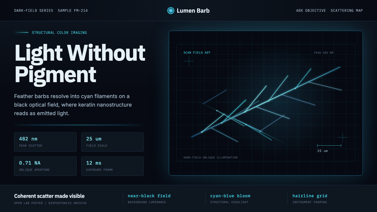 Feather MicroscopyPhysics glows in the dark. Cyan filaments and mono scale bars cut a black ima…黑暗中显出物理之光。青蓝羽丝与等宽比例尺切开暗场。
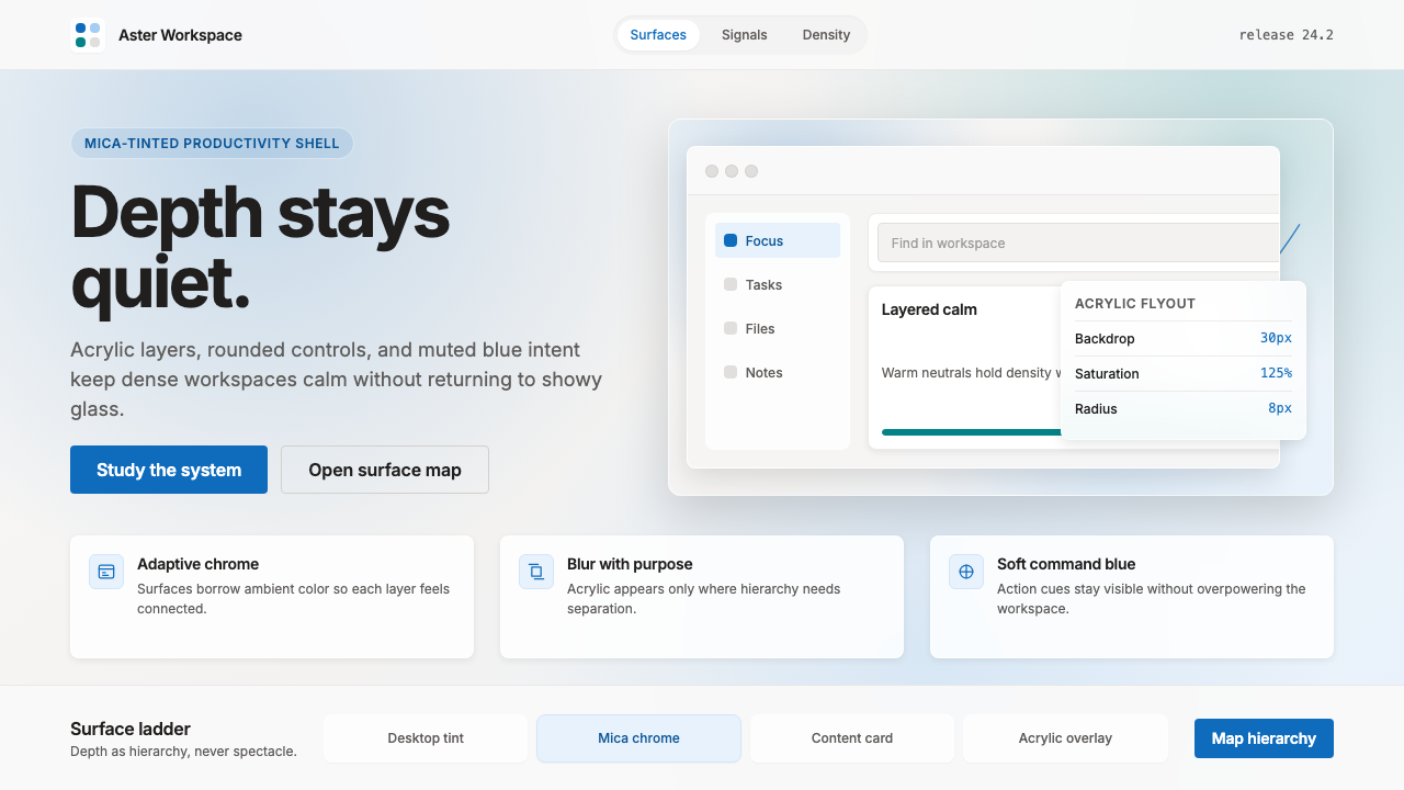 Microsoft Fluent 2Disciplined translucency. Warm Mica neutrals, acrylic blur, and muted blue cr…有纪律的半透明:暖 Mica 中性色、亚克力模糊与低调蓝营造沉稳层次。
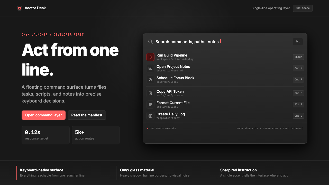 Raycast Spotlight Launcher (2023)Obsidian confidence. Sharp red cuts through Inter rows and mono shortcut chip…黑曜石般自信。锐红切过 Inter 行与等宽快捷键。
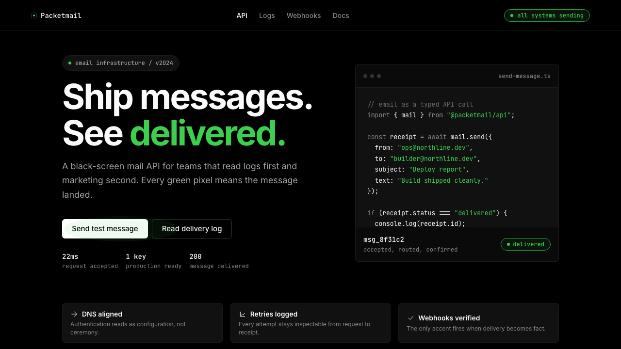 Resend 2024Clean code becomes brand. Pure black, JetBrains Mono, and one green delivered…品牌像 clean code:纯黑、JetBrains Mono、唯一送达绿。
 Vercel 2024Developer luxury by subtraction. Pure black, white Inter, rigid grid, triangu…以删减塑造开发者奢侈感:纯黑白、Inter 字体与刚性网格构成三角发布符号。