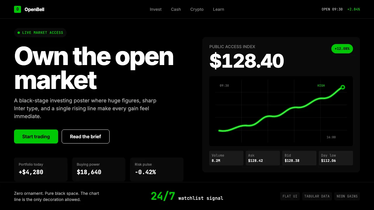
About Robinhood 2023
Robinhood rewrote the rules of retail investing by stripping away the gatekeepers and wrapping stock trading in a consumer-grade interface as confident as a flagship phone. The 2023 visual identity doubles down on that bet: a pitch-black canvas, neon-mint green that screams "your portfolio is up," and razor-sharp Inter type at billboard scale.
Every pixel reinforces the thesis that markets belong to everyone. The near-total absence of decoration — no gradients, no shadows, no texture — lets the numbers breathe. The only ornament permitted is the stock-chart line itself, curving upward in Robinhood green like a dare.
- Origin
- Menlo Park, California
- Era
- 2013 founded; current visual ~2022–2024
- Key figures
- Vlad Tenev · Baiju Bhatt · Robinhood Brand team
- Movements
- Retail trading apps · Gamified fintech · Post-Reddit-WSB consumer finance
Robinhood 2023 design spec
Colors
Typography
The other 11 sections — buttons, cards, spacing, motion, techniques and more — open once you unlock. Download the DESIGN.md or send it to your AI in one click. Unlock once, yours forever.
Sign up nowStyles similar to Robinhood 2023
Also inspired by brands & products, with a close feel.
 Platzi EdtechA developer dashboard you learn inside. Electric spring-green on teal-navy, warmed by lavender.
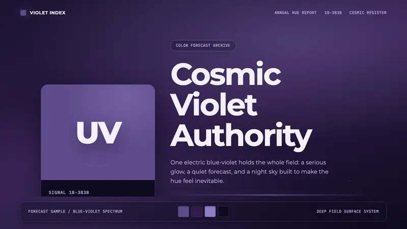 Pantone Ultra VioletCosmic authority. Ultra Violet glows through chip blocks, Montserrat, and deep nebula.
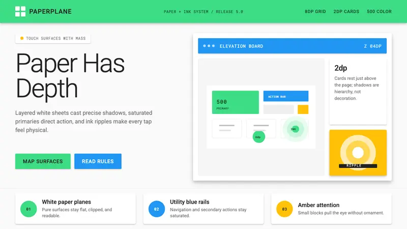 Android Lollipop (Material 1.0)Paper becomes physical. Roboto, green FABs and sharp shadows give white cards depth.
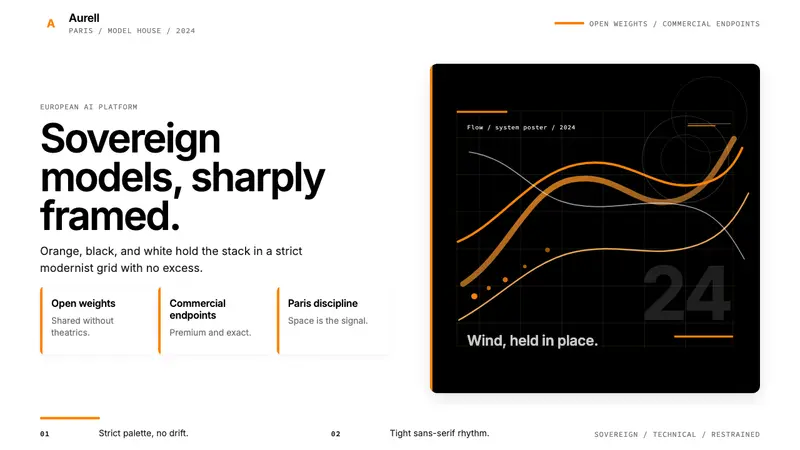 Mistral AI OrangeSovereign AI with restraint. Orange, black, and white lock the grid.