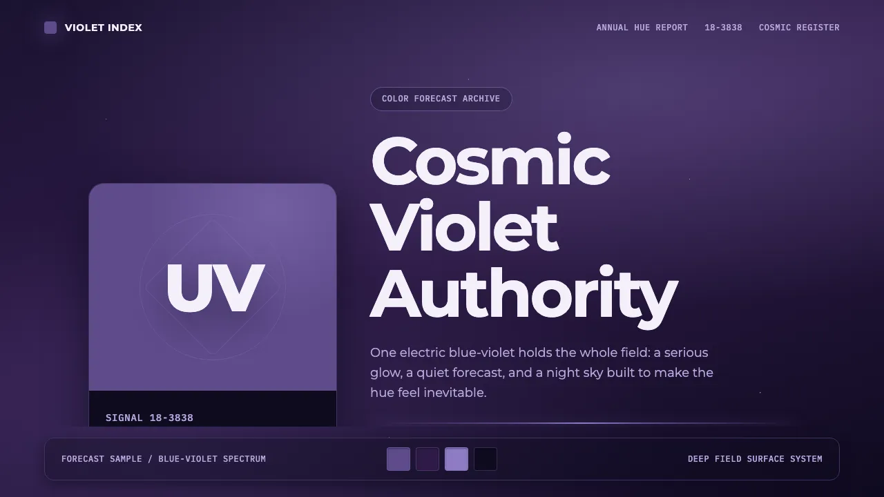
About Pantone Ultra Violet
In December 2017 the Pantone Color Institute crowned 18-3838 Ultra Violet its Color of the Year for 2018, framing the electric blue-violet as a hue of the cosmos — mystical, forward-looking and quietly authoritative. The launch imagery set the swatch against a deep indigo night sky rendered as a nebula gradient, not the white print stock of a traditional chip book.
This system rebuilds that moment: one confident violet, clean geometric grotesque type, generous negative space and a single starlit gradient. Everything serves the hue. Colour blocks read like Pantone chips, mono tags echo PMS codes, and the dark cosmos keeps the violet glowing rather than decorative.
- Origin
- Global / internet design culture (Pantone Color Institute, Carlstadt, NJ)
- Era
- 2010–now; announced December 2017 for 2018
- Key figures
- Leatrice Eiseman · Pantone LLC
- Movements
- corporate colour forecasting · brand-colour systems · digital gradient/cosmos aesthetics
Pantone Ultra Violet design spec
Colors
Typography
The other 11 sections — buttons, cards, spacing, motion, techniques and more — open once you unlock. Download the DESIGN.md or send it to your AI in one click. Unlock once, yours forever.
Sign up nowStyles similar to Pantone Ultra Violet
Also inspired by brands & products, with a close feel.
 Platzi EdtechA developer dashboard you learn inside. Electric spring-green on teal-navy, warmed by lavender.
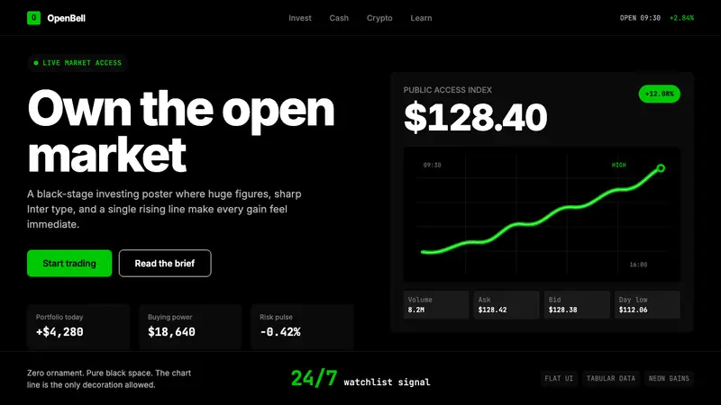 Robinhood 2023Markets feel immediate. Pure black, Inter numbers, and one neon-green line do the work.
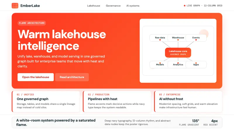 Databricks LakehouseWarm enterprise confidence. Flame red-orange gradients meet DM Sans and clean data diagrams.
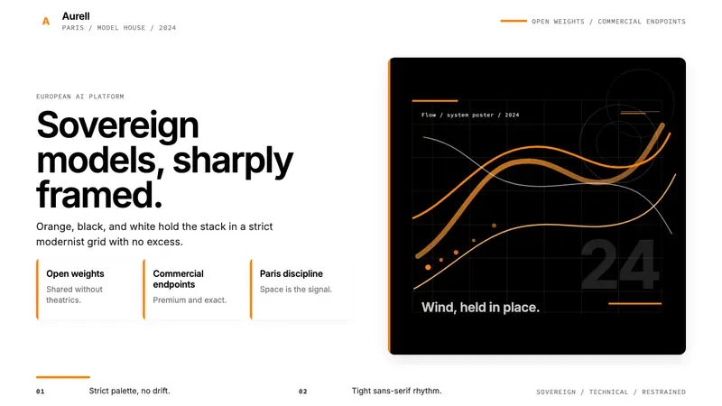 Mistral AI OrangeSovereign AI with restraint. Orange, black, and white lock the grid.