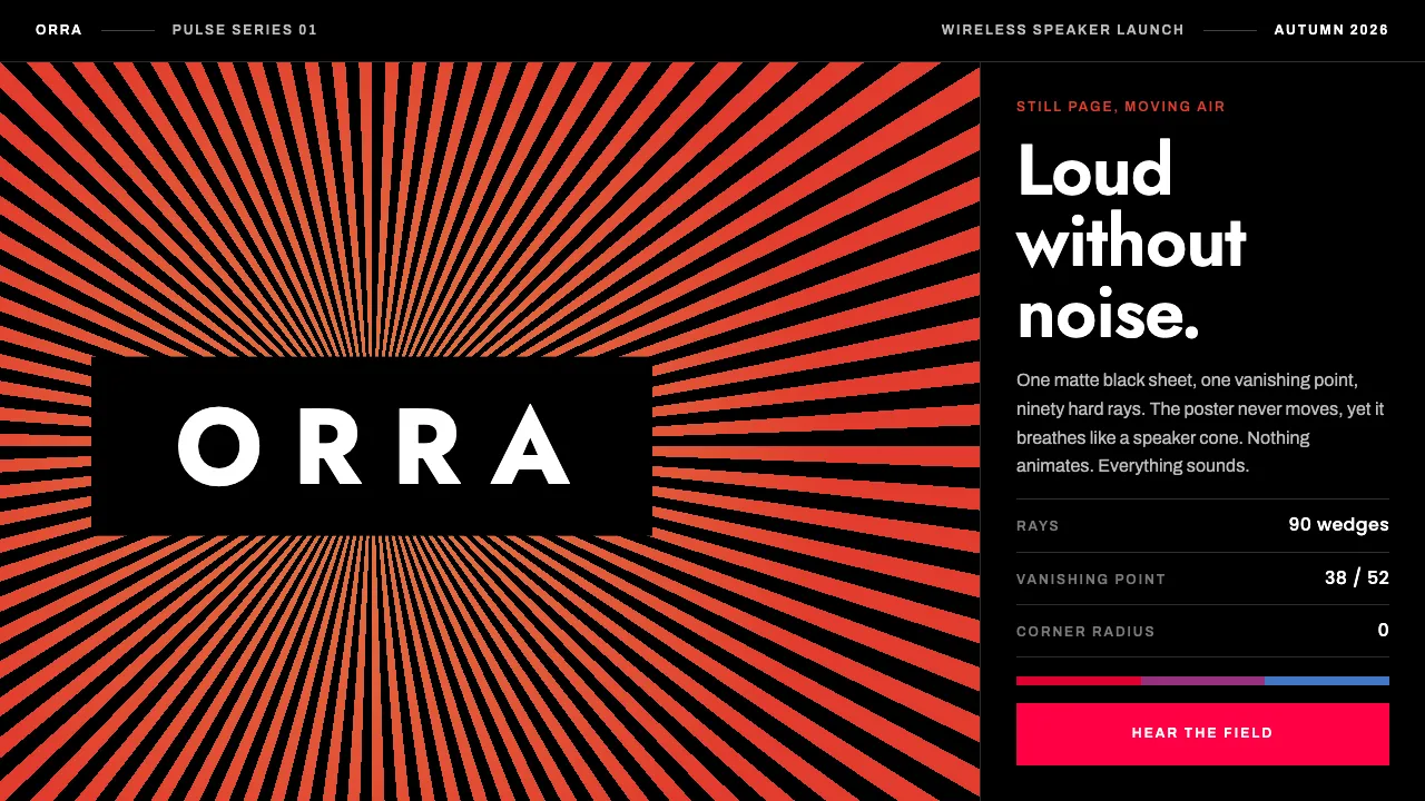
About Sonos Wordmark
One logo, one optical trick. Bruce Mau Design set the SONOS wordmark at the vanishing point of a field of hard-edged rays, graded amber to vermilion, and the sheet seems to breathe the way a speaker cone moves air. Nothing on it is animated.
The system grows out of that artwork: matte black ground, white type, rays that converge on the wordmark's own centre, and duotone music photography cut on a hard diagonal. It suits interfaces that want to sound loud without making any noise.
- Origin
- Santa Barbara, California, USA (Sonos) · Toronto, Canada (Bruce Mau Design)
- Era
- 2015 brand relaunch; pulsing wordmark still in service through the 2020s
- Key figures
- Bruce Mau · John MacFarlane · Craig Shelburne · Tom Cullen
- Movements
- Optical and kinetic illusion in print · One-point-perspective radial systems · Duotone music photography
Sonos Wordmark design spec
Colors
Background
Surface
Primary
Secondary
Accent
Text
Typography
JostHeadings
ArchivoBody
PoppinsMono
Unlock for 1 credit
The other 11 sections — buttons, cards, spacing, motion, techniques and more — open once you unlock. Download the DESIGN.md or send it to your AI in one click. Unlock once, yours forever.
Sign up nowHave an account? Sign in
Styles similar to Sonos Wordmark
Also inspired by brands & products, with a close feel.
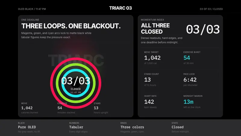 Apple Fitness Rings Closed (2024)Midnight feels exact. Magenta, green, and cyan rings lock onto OLED black.
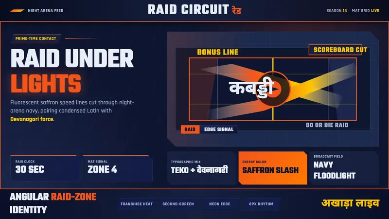 Pro Kabaddi LeagueBroadcast electricity. Saffron slashes, navy court grids, and Devanagari type collide.
 Cash App 2024Fintech that talks like a record label. Pure black, dollar-bill green, type at billboard scale.
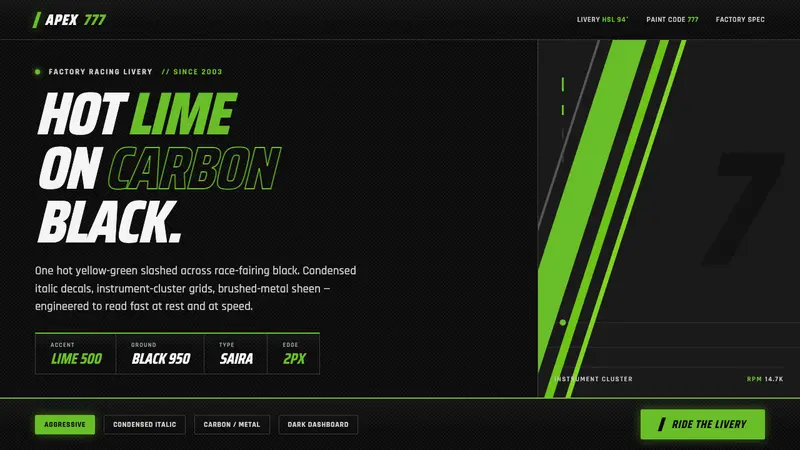 Kawasaki Racing Lime GreenFactory-livery aggression. Hot Kawasaki lime slashed across carbon black in condensed italic decals.