What is Sonos Wordmark?
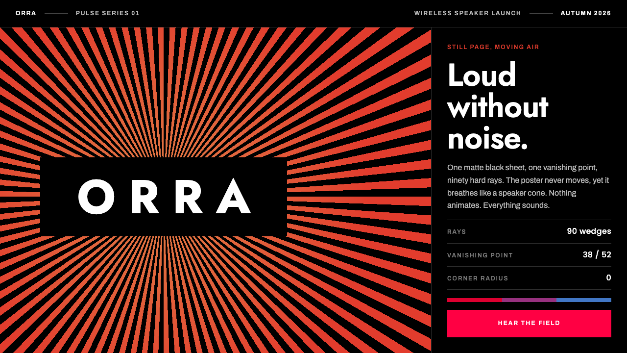
The Sonos wordmark makes a still image feel like it is moving air: hard-edged rays, graded from amber to vermilion, converge on a white name set on matte black, and the sheet seems to breathe like a speaker cone.
Sonos Wordmark in brief
The Sonos Wordmark style is a visual system built from a single piece of brand artwork: the SONOS name placed at the vanishing point of a field of hard-edged rays. The rays are evenly spaced and spread outward from the centre of the word, and their colour is graded from a warm amber through to a deep vermilion. Nothing in the image is animated, yet a viewer who looks at it for a moment, or walks past it on an advertising hoarding, perceives a slow pulse, much as a loudspeaker cone appears to move the air in front of it.
Around that artwork the system adds only a few things. The ground is matte black. Type is white, set reversed out of the dark. The rays always converge on the centre of the wordmark itself, never on an arbitrary point of the layout. Photography, when it appears, is music photography reduced to two tones and cut on a hard diagonal, so that portraits of musicians share the same graphic, angular logic as the rays.
What makes the style distinctive is that it produces loudness without any sound and without any decoration in the usual sense. There are no rounded corners, no soft glows and no gradients that blur into one another; the colour progression happens across separate, crisp bands. The geometry itself is the noise. This makes it a natural fit for interfaces that need to feel as if they have volume, such as audio products, live shows and record labels, while remaining restrained enough that a single focal point can carry an entire page.

Where does Sonos Wordmark come from?
The look comes from the 2015 brand relaunch of Sonos, the wireless home-audio company based in Santa Barbara, California. The new identity was developed with Bruce Mau Design, the Toronto studio associated with Bruce Mau, and its central idea was deliberately small: rather than drawing a new symbol, the designers let the company's name become the source of a visual effect.
That effect belongs to an older family of ideas. Printed optical and kinetic illusion has long relied on repeated, high-contrast lines to trick the eye into seeing movement on a flat sheet. A one-point-perspective radial system, where lines run from a single centre like the spokes of a wheel or the beams of a lighthouse, is one of the simplest ways to do this, because the eye keeps trying to resolve the point where everything meets. Sonos took that device and put its own name exactly on that point, so the thing the eye is drawn toward is the thing the company wants remembered.
The people named in connection with the project reflect both sides of the partnership. Bruce Mau is the designer whose studio led the identity work; John MacFarlane, Craig Shelburne and Tom Cullen are the other figures associated with it on the Sonos and design side. The musical subject matter also pulled in a third tradition: duotone music photography, the long-standing habit of printing record sleeves, posters and gig flyers in two inks so that a portrait becomes a graphic shape rather than a naturalistic picture.
The pulsing wordmark has stayed in service well beyond its launch, still recognisable in the company's work through the 2020s. That longevity is part of the argument for the style. A system that depends on one clear mechanism, rays converging on a name, is easy to reproduce consistently across packaging, screens, stages and street advertising, and it does not date quickly because it never relied on a fashionable texture or effect in the first place.
What defines the Sonos Wordmark look?
Converging rays
Evenly spaced, hard-edged rays spread outward from a single centre, and that centre is always the middle of the wordmark. The eye keeps trying to resolve the meeting point, which is what produces the sense of pulsing. A designer who moves the vanishing point away from the name breaks the effect immediately.
Amber-to-vermilion grading
Colour moves from warm amber to deep vermilion across the rays, but it does so in separate bands rather than a smooth blend. The progression adds heat and energy, and each band keeps a clean edge, so the image stays graphic instead of becoming a glow.
Matte black ground
The background is a flat, non-reflective black. It lets the warm rays and the white type carry all of the contrast, and it gives the page the feel of a darkened venue before a performance begins.
Reversed white type
Text is white on black, set plainly and without effects. The wordmark is the one place where the type is the hero; everywhere else the lettering stays quiet so the artwork keeps its authority.
Duotone music photography
Portraits of musicians are reduced to two tones and cut on a hard diagonal. The slanted edge echoes the angle of the rays, so photographs and artwork read as one graphic family rather than as an image dropped into a template.
No softness
There are no rounded corners, no diffuse glows and no blurred shadows. Every edge is a decision. The result is loud in impression without being busy, because the whole system is built from a handful of hard shapes.

Who shaped Sonos Wordmark?
Designer associated with Bruce Mau Design in Toronto, the studio behind the 2015 Sonos identity and its pulsing wordmark.
Named among the key figures connected with the Sonos identity project.
Named among the key figures connected with the Sonos identity project.
Named among the key figures connected with the Sonos identity project.
How do you use Sonos Wordmark today?
In slide decks, the style works best on a cover or a section divider. Put the title on the matte black ground, let a field of rays converge on the most important word, and keep everything else out of the way. Content slides should drop back to black with white type and a single band of warm colour as an accent, so the deck keeps its mood without the rays competing with the information. For data slides, use black as the background, white for labels and one warm colour for the series that matters; do not spread the full amber-to-vermilion range across a chart, because the effect belongs to the artwork, not to every graphic.
On the web, the pattern suits a landing page for an audio product, a festival, a venue or a record label. A hero section can carry the converging rays behind the product or event name, with navigation reduced to plain white text. In dashboards and pricing pages, treat the rays as a rare accent rather than a background: a thin run of warm bands above a plan name, or a single ray-field behind the featured plan, is enough. Hard edges should carry through to buttons and cards, with square corners and no soft shadows.
For editorial and marketing work, the diagonal duotone treatment is the most useful part of the system. Interview features, tour announcements and release campaigns can all use a musician portrait cut on a slant, tinted in two tones, with white headline type reversed out of the dark. Posters and social tiles benefit from the same recipe, because the centred wordmark and its rays hold up at very small sizes and from a distance.
A common mistake is to push the effect past its mechanism. Placing the rays off-centre, running them behind body text, or blurring the bands into a smooth gradient removes the optical pulse and leaves a generic sunburst. A second mistake is repeating the artwork on every section of a long page; the illusion depends on being rare. Treat the converging rays as a single, deliberate event, and let the rest of the page stay black, white and quiet.
A last point concerns restraint with colour. The warm range carries the brand, so it should not be mixed with unrelated hues such as blues or greens. If a page needs additional emphasis, use size, spacing or a white rule instead of a new colour, and the identity will stay as sharp as the original artwork.

Sonos Wordmark — FAQ
Who designed the Sonos pulsing wordmark?
The identity was created for the 2015 Sonos brand relaunch with Bruce Mau Design, the Toronto studio associated with Bruce Mau. Other names connected with the project are John MacFarlane, Craig Shelburne and Tom Cullen. The core idea was to place the SONOS name at the vanishing point of a field of rays rather than draw a separate symbol.
Is the wordmark actually animated?
No. The image is completely still. The sense of pulsing is an optical effect produced by hard-edged rays converging on a single point, in the tradition of printed optical and kinetic illusion. The eye keeps trying to resolve where the lines meet, and that restless effort reads as a beat, like the movement of a speaker cone.
Why matte black and white type?
A flat black ground gives the warm amber-to-vermilion bands the strongest possible contrast and recalls a darkened venue before a performance. White reversed type stays legible without adding another colour, which leaves the rays as the only colourful event on the page.
What kinds of projects suit this style?
It suits anything that needs to feel loud without being cluttered: audio products, live shows, festivals and record labels are the obvious fits. It also works for launch pages and posters where a single focal point and a strong silhouette matter more than detail. It is a poor match for long, text-heavy documents where the rays would have no room to be rare.
How do I use the duotone photography correctly?
Reduce each portrait to two tones, cut it on a hard diagonal that echoes the angle of the rays, and keep headline type white on the dark ground. Avoid soft vignettes, full-colour photographs or rounded masks, which would break the hard-edged logic that ties the photographs to the artwork.
Related design styles
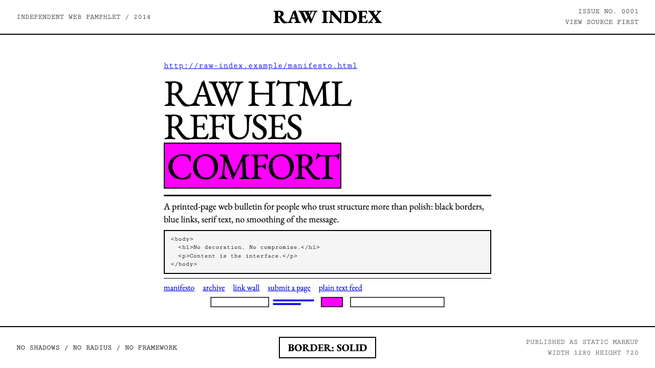 Brutalist Web 2014Browser defaults, weaponized. Times New Roman, electric-blue links — raw HTML…
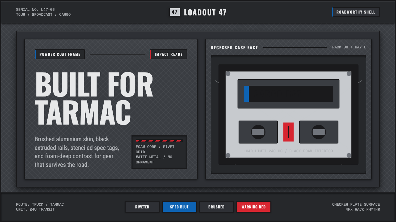 Aluminium Flight CaseRoadproof and exact. Diamond-plate gray, stencil type, black frames, blue-red…
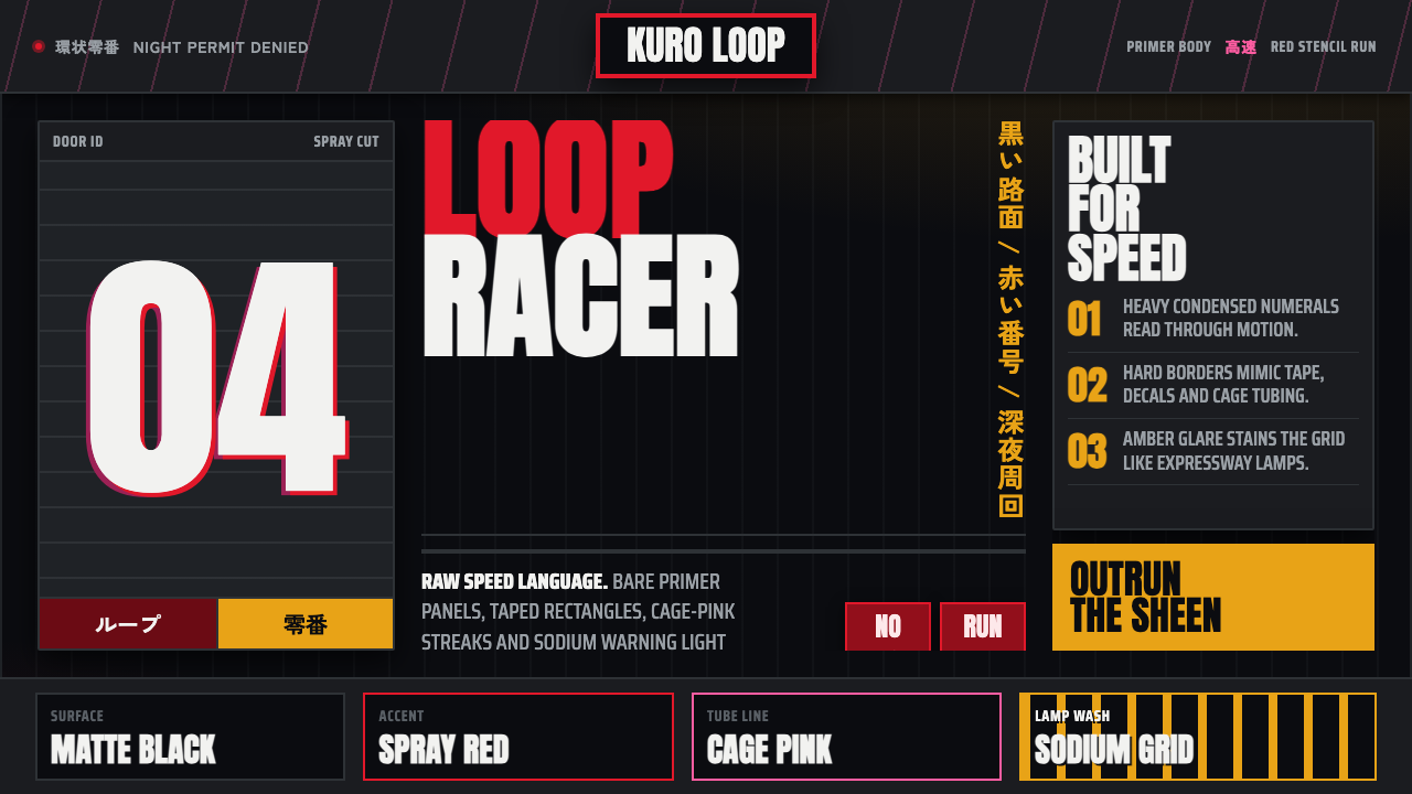 Kanjōzoku Loop RacerSpeed as contraband. Hot red numbers slice black tarmac with amber grid glare.
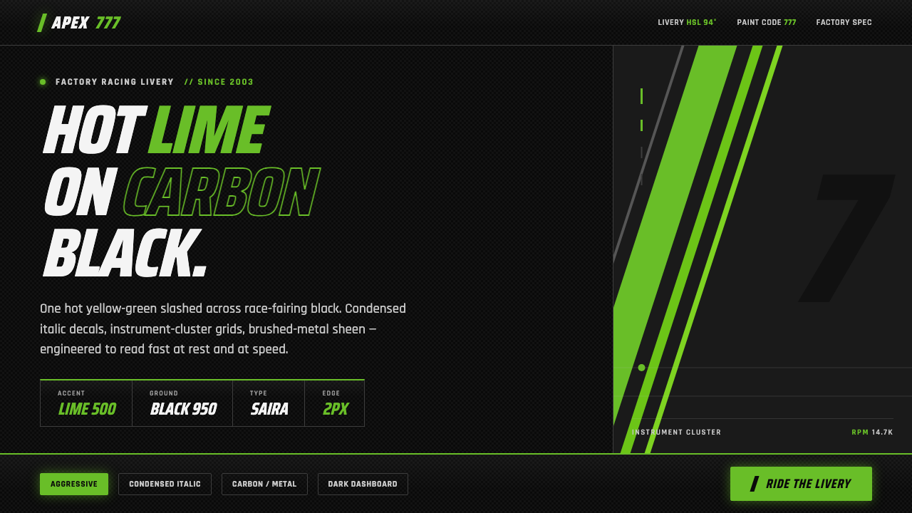 Kawasaki Racing Lime GreenFactory-livery aggression. Hot Kawasaki lime slashed across carbon black in c…
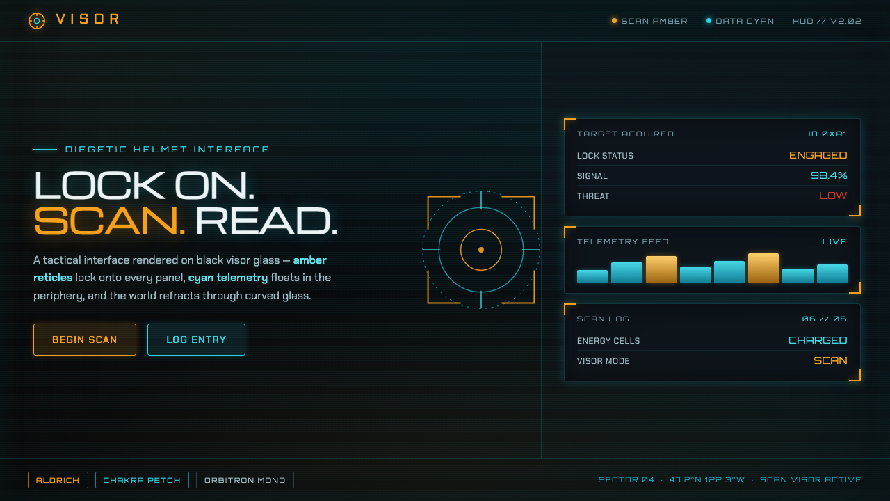 Metroid Prime Scan VisorDiegetic helmet HUD on black glass. Amber reticles lock content, cyan telemet…
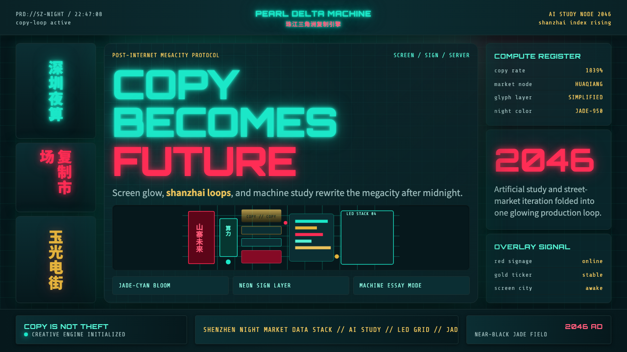 SinofuturismCopy becomes future. Jade-cyan grids, red signage, and Orbitron data stack th…