What is Brutalist Web 2014?什么是 Brutalist Web 2014?
Brutalist web design strips the browser back to its defaults — raw system serif type, default electric-blue hyperlinks, solid black borders — and declares the unadorned HTML document itself to be enough.粗野主义网页设计将浏览器还原到最原始的状态——原生系统衬线字体、默认电蓝超链接、纯黑实线边框——并宣告:未经装饰的 HTML 文档本身,已经足够。
Brutalist Web 2014 in briefBrutalist Web 2014 速览
Brutalist web design is a deliberate aesthetic practice that refuses to apply any visual layer on top of the browser's default rendering. No custom typefaces, no polished color palette, no smooth gradients, no rounded corners — only the raw structural output of HTML and the browser's own stylesheet. The movement coalesced around 2014 as a conscious countermovement to the then-dominant school of highly crafted, heavily styled SaaS interfaces, treating the un-designed page not as a failure state but as a completed statement.粗野主义网页设计是一种拒绝在浏览器的默认渲染之上叠加任何视觉层的有意实践。没有自定义字体,没有精心调制的配色方案,没有流畅渐变,没有圆角——只有 HTML 的原始结构输出与浏览器自身的默认样式表。这一运动在2014年前后成形,是对当时占主导地位的高度精制、重度样式化的 SaaS 界面风格的有意识反驳,将未经设计的页面不视为失败状态,而视为一种完成的宣言。
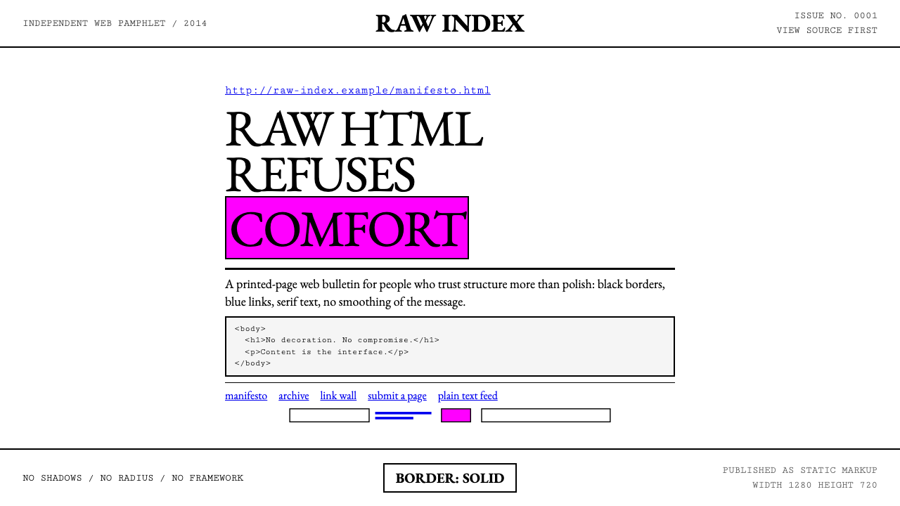
The visual language is strict and limited. A white page, black text in the browser's default system serif, links in the unmistakable default electric blue with underlines intact. Hard black borders — never rounded, never shadowed — as the only method of visual separation. Monospace type for emphasis, evoking the terminal or the typewriter rather than a brand font. Color, when it appears at all, arrives at full saturation: a harsh fuchsia, a screaming acid yellow, a pure red — never pastel, never blended.这套视觉语言严格而克制:白色页面,浏览器默认系统衬线字体的黑色文字,以那种无可认错的默认电蓝色、带下划线呈现的链接,硬黑实线边框——从不圆角,从不加阴影——作为视觉分隔的唯一手段。等宽字体用于强调,唤起终端或打字机而非品牌字体。色彩若出现,则以全饱和度登场:刺目的品红、荧光黄绿、纯红——从不用粉彩,从不做混合。
Underneath the aesthetic is a coherent philosophical position: that the conventions of modern web design — smooth gradients, soft shadows, rounded corners, carefully chosen typefaces — are a form of dishonesty. They dress up content in a costume designed to soothe and sell. Brutalism insists that the costume be torn off. What you see is what the medium is: an HTML document rendered in a browser, nothing more, nothing less.在美学之下,是一套连贯的哲学立场:现代网页设计的种种惯例——流畅渐变、柔和阴影、圆角边框、精心挑选的字体——是一种不诚实。它们把内容裹进一件旨在抚慰与销售的戏服。粗野主义坚持将这件戏服扯掉。你所见即媒介本身:一份在浏览器中被渲染的 HTML 文档,如此而已,别无他物。
See the Brutalist Web 2014 design system查看 Brutalist Web 2014 完整设计系统
Where does Brutalist Web 2014 come from?Brutalist Web 2014 从何而来?
The term 'brutalism' in web design borrows from the architectural movement that peaked in the 1960s and 1970s, whose name derives from the French béton brut — raw concrete. Architects like Le Corbusier in his late period, Alison and Peter Smithson in Britain, and Paul Rudolph in the United States refused to clad their structures in decorative facades; they exposed the building's material honestly, letting concrete and steel speak for themselves. Web brutalism applies the same logic to the digital surface: expose the material of the web — HTML, the browser rendering engine, the default stylesheet — rather than covering it with cosmetic layers.网页设计中“粗野主义”这一术语借自上世纪60至70年代达到顶峰的建筑运动,其名称源自法语 béton brut——清水混凝土。晚期的勒·柯布西耶、英国的艾莉森和彼得·史密森(Alison and Peter Smithson)以及美国的保罗·鲁道夫(Paul Rudolph)等建筑师,拒绝用装饰性立面覆盖结构;他们让建筑材料诚实地暴露,任由混凝土与钢铁自己说话。网页粗野主义将同样的逻辑施于数字表面:暴露网络的材质——HTML、浏览器渲染引擎、默认样式表——而非用化妆性层次将其遮盖。
The movement crystallized around 2014, when Swiss art director Pascal Deville launched brutalistwebsites.com, a gallery cataloguing web designs that violated every convention of contemporary UX. The sites collected there shared a family resemblance: dense text, default or near-default typefaces, hard borders, aggressive link walls, and zero visual concession to the polished aesthetic that a generation of SaaS landing pages had made ubiquitous. What the gallery revealed was that this refusal had been happening in pockets for years — it simply had no name until now.这一运动在2014年前后结晶成形,当时瑞士艺术总监帕斯卡尔·德维尔(Pascal Deville)创立了 brutalistwebsites.com——一个收录违反当代用户体验一切惯例的网页设计的画廊。收录的站点有着家族相似性:密集的文字、默认或接近默认的字体、硬边框、攻击性的链接墙,以及对整整一代 SaaS 落地页所普及的精致美学零视觉妥协。这个画廊所揭示的是:这种拒绝姿态已在各处零散发生多年——只是直到此刻才有了名字。
The movement found unlikely validation from high-profile sources. Balenciaga, under creative direction that prized provocation, stripped its fashion e-commerce site to a nearly raw HTML aesthetic in 2015 — an act that attracted widespread commentary precisely because it came from a luxury brand. The Drudge Report, running essentially the same link-wall layout since 1997 and never updated to fit contemporary design norms, was retroactively canonized as a brutalist ancestor. Bloomberg Businessweek published experimental editorial layouts that broke grid norms in ways the brutalist community recognized as kindred. Each case demonstrated that refusing decoration could itself be a powerful brand statement.这一运动从高知名度的来源获得了意想不到的认可。巴黎世家在重视挑衅的创意总监带领下,于2015年将其时装电商网站剥离至近乎原始的 HTML 美学——此举引发广泛评论,恰恰是因为它出自一个奢侈品牌之手。Drudge Report 自1997年起几乎保持同一链接墙版式,从未更新以迎合当代设计规范,被追认为粗野主义的先祖。彭博商业周刊发表了以粗野主义社群熟悉的方式打破网格规范的实验性编辑版面。每一个案例都证明:拒绝装饰本身可以成为一种有力的品牌声明。
The intellectual context was a reaction to what critics called the 'sameness' of mid-2010s web design — a period when virtually every consumer tech product used the same rounded sans-serif type, the same card-based layout, the same muted pastel palette, and the same modal interactions. The movements that influenced brutalist web design include architectural Brutalism as its direct ancestor, the Italian anti-design movement of the 1960s and 1970s that used bad taste deliberately, and post-digital art, which engaged with the aesthetic of the network itself rather than trying to simulate physical materials on a screen. The Berlin-to-New York axis of independent web design, art publishing, and experimental fashion provided the cultural milieu where these threads converged.这一运动的知识背景,是对批评者所称“2010年代中期网页设计同质化”现象的反抗——在那个时期,几乎每一款消费技术产品都使用相同的圆润无衬线字体、相同的卡片式布局、相同的柔和粉彩色板和相同的模态交互。影响网页粗野主义的思想谱系包括:建筑粗野主义作为它的直接祖先、1960至70年代意大利的反设计运动(蓄意使用糟糕品味),以及后数字艺术(它介入网络本身的美学,而非试图在屏幕上模拟实体材料)。从柏林到纽约的独立网页设计、艺术出版与实验时尚的文化圈,提供了这些线索汇聚的文化土壤。
What defines the Brutalist Web 2014 look?Brutalist Web 2014 的视觉特征是什么?
Default Typography默认字体排印
The canonical typeface is whatever serif the operating system ships with by default — a raw system serif that no professional designer would voluntarily choose. Its use is an act of refusal: if every polished site reaches for a premium web font, brutalism reaches for the browser fallback. Web-font equivalents such as a classic old-style serif occupy a middle position — they feel like the default without being literally the system typeface. Monospace type appears for emphasis or code passages, evoking terminal output rather than brand expression. There is no typographic hierarchy beyond size and weight; heading and body share the same family. The message is the content, not its styling.标志性字体是操作系统默认随附的任何衬线字体——没有哪个职业设计师会主动选择的原生系统衬线字体。使用它是一种拒绝的姿态:当所有精致站点伸手去拿高端网络字体时,粗野主义伸手拿浏览器后备字体。经典旧式风格的网络字体替代品占据中间位置——感觉像默认字体,却不是字面意义上的系统字体。等宽字体用于强调或代码段落,唤起终端输出而非品牌表达。除尺寸与字重之外,不存在排版层级;标题与正文共用同一字族。信息是内容本身,而非它的样式。
Electric-Blue Hyperlinks电蓝超链接
The browser's default link color — that particular shade of electric blue for unvisited links, and a muted purple for visited ones — is one of the most recognizable visual signals on the early web and one of the first things that polished design systems suppress. Brutalist web design restores it. Links are not re-colored to match a brand palette, not stripped of their underlines, not styled as buttons. They look exactly as they did in the web's first decade. This choice functions simultaneously as historical quotation, anti-brand statement, and structural clarity — links are unmistakably links.浏览器默认的链接颜色——未访问链接那种特定的电蓝色调,以及已访问链接的淡紫色——是早期 Web 最具辨识度的视觉信号之一,也是精致设计系统最先压制的东西之一。粗野主义网页设计将其恢复。链接不被重新着色以匹配品牌色板,下划线不被移除,不被样式化为按钮。它们看起来与 Web 第一个十年一模一样。这种选择同时作为历史引用、反品牌宣言与结构清晰度而运作——链接清楚地就是链接。
Hard Borders and Flat Structure硬边框与平面结构
Where borders appear, they are solid single-weight lines — the kind produced by a plain border declaration without any rounding, shadow, or color override. Tables render with visible cell borders. Form inputs retain their native browser appearance. Horizontal rules are actual hard lines, not decorative spacers. Nothing is smoothed or softened. No shadows exist anywhere. Elements sit directly on the white page as if placed on paper. The Z-axis does not exist here — no card floats above another surface, no overlay implies depth. If two elements need visual separation, one of them gets a hard black border. That is the only tool available, and it is sufficient.边框出现时,是实线、单一粗细的线条——由简单的 border 声明产生,不带任何圆角、阴影或颜色覆盖。表格渲染为带有可见单元格边框的表格。表单输入框保留其原生浏览器外观。水平分隔线是真实的硬线,而非装饰性间距。没有任何东西被平滑或柔化。不存在阴影。元素直接落在白色页面上,如同摆放在纸上。Z 轴在这里不存在——没有卡片漂浮于表面之上,没有叠加层暗示深度。若两个元素需要视觉分隔,其中一个会获得一条硬黑边框。这是唯一可用的工具,已经足够。
Content-First Layout内容优先的布局
Brutalist web pages are structured by their content, not by a design grid imposed over the content. The natural document flow of HTML — headings stack above paragraphs, lists render as indented rows, sections follow one another in source order — determines the visual result. There is no hero section, no above-the-fold considered separately from below-the-fold, no decorative padding injected to produce visual breathing room. The page is as long as the content is, and it begins at the top of the viewport. This structural honesty can produce unexpectedly dense, scroll-intensive pages that nonetheless read with a kind of archival authority.粗野主义网页由其内容来决定结构,而非由强加于内容之上的设计网格来决定。HTML 的自然文档流——标题堆叠于段落之上,列表渲染为缩进行,段落按源码顺序依次排列——决定了视觉结果。没有英雄区块,折叠线以上与以下没有分别考量,没有注入装饰性内边距以产生视觉呼吸空间。页面与内容一样长,从视口顶部开始。这种结构诚实有时会产生出乎意料的高密度、需大量滚动的页面,但这些页面仍具有某种档案式权威感。
Full-Saturation Accent Color全饱和度强调色
When a brutalist site departs from pure black-on-white, it does not modulate — it erupts. A single accent color appears at full, uncut saturation: the harshest fuchsia, the most aggressive acid green, an institutional red applied without apology. This color is not chosen from a brand palette; it is chosen for maximum visual disruption against the sparse white-and-black field. Pastels, muted tones, and blended gradients are absent. The effect of a full-saturation block is closer to a warning label or a neon sign than to a designed interface — and that is entirely the point.当粗野主义站点偏离纯粹的白底黑字时,它不是调节——而是爆发。单一强调色以完全的、未经稀释的饱和度出现:最刺目的品红、最具攻击性的荧光绿、毫无歉意施加的机构式红色。这种颜色不是从品牌色板中选取的;它是为了在稀疏的黑白底面上制造最大程度的视觉冲击而选择的。粉彩、柔和色调与渐变混合全部缺席。全饱和色块的效果更接近警告标签或霓虹灯,而非设计过的界面——这恰恰是重点所在。
Link Walls链接墙
The dense, undecorated list of hyperlinks in the browser's default blue with underlines is the fundamental navigation pattern of the early web, and brutalism reclaims it as a deliberate aesthetic choice. A link wall — a long column of underlined blue text, each line a separate link — is one of the style's most characteristic patterns. Visited links render in the browser-default muted purple; hover states may invert to a solid background rather than softly fade. The pattern appears in navigation menus, resource pages, and news aggregators. The effect reads as archival, authoritative, and deliberately un-designed.以浏览器默认蓝色带下划线呈现的密集、未经装饰的超链接列表,是早期 Web 的基本导航模式;粗野主义将其重新认领为一种有意为之的美学选择。链接墙——一长列带下划线的蓝色文字,每行一个独立链接——是这种风格最具代表性的图式之一。已访问链接以浏览器默认的淡紫色渲染;悬停状态可能以实心背景反转呈现而非柔和淡出。这一图式出现于导航菜单、资源页面和新闻聚合器。其效果读起来是档案性的、权威性的,以及刻意地不像设计。
Anti-Animation反动效
Brutalism is suspicious of motion. Animation in web design typically serves to smooth transitions, guide attention, and make interfaces feel polished — all things the style explicitly rejects. The default is no motion at all. Hover states change properties immediately, without easing or transition duration. Scroll is native. Loading states are plain text strings. The baseline is reduced motion — not as an accessibility accommodation, but as a design principle. There are no scroll-triggered fade-ins, no parallax effects, no springy interactions. Stillness is not a limitation; it is the intended condition of the page.粗野主义对动效持怀疑态度。网页设计中的动画通常服务于平滑过渡、引导注意力、使界面感觉精致——而这些恰恰是该风格明确拒绝的一切。默认是完全没有动效。悬停状态立即改变属性,不带缓动或过渡时长。滚动是原生的。加载状态是纯文字字符串。基线状态就是减弱动效——不是作为无障碍访问的让步,而是作为一项设计原则。没有滚动触发淡入,没有视差效果,没有弹性交互。静止不是一种局限;它是页面的预期状态。
See the Brutalist Web 2014 design system查看 Brutalist Web 2014 完整设计系统
Who shaped Brutalist Web 2014?谁塑造了 Brutalist Web 2014?
Swiss art director based in Berlin, Deville founded brutalistwebsites.com in 2014, the single most important act in naming and consolidating the movement. By curating what had been isolated experiments into a coherent visual trend, he gave designers a shared vocabulary and critics a target to discuss. His gallery's existence was itself an argument: these sites were not broken or unfinished, but intentional — and there were enough of them to constitute a movement. Deville's own design practice demonstrated that brutalist web principles could be applied at a high level of craft without becoming merely ironic.旅居柏林的瑞士艺术总监德维尔于2014年创建了 brutalistwebsites.com,这是命名并整合这场运动最重要的单一行动。通过将原本孤立的实验策展成一种连贯的视觉趋势,他赋予了设计师一套共享词汇,也给了批评者一个可讨论的对象。这个画廊的存在本身就是一个论点:这些站点不是坏掉的或未完成的,而是有意为之的——而且数量足以构成一个运动。德维尔自身的设计实践证明,粗野主义网页原则可以在高水准的工艺层面上应用,而不仅仅是沦为反讽。
Founder and editor of Drudge Report, Drudge is not a designer and did not conceive his site as a design statement — yet his site became the most widely cited proof that an aggressively un-designed page could achieve massive scale and cultural authority. Founded in 1996 and essentially unchanged in its visual structure since the late 1990s, the Drudge Report demonstrated that condensed newspaper typesetting, default link colors, and minimal layout could sustain one of the highest-traffic news properties on the internet. The site served as an inadvertent precedent: what the movement was naming had existed in the web's early infrastructure all along, and preserving that infrastructure outlasted every design trend that tried to replace it.Drudge Report 的创始人与编辑德拉吉并非设计师,也没有将其网站构想为一种设计宣言——然而他的网站成为最广被引用的证明:一个攻击性地未经设计的页面,能够实现巨大的规模与文化权威。该网站1996年创办,自1990年代末以来视觉结构基本未变,证明了浓缩的报纸排版、默认链接颜色与极简布局,能够维系互联网上流量最高的新闻媒体之一。这个网站成为一个无意间的先例:这一运动所命名的东西,从来就存在于网络的早期基础设施之中,而保留那种基础设施的站点,比所有试图取代它的设计趋势都活得更久。
Georgian fashion designer who served as creative director of Balenciaga from 2015, Gvasalia oversaw a website redesign that applied Brutalist web principles — default-seeming type, unstyled links, raw structural HTML layout — to one of the most prestigious luxury fashion houses in the world. The redesign generated significant press attention precisely because of the gap between the brand's cultural prestige and the deliberate austerity of its digital presence. The move demonstrated that visual severity could be a form of status signaling — that refusing to impress could itself be impressive — and drew a generation of designers' attention to what the brutalist gallery had been collecting.格鲁吉亚时装设计师格瓦萨利亚(Demna Gvasalia)自2015年起担任巴黎世家创意总监,他主导了一次网站改版,将粗野主义网页原则——近似默认的字体、未经样式化的链接、原始的 HTML 结构布局——应用于全球最负盛名的奢侈时装屋之一。这次改版引发了大量媒体关注,恰恰因为品牌的文化声望与其数字形象的刻意朴素之间的落差。这一举动证明了视觉严肃性可以成为一种身份信号——拒绝给人留下印象本身可以令人印象深刻——并将一代设计师的注意力吸引到了粗野主义画廊一直在收录的东西上。
The inventor of the World Wide Web, Berners-Lee did not design brutalist websites in any intentional aesthetic sense — but the default rendering his browsers established in 1991 is the raw material the movement works with. The first web pages at CERN were pure hypertext documents: plain system serif type, underlined links rendered in the browser's own blue, no style layer. These pages, still accessible in archived form, became canonical reference points for brutalist designers arguing that the un-styled document was the web's original and most honest form. Berners-Lee's original conception of the web as a document system — where the browser mediates between content and reader without imposing its own aesthetic — is philosophically aligned with brutalism's insistence on letting the medium speak for itself.万维网的发明者伯纳斯-李没有在任何刻意的美学意义上设计粗野主义网站——但他的浏览器在1991年确立的默认渲染,正是这一运动所使用的原材料。他在欧洲核子研究中心的最初网页是纯粹的超文本文档:朴素的系统衬线字体,以浏览器自身蓝色渲染的带下划线链接,没有样式层。这些页面仍以存档形式可访问,成为粗野主义设计师的经典参照点,用以论证未经样式化的文档是 Web 最初也是最诚实的形式。伯纳斯-李将网络最初构想为一个文档系统——浏览器在内容与读者之间充当中介而不强加其自身的美学——这在哲学上与粗野主义坚持让媒介自己说话的主张高度一致。
During Richard Turley's tenure as creative director, Bloomberg Businessweek developed an editorial design language that shared significant DNA with the brutalist web sensibility: oversized type, aggressive cropping, clashing colors at full saturation, and deliberate violations of grid conventions. The magazine's print and digital layouts in this period demonstrated that anti-design impulses could coexist with high editorial budgets and institutional contexts — that brutalism was not only for the personal site with no budget, but could function as a premium editorial register. The Businessweek covers of this era remain some of the most frequently cited examples of editorial risk-taking from the 2010s.在理查德·特利任创意总监期间,彭博商业周刊发展出了一套与粗野主义网络感性有着深刻共同基因的编辑设计语言:超大号文字、激进裁切、以全饱和度使用的冲突色彩,以及对网格规范的蓄意违背。这一时期该杂志的印刷与数字版面证明,反设计的冲动可以与高额编辑预算和机构语境共存——粗野主义不仅属于零预算的个人站点,也可以作为一种高端编辑语气发挥作用。这一时代的商业周刊封面,至今仍是2010年代被引用最多的编辑冒险案例之一。
How do you use Brutalist Web 2014 today?今天怎么用 Brutalist Web 2014?
Applying brutalist web design correctly requires understanding what its constraints are actually doing — building visual authority through directness, establishing credibility through apparent effortlessness, and creating a reading experience that trusts the user's intelligence rather than guiding it through animation and visual cues. The style is not suitable for every context, but in the contexts where it works, it works very strongly. Those contexts share a common requirement: the content must be strong enough to carry the page without visual assistance.正确应用粗野主义网页设计,需要理解其约束实际上在做什么——通过直接性建立视觉权威,通过表面上的毫不费力建立可信度,以及创造一种信任用户智识而非通过动画与视觉提示来引导它的阅读体验。这种风格并不适合所有语境,但在它奏效的语境中,力量非常强大。这些语境有一个共同要求:内容必须足够强大,无需视觉辅助即可撑起页面。
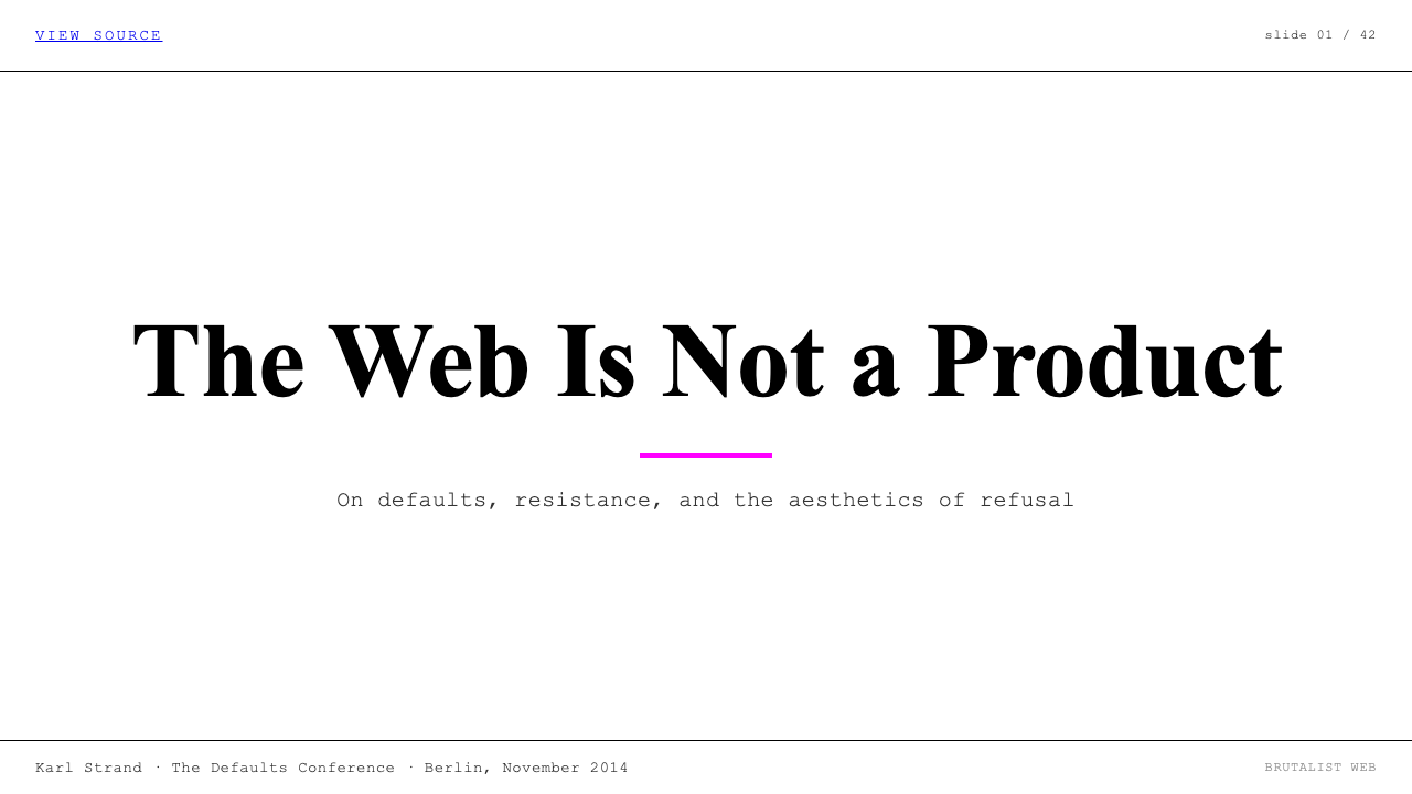
For presentation slides, brutalism translates well to cover pages built around a single typographic statement. A brutalist cover refuses the customary opener: no full-bleed photography, no gradient backdrop, no decorative typeface. Title text sits in an oversized system serif flush-left against a pure white ground, with a thin black rule below the title and the date or presenter name in a small monospace caption. Content slides work like ruled ledger pages — each key point as a flush-left line, a horizontal rule between sections, data tables with hard borders and no background fill. The overall effect reads as a primary document — research, not a pitch.对于演示文稿,粗野主义适合围绕单一排版声明构建的封面页。粗野主义封面拒绝惯常的开场:没有全出血摄影、没有渐变背景、没有装饰性字体。标题文字以超大号系统衬线字体在纯白底面上左对齐,标题下方一条细黑线,日期或演讲者姓名以小号等宽字幕呈现。内容页像账本那样运作——每个关键点作为左对齐的一行,各节之间用水平线分隔,数据表格使用硬边框且无背景填充。整体效果读起来像一份原始文件——是研究,不是推销。
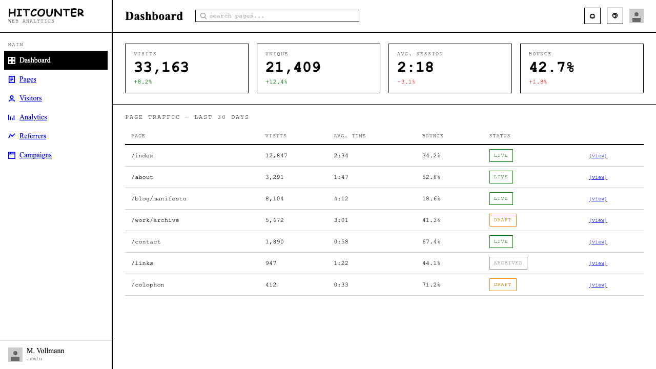
For web user interfaces, brutalism is most naturally at home in dashboards, documentation portals, developer tools, and pricing pages for technical products, where information density and scannable hierarchy matter more than warmth. The implementation approach: let the browser's natural document flow serve as the primary layout mechanism, avoid custom typeface loading, style interactive elements with solid borders and flat color fills rather than soft shadows, and let white space derive from content separation rather than from decorative padding. Navigation rendered as a plain horizontal list of underlined links — without icons or visual hierarchy beyond font weight — fits the idiom exactly.对于网页界面,粗野主义最自然地栖居于仪表板、文档门户、开发者工具和面向技术产品的定价页面——在这些地方,信息密度与可扫描的层级比温暖感更重要。实施方式:让浏览器的自然文档流作为主要布局机制,避免加载自定义字体,用实心边框与平面色块而非柔和阴影来样式化交互元素,让空白源自内容间距而非装饰性内边距。以不带图标、除字重外无视觉层级的纯下划线链接横向列表形式渲染的导航,精准契合这种语境。
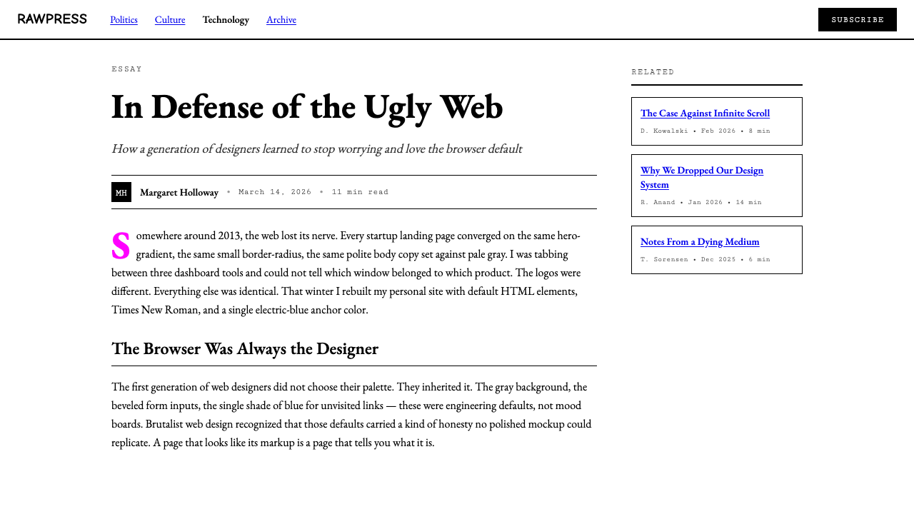
For editorial and marketing work, the style delivers its strongest results in contexts that want to signal independence, authority, or anti-hype. A long-form article in this style has a narrow column, generous top margin for the headline, a byline in small type or monospace, and section breaks marked by a single solid rule — no pull quotes in decorative typographic marks, no sidebars with background fills. Marketing landing pages can use the style's confrontational quality as a differentiator: a hero section that is simply a large serif headline and a hard-bordered call-to-action, no hero image. A product positioned as anti-hype can let its landing page perform that stance by refusing all visual gestures associated with hype.对于编辑与营销内容,这种风格在想要传达独立性、权威感或反炒作立场的语境中效果最强。这种风格的长文章有一个窄列、标题上方充裕的留白、小号字或等宽字体的署名,以及用单条实线而非装饰性排版符号标记的章节分隔——没有有背景填充的侧边栏。营销落地页可以将这种风格的对抗性品质用作差异化因素:一个英雄区块,仅由一个大号衬线标题和一个硬边框行动号召构成,没有英雄图片。一个以反炒作为定位的产品,可以让其落地页通过拒绝所有与炒作相关的视觉姿态来执行那种立场。
The most common mistake when applying this style is treating it as permission to be careless rather than a directive to be precise about which defaults to honor. A well-executed brutalist page requires as many deliberate decisions as any polished interface — the decisions simply move toward the browser's native state rather than away from it. The second most common mistake is partial application: adding a soft shadow to just one card for clarity, softening a solid black border to a mid-gray, substituting a custom blue for the browser's default link color. Each concession undermines the system's coherence. The style depends on totality — a single polished element against an otherwise raw background reads as an error, not a considered choice, because the contrast with everything around it signals incompleteness rather than intention.应用这种风格时最常见的错误,是将其视为粗心大意的许可,而非关于精确选择哪些默认值的指令。一个执行精良的粗野主义页面需要与任何精致界面一样多的有意决策——区别仅在于每一个决策朝向浏览器的原生状态而非远离它。第二个最常见的错误是局部应用:只给一张卡片加柔和阴影“为了清晰”,将纯黑边框软化为中灰色,用自定义蓝色代替浏览器默认链接颜色。每一次妥协都侵蚀系统的连贯性。这种风格依赖于整体性——在其他原始元素背景下的单一精致元素读起来是一个错误而非一个考量过的选择,因为它与周围一切的反差传达的是未完成而非意图。
See the Brutalist Web 2014 design system查看 Brutalist Web 2014 完整设计系统
Brutalist Web 2014 — FAQBrutalist Web 2014 · 常见问题
Is brutalist web design just unfinished or lazy design?粗野主义网页设计只是未完成的或懒惰的设计吗?
No — and this is the most common misconception. A well-executed brutalist site requires as many deliberate decisions as any polished interface; the decisions simply move toward the browser default rather than away from it. Choosing the system serif over a web font is a decision. Setting a narrow content column is a decision. Using a heavier border weight to signal a more important division is a decision. The tell is consistency: a genuinely brutalist site is consistent throughout, while a lazy unfinished site is inconsistent — some elements styled, some not. Intentional brutalism has a whole-system logic that accidental incompleteness never achieves.不是——这是最常见的误解。一个执行精良的粗野主义站点需要与任何精致界面一样多的有意决策;这些决策只不过朝向浏览器默认状态而非远离它。选择系统衬线字体而非网络字体是一个决策。设定窄内容列是一个决策。使用较重边框粗细来标示更重要的分隔是一个决策。判断的关键是一致性:真正的粗野主义站点是自始至终连贯的,而懒惰的未完成站点是不一致的——有些元素有样式,有些没有。有意为之的粗野主义具有意外的不完整性永远无法达到的全系统逻辑。
Can brutalist web design work for a commercial product, or does it only suit personal sites and art projects?粗野主义网页设计能用于商业产品吗?还是说它只适合个人站点和艺术项目?
It can work commercially, but the style carries strong connotations — independence, refusal of convention, raw authority — that need to align with the product's positioning. It works well for developer tools, independent publications, archival projects, fashion or cultural brands that want to signal confidence through restraint, and any product whose target audience is sophisticated enough to recognize the aesthetic as intentional. It works poorly for products that need to communicate warmth, accessibility, or mainstream consumer appeal. Balenciaga's adoption of the aesthetic was commercially successful precisely because luxury fashion is one of the few sectors where ostentatious disregard for convention reads as desirable rather than negligent.可以用于商业领域,但这种风格带有强烈的含义——独立、拒绝惯例、原始权威——这些含义需要与产品定位相符。它适合开发者工具、独立出版物、档案性项目、想通过克制传达自信的时尚或文化品牌,以及任何目标受众足够老练、能将这种美学识别为有意为之的产品。它不适合需要传达温暖感、亲和力或主流消费者吸引力的产品。巴黎世家对这种美学的采用在商业上是成功的,恰恰是因为奢侈时尚是少数几个炫耀性地无视惯例会被解读为令人向往而非疏失的领域之一。
Does brutalism have any relationship to web accessibility?粗野主义与网页无障碍访问有什么关系吗?
There is a meaningful, if not always intended, overlap. The browser's default rendering was built with accessibility in mind long before design systems complicated it. Custom typefaces loaded as web fonts, JavaScript-dependent components, smooth scroll-triggered animations, and low-contrast color palettes chosen for aesthetic reasons all introduce accessibility regressions that a brutalist page simply does not have, because it never introduced those layers in the first place. The brutalist page is not accessible by design intention in most cases; it is accessible by default, which is a different and arguably more durable form of accessibility. Developers in the progressive enhancement and web standards communities have made this connection explicitly.两者之间存在有意义的重叠,尽管这种重叠并非总是刻意为之。浏览器的默认渲染在设计系统使其复杂化之前,早已以无障碍访问为核心设计。通过网络字体加载的自定义字体、依赖 JavaScript 的组件、平滑滚动触发的动画,以及出于美学原因选择的低对比度配色方案,都引入了无障碍访问回退——而粗野主义页面根本没有这些问题,因为它从一开始就没有引入这些层。粗野主义页面在大多数情况下并非出于设计意图而具有可访问性;它是通过默认值实现可访问性,这是一种不同的、可以说更持久的可访问性形式。渐进增强与网页标准社群中的开发者已明确提出了这一联结。
How is brutalist web different from the minimalism in contemporary design systems?粗野主义网页与当代设计系统中的极简主义有何不同?
Contemporary minimalism and brutalist web design can look superficially similar — both use limited color, simple layout, and typographic restraint — but they operate on opposite logics. Contemporary minimalism is highly crafted: it selects a specific typeface at specific sizes, applies a curated color palette, uses custom-designed spacing values, and produces a page that appears simple but is in fact the result of many deliberate design decisions. Brutalist web design produces apparent simplicity by making no decisions at all beyond the content structure — every visual property defaults. The minimalist page is simple because everything unnecessary has been removed by a designer. The brutalist page is simple because nothing has been added. These are philosophically distinct starting points that produce visually similar but qualitatively different results.当代极简主义与粗野主义网页设计表面上看起来可能相似——两者都使用有限色彩、简单布局和字体克制——但它们建立在相反的逻辑之上。当代极简主义经过高度精制:它选择特定字体的特定尺寸,应用经过策划的配色方案,使用自定义设计的间距值,产生的页面看起来简单,实则是许多刻意设计决定的结果。粗野主义网页设计通过在内容结构之外不做任何决定来产生表观的简洁——每一个视觉属性都默认。极简主义页面简洁,因为设计师移除了所有不必要的东西。粗野主义页面简洁,因为什么都没有被添加。这是在哲学上截然不同的出发点,产生视觉上相似但质感上不同的结果。
Is brutalist web design still relevant today, or is it a historical moment?粗野主义网页设计今天仍然有现实意义,还是已成为历史时刻?
Both, depending on how the question is framed. As a transgressive moment — a rebellion against a specific prevailing aesthetic — the brutalist web movement peaked between roughly 2014 and 2018 and then was absorbed by the mainstream it had reacted against. Many of its gestures became themselves design trends, ending their transgressive function. But as a principled approach to building for the web — start with what the browser provides, add only what is structurally necessary — the logic remains as applicable as it was in 2014 and arguably more so, given the continued weight of modern web frameworks. Designers working in progressive enhancement, accessibility-first development, and sustainable web design regularly arrive at brutalist-adjacent conclusions without invoking the movement by name.两者都是,取决于如何框定这个问题。作为一个越轨时刻——对某种特定主流美学的反叛——粗野主义网页运动在大约2014至2018年间达到顶峰,随后被它所反对的主流吸收。它的许多姿态本身成为了设计趋势,这终结了它们的越轨功能。但作为一种有原则的 Web 构建方式——从浏览器提供的开始,只添加结构上必要的——这套逻辑与2014年时同样适用,甚至可以说更为适用,因为现代 Web 框架的重量仍在持续。在渐进增强、无障碍优先开发和可持续网页设计领域工作的设计师,经常在不援引这场运动名称的情况下抵达与粗野主义相邻的结论。
Related design styles相关设计风格
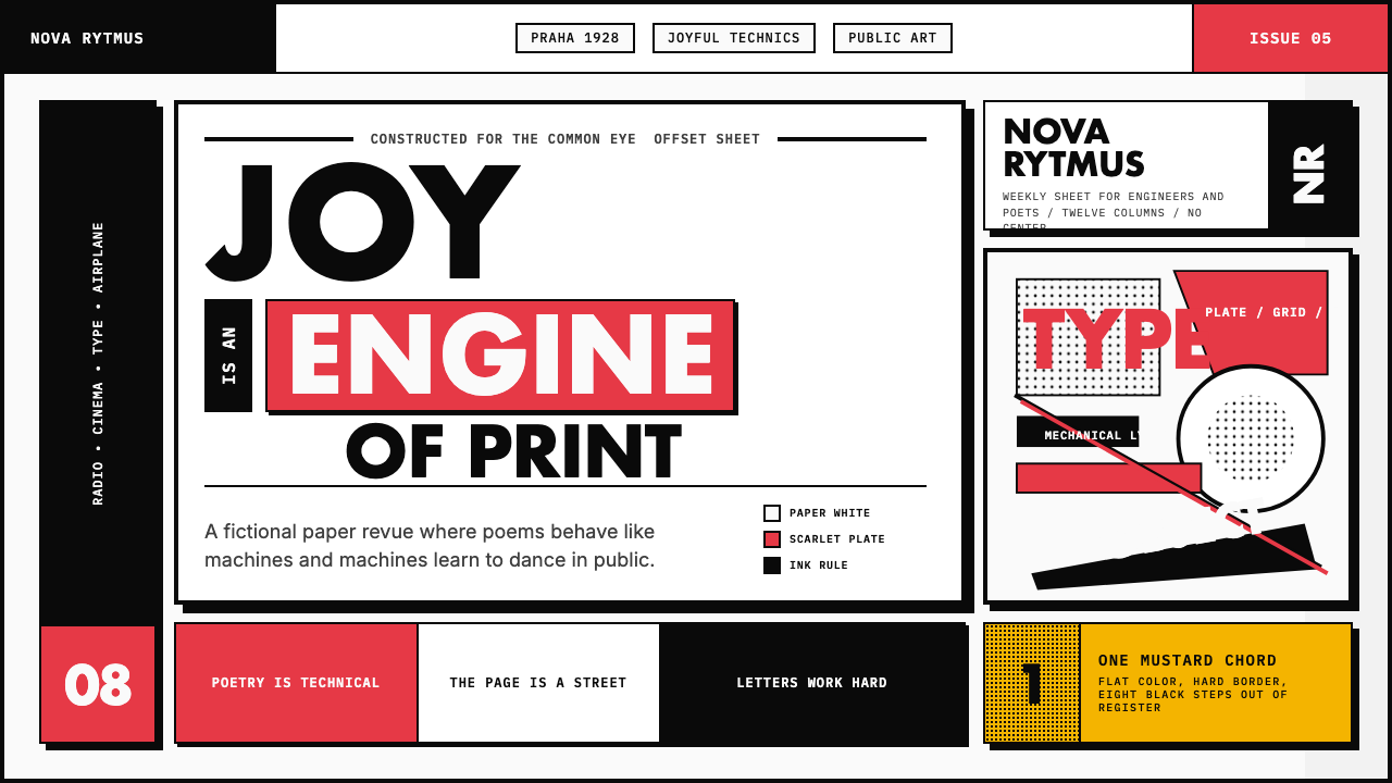 Czech Devětsil Avant-GardeJoy is engineered. Scarlet ink blocks and rotated sans type collide on an asy…欢愉被工程化:猩红墨块与旋转无衬线字撞上非对称网格。
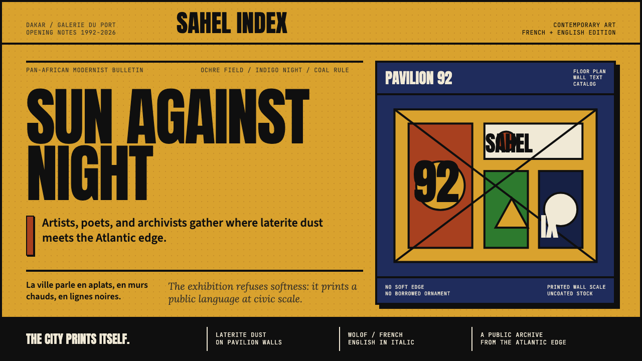 Dak'Art BiennalePan-African modernism speaks loud. Ochre ground, indigo block, Anton type, bl…泛非现代主义强声发言:赭黄底、靛蓝块、Anton大字与黑色粗线。
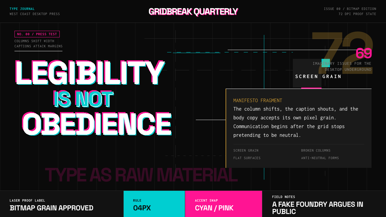 Emigre Magazine (1984–2005)Defies the tidy grid. Cyan, ochre, and hot-pink bitmap type collides on black.拒绝整齐网格:黑底上的青色、赭色与热粉像素字相撞。
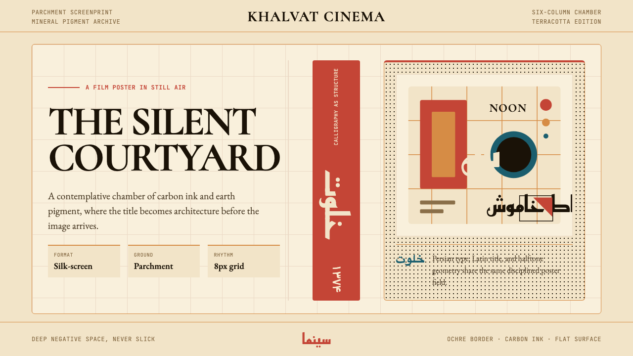 Iranian Modernist Cinema PosterStillness becomes monumental. Terracotta Kufi type breathes inside a Swiss pa…静默成碑。赤陶库法字在羊皮纸瑞士网格中呼吸。
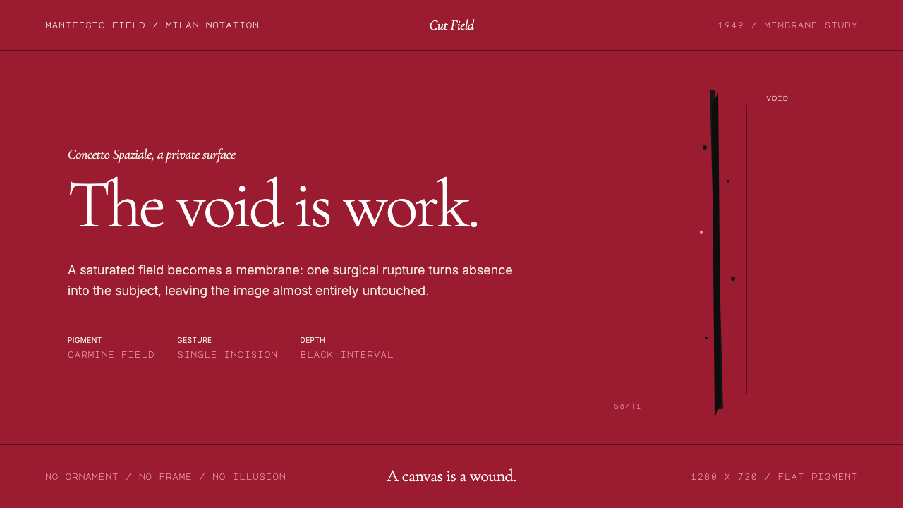 Spatialism (Fontana Cut, 1949)Absence becomes medium. Carmine field, Garamond restraint, one black incision.缺席成为媒介:胭脂红色场、Garamond克制排版、一道黑色切口。
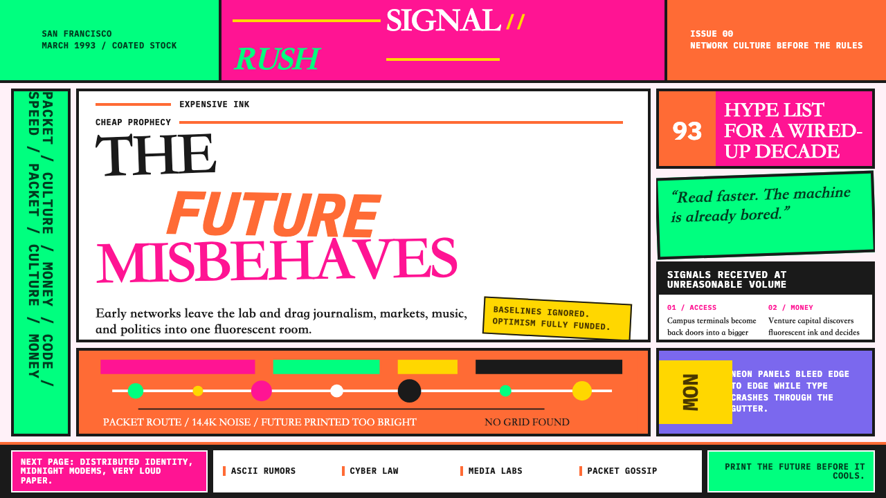 Wired Magazine (1993)Neon rejects restraint. Hot pink, orange, and electric green crash through br…荧光拒绝克制:粉红、橙色与电绿撞进破碎排版。