What is Dak'Art Biennale?什么是 Dak'Art Biennale?
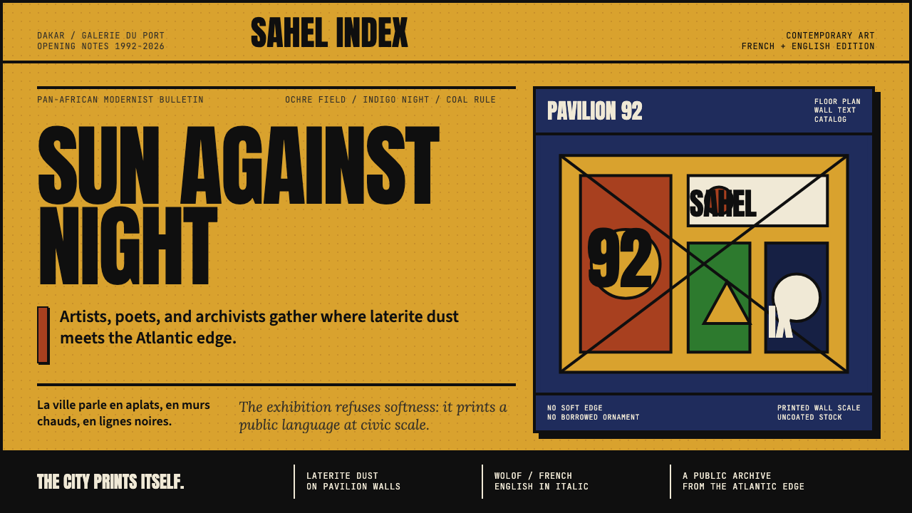
Since 1992, Dak'Art has turned Dakar into the pulse of pan-African contemporary art — ochre ground, indigo block, and monumental type declaring that African modernism speaks on its own terms.自1992年起,达喀尔双年展将这座西非城市变为泛非当代艺术的心脏——赭黄底、靛蓝块与纪念碑式大字,宣告非洲现代主义以自己的方式发声。
Dak'Art Biennale in briefDak'Art Biennale 速览
Dak'Art — formally the Dakar Biennale — is the oldest continuously running pan-African contemporary-art biennial in the world. Founded in 1992, it takes place every two years in Dakar, Senegal, bringing together artists from across the African continent and the diaspora. Its exhibitions span converted colonial warehouses, open-air pavilions, and the labyrinthine Village des Arts — a compound that functions as studio, gallery, and social space simultaneously.达喀尔双年展(Dak'Art)是世界上历史最悠久、持续运作不间断的泛非当代艺术双年展,创办于1992年,每两年在塞内加尔达喀尔举办一届。展览跨越改建后的殖民时代仓库、露天展馆与迷宫般的达喀尔艺术村——这片区域同时发挥着工作室、画廊与社会交流空间的功能。
The visual identity that has come to define Dak'Art's graphic presence draws on a palette of warm yellow ochre, saturated indigo blue, and deep coal black. Surfaces are treated to evoke sand and laterite — the ochre earth of the Sahel — lending a tactile quality that distinguishes the aesthetic from the cool, industrial modernism of European traditions. Monumental sans-serif headlines dominate large-scale print and signage, while French and Wolof appear together as equal typographic presences, refusing the hierarchy that colonial visual culture imposed.构成Dak'Art平面视觉识别的核心色调,由温暖的赭黄、饱和的靛蓝与深沉的炭黑三色组成。表面处理借鉴沙土与红土——萨赫勒地区赭色大地——赋予整套美学体系以触感品质,使其有别于欧洲传统中那种冷静的工业现代主义。纪念碑式无衬线标题主导大尺幅印刷品与标识牌,法语与沃洛夫语作为平等的排印存在并置出现,拒绝殖民视觉文化所强加的等级秩序。
More than a festival identity, the Dak'Art aesthetic represents the most accomplished pan-African modernist graphic system of the post-independence era. It draws simultaneously on the École de Dakar's philosophy of rooting contemporary practice in African visual heritage, on the political urgency of movements like Laboratoire Agit'Art, and on the confident internationalism of a city that has long positioned itself as Africa's foremost cultural capital.Dak'Art的美学不仅是一个节庆品牌,更代表了后独立时代最成熟的泛非现代主义平面设计体系。它同时汲取了达喀尔画派将当代实践根植于非洲视觉遗产的哲学主张、Agit'Art实验室等运动的政治紧迫感,以及这座城市长期作为非洲首要文化之都所拥有的自信国际主义姿态。
See the Dak'Art Biennale design system查看 Dak'Art Biennale 完整设计系统
Where does Dak'Art Biennale come from?Dak'Art Biennale 从何而来?
Dak'Art was founded in 1992, in the waning years of Léopold Sédar Senghor's long cultural legacy in Senegal. Senghor, the poet-president who governed Senegal from independence in 1960 until 1980, had championed Négritude — the literary and intellectual movement that affirmed the dignity, history, and cultural specificity of African and Afro-diasporic peoples — as a founding principle of the postcolonial Senegalese state. When Dak'Art was established, it inherited this commitment to African cultural self-determination and turned it into a living institutional infrastructure.达喀尔双年展于1992年创立,彼时莱奥波尔德·塞达尔·桑戈尔对塞内加尔的深远文化遗产尚未消散。这位诗人总统自1960年独立起执掌塞内加尔至1980年,将「黑人性」(Négritude)——这一肯定非洲及非洲离散人民之尊严、历史与文化特殊性的文学与思想运动——奉为后殖民塞内加尔国家建构的基础原则。当Dak'Art创立时,它继承了这份对非洲文化自决的承诺,并将其转化为鲜活的机制基础。
The founding vision drew heavily on the École de Dakar, an artistic movement that had taken shape in Dakar through the 1960s and 1970s. The École de Dakar sought a synthesis: borrowing the media and formal vocabularies of Western modernism while insisting on grounding imagery, color, and form in African visual traditions — patterning systems from weaving and textiles, the warm earth tones of West African architecture, the bold graphic quality of mask-making and ceremonial objects. This was not nostalgia but an argued position: that African artists had no obligation to choose between modernity and heritage, because their heritage was itself a form of modernity.创立愿景大量汲取了达喀尔画派(École de Dakar)的精神。这一艺术运动在1960至70年代的达喀尔逐渐成形,寻求一种综合:借用西方现代主义的媒介与形式语汇,同时坚持将图像、色彩与形式根植于非洲视觉传统——纺织品与编织物的图案体系、西非建筑的温暖土色调、面具制作与仪式物件的大胆平面品质。这不是对过去的怀旧,而是一种有论据的立场:非洲艺术家没有义务在现代性与遗产之间做出选择,因为他们的遗产本身就是一种现代性形式。
Alongside and sometimes in tension with the École de Dakar was Laboratoire Agit'Art, a collective founded by artists including Issa Samb and El Hadji Sy in the 1970s. Where the École de Dakar engaged with institutions, Agit'Art operated in courtyards, streets, and improvisational performance spaces. It was explicitly political, suspicious of the gallery system, and committed to an art practice embedded in daily life and collective action. Agit'Art's graphic sensibility — raw, urgent, collaged, refusing finish — entered the DNA of what Dakar contemporary art would come to look like, even in more formally produced contexts.与达喀尔画派并行、有时又形成张力的,是Laboratoire Agit'Art——一个由伊萨·桑布、埃尔·哈吉·西等艺术家在1970年代创立的艺术集体。如果说达喀尔画派与机构相互周旋,那么Agit'Art则在庭院、街头与即兴表演空间中运作。它具有鲜明的政治性,对画廊体制保持警惕,致力于将艺术实践嵌入日常生活与集体行动。Agit'Art的平面感性——粗粝、急迫、拼贴、拒绝精致——渗入了达喀尔当代艺术的遗传密码,即便在更为正式的制作语境中也留下了痕迹。
The biennial's current visual identity, refined through the 2022 and 2024 editions, consolidates decades of these influences into a coherent graphic system. Yellow ochre — the color of Dakar's harmattan dust and laterite roads — grounds the palette. Indigo, associated with the ceremonial and domestic textiles of West Africa, provides the structural dark. Carbon black anchors type and rules. The overall effect reads as simultaneously of-the-place and internationally legible, which is precisely what Dak'Art has always sought to be: unapologetically rooted and unapologetically global.双年展现行视觉识别体系经由2022年与2024年两届的精炼,将数十年来这些影响整合为一套连贯的平面系统。赭黄——达喀尔哈马丹风尘与红土道路的颜色——奠定了整体色调的基础。靛蓝,与西非仪式性及日常纺织品相关联,提供了结构性的暗调。炭黑锚定文字与线条。整体效果既属于这片土地,又具有国际可读性——这正是Dak'Art一贯追求的状态:无歉意地扎根,也无歉意地走向全球。
What defines the Dak'Art Biennale look?Dak'Art Biennale 的视觉特征是什么?
Earth-Rooted Palette大地色系
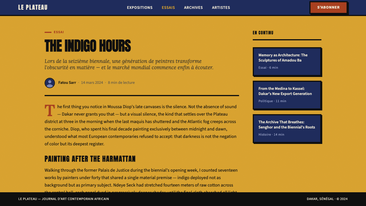
The Dak'Art palette is built from three anchoring tones: yellow ochre, which evokes the laterite earth and harmattan dust of Dakar's landscape; a deep indigo blue drawn from West African ceremonial textiles and the night sky over the Atlantic; and a coal black that frames and grounds both. These are not arbitrary brand colors but colors harvested from place. Secondary accents — terracotta, sand white — appear in supporting roles, always subordinate to the three-color core. The warmth of the palette contrasts sharply with the cool neutrals that dominate most contemporary international design, making Dak'Art materials immediately identifiable at a distance.Dak'Art色板由三种锚定色调构成:赭黄,唤起达喀尔地景的红土大地与哈马丹风沙;深靛蓝,取自西非仪式纺织品与大西洋上空的夜色;以及将两者框定与托底的炭黑。这些不是任意选取的品牌色,而是从土地中汲取的色彩。次级强调色——赤陶红、沙白——以辅助角色出现,始终从属于三色核心。这套色板的温暖感与当代国际设计主流的冷中性色调形成鲜明对比,使Dak'Art的视觉物料在远处即可辨认。
Monumental Sans-Serif Typography纪念碑式无衬线字体
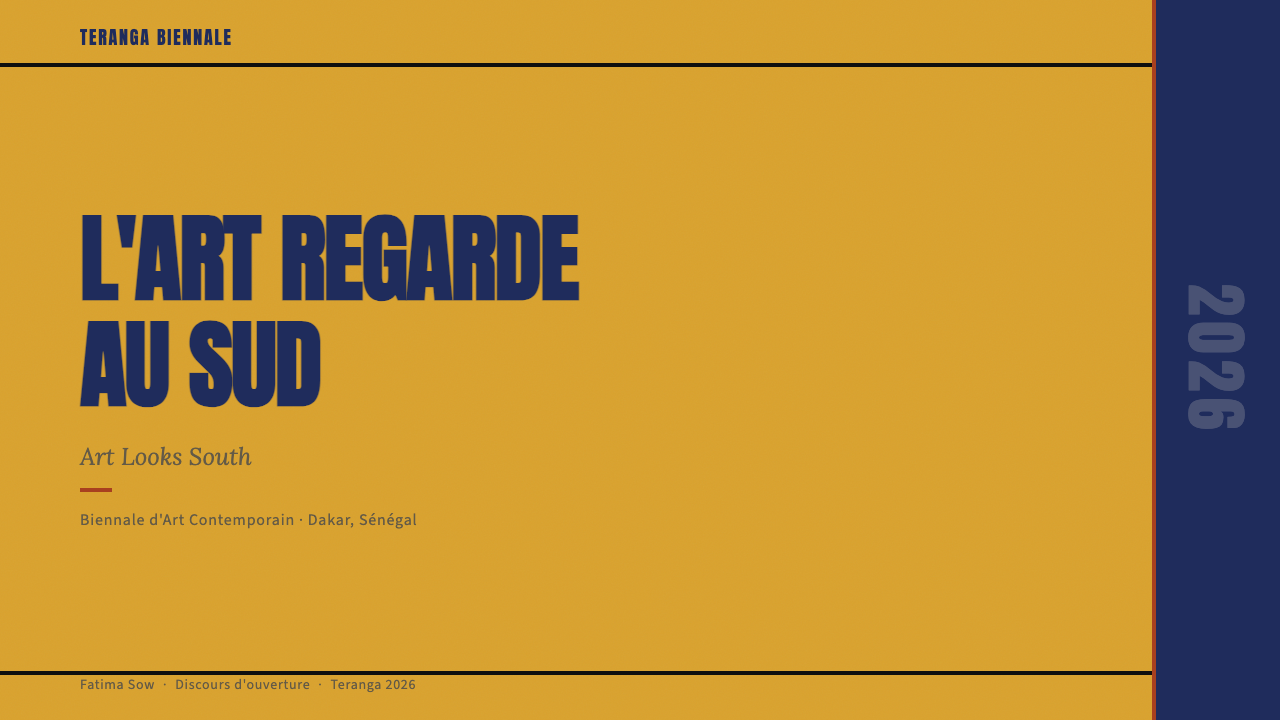
Headlines are set in bold, condensed sans-serif letterforms at commanding scale — the typographic equivalent of a public proclamation. The choice of sans-serif is not purely modernist inheritance; it also reflects the graphic tradition of West African signage and hand-painted commercial lettering, which favors strong, readable strokes over refinement. Scale contrast between headline and body text is extreme: titles occupy substantial portions of the surface, while supporting text is set small and tight. The typographic system is bilingual at its core, treating French and Wolof as co-equal presences rather than relegating one to a subtitle role.标题以粗重、窄体的无衬线字形设置,尺度宏大——在排印上等同于一份公开宣告。选择无衬线字体不仅仅是现代主义传统的继承,也折射出西非招牌与手绘商业字体的平面传统——这一传统偏爱有力、易读的笔画,而非精雕细琢。标题与正文之间的尺度对比极为强烈:标题占据版面的大片区域,而辅助文字则设置得小而紧凑。这套排印系统在核心上是双语的,将法语与沃洛夫语视为平等存在,而非将其中一种降格为副标题。
Sand-Textured Surfaces沙粒质感肌理
Unlike the smooth, flat surfaces that characterize most contemporary digital-first design, Dak'Art's aesthetic incorporates visible texture — the grain of sand, the roughness of unfinished plaster, the fibrous quality of handmade paper. This texture is not decorative noise; it is a material memory, embedding the physical landscape of Senegal into the graphic surface. In digital applications, this quality is approximated through granular overlays and uneven tonal fields that disrupt the pristine flatness of screen rendering. The textured surface places the work in dialogue with the handmade, resisting the seamless polish that connotes mass-produced globalism.与当代数字优先设计所普遍呈现的光滑平整表面不同,Dak'Art的美学融入了可见的肌理——沙砾的颗粒感、未完成抹灰的粗糙、手工纸的纤维质感。这种肌理并非装饰性噪点,而是一种材料记忆,将塞内加尔的物理地景嵌入平面表面。在数字应用中,这种品质通过颗粒叠加与不均匀色调区域加以近似,打破了屏幕渲染那种一尘不染的平整感。有肌理的表面使作品与手工制作产生对话,抵制象征着大规模全球化生产的无缝抛光。
Block Composition and Structural Weight块面构成与结构重量
Dak'Art compositions are organized through large color blocks rather than fine linear grids. An indigo rectangle anchors one edge of a surface; an ochre field occupies another; the interaction between the two creates visual tension without requiring decorative intervention. This block-based structure has roots in both modernist poster tradition and in the bold geometric patterning of West African woven textiles — kente, bogolan, and strip-woven cloth — where large color fields carry symbolic and narrative meaning. The approach favors weight over delicacy: compositions feel substantial, almost architectural, grounded by gravity rather than lifted by lightness.Dak'Art的版面构成依赖大面积色块而非精细的线性网格来组织画面。一块靛蓝矩形锚定版面的一侧边缘,一片赭黄色域占据另一侧,两者之间的交互制造视觉张力,无需装饰性介入。这种以色块为基础的结构,其根源同时来自现代主义海报传统,以及西非编织纺织品的大胆几何图案——肯特布、泥染布与条带织物——在这些织物中,大面积色彩区域承载着象征性与叙事性意义。这种方式偏重量感而非纤巧:构图感觉厚实,几乎具有建筑感,被重力托底而非被轻盈感托举。
Political and Cultural Legibility政治与文化可读性
Every element of the Dak'Art visual system carries a double address: it speaks to an international art world audience fluent in contemporary graphic conventions, and simultaneously to communities for whom the colors, textures, and linguistic choices are culturally specific and legible on different terms. The ochre is not merely a warm neutral — it is the color of the land. The indigo is not merely a dark accent — it is the color of fabric worn at ceremony. This layered legibility is a political act, insisting that a design system can be simultaneously local and global without subordinating one register to the other.Dak'Art视觉系统的每一个元素都承载着双重指涉:它同时向熟悉当代平面设计惯例的国际艺术界受众,以及那些对色彩、肌理与语言选择有着文化特殊性理解的社群发言。赭黄不仅仅是一种温暖的中性色——它是土地的颜色。靛蓝不仅仅是一种暗色调强调——它是仪式场合所穿织物的颜色。这种分层的可读性是一种政治行为,坚持一套设计系统可以同时是本地的与全球的,而无需将其中一种话语模式从属于另一种。
Collage and Layered Accumulation拼贴与分层积累
Unlike styles that achieve their effect through reduction and elimination, the Dak'Art aesthetic permits — even celebrates — accumulation. Photographic fragments, typographic elements, and color fields can coexist in the same space through layering, echoing both the collage practices of Agit'Art and the dense visual environment of Dakar's street culture. This layering is not chaotic; it is organized through scale hierarchy and tonal contrast, with the large ochre and indigo blocks providing a stable substrate beneath the accumulated surface detail. The result is visually rich without feeling cluttered, reflecting a cultural aesthetic where abundance and vitality are valued over austerity.与那些通过削减与去除来取得效果的风格不同,Dak'Art的美学允许——甚至赞美——积累。摄影碎片、字体元素与色彩区域可以通过分层叠压共存于同一空间,呼应了Agit'Art的拼贴实践与达喀尔街头文化浓密的视觉环境。这种叠加并非混沌无序;它通过尺度层级与色调对比加以组织,大面积的赭黄与靛蓝色块在积累的表面细节之下提供稳定的基底。结果是视觉上丰富而不感到拥挤,折射出一种将丰盛与活力置于简朴之上的文化美学。
Diaspora and Continuum离散与连续
The visual system explicitly refuses a fixed or singular African identity, instead positioning the continent and its diaspora as a continuum of related but distinct visual cultures. This is expressed through deliberate inclusivity in imagery — photographs depicting artists and communities across North Africa, West Africa, East Africa, and the Afro-Caribbean and Afro-European diaspora — and through a typographic openness that can accommodate multiple scripts and languages. The aesthetic thereby performs what the biennial itself argues: that pan-African identity is plural, dynamic, and in continuous formation rather than a settled category inherited from the past.这套视觉系统明确拒绝固定或单一的非洲身份,而是将非洲大陆及其离散社群定位为一系列相互关联却各有差异的视觉文化的连续体。这体现在图像选取上刻意的包容性——涵盖北非、西非、东非以及非洲裔加勒比海与欧洲离散社群的艺术家与社区照片——以及一种能够容纳多种文字与语言的排印开放性。这套美学由此在视觉上实践了双年展本身所主张的论点:泛非身份是复数的、动态的,处于持续形成之中,而非从过去继承而来的既定范畴。
See the Dak'Art Biennale design system查看 Dak'Art Biennale 完整设计系统
Who shaped Dak'Art Biennale?谁塑造了 Dak'Art Biennale?
Issa Samb — also known as Joe Ouakam — was a painter, sculptor, philosopher, and performance artist who became one of the founding intellectual forces of the Laboratoire Agit'Art collective in Dakar. His compound on the Médina district became a gathering point for artists working outside institutional structures, and his practice — sprawling, anti-commercial, deeply rooted in Wolof philosophical tradition — modeled an approach to contemporary art-making that refused European museum culture's terms of legibility. His influence on subsequent generations of Dakar-based artists shaped the political and aesthetic DNA that Dak'Art inherited.伊萨·桑布——又名乔·瓦卡姆——是一位画家、雕塑家、哲学家与表演艺术家,是达喀尔Laboratoire Agit'Art集体的创始性思想力量之一。他在梅迪纳区的庭院成为在体制外工作的艺术家的聚集地。他的实践——蔓延、反商业、深深扎根于沃洛夫哲学传统——示范了一种拒绝欧洲博物馆文化可读性标准的当代艺术制作方式。他对后续几代达喀尔艺术家的影响,塑造了Dak'Art所继承的政治与美学遗传密码。
El Hadji Sy is a painter and one of the central figures of both Laboratoire Agit'Art and the broader emergence of contemporary Dakar art. Working with intensely saturated color fields and gestural, improvisational mark-making, his canvases brought West African color sensibility — warm ochres, deep indigos, vibrant reds — into a formally ambitious contemporary painting practice. As a teacher and organizer, he helped transmit the Agit'Art ethos to younger artists while maintaining a rigorous studio practice, and his work has been exhibited internationally as one of the definitive expressions of the Dakar school's contribution to global contemporary art.埃尔·哈吉·西是一位画家,也是Laboratoire Agit'Art与达喀尔当代艺术更广泛兴起的核心人物之一。他的画布以高度饱和的色彩区域与即兴、即时的笔触运作,将西非的色彩感性——温暖的赭黄、深沉的靛蓝、鲜活的红色——带入了一种形式上雄心勃勃的当代绘画实践。作为教师与组织者,他将Agit'Art的精神传递给更年轻的艺术家,同时保持严格的工作室创作,其作品作为达喀尔画派对全球当代艺术贡献的权威表达,已在国际上广泛展出。
Bouna Medoune Seye was a poet, performance artist, and key member of Laboratoire Agit'Art whose practice bridged literary and visual culture. He brought the oral tradition of Wolof griotic performance into dialogue with contemporary conceptual art practice, insisting on the body and the voice as primary artistic media. His work contributed to Agit'Art's resistance to the idea that African contemporary art must conform to Western gallery formats to be taken seriously, and his legacy continues to inform the biennial's commitment to performance, public space, and multidisciplinary practice.布纳·梅杜恩·塞伊是一位诗人、表演艺术家,也是Laboratoire Agit'Art的核心成员,他的实践在文学与视觉文化之间架起桥梁。他将沃洛夫格里奥表演的口述传统带入与当代观念艺术实践的对话,坚持以身体与声音作为首要艺术媒介。他的工作助力了Agit'Art对「非洲当代艺术必须符合西方画廊格式才能被严肃对待」这一观念的抵制,他的遗产持续滋养着双年展对表演、公共空间与跨学科实践的承诺。
Simon Njami is a Cameroonian-Swiss curator, critic, and editor who has served as artistic director of Dak'Art and shaped the conceptual framing of pan-African contemporary art over several decades. As co-founder of the magazine Revue Noire — which documented and championed African contemporary art globally through the 1990s — and as a curator of major international exhibitions including the Africa Remix traveling exhibition, Njami has been instrumental in building the institutional and critical infrastructure through which Dak'Art has engaged with the international art world while maintaining the specificity of its African perspective.西蒙·恩贾米是一位喀麦隆裔瑞士籍策展人、批评家与编辑,曾担任Dak'Art艺术总监,数十年来持续塑造泛非当代艺术的概念框架。作为《黑色评论》(Revue Noire)杂志的联合创办人——该杂志于1990年代在全球记录并推动非洲当代艺术——以及包括「非洲巡回展」(Africa Remix)在内的重大国际展览的策展人,恩贾米在构建机制与批评基础设施方面发挥了关键作用,使Dak'Art在保持其非洲视角特殊性的同时,得以与国际艺术世界展开对话。
Although El Anatsui is Ghanaian rather than Senegalese, his work has become virtually synonymous with the visual ambitions that Dak'Art embodies. His large-scale tapestries — constructed from thousands of flattened bottle caps and aluminum fragments, woven together with copper wire — translate the visual logic of West African strip-woven textiles into monumental sculptural installations of extraordinary optical richness. The way his work catches and redistributes light in colonial-era warehouse spaces, turning industrial refuse into surfaces of luminous gold and deep indigo, is precisely the kind of visual transformation that the Dak'Art aesthetic, at its best, aspires to achieve: making something entirely new from the materials of a shared history.尽管埃尔·安纳祖是加纳人而非塞内加尔人,他的作品在视觉上已几乎成为Dak'Art所体现的抱负的同义词。他的大尺幅挂毯——由数千个展平的瓶盖与铝片碎料用铜线编织而成——将西非条带织物的视觉逻辑转化为具有非凡光学丰富性的纪念碑式装置。他的作品在殖民时代仓库空间中捕捉并重新分配光线的方式,将工业废料转变为流光溢彩的金色与深邃靛蓝色表面,正是Dak'Art美学在最佳状态下所追求的那种视觉转化:用共同历史的材料创造出全然崭新的事物。
How do you use Dak'Art Biennale today?今天怎么用 Dak'Art Biennale?
Applying the Dak'Art aesthetic effectively requires understanding that its power comes from a specific cultural logic, not merely from a color palette. The ochre, indigo, and black work together because they carry material and geographic meaning; borrowing them without understanding that meaning risks producing work that reads as superficial exoticism rather than engaged design. The starting point for any application should be the palette's internal logic: ochre as ground, indigo as structural depth, black as definition, with sand-white and terracotta as supporting accents. From that base, the remaining choices — texture, type scale, block composition — should reinforce the sense of weight, warmth, and declarative confidence that defines the style at its best.有效应用Dak'Art美学,需要理解其力量来自特定的文化逻辑,而非仅仅来自色板。赭黄、靛蓝与黑色之所以协同有效,是因为它们承载着材料性与地理性意义;在不理解这层意义的情况下借用它们,面临的风险是产出一种被解读为表层异国情调而非真正介入的设计。任何应用的出发点都应当是色板的内在逻辑:赭黄为底、靛蓝为结构性深度、黑色为轮廓定义,沙白与赤陶红作为辅助强调。在此基础之上,其余选择——肌理、字体尺度、块面构成——都应强化这种风格在最佳状态下所界定的重量感、温暖感与宣言性自信。
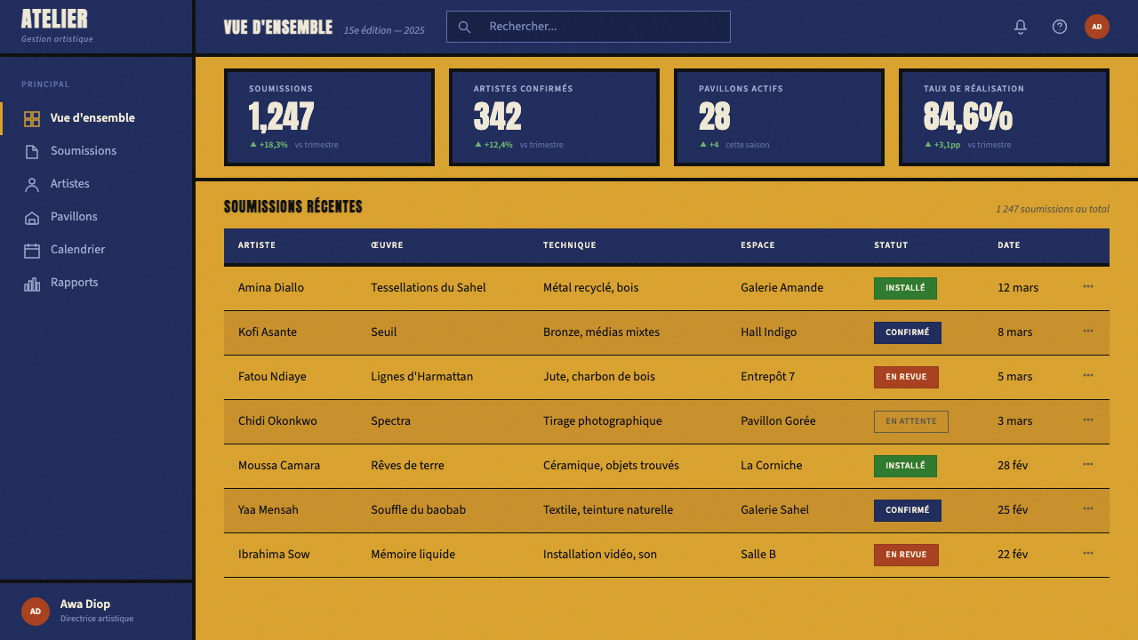
For presentation slides, the Dak'Art aesthetic yields covers of genuine visual authority. A cover slide works well with a large indigo block occupying most of the surface, the title set in a bold, expanded sans-serif against the indigo, and an ochre shape — a horizontal band, a corner accent, a partial frame — introducing the warm ground tone. The biennial's bilingual logic can be adapted by giving equal typographic weight to a subtitle or secondary text rather than subordinating it. Content slides should use the ochre as a background field, keeping type in deep charcoal or black, with indigo used only for emphasis or section markers. Data visualization works particularly well when chart fills are drawn from the three-tone palette, giving bar charts and area graphs the same visual weight as the surrounding design rather than treating them as inserted graphics.对于演示文稿,Dak'Art美学能够产出具有真实视觉权威感的封面。一张封面幻灯片,可以让大面积靛蓝色块占据大部分版面,标题以粗重扩展的无衬线字体设置于靛蓝之上,一个赭黄形状——横向色带、角部强调或局部边框——引入温暖的底色基调。双年展的双语逻辑,可以通过赋予副标题或次要文字平等的排印分量来加以借鉴,而非将其从属化。内容页应以赭黄作为背景色域,文字保持深炭色或黑色,靛蓝仅用于强调或章节标记。数据可视化效果尤为突出——当图表填充色取自三色色调时,柱状图与面积图与周围设计具有同等的视觉分量,而非像插入的独立图形。
For web interfaces — dashboards, pricing pages, editorial platforms — the Dak'Art system requires careful calibration. The texture element, so powerful in print contexts, should be applied lightly in digital environments: a subtle grain on the background field rather than heavy overlay, which can read as distortion on screen. The block-composition principle translates well to section-based web layouts, where full-width color bands alternate between ochre and indigo grounds across page sections. Typography should maintain the extreme scale contrast of the source aesthetic — large display text at commanding size, body text set small and tight — using a single strong sans-serif family rather than mixing faces. Navigation and interface chrome should remain in black or deep charcoal, reserving the warm palette for content areas.对于网页界面——仪表板、定价页面、编辑内容平台——Dak'Art体系需要精细校准。肌理元素在印刷语境中极具力量,在数字环境中则应轻手施加:背景色域上的微妙颗粒感,而非沉重的叠加,后者在屏幕上可能被解读为干扰噪点。块面构成原则可以很好地转化为基于分区的网页布局,全幅色带在页面各区域之间以赭黄底和靛蓝底交替出现。排印应维持源美学的极端尺度对比——大型展示文字设置在宏大的尺寸,正文文字设置得小而紧凑——使用一种强劲的无衬线字体家族,而非混用多种字体。导航与界面框架元素应保持黑色或深炭色,将温暖色调保留给内容区域。
For editorial and marketing applications, the Dak'Art aesthetic supports formats where boldness and cultural specificity are assets. A poster or marketing cover benefits from the full palette deployed with confidence: a dominant ochre ground, an indigo geometric block cutting across the surface, headline type in black or reversed white, and a photographic element — ideally cropped tightly and reproduced with high tonal contrast — integrated as a block rather than placed as a floating image. Editorial article layouts work with a narrower ochre or sand margin paired with a clean white or cream text area, using deep indigo rules as section dividers rather than decorative lines. The style suits campaigns for cultural institutions, arts organizations, educational platforms, and brands that want to signal international sophistication grounded in African creative tradition.对于编辑与营销应用,Dak'Art美学适合那些大胆感与文化特殊性是优势的格式。一张海报或营销封面,适合以充满自信的方式部署全套色板:主导性的赭黄底面,一个靛蓝几何色块斜切版面,标题以黑色或反白设置,摄影元素——理想情况下紧密裁切并以高色调对比度复制——以色块形式整合进版面而非作为浮动图像放置。编辑文章版面,以较窄的赭黄或沙色留白区域配合干净的白色或奶油色文字区域,使用深靛蓝规则线作为段落分隔而非装饰性线条。这种风格适合文化机构、艺术组织、教育平台以及希望传递扎根于非洲创意传统的国际复杂感的品牌的市场推广活动。
The most common mistake when applying this aesthetic is reducing it to its color palette alone, treating the ochre-indigo-black combination as a cosmetic overlay that can be applied to any existing layout structure. Authentic application requires adopting the compositional logic as well: large blocks rather than fine lines, extreme typographic scale contrast, textured surfaces rather than smooth ones, and a willingness to let the design feel heavy and substantial rather than light and airy. A second common error is using the palette as decoration rather than structure — scattering ochre accents across a predominantly white layout produces something that reads as African-inspired pastiche rather than a coherent system. Commit to the palette as the primary organizing force, and the style's distinctive authority will follow.应用这套美学时最常见的错误,是将其简化为单纯的色板,把赭黄-靛蓝-黑色组合当作可以叠加到任何现有版式结构上的表面处理。真正的应用需要同时采用构成逻辑:色块而非细线,极端的排印尺度对比,有质感的表面而非光滑表面,以及愿意让设计感觉厚重而非轻盈。第二种常见错误是将色板用作装饰而非结构——在以白色为主的版面上散置赭黄强调元素,产出的是被解读为非洲风情仿制品的东西,而非一套连贯的体系。将色板作为首要的组织力量全情投入,这种风格的独特权威感自然随之而来。
See the Dak'Art Biennale design system查看 Dak'Art Biennale 完整设计系统
Dak'Art Biennale — FAQDak'Art Biennale · 常见问题
How is the Dak'Art aesthetic different from a generic 'African-inspired' design?Dak'Art美学与泛泛的「非洲风情」设计有何不同?
The difference is specificity versus generalization. Generic 'African-inspired' design typically borrows surface motifs — animal prints, abstract patterns associated with kente or kanga textiles, bright unrelated colors — without grounding them in any particular tradition, history, or geography. The Dak'Art aesthetic is specific to Dakar, Senegal, and the post-independence pan-African cultural project: its ochre comes from Sahel laterite, its indigo from West African ceremonial cloth, its typographic choices from a city where French and Wolof coexist as living languages. Applying it authentically means understanding those references, not just copying the color temperature. The distinction between engaged cultural design and exoticism is almost always a question of specificity and understanding.区别在于特殊性与泛化之间。泛泛的「非洲风情」设计通常借用表层母题——动物纹、与肯特布或卡纳布相关的抽象图案、互不相关的明亮色彩——而不将其根植于任何特定的传统、历史或地理。Dak'Art美学特定于达喀尔、塞内加尔,以及后独立时代的泛非文化工程:它的赭黄来自萨赫勒红土,它的靛蓝来自西非仪式织物,它的排印选择来自一座法语与沃洛夫语共存为活语言的城市。真正地应用它,意味着理解这些参照,而不仅仅是复制色调温度。介入性的文化设计与异国情调之间的区别,几乎总是特殊性与理解深度的问题。
Can the Dak'Art palette work in a light-background digital interface without losing its impact?Dak'Art色板能在浅色背景的数字界面中使用而不失去冲击力吗?
Yes, but it requires rebalancing rather than direct transposition. The full-palette version — large indigo blocks against ochre grounds — is designed for print surfaces and physical environments where both colors can read at full saturation. In a light-background digital interface, the approach shifts: use a near-white or pale sand background as the canvas, deploy ochre and indigo as accent colors for section dividers, interactive states, and data visualization fills rather than as dominant backgrounds. Black remains the primary typographic color. The key is preserving the weight and warmth of the palette — the visual signal that this is not a cool, neutral international design — while adapting the proportions so the interface remains readable and functional. Reducing the ochre to a warm off-white background and using indigo as the primary structural accent is a well-tested approach.可以,但需要重新平衡而非直接移植。完整色板版本——大面积靛蓝色块对应赭黄底面——是为印刷表面与物理环境设计的,在那些场景中两种颜色都能以全饱和度呈现。在浅色背景的数字界面中,方式需要调整:以接近白色或淡沙色的背景作为画布,将赭黄与靛蓝用作区块分隔、交互状态与数据可视化填充的强调色,而非作为主导背景。黑色仍是主要的文字排印色。关键在于保留色板的重量感与温暖感——那种视觉信号,表明这不是一套冷静的、中性的国际化设计——同时调整比例,确保界面保持可读性与功能性。将赭黄还原为温暖的类白色背景,以靛蓝作为主要结构强调色,是一种经过验证的有效方式。
How should photography be integrated into a Dak'Art-styled layout?在Dak'Art风格的版面中,摄影应当如何融合?
Photography in the Dak'Art system functions as a structural block, not a decorative insert. Photographs should be cropped tightly to eliminate contextual background, reproduced at high tonal contrast — deepening shadows and holding highlights — to align with the boldness of the surrounding color fields. They are placed as geometric shapes within the composition: a photograph occupies a column, a half-page zone, or a defined block, and the surrounding color fields treat it as an equal compositional element rather than a window into a separate space. Avoid soft vignettes or graduated edges; the photograph should have a hard, defined boundary, the same decisiveness that characterizes all other edges in the system. When color photographs are used, those with warm, saturated color temperatures — ochres, terracottas, deep blues — integrate most naturally.在Dak'Art体系中,摄影作为结构性色块而非装饰性插图发挥作用。照片应当紧密裁切以去除背景语境,以高色调对比度复制——加深阴影、保留高光——以与周围色彩区域的大胆感保持一致。它们以几何形状被放置于构图之中:一张照片占据一列、半页区域或一个界定的色块,周围的色彩区域将其视为平等的构成元素,而非通向另一空间的窗口。避免柔和的暗角或渐变边缘;照片应当有硬朗、界定分明的边界,与体系中所有其他边缘的果断感保持一致。使用彩色照片时,色温温暖、色彩饱和的照片——赭色调、赤陶色调、深蓝色调——与整套体系的整合最为自然。
Is the Dak'Art aesthetic appropriate for brands outside the cultural sector?Dak'Art美学适用于文化领域以外的品牌吗?
It can be, but the fit depends heavily on what the brand is trying to communicate. The aesthetic signals: pan-African cultural authority, post-colonial confidence, warmth over coolness, weight over delicacy, collective voice over individual refinement. Brands that genuinely align with those values — and have authentic connections to African creative culture — can use the aesthetic with conviction. Brands that are attracted to the palette's visual distinctiveness but have no substantive connection to its cultural context risk producing work that reads as appropriation. The safest and most honest applications are those where the brand's mission, audience, or origins have a genuine relationship to pan-African culture, contemporary African art, or the broader diasporic community the biennial serves.可以,但适配度很大程度上取决于品牌试图传达什么。这套美学所传递的信号是:泛非文化权威、后殖民自信、温暖重于冷静、重量感重于纤巧、集体声音重于个体精炼。真正与这些价值观对齐、且与非洲创意文化有真实联结的品牌,可以有底气地使用这套美学。那些被色板的视觉独特性所吸引、但与其文化语境没有实质性联结的品牌,则面临产出被解读为文化挪用作品的风险。最安全也最诚实的应用,是那些品牌使命、受众或起源与泛非文化、非洲当代艺术,或双年展所服务的更广泛离散社群有着真实关系的场景。
How does Dak'Art relate to other African modernist design traditions?Dak'Art与其他非洲现代主义设计传统有何关联?
Dak'Art represents one node in a larger network of African modernist visual traditions that emerged across the continent in the decades following independence. It is closest in spirit to the broader École de Dakar tradition and to pan-Africanist graphic movements that used bold color, anti-colonial typography, and graphic urgency as political tools — traditions visible in the independence-era poster design of Ghana, the ujamaa graphic culture of Tanzania, and the political poster traditions of Angola and Mozambique. Where Dak'Art diverges from some of these traditions is in its sustained engagement with the international contemporary art world, which has required it to develop a visual language that can operate in gallery and biennial contexts without abandoning its political roots. The result is a style that has more formal sophistication than the urgency of street-level political graphics, while retaining more cultural warmth and specificity than the cool internationalism of mainstream contemporary design.Dak'Art代表着非洲大陆独立后数十年间兴起的更广泛非洲现代主义视觉传统网络中的一个节点。在精神上,它与达喀尔画派的广义传统以及使用大胆色彩、反殖民排印与平面紧迫性作为政治工具的泛非主义平面设计运动最为接近——这些传统在加纳独立时代的海报设计、坦桑尼亚的乌贾马平面文化,以及安哥拉与莫桑比克的政治海报传统中均清晰可见。Dak'Art与这些传统中某些部分的分歧,在于它对国际当代艺术世界的持续介入——这要求它发展出一套能在画廊与双年展语境中运作、同时不放弃政治根基的视觉语言。结果是一种风格,它比街头层面的政治平面图形拥有更多形式上的精炼,同时又比主流当代设计的冷静国际主义保留了更多文化温度与特殊性。
Related design styles相关设计风格
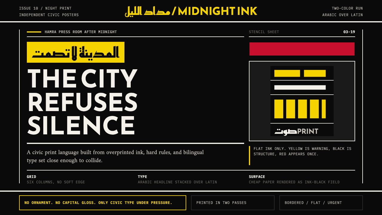 Beirut Indie Graphic DesignCivic type as protest. Sulfur yellow Arabic blocks collide with ink-black pos…公民字体即抗议:硫磺黄阿文块撞上墨黑海报网格。
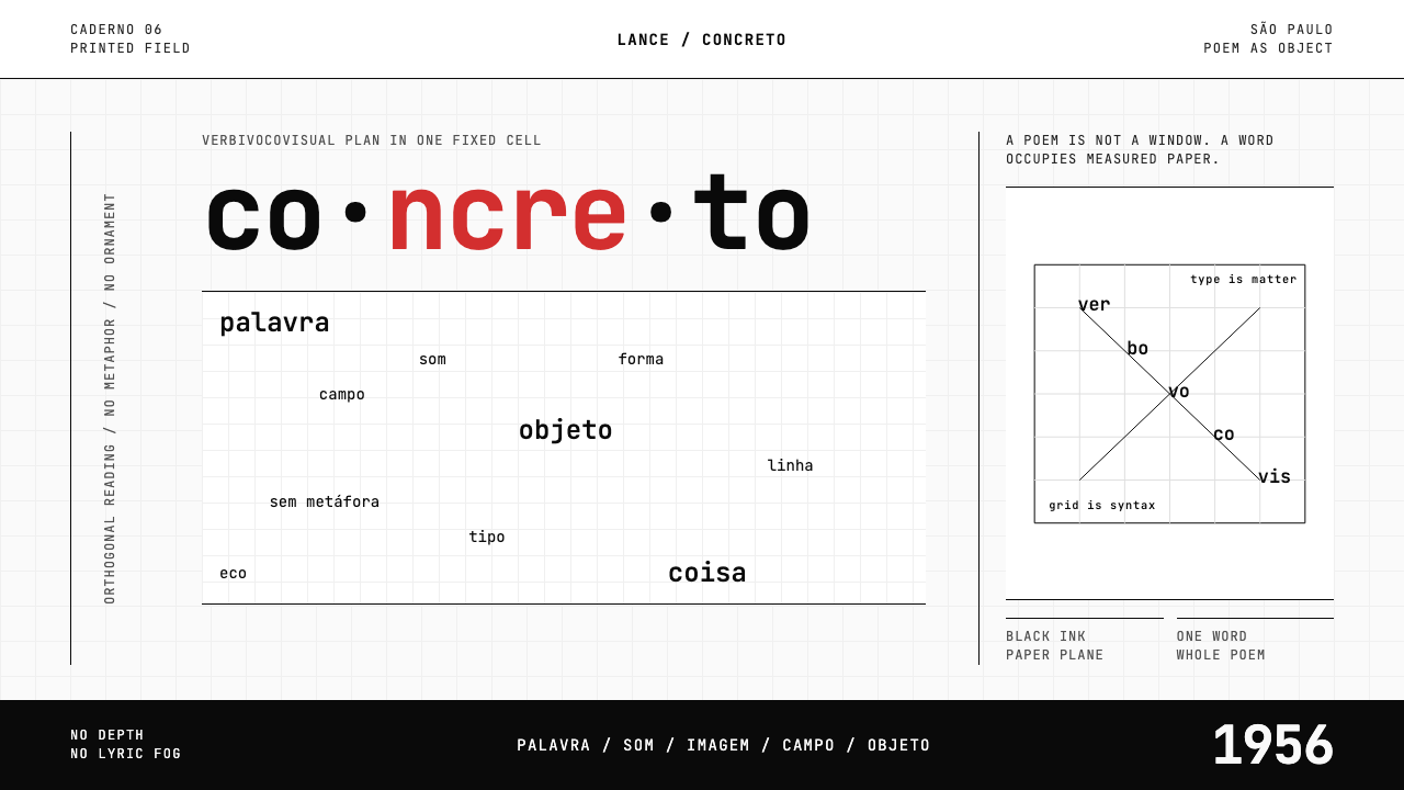 Brazilian Concrete PoetryWords become objects. Monospace cells, black-white paper, one cadmium red rup…字成为物。等宽格、黑白纸面,一处镉红断裂。
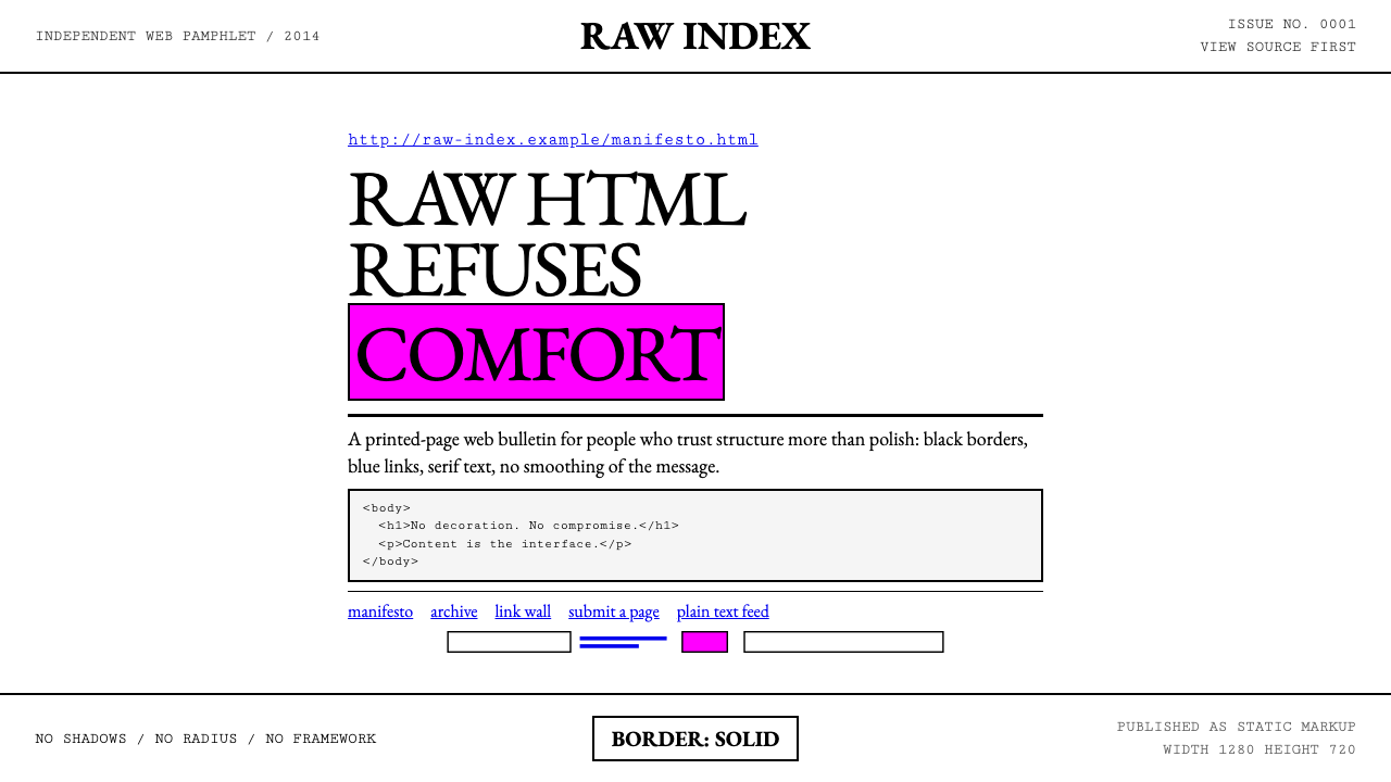 Brutalist Web 2014Browser defaults, weaponized. Times New Roman, electric-blue links — raw HTML…把浏览器默认样式当武器:Times New Roman、电蓝链接——HTML…
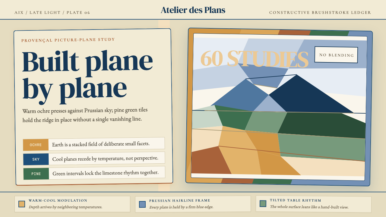 Cézanne — Mont Sainte-VictoireBuilt, not blended. Ochre, Prussian blue, and pine facets tilt into a constru…不描摹,只建构:赭黄、普鲁士蓝与松绿小色面倾斜成山。
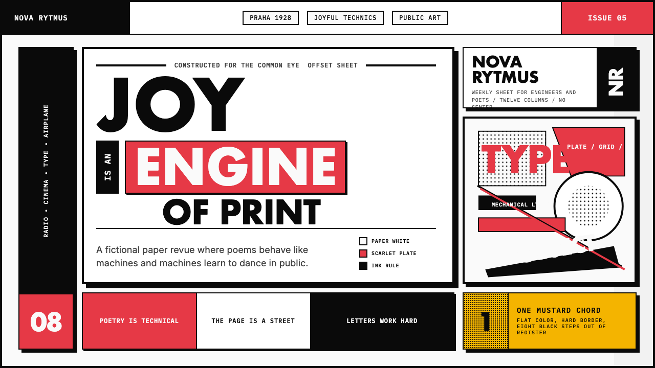 Czech Devětsil Avant-GardeJoy is engineered. Scarlet ink blocks and rotated sans type collide on an asy…欢愉被工程化:猩红墨块与旋转无衬线字撞上非对称网格。
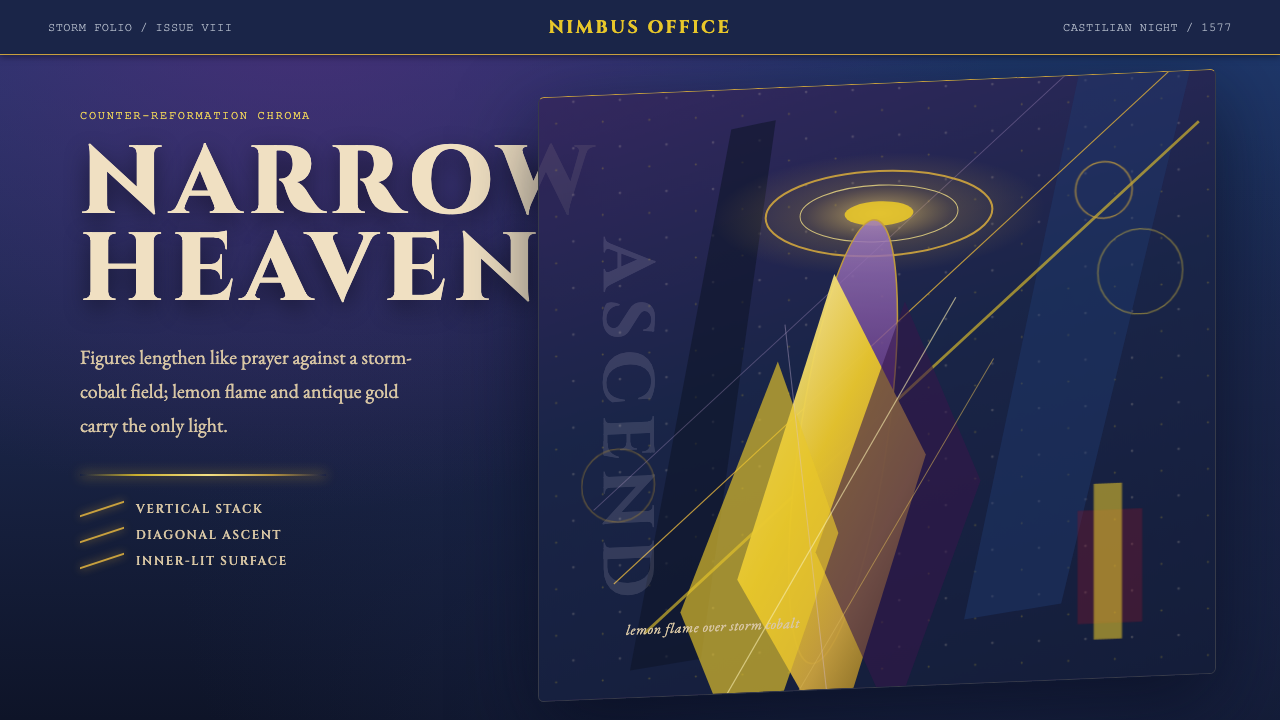 El Greco — Toledo MannerismMysticism strains upward. Storm cobalt, lemon flame, and gold halos pull the…神秘感向上拉伸。风暴钴蓝、柠檬火焰与金色光环令画面纵向紧绷。