What is Cézanne — Mont Sainte-Victoire?什么是 Cézanne — Mont Sainte-Victoire?
Cézanne didn't paint Mont Sainte-Victoire — he built it, facet by facet, until a limestone mountain became the blueprint for every constructed image that followed.塞尚不是在画圣维克多山,他是在建造它——一块色面接一块色面,直到一座石灰岩山头变成此后所有构成性图像的蓝图。
Cézanne — Mont Sainte-Victoire in briefCézanne — Mont Sainte-Victoire 速览
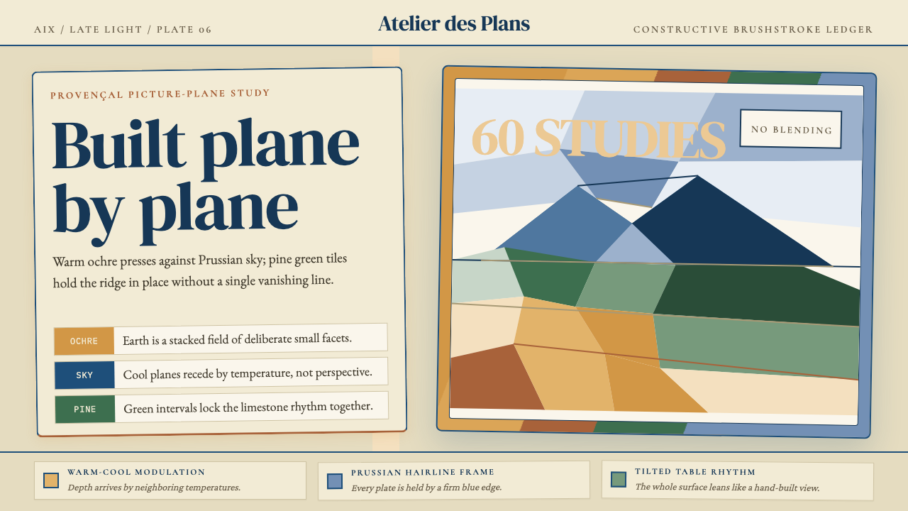
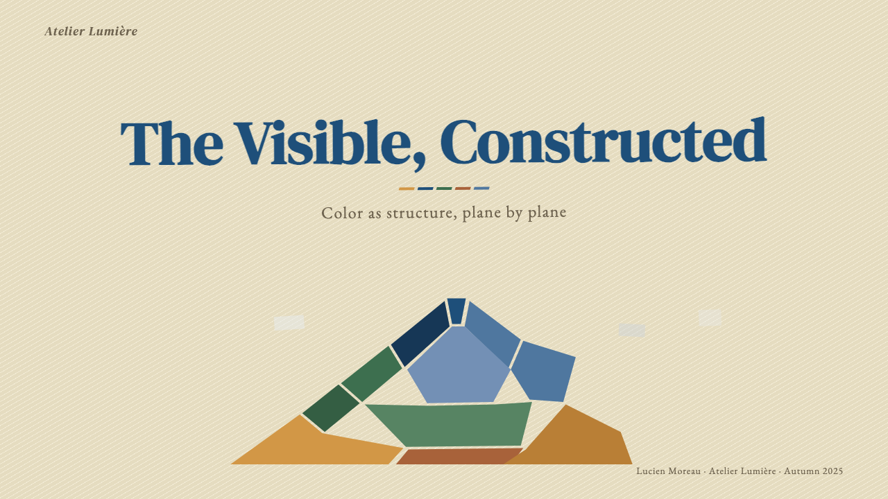
Cézanne — Mont Sainte-Victoire names the visual system distilled from Paul Cézanne's late series of paintings of the Provençal limestone peak he could see from his studio in Aix-en-Provence. Between roughly 1885 and his death in 1906, he returned to the same subject more than sixty times. What emerged was not a landscape style but a structural method: the 'constructive brushstroke,' in which every mark is a small, flat tile of color laid against its neighbor to build form from the inside out rather than describing it from the outside in.「塞尚——圣维克多山」这套视觉语言,提炼自保罗·塞尚晚年对普罗旺斯一座石灰岩山头的系列描绘——那座山就在他艾克斯画室望出去的视野里。从大约1885年到1906年他去世为止,他对着同一个主题画了六十多遍。由此诞生的不是一种风景画风格,而是一套结构方法:「构成性笔触」——每一笔都是一块小而平的色面,像砌瓷砖一样彼此紧靠,从内部建造形体,而非从外部描摹轮廓。
The palette of these canvases is specific and purposeful: warm ochre for the bare rock and sun-baked earth, Prussian blue for the sky and its shadows, pine green for the stands of trees that push up the lower slopes. These three temperature zones — warm, cool, verdant — alternate across the picture plane in a rhythm that creates depth without receding lines or vanishing points. The picture feels simultaneously flat and volumetric, a tension that Picasso and Braque studied closely before arriving at Cubism.这些画作的色彩既具体又有意为之:裸露岩石与灼热土地用温暖的赭黄,天空与阴影用普鲁士蓝,山坡下方的松林用松针绿。这三个温度区间——暖、冷、翠——在画面上交替排布,形成无需透视线或消失点的纵深节奏。画面同时呈现出平面感与体量感,这种张力正是毕加索和勃拉克在抵达立体主义之前深入研究的东西。
As a design language, the Cézanne — Mont Sainte-Victoire aesthetic insists that a surface is composed, not rendered. Each element — a background field, a content card, a data bar, a typographic block — is a discrete color tile with its own temperature and weight. Tiles are laid in sequence; depth emerges from warm-cool opposition; nothing is blended or dissolved. The result is a visual logic that feels simultaneously ancient and radical: earthy, architectural, and rigorously non-decorative.作为设计语言,「塞尚——圣维克多山」美学坚持:一个表面是被构成的,而非被描绘的。每一个元素——背景底面、内容卡片、数据条、排印块——都是一块独立的色面,有自己的温度与分量。色面依次铺设,纵深从冷暖对立中涌现,没有任何过渡或溶解。结果是一套同时显得古老又激进的视觉逻辑:土地感、建筑感,并且严格地拒绝装饰。
See the Cézanne — Mont Sainte-Victoire design system查看 Cézanne — Mont Sainte-Victoire 完整设计系统
Where does Cézanne — Mont Sainte-Victoire come from?Cézanne — Mont Sainte-Victoire 从何而来?
Paul Cézanne was born in Aix-en-Provence in 1839 to a prosperous banking family. He traveled to Paris in the 1860s hoping to make his name in the academic Salon, but his early work — thick-painted, psychologically intense, often violent in subject matter — was repeatedly rejected. His friendship with Émile Zola, a childhood companion who became the era's most celebrated novelist, gave him social entrée to the Parisian avant-garde, where he fell in with the Impressionists and exhibited in their first group show in 1874. Camille Pissarro, the oldest and most pedagogically minded of the Impressionists, became a critical influence: working side by side with Pissarro at Pontoise in the 1870s, Cézanne learned to break down observed color into small, responsive marks and to trust the optical mixture of colors placed side by side rather than blended on the palette.保罗·塞尚1839年生于普罗旺斯艾克斯,出身富裕的银行家家庭。1860年代他赴巴黎,希望在学院派沙龙闯出名堂,但早期作品——厚涂、心理张力强烈、题材常带暴力色彩——屡遭拒绝。童年玩伴、后来成为时代最著名小说家的埃米尔·左拉为他打开了巴黎先锋圈的大门,他由此结识印象派,并参加了1874年的首届群展。卡米耶·毕沙罗——印象派中最年长、也最具教育心的一位——成为关键影响:1870年代在蓬图瓦兹与毕沙罗并肩写生,塞尚学会了将观察到的色彩分解为细小的、有回应性的笔触,学会了相信并排放置的色彩所产生的视觉混合,而不是在调色板上预先调匀。
But Cézanne was never fully satisfied with Impressionism. He famously declared his ambition to 'redo Poussin from nature' — to find a way to paint with the Impressionists' directness and chromatic honesty while recovering the structural permanence he admired in the Old Masters. In 1882, after an increasingly difficult decade in Paris, he retreated permanently to Aix. The Mont Sainte-Victoire, visible from multiple vantage points around the city, became his obsession and his laboratory. He painted it from the Jas de Bouffan estate, from the road to Le Tholonet, and most famously from the purpose-built studio — the Atelier des Lauves — he constructed on a hill north of Aix in 1902, where the mountain dominated the horizon through a wide north-facing window.但塞尚从未对印象派感到完全满足。他有句名言,立志「用自然重做普桑」——找到一种方式,在保持印象派的直接性与色彩诚实的同时,恢复他在古典大师作品中敬仰的结构性永恒感。1882年,经历了愈发艰难的十年巴黎岁月后,他永久撤回艾克斯。从城市多处制高点都能望见的圣维克多山,成了他的执念与实验室。他从布法恩庄园、从通往图洛内的公路,以及最著名地,从他1902年在艾克斯北面山丘上专门修建的画室——洛夫工作室——描绘它,那里的大型朝北窗口让山峰主宰了整条地平线。
The late Mont Sainte-Victoire canvases, produced approximately between 1895 and 1906, represent the culmination of this long experiment. The earlier versions, painted in the 1880s, still show a relatively conventional landscape organization: foreground, middle ground, sky. By the late phase, that recession has collapsed. The mountain and the sky press toward the same plane. Individual strokes read simultaneously as color sensation and as structural module. The tension between the flat mark and the volumetric reading it produces became, in the hands of Cézanne's successors, the founding gesture of modern art.大约从1895年到1906年间创作的晚期圣维克多山系列,是这场漫长实验的集大成之作。1880年代的早期版本依然呈现出相对常规的风景组织方式:前景、中景、天空。到晚期,这种递退已然崩塌。山峰与天空被压向同一平面。每一笔触同时既是色彩感觉,又是结构模块。平面笔触与其所产生的体量感之间的张力,在塞尚的继承者手中,成为现代艺术的奠基性姿态。
Cézanne died in 1906 from pneumonia contracted after collapsing outdoors during a painting session in the rain. He was largely unknown to the general public at the time of his death. The following year, Ambroise Vollard — his longtime dealer — organized a large retrospective at the Salon d'Automne in Paris, with fifty-six works. The response was electrifying. Maurice Denis, one of the Nabis painters who had long admired Cézanne, called him 'the Poussin of Impressionism.' Picasso and Braque, who had both been quietly absorbing his late work, accelerated their joint dismantling of pictorial convention. Within three years, Cubism was in full development. The Post-Impressionist movement, the proto-Cubist legacy, and the broader modernist construction method all trace their structural DNA directly to the Aix studio and the limestone mountain to its east.塞尚于1906年因肺炎去世,此前他在雨中写生时晕倒在户外。生前他几乎不为大众所知。次年,他的长期经销商安布鲁瓦斯·沃拉尔在巴黎秋季沙龙组织了一场规模盛大的回顾展,共展出五十六件作品。反响之热烈令人震撼。长期仰慕塞尚的那比派画家莫里斯·德尼称他为「印象派中的普桑」。一直在悄悄消化其晚期作品的毕加索与勃拉克,加速了对绘画惯例的共同颠覆。不到三年,立体主义全面展开。后印象主义运动、原立体主义遗产,以及更广义的现代主义构成方法,都将其结构基因直接追溯至艾克斯那间画室与其东方的石灰岩山头。
What defines the Cézanne — Mont Sainte-Victoire look?Cézanne — Mont Sainte-Victoire 的视觉特征是什么?
Constructive Brushstroke构成性笔触
The defining mark-making system: each stroke is a small, flat, roughly parallel tile of color applied with deliberate direction — typically diagonal, following the slope of the form being built. Marks do not blend into their neighbors; they abut. Seen close, the canvas reads as a mosaic of discrete color decisions. Seen from distance, the visual system resolves into coherent mass. This dual reading — flat mosaic and solid volume simultaneously — is the central optical achievement of the method.这是这套语言最核心的笔触体系:每一笔都是一块细小、平整、大体平行的色面,以刻意的方向施加——通常是对角线走向,顺着所要建造的形体坡度。笔触不会与相邻笔触融合;它们紧靠。近看,画布是一片离散色彩决策的马赛克;远看,这套视觉系统收敛为连贯的体量。这种双重阅读——平面马赛克与立体体量同时存在——是这一方法最核心的视觉成就。
Warm-Cool Modulation冷暖调制
Depth and volume emerge not from line or tonal gradient but from the systematic alternation of warm and cool color temperatures. A passage of warm ochre advances toward the viewer; an adjacent patch of Prussian blue or shadow green recedes. This push-pull is the spatial engine of the entire system. It means that the arrangement of warm and cool tiles must be intentional and rhythmic — a warm passage flanked by cool neighbors will read as a ridge or a highlight; the reverse reads as a hollow or a shadow plane.纵深与体量不来自线条或调子渐变,而来自冷暖色温的系统性交替。一片暖赭向观者推进;相邻的一块普鲁士蓝或阴影绿退缩。这种推拉是整套系统的空间引擎。这意味着冷暖色面的排布必须是有意图且有节奏的——被冷色邻块夹住的暖色段落会读作山脊或亮部;反过来则读作凹陷或阴面。
Palette Restraint — Three Temperature Zones克制的色板——三个温度区
The Mont Sainte-Victoire palette is deliberately narrow: warm ochre and sienna for earth and rock, Prussian blue for sky and shadow, pine green for vegetation. Secondary hues appear only where the three zones blend optically at their edges. This restraint is not poverty but precision — the same three temperatures recur everywhere in the composition, creating a harmonic unity across the whole surface. No element is an isolated color decision; every tile belongs to the warm, the cool, or the verdant family.圣维克多山色板刻意狭窄:温暖的赭黄与赭红用于土地和岩石,普鲁士蓝用于天空与阴影,松针绿用于植被。间色只在三个区域于边缘处视觉混合时才出现。这种克制不是贫乏,而是精准——同样的三个温度在构图中无处不在地反复出现,为整个画面创造出和谐的统一感。没有任何元素是孤立的色彩决策;每一块色面都归属于暖系、冷系或翠系家族。
Collapsed Recession坍塌的纵深
Traditional landscape painting organized pictorial space into clearly separated planes: a distinct foreground, a middle ground, and a sky that receded convincingly to a horizon. In the late Mont Sainte-Victoire canvases, this separation dissolves. The mountain presses against the picture plane with the same urgency as the foreground foliage. Sky and rock share the same scale of brushstroke, the same density of attention. The effect is a compressed, layered frontality — the image is not a window but a wall of color built up in parallel planes.传统风景画将画面空间组织为清晰分离的平面:独特的前景、中景,以及令人信服地退向地平线的天空。在晚期圣维克多山画作中,这种分离消解了。山峰以与前景树丛同等的紧迫感逼向画面平面。天空与岩石共享同一尺度的笔触、同等密度的专注。效果是一种压缩的、分层的正面性——图像不是一扇窗,而是一道由平行色面堆砌而成的色彩之墙。
Geological Weight and Earthiness地质感与土地气质
The aesthetic carries an irreducible quality of weight and mineral substance. The ochre range evokes limestone, fired clay, and dry Provençal soil — not painted surface but material presence. Even when the system is transposed into digital or print design, this earthiness persists as long as the warm tones lead: surfaces feel tactile rather than luminous, solid rather than airy. This is a key differentiator from other post-Impressionist or geometric styles — the palette has gravity.这套美学携带着一种不可化约的重量感与矿物质感。赭黄色域唤起石灰岩、烧制陶土与普罗旺斯干燥土壤——不是涂上去的表面,而是物质的在场。即使这套系统被移植到数字或印刷设计中,只要暖色调主导,这种土地气质就会持续:表面让人感到触感而非发光,厚重而非轻盈。这是与其他后印象派或几何风格的关键差异——这套色板有重力。
Non-Linear, Rhythmic Composition非线性、有节奏的构图
The compositions do not lead the eye along a single directional path. Instead, the alternating warm and cool tiles create a field of micro-movements — the eye travels between temperature zones in a scanning rhythm rather than following a linear guide. This means the viewer's attention distributes relatively evenly across the whole surface, with no single focal point commanding prolonged attention at the expense of the rest. For design applications, this translates to layouts where the whole is weighted more evenly than in hierarchical, arrow-like compositions.这些构图不引导眼睛沿单一方向路径移动。相反,交替的冷暖色面创造出一片微小运动的场域——眼睛在温度区间之间以扫描节奏游走,而不是跟随线性引导。这意味着观者的注意力相对均匀地分布于整个画面,没有任何单一焦点以牺牲其余部分为代价长时间抓住目光。在设计应用中,这转化为整体权重比箭头式层级构图更为均衡的版面。
Structural Flatness with Implied Volume结构性平面感与隐含的体量
Each individual tile of color is unambiguously flat — it does not pretend to be a gradient or a modeled surface. Yet the accumulation of flat tiles in temperature sequence produces an undeniable sense of three-dimensional mass. This is the formal paradox at the heart of the system, and it is directly applicable in design: a layout can feel spatial and layered without employing depth blur, drop shadows, or gradient fills. The depth is in the color logic, not in the surface effects.每一块独立的色面毫无疑义地是平的——它不假装是渐变或塑造过的表面。然而,按温度序列堆积的平面色块却产生了不可否认的三维体量感。这是这套系统核心处的形式悖论,也直接适用于设计:一个版面可以感觉有空间感和层次感,而无需借助景深模糊、投影或渐变填充。纵深在色彩逻辑里,不在表面效果里。

See the Cézanne — Mont Sainte-Victoire design system查看 Cézanne — Mont Sainte-Victoire 完整设计系统
Who shaped Cézanne — Mont Sainte-Victoire?谁塑造了 Cézanne — Mont Sainte-Victoire?
Cézanne (1839–1906) spent the decisive decades of his career in relative isolation in Aix-en-Provence, working obsessively on the same subjects — the Mont Sainte-Victoire, the Jas de Bouffan gardens, groups of bathers — and developing the constructive brushstroke method in quiet defiance of both the academic tradition and the Impressionism he had helped establish. His influence on twentieth-century art is structurally unparalleled: Cubism, Fauvism, and the broader tradition of modernist abstraction all treat his late work as their point of departure. He is, as Braque said, 'the father of us all.'塞尚(1839—1906年)在艾克斯普罗旺斯相对孤立地度过了职业生涯中最关键的数十年,执迷地反复描绘同一批主题——圣维克多山、布法恩庄园花园、沐浴者群像——在对抗学院传统与他自己曾参与建立的印象主义的双重沉默抵抗中,发展出构成性笔触方法。他对二十世纪艺术的影响在结构意义上是无与伦比的:立体主义、野兽派,以及更广义的现代主义抽象传统,都将他的晚期作品视为出发点。正如勃拉克所说,他是「我们大家的父亲」。
Pissarro (1830–1903) was the elder statesman of Impressionism and the movement's most generous teacher. His collaborative painting sessions with Cézanne at Pontoise in the 1870s were the immediate catalyst for Cézanne's breakthrough: it was Pissarro who taught Cézanne to break observed color into discrete brushstrokes, to work directly from the motif, and to trust optical mixing over palette mixing. Without Pissarro's patient instruction, the technical vocabulary that produced the Mont Sainte-Victoire series might have developed very differently or not at all.毕沙罗(1830—1903年)是印象派的长老政治家与这一运动最慷慨的教师。1870年代他与塞尚在蓬图瓦兹共同写生的经历,是塞尚突破的直接催化剂:正是毕沙罗教会塞尚将观察到的色彩分解为离散笔触,直接对着写生对象工作,并相信视觉混合胜于调色板混合。若没有毕沙罗耐心的指导,产生圣维克多山系列的那套技术词汇,可能会走向截然不同的发展,或根本不会出现。
Vollard (1866–1939) was the Paris dealer who took the commercial risk of representing Cézanne when almost no one else would. He organized Cézanne's first solo exhibition in 1895, introducing the artist's mature work to the Parisian art world. After Cézanne's death, Vollard organized the critical 1907 Salon d'Automne retrospective that introduced his late Mont Sainte-Victoire canvases to the generation of Picasso and Braque. Without Vollard's persistent advocacy, the canonization of Cézanne's method might have taken another decade — long enough to delay or deflect the entire Cubist project.沃拉尔(1866—1939年)是那位在几乎无人愿意的时候,承担商业风险代理塞尚的巴黎经销商。1895年他组织了塞尚的首次个展,将这位艺术家的成熟作品引入巴黎艺术界。塞尚去世后,沃拉尔组织了1907年秋季沙龙上那场关键的回顾展,将晚期圣维克多山系列画作引介给毕加索和勃拉克那一代人。若没有沃拉尔坚持不懈的倡导,塞尚方法的经典化可能还需要十年——足以延迟或偏转整个立体主义项目。
Denis (1870–1943), a painter and theorist associated with the Nabis, was among the first to articulate what Cézanne's method actually meant as a structural principle. His 1907 text on Cézanne's retrospective described the artist as 'the Poussin of Impressionism' — capturing both the classical ambition and the new painterly means — and helped establish the critical framework through which the twentieth century would understand Cézanne's legacy. Denis's formulation that a painting is 'a flat surface covered with colors arranged in a certain order' was both a description of Cézanne's practice and an axiom for all subsequent non-representational art.德尼(1870—1943年),与那比派相关联的画家兼理论家,是最早明确阐释塞尚方法作为结构原则究竟意味着什么的人之一。他1907年关于塞尚回顾展的文章称其为「印象派中的普桑」——同时捕捉到古典抱负与新的绘画手段——并帮助建立了二十世纪理解塞尚遗产的批评框架。德尼的表述——一幅画是「一个以某种秩序排布色彩的平面」——既是对塞尚实践的描述,也是此后所有非具象艺术的公理。
Picasso (1881–1973) spent a formative period in 1907 intensively studying Cézanne's work in the collection of Gertrude Stein and at the Salon d'Automne retrospective. The direct result was Les Demoiselles d'Avignon, which decomposed the figure into interlocking faceted planes — a translation of Cézanne's constructive tile system from landscape into the human form. Together with Georges Braque, Picasso developed Analytic Cubism between 1908 and 1912, a movement whose entire visual logic — simultaneous multiple viewpoints, the surface as a field of interlocking planes — is an extension of the spatial method Cézanne had worked out on the slopes of Mont Sainte-Victoire.毕加索(1881—1973年)在1907年度过了一段关键时期,密集研究格特鲁德·斯坦因收藏中的塞尚作品以及秋季沙龙回顾展。直接结果是《亚维农的少女》——将人体分解为相互咬合的小色面平面,是将塞尚的构成性色块体系从风景移植到人体形态的翻译。与乔治·勃拉克一起,毕加索在1908年至1912年间发展出分析立体主义——这场运动的全部视觉逻辑(同时呈现多个视点、表面作为相互咬合平面的场域)都是塞尚在圣维克多山坡上解决的空间方法的延伸。
How do you use Cézanne — Mont Sainte-Victoire today?今天怎么用 Cézanne — Mont Sainte-Victoire?
The Cézanne — Mont Sainte-Victoire aesthetic is a structural system, not a surface veneer. Applying it well requires thinking about every element — a background, a card, a chart, a headline — as a discrete color tile with a specific temperature, and then arranging those tiles so that warm and cool zones alternate in a way that creates rhythm and implied depth. The palette is narrow by design: the ochre range for earth and warmth, blue-shifted tones for sky and shadow, and green-pine accents for life and mid-temperature transitions. Using all three zones simultaneously at full saturation produces the characteristic mineral richness; favoring one zone over the others shifts the mood while staying within the system.「塞尚——圣维克多山」美学是一套结构系统,而非表面贴皮。要运用得好,需要将每个元素——背景、卡片、图表、标题——视为一块有特定温度的独立色面,然后将这些色面排布为冷暖区域交替的节奏,从而创造韵律与隐含的纵深。色板设计上是狭窄的:赭黄色域用于土地感与温暖,偏蓝的色调用于天空与阴影,松针绿点缀用于生命感与中温度过渡。三个区域同时以充分饱和度使用,产生标志性的矿物丰富感;偏重某一区域则在保持系统内部的同时移换情绪。
For presentation slides, the style is particularly effective on cover pages and section dividers where the full compositional logic can operate. A cover built in this mode treats the slide as a canvas: background fields in ochre or warm stone, a diagonal sweep of cooler blue-gray anchoring one side, and a narrow pine-green accent introducing the third temperature. Type sits as its own flat tile — high-contrast and unadorned, set in a single weight — against the warm ground. Content slides should be handled as structured grids: each content block — a bullet column, a quote, an image — is a distinct tile with a defined temperature, separated by thin ruled lines rather than graduated spacers. Data visualizations adopt the tile logic naturally: bar segments and pie arcs rendered in the ochre, blue, and green zones, with no gradient fills, each segment reading as a flat color decision.在演示文稿中,这套风格在封面页与分节页上尤其有效——在这些地方,完整的构图逻辑可以充分施展。按这种方式建造的封面将幻灯片当作画布:赭黄或温暖石色的背景底面,一抹较冷的蓝灰斜扫锚定一侧,一条细窄的松针绿点缀引入第三个温度。文字作为自己的平面色块置于温暖底面上——高对比度、无装饰,以单一字重设置。内容页应作为结构化网格处理:每个内容块——一列要点、一段引语、一张图片——都是一块有明确温度的独立色面,以细线而非渐变间隔分开。数据可视化自然地采纳色块逻辑:柱段与饼弧以赭黄、蓝色和绿色区间呈现,无渐变填充,每个段落读作一个平面色彩决策。
For web interfaces, the system translates well to dashboards, analytics tools, and pricing pages where the user needs to scan and compare large amounts of structured information. The approach begins with a warm near-neutral ground — the base of the palette, not a stark white — and builds information hierarchy through color temperature rather than depth effects. Cards and containers use the ochre or stone tone as their surface; selected or active states introduce the Prussian blue or pine green. Interactive elements gain legibility through hard-bordered treatments rather than soft shadows. Navigation is typographic and flat; icons, if used at all, should be reduced to geometric silhouette rather than detailed illustration. The system performs well in contexts where authority and material solidity are valued — financial tools, research platforms, professional editorial interfaces.在网页界面中,这套系统能很好地移植到仪表板、分析工具和定价页面,即用户需要扫描和比较大量结构化信息的场景。方法从温暖的近中性底面开始——色板的基础,而非刺眼的纯白——并通过色温而非深度效果构建信息层级。卡片与容器以赭黄或石色调作为底面;选中或激活状态引入普鲁士蓝或松针绿。交互元素通过硬边处理而非柔和阴影获得可读性。导航是字体性的、平面的;图标若有,应简化为几何剪影而非精细插图。这套系统在重视权威感与物质厚重感的场景中表现出色——金融工具、研究平台、专业编辑界面。
For editorial and marketing applications, the aesthetic supports strong visual hierarchy and poster-like impact. An editorial layout in this mode uses a warm ground for the full page, reserves the cooler blue-shifted tones for sidebar elements or pull-quote backgrounds, and uses the pine green sparingly — perhaps for a single recurring accent in section headers or call-to-action elements. Marketing pages work best when treated as a sequence of facets: alternating full-width blocks in warm and cool ground colors, each block containing one strong typographic statement and minimal other content. The rhythm of warm-cool alternation across a scroll mimics the constructive rhythm of the painting itself, giving the page a sense of accumulating structure rather than arbitrary decoration.在编辑与营销应用中,这套美学支持强劲的视觉层级与海报式冲击力。以这种方式设计的编辑版面用温暖底面覆盖整页,将偏冷的蓝移色调保留给侧边栏元素或引用语背景,松针绿使用克制——也许只在栏目标题或行动号召元素中作为单一的反复出现的强调色。营销页面最好被视为色面序列:全宽区块以冷暖底色交替,每个区块包含一个强劲的排印陈述和极少的其他内容。随着页面滚动,冷暖交替的节奏模拟了画作本身的构成性节奏,赋予页面一种积累结构感,而非任意装饰感。
A common mistake when applying this aesthetic is treating the ochre-blue-green triad as a decorative color theme rather than a structural temperature system. Designers who simply swap their existing palette for these three hues while maintaining soft gradients, blurred shadows, and smoothly blended transitions miss the entire point. The constructive logic requires flat tiles, hard edges, and the visible seam between warm and cool areas. Similarly, introducing too many values within a single temperature zone — multiple shades of ochre fighting for attention — breaks the tile-and-temperature logic that makes the system work. Restraint within each zone and clarity at the zone boundaries are what distinguish an authentic application from a color-themed pastiche.应用这套美学时最常见的错误,是将赭黄-蓝-绿三色组当作装饰性色彩主题,而非结构性温度系统。仅仅将现有色板换成这三种色相、同时保留柔和渐变、模糊阴影和平滑过渡的设计师,完全错过了要点。构成性逻辑要求平面色块、硬边,以及冷暖区域之间可见的接缝。同样,在单一温度区间内引入过多明度值——多个赭黄互相争夺注意力——会破坏使系统有效运转的色块与温度逻辑。在每个区间内的克制,以及区间边界处的清晰,才是真正应用与色彩主题化仿制之间的分野。
See the Cézanne — Mont Sainte-Victoire design system查看 Cézanne — Mont Sainte-Victoire 完整设计系统
Cézanne — Mont Sainte-Victoire — FAQCézanne — Mont Sainte-Victoire · 常见问题
How does this aesthetic differ from other Post-Impressionist styles like Seurat's Pointillism?这套美学与修拉的点彩派等其他后印象派风格有何不同?
Both Cézanne's constructive brushstroke and Seurat's Pointillism are systems that build color from discrete marks rather than blended passages, but they operate on opposite principles. Seurat's dots are uniform in size and governed by scientific color theory — the goal is optical mixing to produce luminous, atmospheric light. Cézanne's tiles are varied in size, directional in their placement, and governed by structural logic rather than optical physics — the goal is to build form and volume, not atmosphere. Seurat's paintings feel vibrant and immaterial; Cézanne's feel weighted and geological. In design terms: Pointillist-derived aesthetics produce luminous, airy surfaces; Cézannian aesthetics produce dense, material, architectural surfaces.塞尚的构成性笔触与修拉的点彩派都是用离散笔触而非混合色块来建构色彩的系统,但两者运作在相反的原则之上。修拉的点是尺寸统一、受科学色彩理论支配的——目标是视觉混合,产生发光的、大气的光线感。塞尚的色块大小各异、排布有方向性,受结构逻辑而非光学物理支配——目标是建造形体与体量,而非大气感。修拉的画感觉震动而非物质;塞尚的画感觉沉重而地质化。在设计中:点彩派衍生美学产生发光、轻盈的表面;塞尚式美学产生厚密、物质性、建筑感的表面。
Can the palette work effectively in dark-mode or dark-ground layouts?这套色板能有效运用在暗色模式或深色底面的版面中吗?
The historical Cézanne palette is inherently warm and light-ground — the limestone whites and warm ochres of Provence set the tonal foundation. A dark inversion is possible but requires significant adjustment. On a dark ground, the ochre tones must be warmed and brightened to retain their temperature contrast against the background, and the Prussian blue needs to shift toward a dusty, medium-dark value rather than a deep navy that merges into the ground. Pine green, which reads naturally at mid-tone, transitions best to the dark variant. The risk in dark-ground applications is that the geological weight of the palette becomes oppressive rather than grounding — the system works best when there is genuine tension between a warm ground and cooler mark-making, which a dark-mode layout reduces. Use the dark variant selectively: it suits single-screen data views or cover panels better than full reading layouts.历史上塞尚色板本质上是温暖的、以浅色为底的——普罗旺斯的石灰石白色与温暖赭黄奠定了色调基础。深色反转是可能的,但需要显著调整。在深色底面上,赭黄调必须加暖、提亮,以保持相对于背景的温度对比;普鲁士蓝需要向偏灰的中深色移动,而不是沉入背景的深海军蓝。中间调下自然读出的松针绿,在暗色变体中过渡最顺畅。深色底面应用的风险,是这套色板的地质感重量变得压抑而非稳固——这套系统在温暖底面与较冷笔触之间存在真实张力时效果最好,而暗色模式版面会削弱这种张力。选择性地使用暗色变体:它比完整阅读版面更适合单屏数据视图或封面面板。
Is this style appropriate for consumer-facing products, or does it work better in professional contexts?这种风格适合面向消费者的产品,还是更适合专业语境?
The Cézanne — Mont Sainte-Victoire aesthetic carries specific connotations: geological weight, material seriousness, constructed structure, and a visual language associated with art history and cultural authority. These qualities make it highly effective for professional tools, research platforms, editorial publications, cultural institutions, and premium products positioning themselves as enduring rather than fashionable. It is less suited to contexts that call for lightness, play, or consumer warmth — children's products, entertainment apps, fast-moving consumer goods, or anything that needs to feel spontaneous rather than deliberate. The palette's earthiness can also feel heavy in interfaces that rely on high information density, unless the warm and cool alternation is handled with restraint. When the product's values align with the aesthetic's — seriousness, craft, permanence — the match is distinctive. When they do not, the result reads as incongruous or unnecessarily somber.「塞尚——圣维克多山」美学携带特定的联想:地质感重量、物质上的严肃性、建构的结构感,以及与艺术史和文化权威相关联的视觉语言。这些特质使其在专业工具、研究平台、编辑出版物、文化机构,以及将自身定位为持久而非时髦的高端产品中极为有效。它不太适合需要轻盈感、趣味性或消费者温度的语境——儿童产品、娱乐应用、快速消费品,以及任何需要感觉自发而非刻意的场景。这套色板的土地气质在依赖高信息密度的界面中也可能显得沉重,除非冷暖交替的处理极为克制。当产品的价值观与美学的价值观对齐——严肃性、手艺感、永久性——这种匹配是独特的。若不对齐,结果会读作格格不入或不必要的沉郁。
How should typography be handled within this system?在这套系统中应如何处理排版?
Typography in the Cézanne — Mont Sainte-Victoire system should function as another tile in the composition — a flat, weighted block of color (typically near-black on a warm ground) with its own temperature reading. The key principles are flatness and temperature coherence: type should not be shadowed, embossed, or given gradient treatments. A single typeface family at clearly differentiated size and weight levels creates the strongest system — the scale contrast does the organizational work that the Bauhaus achieves with geometric shapes. Serif typefaces with classical proportions sit naturally against the historical and geological quality of the palette; humanist designs also work well. Avoid highly geometric sans-serifs, which introduce a different aesthetic logic and conflict with the organic, constructed character of the brushstroke-tile system. Letterspacing should be generous in display contexts to allow each letter to read as its own form, consistent with the tile-and-space logic of the overall composition.在「塞尚——圣维克多山」系统中,排版应当作构图中的另一块色面来处理——一块平面的、有分量的色块(通常是温暖底面上的近黑色),有自己的温度读数。关键原则是平面性与温度一致性:文字不应加投影、浮雕或渐变处理。单一字体家族以清晰区分的字号与字重层次创造最强的系统——尺度对比做了包豪斯靠几何形状完成的组织工作。具有古典比例的衬线字体与这套色板的历史感和地质感自然契合;人文主义设计也同样有效。避免高度几何化的无衬线字体——那会引入不同的美学逻辑,并与笔触色块体系有机的、构成性的特质产生冲突。在展示尺寸的语境中,字符间距应当宽松,让每个字母作为自己的形态被阅读,与整体构图的色块与空间逻辑保持一致。
What distinguishes an authentic application of this aesthetic from a superficial one?真正应用这套美学与流于表面的应用之间,区别在哪里?
The deepest test is whether the layout reads as built or as decorated. An authentic application treats every visual element as a discrete tile with a temperature: backgrounds, cards, type blocks, image crops, dividers, and data elements all participate in a warm-cool rhythm that creates implied depth without surface effects. The palette is limited and purposeful; the three temperature zones recur rather than multiply. Edges are crisp and intentional — the seam between a warm ochre field and a cool blue passage is where the structural logic is most visible. A superficial application borrows the color names — ochre, blue, green — while maintaining blended gradients, soft shadows, and decorative layering; the result resembles the palette without embodying the method. The distinction is precisely analogous to the difference between Cézanne's actual canvases and a painting that uses the same pigments but blends them in the Impressionist manner: same colors, entirely different structural logic.最深层的检验是:这个版面读起来是被建造的还是被装饰的。真正的应用将每个视觉元素视为一块有温度的独立色面:背景、卡片、文字块、图片裁切、分割线和数据元素,全都参与到一个冷暖节奏中,无需表面效果就能创造隐含的纵深。色板有限制且有目的;三个温度区间反复出现而不增殖。边缘清晰而有意——温暖赭黄底面与较冷蓝色段落之间的接缝,是结构逻辑最清晰可见之处。流于表面的应用借用色彩名称——赭黄、蓝、绿——同时保留混合渐变、柔和阴影与装饰性分层;结果貌似色板而未体现方法。这种区别恰好类比于塞尚真实画作与使用同种颜料却以印象派方式混合的画作之间的差异:同样的色彩,完全不同的结构逻辑。
Related design styles相关设计风格
 Gill Sans (BBC, 1928)Quiet authority, clearly set. Warm cream, black humanist sans, and hairline o…安静而权威。奶油底、黑色人文无衬线与橙蓝细线。
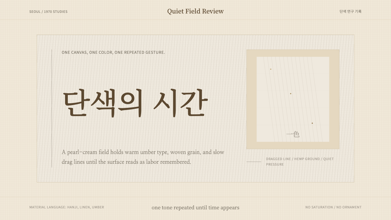 Korean Dansaekhwa MonochromeLabor becomes stillness. Umber serif type and drag lines on pearl cream.劳作化为静默。珍珠米底、褐色衬线和拖痕线条。
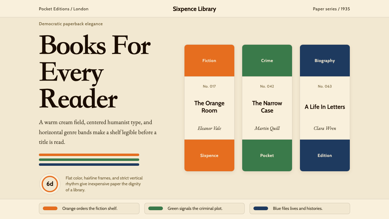 Penguin Books (1935)Paperback democracy. Cream stock, Cabin type, and orange-green-blue bands mak…平装书的民主美学:奶油纸、Cabin 字体与橙绿蓝横带让秩序成标识。
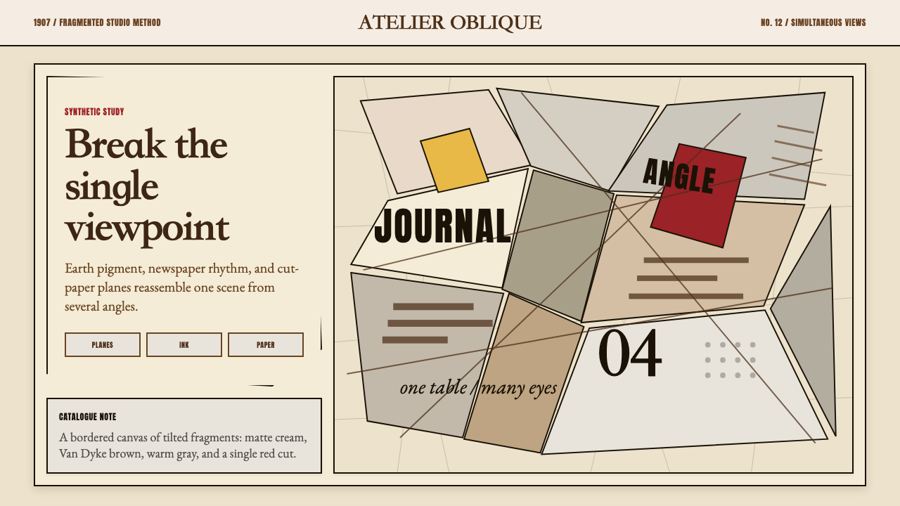 Picasso CubismSingle sight is shattered. Cream collage paper fractures brown-gray planes wi…单一视角被击碎:奶油拼贴纸上,褐灰棱面被一刀红色刺穿。
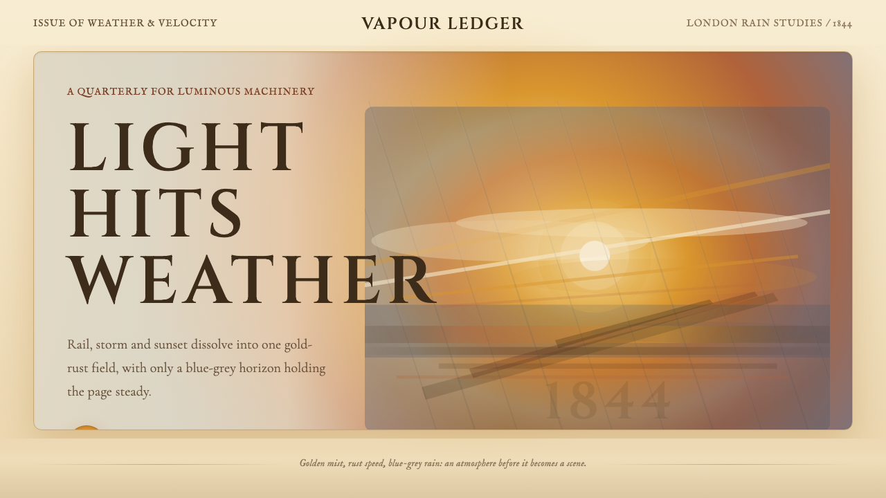 Turner — Rain, Steam and SpeedEdges dissolve into weather. Amber mist, rust smears and blue-grey horizon ca…边缘化入天气。琥珀雾、金锈涂痕与蓝灰地平线托住画面。
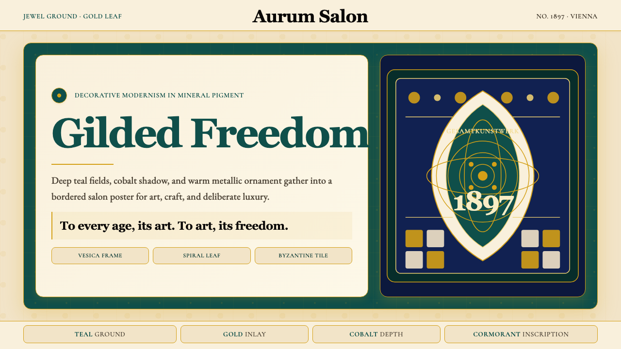 Wiener Secession (Klimt)Opulence made modern. Teal grounds, gold inlay, vesica frames and Cormorant d…奢华被现代化:深翠绿底、金箔嵌线、杏仁框与Cormorant标题。