What is Penguin Books (1935)?什么是 Penguin Books (1935)?
Three horizontal bands, a penguin, and sixpence changed what books looked like — and who got to read them.三道横带、一只企鹅,加上六便士的定价,改变了书的样子,也改变了谁能读书这件事。
Penguin Books (1935) in briefPenguin Books (1935) 速览
Penguin Books is a British publishing visual identity founded in 1935 whose cover system — horizontal color bands divided into three registers, restrained sans-serif typography centered on cream stock, and a small illustrated penguin emblem — became one of the most imitated and most enduring graphic standards in the history of print. The system is not merely attractive; it is a coded language where band color signals genre, type placement signals authority, and the cream ground signals quality at a modest price.企鹅图书是1935年创立于英国的出版视觉识别体系,其封面系统——三段水平色带、奶油底纸上居中排列的克制无衬线字体,以及一枚小小的企鹅图形——成为印刷史上被模仿最多、流传最久的平面标准之一。这套系统不仅仅令人赏心悦目,它本质上是一套编码语言:横带颜色传递类型信息,文字布局传递权威感,奶油底纸传递以平价换来的品质承诺。
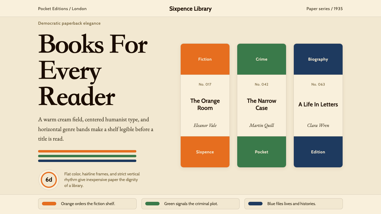
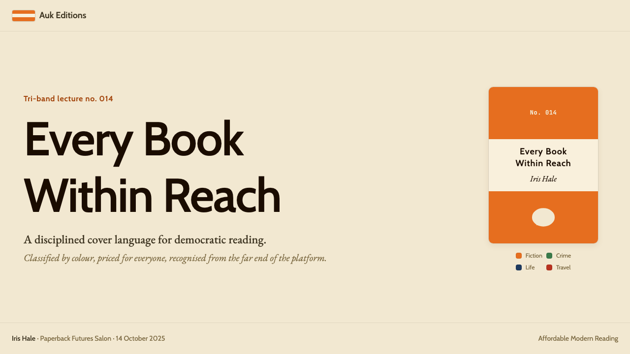
The identity works through an almost austere economy of means. The cover is divided horizontally into three zones: a top color band carrying the publisher name and imprint, a wide cream-colored central panel holding the title and author in centered letterforms, and a bottom band matching the top in color and weight. A thin ruled line separates each zone from the next. Within this framework, the only variable that changes from book to book is the color of the bands — everything else, the proportions, the typeface, the cream ground, the penguin mark, remains constant.这一视觉识别依靠几乎苛刻的经济性运作。封面水平分为三个区域:顶部色带承载出版社名称,宽阔的奶油色中央面板以居中字形呈现书名与作者名,底部色带在颜色与分量上与顶部呼应。每个区域之间以细线框分隔。在这个框架内,唯一因书而异的变量是横带颜色——其余一切,比例、字体、奶油底、企鹅标志,全部保持不变。
What makes the Penguin identity remarkable is its demonstration that strict typographic discipline and a minimal palette can produce infinite variety without visual chaos. A shelf of Penguin originals looks simultaneously unified and individual — each title distinguishable by color, every spine recognizable as part of the same family. It is an object lesson in how constraint, applied intelligently, generates identity rather than limiting it.企鹅视觉识别的非凡之处,在于它证明了严格的排版纪律与极简色板能在没有视觉混乱的前提下产生无穷变化。一排企鹅原版书看起来既统一又各有个性——每本书通过颜色得以区分,每一本书脊都能被辨认为同一家族的成员。这是一堂关于约束的课:智慧地运用约束,创造的是身份认同,而非局限。
See the Penguin Books (1935) design system查看 Penguin Books (1935) 完整设计系统
Where does Penguin Books (1935) come from?Penguin Books (1935) 从何而来?
Penguin Books was founded by Allen Lane in July 1935, initially as an imprint of The Bodley Head. Lane's founding insight was simple and, in hindsight, radical: quality literature should be available at the price of a packet of cigarettes. He priced each title at sixpence and sold them not just through bookshops but through Woolworths stores — chain variety shops that had never stocked books before. The first ten titles included works by Agatha Christie, Ernest Hemingway, and André Maurois. They sold several hundred thousand copies in the first year and established that a large, underserved market for affordable, well-designed reading matter existed.企鹅图书由艾伦·莱恩于1935年7月创立,起初作为博德利·黑德出版社的一个品牌运营。莱恩的创业洞见简单而在事后看来颇具革命性:优质文学作品应当以一包香烟的价格购得。他将每本书定价六便士,销售渠道不仅限于书店,还通过伍尔沃斯连锁杂货店出售——那是从未有人在那里卖书的地方。最初十种书目包括阿加莎·克里斯蒂、欧内斯特·海明威与安德烈·莫鲁瓦的作品。第一年就卖出了数十万册,证明了这个此前被忽视的、对平价优质读物有巨大需求的市场确实存在。
The original cover design was created by Edward Young, a twenty-one-year-old production assistant at The Bodley Head. Young conceived the three-band horizontal structure, chose the cream ground, drew the first penguin mascot (reportedly sketched from a visit to London Zoo), and established the color-coding convention: orange for general fiction, green for crime and mystery, dark blue for biography and memoirs, red for travel and adventure, cerise for essays and belles-lettres, yellow for miscellaneous. This genre-color grammar was immediately legible to buyers who could now identify the type of book they were picking up without reading the spine — a revolutionary aid to browsing in a Woolworths aisle.最初的封面设计由爱德华·杨创作,他当时是博德利·黑德出版社年仅二十一岁的编辑助理。杨构思了三段水平结构,选定了奶油底色,亲手画出了第一只企鹅吉祥物(据说是参观伦敦动物园后速写而来),并确立了颜色编码惯例:橙色代表通俗小说,绿色代表犯罪悬疑,深蓝代表传记与回忆录,红色代表旅行与冒险,玫瑰色代表随笔与美文,黄色代表杂类。这套类型-颜色语法立即对买书者形成了直观的可读性——他们不必细读书脊,光凭颜色便能判断正在拿的是哪类书,这对于在伍尔沃斯货架前浏览的顾客来说是革命性的帮助。
The second pivotal chapter in the Penguin design story came in 1947, when Allen Lane hired the Swiss typographer Jan Tschichold to impose systematic rigor on what had, over a decade of rapid growth, become an inconsistent visual standard. Tschichold spent two years at Penguin, writing his famous Penguin Composition Rules — a detailed typographic specification governing typeface selection, type area proportions, spacing norms, and punctuation conventions. His rules brought Swiss modernist discipline to bear on the entire catalog and produced a coherent typographic standard that remained authoritative for decades. Tschichold himself was ambivalent about the commercial context — he privately described some of the work as below his usual standards — but the resulting system was a landmark in applied typography.企鹅设计故事的第二个关键章节出现于1947年,艾伦·莱恩聘用瑞士排版师扬·奇肖尔德,对历经十年快速扩张后已趋于混乱的视觉标准施加系统性的严格规范。奇肖尔德在企鹅工作了两年,撰写了著名的《企鹅排版规则》——一份详尽的排版规格,涵盖字体选择、版心比例、间距规范与标点惯例。他的规则将瑞士现代主义的纪律引入整个书目,生成了一套数十年间持续发挥权威作用的连贯排版标准。奇肖尔德本人对这段商业合作有所保留——他私下认为部分成果低于自己通常的标准——但这套体系所达到的高度,仍是应用排版史上的里程碑。
A third significant revision arrived in 1961, when Romek Marber, a Polish-born British graphic designer, redesigned the crime series covers under art director Germano Facetti. Marber's grid introduced a more architecturally structured visual framework: a defined image area in the upper two-thirds of the cover, with the text zone firmly anchored in the lower third. This became known as the Marber Grid and was extended across multiple Penguin series. The Marber Grid preserved the horizontal band logic while creating space for imagery — photography, illustration, and abstract design — within a controlled compositional system. It represents the moment when Penguin's identity evolved from a purely typographic standard to one that could accommodate visual complexity without losing coherence.第三次重大改版发生于1961年,波兰裔英国平面设计师罗梅克·马尔伯在艺术总监日耳曼诺·法切蒂主导下重新设计了犯罪系列的封面。马尔伯的网格引入了更具建筑结构感的视觉框架:封面上三分之二为图像区域,文字区域牢固地锚定在下三分之一。这一框架后来被称为马尔伯网格,并被推广至多个企鹅系列。马尔伯网格在保留水平横带逻辑的同时,为图像——摄影、插图与抽象设计——在受控的构图体系中创造了空间。这标志着企鹅视觉识别从纯排印标准演进为能够在不失去连贯性的前提下容纳视觉复杂度的设计系统。
What defines the Penguin Books (1935) look?Penguin Books (1935) 的视觉特征是什么?
Color Band System色带系统
The defining structural element of the Penguin cover is its three-band horizontal division, where the top and bottom bands carry a genre-identifying color and the center panel remains cream. The color assignments — orange for general fiction, green for crime, deep blue for biography, red for travel — create a genre grammar legible from across a room. The bands are equal in depth, which distributes visual weight symmetrically and frames the central text zone as a calm neutral field within an energetic chromatic border.企鹅封面最核心的结构元素是三段水平色带:上下两条横带承载类型专属颜色,中间面板保持奶油色。颜色分配——橙色对应通俗小说,绿色对应犯罪悬疑,深蓝对应传记,红色对应旅行——构成了一套在房间另一端都能辨读的类型语法。各横带等高,使视觉重量对称分布,并将中央文字区域框定为富有活力色彩边框内的平静中性地带。
Cream Ground奶油底色
The cream-colored central panel is not merely a background — it is a deliberate quality signal. In the 1930s, cream stock was associated with good-quality printing; white was cheap, cream was refined. The choice to hold the cream constant across all genre variants makes it the unifying visual constant of the identity, the element that says 'Penguin' before the penguin emblem is even registered. Against the warm neutral, black type achieves excellent legibility, and the bold band colors at top and bottom read as vivid contrasts rather than competing saturations.奶油色中央面板不仅是背景——它是一个刻意经营的品质信号。在1930年代,奶油色纸张与优质印刷相关联;白色显廉价,奶油色显精良。在所有类型变体中始终保持奶油色,使其成为这一视觉识别的统一常量——在企鹅标志被注意到之前,它便已经在传递「这是企鹅」的信息。在这块暖中性色底面上,黑色文字达到极佳的可读性,顶底两端的醒目横带颜色呈现为鲜明对比,而非相互竞争的饱和色。
Centered Typography居中排版
The title and author name are set centered on the cream panel, a typographic choice that reads as formal and authoritative without being stiff. Centering aligns with the horizontal symmetry of the band structure and gives the cover a poster-like calm. The hierarchy is straightforward: the title holds the larger, more prominent position; the author name sits beneath it in a smaller but equally weighted setting. No decorative devices — rules, boxes, ornaments — interrupt the text zone. The letterforms carry the full communicative load.书名与作者名在奶油面板上居中排列,这一排版选择传递出正式与权威感,却不显僵硬。居中与横带结构的水平对称相互呼应,赋予封面一种海报般的平静。层级直截了当:书名占据更大、更显眼的位置,作者名以较小但同等份量的字号置于其下。文字区域内没有任何装饰元素——线框、方框、花饰——打断视线,字形自身承担全部传达功能。
Penguin Emblem企鹅标志
The penguin mascot, drawn in a loose illustrative style that conveys both dignity and a light wit, appears in the lower portion of the central panel or within the bottom band, depending on the series and era. The bird is always rendered simply — a few confident strokes rather than elaborate illustration — and reads as friendly without being frivolous. Its presence softens the system's formal typographic rigor: the reader understands that seriousness and accessibility are not opposites. Across nine decades, the penguin silhouette has remained broadly consistent, a mark of institutional continuity.企鹅吉祥物以一种兼具庄重与轻盈机智的随性插图风格绘制,根据系列和年代,出现在中央面板下方或底部横带内。这只鸟的描绘始终简洁——寥寥几笔肯定的线条,而非繁复的插图——亲切而不轻浮。它的存在柔化了整套系统正式排版纪律的刚性:读者由此明白,严肃与亲和并非对立的。九十年来,企鹅轮廓始终大体一致,是机构连续性的一个标志。
Rule Lines and Framing线框与分隔
Thin horizontal rules separate the color bands from the cream center panel, providing a crisp edge that prevents the colors from bleeding visually into the neutral ground. These rules are structural rather than decorative — they define zones and hold the composition tight. Their consistent weight and placement across all covers is part of what makes the system feel rigorous rather than casual. When rule lines were occasionally varied or eliminated in later editions, the covers often lost the precise, architectural feel that made the original system distinctive.细水平线将色带与奶油中央面板分隔,提供一条清晰的边界,防止颜色视觉上渗入中性底面。这些线条是结构性的,而非装饰性的——它们划定区域,将构图收紧。在所有封面中保持一致的线条粗细与位置,是这套系统呈现出严谨而非随性感觉的原因之一。当后期版本偶尔改变或取消线框时,封面往往失去了令原始系统与众不同的那种精确而具建筑感的气质。
Typographic Restraint排版克制
From Jan Tschichold's 1947 rules onward, the Penguin typographic standard prescribed a humanist sans-serif letterform — open, legible, and warm without being decorative — set at specific size relationships that established clear hierarchy without resorting to bold weights or italic emphasis beyond what was functionally necessary. The discipline prohibited mixing typefaces for stylistic effect, setting type in unusual colors within the neutral panel, or using decorative letterforms of any kind. Legibility in service of the text, not the designer's expression, was the governing principle.自扬·奇肖尔德1947年制定规则以来,企鹅排版标准规定使用人文主义无衬线字形——开放、易读、温润而不流于装饰——并以特定的字号比例确立清晰的层级,不依赖粗体字重或功能性必要范围之外的斜体强调。这套规范禁止为风格效果混用字体,禁止在中性面板内以非常规颜色排字,禁止使用任何形式的装饰性字形。为文本服务的易读性,而非设计师的自我表达,是最高原则。
Systematic Variation系统性变化
Perhaps the most sophisticated aspect of the Penguin system is the way it enables variety within strict constraint. The band color changes by genre; the title changes with each book; the period of publication is sometimes signaled by subtle shifts in the penguin drawing or the typeface generation. Yet the overall grammar remains constant. A reader encountering a Penguin title from 1938 and one from 1962 on the same table instantly recognizes both as Penguin. This is the achievement of a system designed with such confidence in its underlying logic that it can absorb variation without losing coherence.企鹅系统最精妙的地方,也许在于它在严格约束内实现变化的方式。横带颜色随类型改变,书名随每本书改变,出版年代有时通过企鹅插图或字体世代的细微变化得以传递。然而整体语法保持不变。一个读者将1938年版与1962年版企鹅书并排放在桌上,会立即认出两者都是企鹅。这是一套系统对其底层逻辑怀有如此充分的信心,以至于能够吸纳变化而不失去连贯性的成就。
See the Penguin Books (1935) design system查看 Penguin Books (1935) 完整设计系统
Who shaped Penguin Books (1935)?谁塑造了 Penguin Books (1935)?
Allen Lane founded Penguin in 1935 after being unable to find affordable reading matter at Exeter station and deciding to act on that frustration rather than merely note it. His commercial instinct was to treat the paperback not as a cheap object but as a democratized premium — the same content as the hardback at a fraction of the price, with design quality to match. Lane oversaw the expansion of the color-coding system, hired Jan Tschichold and later Germano Facetti, and defended the design identity of the list against commercial pressures throughout his tenure as publisher until his death in 1970. He received a knighthood in 1952.艾伦·莱恩1935年创立企鹅图书,起因是在埃克塞特车站买不到平价读物,他决定将这种沮丧转化为行动。他的商业直觉是:将平装书视为民主化的精品——与精装书内容相同,价格却只有零头,设计品质毫不逊色。莱恩主持了颜色编码系统的扩展,先后聘用扬·奇肖尔德与日耳曼诺·法切蒂,在担任出版人期间一直抵御商业压力,捍卫书目的设计完整性,直至1970年辞世。他于1952年获封爵士。
Edward Young was a production assistant at The Bodley Head when he designed the original Penguin cover format in 1935 at the age of twenty-one. The three-band horizontal structure, the cream ground, the color-genre coding system, and the first penguin illustration were all his contributions. Young subsequently joined the Royal Navy and later returned to publishing, but it is the cover format he sketched in 1935 — reportedly on the back of an envelope — that represents his lasting contribution to graphic design. Few designers have had a more consequential first project.爱德华·杨1935年时年仅二十一岁,是博德利·黑德出版社的一名编辑助理,正是他设计了企鹅最初的封面格式。三段水平结构、奶油底色、颜色-类型编码系统,以及第一只企鹅插图,都出自他手。杨后来加入皇家海军,此后回到出版业,但让他在平面设计史上留名的,是他1935年——据说在一个信封背面——草草勾画的那个封面格式。很少有设计师的第一个项目会产生如此深远的影响。
Jan Tschichold was one of the twentieth century's pre-eminent typographers, known for his early advocacy of asymmetric modernist layout in the 1928 manifesto Die neue Typographie and his subsequent return to classical centered composition — a reversal he justified on philosophical grounds. Allen Lane hired him in 1947 to systematize Penguin's typography. In two years, Tschichold revised hundreds of books, wrote the Penguin Composition Rules, standardized typeface choices, corrected line spacing, and established the proportional norms that governed the series for decades. His Penguin period demonstrates that the most effective design standards are often written, not just drawn.扬·奇肖尔德是二十世纪最杰出的排版师之一,以其1928年宣言《新字体排印》中对非对称现代主义版面的早期倡导而知名,此后他又回归古典居中构图,并从哲学层面为这一转变作出辩护。艾伦·莱恩1947年聘请他系统化企鹅的排版规范。在两年内,奇肖尔德修订了数百本书,撰写了《企鹅排版规则》,规范了字体选择,纠正了行距,确立了数十年间制约这一系列的比例规范。他在企鹅的工作时期证明了一点:最有效的设计标准往往是被写下来的,而不仅仅是被画出来的。
Romek Marber was a Polish-born graphic designer who worked in Britain from the 1950s. In 1961, under art director Germano Facetti, he redesigned the Penguin Crime covers and in doing so created the Marber Grid — a compositional framework dividing the cover into a large image field in the upper two-thirds and a tightly controlled text zone in the lower third. The grid was subsequently adopted across other Penguin series and brought the possibility of photographic and illustrative imagery into the cover system without sacrificing typographic order. Marber's solution demonstrated that a strong structural system could accommodate visual ambition as well as typographic purity.罗梅克·马尔伯是波兰裔英国平面设计师,自1950年代起在英国工作。1961年,在艺术总监日耳曼诺·法切蒂主导下,他重新设计了企鹅犯罪系列封面,由此创造了马尔伯网格——一套将封面划分为上三分之二大图像区域与下三分之一严格控制文字区域的构图框架。这一网格随后被推广至其他企鹅系列,在不牺牲排版秩序的前提下,将摄影与插图图像的可能性引入封面系统。马尔伯的方案证明了一套强大的结构体系既能容纳视觉野心,也能保持排版纯粹性。
How do you use Penguin Books (1935) today?今天怎么用 Penguin Books (1935)?
The Penguin Books visual language is one of the most directly transferable historical identities in contemporary design, precisely because its underlying logic — color codes genre, type codes authority, neutral ground codes quality — is a structural system rather than a decorative one. Applying it well means understanding what each element is doing and replicating the function, not just the appearance.企鹅图书的视觉语言是当代设计中可移植性最强的历史视觉识别之一,恰恰因为其底层逻辑——颜色编码类型,字体编码权威,中性底面编码品质——是一套结构性体系,而非装饰性体系。恰当地应用它,意味着理解每个元素在做什么,并复制其功能,而不仅仅是外观。
For presentation slides, the Penguin approach works particularly well on covers and section dividers. A cover built on Penguin logic uses the three-band horizontal structure: a top band in a bold, solid color carries the series or company name; a wide cream or off-white central field holds the presentation title and subtitle in centered, hierarchically scaled type; a bottom band in the matching color anchors the layout and carries metadata such as date or speaker name. Content slides can adopt a quieter version of the same logic — a color bar along the top edge serving as a section indicator, cream or near-white body, black type — creating a visual family across the deck without overwhelming each content page with color.对于演示文稿,企鹅方法在封面页与章节分隔页上尤为出色。以企鹅逻辑构建的封面采用三段水平结构:顶部色带以醒目的实色承载系列名或公司名;宽阔的奶油或近白色中央面板以居中、有层次比例的字体呈现演示标题与副标题;底部色带在颜色上与顶部呼应,锚定版面并承载日期或演讲者姓名等元数据。内容页可以采用同一逻辑的更静默版本——顶部边缘一道色条作为章节指示,奶油或近白色页面主体,黑色文字——在整套演示文稿中建立视觉家族感,而不会让每一页内容页都被色彩淹没。
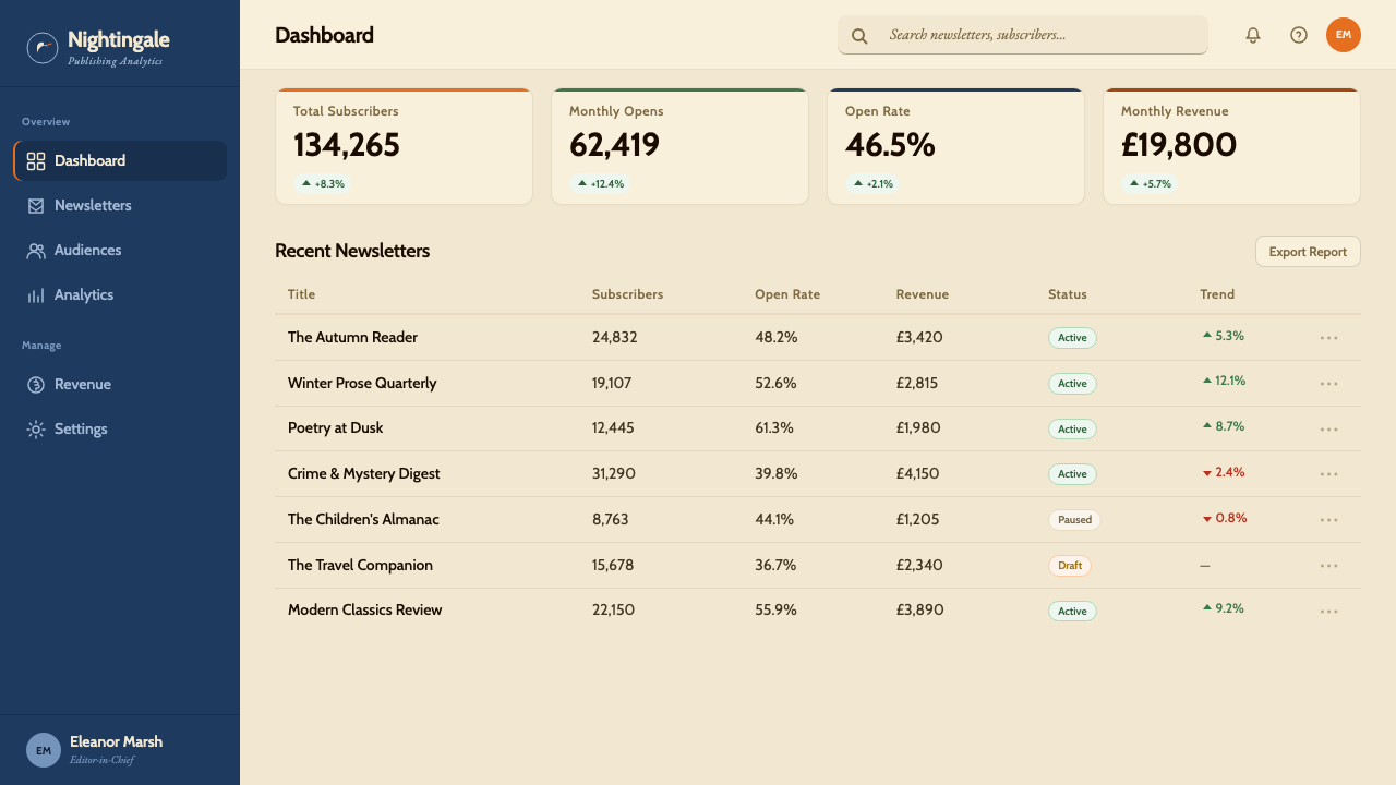
For web interfaces, the Penguin idiom is well suited to editorial platforms, publishing tools, newsletter designs, and any interface where the primary product is text and where institutional trust is a key value. The horizontal band as a navigation or header device works exceptionally well: a solid color header band containing only wordmark and navigation links, with the page body in cream or near-white. Pricing and feature-comparison pages benefit from the color-coding logic — assigning a different band color to each tier creates immediate visual differentiation without requiring complex iconography. Dashboard interfaces can use the color bands as section headers, with white card bodies below.对于网页界面,企鹅风格尤其适用于编辑平台、出版工具、新闻通讯设计,以及任何以文字为核心产品、以机构信任为关键价值的界面。水平横带作为导航或页头元素效果极佳:一道实色页头带,仅包含文字标志与导航链接,页面主体为奶油色或近白色。定价与功能对比页面受益于颜色编码逻辑——为每个等级分配不同的横带颜色,无需复杂图标即可实现即时视觉区分。仪表板界面可以将色带用作章节标题,下方为白色卡片主体。
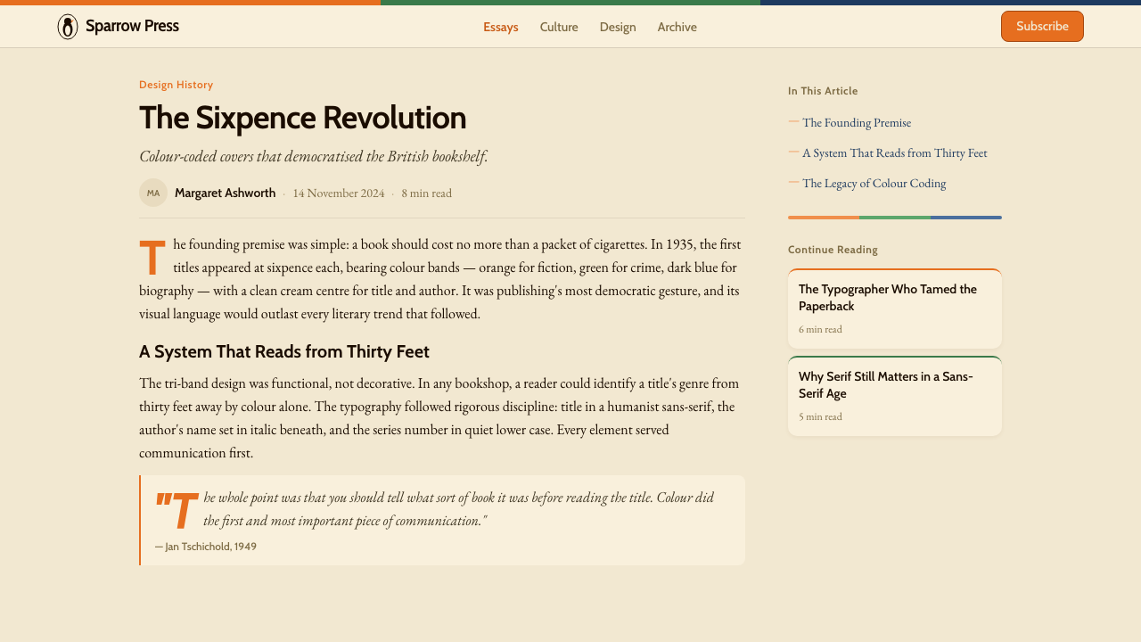
For editorial and marketing material, Penguin logic supports a wide range of output: book cover pastiches, event posters, newsletter templates, product packaging, and social media cards all translate naturally. The key is maintaining the horizontal register structure — three zones, proportionally balanced, with the color in the outer bands and the content in the neutral center. Marketing copy works well in this format because the cream center field gives text strong legibility and the colored bands function as bold visual bookends. The system is also highly effective for series branding, where multiple products in a family each take a different band color while sharing all other visual constants.对于编辑与营销物料,企鹅逻辑支持广泛的输出类型:仿企鹅书封、活动海报、新闻通讯模板、产品包装与社交媒体卡片均可自然转化。关键在于保持水平寄存结构——三个区域,比例均衡,颜色在外侧横带,内容在中性中央区域。营销文案在这种格式中效果很好,因为奶油中央面板赋予文字强劲的可读性,有色横带起到醒目的视觉书挡作用。这套系统对系列品牌塑造也极为有效——一个家族中的多个产品各取不同横带颜色,同时共享所有其他视觉常量。
A common mistake when applying this style is treating the color bands as decorative trim rather than as semantic identifiers. In the original Penguin system, each color meant something specific; using the bands purely for visual variety without assigning each a consistent meaning destroys the system's legibility advantage. Similarly, introducing gradients, soft shadows, or rounded geometry into what is fundamentally a flat, ruled, rectangular system produces a hybrid that reads as neither Penguin nor contemporary — it loses the historical authority without gaining modern lightness. If you are going to work within the Penguin idiom, commit to the hardness of its edges and the semantic weight of its colors.应用这种风格时最常见的错误,是将色带视为装饰性装饰而非语义标识符。在原始企鹅系统中,每种颜色都具有特定含义;仅为视觉多样性而使用横带,而不赋予每种颜色一致的含义,将摧毁这套系统的可读性优势。同样,在这个本质上平面、有线框、矩形的系统中引入渐变、柔和阴影或圆角几何,会产生一种既非企鹅也非当代风格的混合物——它失去了历史权威感,却没有获得现代的轻盈感。如果你要在企鹅风格中工作,就请坚守其边缘的硬度与颜色的语义重量。
See the Penguin Books (1935) design system查看 Penguin Books (1935) 完整设计系统
Penguin Books (1935) — FAQPenguin Books (1935) · 常见问题
Do I need to use all three bands, or can I adapt the structure?必须使用三段横带吗,还是可以对结构进行改编?
The three-band structure is the core grammar of the system, but it can be simplified to two bands — a single color band at top or bottom with a large neutral field — without losing the essential logic. What matters is the horizontal register principle: color signals category, neutral ground holds content, ruled lines mark transitions. Collapsing to one band works well for simpler formats like social cards or email headers. What does not work is treating the bands as merely decorative stripes and varying their count, weight, or proportions arbitrarily — once they lose semantic consistency, they become visual noise.三段横带结构是这套系统的核心语法,但可以简化为两段——顶部或底部的单一色带加上大面积中性区域——而不失去其本质逻辑。重要的是水平寄存原则:颜色传递类别信息,中性底面承载内容,线框标记转换。在社交媒体卡片或电子邮件页头等更简单的格式中,收缩为单一横带效果很好。不奏效的是将横带视为纯粹的装饰性条纹,随意改变其数量、粗细或比例——一旦失去语义一致性,它们就成了视觉噪音。
How does this style relate to Swiss International Style?这种风格与瑞士国际主义风格有何关系?
They share a common ancestry in the European modernist typography of the 1920s and 1930s, and Jan Tschichold — who brought Swiss typographic rigor to Penguin in 1947 — is a direct link between them. But they are distinct. Penguin is fundamentally a cover-design system built around horizontal register, color-coded genre, and centered type — it is warm, institutional, and explicitly British. Swiss Style is grid-driven, left-aligned, and aspires to neutral internationalism. Penguin uses color symbolically and sparingly within a defined genre vocabulary; Swiss Style uses a broader tonal range and incorporates photography as a primary element. Confusing them leads to layouts that are neither.两者共同根植于1920至30年代的欧洲现代主义排版,扬·奇肖尔德——1947年将瑞士排版严格性带入企鹅的那个人——是它们之间的直接纽带。但它们是不同的。企鹅本质上是一套围绕水平寄存、颜色编码类型与居中排版构建的封面设计系统——温润、有机构感,且明确带有英国气质。瑞士风格以网格为驱动,左对齐,追求中立的国际主义。企鹅在既定类型词汇内象征性而节制地使用颜色;瑞士风格使用更宽广的色调范围,并将摄影作为主要元素。混淆两者会导致版面既非其一。
Can the Penguin style work for digital dark-mode interfaces?企鹅风格能用于数字暗色模式界面吗?
A dark-mode inversion is possible but requires care. The original system is fundamentally a light-ground identity — the cream panel is doing significant work in signaling warmth and quality. Inverting to a dark background loses that quality signal and can make the system feel industrial rather than literary. If dark mode is required, the most coherent approach is to invert the cream to a very dark warm neutral — a near-black with warmth rather than a cool charcoal — and to retain the color bands at their original saturation. Avoid inverting the band colors to pastels or muted tones, as this undermines the boldness that gives the system its immediate recognizability.暗色反转是可行的,但需要谨慎处理。原始系统本质上是浅色底面识别——奶油面板在传递温润与品质感方面承担了重要工作。反转为深色背景会失去这种品质信号,可能使系统感觉工业化而非文学化。若确需暗色模式,最连贯的处理方式是将奶油色反转为极深的暖中性色——接近黑色但带有暖意,而非冷调的深灰——并保持横带颜色在原有饱和度。避免将横带颜色反转为粉彩或柔和色调,因为这会削弱赋予系统即时辨识度的那种醒目感。
Is this style appropriate for brands outside publishing and education?这种风格适用于出版与教育之外的品牌吗?
Yes, with judgment. The Penguin idiom carries strong associations with institutional trust, literary seriousness, and accessible quality — these transfer well to legal services, financial products, think tanks, professional associations, and premium consumer goods where heritage and trustworthiness are desired values. It transfers less well to contexts where warmth, playfulness, or cutting-edge modernity are the primary brand values, because the system reads as established and correct rather than dynamic and emergent. The risk of using it outside its natural territory is that the institutional associations become deadweight — the design reads as borrowed authority rather than authentic positioning.可以,但需要判断。企鹅风格带有强烈的机构信任、文学严肃性与平价品质的联想——这些联想能很好地迁移至法律服务、金融产品、智库、行业协会,以及那些以传承感与可信赖性为期望价值的优质消费品。它在温暖感、玩乐性或前沿现代感是首要品牌价值的场景中则迁移效果较差,因为这套系统传递的是「成熟且端正」而非「动态且新兴」的气质。在其自然领域之外使用它的风险在于:机构联想可能变成负担——设计会被解读为借用的权威,而非真实的定位。
How much does the typeface choice matter when working in this style?在这种风格中字体选择的重要性有多大?
It matters considerably, though not in the way people often assume. The key quality to match is not a specific typeface name but a typographic character: humanist proportions, open apertures, even stroke weight without mechanical rigidity, and comfortable legibility at book-text sizes. Geometric sans-serifs with very tight apertures or very uniform stroke weights read as wrong in this context — they feel too cold, too Swiss, too contemporary. Heavy display fonts with strong personality undermine the neutrality that lets the color system carry meaning. A secondary serif for body text, used judiciously, is historically appropriate and adds a layer of the literary warmth that the original covers projected.相当重要,但不是人们通常以为的那种方式。需要匹配的关键品质不是特定的字体名称,而是一种排版气质:人文主义比例,开放的字腔,笔画粗细均匀而不显机械刻板,在书页正文字号下具有舒适的可读性。字腔极紧或笔画粗细极度均一的几何无衬线字体在这个语境中感觉不对——太冷,太瑞士,太当代。个性过强的大号展示字体会破坏让颜色系统得以承载意义的那种中立性。适度使用衬线字体作为正文,在历史上是恰当的,并为整体增添一层原版封面所散发的文学温润感。
Related design styles相关设计风格
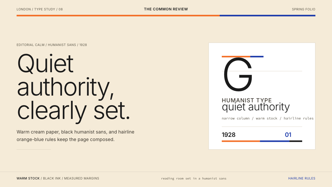 Gill Sans (BBC, 1928)Quiet authority, clearly set. Warm cream, black humanist sans, and hairline o…安静而权威。奶油底、黑色人文无衬线与橙蓝细线。
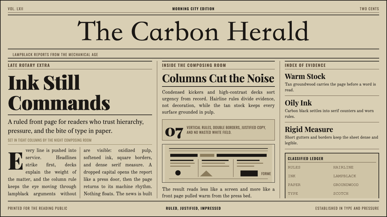 Broadsheet LetterpressAuthority in ink. Lampblack serif decks lock into tan paper with strict ruled…油墨里的权威:灯黑衬线与褐黄纸面,被严密栏线锁住。
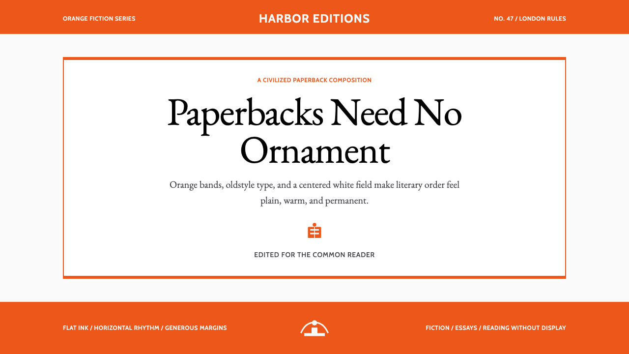 Penguin Classics OrangePaperback authority. Orange tri-bands, serif title panel, and flat ink enforc…平装书的权威感:橙色三段、衬线标题与平面油墨建立克制秩序。
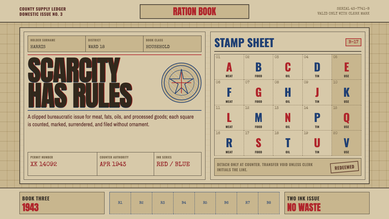 Wartime Ration CouponScarcity made visible. Buff card, red-blue overprint, and perforated grids do…稀缺被看见:浅黄卡纸、红蓝套印与齿孔格构成秩序。
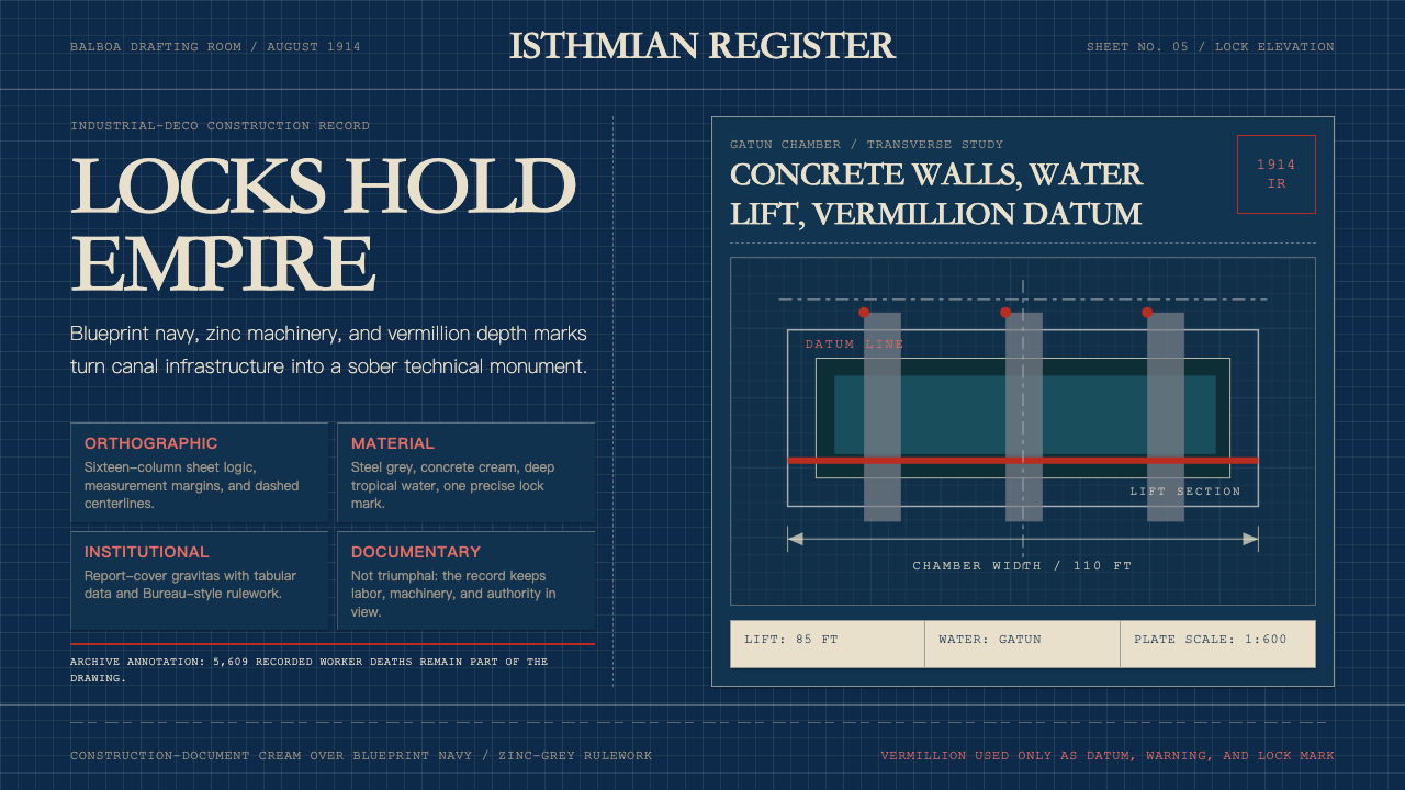 Panama Canal Deco 1914Blueprint authority. Navy grids, zinc rulework, and vermillion datum lines ma…蓝图式权威:海军蓝网格、锌灰线框与朱红基准线,冷峻精密。
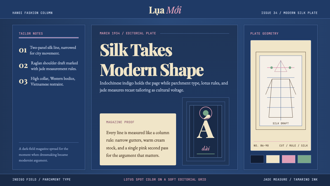 Vietnamese Áo Dài 1934 (Cát Tường)Indigo editorial poise. Parchment serif columns and lotus-pink rules frame th…靛蓝编辑气质。羊皮纸衬线栏与莲粉细线,框住1934服饰转折。