What is Picasso Cubism?什么是 Picasso Cubism?
Picasso and Braque shattered the single viewpoint that had ruled Western painting since the Renaissance — and in the wreckage built a new visual language from fractured planes, earth pigments, and collaged scraps of the everyday world.毕加索与布拉克击碎了自文艺复兴以来统治西方绘画的单一视角——并在碎片中,以断裂棱面、大地色素与日常生活的拼贴碎料,建起一套全新的视觉语言。
Picasso Cubism in briefPicasso Cubism 速览
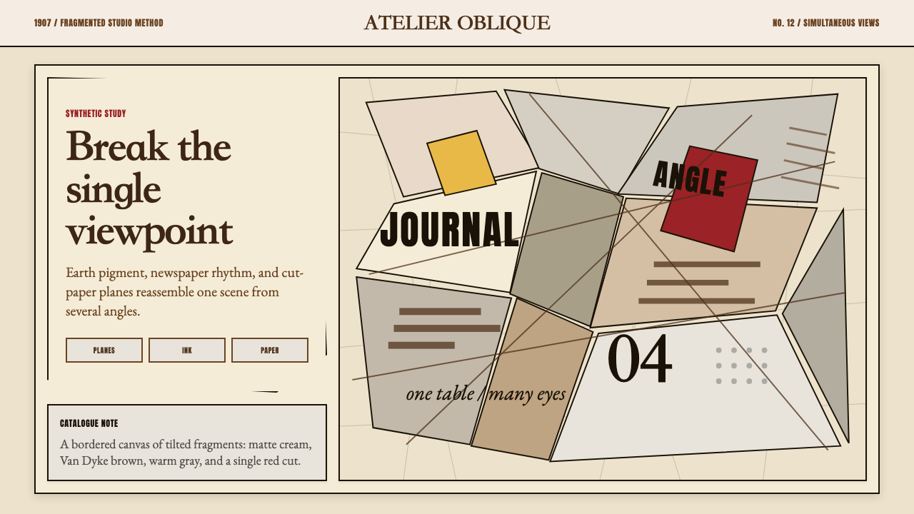
Cubism is the early-twentieth-century movement, pioneered in Paris between 1907 and 1925, that dismantled the Renaissance convention of painting a scene from a single, fixed viewpoint. Instead of depicting an object as it appears from one position at one moment, Cubist work shows multiple facets simultaneously — the front and side of a guitar neck, the profile and full-face of a portrait subject, the top and elevation of a café table — compressed onto a single flat picture plane. The result is not distortion for its own sake but a more complete account of an object's total form.立体主义是二十世纪初兴起于巴黎(约1907至1925年间)的艺术运动,彻底瓦解了文艺复兴以来以单一固定视角描绘场景的绘画惯例。立体主义作品不再呈现物体在某一时刻从某一位置呈现的外观,而是同时展示多个侧面——吉他颈部的正面与侧面、肖像主体的侧脸与正脸、咖啡桌的俯视与立视——将它们压缩于单一的平面画布之上。结果不是为了扭曲而扭曲,而是对一个物体完整形态更全面的呈现。
The movement divides into two distinct phases. Analytic Cubism, roughly 1908 to 1912, restricted its palette to browns, grays, ochres, and blacks, using near-monochrome to eliminate color as a distraction and focus attention on the dissection of form. Faceted planes overlap and interlock across the picture surface like a shattered mirror reassembled at conflicting angles. Synthetic Cubism, from around 1912, reintroduced color and introduced collage — papier collé — in which pieces of newspaper, wallpaper, wood-grain paper, and printed ephemera were pasted directly onto the canvas alongside painted passages. The found material brought typography, texture, and a fragment of the real world into the picture without pretending to depict them naturalistically.这场运动分为两个截然不同的阶段。分析立体主义(约1908至1912年)将色板限制在棕色、灰色、赭石色与黑色之间,以近乎单色的方式消除色彩干扰,将注意力集中于形态的解剖。棱面在画面上相互叠压、交织,如同一面镜子碎裂后以相互矛盾的角度重新拼合。综合立体主义(约自1912年起)重新引入色彩,并发明了拼贴手法——纸粘贴(papier collé)——将报纸、壁纸、木纹纸与印刷品碎片直接粘贴于画布,与绘画笔触并置。这些现成材料将文字、肌理与真实世界的碎片引入画面,却并不假装以自然主义的方式再现它们。
As a design system, Cubism translates these pictorial strategies into a visual language built on prismatic polygon fragmentation, earth-toned and muted palettes offset by sharp accent notes, hand-cut paper edge qualities, and mixed typographic registers that quote the movement's café-table collage origins. It is a style suited to work that wants to communicate complexity, layered meaning, or intellectual depth without abandoning visual order.作为一套设计系统,立体主义将这些绘画策略转化为由棱镜式多边形碎片化、大地色调与静谧色板、手工剪裁纸边肌理,以及混合排版风格所构筑的视觉语言——后者直接引用了这场运动的咖啡桌拼贴起源。这是一种适合传达复杂性、多层含义或智识深度,同时又不放弃视觉秩序的风格。
See the Picasso Cubism design system查看 Picasso Cubism 完整设计系统
Where does Picasso Cubism come from?Picasso Cubism 从何而来?
The story of Cubism begins in the winter of 1906 to 1907, in the cramped studios of the Bateau-Lavoir — a ramshackle wooden building on the Butte Montmartre in Paris whose nickname translated loosely as 'the laundry boat,' a reference to its swaying floors and shared water tap. It was here that Pablo Picasso, a twenty-five-year-old from Málaga working through the aftermath of his Blue and Rose Periods, began a painting that would take months to complete and would eventually be called Les Demoiselles d'Avignon. The five nude figures in that canvas do not share a coherent pictorial space. Their bodies are fragmented, their faces — particularly those on the right, reworked after Picasso's encounter with Iberian and African sculpture at the Trocadéro museum — look simultaneously forward and sideways, their features disassembled and recombined. When Picasso finally showed the unfinished canvas to his circle, the reaction was mostly bewilderment. Georges Braque, then painting in a Fauve manner, reportedly said it felt like someone was making him eat rope and spit fire. Within a year, the two were in daily conversation.立体主义的故事始于1906至1907年的冬天,地点是巴黎蒙马特山丘上那栋简陋木结构建筑——洗濯船(Bateau-Lavoir)——的狭窄工作室。这个绰号大致可译为「洗衣驳船」,源自它摇晃的地板与共用水龙头。正是在这里,二十五岁的西班牙青年、正从蓝色时期与玫瑰时期中走出的毕加索,开始了一幅耗时数月的画作,最终命名为《亚威农少女》。画中五位裸体人物并不共享一个连贯的画面空间:身体支离破碎,面孔——尤其是右侧两位,在毕加索参观特罗卡德罗博物馆并接触伊比利亚与非洲雕塑后重新绘制——同时望向正面与侧面,五官被拆解后重新组合。毕加索将未完成的画布展示给圈中友人时,迎来的大多是困惑。当时正以野兽派手法作画的乔治·布拉克据说表示,这感觉像是有人要他吃绳子、吐火焰。不到一年,两人已开始每日深谈。
The partnership between Picasso and Braque between 1908 and 1914 was among the most intensive collaborative relationships in the history of modern art. The two men worked in close proximity, exchanged canvases, and for a period deliberately avoided signing the fronts of their paintings so that their individual contributions could not be easily distinguished — the work was that intertwined. The breakthrough came through a shared debt to Paul Cézanne, whose posthumous retrospective at the 1907 Salon d'Automne electrified both artists. Cézanne had written that nature could be treated in terms of the cylinder, the sphere, and the cone, and that painters should study from multiple viewpoints simultaneously. Picasso and Braque took this directive further than Cézanne had imagined, systematically dismantling the conventions of Renaissance perspective.1908至1914年间,毕加索与布拉克的合作关系是现代艺术史上最紧密的创作伙伴关系之一。两人近距离并肩工作,相互交换画布,有一段时期甚至刻意不在画作正面签名——作品之间的交织已密不可分。这场突破来自两人共同对保罗·塞尚的债务:塞尚的遗作回顾展在1907年秋季沙龙震动了两位艺术家。塞尚曾写道,自然界可以用圆柱、球体与圆锥来处理,画家应同时从多个视角研究对象。毕加索与布拉克将这一指引推进到塞尚未曾设想的程度,系统性地拆解了文艺复兴透视法的全部惯例。
The dealer Daniel-Henry Kahnweiler played a foundational role in giving Cubism an economic and critical infrastructure. A young German art dealer who had opened his gallery on the Rue Vignon in 1907, Kahnweiler signed exclusive contracts with Picasso and Braque and later with Juan Gris, providing them with a steady monthly stipend in exchange for first rights to their production. This arrangement freed the artists from the pressures of the Salon system and from the need to produce immediately saleable work. Kahnweiler also wrote extensively about Cubism — his 1920 book on the movement remained a foundational text — and circulated the work to collectors across Europe and North America, turning a studio experiment into an international movement.画商丹尼尔-亨利·卡恩韦勒在为立体主义建立经济与批评基础设施方面发挥了关键作用。这位年轻的德国画商于1907年在维尼翁街开设画廊,与毕加索、布拉克,以及后来的胡安·格里斯签订独家合同,以每月固定津贴换取作品优先购买权。这一安排将艺术家从沙龙制度的压力和必须即时出售作品的需要中解放出来。卡恩韦勒还大量撰写关于立体主义的评论文章——他1920年出版的相关著作至今仍是奠基性文献——并将作品流通至欧洲与北美的收藏家手中,将一个工作室实验转化为一场国际运动。
Juan Gris joined the movement around 1911 and brought to it a more systematic, almost architectural approach to the decomposition and recomposition of form. Where Picasso and Braque's Analytic canvases could feel turbulent and improvisatory, Gris worked from a clearly structured compositional plan, laying in grids and tonal sequences before introducing the subject. His Synthetic work in particular — with its crisper color, more legible structure, and sophisticated use of collaged materials — has proved especially influential on subsequent design systems that draw on Cubism. The movement faded as a cohesive force after the First World War, but its core insight — that a representation could carry multiple simultaneous viewpoints — had permanently altered the terms on which visual communication operated.胡安·格里斯约于1911年加入这场运动,为其带来了一种更系统、几乎具有建筑感的形态解构与重组方式。若说毕加索与布拉克的分析立体主义画面有时感觉湍急而即兴,格里斯则从明确的构图方案出发,在引入主题之前先铺设网格与色调序列。他的综合立体主义作品尤为如此——色彩更为清晰,结构更易读,拼贴材料的运用更加精妙——这对后来援引立体主义的设计系统产生了格外深远的影响。这场运动作为一股凝聚力量,在第一次世界大战后逐渐消散,但其核心洞见——一幅再现可以同时承载多个视角——已永久改变了视觉传播运作的基础条件。
What defines the Picasso Cubism look?Picasso Cubism 的视觉特征是什么?
Palette色调
Analytic Cubism established a near-monochrome discipline: browns, warm grays, ochres, raw umbers, and blacks, drawn from the earth-pigment tradition of Old Master underdrawing. The range is narrow but not dull — slight warm-cool shifts within the brown-gray family create the tonal modeling that suggests planar rotation. Synthetic Cubism relaxed this restriction, introducing dusty muted greens, terracottas, sandy creams, and occasional sharp notes of red or blue that read as accents against the earthy ground. In contemporary design applications, the palette feels neither historical nor digital — it occupies the space of aged paper, natural mineral pigment, and café-table still life.分析立体主义确立了一种近乎单色的纪律:棕色、暖灰、赭石、生褐与黑色,均来自古典大师底稿的大地矿物颜料传统。范围虽窄却绝不沉闷——棕灰色系内部微妙的冷暖偏移制造出暗示平面旋转的色调塑形。综合立体主义放宽了这一限制,引入了粉灰绿、赤陶色、沙质奶油色,以及偶尔出现的鲜红或蓝色强调音——在大地色底面上如同跳音般跃出。在当代设计应用中,这套色调既不显历史感也不显数字感,它占据了陈旧纸张、天然矿物颜料与咖啡桌静物的空间。
Prismatic Fragmentation棱镜式碎片化
The defining formal move of Cubism is the decomposition of a continuous surface — a face, a bottle, a musical instrument — into a mosaic of angular, overlapping planes. These planes do not follow the logic of a single light source; each facet may be lit from a different implied direction, suggesting that the object is being perceived from multiple positions simultaneously. In design work, this translates to geometric polygon grids that read as broken glass or fractured crystal: angular shapes that overlap and share edges, creating interlocking figure-ground ambiguity without becoming chaotic.立体主义最核心的形式动作,是将一个连续表面——一张脸、一只瓶子、一件乐器——分解为一组角形、相互叠压的平面拼图。这些平面并不遵循单一光源的逻辑;每个棱面可能暗示来自不同方向的光,意味着该物体正在被从多个位置同时感知。在设计实践中,这转化为多边形网格,读来如破碎玻璃或断裂水晶:角形形状相互叠压、共享边缘,制造出相互交织的图-底模糊感,却不至于混乱失序。
Collage and Material Texture拼贴与材料质感
The introduction of papier collé in 1912 brought the texture of torn and cut paper edges, printed newsprint type, wood-grain patterns, and wallpaper fragments directly into the picture. These materials carry their own visual weight — the irregular torn edge, the uneven ink absorption of newsprint, the directional grain of wood — and they coexist with painted passages rather than blending into them. In design, this quality is evoked through layered surfaces that show their seams: visible crop edges, slightly misaligned text blocks, torn-paper graphic elements, and typographic matter that reads as if sourced from different registers of printed culture.1912年引入的纸粘贴手法,将撕裂与剪切纸边的质感、印刷报纸字体、木纹图案与壁纸碎片直接带入画面。这些材料携带着自身的视觉重量——不规则的撕边、报纸墨水吸收的不均匀、木纹的方向性——它们与绘画笔触并存,而非融合其中。在设计中,这种质感通过显露接缝的分层表面来唤起:可见的裁切边缘、略微错位的文字块、撕纸式图形元素,以及读来仿佛取材自印刷文化不同层次的排版材料。
Simultaneous Viewpoints多视角同时性
The conceptual engine of Cubism is the rejection of monocular perspective in favor of showing multiple viewpoints on the same surface at the same time. A Cubist portrait may show one eye seen straight-on and the other in profile; a still-life bottle may show its label, its opening, and its base in the same composition. This principle translates in design to layouts that deliberately layer information from different scales or perspectives — a diagram and its caption occupying the same spatial zone, a data visualization that embeds its own legend within the chart body, or overlapping text and image that read as separate layers without creating illegibility.立体主义的概念引擎,是拒绝单眼透视,转而在同一画面上同时展示多个视角。一幅立体主义肖像可能让一只眼睛以正面、另一只以侧面的方式出现;一幅静物中的瓶子可能在同一构图里同时呈现标签、瓶口与底部。这一原则在设计中转化为刻意将来自不同尺度或视角的信息分层的版面——图表与说明文字占据同一空间区域,数据可视化将图例内嵌于图表主体,叠压的文字与图像被读为独立层次而不产生难以辨读的问题。
Typography as Found Object字体作为现成物
Synthetic Cubism introduced stenciled lettering, newspaper headlines, and printed text as visual elements on equal footing with painted marks. Letters appear not as captions explaining the image but as objects within the composition — a fragment of a newspaper masthead, the word 'journal,' the letters 'LE' floating among the planes. This tradition gives Cubist-influenced design a distinctive typographic character: type that mixes registers (serif alongside sans-serif, small alongside large, upright alongside rotated), that appears deliberately collaged rather than uniformly typeset, and that treats letterforms as shapes carrying visual weight independent of their linguistic content.综合立体主义引入了镂版印刷字母、报纸标题与印刷文字,作为与绘画笔触平等的视觉元素。字母出现在画面中,不是作为解释图像的说明文字,而是作为构图中的物体——一片报纸报头碎片、单词「journal」、字母「LE」浮游于棱面之间。这一传统赋予立体主义影响下的设计一种独特的排版气质:字体混合层次(衬线与无衬线并置、大与小交错、直立与旋转共存),看起来是刻意拼贴而非统一排版,并将字形作为承载独立于语义内容的视觉重量的形状来对待。
Structured Flatness结构性平面
Despite the complexity of Cubist compositions, the picture plane itself remains assertively flat. There is no recession into deep space, no vanishing-point perspective pulling the eye back. Planes overlap but do not cast convincing shadows; figures and grounds shift roles without one definitively retreating behind the other. This commitment to flatness — what the critic Clement Greenberg later identified as the central formal achievement of Cubism — produces a visual tension between local complexity and overall compactness. In design, this translates to layered compositions that read as surface rather than depth: elements appear to be on the same plane even when they overlap, creating a sense of dense, organized complexity rather than spatial recession.尽管立体主义构图复杂,画面本身始终保持明确的平面性。画面没有向深空延伸的退缩感,没有将视线引向远处的消失点透视。平面相互叠压却不投射出令人信服的阴影;图与底相互转换角色,却没有哪一方确切地退入另一方之后。这种对平面性的坚守——批评家克莱门特·格林伯格后来将其认定为立体主义的核心形式成就——在局部复杂性与整体紧凑感之间制造了视觉张力。在设计中,这转化为以表面而非深度来解读的分层构图:元素即使相互叠压,看起来也处于同一平面,制造出一种密集而有组织的复杂感,而非空间上的退缩感。
Angular Dynamism角度动势
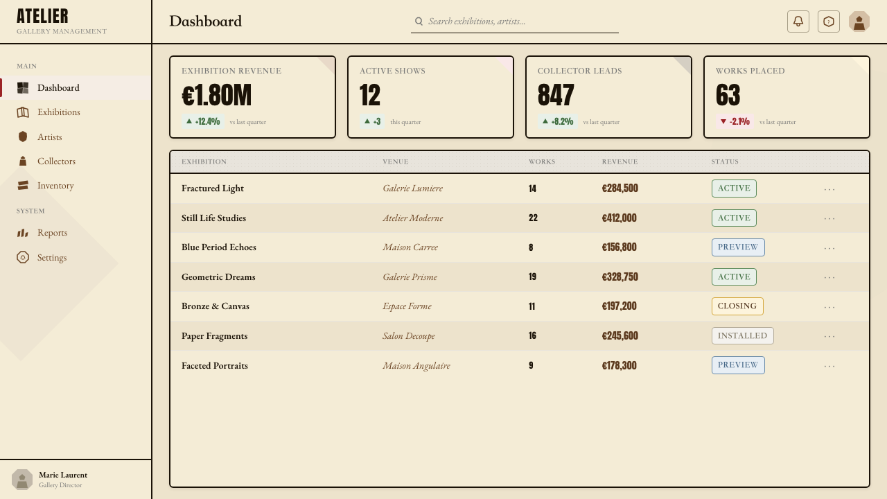
Where movements such as Bauhaus favor the geometric stability of right angles and primary circles, Cubism is characterized by acute and obtuse angles that suggest energy and arrested motion. The tilted plane, the diagonal edge, the irregular polygon that fits against its neighbor like a jigsaw piece — these create compositions that feel in tension, as though the fragmented object is caught mid-reassembly. In design, diagonal elements and non-orthogonal grids introduce a controlled restlessness that distinguishes Cubist-inflected work from the steadier cadence of strictly horizontal-vertical systems.包豪斯等运动青睐直角与圆形的几何稳定性,立体主义则以锐角与钝角为特征,暗示能量与定格的运动感。倾斜的平面、斜向的边缘、像拼图碎片一样与邻块吻合的不规则多边形——这些制造出一种紧张感的构图,仿佛被分解的物体正被捕捉于重新组合的过程之中。在设计中,对角线元素与非正交网格引入了一种受控的躁动感,将受立体主义影响的作品与严格水平-垂直系统的稳定节奏区别开来。
See the Picasso Cubism design system查看 Picasso Cubism 完整设计系统
Who shaped Picasso Cubism?谁塑造了 Picasso Cubism?
Born in Málaga in 1881 and trained in Barcelona, Picasso arrived in Paris permanently in 1904 and settled at the Bateau-Lavoir. His encounter with Iberian and African sculpture at the Trocadéro in 1906 catalyzed the formal rupture that produced Les Demoiselles d'Avignon and launched Analytic Cubism. Picasso's contribution to the movement was less systematic than Braque's — he worked by intuition and leap — but his range was extraordinary: he pushed Cubism through Synthetic collage, into sculpture, into theatrical costume design for Diaghilev's Ballets Russes, and eventually into the Neoclassical reaction of the 1920s. His longevity and celebrity ensured that Cubism's formal language remained visible and influential throughout the twentieth century.毕加索1881年生于马拉加,在巴塞罗那接受训练,1904年定居巴黎洗濯船工作室。1906年在特罗卡德罗博物馆与伊比利亚及非洲雕塑的相遇,催化了形式上的断裂,催生了《亚威农少女》,并开启了分析立体主义。毕加索对这场运动的贡献不如布拉克系统,他依靠直觉与跳跃式思维工作,但其幅度之广令人叹为观止:他将立体主义推进至综合拼贴、雕塑、为佳吉列夫芭蕾舞团设计戏服,并最终进入1920年代的新古典主义反应。他的长寿与盛名确保了立体主义的形式语言在整个二十世纪持续可见并保持影响力。
If Picasso was the movement's intuitive force, Braque was its methodical intelligence. A painter from Normandy who had been working in the Fauve manner when he first saw Les Demoiselles, Braque spent the summer of 1908 in L'Estaque painting a series of landscapes so geometrically reduced that the critic Louis Vauxcelles described them as composed of 'little cubes' — inadvertently naming the movement. Braque's contribution to Analytic Cubism was the development of a rigorous tonal grammar for modeling fractured planes, and to Synthetic Cubism the invention of papier collé in 1912: the technique of pasting cut paper directly onto canvas that introduced the collage principle and the texture of real-world material into painting. Braque and Picasso's wartime separation ended their collaboration; Braque's subsequent work moved toward a more lyrical, less programmatic exploration of Cubist space.若说毕加索是这场运动的直觉力量,布拉克则是其方法论智识。这位诺曼底画家在第一次看到《亚威农少女》时正以野兽派手法创作。1908年夏,他在莱斯塔克画了一系列几何简化程度极高的风景画,批评家路易·沃克塞尔将其描述为由「小立方体」构成——在无意中命名了这场运动。布拉克对分析立体主义的贡献,是发展出一套塑造断裂平面的严格色调语法;对综合立体主义的贡献,是1912年发明纸粘贴技法:将剪切纸片直接粘贴于画布,将拼贴原则与现实材料质感引入绘画。战时分离终结了两人的合作;布拉克此后的作品转向对立体主义空间更为抒情、更少纲领性的探索。
The Spanish painter Juan Gris moved to Paris in 1906 and settled at the Bateau-Lavoir, initially working as an illustrator before committing fully to painting around 1911. His approach to Cubism was more architectural and systematic than that of Picasso or Braque: he typically began with an abstract compositional scaffold — a grid of tonal relationships — and then introduced the subject into that framework rather than starting from observation and moving toward abstraction. Gris's Synthetic Cubist work is among the most design-legible of the movement: his color is cleaner, his structure more evident, and his compositions carry a decorative balance that made his work influential on the design generation of the 1920s. The Art Deco movement's angular elegance owes a particular debt to Gris's refinement of the Cubist vocabulary.西班牙画家胡安·格里斯1906年移居巴黎,定居洗濯船工作室,起初以插图为业,约1911年才全身心投入绘画。他的立体主义方法比毕加索或布拉克更具建筑感与系统性:他通常从一个抽象的构图骨架入手——色调关系的网格——然后将主题引入这一框架,而非从观察出发向抽象推进。格里斯的综合立体主义作品是这场运动中设计可读性最强的之一:色彩更清晰,结构更明显,构图带有装饰性的平衡感,使他的作品对1920年代的设计一代产生了重要影响。装饰艺术运动的角度优雅感,对格里斯精炼立体主义语汇的贡献负有特殊的债务。
Kahnweiler was not a painter but the movement's essential critical and commercial architect. Born in Mannheim in 1884, he opened his gallery at 28 Rue Vignon in Paris in 1907 at the age of twenty-two with almost no prior experience in the art trade. His commitment to Picasso, Braque, Gris, and Fernand Léger was total: he provided monthly stipends, purchased production in advance, and refused to sell to institutions that would not commit to long-term acquisitions. His 1920 monograph on Cubism, written partly from memory after the wartime confiscation of his stock as enemy alien property, established the intellectual framework through which the movement was understood for decades. Kahnweiler's model of the dealer-as-advocate transformed how avant-garde art could be sustained economically and shaped the modern gallery system.卡恩韦勒不是画家,而是这场运动不可或缺的批评与商业建筑师。他1884年生于曼海姆,1907年二十二岁时在巴黎维尼翁街28号开设画廊,几乎毫无艺术交易的先验经验。他对毕加索、布拉克、格里斯与费尔南·莱热的承诺是全身心的:提供每月津贴,预先购买作品,拒绝向不承诺长期收藏的机构出售。他1920年出版的立体主义专著——部分靠记忆写成,因他的库存在战时以敌国侨民财产为由被没收——确立了数十年间理解这场运动的智识框架。卡恩韦勒开创的画商即倡导者模式,改变了先锋艺术在经济上的存续方式,并塑造了现代画廊体系。
Léger developed a variant of Cubism sometimes called Tubism — a style that replaced the brown-gray faceted planes of Analytic Cubism with bold cylindrical and tubular forms, bright color, and an explicit celebration of industrial machinery and modern urban life. His work bridges Cubism and what would become the machine aesthetic of the 1920s: the forms in his paintings look like mechanical components, and his color — strong primaries alongside metallic silvers and blacks — anticipates both Constructivism and the poster tradition of the interwar years. Léger's design influence is particularly visible in motion graphics, typographic posters, and the boldly geometric editorial illustration that characterized the decade following the First World War.莱热发展出一种有时被称为「管状主义」的立体主义变体——一种以粗犷的圆柱与管状形态、鲜明色彩,以及对工业机械与现代都市生活的明确礼赞,取代分析立体主义棕灰棱面的风格。他的作品架接起立体主义与1920年代将要兴起的机器美学:画面中的形态看起来像机械零件,他的色彩——强烈的原色与金属银色和黑色并置——同时预示了构成主义与两次大战间的海报传统。莱热的设计影响在动态图形、排版海报,以及第一次世界大战后十年间以大胆几何插图为特征的编辑插画领域中尤为显著。
How do you use Picasso Cubism today?今天怎么用 Picasso Cubism?
Cubism is one of the more demanding historical styles to apply well in contemporary design, because its complexity must be purposeful rather than merely decorative. The movement's core logic — simultaneous viewpoints, fractured planes, collaged registers — translates into design that layers information visually rather than separating it spatially. Done well, this creates depth and richness without requiring three-dimensional illusion. Done carelessly, it produces visual noise that obscures rather than communicates. The key discipline is to fragment with intention: every angular division, every overlapping layer should serve either compositional structure or information hierarchy.立体主义是在当代设计中较难出色运用的历史风格之一,因为其复杂性必须是有目的的,而非仅仅是装饰性的。这场运动的核心逻辑——多视角同时性、断裂平面、拼贴式层次——转化为以视觉方式分层信息而非在空间上隔离信息的设计。做得好,可以在不借助三维幻觉的情况下制造深度与丰富感;做得粗率,则产生遮蔽而非传达的视觉噪音。关键的纪律是有意图地碎片化:每一次角度分割、每一个叠压层次,都应服务于构图结构或信息层级。
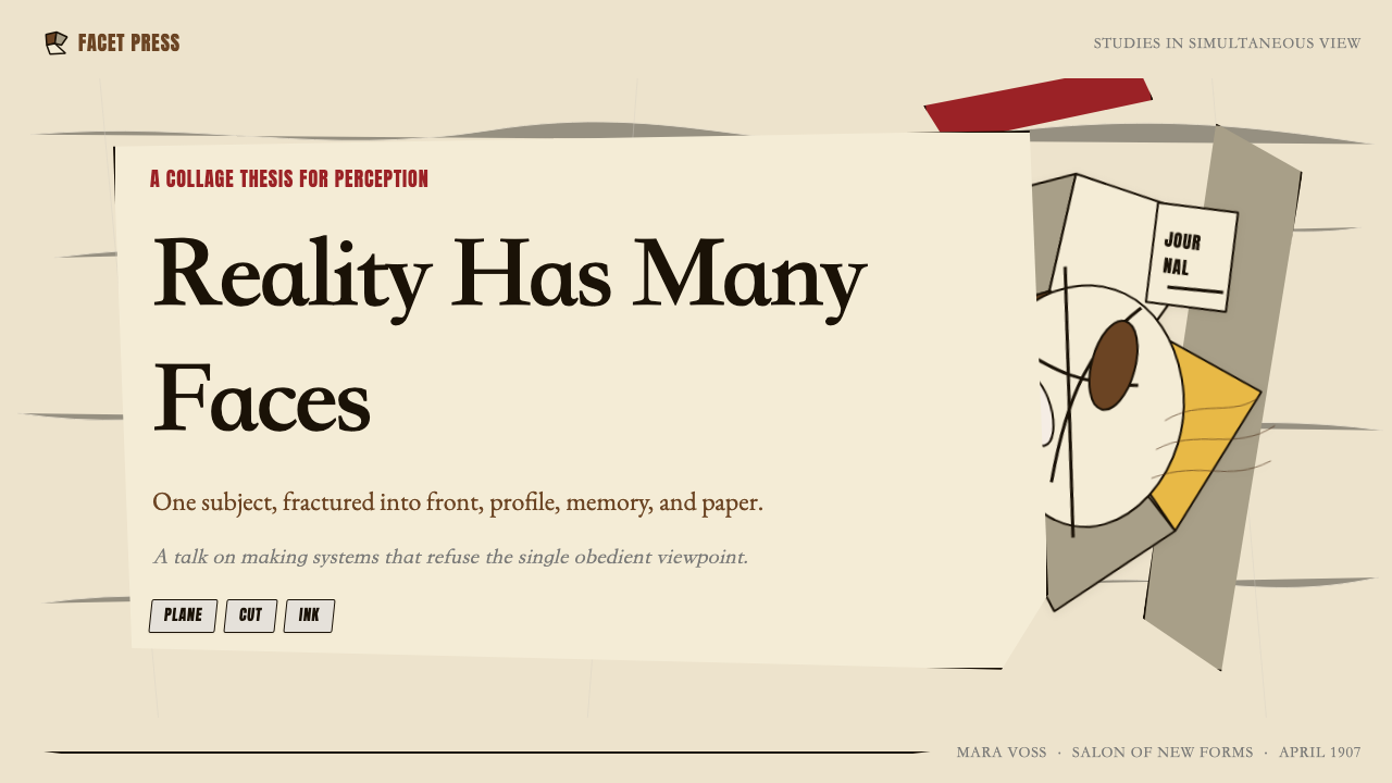
For presentation slides, Cubist influence works particularly well on cover and section-divider slides where visual impact matters more than information density. A cover built on prismatic polygon fragmentation — geometric planes in the earth-toned palette, one plane carrying the title in bold type, adjacent planes in muted ochre and gray — creates immediate visual authority without demanding close reading. For content slides, the application should be lighter: a geometric polygon as a background texture element, a slightly diagonal rule separating sections, or a collage-style image treatment where photography is cropped into angular shapes rather than rectangular frames. Data slides can use the Cubist palette — browns, grays, warm ochres — for chart elements, with one muted accent color calling out the key datum, treating the chart itself as a still-life composition.在演示文稿中,立体主义影响在视觉冲击力重于信息密度的封面页与章节分隔页上效果尤佳。一个建立于棱镜式多边形碎片化的封面——大地色调的几何平面,一块平面承载粗体标题,相邻平面以静谧赭石色与灰色呈现——制造出即时的视觉权威感,无需仔细阅读。内容页的应用应更为轻盈:一个多边形作为背景质感元素,一条略微倾斜的分割线,或将摄影图片裁切为角形而非矩形框的拼贴式图像处理。数据页可以将立体主义色板——棕色、灰色、暖赭石——用于图表元素,以一种静谧的强调色标出关键数据,将图表本身视为一幅静物构图来处理。
For web interfaces, the style suits editorial platforms, cultural institution sites, and creative agency portfolios better than transactional or utility interfaces. A dashboard built on Cubist principles would use an angular grid with slightly irregular column weights, an earth-toned palette with one stronger accent reserved for interactive states, and typographic layering that mixes scale deliberately — a large rotated label alongside standard body text — to create the collage register shift that is native to the movement. Pricing and feature comparison pages benefit from the style's ability to handle visual complexity: overlapping planes can delineate tiers spatially without requiring conventional card borders.对于网页界面,这种风格更适合编辑平台、文化机构网站与创意机构作品集,而非交易型或工具型界面。一个基于立体主义原则构建的仪表板,会使用列宽略微不规则的角度网格,以大地色调为主色调并将一种较强的强调色保留给交互状态,以及刻意在尺度上混合的排版分层——一个大号旋转标签与标准正文并置——制造出这场运动原有的拼贴层次转换感。定价与功能对比页面可以受益于这种风格处理视觉复杂性的能力:叠压平面可以在空间上划定等级区间,而无需借助传统的卡片边框。
For editorial and marketing work, Cubism supports strong hero imagery and article illustration through the collage and fragmentation principles. A magazine feature opener can break a portrait photograph into angular segments, offsetting and slightly rotating each piece against an earth-toned ground — capturing the movement's simultaneous-viewpoint logic while keeping the composition legible. Marketing campaigns with conceptual or intellectual positioning — technology, culture, finance — can use geometric fragmentation to signal complexity and depth without resorting to the overused lens flare or gradient mesh of generic digital aesthetics. Poster work is perhaps the most natural home for Cubist design principles: the combination of bold polygon grids, collaged typographic elements, and earth-accent palette produces immediate graphic authority.对于编辑与营销内容,立体主义通过拼贴与碎片化原则支持强力的主视觉图像与文章插图。一个杂志专题开篇页可以将一张肖像照片分解为角形分段,在大地色底面上偏移并略微旋转每一碎片——捕捉这场运动的多视角同时性逻辑,同时保持构图的可读性。具有概念性或知识性定位的营销活动——科技、文化、金融——可以用几何碎片化来传递复杂性与深度,而无需诉诸通用数字美学中过度使用的耀光或渐变网格。海报作品可能是立体主义设计原则最自然的归宿:粗犷多边形网格、拼贴排版元素与大地强调色板的组合,制造出即时的图形权威感。
A common mistake when applying Cubist influence is confusing fragmentation with randomness. Cubist paintings, however complex they appear, are rigorously composed: Picasso and Braque's planes interlock with structural precision, and Gris's compositional grids are calculated before a mark is made. In design, this means that every angular shape must belong to a system — a grid, a modular scale, a set of consistent angles — rather than being placed intuitively for visual interest. A second common error is applying the full palette — all earth tones plus accent — at uniform density across the entire composition. Authentic Cubist-inflected design typically leads with a dominant ground tone, introduces a secondary plane tone with moderate contrast, and uses the accent color sparingly to draw the eye to one or two focal elements. The restraint is what makes the complexity legible.应用立体主义影响时最常见的错误,是将碎片化与随机性混为一谈。立体主义绘画无论看起来多么复杂,都是经过严格构图的:毕加索与布拉克的平面以结构性的精准度相互咬合,格里斯的构图网格在落笔之前已经计算完毕。在设计中,这意味着每一个角形必须归属于一套系统——网格、模块化尺度、一组一致的角度——而非凭直觉摆放以追求视觉趣味。第二个常见错误是以均匀密度将完整色板——所有大地色调加上强调色——铺满整个构图。真正受立体主义影响的设计,通常以一种主导底面色调领头,以中等对比度引入第二平面色调,并节制地使用强调色,将视线引向一两个焦点元素。正是这种克制,让复杂性变得可读。
A third pitfall is mistaking the style for a purely monochrome system because of Analytic Cubism's gray-brown palette. Synthetic Cubism and the work of Léger and Gris demonstrate that the style accommodates color — but color that is muted, chalky, or deliberately dusty, not saturated or luminous. In digital work, this means pulling back saturation and brightness considerably from default values, favoring pigment-like rather than screen-like color, and ensuring that the one or two accent notes are warm and grounded rather than cool and bright.
See the Picasso Cubism design system查看 Picasso Cubism 完整设计系统
Picasso Cubism — FAQPicasso Cubism · 常见问题
What is the difference between Analytic and Synthetic Cubism in design applications?分析立体主义与综合立体主义在设计应用中有何区别?
Analytic Cubism (roughly 1908 to 1912) provides a near-monochrome vocabulary: brown-gray faceted planes, dense tonal overlapping, and high formal complexity with minimal color variation. Designs drawing on this phase feel austere, intellectual, and dense — appropriate for editorial work, cultural institutions, or products positioning themselves as rigorous or scholarly. Synthetic Cubism (from around 1912) reintroduces color — muted greens, terracottas, creams, occasional sharp accents — and the collage principle: layered materials, mixed typographic registers, visible seams. Designs drawing on this phase feel warmer, more tactile, and more playful, while retaining the angular geometry. For most contemporary applications, a blend weighted toward Synthetic gives more practical flexibility, while a headline or hero element might invoke the Analytic palette for visual contrast.分析立体主义(约1908至1912年)提供了一套近乎单色的词汇:棕灰棱面、密集的色调叠压,以及色彩变化极少的高度形式复杂性。援引这一阶段的设计感觉严峻、知性而密集,适合编辑内容、文化机构或将自身定位为严谨或学术性的产品。综合立体主义(约自1912年起)重新引入了色彩——静谧的绿色、赤陶色、奶油色、偶尔的鲜明强调色——以及拼贴原则:分层材料、混合排版层次、可见的接缝。援引这一阶段的设计感觉更温暖、更具触感、更为活泼,同时保留了角度化几何。对于大多数当代应用,偏向综合立体主义的混合提供了更多实际灵活性,而标题或主视觉元素则可以援引分析立体主义色板以制造视觉对比。
Can Cubist design work in digital interfaces, or is it primarily a print style?立体主义设计能用于数字界面吗?还是它主要是一种印刷风格?
Cubism originated in paint and collage, and its most direct translations remain in print — posters, editorial layouts, book covers. However, its core principles transfer to digital with some adaptation. The earth-toned palette works well on screen when saturation is pulled back to avoid the color feeling muddy or dated. The angular polygon grid provides strong structural underpinning for card-based interfaces, modular layouts, and hero sections. The collage typographic register — mixed scales, slight misalignment, layered text and image — works particularly well in editorial web design and cultural institution sites where a crafted, non-corporate feel is desirable. Where Cubism struggles digitally is in high-interactivity contexts: small interactive elements, complex forms, and data-dense tables work better within cleaner, more conventional grid systems. Use the style at the level of art direction and hero imagery, and reserve conventional layout logic for functional UI zones.立体主义起源于绘画与拼贴,其最直接的转化仍然在印刷领域——海报、编辑版面、书籍封面。但其核心原则经过一定调整后可以移植至数字端。大地色调在屏幕上效果良好,前提是适当降低饱和度以避免色彩显得浑浊或过时。角度化多边形网格为基于卡片的界面、模块化布局与主视觉区域提供了强力的结构支撑。拼贴式排版层次——混合尺度、略微错位、文字与图像叠压——在编辑类网页设计与文化机构网站中效果尤为突出,适合追求手工质感而非企业感的场合。立体主义在数字端表现欠佳之处,在于高互动性场景:小型可交互元素、复杂表单与数据密集型表格,在更整洁、更常规的网格系统中效果更好。将这种风格运用于美术指导与主视觉层面,将常规布局逻辑保留给功能性界面区域。
How does Cubism differ from other fragmented or geometric styles like Futurism or Constructivism?立体主义与未来主义或构成主义等其他碎片化或几何风格有何不同?
All three movements share an interest in geometric abstraction and a rejection of academic naturalism, but their underlying logics are distinct. Cubism is concerned with simultaneity of viewpoint — showing an object from multiple angles at once — and its palette remains grounded in earth pigments and the textures of collage. Futurism is concerned with motion and dynamism: its forms streak and blur, its palette uses high energy contrasts, and its composition implies speed through diagonal force lines. Constructivism is concerned with function and social utility: it uses primary colors as symbolic systems, favors diagonals as directional signals, and treats type and image as elements of a communication system rather than a perceptual experiment. In design terms: Cubism feels material and perceptual, Futurism feels kinetic, Constructivism feels organizational. A Cubist-inflected design invites the eye to explore a complex surface; a Constructivist design channels the eye along a clear directed path.这三场运动都对几何抽象感兴趣,都拒绝学院派自然主义,但它们的底层逻辑截然不同。立体主义关注视角的同时性——从多个角度同时呈现一个物体——其色板扎根于大地矿物颜料与拼贴的质感。未来主义关注运动与动势:形态拖曳模糊,色板使用高能量对比,构图通过对角力线暗示速度。构成主义关注功能与社会效用:它将三原色作为象征系统使用,以斜线作为方向信号,将文字与图像视为传播系统的元素而非感知实验。在设计语境中:立体主义感觉物质而感知性,未来主义感觉动态,构成主义感觉组织性。一个受立体主义影响的设计邀请视线在复杂表面上探索;一个构成主义设计则将视线沿清晰的导向路径引领。
Is collage texture essential to the Cubist design style, or can the style work cleanly?拼贴质感是立体主义设计风格的必要元素吗?还是这种风格也可以呈现为干净利落的面貌?
Collage texture — torn paper edges, newsprint grain, overlapping found materials — is central to Synthetic Cubism historically, but it is not a prerequisite for Cubist-inflected design. The style's more fundamental properties are the angular polygon geometry, the earth-toned palette, the simultaneous-viewpoint compositional logic, and the mixed typographic register. A design can invoke all of these qualities with clean vector geometry and without any simulated paper texture. The clean version tends to feel more contemporary and more suited to digital contexts; the textured version feels more materially specific and more explicitly historical. The choice depends on whether you want the reference to read as a direct quotation of the original movement or as a distillation of its structural principles. Both are valid; mixing them without intention — clean geometry alongside heavy grunge texture — tends to produce incoherence.拼贴质感——撕裂纸边、报纸纸纹、叠压的现成材料——在历史上是综合立体主义的核心,但它并非受立体主义影响的设计的必要前提。这种风格更基本的属性是:角度化多边形几何、大地色调色板、多视角同时性的构图逻辑,以及混合排版层次。一个设计可以用干净的矢量几何全面援引这些品质,而无需任何模拟纸张质感。干净版本感觉更当代、更适合数字语境;有质感的版本感觉更具材料特殊性、更明显地带有历史感。选择取决于你希望这种引用被读作对原始运动的直接引用,还是对其结构原则的提炼。两者都是有效的;无意识地混合两者——干净几何与厚重磨损质感并置——则往往产生不连贯感。
What kinds of projects or brands should avoid Cubist design, and why?哪些类型的项目或品牌应该避免立体主义设计?为什么?
Cubism is a style built on intellectual complexity, visual density, and a deliberate challenge to easy legibility. This makes it unsuitable for several categories of design work. Consumer products aimed at mass-market accessibility — grocery brands, family healthcare, quick-service food — need immediate warmth and clarity that Cubist fragmentation actively resists. Children's design requires organic curves, bright saturated color, and approachable imagery that contradicts the angular, earth-toned, intellectually demanding quality of the style. E-commerce conversion pages, where the user needs to move quickly from browsing to purchasing, work better with clean hierarchy and minimal visual noise. Any context where the primary communication goal is speed of comprehension — emergency services, transit signage, public health communication — is poorly served by a style whose legacy includes deliberately making familiar objects difficult to read at a glance. Cubism works best where the audience has time and inclination to dwell with the image.立体主义是一种建立于知识复杂性、视觉密度与刻意挑战易读性的风格。这使它不适合若干类别的设计工作。面向大众市场可及性的消费品——杂货品牌、家庭医疗、快餐——需要立体主义碎片化所主动抵抗的即时温暖感与清晰感。儿童设计需要有机曲线、鲜明饱和色与亲切图像,与这种风格角度化、大地色调、知识性要求较高的气质相悖。电商转化页面,用户需要快速从浏览推进至购买,在干净的层级与最少的视觉噪音下效果更好。任何以理解速度为首要传播目标的场景——急救服务、交通标识、公共卫生传播——都不适合一种遗产包括刻意让熟悉物体难以一瞥即读的风格。立体主义在受众有时间与意愿驻留于图像之处效果最佳。
Related design styles相关设计风格
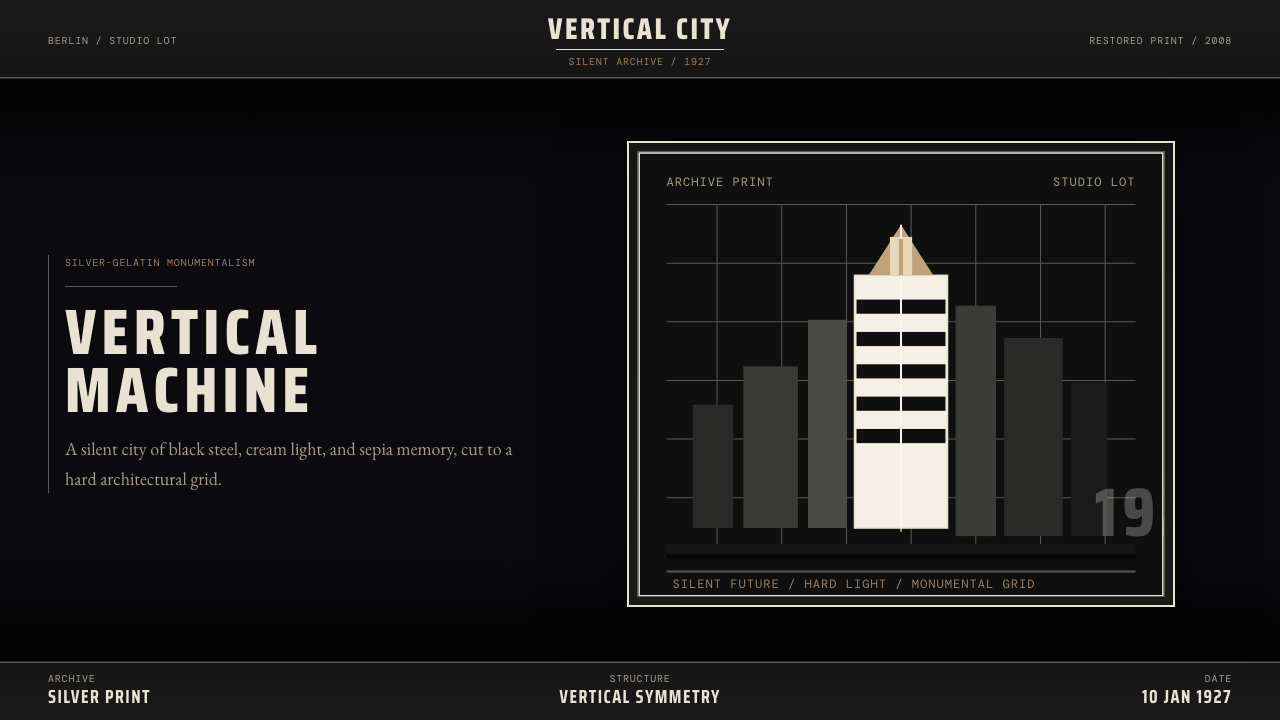 Metropolis (Fritz Lang, 1927)Monumental and severe. Black grid, cream type, sepia shadows.庄严而冷峻。黑底网格、奶白字与赭色阴影。
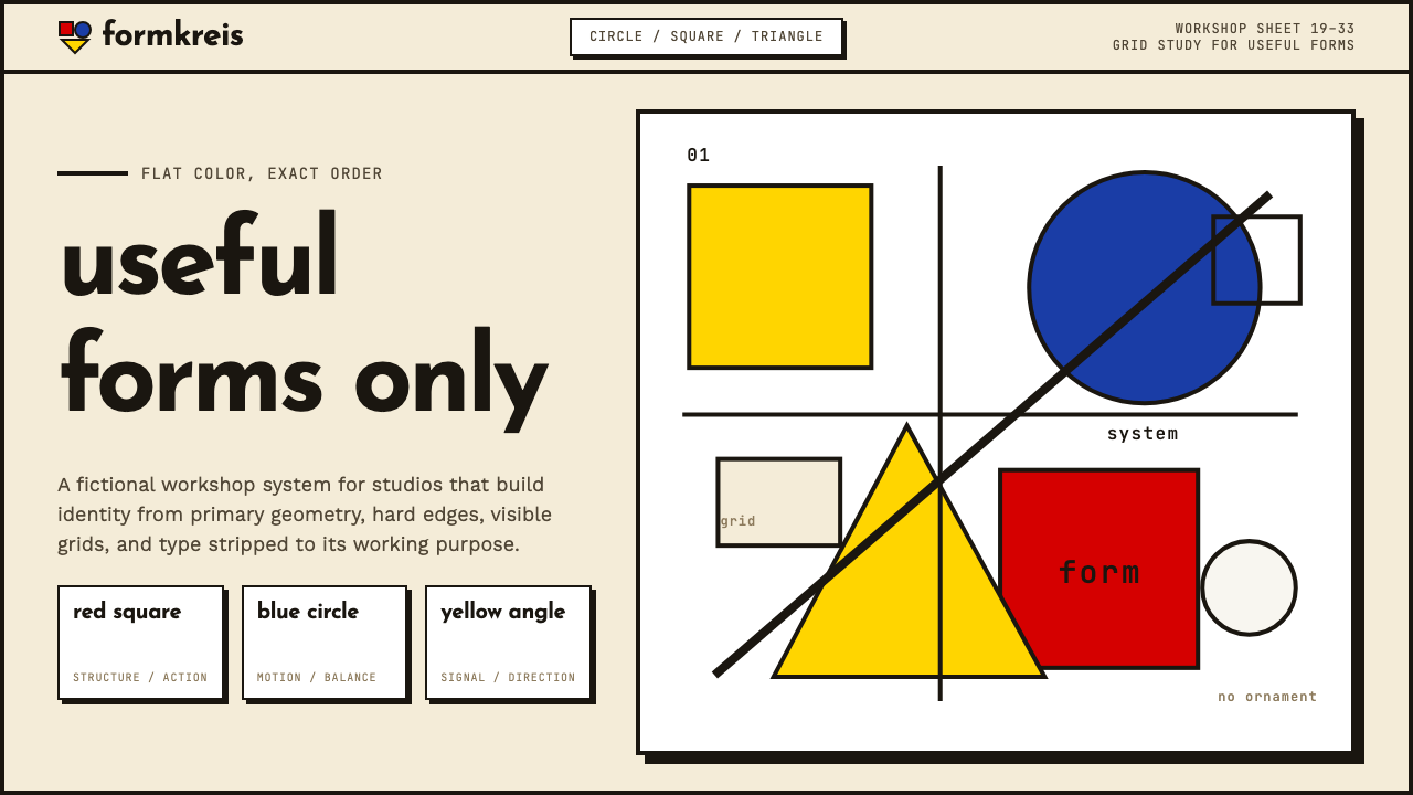 Bauhaus WeimarForm follows revolution. Primary red-blue-yellow on cream, hard shadows, no o…形式追随革命:奶油纸底上的红蓝黄三原色、硬偏移投影、零装饰——纯粹功能即美。
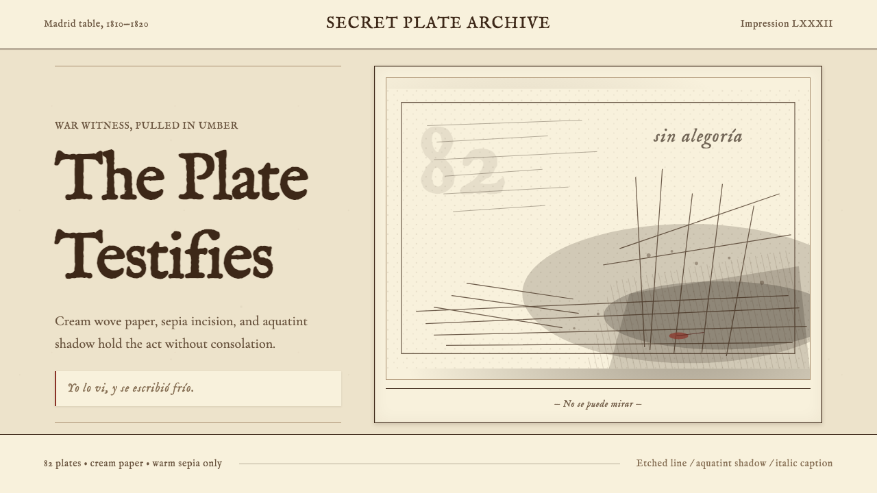 Goya — Disasters of WarWitness without ornament. Cream paper, umber line, aquatint shadow, italic ca…无装饰的见证:米色纸、赭褐线、飞尘暗影与斜体短注。
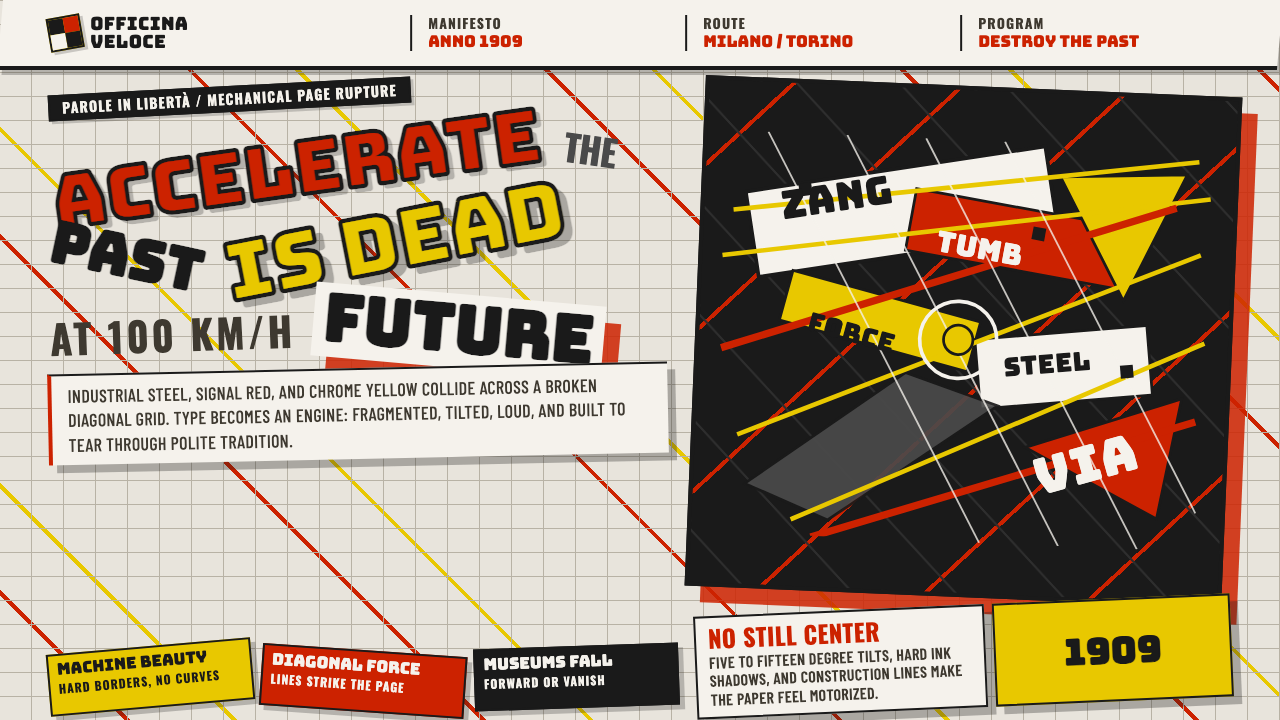 Italian Futurism (Marinetti 1909)Speed murders tradition. Signal red and chrome yellow slash a broken diagonal…速度杀死传统:信号红与铬黄斩开破碎斜向网格。
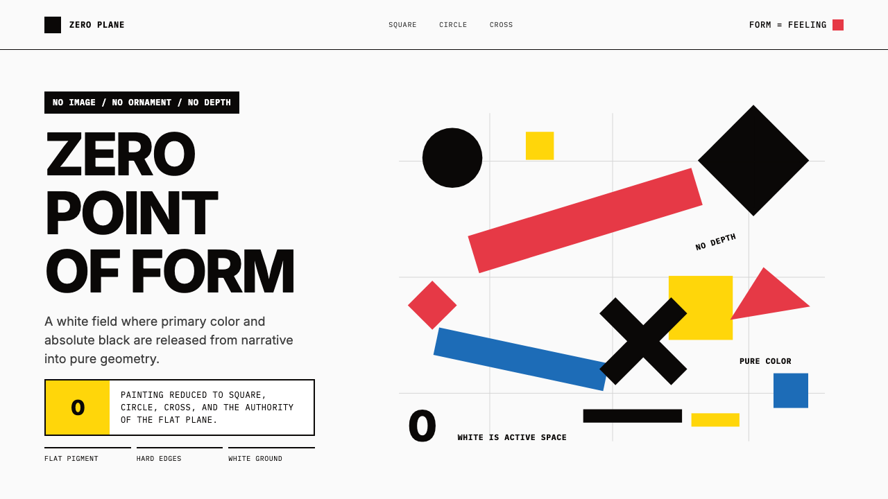 Malevich SuprematismGeometry declares zero. Red, yellow, blue and black blocks float on active wh…几何宣告零点:红黄蓝黑色块漂浮于主动白场。
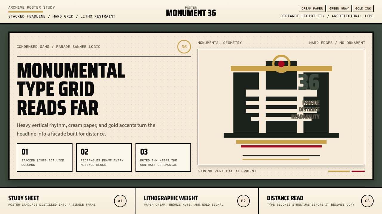 Olympic Poster Berlin (1936)Monumental and legible. Green-gray, cream, and gold turn type into architectu…纪念碑感十足。绿灰、奶油纸与金色把字体变成建筑。