What is Malevich Suprematism?什么是 Malevich Suprematism?
Malevich declared painting's zero hour: pure geometric forms — square, circle, cross — suspended on white, where sensation itself becomes the only subject.马列维奇宣告绘画的零时刻:纯粹几何形体——方块、圆形、十字——悬浮于白场之上,感受本身成为唯一的主题。
Malevich Suprematism in briefMalevich Suprematism 速览
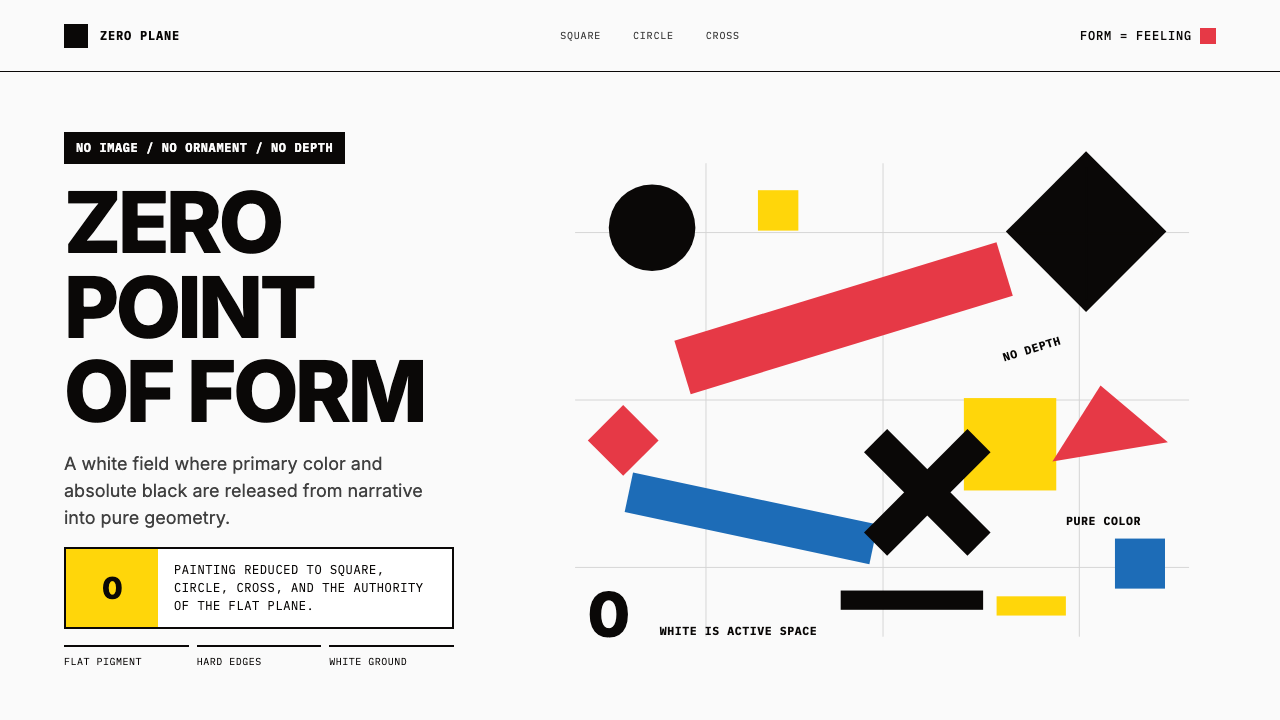
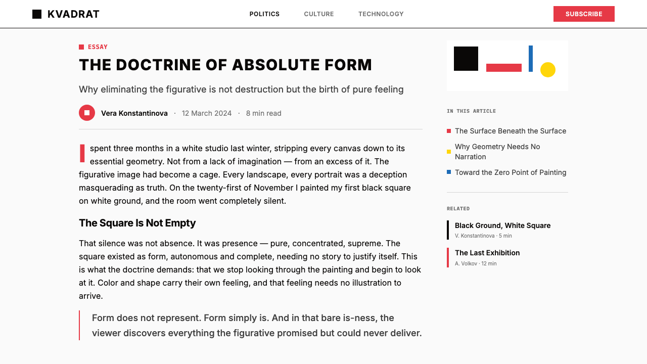
Suprematism is the most radical artistic reduction of the early twentieth century: a system in which pure geometric forms — the square, the circle, the cross, the rectangle — float on white grounds, stripped of all narrative, all representation, and all ornament. Originating in Russia between 1913 and 1915, it declared that painting's only legitimate subject was the supremacy of pure feeling, liberated from the visible world. Kazimir Malevich, its inventor, considered his 1913 pencil sketch of a black square the zero point of painting — the moment the medium broke free from depicting objects and became a language of sensation in itself.至上主义是二十世纪初最激进的艺术简化:一套以纯粹几何形体——方块、圆形、十字、矩形——漂浮于白色画布之上的体系,彻底剥离一切叙事、一切再现、一切装饰。这场运动发源于1913至1915年间的俄罗斯,它宣告绘画唯一合法的主题是纯粹感受的至上性,是从可见世界中彻底解放出来的感觉本身。马列维奇——至上主义的发明者——将他1913年的铅笔素描《黑色方块》视为绘画的零点:这是绘画从描绘物体的束缚中挣脱出来、成为感受语言本身的时刻。
The palette is doctrinally severe. Black, cadmium red, cadmium yellow, cobalt blue, and white are the sanctioned elements. No mixed tones, no naturalistic gradients, no illusionistic depth. Forms are flat — they do not cast shadows, do not recede in perspective, do not belong to a recognizable space. They hover. The white ground is not empty; Malevich described it as an active field of sensation, not a background but a void charged with potential. This distinction between inactive surface and active void is central to understanding why Suprematist compositions feel weightless rather than sparse.色彩体系教条般严苛。纯黑、镉红、镉黄、钴蓝与白色是被认可的元素。没有混合色调,没有自然主义的渐变,没有幻觉式的深度。形体是平面的——它们不投射阴影,不在透视中退远,不归属于任何可识别的空间。它们悬浮。白色底面不是空洞的;马列维奇将它描述为一个主动的感受场域,不是背景,而是充满潜能的虚空。这种无活力表面与主动虚空之间的区分,是理解至上主义构图为何给人以失重感而非空洞感的关键。
Visually, the system is immediately recognizable and immediately extreme. A single black square on white. A red rectangle tilting across a canvas. A cluster of bars and circles in red, black, and yellow arranged in dynamic diagonal tension. Color carries no symbolic hierarchy borrowed from nature — red is not blood or fire, black is not death. Each form and each color is a pure sensation, an event on the picture plane, answerable only to its relation with adjacent elements. The severity that makes Suprematism difficult to look at for the first time is also what makes it inexhaustibly legible: there is nothing to decode except the composition itself.在视觉上,这套体系一眼即可辨认,且极端到令人震惊。白底上的单一黑色方块。倾斜横越画布的红色矩形。以红、黑、黄色排列的条块与圆形群落,在动态的对角线张力中相互作用。色彩不携带任何从自然借来的象征层级——红色不是血与火,黑色不是死亡。每一个形体、每一种颜色都是纯粹的感受,是画面上的一个事件,只对与相邻元素的关系负责。让至上主义在初次凝视时令人不适的严苛,恰恰也是使它在任何时刻都清晰可读的原因:没有什么需要解码,除了构图本身。
See the Malevich Suprematism design system查看 Malevich Suprematism 完整设计系统
Where does Malevich Suprematism come from?Malevich Suprematism 从何而来?
The seeds of Suprematism were planted in Moscow's pre-war avant-garde, where Malevich had already passed through Impressionism, Symbolism, and Russian Cubo-Futurism. By 1913 he was collaborating on the Futurist opera Victory over the Sun — a deliberately absurdist theater piece — for which he designed backdrops and costumes using stark geometric shapes. One backdrop featured a black divided square. Malevich later identified this moment as the conceptual birth of Suprematism: the realization that a geometric form on a stage could carry complete expressive force without representing anything at all.至上主义的种子播种于莫斯科战前的先锋派土壤之中。彼时马列维奇已先后穿越印象主义、象征主义与俄罗斯立体-未来主义。1913年,他参与了未来主义歌剧《战胜太阳》的创作——一部刻意荒诞的剧场作品——为其设计了使用硬朗几何形体的布景与服装。其中一块布景呈现了一个被分割的黑色方块。马列维奇后来将这一时刻认定为至上主义的概念诞生:他意识到,舞台上的一个几何形体可以在不再现任何事物的情况下,携带完整的表现力。
The public declaration came in December 1915 at the 0.10 (Zero-Ten) exhibition in Petrograd — the title signaling the group's intention to reduce painting to zero before rebuilding from ten pure principles. Malevich showed thirty-five works under the banner 'Suprematism of Painting.' The most dramatic gesture was placement: his Black Square was hung high in the corner of the room, precisely where Russian Orthodox families hang their icons. The choice was not accidental. Malevich was displacing the sacred image with an image of absolute geometric sensation, claiming for abstract art the reverence traditionally reserved for religious objects. Contemporaries understood the provocation immediately.公开宣言于1915年12月在彼得格勒的「0.10」(零十)展览上发出——展名暗示了参展者将绘画归零再从十条纯粹原则重建的意图。马列维奇以「绘画中的至上主义」为题展出了三十五件作品。最具戏剧性的姿态在于悬挂方式:《黑色方块》被高悬于展厅的角落处——那正是俄罗斯东正教家庭悬挂圣像的位置。这一选择绝非偶然。马列维奇在用一幅绝对几何感受的图像置换圣像,为抽象艺术索取本属于宗教器物的崇敬。当时的观众立即理解了这一挑衅的含义。
The movement's theoretical framework was published in 1916 as the pamphlet From Cubism and Futurism to Suprematism: The New Realism in Painting. Malevich argued that both Cubism and Futurism, despite their radicalism, remained attached to the material world — they fragmented objects but still depicted them. Suprematism cut the remaining thread. The 'additional element' — the geometric form liberated from object-reference — was now the entirety of painting's content. This was not emptiness but fullness: pure feeling, uncontaminated by subject matter.这场运动的理论框架于1916年以小册子《从立体主义和未来主义到至上主义:绘画中的新现实主义》的形式发表。马列维奇论证:立体主义与未来主义尽管激进,仍依附于物质世界——它们将物体碎片化,但始终还是在描绘物体。至上主义则切断了这最后一根线索。「附加元素」——从对象指涉中解放出来的几何形体——如今成为绘画内容的全部。这不是空洞,而是充盈:纯粹的感受,不受题材污染。
The Vitebsk period (1919–1922) gave the movement its second act and its pedagogical arm. When Malevich arrived at the Vitebsk People's Art School in 1919, he displaced Marc Chagall as its dominant voice and transformed the school into UNOVIS — Affirmers of the New Art — a collective in which students and teachers wore black squares on their clothing as a kind of movement insignia. El Lissitzky, who emerged from UNOVIS, developed the Proun compositions: spatial diagrams that took Suprematist geometric language and extended it into imagined architectural and typographic space, connecting pure abstraction to the practical demands of Soviet poster design and exhibition architecture. When the Soviet cultural climate hardened against pure abstraction in the early 1920s, Malevich turned to writing and theory; Lissitzky and Popova carried the visual vocabulary outward into applied work, ensuring that Suprematist geometry would outlive the movement's moment of institutional power.维捷布斯克时期(1919—1922年)赋予了这场运动第二幕与其教学维度。1919年马列维奇抵达维捷布斯克人民艺术学校,取代马克·夏加尔成为主导力量,并将学校改造为UNOVIS——「新艺术肯定者」集体——学生与教师在衣服上佩戴黑色方块作为运动徽记。从UNOVIS走出的埃尔·利西茨基发展出「Proun」构图:这些空间图示将至上主义的几何语言延伸进想象性的建筑与字体空间,将纯粹抽象与苏联海报设计和展览建筑的实际需求连接起来。当苏联文化气候在1920年代初对纯粹抽象趋于强硬时,马列维奇转向写作与理论;利西茨基与波波娃则将这套视觉词汇向外延伸至应用领域,确保至上主义的几何语言在运动失去制度权力之后仍得以延续。
What defines the Malevich Suprematism look?Malevich Suprematism 的视觉特征是什么?
Geometric Primacy几何首位
The square, circle, cross, and rectangle are not chosen for their resemblance to anything in the world — they are chosen because they are irreducible. No geometric form is more basic than these. Suprematist compositions are built exclusively from these elements, and the relationships between them — overlapping, hovering apart, tilting on a diagonal — carry the entire expressive load of the work. There is no hierarchy among the forms themselves; a small circle can command a composition as forcefully as a large rectangle.方块、圆形、十字与矩形被选用,并非因为它们与世界中某物相似,而是因为它们不可再简化。没有比这些更基本的几何形体。至上主义构图完全由这些元素构成,而它们之间的关系——相互叠压、悬浮间隔、倾斜对角——承担着作品全部的表现重量。形体本身之间没有层级高下;一个小圆形可以与一个大矩形一样有力地主导构图。
Active White Ground主动白场
The white ground in Suprematist work is not a background or a neutral field — it is an active void, a space charged with potential energy. Malevich described white as the color of infinity, a field of pure possibility against which geometric forms register as events rather than objects. This understanding of white as participatory rather than passive is one of the most consequential ideas Suprematism contributed to modern design: the blank space around a form is itself a force, not an absence.至上主义作品中的白色底面不是背景,也不是中性场域——它是主动的虚空,一个充满潜在能量的空间。马列维奇将白色描述为无限的颜色,一片纯粹可能性的场域,几何形体在其上注册为事件而非物体。将白色理解为参与性而非被动性,是至上主义对现代设计最深远的贡献之一:形体周围的空白本身是一种力量,而非一种缺席。
Canonical Four-Color Palette经典四色体系
Suprematism permits four chromatic elements: pure black, an intense red, a strong yellow, and a deep blue — deployed against white. These colors are used in their most saturated, unmodified state; no tints, no shades, no mixed intermediates. Each color is used as a flat, opaque plane with no internal variation. The severity of this restriction means that every color decision is legible: black anchors, red activates, yellow sharpens, blue deepens. When only one or two colors appear in a composition, the reduction is even more concentrated.至上主义允许四种色彩元素:纯黑、浓烈的红、强劲的黄与深沉的蓝——部署于白色之上。这些颜色以其最高饱和度、未经调配的状态使用;没有淡色,没有暗色,没有混合中间色。每种颜色以平涂、不透明的色面呈现,内部无变化。这一限制的严格意味着每个色彩决定都清晰可读:黑色锚定,红色激活,黄色锐化,蓝色深化。当构图中只出现一两种颜色时,这种简化变得更加集中。
Diagonal Dynamism对角线动势
While the square and rectangle are the most iconic Suprematist forms, the movement discovered early that tilting a form on the diagonal transforms its character entirely. A horizontal rectangle is stable, almost inert. The same rectangle rotated to a steep angle becomes a vector — it implies motion, direction, and force. Many of the most energetic Suprematist compositions exploit this effect, setting bars and planes at competing angles to generate a sense of movement across a static surface. This diagonal dynamism distinguishes Suprematism from the more stable, centered compositions of contemporaneous geometric abstraction.尽管方块与矩形是至上主义最具代表性的形体,但这场运动很早便发现:将一个形体倾斜至对角线方向,会彻底改变其性格。水平放置的矩形是稳定的,几乎是惰性的。同一矩形旋转至陡峻角度后,便成为一个向量——它暗示运动、方向与力量。许多最具活力的至上主义构图正是利用了这一效果,将条块与平面置于相互竞争的角度,在静态表面上制造运动感。这种对角线动势将至上主义与同时代几何抽象中更为稳定、居中的构图明确区分开来。
Flatness Without Depth无深度的平面性
There is no perspective, no shadow, no modeling, and no atmospheric depth in Suprematist work. Forms do not recede or advance in three-dimensional space — they exist on a single plane, their scale and position defined entirely by their compositional relationship with other elements on the same plane. Where forms overlap, the overlapping form reads as simply 'in front,' but this is a graphic convention, not a spatial illusion. The result is a pictorial world that operates under its own laws, entirely independent of how light behaves on physical objects.至上主义作品中没有透视,没有阴影,没有体积塑造,没有大气深度。形体不在三维空间中退远或前进——它们存在于同一平面,其尺度与位置完全由与同一平面上其他元素的构图关系所确定。当形体相互叠压时,叠压在上的形体被读作「在前」,但这是一种图形约定,而非空间幻觉。结果是一个按照自身法则运作的图像世界,与光线在物理物体上的行为方式完全无关。
Economy of Elements元素的经济性
Suprematism practices an extreme economy of means. A single form on a white ground constitutes a complete work. Nothing is added for visual richness, decorative appeal, or compositional weight beyond what the expressive intention requires. This is not minimalism in the contemporary sense — it is not a style preference but a philosophical commitment to the idea that every element must justify its existence by what it contributes to the work's total sensation. The discipline enforces a kind of compositional accountability that distinguishes Suprematist-derived design from work that borrows only the geometric surface.至上主义实践着一种极端的手段经济性。一个形体置于白色底面,便构成一件完整的作品。没有任何东西被添加进来用于视觉丰富性、装饰吸引力或超出表现意图所需的构图分量。这不是当代意义上的极简主义——它不是风格偏好,而是一种哲学承诺:每个元素必须以其对作品整体感受的贡献来证明自身存在的正当性。这种自律执行着一种构图层面的可问责性,将至上主义衍生设计与那些只借用几何表面的作品明确区分开来。
Sensation Over Meaning感受先于意义
Suprematism insists that pure sensation — the direct visual experience of form in relation to ground — is more primary than symbolic or narrative meaning. A red square is not a flag, not a warning, not a symbol of revolution. It is a red square: a sensation of intense color in a particular geometric boundary on a white void. This resistance to symbolic reading is one of Suprematism's most challenging and most valuable contributions. When applied to design, it demands that the designer trust the sensory impact of composition itself rather than relying on learned associations to carry communicative weight.至上主义坚持:纯粹的感受——形体相对于底面的直接视觉体验——比象征性或叙事性意义更具原初性。一个红色方块不是旗帜,不是警告,不是革命的象征。它就是一个红色方块:在白色虚空上某个特定几何边界内的强烈色彩感受。这种对象征性解读的抵制,是至上主义最具挑战性也最有价值的贡献之一。当应用于设计时,它要求设计师信任构图本身的感官冲击力,而不是依赖后天习得的联想来承担传达的重量。
See the Malevich Suprematism design system查看 Malevich Suprematism 完整设计系统
Who shaped Malevich Suprematism?谁塑造了 Malevich Suprematism?
Malevich invented Suprematism and remained its defining theorist throughout his life. Born in Kiev in 1879 to Polish parents, he arrived at geometric abstraction through Impressionism and Cubo-Futurism before producing the Black Square in 1913. His 1915 installation at the 0.10 exhibition — placing the Black Square in the icon corner — remains one of the most deliberately provocative gestures in the history of art. After the Vitebsk period, he returned to figurative painting briefly in the late 1920s, but his theoretical writings — including The Non-Objective World, published in Germany in 1927 — spread Suprematist ideas across Europe and into the Bauhaus circle. He died in Leningrad in 1935; his body was transported in a coffin marked with a black square.马列维奇发明了至上主义,并终其一生担任其核心理论家。1879年生于基辅的他在穿越印象主义与立体-未来主义后,于1913年创作出《黑色方块》。他在「0.10」展览上的1915年装置——将《黑色方块》置于圣像角——至今仍是艺术史上最具刻意挑衅性的姿态之一。维捷布斯克时期结束后,他在1920年代末短暂回归具象绘画,但他的理论著作——包括1927年在德国出版的《非客观世界》——将至上主义理念传播至整个欧洲并进入包豪斯圈子。他于1935年在列宁格勒辞世;遗体被置于一口标有黑色方块的棺椁中运送。
Lissitzky joined UNOVIS at Vitebsk in 1919 and became the movement's most influential applied practitioner. His Proun series — the name coined from a Russian phrase meaning 'project for the affirmation of the new' — extended Suprematist geometry into imaginary architectural and typographic space, creating compositions that implied three-dimensional construction while remaining resolutely flat. His work in exhibition design, particularly the Proun Room installed at Berlin in 1923, demonstrated that Suprematist visual logic could organize an entire spatial environment. His later typographic work for Soviet journals and international avant-garde publications spread the geometric vocabulary far beyond the Russian context.利西茨基于1919年加入维捷布斯克的UNOVIS,成为这场运动影响最深远的应用实践者。他的「Proun」系列——名称取自俄语「肯定新事物的方案」——将至上主义几何语言延伸进想象性的建筑与字体空间,创造出暗示三维构造却始终保持平面性的构图。他的展览设计作品——尤其是1923年在柏林安装的「Proun 房间」——证明了至上主义视觉逻辑可以组织整个空间环境。他后来为苏联期刊与国际先锋派出版物所做的排版工作,将这套几何词汇传播至远超俄罗斯范畴的广阔领域。
Rozanova was a founding participant of Suprematism and one of its most formally inventive contributors. Her 1917 Green Stripe — a single diagonal band of vivid color on white — distilled Suprematist logic to a single gesture and anticipated by decades the concerns of Color Field painting. Before her premature death from diphtheria in 1918, she had produced a body of work that extended Suprematism into book design and textile pattern, demonstrating the movement's applicability beyond painting. Her relative obscurity in Western art history compared to Malevich reflects the gendered exclusions of early modernist historiography rather than the actual significance of her contribution.罗赞诺娃是至上主义的创始参与者之一,也是其形式上最富创造力的贡献者之一。她1917年的《绿色条纹》——白底上一道单一的对角鲜艳色带——将至上主义逻辑浓缩为单一姿态,比色域绘画的关切早了数十年。在1918年因白喉英年早逝之前,她已创作出一批将至上主义延伸至书籍设计与纺织图案的作品,证明了这场运动在绘画之外的可应用性。与马列维奇相比,她在西方艺术史中的相对默默无闻,折射的是早期现代主义史学的性别排斥,而非其贡献的实际重要性。
Popova brought an architectural rigor to Suprematist geometry that connected the movement to Constructivism. Her Painterly Architectonics series (1916–1918) subjected geometric planes to structural analysis — exploring how forms overlap, what happens at their boundaries, and how compositional forces balance across a surface. After 1921, she redirected her energy from easel painting into industrial and theatrical design: her textile designs for Soviet factories and her set and costume designs for theater productions represent the movement's most sustained engagement with designed objects. Popova's ability to translate a purely sensational visual language into functional applied work remains one of Suprematism's most practically relevant legacies.波波娃为至上主义几何带来了一种建筑式的严谨性,将这场运动与构成主义相连接。她1916至1918年的「绘画建构」系列对几何平面进行结构性分析——探索形体如何叠压、边界处发生什么、构图力量如何在表面上取得平衡。1921年后,她将精力从画架绘画转向工业与剧场设计:她为苏联工厂设计的纺织图案,以及她为剧场演出设计的舞台与服装,代表了这场运动与设计物最持续、最深入的接触。波波娃将纯粹感受性视觉语言转化为功能性应用作品的能力,至今仍是至上主义最具实践意义的遗产之一。
Klyun was among Malevich's closest colleagues and a consistent exhibitor at the 0.10 exhibition, showing his own Suprematist canvases alongside Malevich's foundational works. His contributions to the movement included explorations of spherical and curved forms within an otherwise rectangular vocabulary — a direction Malevich himself pursued in the late Suprematist period with works exploring the oval and the circle as alternatives to the absolute authority of the square. Klyun's theoretical writings also helped articulate the philosophical underpinning of Suprematism in ways that complemented rather than simply repeated Malevich's own formulations.克留恩是马列维奇最密切的同僚之一,也是「0.10」展览的持续参展者,与马列维奇的奠基性作品并列展示自己的至上主义画作。他对这场运动的贡献包括在矩形词汇主导的体系内探索球形与曲线形体——这是马列维奇本人在晚期至上主义阶段也追求过的方向,彼时他用圆形与椭圆作为对方块绝对权威的替代性探索。克留恩的理论写作也帮助阐明了至上主义的哲学基础,其表述方式是对马列维奇自身表述的补充,而非简单重复。
How do you use Malevich Suprematism today?今天怎么用 Malevich Suprematism?
Suprematism transfers to contemporary design not through historical imitation but through structural principle: pure geometry carries visual force without ornamentation, negative space is an active participant, and the relationship between elements creates meaning rather than any single element in isolation. Applying these principles correctly requires restraint — the willingness to leave a composition incomplete by conventional standards because the work has already said everything it needs to say.至上主义向当代设计的迁移,不是通过历史模仿,而是通过结构原则:纯粹几何在没有装饰的情况下携带视觉力量,负空间是主动的参与者,元素之间的关系创造意义,而非任何单一元素孤立地承担意义。正确应用这些原则需要克制——需要愿意将一个构图在惯常标准下「留白」,因为作品已经说出了它需要说的全部。
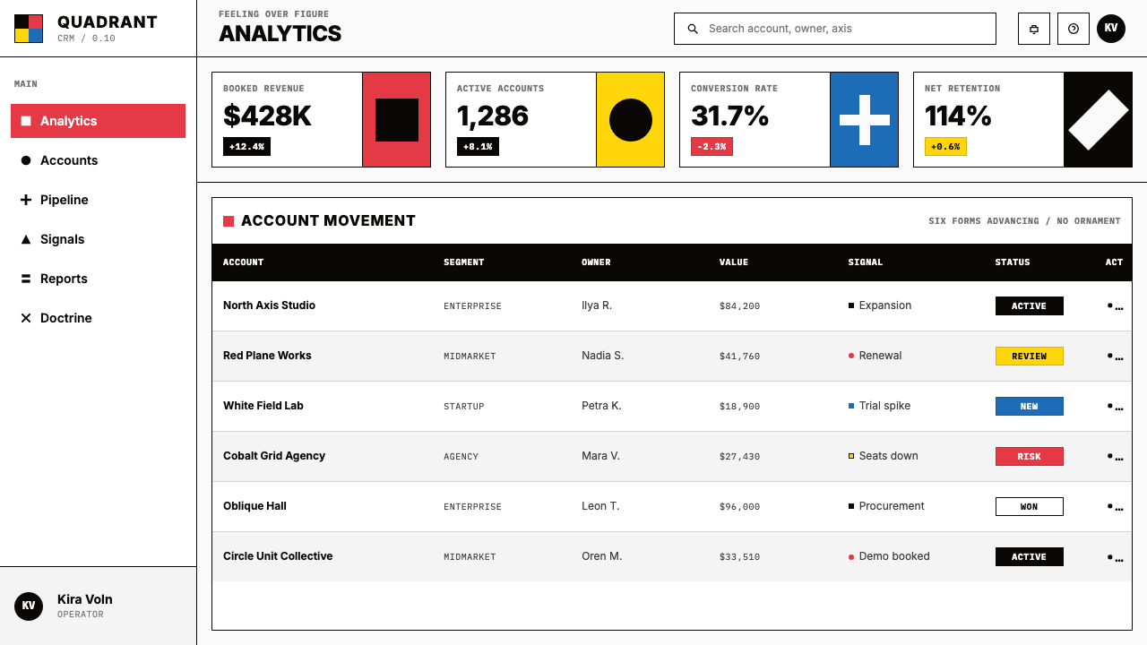
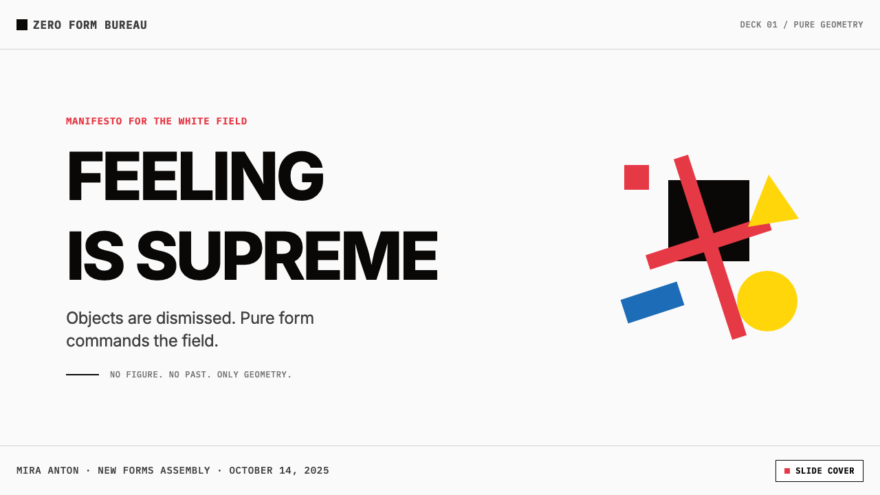
For presentation slides, Suprematism offers a powerful approach to both cover and section-divider pages. A cover built on Suprematist logic uses a single large geometric form — a rectangle, a square, a diagonal bar — in one of the canonical colors placed asymmetrically against a white or near-white field. The title appears in clean, unornamented type with no decorative framing. Section dividers can use the same geometric element at reduced scale to signal progression. Content slides should be typographic and grid-based: the Suprematist influence shows in how white space is treated as territory rather than absence, in how a data visualization is treated as a geometric object with its own compositional weight, and in how hierarchy is established through scale and positioning alone.在演示文稿中,至上主义为封面与章节分隔页提供了一种强大的处理方式。基于至上主义逻辑构建的封面,使用单一大型几何形体——矩形、方块或对角条——以某一经典颜色非对称地置于白色或接近白色的底面之上。标题以干净、无装饰的字体呈现,不设装饰性框架。章节分隔页可使用同一几何元素的缩小版来标示进程。内容页应当以字体与网格为主:至上主义影响体现在将白色空间视为领域而非缺席,将数据可视化视为具有自身构图分量的几何对象,以及仅通过尺度与位置确立层级。
For web interfaces, the style is particularly well-suited to dashboards, data displays, and analytical tools where the content itself carries complexity and the interface must not compete with it. The approach: keep the background pure white or very close to it, use black for all body text and structural lines, and deploy the canonical colors only for states that require attention — active selections, alerts, primary actions. Card components acquire their visual definition from a clean border or a solid block of color rather than shadow and blur. Navigation is typographic and spatial rather than icon-dependent. On pricing pages, the primary color reserved for the recommended tier creates a bold focal point that the rest of the layout defers to.对于网页界面,这种风格尤其适合仪表板、数据展示与分析工具——在这些场景中,内容本身携带复杂性,界面不能与它竞争。方法如下:保持背景纯白或非常接近白色,所有正文与结构性线条使用黑色,仅将经典颜色部署于需要注意的状态——激活选择、警示、主要行动。卡片组件通过干净的边框或纯色块获得视觉定义,而非阴影与模糊。导航依赖字体与空间,而非图标。在定价页面,为推荐套餐保留的主色创造了一个大胆的视觉焦点,其余版面向它臣服。
For editorial and marketing work, the Suprematist sensibility produces materials of unusual visual authority. A poster or hero section built on a Suprematist composition — large geometric form anchoring one region, type in high contrast, the remaining field left open — reads immediately and at distance. Marketing pages can alternate full-width blocks of white with blocks of a single strong color, with a geometric form serving as a visual anchor in each. Editorial layouts benefit from treating column dividers and rule lines as geometric objects with compositional weight, not mere separators. The key is using color as event rather than atmosphere: one strong color decision per composition, not a palette spread evenly across the surface.在编辑与营销内容中,至上主义感性产出具有非同寻常视觉权威感的材料。基于至上主义构图的海报或主视觉区——大型几何形体锚定某一区域,高对比度的文字,其余场域保持开放——能在远距离下立即被阅读。营销页面可以将白色全宽区块与单一强色区块交替,以几何形体在每处充当视觉锚点。编辑版面得益于将分栏线与规则线视为具有构图分量的几何对象,而非单纯的分隔符。关键在于将色彩用作事件而非氛围:每个构图一个强烈的色彩决定,而非将色板均匀铺散于整个表面。
A common mistake when applying this aesthetic is confusing Suprematist severity with emptiness and compensating by adding more elements — a texture, a gradient, a decorative typeface, a soft shadow — until the work loses the very quality that makes the reference legible. Suprematism is not sparse because it ran out of things to add; it is sparse because every addition was refused. When a layout feels incomplete under a Suprematist approach, the solution is almost always to make the elements that remain more decisive — bolder in scale, more precise in placement, more absolute in color — rather than to add new ones. The style rewards commitment and punishes hedging.应用这种美学时最常见的错误,是将至上主义的严苛与空洞混为一谈,并通过添加更多元素来补偿——纹理、渐变、装饰性字体、柔和阴影——直到作品失去了使这一参照可读的特质本身。至上主义的稀疏,不是因为缺少可添加的东西;而是因为每一次添加都被拒绝了。当一个版面在至上主义方法下感觉不完整时,解决方案几乎始终是让留存的元素更具决定性——在尺度上更大胆,在位置上更精确,在色彩上更绝对——而不是添加新的元素。这种风格奖励承诺,惩罚骑墙。
See the Malevich Suprematism design system查看 Malevich Suprematism 完整设计系统
Malevich Suprematism — FAQMalevich Suprematism · 常见问题
What is the difference between Suprematism and Constructivism?至上主义与构成主义有何区别?
Both movements emerged from the Russian avant-garde and both use geometric abstraction, but their philosophies are opposed in a fundamental way. Suprematism is purely sensational: it is concerned with the experience of pure form and pure color in themselves, with no utilitarian purpose and no interest in producing functional objects. Constructivism, which emerged as a critique of Suprematism after 1921, rejected art-for-sensation's-sake entirely and insisted that geometric visual language must be put in service of social production — posters, architecture, industrial design, propaganda. El Lissitzky and Lyubov Popova are figures who moved between the two positions. In practical design terms, Suprematism is the more meditative and compositional of the two; Constructivism is more aggressive, more typographic, and more explicitly communicative.两场运动都发源于俄罗斯先锋派,都使用几何抽象,但它们的哲学在根本上是对立的。至上主义是纯粹感受性的:它关注纯粹形体与纯粹色彩本身的体验,没有功利目的,也不关心生产功能性物品。构成主义在1921年后作为对至上主义的批判而出现,彻底拒绝了「为感受而艺术」,坚持几何视觉语言必须服务于社会生产——海报、建筑、工业设计、宣传。利西茨基与波波娃是在两种立场之间游移的人物。在实践设计层面,至上主义更具沉思性与构图性;构成主义更具攻击性,更倚重字体,传达意图更为明确。
Can Suprematism be applied to dark backgrounds?至上主义可以应用于深色背景吗?
The canonical Suprematist ground is white — active white, not neutral white — and this is not a historical accident but a philosophical commitment. White is the color of infinity in Malevich's system; it is the void from which forms emerge. A dark inversion is possible in contemporary application, but it changes the character of the system fundamentally. On a black ground, forms advance rather than float; the sense of weightless suspension is replaced by a sense of emergence or pressure. If a dark variant is needed, it works most coherently when restricted to a single color of form — a white rectangle on a near-black field, or a single vivid red on deep charcoal — rather than deploying the full canonical palette, which can become visually chaotic against a dark ground.至上主义的经典底面是白色——主动的白色,而非中性的白色——这不是历史上的偶然,而是哲学上的承诺。在马列维奇的体系中,白色是无限的颜色;它是形体从中浮现的虚空。在当代应用中,深色反转是可能的,但它从根本上改变了这套体系的性格。在黑色底面上,形体是向前突进的,而非漂浮的;失重的悬浮感被浮现感或压迫感所取代。如果需要深色变体,将其限制为单一颜色的形体——近黑底面上的白色矩形,或深炭底面上单一的鲜红——比完整部署经典色板更为连贯,后者在深色底面上可能在视觉上变得混乱。
How does Suprematism handle text and typography?至上主义如何处理文字与字体排印?
In the original paintings, Malevich used no text at all — the works are entirely non-verbal. In the applied and printed work that emerged from the movement, particularly from El Lissitzky and from UNOVIS-trained designers, text is treated as a geometric element: set in clean, unornamented letterforms, positioned on the composition as if it were a rectangle or a bar, and aligned to the geometric logic of the surrounding forms rather than to conventional text-centered layout conventions. Text weight and scale create hierarchy; decorative devices are absent. When applying this approach in contemporary design, the principle is that text behaves as form — its mass, its position, and its angle on the page are compositional decisions of the same order as the placement of a geometric shape.在原始绘画中,马列维奇完全不使用文字——作品是彻底非语言性的。在这场运动衍生出的应用与印刷作品中——尤其是在利西茨基与受UNOVIS训练的设计师的作品中——文字被视为几何元素:以干净、无装饰的字形排设,在构图中被定位得如同矩形或条块,并与周围形体的几何逻辑对齐,而非遵循传统的文字居中排版惯例。文字字重与尺度创造层级;装饰性手段缺席。在当代设计中应用这一方法时,原则是:文字像形体一样运作——它的质量、位置与在页面上的角度,是与几何形体摆放同等级别的构图决定。
Is Suprematism suitable for brands that need to communicate warmth or approachability?至上主义适合需要传达温暖感或亲和力的品牌吗?
Rarely. Suprematism is a style of absolute conviction — it does not accommodate, it does not soften, and it does not invite in the way that warmer visual languages do. Brands that need to signal approachability, sensory pleasure, organic authenticity, or emotional intimacy will find Suprematism working against them. The style is better suited to products and institutions that wish to communicate intellectual rigor, formal authority, clarity of purpose, or radical modernity: analytics platforms, architecture firms, contemporary art institutions, technology infrastructure companies, financial tools. Attempting to 'warm up' a Suprematist composition by adding texture, rounded corners, or gradient color almost invariably produces something that has neither the warmth of the warmer reference nor the authority of the Suprematist one.很少适合。至上主义是一种绝对信念的风格——它不迁就,不柔化,也不像更温暖的视觉语言那样邀请人靠近。需要传达亲和力、感官愉悦、有机真实感或情感亲密感的品牌,会发现至上主义在与它们对着干。这种风格更适合希望传达智识严格性、形式权威感、目标清晰度或激进现代性的产品与机构:分析平台、建筑事务所、当代艺术机构、技术基础设施公司、金融工具。试图通过添加纹理、圆角或渐变色彩来「温暖化」一个至上主义构图,几乎必然产出一个既没有较温暖参照的温度、也没有至上主义参照的权威感的东西。
How do I avoid making Suprematist-influenced work look like a generic 'geometric abstract' style?如何避免至上主义影响的作品看起来像普通的「几何抽象」风格?
The generic geometric abstract style borrows the forms but ignores the logic. A Suprematist composition is not a collection of shapes; it is a composition in which every element's position, scale, color, and angle is a deliberate decision accountable to the total sensation of the work. The discipline shows in what is absent: no gradients, no soft shadows, no decorative framing, no naturalistic texture, no more than four colors, no representational element however abstract it may appear. It shows equally in scale decisions — Suprematism tends toward extremes of scale rather than comfortable middle-sizes — and in the treatment of the ground as active territory. If a composition could have a fifth element added and still feel coherent, it probably does not yet embody Suprematist logic; the mark of the discipline is that removing any existing element would fundamentally alter the work.普通的几何抽象风格借用了形体,却忽视了逻辑。一个至上主义构图不是形状的集合;它是一个构图,其中每个元素的位置、尺度、色彩与角度,都是对作品整体感受负责的蓄意决定。这种自律体现在缺席的东西上:没有渐变,没有柔和阴影,没有装饰性框架,没有自然主义纹理,不超过四种颜色,没有再现性元素(无论它看起来多么抽象)。它同样体现在尺度决定上——至上主义倾向于走向极端的尺度,而非令人舒适的中间尺寸——以及在将底面视为主动领域的处理方式上。如果一个构图可以添加第五个元素而仍然感觉连贯,它可能还未体现至上主义逻辑;自律的标志是:移除任何现有元素都会从根本上改变这件作品。
Related design styles相关设计风格
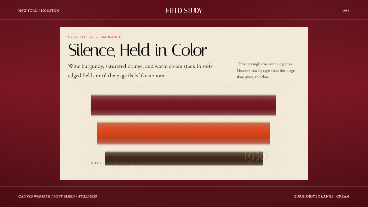 Mark Rothko Color Field (1950)Silence made visible. Burgundy, orange, and cream stack in soft-edged fields.把沉默变成可见。酒红、橙与奶油柔边堆叠成色域。
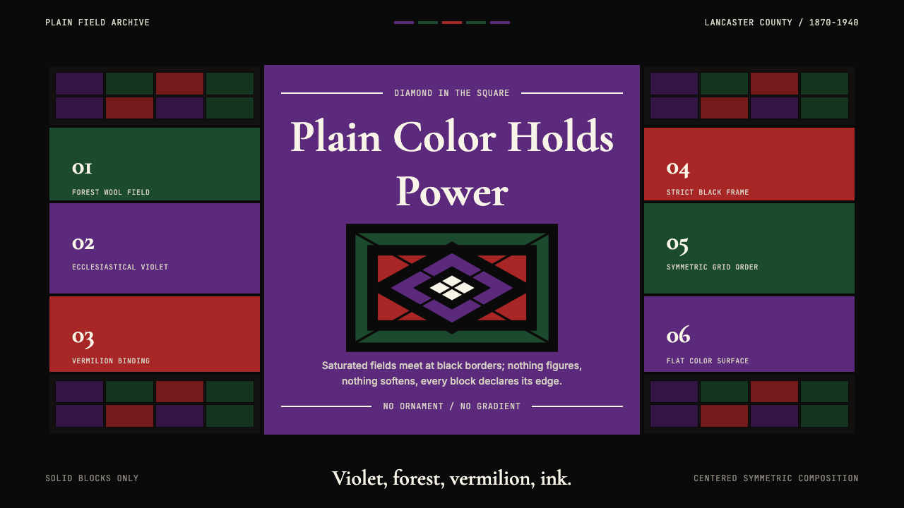 Amish Pennsylvania Quilt Bold GeometricRadical plainness. Violet, forest, and vermilion blocks lock into ink-black q…激进的朴素:紫、森林绿、朱砂红被墨黑拼布几何锁定。
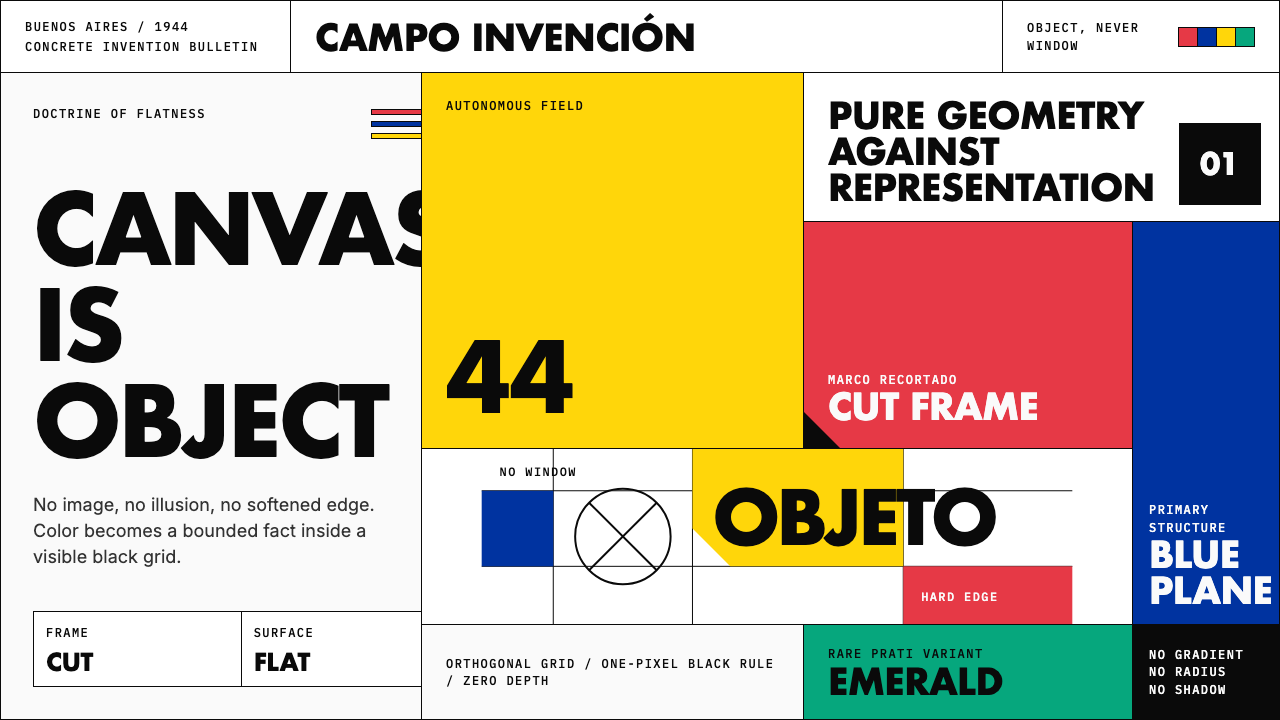 Argentine Arte ConcretoCanvas becomes object. Primary blocks, black hairlines, and a cut-frame grid…画布成为物:原色块、黑色细线与剪裁框网格强制平面性。
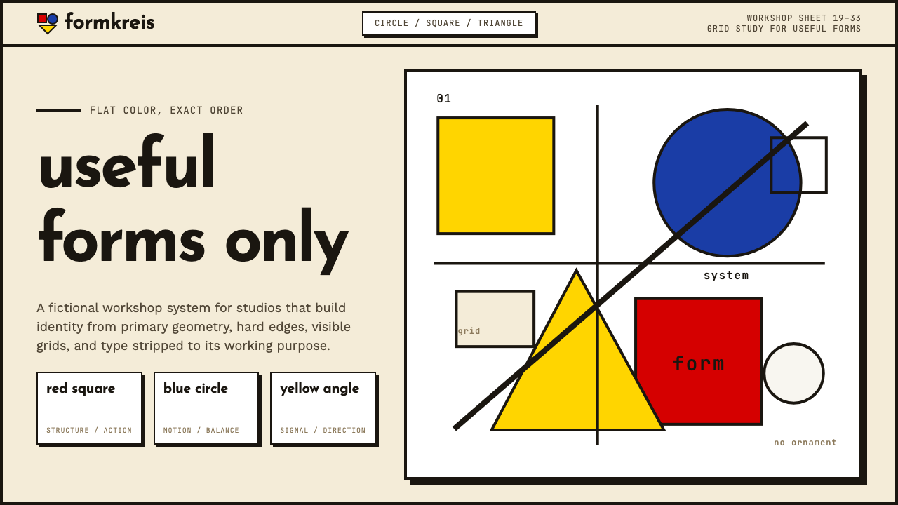
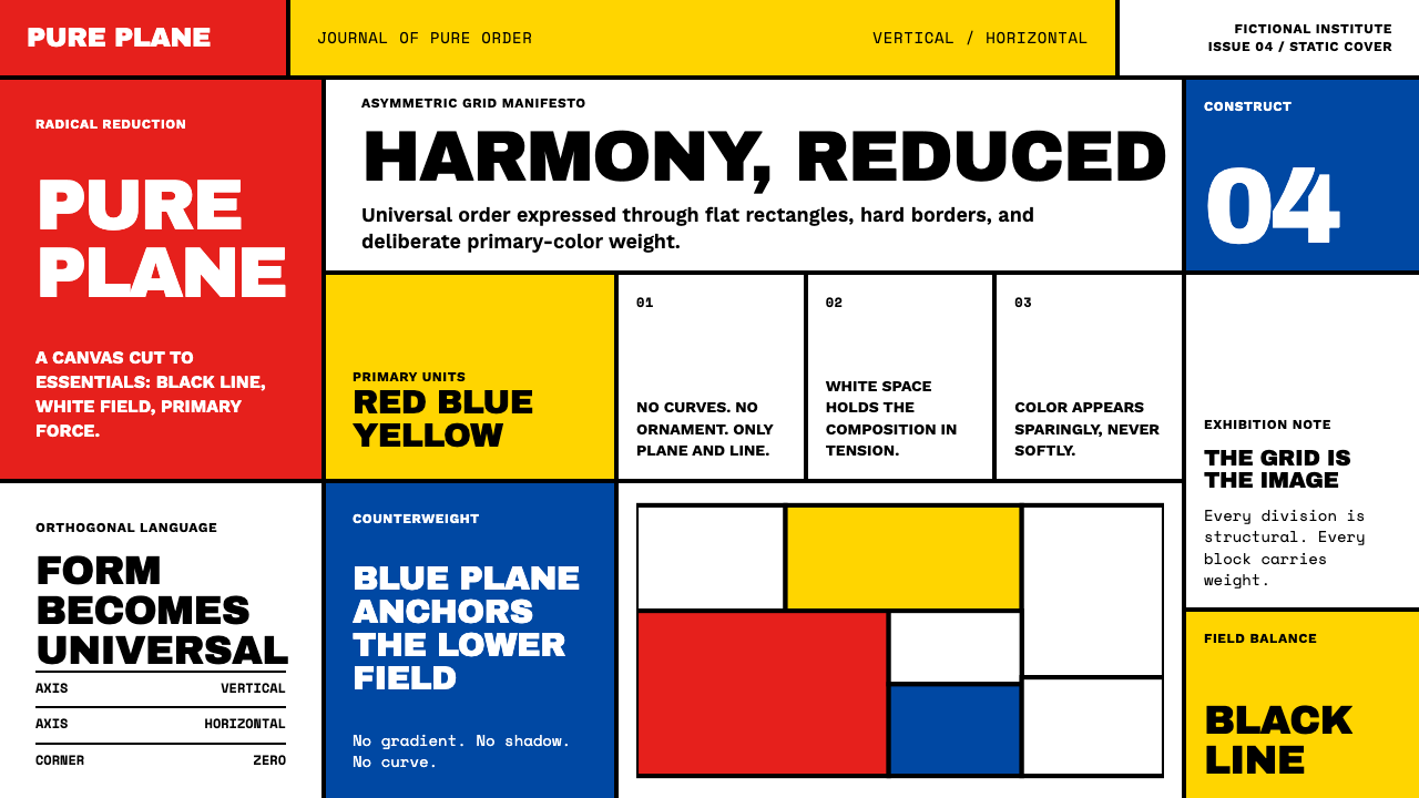 De StijlPrimary colors, locked in a black grid. Mondrian's compositions, in thick bor…蒙德里安的构成系列译为界面:黑色粗线划分白底、纯红蓝黄填充、零圆角——新造型主…
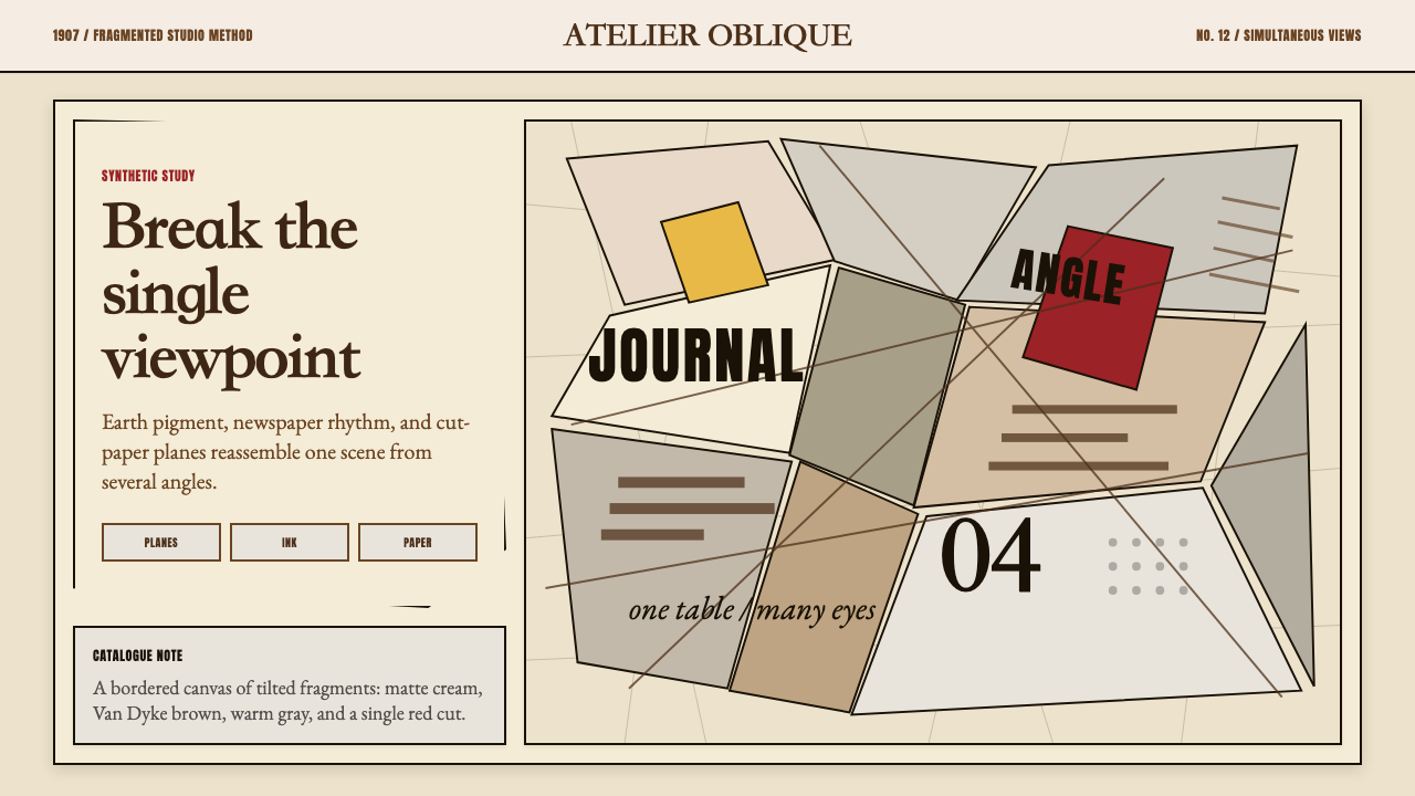 Picasso CubismSingle sight is shattered. Cream collage paper fractures brown-gray planes wi…单一视角被击碎:奶油拼贴纸上,褐灰棱面被一刀红色刺穿。
 Bauhaus WeimarForm follows revolution. Primary red-blue-yellow on cream, hard shadows, no o…形式追随革命:奶油纸底上的红蓝黄三原色、硬偏移投影、零装饰——纯粹功能即美。