Design style guide设计风格指南
What is Amish Pennsylvania Quilt Bold Geometric?什么是 Amish Pennsylvania Quilt Bold Geometric?
Amish Pennsylvania Quilt Bold Geometric translates the radical color-field geometry of Lancaster County's plain-community quilts — saturated solid blocks framed by ink-black borders — into a design language that anticipated color-field painting by half a century.宾夕法尼亚阿米什拼布大胆几何,将兰开斯特县朴素教派拼布的激进色域几何——饱和纯色块以墨黑边框严格框定——转化为一套早于色域绘画半个世纪的设计语言。
Amish Pennsylvania Quilt Bold Geometric in briefAmish Pennsylvania Quilt Bold Geometric 速览
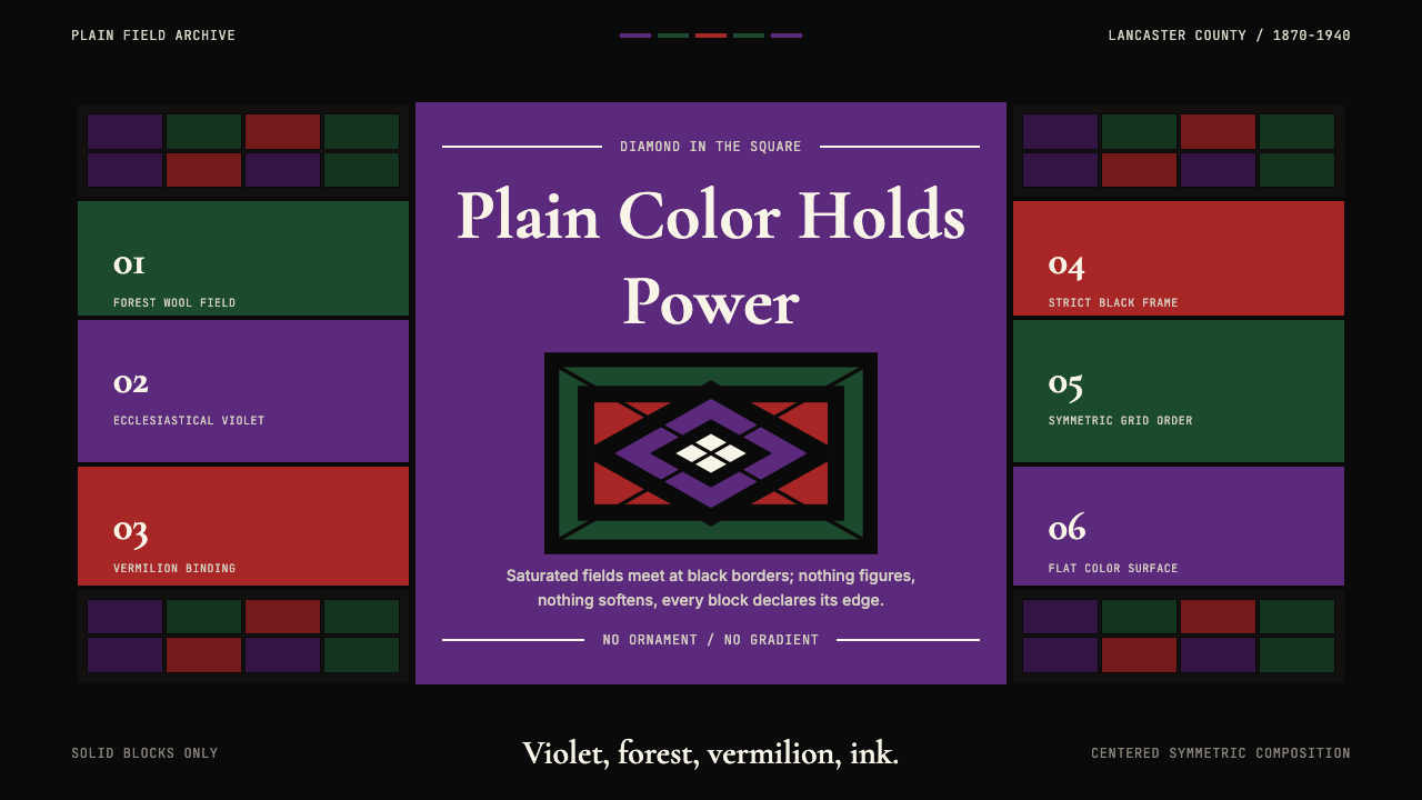
Amish Pennsylvania Quilt Bold Geometric is a design system rooted in the wool quilts made by Old Order Amish women in Lancaster County from roughly the 1870s through the 1940s. Those quilts — Diamond in the Square, Bars, Center Square, Sunshine and Shadow — are among the most formally rigorous works of textile art ever produced in North America. Their visual power comes not from complexity but from its deliberate absence: large, flat, unbroken fields of saturated color — ecclesiastical violet, deep forest green, vermilion red — held together by wide expanses of ink-black or midnight-blue ground.宾夕法尼亚阿米什拼布大胆几何是一套植根于兰开斯特县旧秩序阿米什妇女羊毛拼布的设计系统,这批拼布大约制作于十九世纪七十年代至二十世纪四十年代之间。这些拼布——方中菱、条纹、中心方形、阳光与阴影——是北美有史以来形式上最严谨的纺织艺术作品之列。其视觉力量来源不在于复杂性,而在于对复杂性的刻意缺席:大面积、平坦、完整的饱和色域——教会紫、深林绿、朱砂红——被宽幅墨黑或午夜蓝底色严格框定。
The Ordnung, the unwritten code governing Amish community life, prohibited figurative ornament, representational imagery, and anything that might elevate individual aesthetic expression over communal plainness. Paradoxically, this prohibition produced a tradition of extraordinary visual force. With no flowers, no birds, no narrative scenes permitted, quilt makers channeled everything into the elemental: the relationship between one color and another, the weight of a border, the precision of a seam. The result is an aesthetic of pure color geometry — squares, diamonds, rectangles, and bars — that reads today with startling modernity.规约(Ordnung)是支配阿米什社区生活的不成文法则,禁止一切具象纹饰、表象图像以及任何可能将个体审美表达凌驾于集体朴素之上的东西。矛盾的是,正是这一禁令催生了一种具有非凡视觉力量的传统。在花卉、鸟类、叙事场景均被禁止的前提下,拼布制作者将一切能量倾注于最基本的元素:一种颜色与另一种颜色的关系、边框的分量、接缝的精度。由此产生了一种纯粹色彩几何的美学——方形、菱形、长方形与条纹——在今天读来仍令人惊叹地具有现代感。
In interface design terms, this system operates on a small number of powerful contrasts rather than a dense hierarchy of visual information. The palette is deliberately limited: two or three saturated hues against a near-black ground. Composition is symmetric and centered, echoing the Diamond in the Square format. Borders and frames are wide enough to carry visual weight of their own. Nothing within a color field breaks the flatness — no texture, no gradient, no internal pattern. The power of the system is the power of restraint applied to already-bold material.在界面设计语境中,这套系统依靠少数强烈对比而非密集的视觉信息层级运作。色板刻意受限:两到三种饱和色相对近黑底色。构图对称居中,呼应方中菱的格式。边框与框架足够宽阔,能自行承担视觉分量。色域内部没有任何打破平面性的元素——无质感、无渐变、无内部图案。这套系统的力量,是将克制施加于本已大胆的素材之上所产生的力量。
Where does Amish Pennsylvania Quilt Bold Geometric come from?Amish Pennsylvania Quilt Bold Geometric 从何而来?
The Amish, an Anabaptist sect originating in the Alsace region of present-day France and Switzerland, began migrating to Pennsylvania in the early eighteenth century, settling in the rich farmland of Lancaster County. By the mid-nineteenth century, the Lancaster County Amish had developed a quilting tradition that diverged sharply from the pieced, patterned quilts made by their non-Amish neighbors. Where mainstream American quilts of the Victorian era featured complex multi-color patchwork, intricate appliqué, and naturalistic floral motifs, Amish quilts used solid-color wools in large geometric forms, sewn with exceptional technical precision and finished with elaborate hand quilting.阿米什人是再洗礼派的一支,起源于今日法国与瑞士交界的阿尔萨斯地区,于十八世纪初开始移居宾夕法尼亚,定居于兰开斯特县富饶的农业地带。到十九世纪中叶,兰开斯特县阿米什人已发展出一套与非阿米什邻居截然不同的拼布传统。维多利亚时代主流美国拼布以复杂的多色拼贴、繁复的贴布绣和自然主义花卉图案为特征,而阿米什拼布则使用大几何形态的纯色羊毛,以极高的技术精度缝制,再以精美的手工绗缝收尾。
The choice of solid wool over printed cotton was partly practical — wool was what Amish farms produced — and partly doctrinal. The Ordnung's prohibition on worldly display extended to printed cloth with its commercial patterns and colors. Plain fabric, dyed in the deep, saturated hues available from natural and then commercial dyestuffs, was the permitted material. Within this constraint, quiltmakers exercised remarkable aesthetic judgment: the pairing of a violet center diamond with a forest-green inner border and a black outer border, or of vermilion bars against a near-black ground, reflects color sensibility of the highest order.选择纯色羊毛而非印花棉布,部分出于实用考量——羊毛正是阿米什农场的产出——部分出于教义规定。规约对世俗炫耀的禁止延伸至带有商业图案和色彩的印花布料。用天然染料(后来也包括商业染料)染成深沉饱和色调的素色布料,才是被允许的材料。在这一限制之内,拼布制作者展现出卓越的审美判断力:将紫色中心菱形与森林绿内框、黑色外框相配,或将朱砂红条纹置于近黑底色之上,反映出最高水准的色彩感知力。
The peak period of Lancaster County Amish quilt production, roughly 1870 to 1940, corresponds precisely to a time when the outside world was producing Art Nouveau, then Modernism, then the Bauhaus — movements that self-consciously theorized the relationship between color, form, and meaning. The Amish quilters knew nothing of these movements and had no interest in them. Their formal choices were governed by community tradition and the logic of the Ordnung, not by art theory. That the results should anticipate so much of what the modernist avant-garde would later formalize is a historical irony that has fascinated scholars since the 1971 Whitney Museum exhibition.兰开斯特县阿米什拼布生产的巅峰期(大约从1870年到1940年),恰好对应着外部世界先后诞生新艺术运动、现代主义和包豪斯的时段——这些运动都在自觉地理论化色彩、形态与意义之间的关系。阿米什拼布制作者对这些运动毫不知晓,也对其毫无兴趣。她们的形式选择受社区传统与规约逻辑支配,而非艺术理论。这些选择的结果竟然先于现代主义先锋所后来正式确立的许多原则,是一个自1971年惠特尼博物馆展览以来令学者们长期着迷的历史巧合。
That exhibition — Abstract Design in American Quilts, organized by Jonathan Holstein and Gail van der Hoof — is the single most important event in the public reception of Amish quilts. Holstein and van der Hoof hung quilts from the nineteenth and early twentieth centuries on the walls of the Whitney as they would hang paintings, stripped of their domestic context. The quilts held their own as large-scale abstract art. Critics who had spent careers writing about Ellsworth Kelly, Frank Stella, and Kenneth Noland recognized immediately that these anonymous rural women had been making color-field and hard-edge abstraction decades before those terms existed. The exhibition traveled internationally and transformed the market for Amish quilts, triggering a collecting boom that by the 1980s had removed many of the finest examples from Lancaster County communities entirely.那场展览——《美国拼布中的抽象设计》,由乔纳森·霍尔斯坦与盖尔·范德霍夫策划——是阿米什拼布公众接受史上最重要的事件。霍尔斯坦与范德霍夫将十九世纪至二十世纪初的拼布像悬挂绘画那样挂在惠特尼的墙面上,剥去其家庭日用的背景。拼布作为大尺幅抽象艺术经受住了考验。那些花了整个职业生涯书写埃尔斯沃思·凯利、弗兰克·斯特拉和肯尼斯·诺兰的批评家们立刻认识到:这些不知名的乡村妇女,早在这些术语诞生之前数十年,就已经在制作色域绘画与硬边抽象。展览巡回至国际各地,彻底改变了阿米什拼布市场,引发了一场收藏热潮,至二十世纪八十年代,许多最优质的藏品已完全流出兰开斯特县社区。
What defines the Amish Pennsylvania Quilt Bold Geometric look?Amish Pennsylvania Quilt Bold Geometric 的视觉特征是什么?
Color色彩
The palette is built from a small number of saturated solid hues — deep violet, forest green, vermilion, and occasionally teal or indigo — deployed against wide expanses of near-black or midnight ground. These are not colors chosen for harmony in the conventional sense; they are chosen for maximum luminous impact against the dark field. The effect is something close to stained glass: each color holds its own visual weight, and the contrast between saturated hue and deep ground creates an almost physical sense of presence. Secondary tones or blended hues are entirely absent. Every color is at full strength.色板由少数饱和纯色构建——深紫、森林绿、朱砂红,偶尔加入蓝绿或靛蓝——铺设于大面积近黑或午夜底色之上。这些色彩的选择并非出于传统意义上的和谐考量,而是为了在暗底上取得最大的发光冲击力。效果接近彩色玻璃:每种色彩自行承担视觉分量,饱和色相与深色底面的对比制造出近乎触觉的存在感。间色或混合色完全缺席,每种颜色都以全强度呈现。
Geometry几何形态
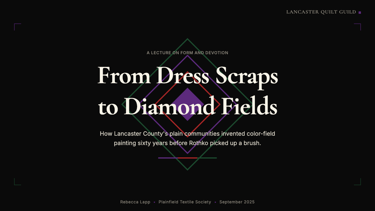
The compositional vocabulary is severe and limited: diamonds, squares, rectangles, and bars. The Diamond in the Square format — a square rotated forty-five degrees and set inside a second square — is the most iconic form, and its logic of a centered, symmetrically framed focal element runs through the entire design system. There are no curves, no diagonal lines that are not derived from the forty-five-degree rotation of a rectangle, and no organic or irregular forms whatsoever. The geometry is uncompromising, and its precision is part of what gives the system its formal authority.构图词汇严格而有限:菱形、方形、长方形与条纹。方中菱格式——一个旋转四十五度的方形置于另一个方形内——是最具标志性的形态,其以中心对称框架焦点元素的逻辑贯穿整套设计系统。没有曲线,没有不来源于长方形四十五度旋转的斜线,没有任何有机或不规则的形态。几何是毫不妥协的,而这种精确性正是系统获得形式权威的原因之一。
Border and Frame边框与框架
Wide, dark borders are as structurally essential to this system as the color fields they contain. In historic quilts, the outer border — typically black or very deep navy — might constitute a third or more of the total surface area. This is not a passive frame; it is an active compositional element that holds the saturated interior in tension and amplifies its luminosity by contrast. In interface terms, wide dark borders and framing elements perform the same function: they give color fields room to breathe while intensifying their apparent saturation.宽幅深色边框对这套系统的结构重要性丝毫不亚于它所包含的色域。在历史拼布中,外边框——通常是黑色或极深的海军蓝——可能占据总面积的三分之一甚至更多。这不是被动的装饰框;它是主动的构图元素,将饱和的内部色彩维持在张力之中,并通过对比增强其发光度。在界面语境中,宽幅深色边框与框架元素执行同样的功能:在给色域留出呼吸空间的同时,强化其表观饱和度。
Symmetry and Centering对称与居中
Unlike the asymmetric, directional compositions of Bauhaus or Swiss International Style, Amish quilt geometry is radically centered and symmetric. The Diamond in the Square composition has bilateral symmetry on both axes; the Bars pattern is symmetric across its central horizontal axis. This centering is not timid or classical — it is deliberate and confrontational, presenting the composition as an object rather than a flow. Applied to interface design, this quality produces layouts that feel monumental and still: landing pages, hero panels, and full-screen modals work particularly well in this register.与包豪斯或瑞士国际主义风格的非对称、方向性构图不同,阿米什拼布几何是彻底居中且对称的。方中菱构图在两条轴线上均具双边对称;条纹图案沿中央水平轴对称。这种居中并非胆怯或古典式的——它是刻意的、对抗性的,将构图呈现为一个对象而非一种流动。应用于界面设计时,这种品质产生感觉庄重而静止的版面:落地页、英雄面板和全屏模态窗口在这种调性中尤为出色。
Flatness平面性
Every color field in this system is unbroken flat — no texture, no gradient, no internal variation of any kind. The only visual information within a color field is its edge: how it meets the adjacent color or border. This absolute flatness was a material consequence of the quilting tradition (solid wool dyed to uniform color), but it reads today as a formal commitment that anticipates the color-field painting of Rothko and Barnett Newman. In digital applications, this flatness translates directly: no drop shadows, no noise overlays, no grain textures, no inner glows. Color is color, edge is edge.这套系统中每个色域都是完整平坦的——无质感、无渐变、无任何内部变化。色域内唯一的视觉信息是它的边缘:它与相邻色彩或边框的交接方式。这种绝对平面性是拼布传统的材料结果(匀染纯色羊毛),但在今天读来却像是一种形式承诺,预示了罗斯科与巴内特·纽曼的色域绘画。在数字应用中,这种平面性直接转化:无投影、无噪声叠加、无颗粒质感、无内发光。色彩即色彩,边缘即边缘。
Scale and Proportion尺度与比例
The power of Amish quilt geometry comes partly from its scale: these are large objects, and the color fields within them are large in proportion. A center diamond might occupy forty percent of the total surface; the surrounding inner borders, outer borders, and corner blocks divide the remaining area into carefully proportioned bands. This allocation of area — not decoration within areas — is where the aesthetic decisions are made. In interface design, the same logic applies: the proportion of dark ground to saturated color, of border width to interior field, determines the emotional register of the whole.阿米什拼布几何的力量部分来自其尺度:这些是大型物件,其中的色域也相应大比例。中心菱形可能占据总面积的百分之四十;周围的内框、外框和角块将剩余面积分配为精心比例的色带。这种面积分配——而非面积内部的装饰——才是审美决策所在之处。在界面设计中,同样的逻辑成立:暗底与饱和色的比例、边框宽度与内部色域的比例,决定了整体的情感调性。
Zero Ornament Within the Field色域内零装饰
The Ordnung prohibition on worldly display translates, in visual terms, to a near-total suppression of ornament within each color field. Unlike the patterned quilts of non-Amish American quilt traditions — log cabin, nine-patch, flying geese — Amish solid quilts have nothing to look at within a color field except the color itself. The decorative energy is entirely displaced into the overall geometric composition, the color relationships, and the elaborate hand-quilting stitchwork that covers every field (and which disappears at the scale of reproduction). Applied to digital design, this principle mandates that no icon, pattern, illustration, or texture should interrupt a color panel without strong structural justification.规约对世俗炫耀的禁止在视觉上转化为对每个色域内部装饰的近乎全面压制。不同于非阿米什美国拼布传统的图案拼布——小木屋、九宫格、飞雁——阿米什纯色拼布在色域内部没有任何可供观看的东西,只有色彩本身。装饰能量完全转移到整体几何构图、色彩关系,以及覆盖每个色域的精美手工绗缝针法之中(后者在复制尺度下消失不见)。应用于数字设计,这一原则要求:未经强有力的结构理由,任何图标、图案、插图或质感都不得打断色彩面板。

Who shaped Amish Pennsylvania Quilt Bold Geometric?谁塑造了 Amish Pennsylvania Quilt Bold Geometric?
Holstein was a New York textile collector who, together with his partner Gail van der Hoof, assembled a major collection of Amish and non-Amish American quilts in the late 1960s and early 1970s. His critical insight — that certain quilts, particularly the Lancaster County Amish geometric examples, could be read as monumental abstract art independent of their domestic function — led directly to the 1971 Whitney Museum exhibition. Holstein went on to write The Pieced Quilt (1973), the first serious critical study of American quilt art, and spent decades advocating for the recognition of quilts as a legitimate art form rather than craft or folk artifact.霍尔斯坦是纽约的纺织品收藏家,他与伴侣盖尔·范德霍夫在二十世纪六十年代末至七十年代初共同组建了一批重要的阿米什及非阿米什美国拼布收藏。他的关键洞见——某些拼布,尤其是兰开斯特县阿米什几何拼布,可以被独立于其家庭功能而作为纪念性抽象艺术来解读——直接促成了1971年惠特尼博物馆的展览。此后,霍尔斯坦出版了《拼贴拼布》(1973年),这是第一部认真对待美国拼布艺术的批评性研究,并用数十年时间倡导将拼布认定为合法艺术形式而非工艺品或民俗文物。
Granick is the author of The Amish Quilt (1989), the most thorough scholarly study of the Lancaster County tradition. Her research documented the specific color conventions, regional variations, and dating methods for Amish quilts, establishing the historical record that later design scholarship has drawn on. Granick was particularly attentive to the role of community women as the actual decision-makers in quilt composition — tracking how a particular pairing of violet and green or a specific border proportion might travel from one family's quilts to a neighbor's over decades, constituting an oral-and-tactile aesthetic tradition entirely outside the institutions of the mainstream art world.格兰尼克是《阿米什拼布》(1989年)的作者,这是关于兰开斯特县传统最为系统的学术研究。她的研究记录了阿米什拼布特定的色彩惯例、地区变体与断代方法,建立了后来设计学术研究赖以借鉴的历史档案。格兰尼克特别关注社区女性作为拼布构图实际决策者的角色——追踪特定的紫绿配色或某一边框比例如何在数十年间从一个家庭的拼布传到邻居,构成一种完全存在于主流艺术世界制度之外的口传与触觉审美传统。
Pellman was a curator and author affiliated with The Old Country Store in Intercourse, Pennsylvania, who published extensively on Amish and Mennonite quilts beginning in the 1980s. Her books — including Amish Quilt Patterns (1984) and The World of Amish Quilts (1984, co-authored with her husband Kenneth Pellman) — brought systematic documentation of the compositional formats and color conventions to a broad audience. Pellman was unusual among quilt scholars in maintaining close, respectful relationships with Lancaster County Amish community members, and her writing reflects an insider-adjacent perspective on how quilts were made and valued within the community rather than merely from without.佩尔曼是宾夕法尼亚州因特科斯镇老乡村商店的策展人和作者,从二十世纪八十年代起大量出版阿米什与门诺派拼布相关著作。她的著作——包括《阿米什拼布图案》(1984年)和与丈夫肯尼斯·佩尔曼合著的《阿米什拼布的世界》(1984年)——将构图格式和色彩惯例的系统性记录带给了广大读者。佩尔曼在拼布学者中较为罕见地与兰开斯特县阿米什社区成员保持着密切而尊重的关系,她的写作反映了一种从内部相邻视角看待拼布如何在社区内部被制作与珍视的观点,而非仅仅来自外部的旁观。
Van der Hoof co-organized the 1971 Whitney Museum exhibition with Jonathan Holstein and shared in the assembly of the collection that made the show possible. Her contribution to the critical framing of Amish quilts as high art has been somewhat overshadowed by Holstein's subsequent solo publishing activity, but the original scholarly and curatorial vision behind the Whitney show was genuinely collaborative. The exhibition's catalogue text reflects her sensitivity to the quilts as objects carrying cultural and community meaning, not merely formal properties, and her influence can be traced in later quilt scholarship that takes community context seriously alongside visual analysis.范德霍夫与乔纳森·霍尔斯坦共同策划了1971年惠特尼博物馆展览,并参与组建了使展览成为可能的收藏体系。她对将阿米什拼布定格为高级艺术的批评性框架的贡献,在一定程度上被霍尔斯坦后来的单独出版活动所遮蔽,但惠特尼展览背后最初的学术与策展愿景是真正协作的产物。展览图录文本反映了她对拼布作为承载文化与社区意义的物件——而不仅仅是形式属性——的敏感性,她的影响可以在后来同样重视社区背景与视觉分析的拼布学术研究中追溯到。
Newman was not an Amish quilt scholar but a New York abstract expressionist painter whose zip paintings — large fields of saturated color divided by narrow vertical bands — bear a structural resemblance to Amish quilt geometry so striking that critics noted it immediately when the 1971 Whitney exhibition opened. Newman's own account of his work emphasized spiritual presence over formal analysis: the large color field was meant to envelop and overwhelm the viewer in the way that sublime natural phenomena do. The Amish quilts, made by women who would have been baffled by such theorizing, produce a remarkably similar effect through entirely different means and motivations, which is precisely what makes the comparison so persistent and so interesting.纽曼并非阿米什拼布学者,而是纽约抽象表现主义画家,他的「拉链」绘画——以窄幅垂直色带划分的大面积饱和色域——与阿米什拼布几何的结构相似性如此显著,以至于批评家们在1971年惠特尼展览开幕时立即注意到这一点。纽曼本人对其作品的阐述强调精神性存在而非形式分析:大面积色域旨在以崇高自然现象般的方式包裹并压倒观者。阿米什拼布——由那些对此类理论化感到茫然的女性制作——通过完全不同的手段与动机产生了极为相似的效果,这正是这种比较如此持久而有趣的原因所在。
How do you use Amish Pennsylvania Quilt Bold Geometric today?今天怎么用 Amish Pennsylvania Quilt Bold Geometric?
Amish Pennsylvania Quilt Bold Geometric is a high-impact system that rewards restraint in application. Its power derives from a small number of moves — a very limited palette of saturated solids against a near-black ground, wide structural borders, and rigorous centered symmetry — applied at generous scale. The temptation to add more — more colors, more visual information, more graphic elements — consistently undermines it. Fewer elements, larger fields, and more deliberate negative space always strengthen the system.宾夕法尼亚阿米什拼布大胆几何是一套高冲击力系统,在应用中回报克制。其力量来源于少数几个动作——近黑底色上极有限的饱和纯色板、宽幅结构性边框和严格的居中对称——以充足的尺度施展。添加更多元素的诱惑——更多色彩、更多视觉信息、更多图形元素——始终会削弱它。更少的元素、更大的色域和更刻意的负空间,永远能强化这套系统。
For presentation slides, this system is exceptionally suited to moments requiring maximum visual impact with minimum complexity. A cover slide built in this system uses the Diamond in the Square logic directly: a centered geometric element in one saturated hue occupies the dominant proportion of the frame, surrounded by wide dark borders. The title sits within or beneath the geometric form in light type against the dark field. Content slides should resist the urge to fill space: a single saturated sidebar or top band, a generous dark background, and clean light type on the dark field. Data visualizations become geometric objects — the bars of a bar chart, the segments of a distribution — rendered in the two or three palette hues without softening or gradation.对于演示文稿,这套系统在需要以最小复杂度产生最大视觉冲击的时刻尤为出色。以这套系统构建的封面页直接运用方中菱逻辑:以某一饱和色相为色彩的居中几何元素占据画框的主导比例,四周以宽幅深色边框环绕。标题置于几何形内部或下方,以浅色字体置于深色底面上。内容页应抵制填满空间的冲动:一条单独的饱和侧边栏或顶部色带,充裕的深色背景,深色底面上干净的浅色字体。数据可视化成为几何对象——柱状图的条形、分布图的分段——以两到三种色板色相呈现,无软化或渐变。
For web interfaces, the system is particularly effective in hero panels, full-bleed landing sections, and modal overlays where the full-screen environment allows the dark ground and saturated fields to read at the scale they require. Dashboard applications can use this system for high-priority status panels, alert states, or tier-differentiation elements, where the saturated colors carry semantic meaning — status green, alert red — against a consistently dark interface ground. Pricing pages work well with a centered layout that foregrounds one tier using the saturated color logic: a single highlighted column in deep violet or forest green against a near-black surrounding.对于网页界面,这套系统在英雄面板、全出血落地区块和模态叠加层中特别有效——在这些全屏环境中,深色底面和饱和色域能以它们所需的尺度被读取。仪表板应用可以将这套系统用于高优先级状态面板、警示状态或等级区分元素,其中饱和色彩在持续深色界面底面上承载语义意义——状态绿、警示红。定价页面适合以居中布局突出某一等级,运用饱和色彩逻辑:在近黑色周边环境中,以深紫或森林绿高亮单列。
In editorial and marketing contexts, this system produces work that is bold enough to stop attention at distance — poster-level impact — while remaining formally simple enough to reproduce cleanly at any scale. Feature campaign imagery uses large geometric color fields as background panels, with copy or product isolated in the central diamond or rectangle. Marketing emails and social cards benefit from the same logic: a dominant geometric field in one saturated hue, a wide dark border, and minimal type. The system performs poorly when asked to carry a lot of body text or detailed information, because the large dark fields and high contrast work against extended reading comfort.在编辑和营销语境中,这套系统产生的作品足够大胆,能在远处吸引注意力——达到海报级冲击力——同时在形式上足够简洁,能在任何尺度下清晰复制。特色活动图像以大面积几何色域作为背景面板,文案或产品被隔离在中央菱形或矩形中。营销邮件和社交媒体卡片受益于同样的逻辑:一个以某一饱和色相为主的几何色域,一条宽幅深色边框,最少量的文字。当被要求承载大量正文或详细信息时,这套系统表现欠佳,因为大面积深色底面和高对比度不利于延展性阅读的舒适度。
A common mistake in applying this system is treating the dark ground as interchangeable with a lighter or neutral background. The near-black or midnight ground is not merely a stylistic choice — it is the element that makes the saturated color fields luminous rather than simply bright. On a lighter ground, the same violet or forest green reads as simply saturated; against near-black, it glows with a quality close to transmitted light. A second common error is using the three palette hues simultaneously in the same composition at full saturation. Authentic Amish quilt compositions lead with one dominant color, deploy a second as inner framing, and use a third sparingly or not at all. This restraint is not poverty of imagination; it is what produces the formal authority that makes the system memorable.应用这套系统时的常见错误,是将深色底面视为可与较浅或中性背景互换的元素。近黑或午夜底面不仅仅是风格选择——它是使饱和色域发光而非仅仅明亮的要素。在较浅底面上,同样的紫色或森林绿只是看起来饱和;而置于近黑底面上,它以接近透射光的品质发出光泽。第二个常见错误是在同一构图中同时以全饱和度使用三种色板色相。真实的阿米什拼布构图以一种主色为主导,以第二种作为内框,第三种则极少使用甚至不用。这种克制并非想象力的匮乏;正是它产生了使这套系统令人难忘的形式权威。
Amish Pennsylvania Quilt Bold Geometric — FAQAmish Pennsylvania Quilt Bold Geometric · 常见问题
How does this system relate to color-field painting — are the visual similarities coincidental?这套系统与色域绘画有何关联——视觉上的相似性是巧合吗?
The similarities are structural rather than coincidental, though the causal direction is surprising. The Lancaster County Amish quilts that most closely anticipate color-field painting were made from the 1870s onward — decades before Barnett Newman's first zip painting (1948) or Mark Rothko's mature color-field canvases (early 1950s). The Amish quilters did not influence the painters: they were an isolated rural community with no connection to New York art circles. The parallel emerged because both traditions arrived at similar formal conclusions through entirely different routes. The quilters were working within the constraints of the Ordnung and the logic of available dyed wool; the painters were working through the theoretical aftermath of Abstract Expressionism. That two such different contexts produced such similar visual results suggests the large saturated color field is not a culturally specific discovery but a fundamental formal mode with deep perceptual roots.这种相似性是结构性的而非偶然的,尽管因果方向令人惊讶。与色域绘画最为接近的兰开斯特县阿米什拼布,制作于十九世纪七十年代起——早于巴内特·纽曼的第一幅拉链画(1948年)或马克·罗斯科成熟的色域画布(五十年代初)数十年。阿米什拼布制作者并未影响那些画家:她们是与纽约艺术圈毫无关联的孤立农村社区。这种平行关系的出现,是因为两种传统通过完全不同的路径得出了相似的形式结论。拼布制作者在规约的约束和可用染色羊毛的逻辑下工作;画家们则在抽象表现主义的理论余波中摸索。如此不同的两种背景产生了如此相似的视觉结果,表明大面积饱和色域并非某种特定文化的发现,而是具有深刻感知根基的基本形式模式。
Can this dark, high-contrast system work on light backgrounds?这套高对比深色系统能用在浅色背景上吗?
It can be adapted to a light ground, but something essential is lost in the translation. The luminosity that makes authentic Lancaster County quilts so arresting depends critically on the dark surrounding field: the colors appear to glow because they are read against near-black, not because they are intrinsically brighter. On a light or neutral ground, the same hues read as simply saturated — good-looking, but without the almost electric quality that gives the system its authority. A light-ground adaptation works best when it treats the dark as a contained element — a wide dark border around a light central field, for instance — rather than inverting the whole system. This partial inversion retains the structural logic of the original while accommodating contexts where a predominantly dark interface is not appropriate.可以适配到浅色底面,但在转换中会失去一些本质性的东西。使真实兰开斯特县拼布如此夺目的发光感,关键取决于深色的周边色域:色彩之所以看起来在发光,是因为它们被置于近黑底色上阅读,而非因为它们本身更明亮。在浅色或中性底面上,同样的色相看起来只是饱和——悦目,但没有赋予系统权威性的那种近乎电气的品质。浅色底面的适配版本,在将深色作为被包含的元素处理时效果最好——例如,围绕浅色中心色域的宽幅深色边框——而非将整个系统反转。这种局部反转保留了原始系统的结构逻辑,同时适应了主要深色界面不适宜的语境。
What makes this different from simply using a dark theme with bright accent colors?这与单纯使用深色主题加明亮强调色有何不同?
The difference is in the proportion, the palette discipline, and the compositional logic. A standard dark theme with accent colors typically uses a near-black background as a passive setting for interface elements — navbars, cards, buttons — in which color appears as small, scattered accent. The Amish quilt system inverts this relationship: the saturated color fields are the primary compositional elements, occupying large and deliberately proportioned areas, with the dark functioning as border and frame rather than background fill. The palette discipline is also more severe: where a generic dark theme might use any color that reads clearly on dark, this system restricts to two or three deeply saturated solid hues with historical specificity. The result has a formal coherence and visual weight that generic dark-mode UI rarely achieves.差异在于比例、色板纪律和构图逻辑。标准的带强调色深色主题通常以近黑背景作为界面元素(导航栏、卡片、按钮)的被动底面——色彩以小而分散的强调形式出现。阿米什拼布系统颠倒了这种关系:饱和色域是主要的构图元素,占据大面积且经过刻意比例设计的区域,深色作为边框与框架而非背景填充。色板纪律也更为严格:通用深色主题可能使用任何在深色上清晰可读的色彩,而这套系统限于两到三种具有历史特异性的深度饱和纯色。结果拥有一种通用深色模式界面极少能达到的形式连贯性与视觉分量。
Is this system appropriate for brands or contexts that want to feel warm or approachable?这套系统适合希望传递温暖感或亲切感的品牌或语境吗?
Probably not as a primary system. The deep dark ground and saturated geometric fields produce a quality of visual presence that is monumental, still, and slightly austere — qualities that read as authoritative and serious rather than warm or inviting. This makes the system well suited to contexts where gravity and clarity are valued: premium product launches, high-stakes data presentations, arts and culture institutions, or technology brands positioning themselves as exceptional rather than friendly. For consumer applications where emotional warmth, playfulness, or sensory richness are important — food, children's products, wellness, community platforms — the system will likely feel cold and remote. A partial use of the palette (one saturated hue as accent against a lighter ground, for instance) can bring something of the style's boldness into a warmer register without committing to the full austerity of the system.作为主要系统,可能并不适合。深色底面与饱和几何色域产生的视觉存在感是庄重的、静止的、略带严肃的——这些品质传递权威性和严肃感,而非温暖或亲切。这使得这套系统非常适合重视庄重与清晰的语境:高端产品发布、高风险数据展示、艺术文化机构,或将自身定位为卓越而非友好的科技品牌。对于情感温暖、趣味性或感官丰富性重要的消费者应用——食品、儿童产品、健康、社区平台——这套系统可能会感觉冷漠而疏远。部分运用色板(例如以某一饱和色相作为较浅底面上的强调色)可以将这种风格的大胆感带入更温暖的调性,而无需承担系统的全部严苛性。
How do you handle typography in this system, given that text has to be legible against very saturated color fields?在这套系统中如何处理字体排印?毕竟文字必须在高度饱和的色域上保持清晰。
Typography in this system works best when it treats the legibility challenge as a formal constraint to lean into rather than solve away. The historic quilts had no typography, but the compositional logic suggests clear principles: text should sit either on the dark field (where light type has maximum contrast and reads cleanly) or within a dedicated dark band or border (where the dark ground again provides the contrast). Text placed directly on a saturated color field — violet, forest green, vermilion — creates a legibility challenge that the system does not resolve elegantly; when text must appear on a saturated field, very light or very dark near-solid type works best, and the text block should be kept short. The system favors large-scale display type over extended body text: the visual environment rewards brevity and weight, not density and length.这套系统中的字体排印,在将清晰度挑战视为需要顺势利用而非消解的形式约束时效果最佳。历史拼布中没有字体,但构图逻辑暗示了清晰的原则:文字应当置于深色底面上(浅色字体在此拥有最大对比度,读取清晰),或置于专用的深色色带或边框内(深色底面再次提供对比)。将文字直接置于饱和色域上——紫色、森林绿、朱砂红——会产生系统无法优雅解决的清晰度挑战;当文字必须出现在饱和色域上时,极浅或极深的近纯色字体效果最好,且文字块应保持简短。这套系统更适合大尺度展示字体而非延展性正文:视觉环境回报的是简洁与分量,而非密度与长度。
Related design styles相关设计风格
 Malevich SuprematismGeometry declares zero. Red, yellow, blue and black blocks float on active wh…几何宣告零点:红黄蓝黑色块漂浮于主动白场。
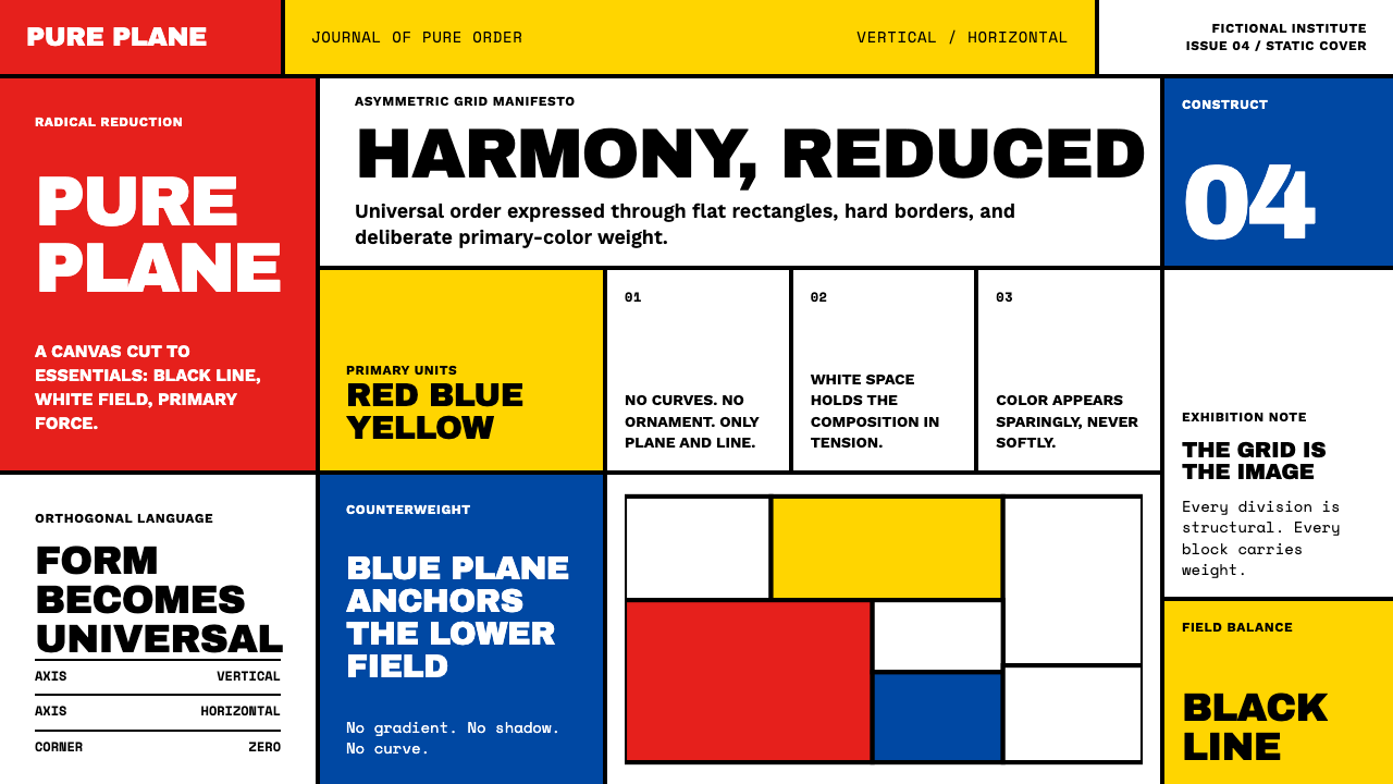 De StijlPrimary colors, locked in a black grid. Mondrian's compositions, in thick bor…蒙德里安的构成系列译为界面:黑色粗线划分白底、纯红蓝黄填充、零圆角——新造型主…
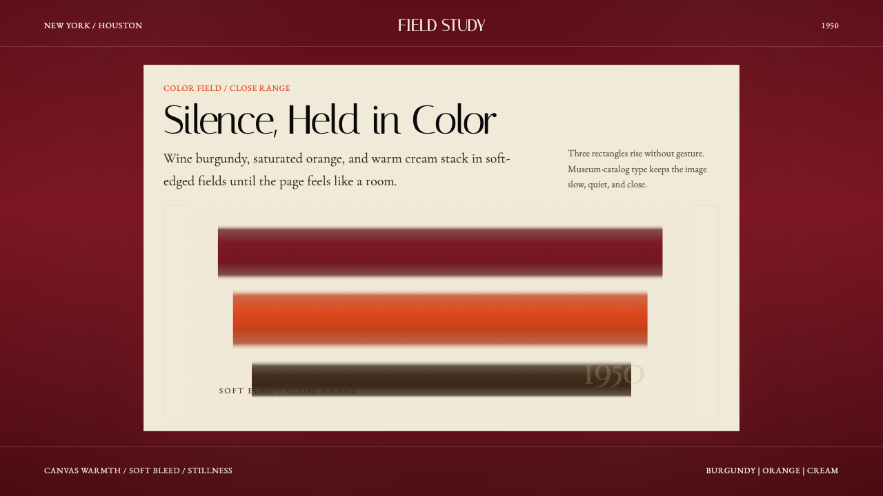 Mark Rothko Color Field (1950)Silence made visible. Burgundy, orange, and cream stack in soft-edged fields.把沉默变成可见。酒红、橙与奶油柔边堆叠成色域。
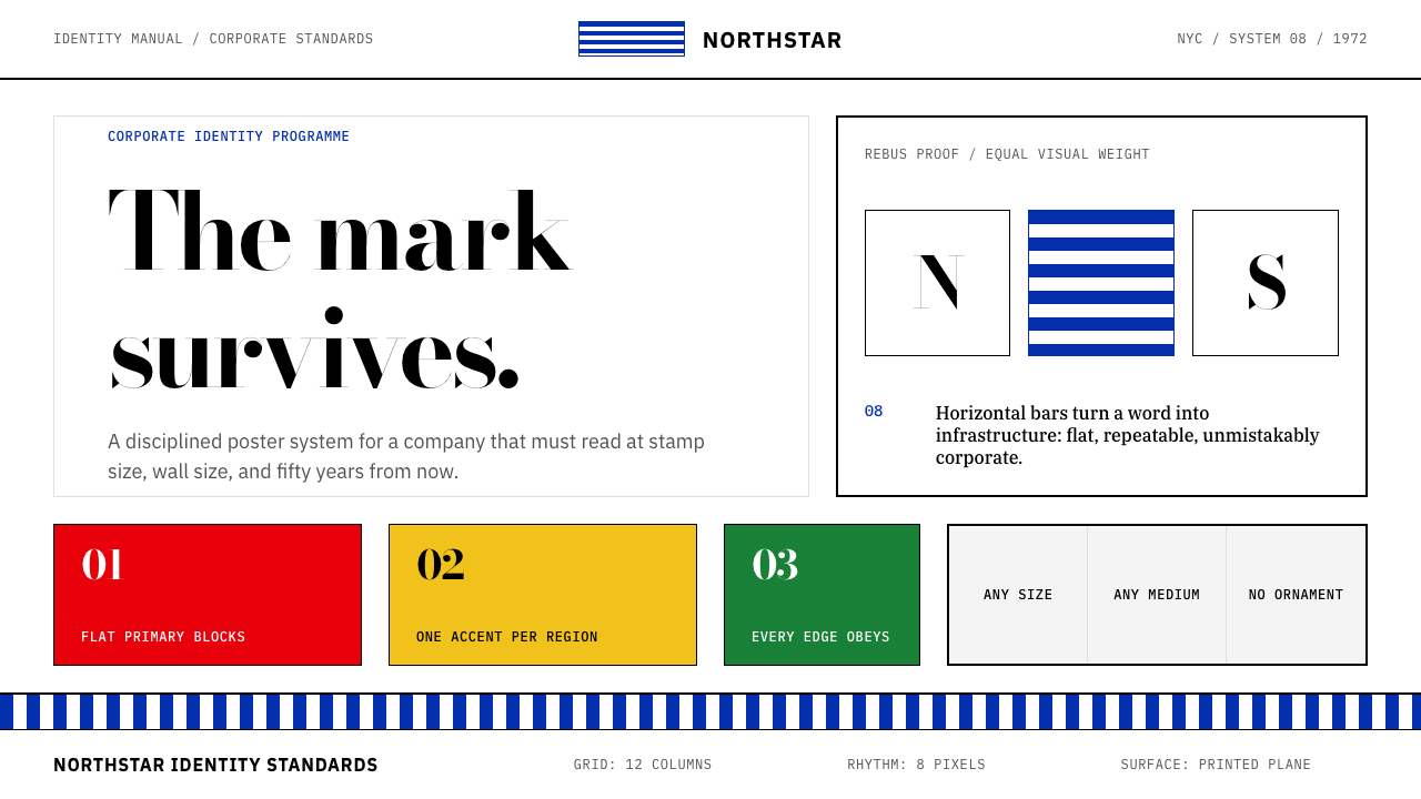 Paul Rand / IBM Corporate IdentityCorporate modernism stays exact. Blue 8-bar stripes, high-contrast serif, har…企业现代主义保持精确:蓝色八条纹、高反差衬线与硬网格色块。
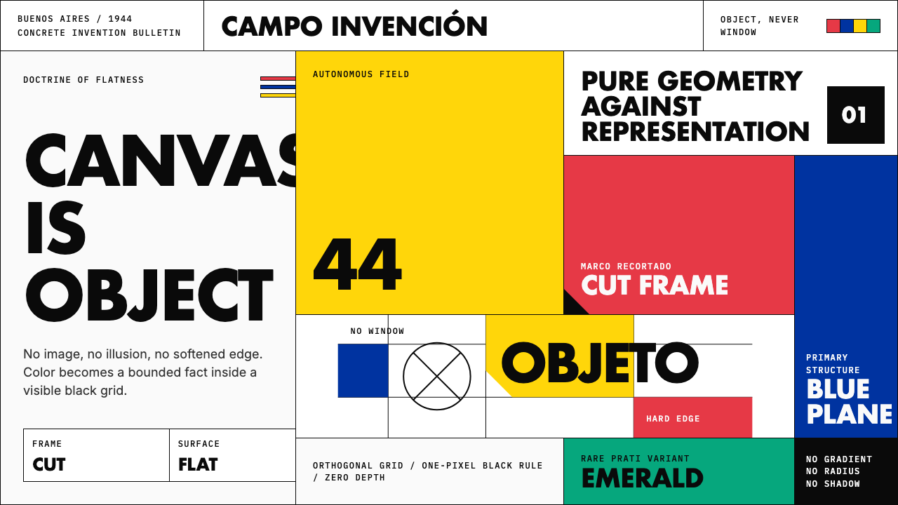 Argentine Arte ConcretoCanvas becomes object. Primary blocks, black hairlines, and a cut-frame grid…画布成为物:原色块、黑色细线与剪裁框网格强制平面性。
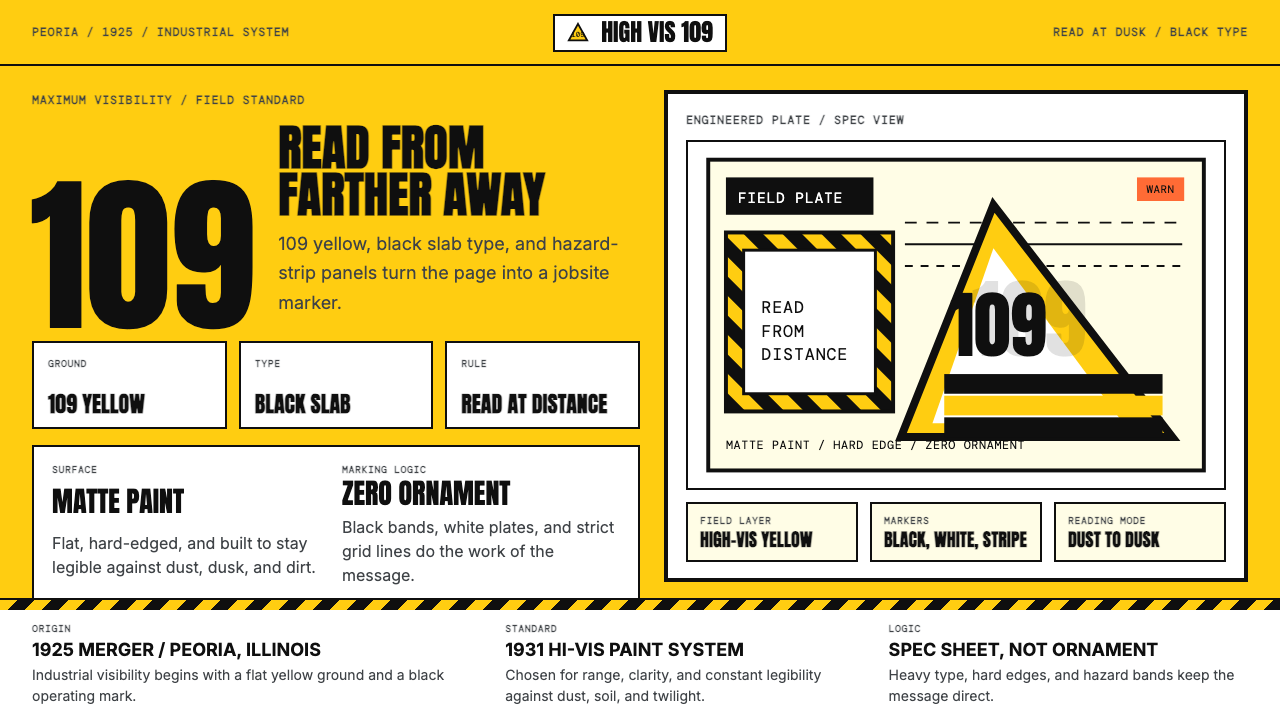 Caterpillar Construction Yellow (1925)Maximum visibility, zero softness. 109 yellow ground and black slab type.高可见度,零柔和。109 黄底配黑色粗体。