What is De Stijl?什么是 De Stijl?
De Stijl reduced the entire visual world to a black grid, three primary colors, and pure white — and in doing so produced one of the most recognizable and enduring design languages of the twentieth century.风格派将整个视觉世界简化为黑色网格、三原色与纯白——由此诞生了二十世纪最具辨识度、最经久不衰的设计语言之一。
De Stijl in briefDe Stijl 速览
De Stijl — Dutch for 'The Style' — is a Dutch art and design movement founded in 1917 whose visual language restricts itself to vertical and horizontal black lines, pure primary red, blue, and yellow fills, and white or neutral grounds. The result is a composition of asymmetric rectangles separated by thick black borders, with color used sparingly as a flat, symbolic fill rather than as shading or representation.风格派——荷兰语「De Stijl」意为「这种风格」——是1917年创立于荷兰的艺术与设计运动,其视觉语言将自身限定于垂直和水平的黑色线条、纯原色红、蓝、黄的填充,以及白色或中性底面。结果是由粗黑边框分隔的不对称矩形构成的画面,色彩作为平面的象征性填充而非阴影或再现被节制地使用。
The movement called its underlying philosophy Neoplasticism, a term coined by Piet Mondrian. Neoplasticism held that universal harmony could be expressed through the most reduced visual means possible: the right angle, the straight line, the primary color, and their opposites — oblique angles, curves, and mixed or muted hues — were to be rejected entirely. What remained after this purification was not emptiness but a distilled representation of the fundamental forces of existence: the vertical and horizontal, the particular and the universal, the material and the spiritual.该运动将其底层哲学称为新造型主义,这一术语由皮特·蒙德里安创造。新造型主义主张:宇宙和谐可以通过最简化的视觉手段来表达。直角、直线、三原色,以及它们的对立面——斜角、曲线、混合或中性色调——都应被彻底摒弃。经过这种净化之后留存下来的,不是空洞,而是对存在基本力量的提炼表达:垂直与水平、个别与普遍、物质与精神。
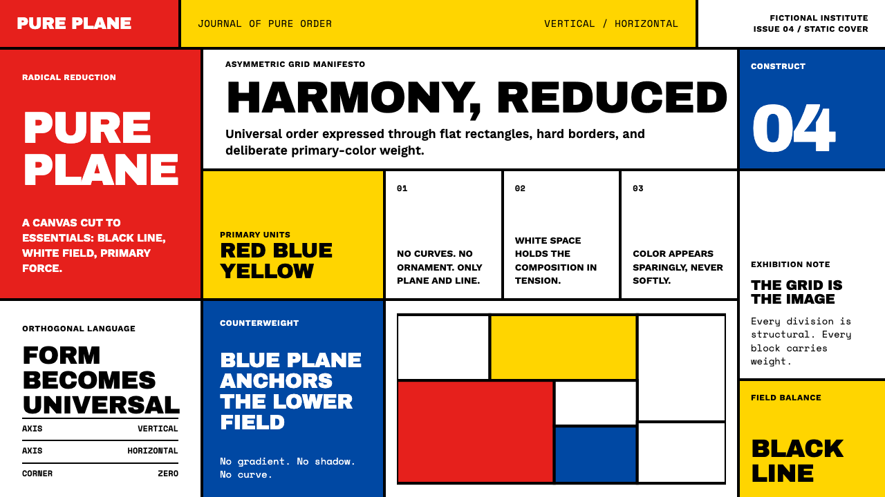
Visually, De Stijl is immediately legible. A thick black orthogonal grid divides a white surface into unequal rectangular fields. Most fields remain white; a handful are filled with an unmodulated primary color — a block of pure red anchoring one corner, a narrow strip of blue cutting across the middle, a small square of yellow providing tension. The asymmetry is carefully calibrated so that the composition feels balanced through weight and visual tension rather than symmetry. Nothing curves. Nothing blends. No surface has texture. The grid itself is the content.从视觉上看,风格派是立刻可辨的。粗黑的正交网格将白色表面切割为大小不等的矩形区域。大多数区域保持白色;少数填充以未经调和的原色——一块纯红锚定某个角落,一条窄蓝穿过中部,一小块黄色制造张力。这种非对称性经过精心校准,使构图通过重量与视觉张力而非对称感到平衡。没有曲线,没有混融,没有表面纹理。网格本身就是内容。
Where does De Stijl come from?De Stijl 从何而来?
De Stijl was founded in Leiden in October 1917 by the painter Piet Mondrian, the painter and architect Theo van Doesburg, and a small circle of collaborators including the designer Bart van der Leck, the architect J.J.P. Oud, and the furniture maker Gerrit Rietveld. The founding coincided with the publication of the first issue of their journal, also called De Stijl, which became the primary vehicle for disseminating their ideas. The Netherlands had remained neutral during the First World War, but the catastrophe of the war — which seemed to many European artists to reveal the bankruptcy of Western civilization's inherited values — provided the movement's moral urgency. A new visual order, they argued, was not merely an aesthetic preference but a necessity if human culture was to be reconstructed on better foundations.风格派于1917年10月由画家皮特·蒙德里安、画家兼建筑师特奥·凡·杜斯堡及一小圈合作者——包括设计师巴特·凡·德·莱克、建筑师J.J.P.奥德和家具制作者赫里特·里特韦尔德——在莱顿共同创立。这一创立时机与他们刊物《风格》第一期的出版同步,该刊成为传播其思想的主要载体。荷兰在第一次世界大战中保持中立,但战争的灾难——在许多欧洲艺术家看来揭示了西方文明既有价值观的破产——赋予了这场运动道德上的迫切感。他们主张:一种新的视觉秩序不仅仅是审美偏好,更是在更好的基础上重建人类文化的必要条件。
Mondrian arrived at his radical reduction through a decade of progressive abstraction. Trained in the Dutch landscape tradition, he had gradually dissolved the representational content of his work: first the curves of trees gave way to horizontal and vertical lines, then colors simplified to the primary three, then compositions stripped to the grid. By 1913 he was producing works that bore no resemblance to observed nature. His theoretical writings — collected in journals and later in his essays on Neoplasticism — argued that true painting must transcend the particular and contingent to express the universal relationships underlying all phenomena. The orthogonal grid was his solution: a structure that embodied the tension between opposites without privileging either.蒙德里安通过十年的渐进式抽象走向了他的彻底简化。受训于荷兰风景画传统,他逐渐消解了作品的再现性内容:先是树木的曲线让位于水平和垂直线条,继而颜色简化为三原色,最终构图剥离为网格。到1913年,他已在创作与观察自然毫无相似之处的作品。他的理论著作——收录于刊物中,后来汇成关于新造型主义的论文——主张:真正的绘画必须超越个别与偶然,去表达一切现象背后的普遍关系。正交网格是他的解答:一种体现对立面之间张力而不偏袒任何一方的结构。
Theo van Doesburg's role was as much organizational and polemical as it was artistic. He managed the journal, corresponded with Bauhaus figures — eventually causing a split with Mondrian over his introduction of diagonal lines in 1924 — lectured across Europe, and designed typefaces and architectural interiors that applied De Stijl principles to three-dimensional space. His work at the Café Aubette in Strasbourg, completed in 1928 with Jean Arp and Sophie Taeuber-Arp, represents one of the most ambitious attempts to apply the movement's language to an entire interior environment.凡·杜斯堡的角色在组织与论辩方面同样不亚于艺术创作。他管理刊物,与包豪斯人物通信——最终因1924年引入斜线而与蒙德里安产生决裂——在欧洲各地讲学,并设计了将风格派原则应用于三维空间的字体和建筑室内。他在斯特拉斯堡奥巴特咖啡馆的作品于1928年完工,与让·阿尔普和索菲·陶伊伯-阿尔普合作,是将这场运动的视觉语言应用于完整室内环境最雄心勃勃的尝试之一。
Gerrit Rietveld translated De Stijl into furniture and architecture with arguably the most tactile and enduring results. His Red and Blue Chair, designed around 1917 and refined over subsequent years, decomposed the chair into a spatial construction of independent structural members colored according to the De Stijl palette. His Rietveld Schröder House in Utrecht, built in 1924, extended this logic to architecture: the house's exterior breaks down into intersecting planes of primary color and neutral gray, with no enclosing corners and sliding partitions that transform the interior geometry. The house is a UNESCO World Heritage Site and remains the clearest surviving demonstration of what De Stijl architecture actually felt like to inhabit.赫里特·里特韦尔德将风格派转化为家具与建筑,产生了也许最具触感和最持久的成果。他约在1917年设计、此后数年不断完善的红蓝椅,将椅子解构为一组独立结构杆件的空间构造,按照风格派色板着色。他1924年建于乌得勒支的里特韦尔德-施罗德住宅将这一逻辑延伸至建筑:住宅外观分解为原色与中性灰色平面的交叉叠合,没有封闭的转角,推拉隔断改变着室内的几何关系。该住宅是联合国教科文组织世界遗产,也是风格派建筑居住感受最清晰的现存明证。
The movement formally dissolved with van Doesburg's death in 1931, though Mondrian had already distanced himself from the group following the 1924 diagonal dispute. The influence, however, was just beginning. The Bauhaus absorbed De Stijl thinking through direct contact with van Doesburg, who lectured in Weimar in 1921 and 1922. The International Style in architecture owed a significant structural debt to Rietveld and Oud. By the 1960s, De Stijl's visual vocabulary had become so thoroughly absorbed into graphic design, corporate identity, and modernist architecture that it was often mistaken for a neutral, universal language rather than the product of a specific philosophical program.这场运动随凡·杜斯堡于1931年的去世而正式解散,尽管蒙德里安在1924年斜线之争后已与团体保持距离。然而,影响才刚刚开始。包豪斯通过直接接触吸收了风格派思想——凡·杜斯堡于1921年和1922年在魏玛讲学。国际风格建筑对里特韦尔德和奥德有着深厚的结构性债务。到了1960年代,风格派的视觉词汇已被平面设计、企业视觉识别和现代主义建筑如此彻底地吸收,以至于常被误认为一种中性的、普遍性的语言,而非某个特定哲学纲领的产物。
What defines the De Stijl look?De Stijl 的视觉特征是什么?
The Orthogonal Grid正交网格
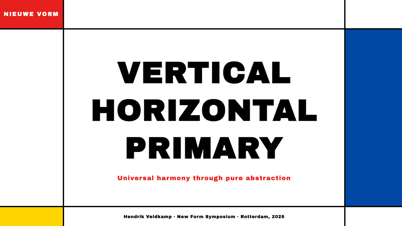
The defining structural element of De Stijl is the grid of thick black horizontal and vertical lines. These lines are not mere borders or separators — they are load-bearing visual elements in their own right, with a visual weight that commands attention equal to the color fills they enclose. The grid is always asymmetric: the rectangular fields it creates vary substantially in size, producing visual rhythm and tension rather than mechanical regularity. The intersections of these lines are not chamfered or rounded; they meet at strict right angles, and this orthogonal purity is non-negotiable within the system.风格派最具决定性的结构元素是由粗黑水平线与垂直线构成的网格。这些线条并非单纯的边框或分隔符——它们本身就是承重的视觉元素,其视觉分量与它们所围合的色彩填充并驾齐驱。网格始终是非对称的:它创造出大小各异的矩形区域,产生视觉节奏与张力,而非机械的规律性。这些线条的交汇处既不切角也不圆化,而是以严格的直角相交——这种正交纯粹性在这套系统中是不可谈判的。
Color as Absolute作为绝对的色彩
De Stijl uses only pure primary red, blue, and yellow as chromatic elements, set against fields of white, gray, or black. These colors are never mixed, never tinted, never shaded, and never applied as gradients — each appears as a flat, unmodulated fill at full intensity. The theoretical rationale, drawn from Mondrian's Neoplasticism, is that primary colors represent the universal before individuation: they are the irreducible starting points of all color, just as horizontal and vertical lines are the irreducible starting points of all spatial organization. Color carries conceptual weight, not decorative weight.风格派仅以纯原色红、蓝、黄作为色彩元素,置于白色、灰色或黑色的底面之上。这些颜色从不混合、从不减淡、从不加深,也从不以渐变形式呈现——每种色彩都以未经调和的平面填充、满饱和度呈现。这一理论依据来自蒙德里安的新造型主义:三原色代表尚未个别化的普遍性——它们是所有色彩最不可分割的起点,就像水平线与垂直线是所有空间组织最不可分割的起点一样。色彩承载的是概念性分量,而非装饰性分量。
Asymmetric Balance非对称平衡
De Stijl compositions are never mirror-symmetrical, yet they achieve a precise visual equilibrium. A large white field on one side is balanced by a smaller but more intensely colored field on the other; a thick horizontal band across the upper portion is answered by a narrow vertical stripe at the edge. This balance is arrived at through intuitive calibration of visual weight rather than geometric formula, which is why De Stijl compositions feel alive and taut rather than mechanical. The asymmetry was also a philosophical position: symmetry implies a fixed center of authority; asymmetry implies dynamic tension between equals.风格派的构图从不是镜像对称的,却达到了一种精确的视觉平衡。一侧巨大的白色区域被另一侧较小但色彩更为强烈的区域所平衡;上方一条宽阔的水平带被边缘一条细窄的垂直条纹所回应。这种平衡通过对视觉重量的直觉校准而非几何公式来实现——这正是风格派构图感觉充满活力与张力而非机械的原因。非对称性同时也是一个哲学立场:对称意味着固定的权威中心;非对称意味着平等者之间的动态张力。
Zero Curve, Zero Ornament零曲线,零装饰
Within the De Stijl system, the curve does not exist. Neither does diagonal orientation, decorative flourish, representational imagery, or surface texture. Mondrian's rejection of the curve was explicit and philosophical: the curve belongs to nature and to individual sensation; the straight line belongs to the universal. In applied design, this absolute flatness extends to every component — there are no rounded corners on rectangles, no drop shadows, no icons that reference organic shapes, no typographic ornaments. The visual field is clean to the point of severity, and this severity is the point.在风格派系统内,曲线不存在。对角线方向、装饰花纹、再现性图像和表面纹理同样不存在。蒙德里安对曲线的拒绝是明确而哲学性的:曲线属于自然与个别感受;直线属于普遍。在应用设计中,这种绝对平面性延伸至每一个组件——矩形没有圆角,没有投影,没有引用有机形状的图标,没有排版装饰。视觉场域干净到近乎严峻的程度,而这种严峻正是要点所在。
Spatial Rhythm Through Scale Contrast通过尺度对比创造空间节奏
Because De Stijl excludes texture, gradient, and decorative variety, it creates visual rhythm entirely through the contrast of scale — large fields against small ones, wide lines against narrow ones, vast white expanses against concentrated color. This scale contrast is the primary mechanism for guiding attention and establishing hierarchy within a composition. A small square of pure yellow in a large white field draws the eye with startling force; a wide black horizontal line stops the gaze and resets it. Learning to orchestrate scale contrast is the central skill in working fluently with this visual language.由于风格派排除了纹理、渐变和装饰性变化,它完全通过尺度对比来创造视觉节奏——大区域对小区域,宽线条对细线条,大片留白对集中色彩。这种尺度对比是构图中引导注意力与建立层级的主要机制。一小块纯黄在大片白色区域中以惊人的力量吸引目光;一条宽阔的黑色水平线停住视线并将其重置。掌握尺度对比的编排是流畅运用这套视觉语言的核心技能。
Typography as Grid Element作为网格元素的排版
In De Stijl's application to graphic design, letterforms are treated as geometric constructions that must align to and reinforce the orthogonal grid. Typefaces are geometric and sans-serif, stripped of calligraphic variation. Text blocks are set in strict rectangles, their widths and margins determined by the same grid lines that govern the color fields. Headlines function like color blocks — as weighted rectangular masses in the composition — rather than as separate typographic flourishes. Capital letters and reduced letter-spacing are common, enhancing the geometric, architectural quality of text.在风格派应用于平面设计的实践中,字形被视为几何构造,必须与正交网格对齐并加强网格。字体是几何无衬线体,去除了书法性变化。文字块以严格的矩形排布,其宽度和边距由支配色彩区域的同一套网格线决定。标题发挥着色块的功能——作为构图中有分量的矩形块——而非独立的排版花饰。大写字母和缩小的字母间距很常见,增强了文字的几何建筑质量。
Extension into Three Dimensions向三维空间的延伸
What distinguished De Stijl from a purely painterly movement was its ambition to extend Neoplastic principles into furniture, architecture, and interior space. Rietveld's furniture treats construction members as lines in space — each beam, leg, and plane painted independently in primary or neutral colors, the joints designed to make the spatial logic visible rather than concealed. In architecture, De Stijl eliminated the corner as a form of ornament: walls intersect as planes in space rather than as monolithic enclosures. The spatial experience that results is one of constructed transparency — boundaries present but not imprisoning.将风格派与纯粹绘画运动区分开来的,是它将新造型主义原则延伸至家具、建筑和室内空间的抱负。里特韦尔德的家具将构造杆件视为空间中的线条——每根横梁、椅腿和平面都独立地涂以原色或中性色,榫接设计使空间逻辑得以显现而非隐藏。在建筑中,风格派消除了作为装饰形式的转角:墙壁作为空间中的平面而非整体性围合体相互交叉。由此产生的空间体验是一种构造的透明性——边界存在但不囚禁。
Who shaped De Stijl?谁塑造了 De Stijl?
Mondrian is the defining figure of De Stijl and the artist whose mature work most completely embodies Neoplastic principles. His Composition series, developed from the early 1920s onward, reduced painting to black grid lines and primary color rectangles on white grounds with a rigor that has never been surpassed within the system he established. His theoretical writings — including the essays collected as Plastic Art and Pure Plastic Art — provide the philosophical framework for the entire movement. After spending years in Paris and London, he emigrated to New York in 1940, where his final works, Broadway Boogie-Woogie and Victory Boogie-Woogie, introduced a staccato colored grid that some saw as a departure and others as the fullest expression of his thinking.蒙德里安是风格派最具决定性的人物,也是其成熟作品最完整地体现新造型主义原则的艺术家。他从1920年代初开始发展的《构成》系列,以他所建立的系统内前无古人的严格性,将绘画简化为黑色网格线与白色底面上的原色矩形。他的理论著作——包括收入《造型艺术与纯造型艺术》的论文——为整场运动提供了哲学框架。在巴黎和伦敦度过多年之后,他于1940年移居纽约,在那里他的最后作品《百老汇爵士乐》与《胜利爵士乐》引入了一种断奏式的彩色网格,有人视之为背离,也有人视之为其思想最充分的表达。
Van Doesburg was the movement's propagandist, architect, and eventually its most significant internal dissident. He founded the journal De Stijl and used it to broadcast Neoplastic ideas across Europe, building relationships with the Bauhaus, Russian Constructivism, and Dada simultaneously. His architectural collaborations — including the Café Aubette interior in Strasbourg — pushed De Stijl into three-dimensional space with an exuberance that often exceeded Mondrian's own more austere vision. His introduction of diagonal lines in 1924, which he called Elementarism, caused Mondrian to permanently break with the group, regarding diagonals as a reintroduction of the individual dynamic that Neoplasticism sought to transcend.凡·杜斯堡是这场运动的宣传家、建筑师,也最终成为其最重要的内部异见者。他创办了刊物《风格》,并借此在欧洲各地传播新造型主义思想,同时与包豪斯、俄国构成主义和达达主义建立联系。他的建筑合作项目——包括斯特拉斯堡奥巴特咖啡馆的室内设计——以一种热情常常超越蒙德里安本人更为简朴愿景的方式,将风格派推入三维空间。他于1924年引入的对角线——他称之为元素主义——使蒙德里安与团体永久决裂,因为在后者看来,对角线重新引入了新造型主义试图超越的个别动态性。
Rietveld was the cabinetmaker and architect who gave De Stijl its most enduring physical form. Trained as a furniture designer, he developed a constructional method in which every component is visually distinct, painted in its own color, and assembled in a way that exposes rather than conceals the logic of construction. The Red and Blue Chair became iconic not because it is comfortable but because it makes spatial and structural logic visible in three dimensions. His Rietveld Schröder House in Utrecht, designed in 1924 with Truus Schröder, remains a UNESCO World Heritage Site and the only building fully realized according to De Stijl principles — a house in which walls, floors, and ceilings dissolve into intersecting colored planes.里特韦尔德是给予风格派最持久物质形态的橱柜匠与建筑师。受训于家具设计,他发展出一种构造方法:每个组件在视觉上都是独立的,涂以各自的颜色,以一种揭示而非隐藏构造逻辑的方式组装。红蓝椅之所以成为经典,不是因为它舒适,而是因为它在三维中使空间与结构逻辑可见。他与特鲁斯·施罗德于1924年设计的乌得勒支里特韦尔德-施罗德住宅,至今仍是联合国教科文组织世界遗产,也是唯一一座完全按照风格派原则建造的建筑——一座墙壁、地板和天花板溶解为相互交叉的彩色平面的住宅。
Van der Leck was a painter and designer whose work was crucial to the movement's early formation, though he left the group by 1918 after disagreements about the nature of abstraction. His contribution was a distinctive approach to applying flat primary-color shapes across white grounds in a way that retained a compositional looseness that Mondrian's later work would eliminate. He also made significant contributions to applied graphic design: his poster and package work for the Batavier shipping line and later for the Delft Salad Oil company demonstrated that Neoplastic principles could function commercially without becoming merely decorative.凡·德·莱克是一位画家兼设计师,其工作对这场运动的早期形成至关重要,尽管他因对抽象本质的分歧于1918年离开了团体。他的贡献是一种独特的方式:将平面原色形状铺设于白色底面上,保留了一种蒙德里安后期作品将会消除的构图上的松弛感。他也在应用平面设计上做出了重要贡献:他为巴塔维尔航运公司,后来为代尔夫特色拉油公司所做的海报与包装设计,证明了新造型主义原则可以在商业层面发挥作用,而不仅仅沦为装饰。
Oud was the municipal architect of Rotterdam when De Stijl was founded, and he became the movement's primary link between its aesthetic principles and social housing practice. His workers' housing projects — including the Hoek van Holland development and the Kiefhoek housing estate — applied De Stijl's principles of flat surfaces, primary color accents, and horizontal emphasis to large-scale residential architecture. Unlike Rietveld's more experimental buildings, Oud's work was built to be lived in at scale, demonstrating that a radical aesthetic vision could be practically deployed in service of public housing.奥德在风格派创立时是鹿特丹的市政建筑师,他成为这场运动在其美学原则与社会住宅实践之间的主要纽带。他的工人住宅项目——包括胡克·凡·霍兰德开发项目和基夫胡克住宅区——将风格派平面、原色点缀与水平强调的原则应用于大规模住宅建筑。与里特韦尔德更具实验性的建筑不同,奥德的作品是按规模建造供人居住的,证明了激进的美学愿景可以切实部署于公共住宅服务。
How do you use De Stijl today?今天怎么用 De Stijl?
De Stijl is one of the most immediately recognizable historical styles in contemporary design work, and this recognizability is both its greatest asset and its primary risk. Applied with understanding, the system creates compositions of extraordinary clarity and authority. Applied carelessly, it produces cliché — the three-primary-color grid that signals modernism without meaning anything in particular. The difference lies in whether the designer uses the system's logic or merely its surface appearance.风格派是当代设计实践中最具即时辨识度的历史风格之一,而这种辨识度既是它最大的资产,也是它主要的风险。以理解为前提应用这套系统,能创造出具有非凡清晰度与权威感的构图。漫不经心地应用,则会产生陈词滥调——那种三原色网格,传递着「现代主义」的信号却没有任何具体含义。区别在于设计师是在运用这套系统的逻辑,还是只在借用其表面外观。
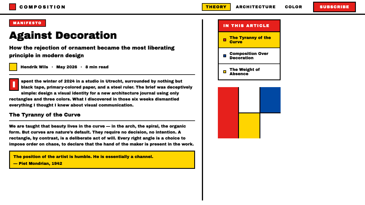
For presentation slides, De Stijl works with particular strength on cover and section-break pages, where a bold asymmetric composition can carry the full weight of a spread. A cover built on De Stijl principles uses the thick black grid as the primary organizational structure, reserves one or at most two color fills for the most important element, and keeps the title in geometric, uppercase letterforms tightly aligned to a grid column. Content slides benefit from the system's discipline of restricting color to one accent per page — the grid lines themselves handle all the structural work, freeing the designer from any need for decorative dividers or visual ornament. Data visualization fits naturally: bar charts become color blocks within the grid, their bars reading as primary-color fills against a white field.对于演示文稿,风格派在封面和章节分隔页上表现出特别的力量,在那里一个大胆的非对称构图可以承担整张展开页的全部重量。一张依据风格派原则构建的封面,以粗黑网格作为主要组织结构,将一种或至多两种色彩填充保留给最重要的元素,标题以几何大写字形紧密对齐网格列。内容页得益于这套系统每页只使用一种强调色的纪律——网格线本身承担所有结构性工作,设计师无需任何装饰性分割线或视觉装饰。数据可视化天然契合:柱状图成为网格内的色块,其条形以白色底面上的原色填充呈现。
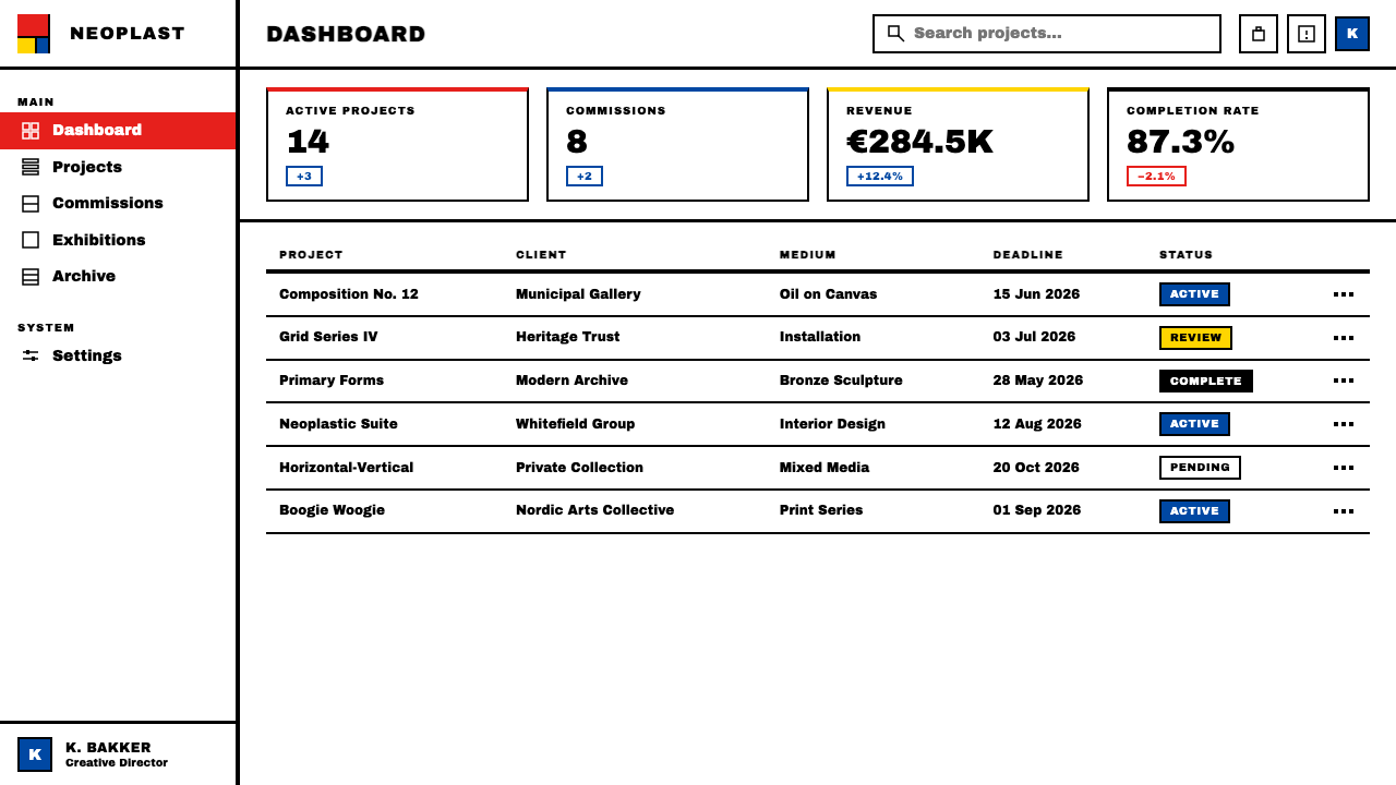
For web interfaces, De Stijl is best suited to dashboards, pricing pages, and landing pages where hierarchy needs to be immediately legible at a glance. The approach requires a strict column grid, a white or near-white background, black for all body text and navigational elements, and a single primary color reserved for the most critical interactive state or tier indicator. Card components take on hard borders without shadow; buttons use flat fills; inputs have visible borders and no rounded corners. Navigation should be typographic, with text labels aligned to the grid — icon-based navigation imports a visual language that conflicts with the movement's exclusion of representational imagery.对于网页界面,风格派最适合需要一眼即可辨读层级的仪表板、定价页面和落地页。这种方法需要严格的列网格、白色或接近白色的背景、所有正文与导航元素使用黑色,以及一种单一原色保留给最关键的交互状态或等级指示。卡片组件呈现硬边框而无投影;按钮使用平面填充;输入框有可见边框且无圆角。导航应当是字体性的,文字标签对齐网格——基于图标的导航引入了一种与这场运动排除再现性图像相冲突的视觉语言。
For editorial and marketing work, De Stijl's poster heritage makes it naturally suited to high-impact full-page layouts. An editorial page uses the black grid as a macro-structure element: a thick horizontal rule divides above-the-fold from scroll content, vertical lines define text columns, and the grid establishes the measure of every text block. Color appears in large fields as section markers or background panels — a primary-yellow panel signals a feature section; a narrow red rule marks a critical call-out. Marketing pages work as a series of full-width panels, each dominated by one primary color or white, with hard-edged geometry creating the transitions between sections rather than gradients or fades.对于编辑与营销内容,风格派的海报传统使其天然适合高冲击力的全页版面。编辑页面将黑色网格作为宏观结构元素:一条粗水平线将首屏内容与滚动内容分隔,垂直线定义文字列,网格确定每个文字块的行宽。色彩以大面积区域出现,作为章节标记或背景面板——一块原色黄面板标示特色章节;一条细红线标记关键引用。营销页面作为一系列全宽面板运作,每个面板以一种原色或白色为主导,硬边几何形创造各章节间的过渡,而非渐变或淡化。
The most common mistake when applying De Stijl is using all three primary colors simultaneously at equal visual weight. In Mondrian's actual Compositions, one color typically dominates by area — usually a significant red or blue field — while the other primaries appear as much smaller accents. Using equal quantities of pure red, pure blue, and pure yellow simultaneously at full saturation produces visual chaos, not the taut equilibrium the style is known for. A second frequent error is applying primary colors as superficial fills onto a layout that otherwise uses the design conventions of another style — rounded corners, soft shadows, gradients in transitions. De Stijl requires the supporting geometry to be as radical as the color: orthogonal everything, hard everything, flat everything.应用风格派时最常见的错误,是同时以相等的视觉分量使用三种原色。在蒙德里安真实的《构成》作品中,通常一种色彩在面积上占据主导——往往是相当大的红色或蓝色区域——而其他原色以小得多的点缀形式出现。同时以满饱和度等量使用纯红、纯蓝与纯黄,产生的是视觉混乱,而非这种风格赖以著称的紧绷平衡。第二个常见错误是将原色作为表面填充,覆盖在其他风格设计惯例之上——圆角、柔和投影、过渡处的渐变。风格派要求支撑性几何与色彩同样彻底:一切正交,一切硬边,一切平面。
De Stijl — FAQDe Stijl · 常见问题
Is De Stijl the same as Mondrian's personal style, or is it a broader movement?风格派等同于蒙德里安的个人风格,还是一场更广泛的运动?
De Stijl is broader than Mondrian alone, though his paintings are its most famous products. The movement encompassed furniture design by Rietveld, architecture by Oud and van Doesburg, graphic design by van der Leck and van Doesburg, and interior design including the Café Aubette. What unified these diverse practices was a shared philosophical program — Neoplasticism — and a shared visual vocabulary: orthogonal grids, primary colors, asymmetric composition, and the total exclusion of curves and ornament. Mondrian's canvases are perhaps the purest and most reductive expression of these principles, which is why he tends to be identified with the movement as a whole, but many practitioners extended the logic into applied and spatial design in ways that went well beyond painting.风格派比蒙德里安个人更为宽广,尽管他的绘画是其最著名的产物。这场运动涵盖了里特韦尔德的家具设计、奥德与凡·杜斯堡的建筑、凡·德·莱克与凡·杜斯堡的平面设计,以及包括奥巴特咖啡馆在内的室内设计。将这些多元实践统一起来的,是一个共同的哲学纲领——新造型主义——和一套共同的视觉词汇:正交网格、三原色、非对称构图,以及对曲线与装饰的彻底排除。蒙德里安的画布也许是这些原则最纯粹、最简化的表达,这正是他倾向于被认同为整场运动代表的原因,但许多实践者以远超绘画的方式将这一逻辑延伸到了应用设计与空间设计之中。
How does De Stijl differ from Bauhaus? They seem very similar.风格派与包豪斯有何区别?两者看起来非常相似。
They share deep roots — both rejected ornament, favored geometric form and primary colors, and believed that designed objects could carry universal meaning. But their philosophies diverged significantly. Bauhaus was primarily pedagogical and practical: it sought to reform design education and reconnect art with industrial production. De Stijl was primarily philosophical: it sought to express a metaphysical vision of universal harmony through pure visual means. As a result, Bauhaus work is more varied in its color use and more open to asymmetric, dynamic composition. De Stijl is more absolute and more restrictive — its palette is strictly primary, its grid is strictly orthogonal, and its philosophy admits fewer exceptions. When the two movements appear similar, it is usually because their shared rejection of ornament and their shared interest in geometric form produce superficially similar results, but the underlying systems are quite different.两者有深厚的共同根源——都拒绝装饰,青睐几何形态与三原色,并相信设计对象能够承载普遍意义。但它们的哲学存在显著分歧。包豪斯首先是教育性与实践性的:它寻求改革设计教育,重新连接艺术与工业生产。风格派首先是哲学性的:它寻求通过纯粹的视觉手段表达一种关于普遍和谐的形而上愿景。因此,包豪斯作品在色彩运用上更为多样,对非对称、动态构图也更为开放。风格派更为绝对、更为严格——其色板严格限于原色,其网格严格限于正交,其哲学允许的例外更少。当两者看起来相似时,通常是因为它们共同对装饰的拒绝和对几何形态的共同关注产生了表面相似的结果,但底层系统却相当不同。
Can De Stijl work with photography, or does it exclude images entirely?风格派能与摄影结合使用吗?还是说它完全排除图像?
The original De Stijl movement was largely hostile to representational imagery — Mondrian explicitly rejected it, and most De Stijl paintings contain no photographic or illustrative content whatsoever. In contemporary applications, photography can be incorporated, but it requires significant transformation: cropped to a strict rectangle that aligns to the grid, treated in high-contrast black-and-white or duotone with a primary color overlay, or used as a fill within one of the grid's rectangular fields rather than as a freestanding element. The moment photography introduces curves, organic forms, or naturalistic color into the composition, it begins to undermine the system's structural logic. Photography that has been reduced to near-graphic quality — a strongly lit geometric subject, a high-contrast architectural detail — integrates more successfully than naturalistic portraiture or landscape.原始的风格派运动在很大程度上对再现性图像持敌对态度——蒙德里安明确地拒绝了它,大多数风格派绘画根本不包含任何摄影或插画内容。在当代应用中,摄影可以被整合进来,但需要进行重大转化:裁剪至对齐网格的严格矩形,以高对比度黑白或与原色叠加的双色调处理,或者作为网格矩形区域内的填充而非独立元素使用。一旦摄影将曲线、有机形态或自然主义色彩引入构图,它就开始破坏这套系统的结构逻辑。被简化至接近平面图形质量的摄影——强烈打光的几何主体,高对比度的建筑细节——比自然主义的人像或风景更容易成功整合。
Why does De Stijl use primary colors specifically? Are they just a stylistic choice?风格派为何专门使用三原色?这只是一种风格上的选择吗?
For Mondrian, the primary colors were not a stylistic preference but a philosophical necessity. His theory of Neoplasticism held that individual colors — the infinite particular shades of observed nature — represent the world of appearances, the subjective and contingent. Primary red, blue, and yellow, by contrast, are colors before individuation: they cannot be produced by mixing other colors, and they stand at the origin of all chromatic possibility. Using them exclusively was an attempt to access the universal rather than the particular — to reach the level of reality that underlies all appearances. In contemporary use, most designers treat the primary palette as a stylistic constraint rather than a metaphysical commitment, but understanding the philosophical origin clarifies why De Stijl applies color so differently from other styles that also use primaries: it is not decoration, it is argument.对蒙德里安而言,三原色不是风格偏好,而是哲学必然性。他的新造型主义理论认为:个别色彩——观察自然中无限的特殊色调——代表着表象世界,即主观与偶然的领域。相比之下,原色红、蓝、黄是尚未个别化之前的色彩:它们无法通过混合其他颜色产生,并矗立于所有色彩可能性的起点。专门使用它们,是一种接触普遍而非个别的尝试——触及一切表象背后的现实层面。在当代使用中,大多数设计师将原色色板视为风格上的约束而非形而上的承诺,但理解其哲学起源有助于澄清风格派为何以如此不同于其他同样使用原色的风格的方式运用色彩:这不是装饰,这是论证。
Is De Stijl appropriate for products that need to feel approachable or warm?风格派适用于需要传达亲和感或温暖感的产品吗?
Generally not, and understanding why matters as much as the answer itself. De Stijl's visual language was deliberately constructed to transcend the personal, the sensory, and the emotionally particular in favor of the universal and structural. The result is a style that communicates authority, precision, and rational order with unusual force — but also one that keeps emotional warmth at a deliberate distance. Products that need to feel nurturing, intimate, playful, or culturally rooted will fight against the style rather than benefit from it. De Stijl works best for products whose core proposition is clarity, reliability, and systemic thinking: financial tools, design systems documentation, analytical platforms, architecture and spatial design portfolios. If the product needs to feel warm first and rigorous second, look to styles that have expressiveness and humanity built in rather than designed out.通常不适合,而且理解原因与知道答案本身同样重要。风格派的视觉语言是被刻意构建来超越个人性、感官性与情感特殊性的,以偏向普遍性与结构性。结果是一种能以不寻常的力量传递权威、精确与理性秩序的风格——但也是一种刻意与情感温暖保持距离的风格。需要传达养育感、亲密感、趣味感或文化根植感的产品,会与这种风格对抗而非从中获益。风格派最适合核心主张是清晰、可靠与系统性思维的产品:金融工具、设计系统文档、分析平台、建筑与空间设计作品集。如果产品需要首先传达温暖感、其次才是严谨感,那么应当寻找那些将表现力与人文气息内建而非设计排除在外的风格。
Related design styles相关设计风格
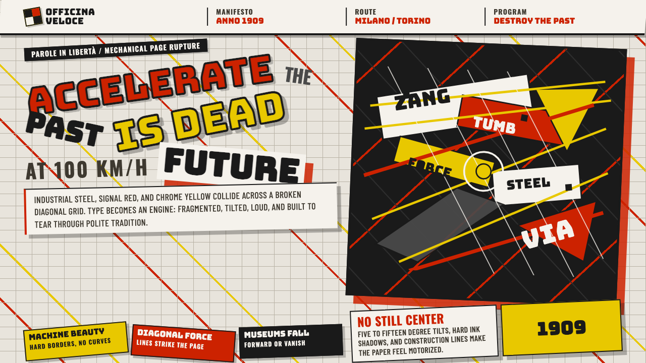 Italian Futurism (Marinetti 1909)Speed murders tradition. Signal red and chrome yellow slash a broken diagonal…速度杀死传统:信号红与铬黄斩开破碎斜向网格。
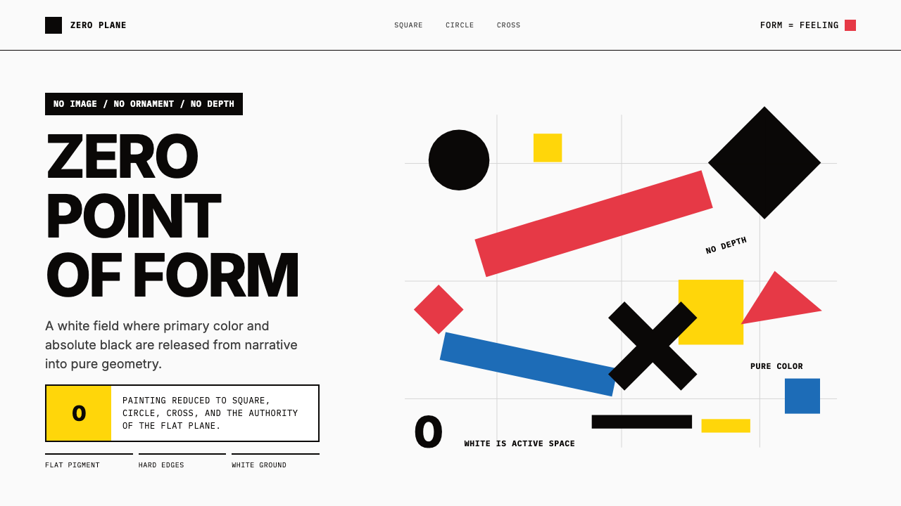 Malevich SuprematismGeometry declares zero. Red, yellow, blue and black blocks float on active wh…几何宣告零点:红黄蓝黑色块漂浮于主动白场。
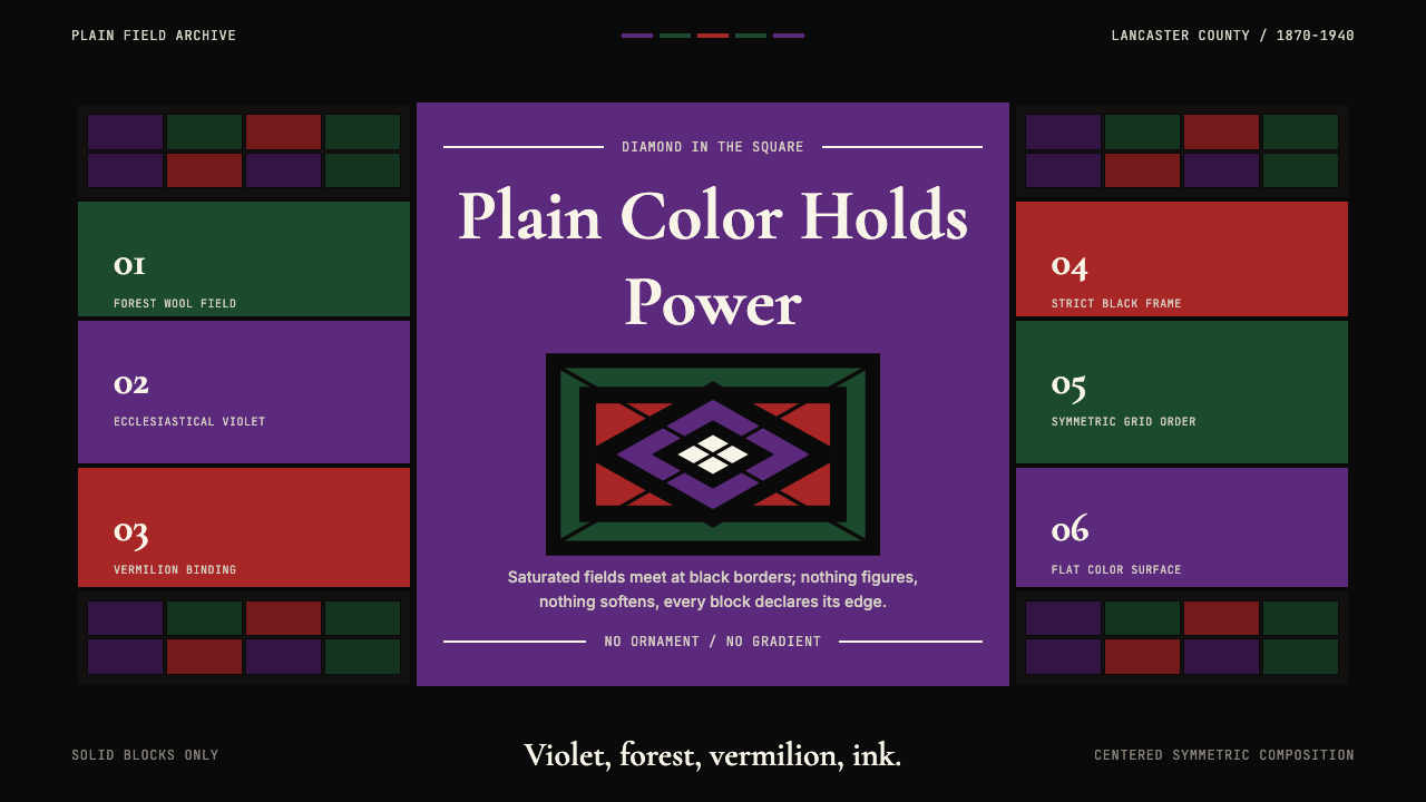 Amish Pennsylvania Quilt Bold GeometricRadical plainness. Violet, forest, and vermilion blocks lock into ink-black q…激进的朴素:紫、森林绿、朱砂红被墨黑拼布几何锁定。
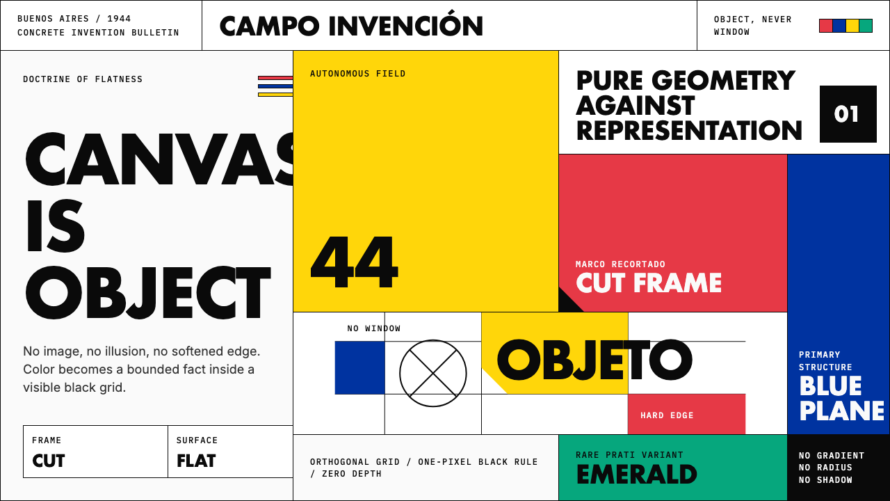 Argentine Arte ConcretoCanvas becomes object. Primary blocks, black hairlines, and a cut-frame grid…画布成为物:原色块、黑色细线与剪裁框网格强制平面性。
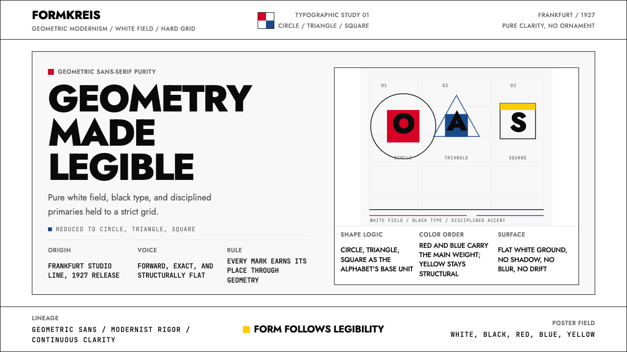 Futura Typeface (Renner, 1927)Geometry is legible. Black type and white fields, with red-blue-yellow anchor…几何即可读。黑白主版,红蓝黄点缀于网格。
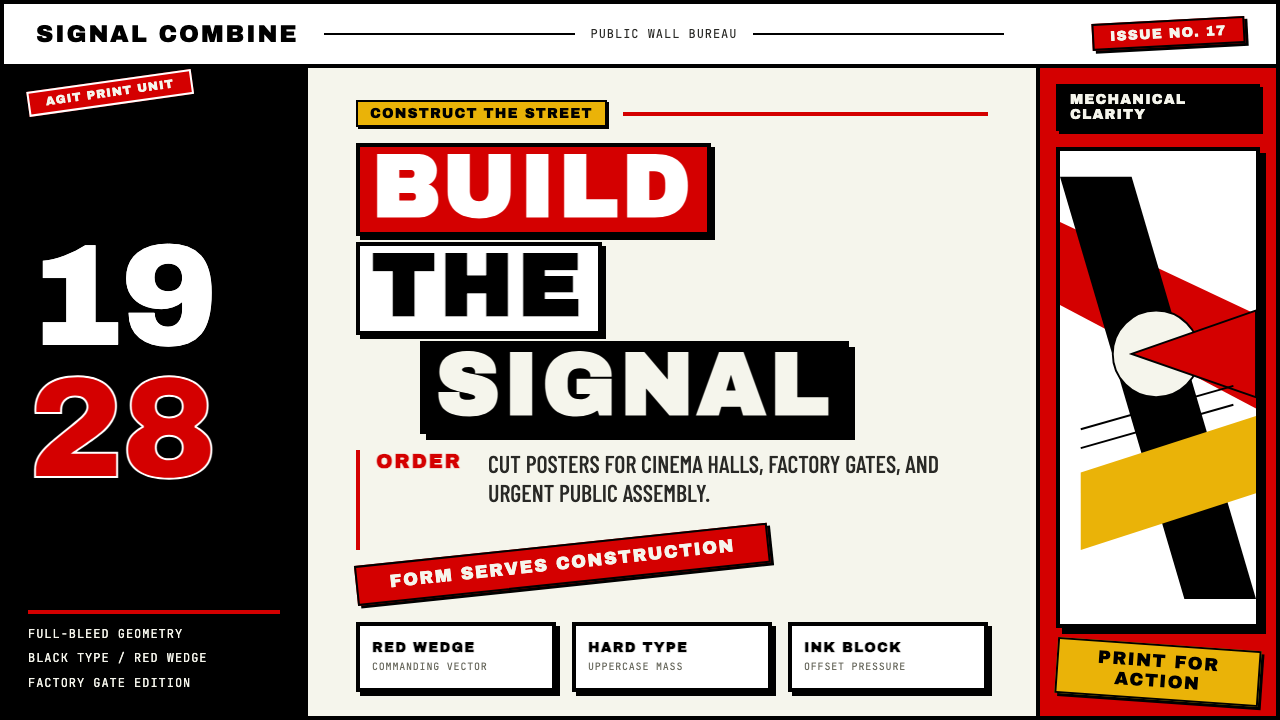 Russian ConstructivismRevolution red, slashed across black and white. Diagonal sans-serif, photomon…1917 年革命视觉:红色斜劈黑白画面、几何无衬线倾斜排版、照片蒙太奇——形式…