What is Paul Rand / IBM Corporate Identity?什么是 Paul Rand / IBM Corporate Identity?
Paul Rand spent four decades proving that a corporate logo could be a work of art — and that rigorous structure was the only foundation worth building on.保罗·兰德用四十年证明了一件事:企业标志可以是艺术品,而严格的结构是唯一值得信赖的基础。
Paul Rand / IBM Corporate Identity in briefPaul Rand / IBM Corporate Identity 速览
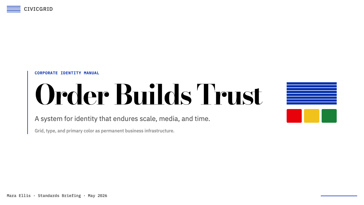
Paul Rand / IBM Corporate Identity is a design system rooted in American corporate modernism — the belief that a business communication should be as formally disciplined as a fine-art print. Its visual language is built from flat primary rectangles, IBM Blue as an anchor color, high-contrast serif display type alongside geometric sans-serif body text, and an absolute refusal of ornament. Every composition obeys a hard grid. Every color carries a specific role. Nothing is decorative.保罗·兰德 / IBM 企业视觉识别是一套根植于美国企业现代主义的设计体系——其核心信念是:商业传播应当像纯艺术版画一样具备形式上的严格纪律。它的视觉语言由扁平的原色矩形、作为锚点的 IBM 蓝、高反差衬线展示字与几何无衬线正文字构成,并彻底拒绝一切装饰元素。每一个构图都遵从硬网格,每一种颜色都承担特定角色,没有任何元素是装饰性的。
The system draws directly from Paul Rand's forty-year relationship with IBM, which began in 1956 and produced some of the most recognized marks in design history: the IBM 8-bar logo (1972), the ABC eye (1962), the UPS shield (1961), and the NeXT cube (1986). Rand's conviction was simple and unyielding — a mark must work at any size, in any medium, for decades. That conviction shaped not just the logos but the entire grammar of IBM's printed materials, posters, and presentations.这套体系直接来源于保罗·兰德与 IBM 长达四十年的合作——始于 1956 年,催生了设计史上最具辨识度的一批标志:IBM 8 条横纹标志(1972 年)、ABC 电视台的眼睛(1962 年)、UPS 盾牌(1961 年),以及乔布斯委托创作的 NeXT 立方体(1986 年)。兰德的信念简单而坚定:一个标志必须在任何尺寸、任何媒介、永远都能成立。这种信念不仅塑造了标志本身,更定义了 IBM 印刷材料、海报与演示文稿的整套视觉语法。
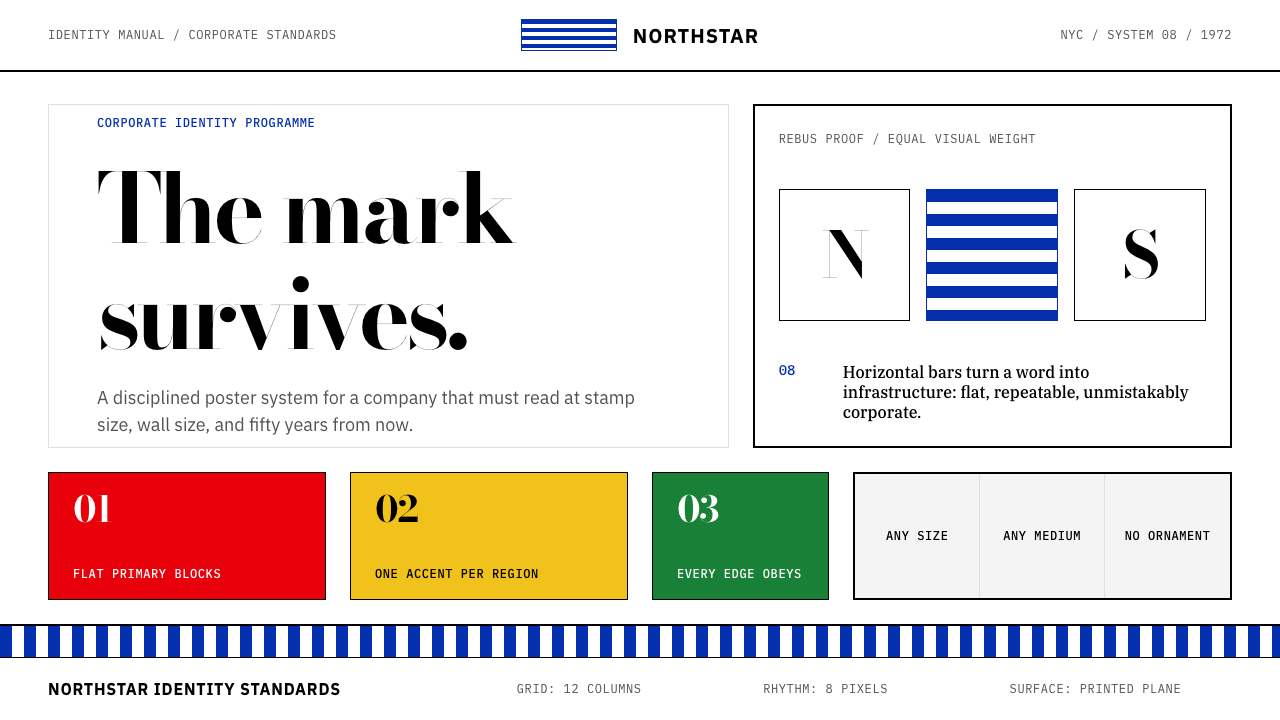
Visually, the style is bold and diagrammatic. Color blocks are flat and hard-edged. Type sits in sharp hierarchical contrast — a heavy display face for headlines, a clean geometric sans for body copy, with scale doing the organizing work rather than decoration. Rand's famous rebus posters, which replaced words with images to spell out slogans, demonstrated that corporate communication could be witty, precise, and visually inventive all at once. That spirit — serious discipline with unexpected playfulness — is the defining tension of this system.在视觉上,这种风格大胆而具示意图特质。色块扁平且边缘硬朗。字体层级对比鲜明——粗重的展示字体用于标题,干净的几何无衬线字体用于正文,以尺度而非装饰完成组织工作。兰德著名的图文混排(rebus)海报——用图像替换词语来拼写口号——证明了企业传播可以同时做到机智、精确与视觉上的创造性。这种精神——严格纪律与意外俏皮的并存——正是这套体系最核心的张力。
See the Paul Rand / IBM Corporate Identity design system查看 Paul Rand / IBM Corporate Identity 完整设计系统
Where does Paul Rand / IBM Corporate Identity come from?Paul Rand / IBM Corporate Identity 从何而来?
Paul Rand was born Peretz Rosenbaum in Brooklyn in 1914 and trained himself on the work of the European modernists — Cassandre, El Lissitzky, Jan Tschichold — at a time when American commercial art was dominated by Victorian illustration and ornate lettering. By his mid-twenties he had redesigned the covers of Esquire and Apparel Arts, invented a bold typographic identity for the advertising agency William H. Weintraub & Co., and established himself as the leading practitioner of what he called 'functional graphic design': the idea that beauty and utility were not competing values but the same value expressed at different scales.保罗·兰德(原名 Peretz Rosenbaum)1914 年生于布鲁克林,在美国商业美术仍被维多利亚式插图与繁复花体字统治的年代,他自学欧洲现代主义大师的作品——卡桑德尔、利西茨基、扬·奇肖尔德。二十几岁时,他已重新设计了《Esquire》杂志的封面与《Apparel Arts》,为广告公司威廉·H·温特劳布设计了大胆的字体标识,并确立了自己在「功能性平面设计」领域的领军地位:在他看来,美与实用并非相互竞争的价值观,而是同一价值观在不同尺度上的表达。
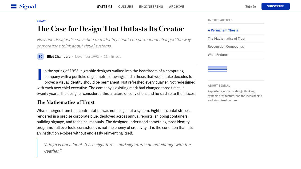
His engagement with IBM began in 1956 when the industrial designer Eliot Noyes — who was coordinating a comprehensive modernization of the company under CEO Thomas J. Watson Jr. — invited Rand to redesign the IBM logotype. The original City Medium typeface wordmark was considered too rigid and institutional; Rand's solution was to introduce horizontal stripes across the letters, initially eight, as a way of suggesting both speed and solidity. The resulting 8-bar IBM logo, formalized in 1972, became one of the most reproduced corporate marks of the twentieth century and remains in use today. Watson Jr.'s commitment to design — he called it a competitive advantage, not a luxury — gave Rand unusual freedom to operate at the level of a genuine creative director rather than a vendor.他与 IBM 的合作始于 1956 年。当时,工业设计师埃利奥特·诺伊斯正在 CEO 小托马斯·J·沃森的授权下主导公司的全面现代化改造,并邀请兰德重新设计 IBM 的文字标志。原有的 City Medium 字体标志被认为过于死板,缺乏生命力。兰德的解决方案是在字母上叠加水平条纹——最初定为八条——同时传递速度感与稳定感。由此诞生的 8 条横纹 IBM 标志于 1972 年正式确立,成为二十世纪被复制次数最多的企业标志之一,并沿用至今。小沃森对设计的承诺——他称之为竞争优势而非奢侈品——赋予了兰德罕见的自由,使他得以作为真正的创意总监而非外包供应商来运作。
The intellectual foundations of the IBM identity were drawn from the International Typographic Style (Swiss Style) and from Rand's reading of American pragmatist philosophy. Rand was a close reader of John Dewey, and his book Art and Industry (1947) makes explicit the Deweyan argument that art is not a category separate from life but a quality of experience that good design can produce in everyday contexts. This philosophical grounding distinguished his corporate work from that of contemporaries who treated identity design as pure problem-solving: for Rand, the IBM poster was simultaneously a business asset and a cultural object, and he refused to treat those as different things.IBM 视觉识别的思想基础来自国际字体风格(瑞士风格)以及兰德对美国实用主义哲学的研读。兰德是约翰·杜威的忠实读者,他的著作《艺术与工业》(1947 年)明确阐发了杜威式论点:艺术不是与生活相分离的类别,而是优秀设计能在日常语境中产生的一种经验品质。这种哲学根基使他的企业设计作品有别于同代人仅将标识设计视为纯粹问题求解的做法:对兰德而言,一张 IBM 海报同时是商业资产和文化对象,他拒绝将两者分开看待。
The peak period of the IBM identity — the 1960s through the 1980s — coincided with IBM's dominance of the computing industry and with the broader adoption of corporate modernism as the standard visual language of American business. Rand's rebus posters, produced throughout this period, are the most celebrated artifacts of the collaboration: compositions in which the letters I, B, and M are replaced by an eye, a bee, and a stylized M, or in which the word 'love' is rendered as a heart — playful inversions that made the IBM communications instantly recognizable in any language. Rand continued working with IBM until 1996, the year of his death, maintaining a consistency of vision across four decades that few designers in any field have matched.IBM 视觉识别的巅峰期——1960 至 1980 年代——与 IBM 对计算机行业的主导地位以及企业现代主义作为美国商业标准视觉语言的广泛确立同步发生。这一时期创作的图文混排海报是这段合作中最受推崇的作品:在构图中,I、B、M 三个字母被替换为眼睛、蜜蜂和程式化的 M,或者将单词「love」渲染为一颗心——这些俏皮的视觉转换让 IBM 的传播物在任何语言中都能被立即辨认。兰德持续与 IBM 合作直至 1996 年去世,在四十年间保持了视觉愿景的一致性,这在任何领域的设计师中都极为罕见。
What defines the Paul Rand / IBM Corporate Identity look?Paul Rand / IBM Corporate Identity 的视觉特征是什么?
IBM Blue as AnchorIBM 蓝作为锚点
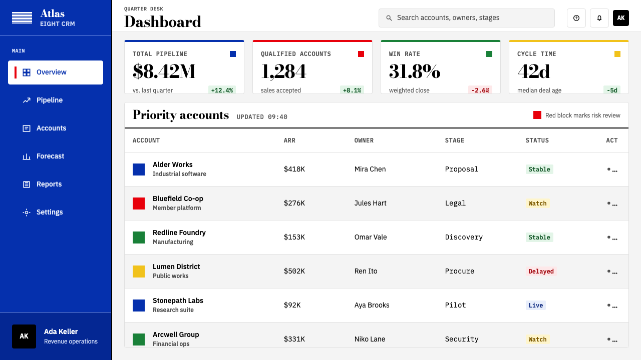
A specific cool, saturated blue functions as the immovable center of the palette — authoritative and institutional without being somber. It does not flex to context: it is always the dominant structural color, used for backgrounds, large type, and the horizontal bar motifs that echo the 8-bar logo. Secondary colors — red, green, yellow — appear as accents within a primarily blue field, never as equals to it.一种特定的冷调、饱和蓝是整套色板无法撼动的核心——具有权威感和机构感,但不显沉闷。它不因语境而调整:它始终是主导性的结构色,用于背景、大号字体以及呼应 8 条横纹标志的水平条纹母题。红、绿、黄等辅助色作为强调色出现在以蓝色为主导的视觉场域中,从不与蓝色平起平坐。
Flat Primary Rectangles扁平原色矩形
Color is applied as hard-edged, solid rectangles — never gradients, never blurred, never vignetting. These blocks function as structural elements in the composition: they define zones, separate content, and create rhythm. A large primary rectangle at the top of a layout anchors everything below it. The flatness is not a stylistic choice but a statement of intent: this system trusts geometry, not atmosphere.色彩以硬边实心矩形的形式呈现——从不渐变,从不模糊,从不产生晕影。这些色块在构图中作为结构性元素发挥作用:划定区域、分隔内容、创造节奏。版面顶部的一块大面积原色矩形为其下所有内容提供锚点。扁平性不是风格选择,而是一种意图声明:这套体系信任几何,而非氛围。
High-Contrast Serif Display高反差衬线展示字
Headlines are set in a high-contrast modern serif — the kind of face associated with Bodoni, where the difference between thick and thin strokes is extreme. This contrast gives display type a strong graphic presence even at small sizes, and it pairs deliberately with the softness of geometric sans-serif body text. The combination is not timid: it announces a hierarchy that the reader cannot miss.标题采用高反差现代衬线字体——那种笔画粗细对比极为强烈的字体,与 Bodoni 一脉相承。这种对比使展示字体即便在较小尺寸下也具有强劲的图形存在感,并与几何无衬线正文字有意形成配对。这种组合毫不怯懦:它宣告了一个读者无法忽视的层级关系。
Hard Grid Structure硬网格结构
Every composition is governed by a grid that is visible in its effect even when the grid lines themselves are not shown. Margins are consistent. Column widths are fixed. Elements align to invisible axes. The discipline produces a quality that Rand called 'visual logic' — the sense that every object is exactly where it should be and could not reasonably be placed anywhere else. Randomness and visual approximation are simply not present.每一个构图都受一套网格支配,即便网格线本身不可见,其效果也清晰可感。页边距一致,栏宽固定,元素沿不可见的轴线对齐。这种纪律产生了兰德所称的「视觉逻辑」——每个对象都恰好处于它应在的位置,且合理地无法被放置在其他任何地方的感觉。随意性与视觉上的近似感根本不存在。
Rebus Wit and Visual Wordplay图文混排的机智与视觉文字游戏
Rand's most distinctive contribution to the IBM identity was the rebus poster: compositions in which letters are replaced by images that carry the same phonetic value. The I of IBM becomes an eye, the B a bee. This device does several things simultaneously — it makes the viewer stop and decode, it demonstrates that corporate communication can be playful, and it proves that meaning can be carried by image as effectively as by text. Applied to contemporary work, it translates as a willingness to substitute visual metaphor for literal statement.兰德对 IBM 视觉识别最具独特性的贡献是图文混排海报:在构图中,字母被读音相同的图像所替换——IBM 的 I 变成一只眼睛,B 变成一只蜜蜂。这种手法同时完成了多件事:它让观者停下来解码,它证明企业传播可以充满趣味,它还证明了图像传递意义的效力不亚于文字。应用于当代设计时,这种精神转化为一种以视觉隐喻替代字面陈述的意愿。
Zero Ornament, Maximum Precision零装饰,极致精确
There are no decorative borders, no drop shadows, no gradient overlays, no illustrative flourishes. What remains when all ornament is removed is not emptiness — it is precision. Spacing between elements is exact and deliberate. The weight of a rule line is a considered decision. The margin between a headline and the text below it is part of the design, not a default. This precision distinguishes authentic work in this style from imitations that borrow the primary colors but retain visual clutter.没有装饰性边框,没有投影,没有渐变叠层,没有插图花饰。去除所有装饰后剩下的不是空洞,而是精确。元素间距是经过精心计算的。线条的粗细是一个经过深思熟虑的决定。标题与其下文字之间的间距是设计的一部分,而非默认值。这种精确性将这种风格的真实作品与那些借用三原色却保留视觉杂乱的仿制品区别开来。
Timeless Reproducibility跨时代的可复制性
The system was designed from the outset to work at any scale and in any medium — embossed on a business card, projected at stadium size, reproduced in single-color newsprint, rendered on a screen. This medium-agnosticism produces a visual quality that resists dating: work designed within this system in 1972 and work designed in it today are difficult to distinguish, not because the style is static but because it was built on principles that do not depend on any particular technology or cultural moment.这套体系从一开始就被设计为能在任何尺寸、任何媒介中运作——压印在名片上、投影在体育场大屏幕上、以单色印刷在报纸上、在屏幕上渲染。这种媒介不可知性产生了一种抗拒时代感的视觉品质:按照这套体系在 1972 年设计的作品与今天在其中设计的作品难以区分,并非因为风格是静止的,而是因为它建立在不依赖任何特定技术或文化时刻的原则之上。
See the Paul Rand / IBM Corporate Identity design system查看 Paul Rand / IBM Corporate Identity 完整设计系统
Who shaped Paul Rand / IBM Corporate Identity?谁塑造了 Paul Rand / IBM Corporate Identity?
Rand (1914–1996) is the central figure of American corporate modernism. His four-decade relationship with IBM produced the 8-bar logo, the rebus poster series, and a complete system of printed communications that influenced every major American corporation's identity program. He also taught at Yale School of Art for decades, shaping generations of American designers. His books — Thoughts on Design (1947), A Designer's Art (1985), and Design, Form, and Chaos (1993) — remain foundational texts. His other major marks include the ABC eye (1962), the UPS shield (1961), Westinghouse (1960), and the NeXT cube (1986), commissioned by Steve Jobs.兰德(1914—1996)是美国企业现代主义的核心人物。他与 IBM 长达四十年的合作产生了 8 条横纹标志、图文混排海报系列,以及一套影响了美国几乎所有大型企业视觉识别项目的印刷传播体系。他还在耶鲁大学艺术学院执教数十年,培育了数代美国设计师。他的著作——《关于设计的思考》(1947)、《设计师的艺术》(1985)、《设计、形式与混沌》(1993)——至今仍是基础性文本。他的其他重要标志包括 ABC 电视台的眼睛(1962)、UPS 盾牌(1961)、西屋电气(1960),以及由史蒂夫·乔布斯委托创作的 NeXT 立方体(1986)。
Noyes (1910–1977) was the industrial designer who served as IBM's design coordinator from 1956, orchestrating the comprehensive modernization program that brought Rand, Eero Saarinen, and Charles and Ray Eames into the IBM orbit. Noyes ensured visual and material coherence across IBM's products, buildings, and communications — the typewriters, the mainframe casings, the architecture of IBM offices, and the graphic identity system all belonged to a single design philosophy. His own industrial designs, including the IBM Selectric typewriter housing, embody the same values of precision, modularity, and formal authority.诺伊斯(1910—1977)是工业设计师,1956 年起担任 IBM 的设计协调人,主导了将兰德、埃罗·沙里宁以及查尔斯与蕾·伊姆斯纳入 IBM 设计体系的全面现代化改造项目。诺伊斯确保了 IBM 产品、建筑与传播材料之间的视觉与材质一致性——打字机、大型机外壳、IBM 办公室建筑和平面识别体系,全都属于同一设计哲学。他本人的工业设计作品,包括 IBM Selectric 打字机的外壳,体现了同样的精确性、模块化与形式权威。
Watson Jr. (1914–1993) succeeded his father as IBM's CEO in 1952 and made design a central element of corporate strategy, famously declaring that 'good design is good business.' His partnership with Eliot Noyes and his support for Rand gave the IBM identity program the executive authority it needed to maintain coherence across a corporation employing hundreds of thousands of people. Watson's commitment meant that Rand was not merely a vendor producing deliverables but a trusted advisor whose judgment shaped IBM's public face for decades. His influence legitimized corporate investment in design quality throughout American business.小沃森(1914—1993)1952 年接替父亲出任 IBM CEO,并将设计列为企业战略的核心要素,留下了「好设计就是好生意」的名言。他与埃利奥特·诺伊斯的合作以及对兰德的支持,赋予了 IBM 视觉识别项目维持一致性所需的高管权威——这家企业雇用了数十万名员工。小沃森的承诺意味着兰德不仅仅是提交交付物的外包供应商,而是一位受信任的顾问,其判断力在数十年间塑造了 IBM 的公众形象。他的影响力使美国商界对设计品质的企业投资合法化。
Tschichold (1902–1974) did not work directly with IBM, but his influence on Rand — and through Rand on the entire IBM identity — is substantial. His 1928 manifesto Die neue Typographie established the principles of asymmetric grid layout, sans-serif primacy, and functional hierarchy that Rand absorbed and adapted for American corporate contexts. Tschichold's later work for Penguin Books demonstrated that these principles could be applied at industrial scale with complete consistency, a proof of concept that informed Rand's approach to IBM's vast output of printed material.扬·奇肖尔德(1902—1974)并未直接与 IBM 合作,但他对兰德的影响——以及通过兰德对整个 IBM 视觉识别的影响——是深远的。他 1928 年的宣言《新字体排印》确立了非对称网格布局、无衬线字体优先以及功能性层级的原则,兰德将这些原则吸收并改造,适应了美国企业语境。奇肖尔德后来为企鹅图书所做的工作证明,这些原则可以在工业规模上以完全的一致性加以应用——这一概念验证影响了兰德处理 IBM 庞大印刷材料产出的整体方式。
Jobs (1955–2011) commissioned Rand to design the NeXT identity in 1986, after Jobs had left Apple. The NeXT cube logo — a tilted black square with the NeXT wordmark set at a precise angle — was accompanied by a hundred-page brand manual that Rand delivered alongside a single design option, famously telling Jobs he did not present options but solutions. Jobs paid the reported fee without negotiation and later described Rand as 'the greatest living graphic designer.' The NeXT engagement demonstrates the IBM identity's core principle in concentrated form: one correct answer, rigorously derived.乔布斯(1955—2011)在离开苹果后,于 1986 年委托兰德设计 NeXT 的视觉识别。NeXT 立方体标志——一个黑色倾斜正方形上以精确角度排列的 NeXT 文字标志——附带一份兰德交付的百页品牌手册。据闻兰德告诉乔布斯,他不提供选项,只提供解决方案。乔布斯据报二话不说支付了设计费,并后来称兰德为「在世最伟大的平面设计师」。NeXT 项目以高度浓缩的形式展现了 IBM 视觉识别的核心原则:一个正确答案,严格推导而来。
How do you use Paul Rand / IBM Corporate Identity today?今天怎么用 Paul Rand / IBM Corporate Identity?
The Paul Rand / IBM Corporate Identity system is among the most practically transferable of the historical modernist styles because its principles are structural and medium-agnostic. Applying it correctly requires internalizing what the system is doing at the level of logic — using color to assign authority, using grid to make every placement deliberate, using typographic hierarchy to guide reading sequence — rather than simply borrowing the visual surface. A layout that uses IBM Blue but ignores the grid is not in this style; it is a pastiche.保罗·兰德 / IBM 企业视觉识别是历史现代主义风格中实践可移植性最强的体系之一,因为它的原则是结构性且媒介不可知的。正确应用它,需要在逻辑层面内化这套体系在做什么——以色彩指派权威感,以网格使每一次布置都经过深思熟虑,以字体层级引导阅读顺序——而不仅仅是借用视觉表面。一个使用了 IBM 蓝却无视网格的版面不属于这种风格,它只是一件仿制品。
For presentation slides, the system works with particular force on cover pages and section dividers. A cover benefits from a full-bleed primary rectangle occupying a substantial portion of the field, with the title set in high-contrast serif display type against the colored ground and a secondary line of geometric sans beneath. Content slides should be treated as strict grids: no decorative dividers, type hierarchy defined entirely by size and weight, data charts treated as geometric objects — bars and segments in the primary palette, axes in black or the anchor blue. Section dividers can echo the horizontal bar motif of the 8-bar logo: a cluster of parallel rules in varying weights, referencing the source material without replicating it.在演示文稿方面,这套体系在封面页与章节分割页上尤为有力。封面适合让一块大面积原色矩形占据版面相当比例,标题用高反差衬线展示字设置于彩色底面,下方跟随一行几何无衬线字体的副标题。内容页应作为严格网格处理:无装饰性分割线,字体层级完全由尺寸与字重定义,数据图表视为几何对象——柱条与扇区使用主色板,坐标轴为黑色或锚点蓝。章节分割页可以呼应 8 条横纹标志的水平条纹母题:一组粗细不一的平行线条,参引源材料而不复制它。
For web interfaces — particularly dashboards, pricing pages, and analytics products — the system provides an exceptionally clear visual hierarchy. The approach: commit to a hard grid with generous but fixed gutters, use IBM Blue for the primary navigation and header zone, reserve red or green for status indicators and calls to action, and keep the content field near-white. Card components should have hard, offset shadows rather than soft diffuse ones, or no shadow at all with a visible border. Interactive states should be communicated through color change at full saturation, not opacity reduction. Icon sets, if used, should be geometric and stroke-based with consistent line weight.在网页界面设计方面——尤其是仪表板、定价页面和数据分析产品——这套体系提供了极为清晰的视觉层级。方法如下:确立带有宽阔但固定间距的硬网格,将 IBM 蓝用于主导航与页头区域,保留红色或绿色用于状态指示与行动号召,将内容区域保持为接近白色。卡片组件应有硬边偏移投影而非柔和漫射阴影,或完全无阴影但有可见边框。交互状态应通过颜色在完整饱和度下的切换来传递,而非透明度的降低。图标集若使用,应为几何形态、以描边为主,且保持一致的线条粗细。
For editorial design and marketing materials, the style supports the kind of poster-like boldness that makes hierarchy legible at a glance. A marketing page in this system alternates full-width blocks between IBM Blue grounds with reversed type and near-white grounds with dark type, maintaining a single accent color — typically a warm red or a clean yellow — for all interactive and call-to-action elements. Typographic pull-quotes can be set at a dramatically larger scale than the body, with a thin horizontal rule as the only separating device. Printed collateral benefits from the system's roots in offset and letterpress: the aesthetic was designed for physical reproduction and loses nothing in print.在编辑设计与营销材料方面,这种风格支持海报式的大胆感,使层级在一瞥之间即可识别。采用这套体系的营销页面在 IBM 蓝底面反白字与接近白色底面深色字之间交替出现全宽区块,并保持单一的强调色——通常是暖红色或干净的黄色——用于所有互动元素与行动号召。文字引用可以以远大于正文的比例排版,以一条细水平线作为唯一的分隔装置。印刷品在这套体系中得天独厚——这套美学本就是为胶版和凸版印刷物理复制而设计的,在印刷中毫无损失。
The most common error when working in this system is mistaking the primary palette for permission to use all colors at high saturation simultaneously. Authentic IBM-era Rand work leads with one color — almost always IBM Blue — and introduces a second as a controlled accent. A third primary color appears rarely and only to mark a specific distinction. The second common error is using multiple display typefaces to create variety: this system generates variety through scale, weight, and placement, not through typeface substitution. A single serif display face and a single geometric sans, used at multiple sizes and weights, will produce more coherent results than any combination of mixed families.在这套体系中工作时最常见的错误,是将原色色板误解为同时以高饱和度使用所有颜色的许可。兰德 IBM 时期的真实作品以一种颜色为主导——几乎总是 IBM 蓝——并将第二种颜色作为受控的强调色引入。第三种主色极少出现,且仅用于标记特定区分。第二个常见错误是使用多种展示字体来制造多样性:这套体系通过尺度、字重与版式位置产生多样性,而非通过字体替换。一种衬线展示字体与一种几何无衬线字体,以多种尺寸和字重使用,将比任何混合字体家族的组合产生更为连贯的结果。
See the Paul Rand / IBM Corporate Identity design system查看 Paul Rand / IBM Corporate Identity 完整设计系统
Paul Rand / IBM Corporate Identity — FAQPaul Rand / IBM Corporate Identity · 常见问题
Is the Paul Rand / IBM style the same as Swiss International Style?保罗·兰德 / IBM 风格与瑞士国际主义风格是同一回事吗?
They share common ancestry — both draw on European modernism, both are grid-based and sans-serif dominant — but they are distinct in character. Swiss International Style, as practiced by Müller-Brockmann, Armin Hofmann, and their contemporaries, is cooler, more typographically systematic, and more committed to the mathematical grid as an end in itself. Rand's American corporate modernism is warmer in its wit, more willing to use a bold serif for display purposes, and more comfortable with playful visual devices like the rebus. Swiss Style tends toward the universal and anonymous; Rand's work, even at its most disciplined, retains a personality and a sense of authorship.两者有共同的起源——都根植于欧洲现代主义,都以网格为基础,都以无衬线字体为主——但性格截然不同。瑞士国际主义风格(穆勒-布罗克曼、阿明·霍夫曼等人的实践)更为冷静,在字体排印上更具系统性,更倾向于将数学网格视为目的本身。兰德的美国企业现代主义在机智上更为温暖,更愿意将粗重衬线字体用于展示目的,也更乐于接受图文混排这样的俏皮视觉手法。瑞士风格趋向普世性与匿名性;兰德的作品即便在最严格克制时,也保留了个性与作者感。
Can this style work for consumer products, or is it only appropriate for B2B and enterprise?这种风格适用于消费品吗,还是只适合 B2B 和企业产品?
The style's native territory is enterprise, institutional, and professional contexts — it was literally invented for one of the world's largest corporations. It transfers well to any product where authority, clarity, and a sense of considered quality are desired: financial services, analytical tools, professional software, educational platforms, and premium hardware. It is poorly suited to products that depend on warmth, playfulness, or sensory richness — children's products, food brands, wellness applications, and consumer lifestyle categories generally. The rebus wit provides some relief from the system's severity, but it is wit of a particular kind: clever and geometric, not warm and organic.这种风格的原生领域是企业、机构和专业场景——它字面意义上是为世界上最大的企业之一而发明的。它能很好地迁移到任何需要权威感、清晰度和经过深思熟虑的品质感的产品中:金融服务、分析工具、专业软件、教育平台以及高端硬件。它不适合依赖温暖感、趣味性或感官丰富性的产品——儿童产品、食品品牌、健康应用以及消费生活方式类别。图文混排的机智为这套体系的严肃性提供了些许缓解,但那是一种特定类型的机智:聪明而几何化,而非温暖而有机的。
How do you use the rebus device without it seeming like a direct imitation of the IBM posters?如何使用图文混排手法而不显得是在直接模仿 IBM 海报?
The rebus device is a principle, not a specific visual. Rand's principle was: find an image that carries the same meaning or phonetic value as the word it replaces, and trust the viewer to decode it. Applied to contemporary work, this translates as a willingness to substitute a strong, flat image for a word or phrase when the image is unambiguous. A cloud icon replacing the word 'storage,' a lock icon replacing 'security,' or a stylized graph replacing 'growth' — these are rebus-logic compositions without directly echoing any specific poster. The key is that the substituted image must be as flat and geometric as the surrounding type: photographic imagery or rendered illustration breaks the system's logic.图文混排手法是一种原则,而非一种特定的视觉形式。兰德的原则是:找到一个与它所替换的词语具有相同含义或语音价值的图像,并相信观者能够解码它。应用于当代设计,这转化为一种在图像含义明确时,以强烈的扁平图像替换词语或短语的意愿。用云图标替换「存储」一词,用锁图标替换「安全」,用程式化图表替换「增长」——这些都是图文混排逻辑的构图,而不直接呼应任何特定的海报。关键在于被替换的图像必须与周围的字体一样扁平、几何化:摄影图像或渲染插图会破坏这套体系的逻辑。
The IBM 8-bar logo is a registered trademark. How should designers engage with this visual system without trademark risk?IBM 8 条横纹标志是注册商标。设计师如何在不涉及商标风险的情况下使用这套视觉体系?
The IBM 8-bar logo itself is protected, but the underlying design principles — horizontal rule systems, hard grid layouts, primary palette with blue as anchor, high-contrast serif display type, flat color blocking — are not. Designers working in this system should treat the horizontal bar motif as a general visual principle (parallel rules as a structural device) rather than as a direct reproduction of the IBM logo. The goal is to internalize the logic of the system — what Rand was trying to achieve — and apply that logic to original work, rather than to quote specific artifacts. This is the same distinction that separates 'working in the Bauhaus tradition' from 'copying a specific Bauhaus poster.'IBM 8 条横纹标志本身受到保护,但其底层的设计原则——水平线条体系、硬网格版式、以蓝色为锚点的原色色板、高反差衬线展示字体、扁平色块——并不受保护。在这套体系中工作的设计师应将水平条纹母题视为一种通用视觉原则(平行线条作为结构性装置),而非对 IBM 标志的直接复制。目标是内化这套体系的逻辑——兰德试图实现什么——并将该逻辑应用于原创作品,而非引用特定的历史产物。这与「在包豪斯传统中工作」和「复制某张特定包豪斯海报」之间的区别是同样的道理。
Does this style work well in dark mode or on dark backgrounds?这种风格在深色模式或深色背景下表现良好吗?
The canonical IBM / Rand system was built for light grounds — white or very pale fields are the norm, with IBM Blue providing the dominant dark anchor. A dark inversion is possible and does appear in some contemporary IBM design language variations, but it requires rethinking the color roles. On a dark ground, the structured blue loses some of its anchoring force because it no longer contrasts against white; a lighter, more electric variation of the blue is typically needed. The primary accent colors — red, yellow, green — can become aggressive at high saturation on dark grounds and should be used more sparingly than on light grounds. The typographic system and grid logic transfer without modification; the color system requires deliberate recalibration.IBM / 兰德的经典体系是为浅色底面而建立的——白色或极浅的底面是规范,IBM 蓝提供主导性的深色锚点。深色反转版本是可能的,在一些当代 IBM 设计语言变体中也确实出现,但它需要重新思考色彩的角色。在深色底面上,结构性的蓝色失去了部分锚定力,因为它不再与白色形成对比;通常需要一种更浅、更具电气感的蓝色变体。原色强调色——红、黄、绿——在深色底面上以高饱和度出现时容易变得攻击性过强,应比在浅色底面上更为克制地使用。字体系统与网格逻辑无需修改即可迁移;色彩系统则需要刻意重新校准。
Related design styles相关设计风格
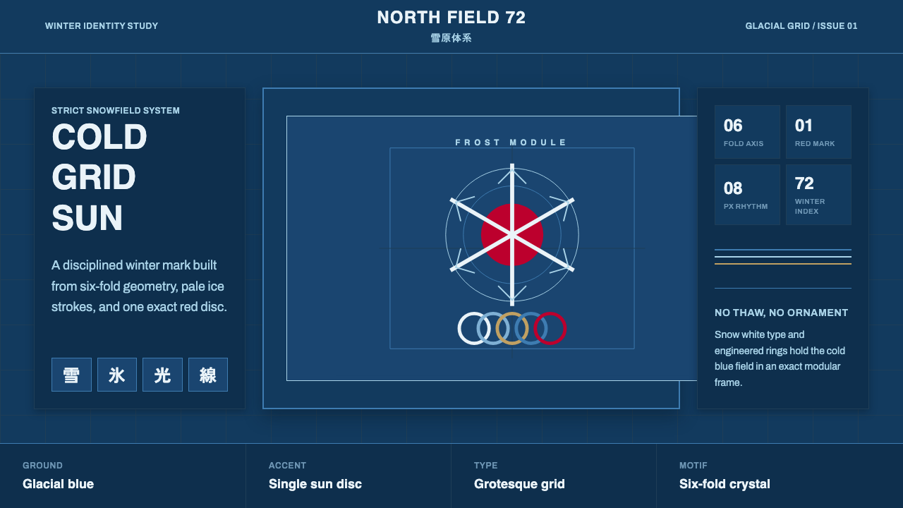 Sapporo Winter 1972Icy order, exact and calm. Glacial blue grid, snow-white type, one red sun di…冰冷秩序:冰川蓝网格、雪白字体与唯一红日圆。
 Saul Bass CorporateAuthority distilled. Deep blue geometry, tight Inter lockups, and white space…权威被蒸馏:深蓝几何、紧排 Inter 与留白承载标志。
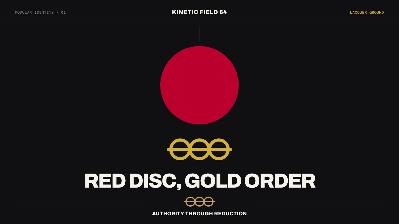 Tokyo 1964 (Kamekura)Ceremony reduced to a mark. Crimson disc and gold rings lock to a black axial…庄重被压缩成标记:黑色轴线网格锁定红日与金环。
 2001 — A Space OdysseyAbsolute restraint. Black void, white monolith geometry, one HAL-red signal.绝对克制:黑色虚空、白色巨石几何、唯一的 HAL 红信号。
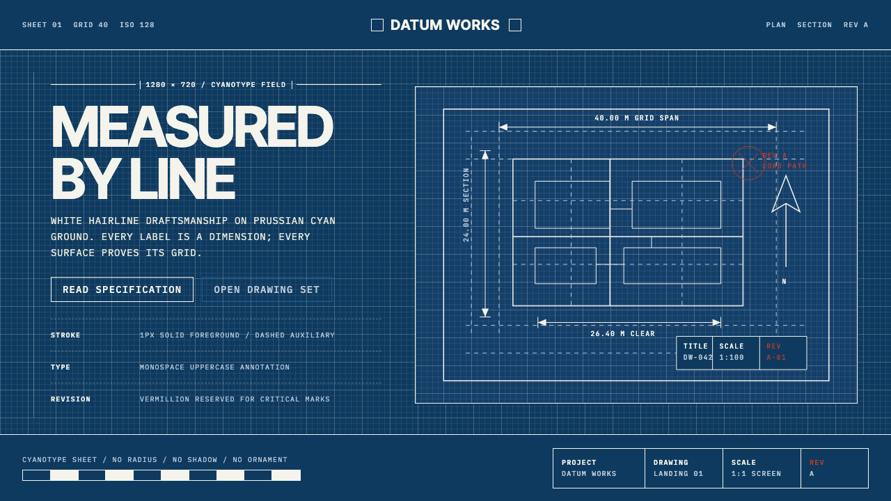 Architectural BlueprintMeasurement, not mood. Prussian cyan grid with white hairlines and vermillion…测量,不造情绪。普鲁士青网格、白色发丝线与朱砂修订标记。