What is Architectural Blueprint?什么是 Architectural Blueprint?
Architectural Blueprint translates the cyanotype drafting table directly into a design system — Prussian-cyan grounds, white hairlines, dimension ticks, and vermillion revision marks, with every stroke treated as a measurement.建筑蓝图将氰版制图台直接转化为设计系统——普鲁士青底面、白色发丝线、尺寸刻度与朱砂修订标记,每一笔画都被当作一个测量值。
Architectural Blueprint in briefArchitectural Blueprint 速览
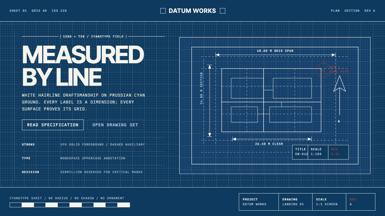
Architectural Blueprint is the aesthetic of technical drafting made into a visual design language. Its foundation is the cyanotype process — the photographic chemistry that gave nineteenth-century engineers a reproducible, high-contrast medium for copying plans. Everything about the visual grammar descends from that original constraint: a deep Prussian-cyan ground that reads as the sensitized paper, white lines that read as the unexposed emulsion, and the strict economy of marks that comes from a discipline where every line must justify its presence.建筑蓝图是技术制图的美学被转化为视觉设计语言的产物。其基础是氰版工艺——这一摄影化学法在十九世纪为工程师提供了一种可复制的高对比度图纸复印介质。所有视觉语法都源自这一原始约束:深普鲁士青底面模拟感光纸,白色线条模拟未曝光的乳剂层,而严格的标记经济性则来自一个每条线都必须自证其存在的专业规训。
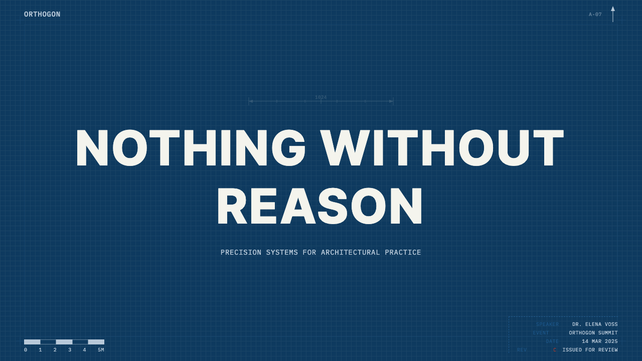
The system is tonal and binary. Prussian cyan and pure white carry the full weight of composition — there is no warm tone, no ambient gray, no decorative gradient. Vermillion is the sole exception, reserved strictly for revision clouds, correction marks, and critical dimensions, exactly as it appears in the physical practice of architectural mark-up. Zero radius, zero shadow, zero ornament: the visible grid is not a design decision imposed on top of a composition — it is the composition.这套系统是色调性与二元性的。普鲁士青与纯白承载构图的全部重量——没有暖色调,没有环境灰,没有装饰性渐变。朱砂红是唯一例外,严格保留给修订云线、修改标记与关键尺寸,完全沿用建筑图纸实物标注的惯例。零圆角、零阴影、零装饰:可见的网格并非叠加于构图之上的设计决定——它本身就是构图。
This is not a stylized tribute to blueprints. It is the actual typographic and compositional conventions of technical drafting applied at interface scale: hairline weight construction lines, heavier weight object lines, dimension ticks and leaders, north arrows, title blocks in the lower right corner, monospaced uppercase annotation. The discipline demands that every element either measures something or names something — decorative elements have no role.这不是对蓝图的风格化致敬,而是将技术制图的真实排版与构图惯例应用于界面尺度:发丝粗细的辅助线、更重的轮廓线、尺寸刻度与引线、北向箭头、右下角图签栏、等宽全大写注释文字。这套规律要求每个元素要么在测量某物,要么在命名某物——装饰性元素没有立足之地。
See the Architectural Blueprint design system查看 Architectural Blueprint 完整设计系统
Where does Architectural Blueprint come from?Architectural Blueprint 从何而来?
The physical basis of Architectural Blueprint is the cyanotype process, invented by the English scientist Sir John Herschel in 1842. Herschel discovered that certain iron salts were sensitive to ultraviolet light and could fix an image when washed in water. The characteristic Prussian-blue tone — named for the iron compound at its chemical heart — was a byproduct of the chemistry, not a design choice. Anna Atkins, a botanist and photographer, immediately recognized the process's value for scientific documentation and used it to produce the first photographically illustrated books, contact-printing algae specimens directly onto the sensitized paper. Engineers and architects soon followed: the cyanotype's high contrast and its resistance to fading made it ideal for reproducing ink drawings at full scale.建筑蓝图的物质基础是氰版工艺,由英国科学家约翰·赫歇尔爵士于1842年发明。赫歇尔发现某些铁盐对紫外线敏感,经水洗后可定影成像。那种标志性的普鲁士蓝色调——以其化学核心的铁化合物命名——是化学反应的副产品,并非设计选择。植物学家兼摄影师安娜·阿特金斯立即认识到这一工艺在科学记录方面的价值,将海藻标本直接接触印相于感光纸上,制作出第一批以摄影图像为插图的书籍。工程师与建筑师随即跟进:氰版的高对比度与抗褪色性使其成为全尺寸复制墨线图纸的理想媒介。
By the late nineteenth century, the blueprint had become the universal language of technical drafting. Architectural and engineering offices across Europe and North America maintained blueprint rooms — darkrooms equipped with UV-exposure frames where draftsmen's original linen or vellum drawings were contact-printed and reproduced in quantity. The conventions that evolved in this medium — the specific hierarchy of line weights, the standardized symbols for doors, windows, stairs, and sections, the title block format in the lower right corner, the revision cloud — were not aesthetic decisions. They were functional protocols agreed upon across the profession so that a drawing produced in one office could be read unambiguously in another.到十九世纪末,蓝图已成为技术制图的通用语言。欧洲与北美的建筑和工程事务所都设有蓝图室——配备紫外线曝光架的暗室,绘图员的原始亚麻或描图纸图纸在此被接触印相并批量复制。在这一媒介中演化出的惯例——线宽的具体层级、门窗楼梯与剖面的标准化符号、右下角图签栏的格式、修订云线——并非美学决定,而是整个行业达成共识的功能性规范,使一个事务所绘制的图纸能在另一个事务所被无歧义地读取。
The Bauhaus and its contemporaries — above all Mies van der Rohe and Le Corbusier — elevated technical drawing to a form of architecture in itself. Mies's plans for the Barcelona Pavilion and the Farnsworth House are not merely construction documents: they are compositions in which the precision of the line communicates the absolute control of the spatial idea. Le Corbusier's purism extended to his drawing hand; his section drawings of the Villa Savoye demonstrate that a correctly-weighted line in the right position can carry the full architectural argument without perspective illusion. The technical drawing became a statement of ideology — precision as the visible signature of rational modernism.包豪斯及其同时代人——尤其是密斯·凡德罗与勒·柯布西耶——将技术图纸提升为建筑本身的一种形式。密斯为巴塞罗那馆和范斯沃斯住宅绘制的平面图,不仅仅是施工文件,它们是构图——线条的精确性传达着对空间理念的绝对掌控。柯布西耶的纯粹主义延伸至他的绘图之手:他的萨伏伊别墅剖面图表明,一条粗细恰当、位置正确的线,可以在不借助透视幻觉的前提下承载完整的建筑论点。技术图纸成为一种意识形态宣言——精确性作为理性现代主义的可见签名。
The digital era did not replace the blueprint aesthetic; it intensified its influence. When computer-aided drafting software arrived in the late 1970s and early 1980s, it was calibrated to the conventions of hand drafting — layers, line weights, annotation styles, title blocks. The visual language of technical drawing entered screen design as a literal interface: early CAD software used cyan-on-black precisely because that palette preserved the perceptual contrast of the cyanotype print on a low-resolution monitor. Contemporary applications of the blueprint aesthetic — in product design presentations, engineering documentation, and architectural portfolio work — return to these conventions not as nostalgia but as a claim: this is measurement, not decoration.数字时代并没有取代蓝图美学,而是强化了它的影响力。计算机辅助制图软件在1970年代末至1980年代初问世时,是以手工制图的惯例为校准基准的——图层、线宽、注释样式、图签栏。技术图纸的视觉语言作为字面界面进入了屏幕设计:早期CAD软件使用青色对黑色,正是因为这种色板在低分辨率显示器上保留了氰版印刷的感知对比度。当代对蓝图美学的应用——产品设计演示、工程文档、建筑作品集——回归这些惯例不是出于怀旧,而是一种主张:这是测量,不是装饰。
What defines the Architectural Blueprint look?Architectural Blueprint 的视觉特征是什么?
Ground and Tone底面与色调
The foundational color is a deep, saturated Prussian cyan — the exact hue of the developed cyanotype print, which sits between a navy and a true cyan without leaning toward either. This is a dark-mode system by definition: white carries all the informational load, and the cyan ground is the field against which every element reads. There is no light mode equivalent; inverting the palette produces something different in kind, not merely in polarity.基础色是深饱和的普鲁士青——氰版印相显影后的确切色相,介于海军蓝与正蓝青之间,不偏向任何一侧。这从定义上就是一套深色模式系统:白色承载所有信息负荷,青色底面是所有元素浮现的场域。它没有等价的浅色模式;反转色板产生的是种类上不同的事物,而非仅仅是极性相反的版本。
Line Hierarchy线条层级
Technical drafting assigns meaning to line weight with the same rigor that typography assigns meaning to type size. Construction lines — used to establish geometry before the final drawing — are drawn as hairlines, the thinnest marks the medium can produce. Object lines defining walls, edges, and primary forms carry a heavier weight. Dimension lines and leaders are lighter than object lines but heavier than construction lines. This three-tier hierarchy is not a visual preference; it is a professional convention that allows any trained reader to parse the drawing instantly.技术制图以与排版用字号指派意义同等严格的规范,将意义赋予线宽。辅助线——在绘制最终图形之前用于建立几何关系——以发丝粗细绘制,是该媒介所能产生的最细标记。定义墙体、边缘与主要形体的轮廓线承载更重的线宽。尺寸线与引线比轮廓线细,但比辅助线重。这种三级层级并非视觉偏好,而是专业惯例,使任何经过训练的读者都能即时解读图纸。
Annotation and Typography注释与字体排印
All text in a technical drawing is set in monospaced uppercase — the letterforms that produce the most legible annotation when written by hand with a technical pen, and the forms that early typesetters and plotters could reproduce most reliably. In a design system derived from blueprints, this convention carries forward: labels, callouts, dimension numerals, and section tags are all monospaced and capitalized. No script, no display serif, no mixed case in structural labels. The only typographic variation is scale — a room label in large monospaced capitals versus a tolerance note in small monospaced capitals.技术图纸中的所有文字均以等宽全大写设置——这是用针管笔手工书写时可读性最佳的字形,也是早期排版机与绘图仪最能可靠再现的字形。在衍生自蓝图的设计系统中,这一惯例得以延续:标签、引注、尺寸数字与剖面标记,均为等宽且大写。结构性标签中不使用手写体、展示性衬线字体,也不使用混合大小写。唯一的字体排印变化是比例——大等宽大写字母的房间标签,与小等宽大写字母的公差注释。
Grid as Composition网格即构图
The drafting grid is not a background element — it is the primary organizational force. In blueprint-derived design, the visible grid is part of the finished composition, not a scaffold to be removed before delivery. Grid intersections anchor dimension marks. Grid lines at module intervals establish the underlying proportional system. The act of making the grid visible is itself a statement: this layout was not intuited, it was measured. The grid should be regular, fine-pitched, and maintained at a consistent weight — neither so light it disappears nor so heavy it competes with object lines.制图网格并非背景元素——它是首要的组织力量。在蓝图衍生的设计中,可见网格是最终构图的组成部分,而非交付前需要移除的脚手架。网格交叉点锚定尺寸标记。模数间距的网格线建立底层比例体系。使网格可见本身就是一种声明:这个版面不是直觉产生的,它是被测量出来的。网格应当规律、细密,并保持一致的线宽——既不至于细到消失,也不至于重到与轮廓线竞争。
Dimension and Annotation Marks尺寸与注释标记
Dimension lines with terminal ticks or arrowheads, extension lines running perpendicular to the measured element, leaders connecting callout text to the annotated feature — these are not decorative devices. In blueprint-derived design, they function as both navigation and hierarchy tools: a dimension string along the edge of a diagram directs the eye along the measurement axis; a leader forces the reader to connect label to element. North arrows, scale bars, and revision triangles from physical drafting practice all translate into interface conventions that communicate the same things — orientation, proportion, and change history.带端头刻度或箭头的尺寸线、垂直于被测元素的延伸线、将引注文字连接至标注特征的引线——这些不是装饰性装置。在蓝图衍生的设计中,它们既是导航工具也是层级工具:沿图表边缘的尺寸串将视线引导至测量轴线;引线迫使读者将标签与元素联系起来。来自实物制图实践的北向箭头、比例尺与修订三角形,都转化为传达相同信息的界面惯例——方向、比例与变更历史。
Vermillion as Signal Color朱砂红作为信号色
In the physical practice of architectural mark-up, a red pencil or red pen on a blueprint signals human intervention — a correction, a query, a critical measurement that cannot be ignored. Vermillion (a saturated warm red) is the only color permitted in a blueprint system outside of Prussian cyan and white, and it is strictly functional: it marks revisions, highlights critical dimensions, and flags errors or unresolved conditions. It is never used for decoration, hierarchy alone, or brand differentiation. Its power comes entirely from restraint — if everything is red, nothing is.在建筑图纸实物标注的实践中,蓝图上的红铅笔或红笔标记着人工介入——修改、查询、不可忽视的关键尺寸。朱砂红(一种饱和暖红)是蓝图系统中普鲁士青与白色之外唯一被允许的颜色,且严格具有功能性:它标记修订、突出关键尺寸、标记错误或未解决状态。它从不用于装饰、单纯的层级区分或品牌差异化。它的力量完全来自克制——如果所有东西都是红色,则没有任何东西是红色。
Title Block and Metadata Frame图签栏与元数据框架
The title block — a structured rectangular zone in the lower right corner of every technical drawing — records the document's identity: project name, drawing number, scale, revision history, date, and the names of the drafter and checker. It is a formal metadata container, and in blueprint-derived design systems it translates into a persistent information zone: a footer or sidebar that carries authorship, version, and context data independently of the main content area. The title block's formality communicates that this document has a provenance, a revision history, and a responsible party — claims that are the aesthetic opposite of anonymous or provisional.图签栏——每张技术图纸右下角的结构化矩形区域——记录文件的身份信息:项目名称、图纸编号、比例、修订历史、日期,以及绘图员与审核员的姓名。这是一个正式的元数据容器,在蓝图衍生的设计系统中,它转化为持久的信息区域:独立于主内容区域承载作者信息、版本与背景数据的页脚或侧边栏。图签栏的正式性传达着这份文件有出处、有修订历史、有负责方——这些主张在美学上与匿名或临时性完全相反。

See the Architectural Blueprint design system查看 Architectural Blueprint 完整设计系统
Who shaped Architectural Blueprint?谁塑造了 Architectural Blueprint?
Herschel invented the cyanotype process in 1842, discovering that iron salts sensitized with potassium ferricyanide would produce a stable Prussian-blue image when exposed to ultraviolet light and washed in water. Although trained as an astronomer and mathematician, Herschel was instrumental in the early development of photography: he coined the terms 'photography,' 'negative,' and 'positive,' and his cyanotype invention gave engineers and architects a reproducible, durable, and inexpensive method for copying technical drawings. The specific visual character of the blueprint — its deep cyan ground and white lines — is a direct consequence of his chemistry.赫歇尔于1842年发明了氰版工艺,发现以铁氰化钾敏化的铁盐在紫外线照射并水洗后可产生稳定的普鲁士蓝图像。尽管受训为天文学家与数学家,赫歇尔对早期摄影的发展至关重要:他创造了「摄影」、「负片」与「正片」等术语,而他的氰版发明为工程师与建筑师提供了一种可复制、耐用且廉价的技术图纸复印方法。蓝图独特的视觉特征——深青底面与白色线条——是其化学工艺的直接结果。
Mies van der Rohe's contribution to the blueprint aesthetic is architectural in the most literal sense: his precision plans and sections — for the Barcelona Pavilion, the Farnsworth House, the Illinois Institute of Technology campus — demonstrate that a technical drawing can simultaneously function as a construction document and as a composition of extraordinary spatial intelligence. Mies's maxim 'less is more' is perfectly legible in his drafting practice: every line in his drawings carries structural necessity. As director of the Bauhaus from 1930 and later as a central figure of the Chicago modernist scene, he established precision of execution as the primary value of architectural design.密斯·凡德罗对蓝图美学的贡献,在最字面意义上是建筑性的:他精确的平面图与剖面图——为巴塞罗那馆、范斯沃斯住宅、伊利诺伊理工学院校园绘制——证明技术图纸可以同时作为施工文件与具有超凡空间智慧的构图运作。密斯的格言「少即是多」在他的制图实践中清晰可辨:他图纸中的每条线都承载着结构必要性。作为1930年起包豪斯的校长,以及后来芝加哥现代主义的核心人物,他确立了执行精确性作为建筑设计首要价值的地位。
Le Corbusier's Purist aesthetic extended from his paintings to his technical drawings: both operated on the principle that a correctly-proportioned, correctly-positioned element required no further justification. His section drawings — most famously of the Villa Savoye and Unité d'Habitation — are studies in line-weight discipline, where the thickness of a line communicates whether an element is cut, visible, or implied. Le Corbusier's Modulor proportional system formalized the relationship between human scale and architectural measurement, making the act of dimensioning a drawing a philosophical statement about the relationship between the body and the built environment.勒·柯布西耶的纯粹主义美学从他的绘画延伸至技术图纸:两者都以正确比例、正确位置的元素无需进一步辩护这一原则运作。他的剖面图——最著名的是萨伏伊别墅与马赛公寓——是线宽规律的研究,线条的粗细传达着元素是被剖切、可见还是被暗示的。柯布西耶的模数比例系统将人体尺度与建筑测量的关系正式化,使图纸的标注行为成为关于身体与建成环境关系的哲学陈述。
Wright's relationship to the blueprint aesthetic is more complicated than Mies's or Corbusier's: his drafting style was expressive, his line work was precise but not arid, and his color sense extended to his presentation drawings, which used warm earth tones that the standard cyanotype medium could not reproduce. But Wright's contribution to blueprint culture was pedagogical: the Taliesin Fellowship that he established in 1932 trained apprentice architects through comprehensive drawing — not just design, but the full discipline of measured, annotated, reproducible documentation. Wright demonstrated that precision drawing and organic architecture were not contradictions.赖特与蓝图美学的关系比密斯或柯布西耶更为复杂:他的制图风格是表现性的,线条精确但不枯燥,他的色彩感觉延伸至他的展示图纸,使用了标准氰版媒介无法复制的暖大地色调。但赖特对蓝图文化的贡献是教学法上的:他于1932年建立的塔里耶森学社通过全面的图纸训练建筑学徒——不仅仅是设计,而是测量、注释、可复制文档的完整规训。赖特证明了精确图纸与有机建筑并非矛盾。
Atkins was the first person to recognize that Herschel's cyanotype process had systematic documentary value. Beginning in 1843, she used the process to produce 'British Algae: Cyanotype Impressions,' the first book to be illustrated with photographic images rather than hand-drawn plates. Each image was made by placing a dried algae specimen directly on sensitized paper and exposing it to sunlight — a technique called photogram or photogenic drawing — producing a white silhouette on a Prussian-blue ground. Atkins established the core visual logic of the blueprint before it was applied to architecture: white form reading against a cyan field, maximum contrast, no tonal graduation.阿特金斯是第一个认识到赫歇尔氰版工艺具有系统性文献价值的人。从1843年起,她利用这一工艺制作了《英国海藻:氰版印象》,这是第一本以摄影图像而非手绘插图进行插图说明的书。每张图像都是将干燥的海藻标本直接放置于感光纸上并在阳光下曝光制作的——这种技术称为光图或光生绘画——在普鲁士蓝底面上产生白色剪影。阿特金斯在蓝图被应用于建筑之前,就建立了其核心视觉逻辑:白色形态在青色场域中显现,最大对比度,无色调层次。
How do you use Architectural Blueprint today?今天怎么用 Architectural Blueprint?
Architectural Blueprint's visual authority comes from its strict adherence to drafting conventions. Applying it well means understanding that every element must earn its place by measuring or naming something — aesthetic decoration has no role. When this discipline is maintained, the style reads as precise, authoritative, and trustworthy. When it breaks down — when decorative elements are added, when the color system is violated, when the grid is ignored — the result is neither blueprint nor design, but costume.建筑蓝图的视觉权威性来自于它对制图惯例的严格遵守。正确应用它意味着理解每个元素都必须通过测量或命名某物来证明其存在——装饰没有任何角色。当这种规律被维持时,该风格读来精确、权威且值得信赖。当它崩溃时——当装饰性元素被添加、当色彩系统被违反、当网格被忽略——结果既不是蓝图,也不是设计,而只是服装。
For presentation slides, the style is particularly effective on technical documentation decks, engineering proposals, and architectural portfolios. A cover slide should use the full Prussian-cyan ground, white headline type in monospaced uppercase, and a single framing element — a title block in the lower right, a thin white border rule at the margins, or a dimension-tick motif that echoes the subject matter. Content slides should treat data as plans: diagrams are orthographic, labels are in monospaced uppercase callouts with leaders, and the grid is always visible underneath. Data slides gain the most from the convention of dimension strings — place measurement values outside the chart area as if annotating a section drawing, rather than labeling bars directly.对于演示文稿,该风格在技术文档演示、工程提案与建筑作品集中尤为有效。封面页应使用完整的普鲁士青底面、等宽全大写的白色标题字体,以及单一的框架元素——右下角的图签栏、边距处的细白边框线,或呼应主题的尺寸刻度母题。内容页应将数据当作平面图处理:图表是正交的,标签是带引线的等宽全大写引注,网格始终可见于底层。数据页最能从尺寸串惯例中获益——将测量值置于图表区域外侧,如同为剖面图添加注释,而非直接标注柱条。
For web interfaces, Architectural Blueprint is best suited to technical platforms, developer tools, engineering dashboards, and any product where the message is precision and measurability. Implement the dark Prussian-cyan background at full depth, use white for all primary text and interactive elements, and reserve vermillion strictly for alerts, error states, and critical action prompts. Navigation components benefit from the title-block convention: a persistent sidebar or header that carries version number, build status, and identity information independently of the main content. Input fields and containers should be hard-bordered in white, with no soft shadow — the line is the boundary, not a suggestion of depth.对于网页界面,建筑蓝图最适合技术平台、开发者工具、工程仪表板,以及任何传递精确性与可测量性信息的产品。以完整深度实现深普鲁士青背景,对所有主要文字与交互元素使用白色,严格将朱砂红保留给警报、错误状态与关键操作提示。导航组件受益于图签栏惯例:持久显示版本号、构建状态与身份信息的侧边栏或标题栏,独立于主内容区域。输入框与容器应以白色硬边框处理,无软阴影——线条是边界,而非深度的暗示。
For editorial and marketing contexts, the style is most powerful when the subject matter directly connects to engineering, architecture, technical specification, or scientific measurement. A product specification sheet, a technical announcement poster, or a data-journalism article about infrastructure can all carry the full blueprint vocabulary. Use the grid visibly, let dimension lines annotate the layout itself, set pull quotes in monospaced uppercase as if they were construction notes. For marketing pages aimed at technical buyers — developer tools, infrastructure products, scientific instruments — the blueprint aesthetic signals that the maker understands precision and takes specification seriously.在编辑与营销语境中,当主题与工程、建筑、技术规范或科学测量直接关联时,该风格最为有力。产品规格说明书、技术发布海报、或关于基础设施的数据新闻文章,都可以承载完整的蓝图词汇。使网格可见,让尺寸线注释版面本身,以等宽全大写设置引文,如同施工注释一般。对于面向技术买家的营销页面——开发者工具、基础设施产品、科学仪器——蓝图美学传达着制造者理解精确性并认真对待规范的信号。
The most common mistake when applying Architectural Blueprint is treating it as a color theme rather than a system. Adding the Prussian-cyan ground and white type while continuing to use rounded corners, soft shadows, gradient fills, and decorative illustration produces a hybrid that satisfies neither the blueprint's logic nor contemporary interface expectations. The system requires commitment to its orthographic principles: hard borders, right angles, a visible grid, monospaced uppercase annotation, and the complete absence of decorative elements. The vermillion accent is particularly prone to overuse — if it appears more than three or four times on a screen, it has lost its signaling function. Restraint is not a stylistic preference here; it is a structural requirement.应用建筑蓝图时最常见的错误,是将其视为色彩主题而非系统。添加普鲁士青底面与白色字体,同时继续使用圆角、软阴影、渐变填充与装饰性插图,产生的混合体既不满足蓝图的逻辑,也不符合当代界面期待。这套系统要求对其正交原则的承诺:硬边框、直角、可见网格、等宽全大写注释,以及装饰性元素的完全缺席。朱砂红强调色尤其容易过度使用——如果它在一个屏幕上出现超过三四次,它就已经失去了信号功能。这里的克制不是风格偏好,而是结构要求。
See the Architectural Blueprint design system查看 Architectural Blueprint 完整设计系统
Architectural Blueprint — FAQArchitectural Blueprint · 常见问题
Is Architectural Blueprint only suitable for dark-mode interfaces?建筑蓝图只适合深色模式界面吗?
The canonical form of the style is dark: Prussian cyan is the ground, white is the figure. This is not a stylistic preference but a historical and perceptual fact — the cyanotype process produces a dark ground, and the visual logic of the style depends on white reading as light against that depth. A light-mode variant is possible but requires rethinking the system from its foundations: inverting to white ground with cyan lines produces something closer to a schematic diagram or a modern CAD line drawing, which is a related but distinct visual register. If your context requires a light interface, consider whether a schematic-diagram system serves better, and if you do adapt Blueprint to light mode, treat it as a distinct palette with its own rules rather than a simple color swap.该风格的规范形式是深色的:普鲁士青是底面,白色是图形。这不是风格偏好,而是历史与感知事实——氰版工艺产生深色底面,该风格的视觉逻辑依赖于白色在那种深度中作为光线显现。浅色模式变体是可能的,但需要从基础重新思考系统:反转为白色底面加青色线条,产生的东西更接近示意图或现代CAD线图——这是相关但截然不同的视觉语域。如果你的语境需要浅色界面,请考虑示意图系统是否更适合;如果你确实将蓝图适配到浅色模式,请将其视为有自己规则的独立色板,而非简单的颜色互换。
Can the Blueprint style incorporate photography or illustration?蓝图风格能融入摄影或插图吗?
Photography is difficult to integrate authentically, because photographic tonality — especially skin tones, organic textures, and naturalistic color — directly contradicts the binary logic of the blueprint system. If photography is necessary, the appropriate treatment is to convert it to a high-contrast duotone using only the system's two colors, or to silhouette the subject against the cyan ground as if it were a photogram. Illustration works better when it is completely orthographic: isometric projections, exploded diagrams, schematic cross-sections. Any illustration that uses perspective projection, soft shading, or naturalistic color will create a tonal conflict with the blueprint ground. The system's strength lies in its consistency — one element that violates the orthographic principle undermines the whole.摄影难以被真实地整合,因为摄影的色调性——尤其是肤色、有机质感与自然主义色彩——直接与蓝图系统的二元逻辑相矛盾。如果必须使用摄影,适当的处理方式是仅使用系统的两种颜色将其转换为高对比度双色调,或将主体在青色底面上做轮廓剪影处理,如同光图一般。插图在完全正交时效果更好:等轴测投影、分解图、示意性剖面图。任何使用透视投影、柔和阴影或自然主义色彩的插图都会与蓝图底面产生色调冲突。该系统的力量在于一致性——一个违反正交原则的元素会破坏整体。
How do you handle color when you need more than cyan, white, and vermillion?当需要超过青色、白色与朱砂红三色时,如何处理色彩?
The short answer is: you should not need more than three colors if the system is applied correctly. The blueprint palette's power comes from its constraint — every color in the system carries a specific and exclusive function, and adding a fourth color dilutes all three. If your use case genuinely requires additional differentiation — for example, multi-team revision marks or a multi-series data chart — the correct approach is to vary the weight, dash pattern, or opacity of white lines rather than introducing new hues. If a color distinction is truly unavoidable, the historically grounded option is to choose from the limited set of colors that appeared in actual drafting practice: yellow for highlight, green for existing conditions versus proposed conditions. These additions should be as rare and functional as vermillion itself.简短的答案是:如果系统被正确应用,你不应该需要超过三种颜色。蓝图色板的力量来自其约束——系统中的每种颜色都承载着特定且专属的功能,增加第四种颜色会稀释前三种。如果你的使用场景真的需要额外的区分——例如多团队修订标记或多系列数据图——正确的方法是改变白色线条的粗细、虚线样式或透明度,而非引入新色相。如果颜色区分真的不可避免,有历史依据的选项是从实际制图实践中出现过的有限色彩集合中选择:黄色用于高亮,绿色用于现有条件与拟建条件的区分。这些补充应当像朱砂红本身一样稀少且具有功能性。
Is Blueprint suitable for consumer-facing products, or is it too technical?蓝图风格适合面向消费者的产品吗?还是说它过于技术性?
Blueprint's severity is a feature in some consumer contexts and a liability in others. It communicates precision, expertise, and uncompromising standards — qualities that resonate with technically sophisticated audiences and with consumers who want assurance that a product has been engineered rather than merely styled. Architecture, engineering, industrial equipment, scientific instruments, professional software, and developer tools are all natural homes for the style. It struggles in contexts that depend on warmth, accessibility, or sensory pleasure: food, personal wellness, children's education, casual social products, and any interface where the primary emotional cue should be invitation rather than authority. The deciding question is whether the product's core value claim is precision and competence or warmth and ease — Blueprint serves the former powerfully and the latter poorly.蓝图的严肃性在某些消费者语境中是特性,在其他语境中则是负担。它传达精确性、专业能力与不妥协的标准——这些品质与技术上成熟的受众以及希望获得产品是工程而非仅仅是设计的消费者产生共鸣。建筑、工程、工业设备、科学仪器、专业软件与开发者工具,都是该风格的自然栖息地。它在依赖温暖感、亲和力或感官愉悦的语境中力不从心:食品、个人健康、儿童教育、休闲社交产品,以及任何主要情感线索应当是邀请而非权威的界面。决定性的问题是:产品的核心价值主张是精确性与能力,还是温暖与便捷——蓝图有力地服务于前者,对后者则效果欠佳。
What distinguishes Architectural Blueprint from general dark-mode design?建筑蓝图与一般深色模式设计有何区别?
General dark-mode design uses a dark background to reduce eye strain, improve perceived contrast, and align with user preference — the color of that background is typically a near-black or very dark gray chosen for neutral readability. Architectural Blueprint uses Prussian cyan as its ground for a specific historical and semantic reason: it is the color of the cyanotype process, and it carries the meaning of technical documentation. The distinction extends beyond color: Blueprint requires monospaced uppercase type, orthographic composition, a visible grid, dimension-line conventions, and the functional use of vermillion as the sole accent. A product can be dark-mode without any of these commitments; Blueprint requires all of them simultaneously. The style is not a dark-mode option — it is a complete semiotic system with its own grammar.一般深色模式设计使用深色背景来减少眼疲劳、提升感知对比度并迎合用户偏好——该背景颜色通常是为中性可读性选择的近黑或极深灰。建筑蓝图使用普鲁士青作为底面,出于特定的历史与语义原因:它是氰版工艺的颜色,承载着技术文档的意义。区别延伸至颜色之外:蓝图要求等宽全大写字体、正交构图、可见网格、尺寸线惯例,以及将朱砂红作为唯一强调色的功能性使用。一个产品可以是深色模式而不具备任何这些承诺;蓝图同时要求全部这些。该风格不是一个深色模式选项——它是一套有自己语法的完整符号学系统。
Related design styles相关设计风格
 Concorde SupersonicPhysics made prestige. Pearl grey, sky-blue window line, and one red wing vec…物理成就尊贵:珍珠灰、天蓝舷窗线和一枚红翼矢量。
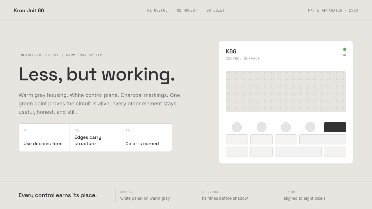 Dieter Rams / BraunQuiet by design. Warm gray, white panels, hairline grids, and one earned gree…安静即设计:暖灰、白面板、细网格,只留一枚绿色指示点。
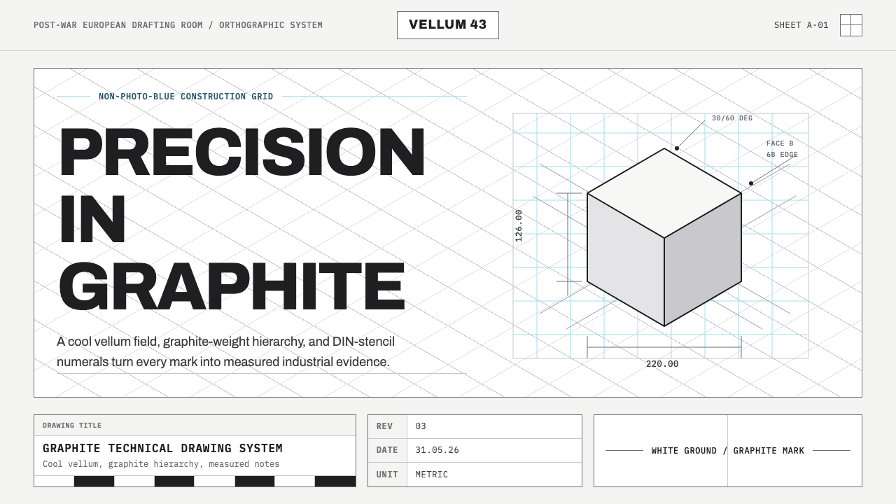 Graphite Technical DrawingDrafting-room precision. Non-photo-blue grid and graphite DIN lettering do th…制图室般精确:淡蓝网格与石墨DIN字母构成秩序。
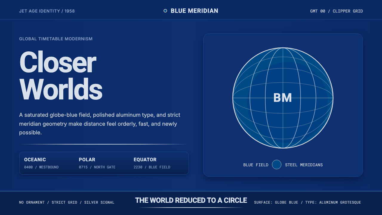 Pan Am Jet AgeJet-age confidence. Globe-blue field, steel type, meridian circle on a strict…喷气时代的信心:蓝色地球场、钢灰字体、经纬圆与严格网格。
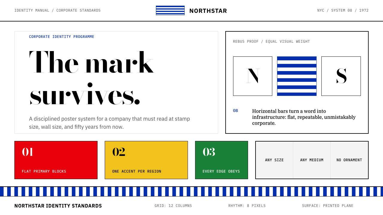 Paul Rand / IBM Corporate IdentityCorporate modernism stays exact. Blue 8-bar stripes, high-contrast serif, har…企业现代主义保持精确:蓝色八条纹、高反差衬线与硬网格色块。
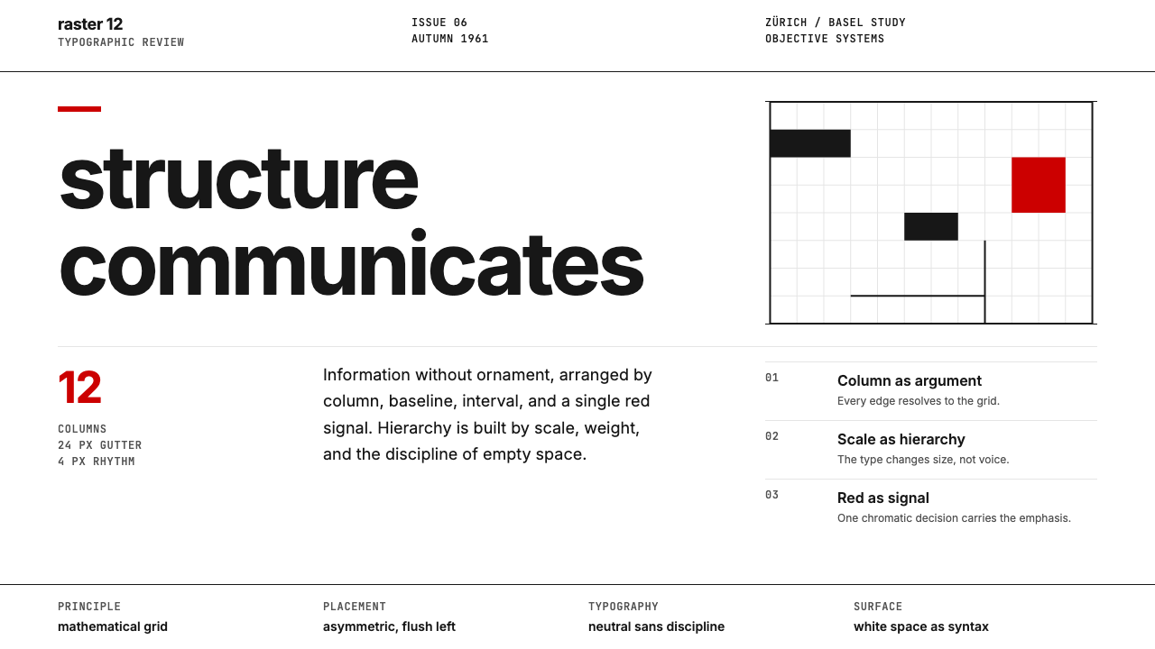 Swiss International StyleObjectivity made visible. Inter scale, white space, and one red block expose…客观性可见:Inter 尺度、留白与单一红块显露网格。