What is Concorde Supersonic?
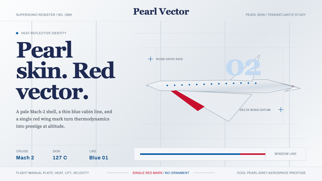
Concorde Supersonic turns aerodynamics into identity — pearl grey skin dictated by heat physics, a razor sky-blue window stripe, and the droop-nose silhouette of a dart aimed at the horizon.
Concorde Supersonic in brief
Concorde Supersonic is a design system rooted in the visual identity of the Aérospatiale-BAC Concorde — the world's first transatlantic supersonic passenger aircraft, which entered commercial service in 1976 and flew until 2003. Unlike most corporate identity systems, Concorde's aesthetic was not chosen by a design committee chasing prestige; it was engineered into existence. Every visual choice traces back to a physical constraint or an operational reality of Mach-2 flight.
The defining feature is the pale pearl-grey-white livery. At cruising altitude, the aircraft skin heats dramatically due to aerodynamic compression. Dark pigments absorb heat and would push the aluminum structure beyond safe temperature limits; the cool, reflective near-white dissipates that heat and keeps the aircraft airworthy. What looks like restraint is actually thermodynamics. The thin sky-blue heritage stripe running along the window line — used by British Airways on its Concorde fleet — added the sole chromatic note, a thread of cool colour connecting each oval window in a single continuous gesture.
The visual system carries the late-1960s aerospace-prestige sensibility: serif titling evokes precision instruments and official documentation, while clean grotesque typefaces echo instrument-panel labels and technical manuals. Generous white space makes the overall composition feel weightless, mirroring the aircraft's own relationship to gravity. This is a style of controlled confidence — engineering pride rendered as elegance, never as spectacle.
Where does Concorde Supersonic come from?
The Concorde programme was announced jointly by the British and French governments in November 1962, with a formal treaty signed the same day that made withdrawal legally impossible. BAC (British Aircraft Corporation) and Aérospatiale collaborated across the English Channel under extraordinary political pressure to produce an aircraft that would beat the United States and Soviet Union in the race for civilian supersonic flight. The first prototype — Bristol 223 merged with Sud Aviation's Super Caravelle concept — flew from Toulouse on 2 March 1969, the year that also gave the style its anchor date.
The visual identity emerged from two design consultancies working on either side of the Channel. Negus & Negus, a British firm, handled much of the signage and branding system in the UK context, while the broader livery grammar was shaped over years of airline-specification work and regulatory documentation. Landor Associates, the American corporate identity firm that had built a reputation for airline branding in the 1970s, later consulted on British Airways' Concorde presentation. The result was a livery language shaped less by any single designer's vision than by the disciplined accumulation of engineering and operational constraints.
The historical context matters. Concorde entered service in January 1976, flying simultaneously for Air France (Paris–Dakar–Rio) and British Airways (London–Bahrain). It cruised at Mach 2.04 at altitudes above 60,000 feet, where the sky darkens toward deep violet and passengers could see the curvature of the Earth. The aircraft was designed to embody national technological prestige at the apex of the post-war jet age — a period when civil aviation was still imbued with the grandeur of pioneering international travel rather than mass-market logistics.
Service continued until 24 October 2003, when both Air France and British Airways retired their fleets simultaneously — partly due to the economics of post-9/11 aviation, partly following the Air France crash of July 2000 that grounded the fleet for over a year. In the two decades since retirement, Concorde's visual identity has become a cultural shorthand for a particular kind of technological confidence: the belief that engineering excellence and aesthetic excellence are not competing values but the same discipline viewed from different angles.
What defines the Concorde Supersonic look?
Palette
The dominant tone is a cool pearl grey — almost white but with a slight metallic neutrality — which serves as both the primary background and the structural anchor. Against this near-white field, a single thin stripe of sky blue traces the window line, providing the only chromatic accent. High-contrast black or very dark grey handles all typographic elements. No warm tones intrude: no cream, no gold, no red. The result is a palette that feels simultaneously technical and rarefied — the colour of altitude itself.
Typography
Serif titling — rooted in the late-1960s tradition of aerospace and prestige engineering communication — carries institutional authority and precision. These are not ornamental serifs but the measured, legible letterforms of technical documentation and official certification. Supporting text uses clean, light grotesque typefaces that evoke instrument panel labelling: functional, unornamented, read at a glance. The contrast between the weighted serif headline and the hairline grotesque body creates a layered hierarchy that feels both official and restrained.
Silhouette
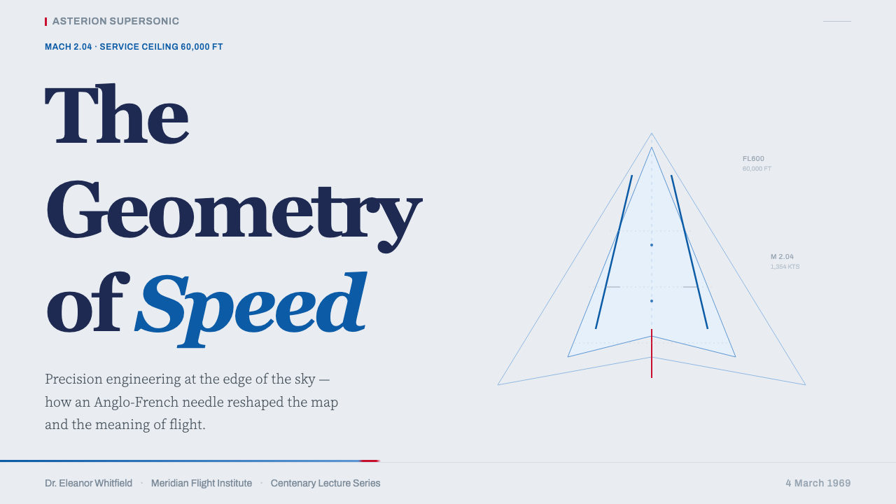
The drooping nose — a hydraulically articulated visor that lowered for takeoff and landing to give the crew forward visibility, then raised to a streamlined position at cruise — is the style's signature shape. Rendered as a graphic element, it reads as an elongated dart or a downward-pointing needle: aggressive forward momentum, engineering purpose made geometric. The delta wing planform, viewed from above, offers a near-perfect isosceles triangle. These silhouettes are the style's most powerful visual currency.
White Space and Weightlessness
Generous negative space is not empty — it is the formal equivalent of altitude. The composition consistently refuses crowding; elements are placed with wide margins and ample breathing room, as if they too need clearance for take-off. This restraint signals that every element present has earned its place. The overall impression is one of weightlessness and controlled confidence — the same qualities Concorde projected at 60,000 feet.
Line as Engineering Grammar
The single continuous window stripe — a horizontal line that runs without interruption from nose to tail — is the style's most disciplined compositional device. It asserts continuous motion, forward direction, and structural unity in a single mark. In graphic applications, this translates to the use of a solitary fine rule or band as the primary organizational element on a page: not multiple borders, not a grid of rules, but one line that does everything. Less is not minimalism here — it is engineering economy.
Reflective Surface Quality
The pearl-grey palette reads differently from matte white: it implies a polished, metallic surface capable of reflecting its surroundings. In print and digital contexts, this quality is suggested through very slight tonal gradations — not gradients in the conventional sense, but the faint luminosity of a surface that catches light. Combined with crisp, high-contrast typography, the effect is one of cool precision: a material that is manufactured, maintained, and flight-certified.
Restrained Asymmetry
Layouts in this system favour a strong horizontal axis — the pull of the window line, the direction of flight — over centred or symmetrical compositions. The primary visual element tends to occupy one side or one corner, with counterweight provided by typographic blocks rather than mirrored shapes. The asymmetry is disciplined rather than expressive: it communicates forward motion and navigational confidence without veering into dynamism for its own sake.
Who shaped Concorde Supersonic?
The joint Anglo-French engineering teams who designed Concorde between 1962 and 1969 produced a machine whose appearance was inseparable from its function. The choice of the pale reflective livery was an engineering decision before it was an aesthetic one. The drooping nose visor, the ogival delta wing, the four Olympus 593 engines clustered beneath — each became a graphic element precisely because each solved a physical problem with visible, elegant economy. No subsequent design studio could have invented this visual language; it was derived.
The British design consultancy Negus & Negus, led by brothers Dick and Ron Negus, worked on the identity and environmental graphics surrounding the Concorde programme in its British context. The firm was known for its rigorous approach to corporate identity systems during the 1960s and 1970s, bringing a discipline of systematic thinking to the aircraft's visual presentation that matched the precision of the engineering itself.
Landor Associates, the San Francisco-based corporate identity firm founded by Walter Landor, consulted on British Airways' presentation of the Concorde fleet. By the 1970s, Landor had built a reputation for airline identity systems — including British Airways' own overall rebranding — and brought an international standard of corporate communication discipline to the Concorde livery's refinement. Their contribution helped consolidate the visual language into the form most widely recognized today.
The aircraft themselves are the primary design objects. G-BOAA, the first British Airways Concorde on the London–Bahrain route in January 1976, and F-BVFA, the first Air France Concorde on the Paris–Dakar–Rio route on the same day, represent the moment when the visual language left prototype status and became a daily operational reality. The liveries that flew those routes — and the slightly differing chromatic interpretations between Air France's blue-white-red striping and British Airways' blue stripe — define the canonical reference points of the style.
Rarely credited as a design element, the four Rolls-Royce/Snecma Olympus 593 engines — arranged in two paired underwing nacelles — contribute decisively to the Concorde silhouette. Their long, cylindrical, chrome-edged forms reinforce the horizontal emphasis of the overall composition and give the underside profile a quality of industrial precision that no surface graphic could replicate. The nacelles are an argument that structural engineering and visual identity, when they share the same physical object, are indistinguishable.
How do you use Concorde Supersonic today?
Concorde Supersonic is among the most specifically tonal design systems in the Curio library — it carries a very particular register of institutional confidence, technological mastery, and controlled elevation. Applying it well means understanding not just the visual grammar but the emotional posture it communicates. This is not a style for products that want to feel warm, approachable, or democratic. It is for products that want to feel like the best-engineered thing in the room.
For presentation slides, the style works best when the cover commits fully to the composition's horizontal logic. Place the title in a weighted serif, left-aligned against a pearl-grey or near-white ground, with the company name or date in a fine grotesque below it. A single thin horizontal rule or a narrow sky-blue band drawn across the lower third of the slide anchors the composition without decoration. Content slides should use a two-column grid with a generous left margin for section labels in a small grotesque and body text in a clean serif. Data slides work well when charts and diagrams are treated as precision instruments: clean axis labels, no chart junk, with a single sky-blue accent used to highlight the primary data series.
For web interfaces, this system is best suited to contexts requiring institutional authority and premium differentiation — financial services landing pages, professional tool pricing tiers, travel-industry prestige products, or any interface where the message is 'you are in the hands of people who know what they are doing.' The approach: use a predominantly near-white or pale cool-grey background, black or very dark grey for all text, and deploy the sky-blue accent with extreme selectivity — one link colour, one active state, one featured element. Avoid gradients entirely. Card components should have no shadow or a very thin rule border; the content itself should carry the weight.
For editorial and marketing work, the style supports long-form pieces where authority and expertise are the core message. An editorial layout in this system uses a narrow column for body text in a readable serif, with a wide outer margin for pull quotes in a large, light grotesque. Section breaks are marked by a fine horizontal rule, not ornamental devices. Marketing pages work best when they resist the impulse to demonstrate the style's full vocabulary on every section: one feature block with the full sky-blue stripe treatment, the rest near-white and typographic. Restraint is the signature.
The most common mistake when applying Concorde Supersonic is adding warmth to soften what is intentionally cool. The style's authority depends entirely on its refusal to ingratiate itself. Warm off-white backgrounds, rounded corners on cards, friendly sans-serif headlines, or additional accent colours — any of these concessions breaks the register. If the product needs warmth, this is not the right system. If the product can afford to be cold and confident, this system will communicate that better than almost any other.
Concorde Supersonic — FAQ
Is Concorde Supersonic only appropriate for aviation or travel brands?
No — though the temptation to use it literally (a fintech company showing silhouettes of the aircraft) should be resisted. The style is appropriate for any product where technological mastery, institutional authority, and premium positioning are the core brand values. Financial instruments, professional software tools, legal services, precision manufacturing — these all sit within the register. What matters is not the industry but whether the product can credibly inhabit the posture of controlled confidence the style communicates. Brands that need to feel accessible, friendly, or culturally specific will find the system actively works against them.
Why is the sky-blue accent so important — can I replace it with another colour?
The sky-blue is load-bearing in this system, not decorative. It is the single chromatic interruption in an otherwise achromatic palette, and it carries a specific associative charge: altitude, atmosphere, the colour of the sky seen at Mach 2 where it begins to darken. Replacing it with a warm accent — gold, amber, red — shifts the register from aeronautical precision to another aesthetic entirely. A cooler substitute (silver-white, electric blue, deep teal) is possible but changes the temperature. The most important principle is that whatever accent is used, it must be used sparingly — one function, one element, one line. Multiple accent colours dissolve the tension that makes the system work.
How does this style differ from Swiss International Style or Brutalist web design?
Swiss International Style (1950s–1970s) shares the sans-serif rigor and grid discipline, but is warmer in palette (more open to photography and mid-greys) and more committed to mathematical grid systems. It communicates democratic modernism and corporate rationality, not technological prestige. Brutalist web design shares the high contrast and rejection of decoration, but its grammar is anti-establishment and confrontational — deliberately unpolished, asymmetric in a disruptive rather than composed sense. Concorde Supersonic is neither: it is establishment confidence, not democratic modernism or anti-establishment confrontation. Think of it as the design language of an institution that does not need to explain itself.
Can this style work in a dark-mode layout?
A dark inversion is possible and has precedent — the interior of Concorde itself was dimly lit, with recessed indirect lighting and dark upholstery. The inversion works when the background moves to a very deep, cool charcoal or near-black with a slight blue-grey cast (not a warm brown-black), white or pale-grey for primary text, and the sky-blue accent preserved at its original saturation. The critical condition is that the palette remains achromatic except for that one accent. A dark mode with multiple warm tones loses the aeronautical precision that defines the system.
What is the single biggest error designers make with this style?
Crowding. The entire visual logic of Concorde Supersonic depends on what is not there: the unsettling generosity of the near-white ground, the thin stripe that does not become a band, the single accent that does not multiply into a palette. The moment a designer adds a second accent colour, rounds the corners, softens the typography to feel more accessible, or fills the negative space with texture or decoration, the register collapses. What looked like high-altitude confidence becomes just another well-produced layout. The style rewards courage in subtraction, not ambition in addition.
Related design styles
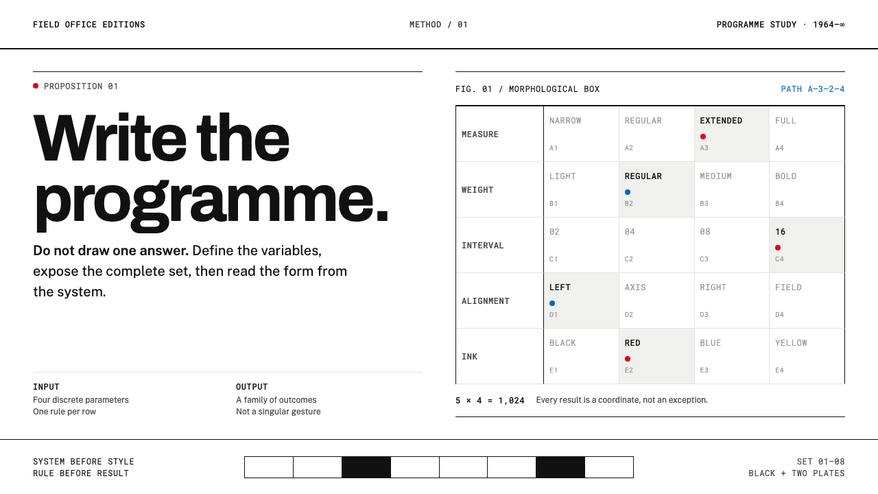 Karl Gerstner ProgrammesDesign becomes a programme. Black hairlines and a strict matrix turn paramete…
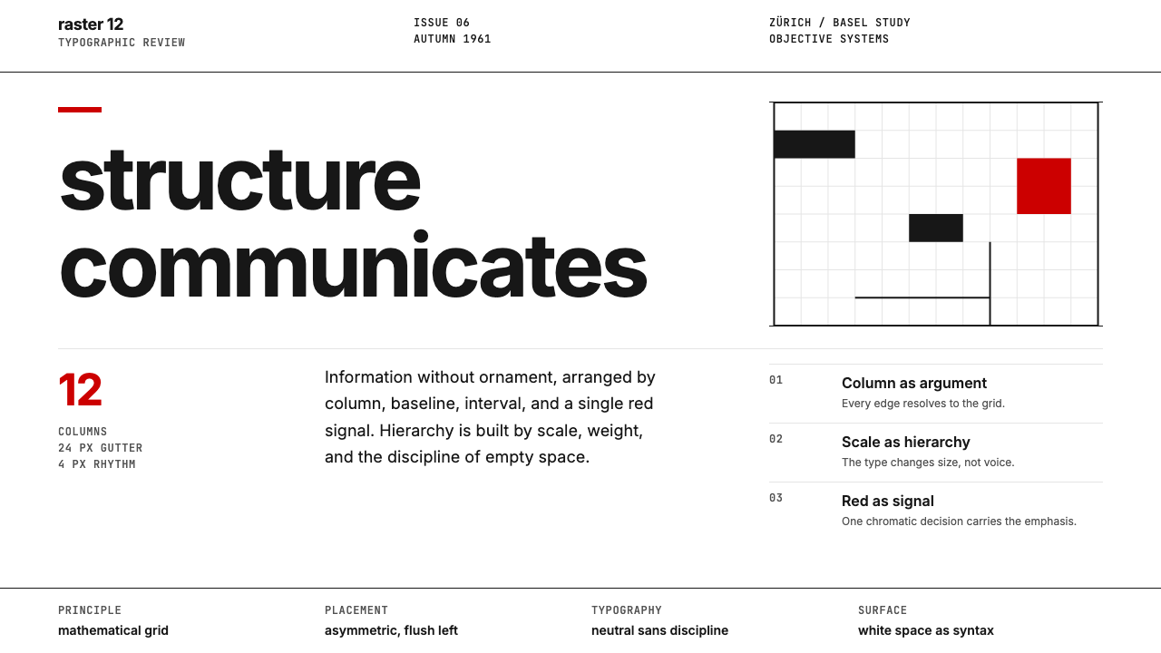 Swiss International StyleObjectivity made visible. Inter scale, white space, and one red block expose…
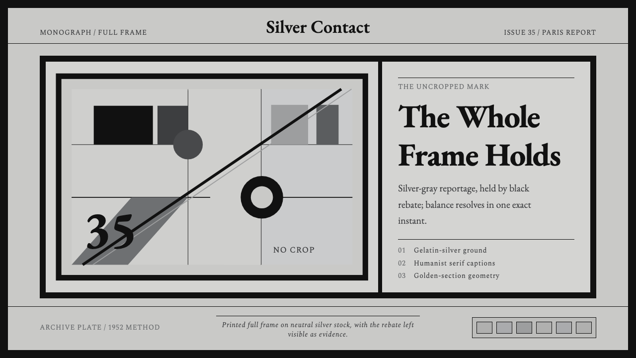 Cartier-Bresson Decisive MomentNever cropped. Silver-gray tonality is locked by a dead-black film rebate.
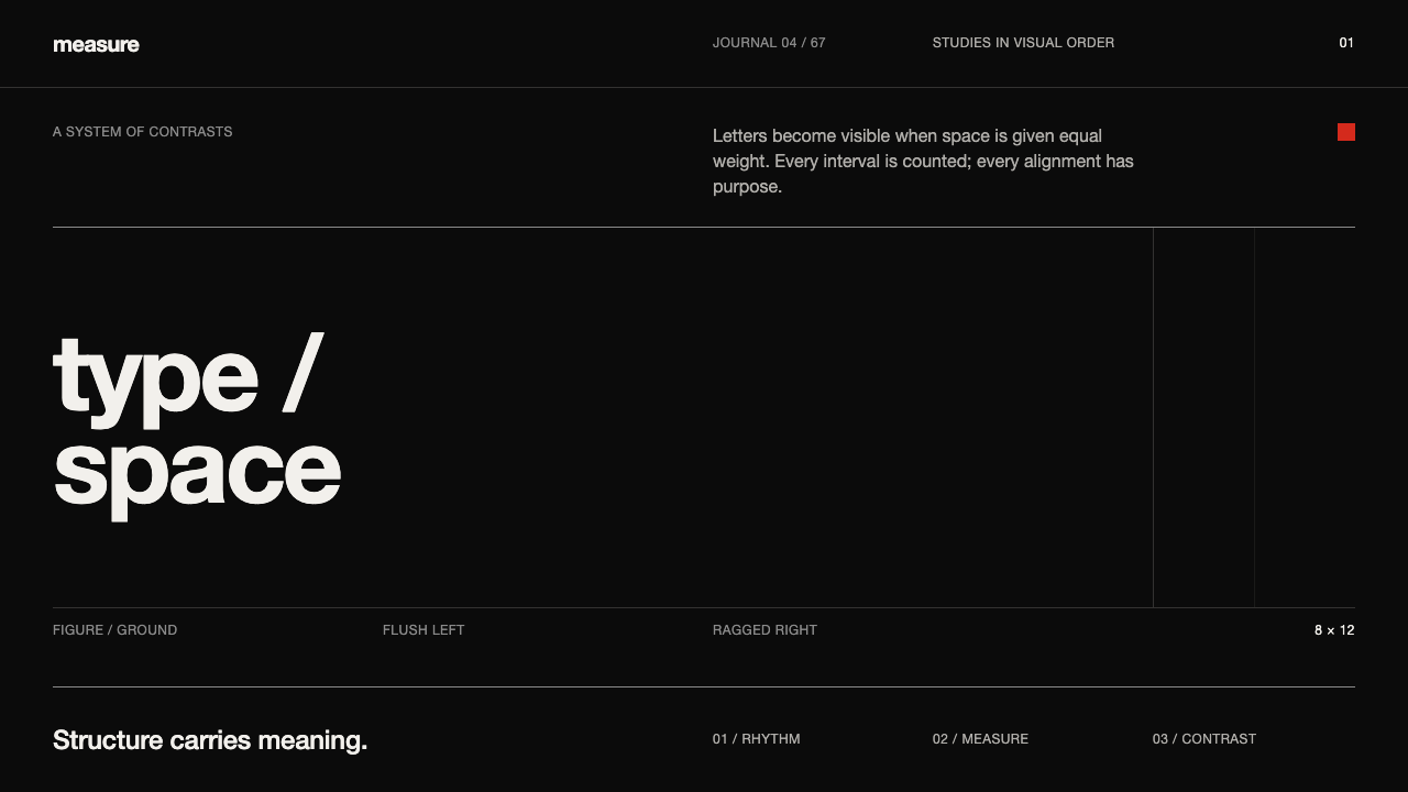 Emil Ruder TypografieDiscipline makes type visible. Near-white grotesque and measured space cut th…
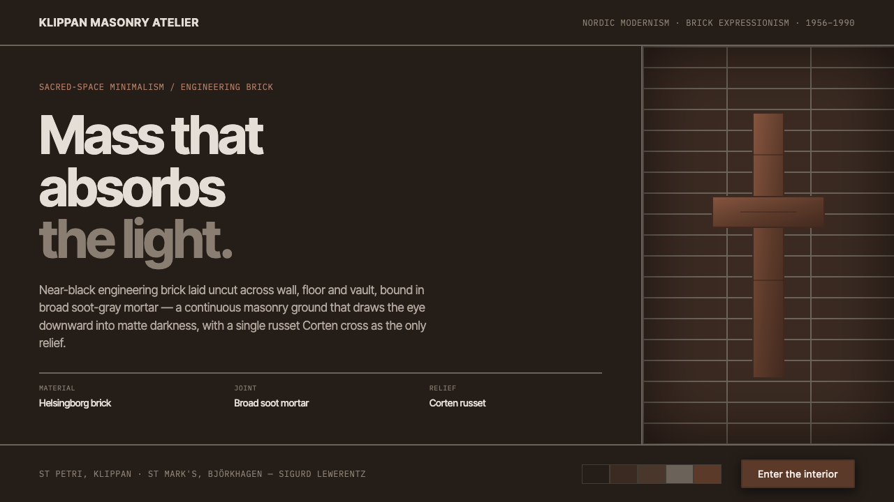 Lewerentz Dark BrickMass that absorbs light. Near-black engineering brick, broad soot mortar, one…
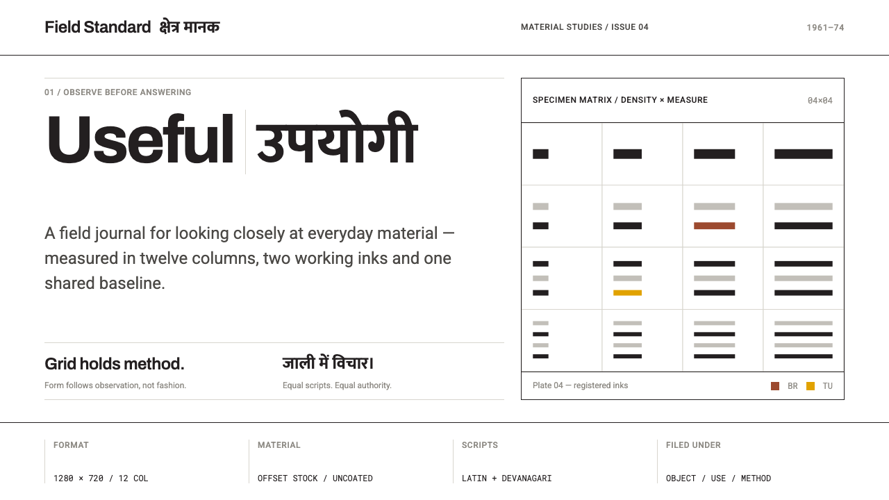 NID Ahmedabad ModernismStructure earns trust. Black rules and equal-weight scripts hold craft color…