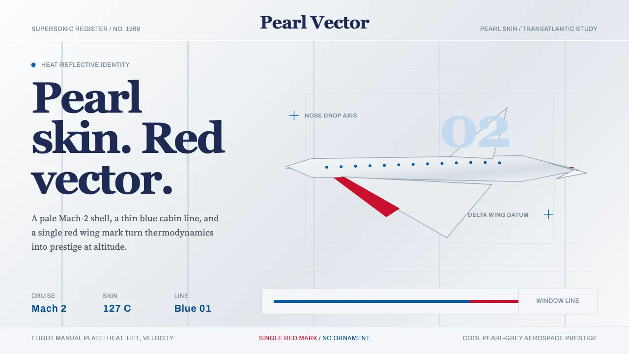
About Concorde Supersonic
Concorde wore its engineering as appearance. The Mach-2 skin was kept a deliberate pale pearl-grey-white so heat could radiate away — dark paint would have grounded it to subsonic flight. This system renders that physics as design: cool reflective surfaces, a thin sky-blue heritage window line, and the sharp drooping-nose silhouette of the dart. Serif titling carries the late-1960s aerospace-prestige tone, while clean grotesques read like instrument-panel labels. Generous white space keeps everything weightless and aerodynamic — pride at altitude, never nostalgia.
- Origin
- Western Europe (United Kingdom / France)
- Era
- 1950–1990 (first flight 1969; service 1976–2003)
- Key figures
- BAC engineers · Aérospatiale engineers · Negus & Negus · Landor Associates
- Movements
- Post-war jet-age aerospace design · Corporate-airline identity systems
Concorde Supersonic design spec
Colors
Typography
The other 11 sections — buttons, cards, spacing, motion, techniques and more — open once you unlock. Download the DESIGN.md or send it to your AI in one click. Unlock once, yours forever.
Sign up nowStyles similar to Concorde Supersonic
Also inspired by brands & products, with a close feel.
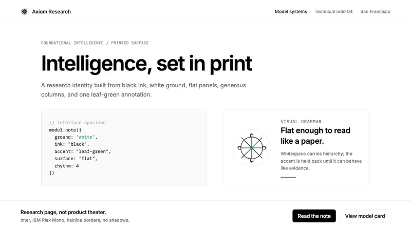 OpenAI 2024Research-grade restraint. Black-on-white Inter, flat code panels, one leaf-green mark.
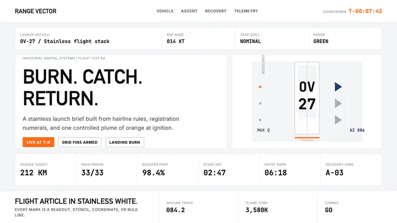 SpaceX Starship / FalconOrbital restraint. Stainless white grids, DIN-like type, and one orange burn line.
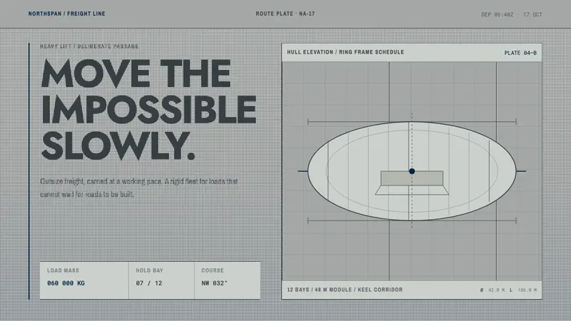 Hydrogen Airship FreightSlow freight is a capability. Matte aluminium grey, DIN grids, and a measured hull elevation.
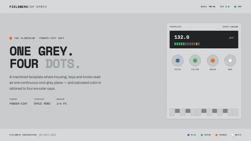 Teenage Engineering OP-1One grey, four dots. Machined aluminium in Space Mono, color rationed to tiny encoder-cap pips.