About OpenAI 2024
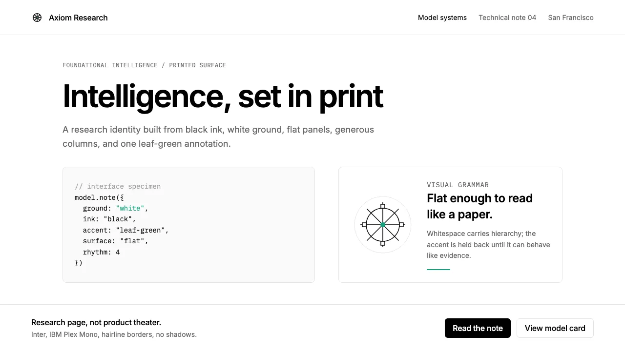
OpenAI's 2024 visual identity positions the company as a foundational AI research laboratory, not a consumer startup. The brand strips away every decorative impulse — pure black text on white ground, a single leaf-green accent inherited from ChatGPT, and Inter at light-to-regular weights channeling the restraint of academic publishing.
The October 2024 "Blossom" logomark replaced the original hexagonal seal, but the design philosophy only deepened: generous reading columns, monospace code blocks, flat surfaces with no shadows, and editorial layouts that treat the webpage as a printed research page.
- Origin
- San Francisco, California
- Era
- 2015 founded; 'Blossom' logomark launched October 2024
- Key figures
- Sam Altman · Greg Brockman · Ilya Sutskever · Mira Murati
- Movements
- Modern AI research labs · Academic-tech crossover branding · Large-language-model commercialization
OpenAI 2024 design spec
Colors
Typography
The other 11 sections — buttons, cards, spacing, motion, techniques and more — open once you unlock. Download the DESIGN.md or send it to your AI in one click. Unlock once, yours forever.
Sign up nowStyles similar to OpenAI 2024
Also inspired by brands & products, with a close feel.
 Hydrogen Airship FreightSlow freight is a capability. Matte aluminium grey, DIN grids, and a measured hull elevation.
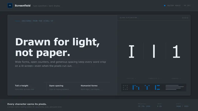 Verdana Screen SansBorn digital, built for clarity. Wide humanist letters glow in cool grey on a dark screen field.
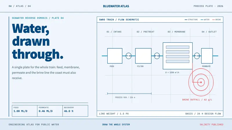 Desalination MegaplantInfrastructure made legible. Navy process lines map cyan water flow and coral brine contours.
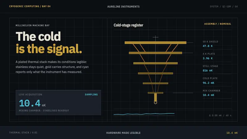 Quantum Datacenter CryoCold hardware, made legible. Gold stages descend on black; cyan is reserved for measured values.