What is Pan Am Jet Age?
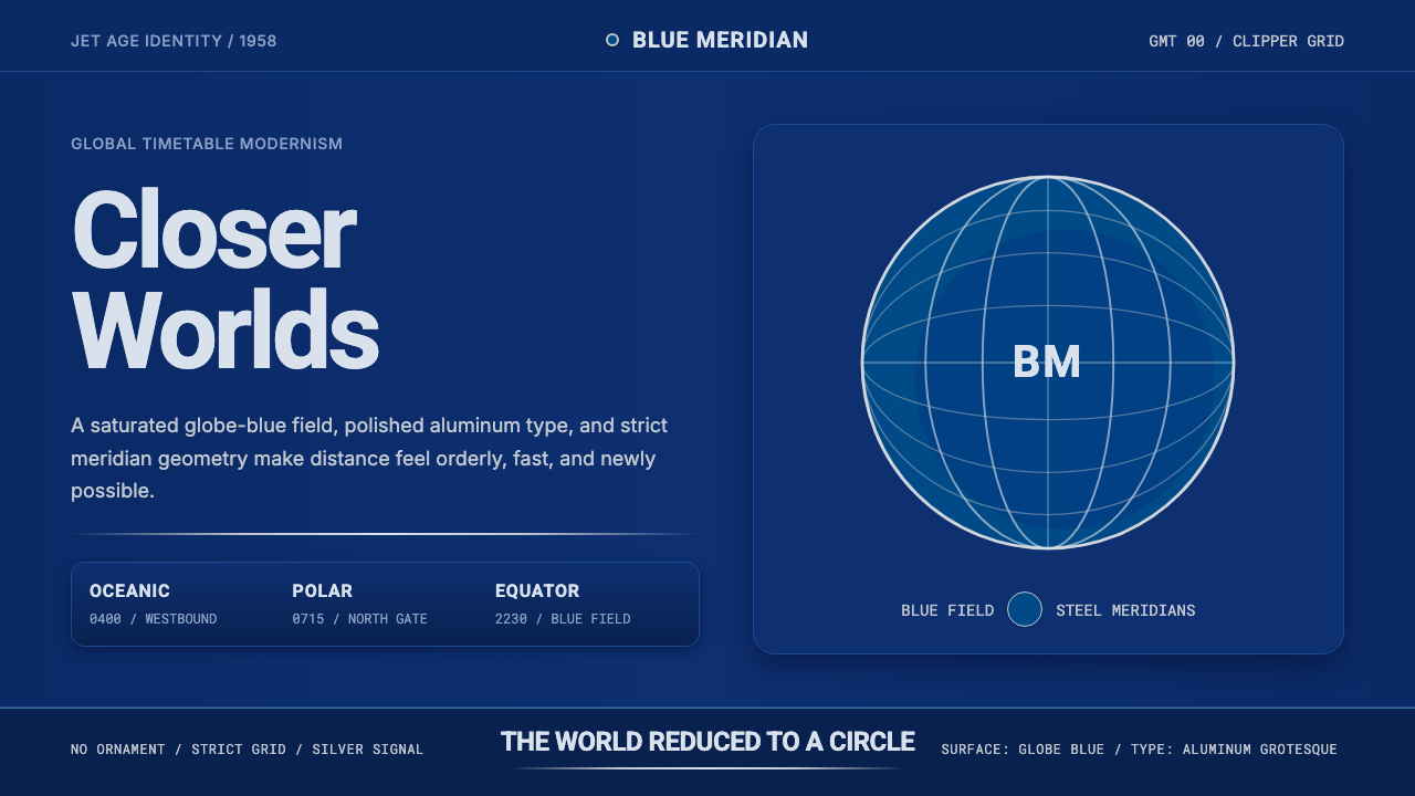
Pan Am's Jet Age identity turned a circle into a promise — a saturated globe of blue meridian lines, calm grotesque type, and the polished confidence of a shrinking world.
Pan Am Jet Age in brief
Pan Am Jet Age is a style built around a single defining symbol: a globe rendered as a saturated blue sphere marked with a grid of meridian and latitude lines, floating against a flat, confident field. That globe was the centerpiece of Pan American World Airways' corporate identity at the height of the jet era, and the style translates its logic — geometric precision, optimism, and global reach rendered with restraint rather than spectacle — into a full visual system.
This is a midcentury corporate identity in the fullest sense: it belongs to the era when major companies first began treating their visual presence as a designed, systematic whole rather than a loose collection of signage and stationery. The palette centers on the deep, saturated globe-blue as the dominant field color, paired with a polished, cool metallic silver standing in for aluminum aircraft fuselage and chrome fittings. Typography favors a calm, humanist sans-serif grotesque, set with even, unhurried spacing that reads as competent rather than urgent.
The overall feeling is flat, crisp, and optimistic — the visual equivalent of a well-maintained aircraft livery. Nothing is textured or aged; surfaces are clean and matte-to-satin rather than glossy or worn. Grids are strict and layouts are calm, communicating the specific confidence of an era that believed technology and design could make the whole world feel closer and more orderly.
Where does Pan Am Jet Age come from?
Pan American World Airways — commonly known as Pan Am — was built by Juan Trippe, an aviation entrepreneur who founded the airline in 1927 and spent decades expanding it into the dominant American international carrier, pioneering transoceanic routes, flying boats, and eventually the jet-powered long-haul flight that would define postwar air travel. Trippe understood that Pan Am's brand was not incidental to its business but central to it: the airline was selling the idea of a world made newly accessible, and its visual identity needed to embody that idea as confidently as its aircraft did.
The turning point for the airline's visual identity came in 1957, when architects Edward Larrabee Barnes and Charles Forberg designed the globe symbol that became known informally as the 'Blue Meatball' — a simple sphere marked with meridian lines, rendered in a deep saturated blue. The design's genius was its restraint: rather than an ornate crest or an illustrative airplane, it reduced the entire concept of global air travel to a single, abstract, geometrically perfect shape. It could be scaled from a tail fin down to a matchbook and remain instantly legible, a quality that made it one of the most enduring corporate symbols of the twentieth century.
This new mark arrived at exactly the right historical moment. In October 1958, Pan Am inaugurated the first regularly scheduled transatlantic jet service using the Boeing 707, marketed under the name 'Jet Clipper' — carrying forward Pan Am's older 'Clipper' naming tradition from its flying-boat era into the new age of jet propulsion. The 707 cut transatlantic travel time dramatically and symbolized a genuine technological leap; Pan Am's blue-globe identity, paired with the calm authority of Helvetica-style typography then coming into vogue among sophisticated corporate identity programs, gave that leap a visual language equal to its ambition.
The identity was sustained and extended over subsequent decades by other notable designers working in the same corporate-modernist tradition, including Ivan Chermayeff, whose design work for Pan Am's headquarters and later projects reinforced the airline's commitment to disciplined, geometric, internationally legible design. This whole period — roughly 1950 through 1990 — represents the high point of midcentury modernist corporate identity applied to the airline industry, running in parallel with the broader rise of the Swiss International Typographic Style that shaped corporate design worldwide, and it left behind a visual grammar of confident global reach that remains recognizable and influential long after Pan Am itself ceased operations in 1991.
What defines the Pan Am Jet Age look?
Globe Blue Ground
A deep, saturated blue functions as the dominant surface color, directly quoting the sphere of the 1957 globe symbol. Rather than appearing only as a logo mark, this blue is treated as the page's own field — the background the entire composition sits within, not merely an accent applied to one element.
Meridian Grid
Thin, evenly spaced curved lines suggesting latitude and longitude trace across the blue field, quoting the meridian markings of the globe symbol. These lines are structural rather than decorative — they suggest a navigable, measured world rather than an ornamental pattern.
Polished Aluminum Silver
A cool, metallic silver stands in for polished aircraft fuselage and chrome fittings, used for typography, dividing lines, and structural accents against the blue field. This silver should read as smooth and reflective in character, not matte or textured — the material logic of a maintained aircraft body.
Calm Grotesque Type
Typography favors an even, humanist sans-serif grotesque letterform, set with generous, unhurried spacing rather than tight or condensed setting. The tone this produces is competent and reassuring rather than urgent or aggressive — the typographic voice of an institution that wants to project calm authority.
Strict Grid Layout
Composition is organized on a rigorous, evenly divided grid, with content aligned to clear horizontal and vertical structure. This strictness communicates precision and reliability, echoing the aviation industry's own dependence on exact measurement, scheduling, and engineering.
Flat, Crisp Surfaces
Nothing in the system appears textured, aged, or worn. Surfaces read as clean and freshly maintained, in the spirit of airline livery that must always look immaculate. There is no visual noise or grain — every surface is smooth and confident.
Optimistic Restraint
The overall tone favors quiet confidence over loud spectacle: bold claims are made through precision and scale rather than ornament or exclamation. This restraint is itself the signal of sophistication — the visual equivalent of an airline that does not need to shout to be believed.
Who shaped Pan Am Jet Age?
Trippe founded Pan American World Airways in 1927 and built it into the leading American international carrier, pioneering transoceanic flying-boat routes and later the jet age itself. He understood corporate identity as central to the airline's mission of making the world feel smaller and more accessible, setting the strategic foundation for the globe symbol and its supporting visual system.
An architect by training, Barnes co-designed the 1957 globe symbol — the 'Blue Meatball' — that became Pan Am's defining mark. His architectural background shows in the symbol's geometric purity: a design reduced to its most essential, scalable, and legible form, treating the logo with the same rigor as a piece of modernist architecture.
Forberg co-designed the globe symbol alongside Barnes, contributing to a mark whose restraint and geometric precision let it function across every scale of application, from tail fins to ticket stationery, and remain one of the most recognized airline symbols of the twentieth century.
A leading figure in postwar American corporate identity design, Chermayeff contributed design work connected to Pan Am's broader visual presence, including its headquarters, reinforcing the airline's commitment to disciplined, internationally legible modernist design across the decades that followed the globe symbol's debut.
How do you use Pan Am Jet Age today?
Pan Am Jet Age suits any product that wants to project global reach, technological confidence, and calm authority — travel, logistics, aviation, finance, and any brand positioning itself as connecting people across distance with precision and reliability.
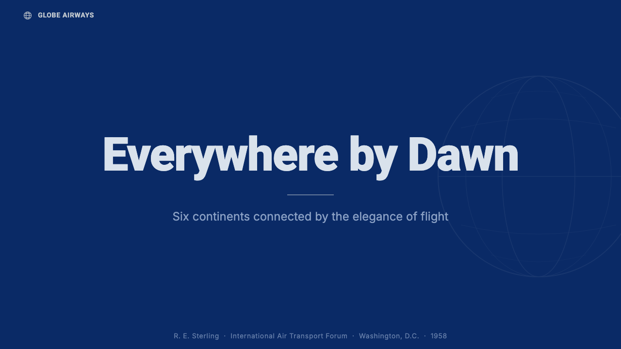
For presentation slides, a cover page benefits enormously from the globe motif treated as a full-bleed field rather than a small corner logo: a deep blue ground with faint meridian lines, silver type set confidently in the upper third. Content slides should hold to a strict grid with generous margins, letting the calm typography and flat blue-and-silver palette carry authority without needing bold color accents. Data slides suit this style particularly well when framed as routes, networks, or global comparisons — the meridian-grid motif naturally extends to maps and connection diagrams.
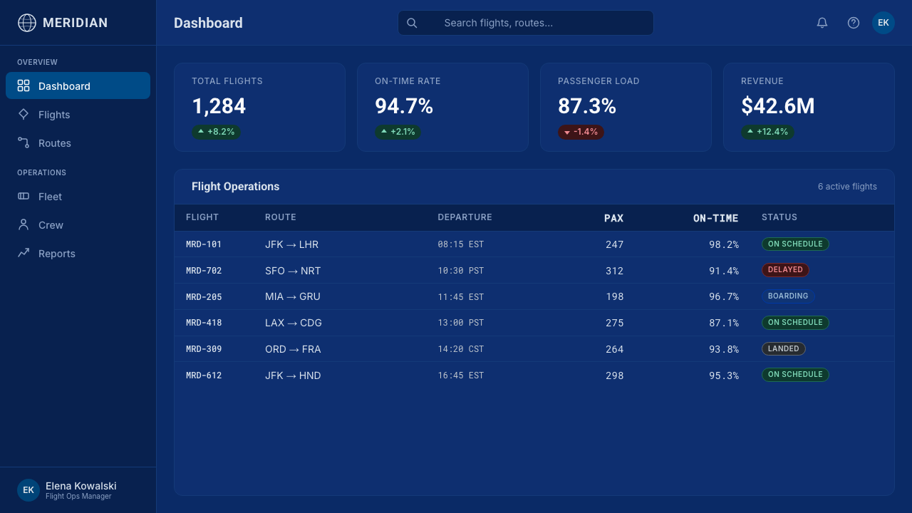
For web interfaces, the style works well for dashboards tracking global operations, logistics, or scheduling — the strict grid and flat, confident surfaces make status information feel authoritative and calm rather than alarming. Pricing pages benefit from the same restraint: silver dividing lines on a deep blue ground, calm typographic hierarchy, and no more than the globe-blue and silver as the working palette communicate a premium, dependable service rather than a promotional deal.
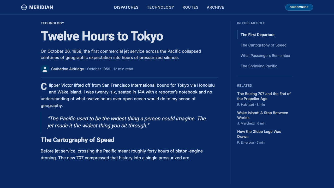
For editorial and marketing work, the style suits long-form content about travel, history, engineering, or global commerce. A magazine-style feature can use the globe-blue as a section-opening field color with silver rules dividing subsections, while marketing pages benefit from the poster-like clarity of flat color blocks and confident type rather than photographic collage.
A common mistake is treating the globe motif as a literal illustrated logo that must appear on every screen, rather than as a source of underlying principles — flat color fields, meridian-line structure, calm type — that can be applied without a literal sphere present. Another is over-brightening the blue toward a cheerful sky tone; the style depends on a deeper, more saturated, almost jewel-toned blue that reads as confident rather than casual.
Pan Am Jet Age — FAQ
What exactly was the 'Blue Meatball,' and why is that nickname significant?
The 'Blue Meatball' was the informal, affectionate nickname for Pan Am's 1957 globe symbol — a simple sphere marked with meridian lines in saturated blue, designed by Edward Larrabee Barnes and Charles Forberg. The nickname is significant because it reflects how successfully the mark became part of everyday culture: a piece of corporate design so familiar and well-loved that the public gave it an informal name, the same way people affectionately nickname a beloved building or landmark rather than a typical logo.
What was the significance of the Boeing 707 'Jet Clipper' service in 1958?
Pan Am's October 1958 launch of transatlantic jet service using the Boeing 707 marked the true beginning of the jet age in commercial aviation — dramatically cutting travel times and making international air travel accessible to a much wider segment of the public than the propeller-driven era had allowed. Marketed as 'Jet Clipper,' it carried forward Pan Am's older Clipper naming tradition from its flying-boat era, linking the technological leap of jet propulsion to the airline's established reputation for pioneering long-distance travel.
How does this style differ from generic 'aviation' or 'travel' visual themes?
Generic aviation themes often lean on literal illustration — airplane silhouettes, clouds, propellers — and can pull from any decade or aesthetic. Pan Am Jet Age is anchored to a specific historical mark (the 1957 globe symbol), a specific technological moment (the 1958 jet-service launch), and a specific design lineage (midcentury modernist corporate identity, running parallel to Swiss International Style). That specificity is what keeps the style disciplined: the blue, the grid, and the restraint all trace back to one real, dated identity rather than a loose, timeless idea of 'travel.'
Is silver required, or can other metallics substitute for it?
Silver specifically references polished aluminum aircraft fuselage and chrome fittings — the actual material vocabulary of midcentury commercial jets. Gold or brass would carry an entirely different connotation, associated with luxury ornament rather than aerospace engineering. Substituting a warmer metallic undermines the specific cool, technological confidence the style is built on; silver's coolness is doing real work, not simply serving as a generic 'metallic accent.'
Does this style work for brands that are not related to travel or aviation at all?
Yes, as long as the brand wants to project the same underlying values: global reach, precision, and calm technological confidence. Financial services, logistics platforms, telecommunications, and any company positioning itself around connecting a large, dispersed network of people or systems can borrow the style's globe-and-grid logic effectively, even without any literal reference to airplanes or flight.
Related design styles
 OS UI HumanistBuilt like a working desktop, not a brand. Window-gray ground, system-blue ch…
 Verdana Screen SansBorn digital, built for clarity. Wide humanist letters glow in cool grey on a…
 Corian Solid SurfaceSeamless matte calm. Glacier White floats over cool grey shadow with neutral…
 Moog Modular SynthWalnut cabinet, brushed-aluminum panels. Toggle-blue switches, orange patch c…
 Saul Bass CorporateAuthority distilled. Deep blue geometry, tight Inter lockups, and white space…
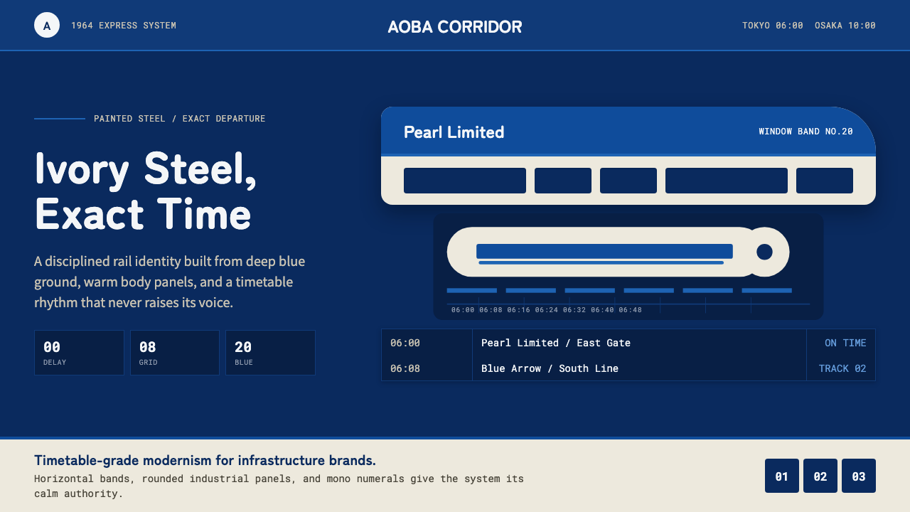 Shinkansen BulletTimetable authority. Ivory steel bands and Bullet Blue grids move with exact…