What is Saul Bass Corporate?什么是 Saul Bass Corporate?
Saul Bass proved that a corporation's entire identity could live in a single geometric shape — and that shape could be unforgettable.索尔·巴斯证明了一家企业的全部个性可以凝缩在一个几何符号里——而那个符号可以令人永生难忘。
Saul Bass Corporate in briefSaul Bass Corporate 速览
Saul Bass Corporate is the visual system distilled from the identity work Saul Bass produced between the early 1950s and the mid-1990s, the era when American corporations first understood that a logo was a strategic asset rather than a decorative monogram. The system is built around a single discipline: reduce every enterprise — no matter how sprawling — to one geometric mark, then surround that mark with enough white space and typographic restraint that nothing can compete with it.索尔·巴斯企业风格是从他在1950年代初至1990年代中期所完成的企业识别作品中提炼出的视觉系统——那是美国企业首次意识到标志是战略资产而非装饰性花押字的年代。这套系统建立在一种核心自律之上:将每一家企业——无论规模多么庞大——压缩为一个几何符号,然后以充裕的留白和节制的排版将这个符号环绕,使任何元素都无法与之竞争。
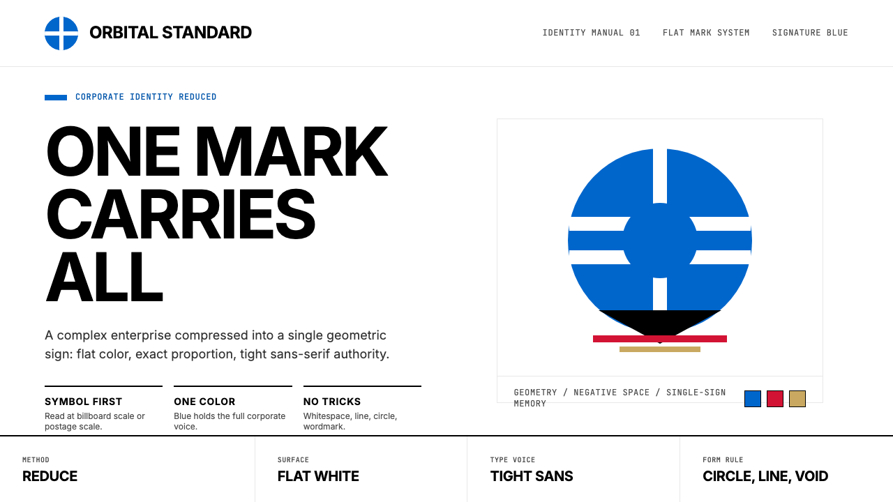
The palette anchors in deep, authoritative blue, used at near-maximum saturation and paired with clean white grounds. Black handles all typographic weight. Color functions as identity signal rather than decoration: one hue, sometimes two, applied flatly and without graduation. The type sensibility is rooted in mid-century Helvetica-era sans-serifs — mechanical, confident, set tightly against the mark. The result reads simultaneously as institutional authority and quiet modernist elegance.色板以深沉、权威的蓝色为锚,接近饱和度的极值,与干净的白色底面配对。黑色承载所有字体重量。色彩作为身份信号而非装饰发挥作用:一种色调,有时两种,平涂施用,不带任何渐变。字体感性植根于二十世纪中叶Helvetica时代的无衬线字体——机械、自信,紧贴标志排设。最终结果同时传递出制度性权威与静默的现代主义优雅。
What separates this system from generic modernism is its commitment to symbol over description. Bass never illustrated what a company did; he found the geometric essence of what a company was. The AT&T globe suggested worldwide reach without depicting a telephone. The Bell System bell was a bell — simple, immediate, owned. This philosophy of visual compression, symbol-first and stripped of narrative decoration, is the defining character of the style.将这套系统与泛泛的现代主义区别开来的,是它对符号而非描述的坚守。巴斯从不图解一家公司的业务;他找到的是一家公司本质的几何内核。AT&T的地球仪暗示全球覆盖,而无需描绘一部电话。贝尔系统的铃铛就是一只铃铛——简单、即时、独一无二。这种以视觉压缩为核心、符号优先、剥去叙事装饰的哲学,是这种风格的决定性特质。
See the Saul Bass Corporate design system查看 Saul Bass Corporate 完整设计系统
Where does Saul Bass Corporate come from?Saul Bass Corporate 从何而来?
Saul Bass was born in the Bronx in 1920 and trained under György Kepes at Brooklyn College, where he absorbed the post-Bauhaus visual grammar that Kepes and László Moholy-Nagy had carried from Central Europe to American design education. By the time Bass opened his Los Angeles studio in 1952, he had internalized a European modernist conviction — that design was a form of visual thinking, not beautification — and was ready to apply it to the American corporate landscape, which was just beginning to understand that mass communication required consistent visual identity.索尔·巴斯1920年生于布朗克斯,在布鲁克林学院师从捷尔吉·凯派什,在那里他吸收了凯派什与拉兹洛·莫霍利-纳吉从中欧带入美国设计教育的后包豪斯视觉语法。1952年在洛杉矶开设工作室时,他已将一种欧洲现代主义信念内化于心——设计是视觉思维的形式,而非美化——并准备好将其应用于美国企业领域。彼时,美国企业刚刚开始理解大众传播需要一致的视觉识别。
His first major landmark was the 1954 identity for Kelton Corporation, but the work that established his reputation was a series of film title sequences beginning with Carmen Jones in 1954 and accelerating through The Man with the Golden Arm (1955), Vertigo (1958), and Psycho (1960). These sequences demonstrated that a purely geometric vocabulary — animated bars, spirals, fragmented type — could carry narrative tension and psychological weight without a single representational image. The same formal discipline Bass applied to film titles he then carried directly into corporate identity.他的第一个重要里程碑是1954年为凯尔顿公司设计的标识,但真正确立其声誉的是一系列电影片头设计:始于1954年的《卡门·琼斯》,经由《金臂人》(1955年)、《迷魂记》(1958年)到《惊魂记》(1960年)愈发引人注目。这些片头设计证明了纯粹的几何词汇——动态的条形、螺旋、碎裂的字体——无需一张具象图像,便能承载叙事张力与心理重量。巴斯将这套形式自律直接带入了企业识别工作。
The peak corporate-identity era ran from approximately 1968 through 1985. In 1969 Bass redesigned the Bell System identity, replacing an older bell illustration with a cleaner, bolder geometric version that held at every scale from business card to interstate highway billboard. In 1973 he created the continental mark for United Airlines — a geometric tulip that suggested flight and organic life simultaneously. In 1983 he designed the AT&T globe for the post-divestiture era: a spherical grid of lines that implied worldwide telecommunications reach. Each project applied the same method: weeks of reduction, stripping away every line until only the irreducible symbol remained.企业标识的鼎盛期大约从1968年延续至1985年。1969年,巴斯重新设计了贝尔系统标识,以更简洁、更粗壮的几何版本取代了旧有的铃铛插图,这个标志从名片到州际公路广告牌均能完美呈现。1973年,他为联合航空创作了一个大陆性标志——一朵同时暗示飞翔与有机生命的几何郁金香。1983年,他为AT&T分拆后的新时代设计了球形网格标志:一个由经纬线构成的球体,暗示全球电信覆盖。每一个项目都运用同一方法:数周的简化,剥去每一根多余的线条,直到只剩不可再减的符号。
Elaine Bass, his wife and long-time collaborator, played a central role in this body of work that historical accounts underrepresented for decades. From the early 1970s onward she co-directed the studio's film title work and shaped the conceptual approach to several corporate projects. The firm's late work — including the Quaker Oats redesign and several pharmaceutical identities from the late 1980s and early 1990s — bears her equal influence. Herb Lubalin, working in New York during the same era, extended related principles into typographic identity systems, and his work provides a useful parallel: where Bass found the symbol, Lubalin found the letterform-as-mark.他的妻子、长期合作者伊莲·巴斯在这批作品中扮演的核心角色,在历史记述中被低估了数十年。自1970年代初起,她共同执导了工作室的电影片头工作,并参与塑造了多个企业项目的概念方向。工作室后期的作品——包括桂格燕麦的重新设计和1980至90年代初的数个制药企业标识——同样承载着她的影响。同一时代在纽约执业的赫布·鲁巴林将相近的原则延伸至字体式识别系统,为我们提供了一个有益的参照:巴斯寻找的是符号,鲁巴林寻找的是作为标志的字母形态。
The movement Bass represented — mid-century American corporate modernism — reached its zenith at the precise moment when American corporations were becoming genuinely global and needed marks that would function across languages, cultures, and scales. A Bass mark worked in newspaper advertising, on the side of a Boeing 747, in a black-and-white television commercial, and as a vinyl floor decal in a retail location. This cross-media resilience was not accidental; it was the direct consequence of the geometric reduction principle. Shapes that can be drawn with a compass and a straightedge reproduce cleanly at any size in any medium.巴斯所代表的运动——美国二十世纪中叶企业现代主义——在美国企业真正走向全球、需要能够跨越语言、文化与尺度运作的标志之际,达到了顶峰。一个巴斯式标志可以用在报纸广告里、波音747的机身上、黑白电视广告里,也可以用作零售门店地板上的乙烯基贴纸。这种跨媒介的韧性并非偶然,而是几何简化原则的直接结果。可以用圆规和直尺画出的形状,能在任何尺寸、任何媒介上清晰再现。
What defines the Saul Bass Corporate look?Saul Bass Corporate 的视觉特征是什么?
Deep Blue Primacy深蓝主色
The signature color is a deep, cool blue used at near-maximum saturation — dense enough to carry institutional weight, controlled enough to avoid aggression. This blue functions as the primary identity anchor: it appears in the mark itself, in headlines, and in key structural elements. It is almost never diluted to a pale tint for backgrounds or gradated through a range. White provides the counterweight, giving the blue room to register with full force against a clean ground.标志性色彩是一种深沉、冷调的蓝色,接近最大饱和度——足够厚重以承载制度性分量,足够克制以避免攻击性。这种蓝色作为主要的识别锚点发挥作用:出现在标志本身、标题以及关键结构元素中。它几乎从不被稀释为浅淡的色调作为背景,也不作渐变处理。白色提供反衡力,让蓝色在干净的底面上以全部力量呈现。
Geometric Symbol-Mark几何符号标志
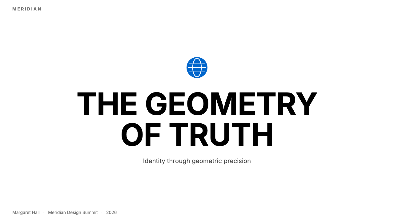
The central visual object is always a closed geometric form — a globe, a bell, a tulip resolved into geometric arcs, a sphere of intersecting lines. The mark is never an illustration of what the company does; it is a symbolic compression of what the company is. Lines are reduced to the minimum number needed for immediate recognition. Every curve is purposeful, every angle considered. The mark functions equally well at the size of a postage stamp and the size of a building facade.核心视觉对象始终是一个封闭的几何形——一个地球仪、一只铃铛、一朵被解析为几何弧线的郁金香、一个由相交线条构成的球体。标志从不图解公司的业务,而是对公司本质的象征性压缩。线条被简化到即时识别所需的最少数量,每一道弧线都有其目的,每一个角度都经过推敲。这个标志在邮票大小和建筑立面大小上同样有效。
Helvetica-Weight Sans-Serif DisciplineHelvetica 字重无衬线自律
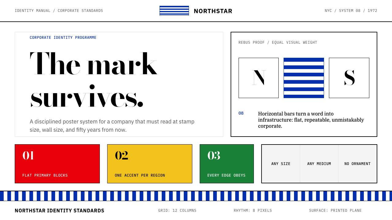
Type is set in a mechanically clean, mid-weight sans-serif that neither competes with the mark nor retreats from it. The relationship between mark and logotype is precisely calibrated: the company name sits below or beside the symbol at a size that asserts it clearly without demanding equal visual attention. Lettering is tracked tightly — white space is a resource concentrated in the surrounding field, not distributed through the wordmark. Headlines and body text use scale contrast rather than decorative differentiation to establish hierarchy.字体采用机械感十足的中等字重无衬线体,既不与标志竞争,也不在其面前退缩。标志与字标之间的关系经过精确校准:公司名称以清晰但不要求同等视觉注意力的尺寸置于符号下方或旁边。字母间距紧缩——留白是集中于周围区域的资源,而非分散于文字标识内部。标题与正文通过尺度对比而非装饰性差异来建立层级。
Generous White Space充裕留白
The mark is never crowded. Substantial clear space — proportional to the mark's own size — is maintained on all sides, treating the empty field not as unused area but as an active compositional element that amplifies the symbol's presence. This spatial discipline extends to page and screen layouts: content is never packed edge-to-edge; margins are wide and deliberate. The effect is one of confidence — a mark that does not need to fill space to be heard.标志周围从不拥挤。在四面保持与标志自身尺寸成比例的充裕净空区域,将空白区域不视为未使用的面积,而是视为放大符号存在感的积极构图元素。这种空间自律延伸至页面和屏幕排版:内容从不从边缘堆至边缘;页边距宽阔而刻意。最终效果传递出一种自信——一个不需要填满空间便能被人听见的标志。
Flat Rendering Without Depth Effects无深度效果的平涂呈现
Marks are rendered as flat vector shapes, with no gradients, no drop shadows, no embossing, and no three-dimensional simulation. Each element is a solid field of color or an absence of color. This flatness is not a technical limitation but a philosophical position: the mark's power comes from its shape, and any depth effect would dilute that shape's authority by introducing a secondary reading — the simulation of light. Flat rendering also ensures perfect reproduction across every medium, from printing in a single ink to embossing on a metal plaque.标志以平涂矢量形式呈现,不含渐变、投影、浮雕或任何三维模拟。每个元素都是纯色色块或色彩的缺席。这种平面性不是技术局限,而是哲学立场:标志的力量来自其形状,任何深度效果都会通过引入次要解读——光线的模拟——来稀释形状的权威。平涂呈现也确保了在每种媒介上的完美再现,从单色印刷到金属铭牌压印。
Structural Minimalism结构性极简
The overall system vocabulary is deliberately restricted. A complete identity system might consist of a mark, a logotype, a single primary color, and one typographic family — nothing more. Decorative elements, illustrative accents, pattern backgrounds, and secondary iconography are absent by principle. This restriction is not perceived as scarcity; when applied correctly it registers as authority. The restraint signals that the organization behind the mark is confident enough not to require visual noise to assert its presence.整套系统词汇被刻意限制。一套完整的识别系统可能仅由一个标志、一个字标、一种主色和一套字体家族构成——仅此而已。装饰性元素、插图式点缀、图案背景和次级图标体系,在原则上均不存在。这种限制不会被感知为匮乏;在正确应用时,它传递的是权威感。这种克制表明,标志背后的组织自信到无需用视觉喧嚣来主张其存在。
Cross-Media Scale Invariance跨媒介尺度不变性
Every element in a Bass-derived identity is designed to hold its integrity at radically different scales simultaneously. The mark that appears on a business card must be identical in character to the mark on an airplane fuselage. This requirement drives every reduction decision: if a detail cannot survive reproduction at the smallest intended size, it is removed. The resulting marks tend toward bold geometries with thick-to-medium stroke weights and clear interior white space — forms that resist the degradation of printing imprecision, low-resolution screens, and long viewing distances.巴斯衍生识别中的每个元素都被设计为在截然不同的尺寸下同时保持其完整性。名片上出现的标志在飞机机身上必须具备同样的特质。这一要求驱动了每一个简化决策:如果某个细节在最小目标尺寸下无法存活,就将其去除。由此产生的标志倾向于粗至中等笔画宽度的大胆几何形,以及清晰的内部留白——这些形态能够抵抗印刷精度的偏差、低分辨率屏幕和远距离观看的侵蚀。

See the Saul Bass Corporate design system查看 Saul Bass Corporate 完整设计系统
Who shaped Saul Bass Corporate?谁塑造了 Saul Bass Corporate?
Bass (1920–1996) built one of the most consequential bodies of corporate-identity work in American design history, shaping the visual face of AT&T, the Bell System, United Airlines, Continental Airlines, Quaker Oats, Minolta, and dozens of other major enterprises. His parallel career in Hollywood — designing title sequences for Alfred Hitchcock, Otto Preminger, Martin Scorsese, and Steven Spielberg — gave him an unusually deep understanding of how moving images and static marks operate on human attention. His conviction that a logo must work as a symbol, not a description, defined mid-century American corporate modernism and continues to influence every subsequent generation of identity designers.巴斯(1920—1996年)构建了美国设计史上最具影响力的企业识别作品群,塑造了AT&T、贝尔系统、联合航空、大陆航空、桂格燕麦、美能达等数十家大型企业的视觉面貌。他在好莱坞的平行职业生涯——为阿尔弗雷德·希区柯克、奥托·普雷明格、马丁·斯科塞斯和史蒂文·斯皮尔伯格设计片头——使他对运动图像与静态标志如何作用于人类注意力有着异乎寻常的深刻理解。他关于标志必须作为符号而非描述发挥作用的信念,定义了美国二十世纪中叶企业现代主义,并持续影响着此后每一代标识设计师。
Elaine Bass (1927–2004) was Saul's wife and studio partner whose contribution to the Bass body of work was systematically underacknowledged during both their lifetimes and afterward. From the 1970s onward she co-directed every film title sequence the studio produced and was a primary collaborator on multiple corporate identity projects. Her work brought a refined attention to pacing, proportion, and the emotional register of geometric forms that shaped the studio's mature style. Reassessment of her role has grown significantly among design historians since the 2010s.伊莲·巴斯(1927—2004年)是索尔的妻子与工作室合伙人,她对巴斯作品群的贡献在两人生前及身后均长期被系统性地低估。自1970年代起,她共同执导了工作室出品的每一部电影片头序列,并在多个企业识别项目中担任主要合作者。她的工作为节奏、比例以及几何形态的情感调性带来了精到的关注,塑造了工作室成熟期的风格。自2010年代以来,设计史学家对她角色的重新评价已取得显著进展。
Lubalin (1918–1981) worked in New York during the same era as Bass and pursued a parallel but distinct approach to corporate identity: where Bass built marks from pure geometric symbol-forms, Lubalin built marks from letterforms pushed to their geometric extreme. His work for the International Typeface Corporation and publications such as Avant Garde demonstrated that typography itself could function as identity, with letters locked, overlapped, and compressed into singular visual objects. The two bodies of work together define the outer boundaries of mid-century American corporate modernism.鲁巴林(1918—1981年)在巴斯的同一时代在纽约执业,追求一种平行但截然不同的企业识别方法:巴斯从纯粹的几何符号形态构建标志,鲁巴林则从被推至几何极限的字母形态构建标志。他为国际字体公司以及《前卫》等出版物所做的工作证明,排版本身可以作为识别发挥作用——字母被咬合、叠压、压缩为单一的视觉对象。这两批作品共同界定了美国二十世纪中叶企业现代主义的外部边界。
Kepes (1906–2001), a Hungarian-born designer and theorist who studied under Moholy-Nagy at the Bauhaus, taught at Brooklyn College where Bass was his student, and later founded the Center for Advanced Visual Studies at MIT. His 1944 book Language of Vision provided the theoretical framework — borrowed largely from Gestalt psychology — that underpinned Bass's understanding of how geometric forms communicate. Kepes argued that visual communication operated through universal perceptual principles, not cultural conventions, which directly justified the reductive, symbol-first approach Bass developed.凯派什(1906—2001年)是匈牙利裔设计师与理论家,曾在包豪斯师从莫霍利-纳吉,后在布鲁克林学院任教(巴斯即为其学生),并在麻省理工学院创立了高级视觉研究中心。他1944年出版的《视觉语言》提供了理论框架——大量借鉴格式塔心理学——支撑了巴斯对几何形态如何传达意义的理解。凯派什主张,视觉传播通过普遍的感知原则而非文化惯例运作,这直接为巴斯所发展的简化、符号优先方法提供了正当性。
Rand (1914–1996) was Bass's closest contemporary and most instructive parallel. Both trained in the same post-Bauhaus tradition, both produced some of the most enduring American corporate marks of the twentieth century — Rand's IBM striped logo, NeXT cube, and ABC eye are as canonical as Bass's AT&T globe. Where Bass was drawn to pure geometric symbol-forms with organic resonance, Rand favored the integration of letterforms and symbols, often wrapping the company name itself into the mark. Comparing the two bodies of work illuminates the full range of the mid-century American corporate modernist approach.保罗·兰德(1914—1996年)是巴斯最近的同时代人,也是最具启发性的参照对象。两人都在同一后包豪斯传统中受训,都创作了一些二十世纪最持久的美国企业标志——兰德的IBM条纹标志、NeXT正方体与ABC之眼,与巴斯的AT&T地球仪同样经典。巴斯倾向于具有有机共鸣的纯粹几何符号形态,兰德则偏爱字母形态与符号的整合,常常将公司名称本身编织进标志之中。对比这两批作品,能够照亮美国二十世纪中叶企业现代主义方法的完整范围。
How do you use Saul Bass Corporate today?今天怎么用 Saul Bass Corporate?
Saul Bass Corporate transfers well to contemporary design precisely because its principles are structural. The system is not a collection of period-specific ornaments to be applied as a surface layer; it is a set of decisions about hierarchy, symbol-making, and spatial economy that are as valid on a digital dashboard as they were on a printed annual report. Applying it correctly requires committing to the core discipline — one dominant mark, one primary color, maximum white space — rather than borrowing visual surface elements selectively.索尔·巴斯企业风格之所以能良好迁移至当代设计,正是因为其原则是结构性的。这套系统不是一批可作为表层涂抹的时代特定装饰元素;它是关于层级、符号构建与空间经济性的一套决策——在数字仪表板上与在印刷年报上同样有效。正确应用它,需要投身于核心自律——一个主导性标志、一种主色、最大化留白——而非选择性地借用视觉表面元素。
For presentation slides, the style is particularly effective on cover and section-break pages. A cover should lead with the mark or symbol — large, centered or slightly offset, surrounded by clear space — with the title in a clean, tightly tracked sans-serif below. The deep blue and white relationship should be literal and high-contrast: no translucency, no overlaid texture, no gradient sky. Content slides should apply the same spatial restraint: wide margins, a single organizing type hierarchy, and any iconography reduced to simple geometric indicators rather than illustrative icons. Data slides work best when charts and graphs are treated as geometric objects — bars become rectangles, lines become architectural elements, and color coding uses the primary palette sparingly to signal only the most critical distinctions.在演示文稿中,这种风格在封面页和章节分隔页上尤为有效。封面应以标志或符号开场——大尺寸、居中或略微偏移、四周围以净空区域——标题以干净、紧缩的无衬线字体置于其下。深蓝与白色的关系应是字面意义上的高对比度:无半透明处理,无叠加纹理,无渐变天空。内容页应采用同样的空间克制:宽阔页边距、单一组织性字体层级,以及任何图标体系都被简化为简单的几何指示符而非插图式图标。数据页面在将图表视为几何对象时效果最佳——柱形变成矩形,折线变成建筑性元素,色彩编码使用主色板克制地仅标示最关键的区分。
For web UI, the system suits dashboard interfaces, pricing pages, and B2B product pages where institutional credibility and information density need to coexist. The practical approach is to anchor the primary color to interactive elements and key metrics, keep background fields near-white, and use black for all body text. Navigation should be typographic and minimal — logotype plus text links, no icon clusters. Card components should have clean borders rather than soft shadows, and the overall grid should be explicit enough that the geometric alignment of elements reads as intentional structure rather than accident.在网页界面中,这套系统适合仪表板界面、定价页面以及需要机构公信力与信息密度共存的B2B产品页面。实践方法是将主色锚定于交互元素和关键指标,保持背景区域接近白色,所有正文使用黑色。导航应当是字体性且极简的——字标加文字链接,无图标群组。卡片组件应有清晰边框而非柔和阴影,整体网格应足够明确,使元素的几何对齐呈现为刻意的结构而非偶然。
For editorial and marketing material, the style supports strong visual hierarchy with poster-like impact. A marketing page laid out in this system alternates full-width blocks between white-ground and deep-blue-ground sections, with the primary color used consistently for calls to action and key pull quotes. Editorial layouts use a wide margin column for callouts or metadata and a controlled measure for body text, with horizontal rules rather than ornamental dividers marking section breaks. The style is especially well-suited to annual reports, product launch decks, and institutional communications where the audience expects seriousness and precision.在编辑与营销材料中,这种风格以海报式冲击力支持强劲的视觉层级。以此系统排版的营销页面,在白底区块与深蓝底区块之间交替排布全宽内容块,主色一贯地用于行动号召和关键引文。编辑版面为引用语或元数据使用宽阔的边距栏,为正文使用受控的行宽,以水平线而非装饰性分隔符标记段落分隔。这种风格尤其适合年报、产品发布演示文稿以及受众期待严肃与精确的机构传播材料。
The most common mistake when applying this system is treating the deep blue as one element within a broader decorative palette, rather than as the entire identity anchor. Bass-derived work succeeds when the blue is used with the same discipline as a corporate logo color — appearing consistently, at full saturation, in the same role across every touchpoint. A second common error is softening the white space to accommodate more content: every concession to density reduces the authority the style generates. When the system starts to feel too spare, that is a signal to remove more elements, not add them.应用这套系统时最常见的错误,是将深蓝视为更宏观装饰色板中的一个元素,而非整个识别系统的锚点。巴斯衍生作品的成功,在于将蓝色以与企业标志色同等的自律加以使用——在每个触点上以全饱和度一致出现,承担同一角色。第二个常见错误是为容纳更多内容而压缩留白:每一次向密度的妥协,都会削减这种风格所产生的权威感。当这套系统开始感觉过于简素时,这是去除更多元素的信号,而非添加的信号。
See the Saul Bass Corporate design system查看 Saul Bass Corporate 完整设计系统
Saul Bass Corporate — FAQSaul Bass Corporate · 常见问题
How is Saul Bass Corporate different from Swiss International Style?索尔·巴斯企业风格与瑞士国际主义风格有何不同?
Both descend from the same post-Bauhaus tradition, but their priorities diverge clearly. Swiss International Style, as developed by Armin Hofmann and Josef Müller-Brockmann in the 1950s and 1960s, is primarily concerned with typographic systems — the mathematical grid, the modular type scale, the photographic grid — and uses a broader range of colors, including photography treated as a compositional element. Saul Bass Corporate is symbol-first: the identity lives entirely in one geometric mark, and everything else — type, color, space — serves that mark. Swiss Style produces rigorous page systems; Bass produces singular icons. A Swiss-derived layout looks systematic; a Bass-derived one looks authoritative.两者都源自同一后包豪斯传统,但各自的优先关注清晰分歧。瑞士国际主义风格,由阿明·霍夫曼和约瑟夫·穆勒-布罗克曼在1950至60年代发展,主要关注排版系统——数学网格、模块化字号体系、摄影网格——并使用更广泛的色彩范围,包括被视为构图元素的摄影图像。索尔·巴斯企业风格以符号为先:识别完全活在一个几何标志中,其他一切——字体、色彩、空间——都服务于那个标志。瑞士风格产生严格的页面系统;巴斯产生单一的图标。源自瑞士风格的版面看起来系统性强;源自巴斯的版面看起来权威感强。
Can this style work for a startup or small brand, or does it only suit large corporations?这种风格适合初创公司或小品牌吗,还是只适合大型企业?
The style originated with large corporations, but its principles suit any brand that wants to project authority, precision, and confidence — regardless of size. A startup in fintech, legal technology, or B2B infrastructure can benefit from the same visual discipline that made AT&T and United Airlines instantly recognizable. The key is commitment: the style only works when the mark is genuinely reduced, the color is genuinely restrained, and the white space is genuinely maintained. A small brand that applies the full system with discipline will read as more established than it is; one that applies it halfway will look merely cold.这种风格起源于大型企业,但其原则适合任何希望传达权威感、精准度与自信的品牌——无论规模大小。金融科技、法律科技或B2B基础设施领域的初创公司,可以从使AT&T和联合航空令人一眼难忘的同一视觉自律中受益。关键在于投入:只有当标志被真正简化、色彩被真正克制、留白被真正维持时,这种风格才能奏效。一个严守整套系统的小品牌,看起来会比其实际更具成熟感;而只应用一半的品牌,看起来只是冷漠。
What is the right way to handle color in a digital interface without undermining the system?在数字界面中如何处理色彩才能不破坏这套系统?
The discipline is to treat the deep blue as a single identity color, not as part of a multi-color palette. In a digital UI, the primary color should appear in the most important interactive elements — primary buttons, active navigation states, key metric highlights — and nowhere else. Secondary and tertiary UI elements should be handled in grays and neutrals derived from the main white-to-black range. When a second accent color is genuinely needed, it should contrast with the primary blue rather than harmonize with it, and its role should be strictly functional — success states, warnings, destructive actions — rather than decorative.自律在于将深蓝视为单一识别色,而非多色色板的组成部分。在数字界面中,主色应出现在最重要的交互元素上——主要按钮、活跃导航状态、关键指标高亮——仅此而已。次级和三级界面元素应以从主白到主黑范围派生的灰色和中性色处理。当真正需要第二种强调色时,它应与主蓝形成对比而非和谐呼应,其角色应严格是功能性的——成功状态、警告、破坏性操作——而非装饰性的。
How do I avoid the style reading as cold or unapproachable?如何避免这种风格被解读为冷漠或难以接近?
The severity of the style is a feature in contexts that call for institutional seriousness, but it can become a liability in consumer-facing or emotionally sensitive contexts. The most effective mitigation is generous white space — paradoxically, adding more breathing room around elements reads as more inviting than filling space with softer decorative elements. A second approach is to ensure the geometric mark itself has a quality of resolution and elegance rather than blunt geometry. Bass's best marks — the AT&T globe, the United tulip — are not cold; they are precise and finished, which is a different register. The coldness problem usually arises when the style is applied incompletely, with the austerity but without the spatial generosity or the formal quality of the mark.在需要机构严肃感的场景中,这种风格的庄重感是一种特质,但在面向消费者或情感敏感的场景中,它可能成为负担。最有效的缓解方法是充裕的留白——矛盾的是,在元素周围增加更多呼吸空间,比用较柔和的装饰元素填满空间,读起来更具亲近感。第二种方法是确保几何标志本身具有精致与优雅的品质,而非单纯的粗钝几何。巴斯最好的标志——AT&T地球仪、联合航空郁金香——并不冷漠;它们精准而完成度高,这是不同的气质层次。冷漠问题通常在这种风格被不完整地应用时出现——有了庄重感,却缺少空间慷慨度或标志本身的形式品质。
Does this style work in dark mode or on dark backgrounds?这种风格在深色模式或深色背景下能奏效吗?
The canonical Saul Bass Corporate palette is light-ground — white or near-white backgrounds against which the deep blue mark registers at full force. A dark inversion is structurally possible but requires careful recalibration. On a very dark background, the deep blue mark tends to lose contrast and read as recessive; reversing to a white or light-toned mark on a dark-blue field is the more structurally consistent approach. A black background with a white mark and a single accent of the primary blue can also work well. What does not work is applying the light-ground system directly to a dark UI without adjustment — the proportional relationships between mark weight, color saturation, and spatial field all shift when the background luminosity changes.索尔·巴斯企业风格的经典色板以浅色底面为基础——白色或接近白色的背景,使深蓝标志以全部力量呈现。深色反转在结构上是可行的,但需要谨慎的重新校准。在非常暗的背景上,深蓝标志往往会失去对比度,显得内敛退缩;将白色或浅色调标志反置于深蓝底面,是结构上更为一致的处理方式。黑色背景配白色标志加单一主蓝强调色也可以奏效。不奏效的是将浅底系统未经调整直接应用于深色界面——当背景亮度改变时,标志重量、色彩饱和度与空间区域之间的比例关系都会发生位移。
Related design styles相关设计风格
 Paul Rand / IBM Corporate IdentityCorporate modernism stays exact. Blue 8-bar stripes, high-contrast serif, har…企业现代主义保持精确:蓝色八条纹、高反差衬线与硬网格色块。
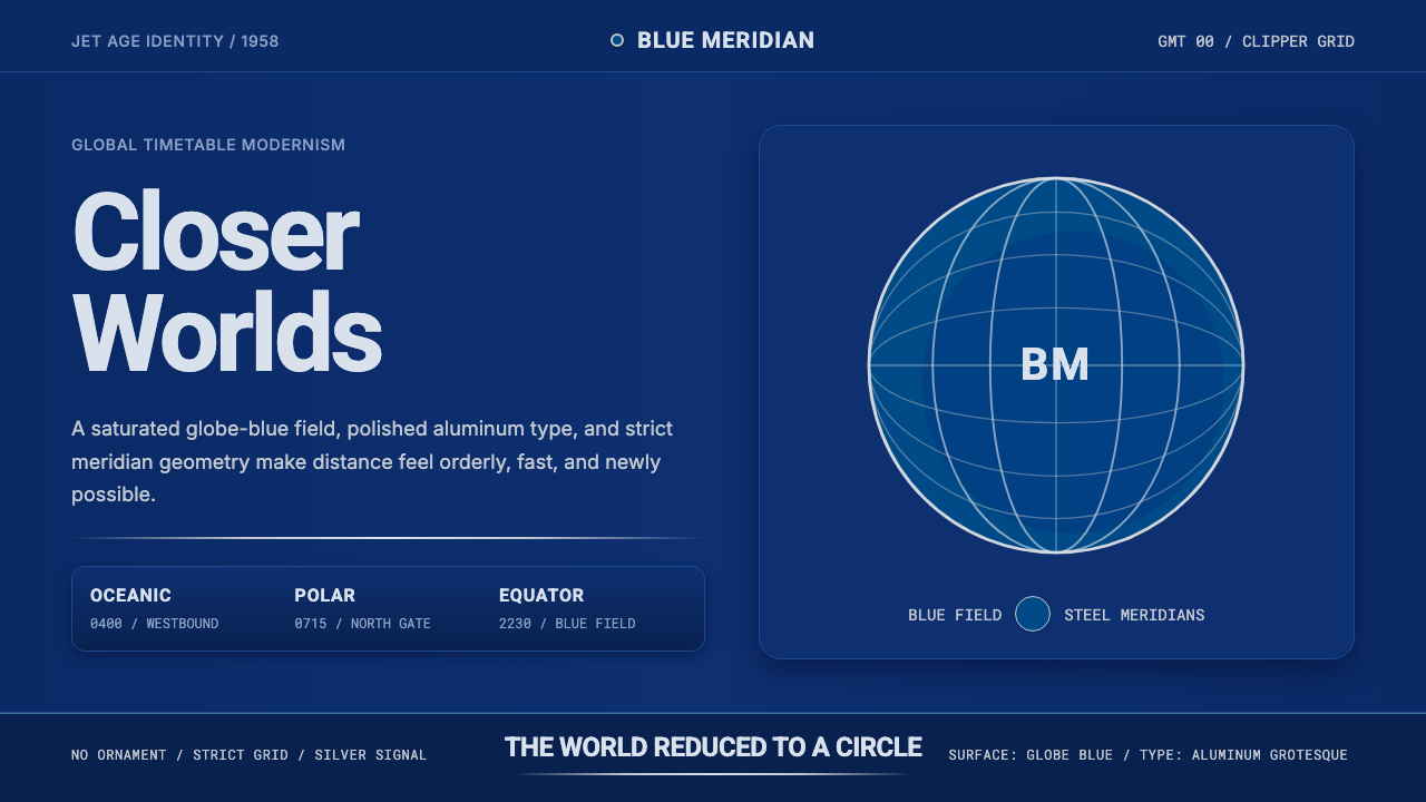 Pan Am Jet AgeJet-age confidence. Globe-blue field, steel type, meridian circle on a strict…喷气时代的信心:蓝色地球场、钢灰字体、经纬圆与严格网格。
 2001 — A Space OdysseyAbsolute restraint. Black void, white monolith geometry, one HAL-red signal.绝对克制:黑色虚空、白色巨石几何、唯一的 HAL 红信号。
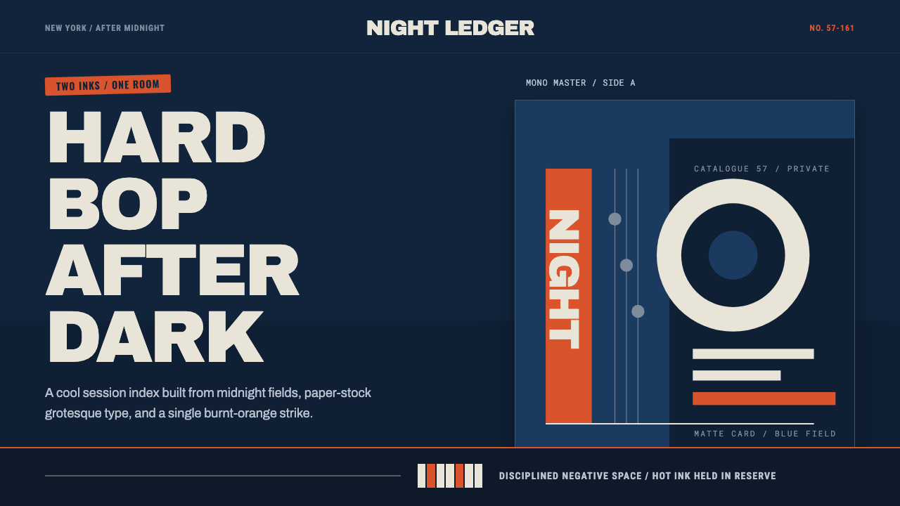 Blue Note JazzCool intelligence, printed flat. Midnight blue, paper type, and one burnt-ora…冷静而智性的平面感:午夜蓝、纸白粗体与一抹焦橙油墨。
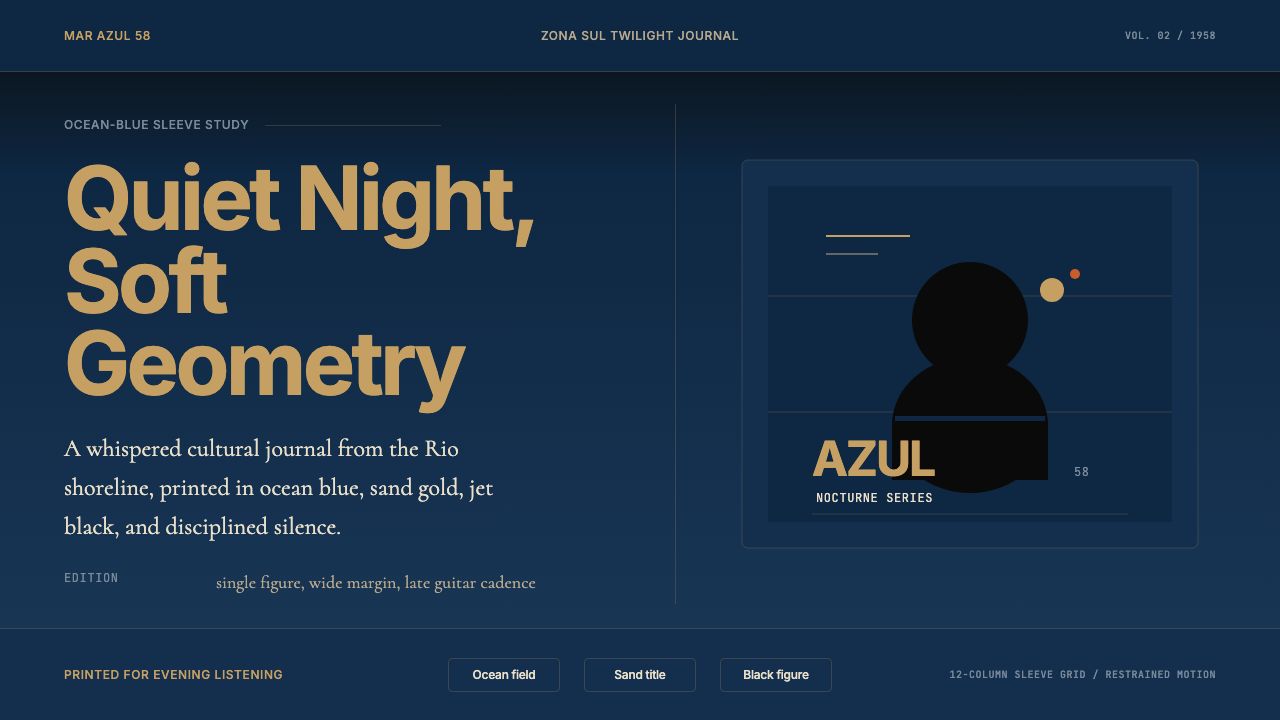 Brazilian Bossa Nova Cool 1958Twilight cool. Ocean blue, sand-gold Inter, one black silhouette with LP-slee…黄昏冷调:海蓝底、沙金 Inter 与黑色剪影,留出唱片封套般呼吸。