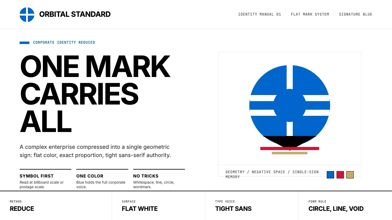
About Saul Bass Corporate
Saul Bass redefined what a corporate logo could be. From the AT&T globe to the Bell System bell to the United Airlines tulip, his geometric symbol-marks distilled complex enterprises into single, unforgettable shapes — bold, flat, and stripped of every unnecessary line.
Beyond boardrooms, Bass brought the same reductive clarity to Hollywood, transforming film title sequences from throwaway credits into art. This system captures his corporate-identity discipline: deep blue primaries, sharp geometry, Helvetica-weight sans-serifs, and the conviction that less is always more.
- Origin
- Los Angeles, United States
- Era
- active 1952–1996; peak corporate-ID era 1968–1985
- Key figures
- Saul Bass · Elaine Bass · Herb Lubalin
- Movements
- Mid-century American corporate modernism · Post-Bauhaus identity systems · Film-title-as-art-form
Saul Bass Corporate design spec
Colors
Typography
The other 11 sections — buttons, cards, spacing, motion, techniques and more — open once you unlock. Download the DESIGN.md or send it to your AI in one click. Unlock once, yours forever.
Sign up nowStyles similar to Saul Bass Corporate
Also inspired by art & artists, with a close feel.
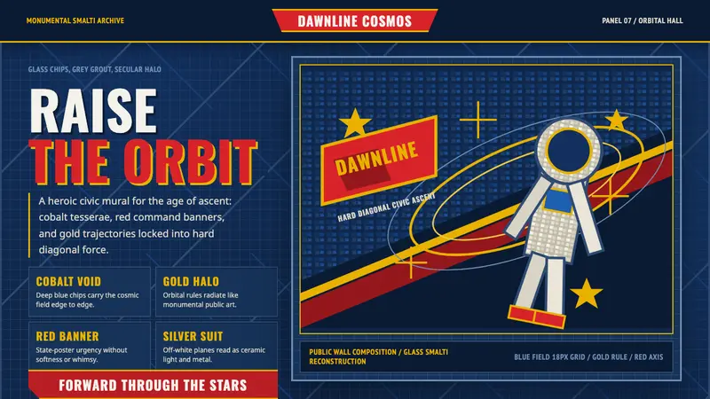 Soviet Cosmic MosaicMonumental and reverent. Cosmic-blue tesserae, red axis, gold orbital halo.
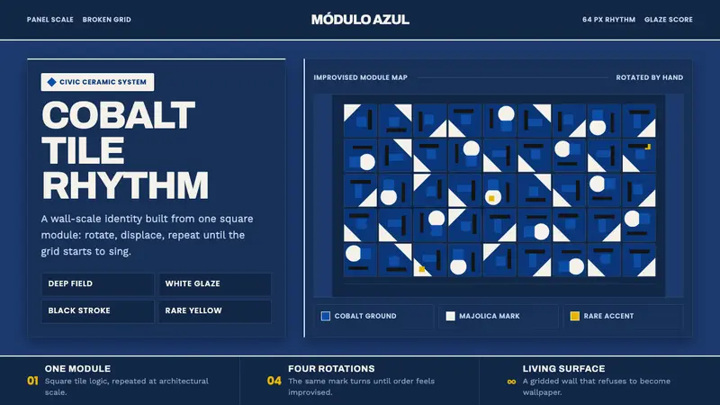 Athos Bulcão Azulejo PanelCobalt grid, alive. Majolica white marks rotate across a broken navy tile field.
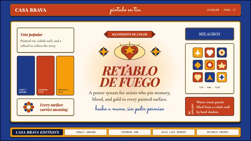 Mexican Folk Art (Frida-era)Defiance painted on tin. Cobalt ground, crimson vows, marigold borders, hard shadows.
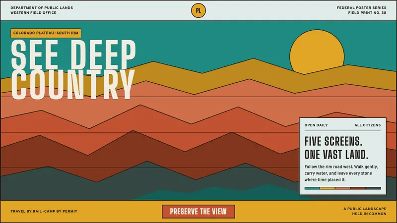 Grand Canyon WPA (1938)Public grandeur in five screens. Turquoise, ochre and terracotta stack in hard strata.