What is Blue Note Jazz?
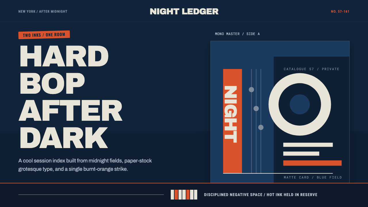
Blue Note Jazz is cool intelligence rendered flat — midnight blue, paper-white type, and a single ration of burnt-orange ink, borrowed from the most coherent record-jacket language in American design.
Blue Note Jazz in brief
This style reproduces the visual system that designer Reid Miles built for Blue Note Records between 1956 and 1967, translated from vinyl record jackets into a general interface language. It is one of the most disciplined and instantly recognizable graphic identities in American design history, built not from unlimited creative freedom but from the opposite: a tight two-to-three-color printing budget that forced every visual decision to count.
The core materials are a deep midnight-blue ground, off-white or paper-toned type and shapes, and a single hot accent color — typically a burnt orange or warm red — used as sparingly as an actual third ink would have been on a limited print run. Session photographs (in the original, shot by Francis Wolff) were duotone-treated, cropped aggressively, and set into asymmetric blocks alongside oversized gothic sans-serif headline type, producing covers that felt intelligent, cool, and controlled rather than decorative.
Applied as an interface style, the system keeps this same economy: a dark blue field does most of the compositional work, large confident sans-serif type carries hierarchy on its own without needing color to help, and the single accent color is reserved for the one thing on a screen that most needs attention. Negative space is not empty space to be filled — it is a structural material, disciplined the same way the original covers rationed ink.
Where does Blue Note Jazz come from?
Blue Note Records was founded in New York City in 1939 by Alfred Lion, a German immigrant with a passion for jazz, and it became one of the defining labels of hard bop and post-bop jazz through the 1950s and 1960s. The label's reputation rested on both its musicians and its production standards, but it was the visual identity of its record jackets — beginning in earnest when Reid Miles joined as principal designer in 1956 — that gave Blue Note a coherence almost no other label of the era achieved.
Miles worked under real commercial constraints: most Blue Note covers were printed with only two or three colors, a budget limitation shared across the American record industry of the period. Rather than treating this as a creative handicap, Miles turned it into the system's core discipline — every color had to justify its use, and midnight blue as a dominant ground became a practical choice as much as an aesthetic one, since it printed cleanly and cheaply while photographing as moody and sophisticated.
Francis Wolff, Blue Note's co-founder and in-house photographer, shot candid session photographs during recording dates — musicians mid-performance, caught in concentration rather than posed. Miles took these photographs and treated them not as documentary record but as raw graphic material: cropping hard, tinting them in duotone to match the cover's limited palette, and often overlapping them with bold type rather than keeping image and text in separate zones. This treatment of photography as a flat, color-limited graphic element, rather than a naturalistic window, is central to the system's look.
The typography — oversized, confident, often gothic sans-serif headlines set at dramatic scale — did the work that color could not, in a budget that limited hue but placed no limit on scale or boldness of letterforms. The result, refined across more than a decade and hundreds of album covers, became retroactively understood as one of the most complete and influential graphic systems to emerge from mid-century American commercial design, admired as much by graphic designers as by jazz listeners.
What defines the Blue Note Jazz look?
Color
The palette is built on a deep midnight blue as the dominant ground, off-white or paper-toned neutrals for type and secondary shapes, and a single hot accent — typically burnt orange or a warm red — used with extreme restraint, as though it were the one costly ink in a limited print run. No other hues appear; the discipline of the palette is as important as the colors themselves.
Typography
Headlines are oversized, confident, and typically gothic sans-serif in character — bold enough to carry a composition on scale and weight alone, without needing color for hierarchy. Type is often set at dramatic size relative to the rest of the layout, and it is treated as a graphic shape as much as a reader of words, sometimes overlapping directly with photographic elements rather than staying confined to a separate text zone.
Duotone Photography
Photographic imagery is never reproduced in full color or naturalistic tone. It is tinted into duotone — typically shades of the same midnight blue or a limited warm tone — so that photographs sit within the same restricted palette as the rest of the layout rather than introducing an uncontrolled range of color. Cropping is aggressive and often asymmetric, favoring a fragment of a figure or gesture over a full, centered portrait.
Asymmetric Blocking
Compositions are organized as blocks of color, type, and image arranged asymmetrically rather than centered or mirrored — a large photographic block might sit heavily to one side, balanced by a smaller field of solid color and a line of type on the other. This asymmetric weighting creates visual tension and a sense of considered arrangement rather than default centering.
Negative Space as Structure
Large areas of the midnight-blue ground are left deliberately empty, functioning as a structural pause rather than wasted space. This restraint mirrors the era's printing economics — every element that appeared had to be paid for in ink — and gives the layout a cool, unhurried confidence rather than a crowded, maximal feel.
Accent Rationing
The single hot accent color appears in only one or two places per composition — a title, a key label, a single graphic mark — never spread across multiple elements. This scarcity is what gives the accent its impact; treating it as a rare, costly resource rather than a freely available brand color is essential to the system's discipline.
Cool Restraint
Every element of the system — the dark cool ground, the disciplined color count, the unhurried negative space — reinforces an overall tone of intelligent restraint rather than warmth or exuberance. Nothing in the composition tries to charm; it earns attention through confident economy instead, in keeping with the cool, cerebral character of the hard bop music the covers originally packaged.

Who shaped Blue Note Jazz?
Miles served as Blue Note's principal graphic designer from 1956 to 1967, creating the majority of the label's most celebrated jacket designs. Working within a strict two-to-three-color print budget, he developed the label's signature vocabulary — oversized gothic type, duotone photography, asymmetric blocking, and disciplined negative space — establishing a visual identity now considered one of the most coherent and influential in American commercial graphic design.
Wolff co-founded Blue Note Records with Alfred Lion and served as the label's in-house photographer, shooting candid images of musicians during recording sessions. His photographs supplied the raw material Miles reworked into duotone graphic elements, and the intimate, in-the-moment quality of his shots gave the cover system its documentary authenticity beneath the graphic treatment.
Lion founded Blue Note Records in New York in 1939 and, as the label's producer, built the roster and recording philosophy that made hard bop and post-bop jazz commercially and artistically viable — the musical foundation that Miles's and Wolff's visual system was built to represent.
How do you use Blue Note Jazz today?
This style carries an intelligent, cool, disciplined mood, which makes it most effective wherever a product wants to signal sophistication, editorial confidence, or considered taste rather than friendliness or energy. Its power comes almost entirely from restraint, so it rewards teams willing to leave space empty and ration color deliberately, rather than filling every area with content or decoration.
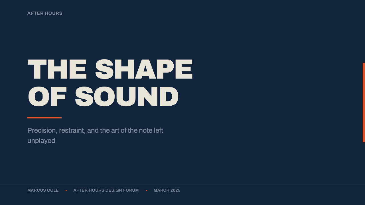
For presentation slides, the style is well suited to cover pages and section dividers that need to feel authoritative and considered: a midnight-blue field, an oversized gothic headline set off-center, and one small burnt-orange mark or label. Content slides should keep most text in off-white or paper tones against the dark ground, reserving the accent color strictly for the single most important word, number, or call-out per slide — using it more than once per slide dilutes its impact.
For web interfaces, the style translates naturally to editorial platforms, music and media products, and premium or curated marketplaces where a cool, confident tone matters more than approachability. Dashboards can use the midnight-blue ground for structural chrome, off-white for data and labels, and the accent color exclusively for the one action or alert that needs to command attention — a primary button, a critical status, a single highlighted metric.
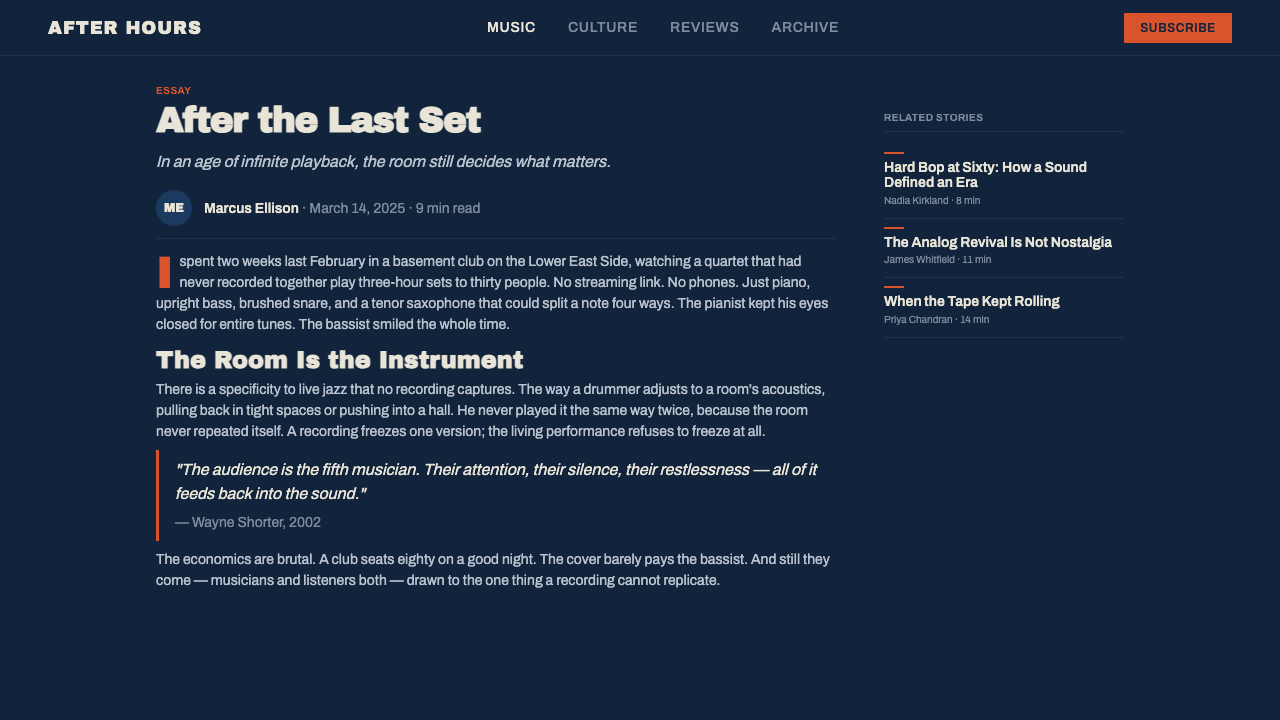
For editorial and marketing work, the system pairs well with content about music, culture, craft, or any subject that benefits from a cool, intelligent tone — a masthead using duotone-treated photography, asymmetric blocking, and oversized gothic type reproduces the record-jacket feel directly. Marketing pages should resist the temptation to use the accent color as a general highlight tool; treating it instead as scarce keeps the layout feeling controlled rather than promotional.
The most common mistake is using the accent color too generously — turning it into a general highlight or link color used throughout a page, the way a typical brand accent would be. The original system's entire visual tension comes from treating that color as a rare resource. A second common mistake is using naturalistic, full-color photography instead of duotone treatment, which immediately breaks the cohesion between image and the rest of the restricted palette.
Blue Note Jazz — FAQ
Is this style the same as general 'jazz aesthetic' or vintage record cover design?
It is a much more specific system than a general jazz or vintage feel. It refers precisely to Reid Miles's Blue Note work between 1956 and 1967 — a particular combination of midnight-blue ground, duotone photography, oversized gothic type, asymmetric blocking, and strict two-to-three-color discipline. A generic 'jazz aesthetic' might use warm colors, saxophone imagery, or smoky textures; this style is cooler, more graphic, and far more disciplined about color count.
How many colors should a layout in this style actually use?
The historical discipline was two to three printable colors, and digital work should aim for a similarly small count: the midnight-blue ground, an off-white or paper neutral for type, and one accent color used sparingly. Adding a fourth or fifth hue undermines the entire logic of the system, which depends on scarcity to give its single accent color meaning.
Does the photography have to be treated in duotone, or can full-color images be used?
Duotone treatment is central to the style. Full-color photography introduces a range of hues the rest of the composition deliberately avoids, breaking the cohesion between image and layout. If a project must use full-color imagery for other reasons, keeping it visually separate from the core Blue-Note-styled elements — rather than blending it into the same blocks — helps preserve the system's discipline elsewhere on the page.
What kind of typography best fits this style?
Bold, oversized, gothic-character sans-serif headlines fit best — type confident enough to carry hierarchy through scale and weight alone, without relying on color. Avoid delicate serif faces, script lettering, or multiple competing typefaces; the original system typically relied on a single strong sans-serif family used at dramatically different scales rather than a mix of families.
Is this style only appropriate for music or entertainment products?
No. While it originates from record jacket design, its underlying logic — cool restraint, disciplined color scarcity, oversized confident type, asymmetric composition — transfers well to any product that wants to signal editorial sophistication or curated taste: publications, cultural institutions, premium subscription products, or design-forward brands more generally. The music origin gives the style its name, not its limits.
Related design styles
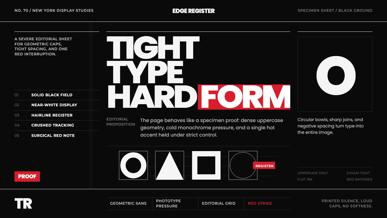 Avant Garde GothicType is the image. Tight white caps on black, ruled grids, one hot red strike.
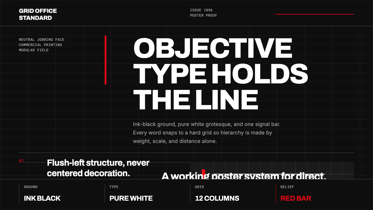 Akzidenz-Grotesk BertholdObjectivity in black ink. White grotesque type, hard grid, one rationed red b…
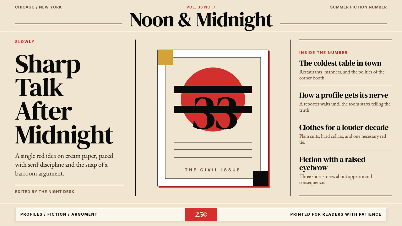 Esquire MagazineConceptual punch on paper. Cream stock, black hairlines, and one saturated re…
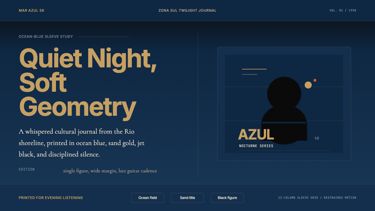 Brazilian Bossa Nova Cool 1958Twilight cool. Ocean blue, sand-gold Inter, one black silhouette with LP-slee…
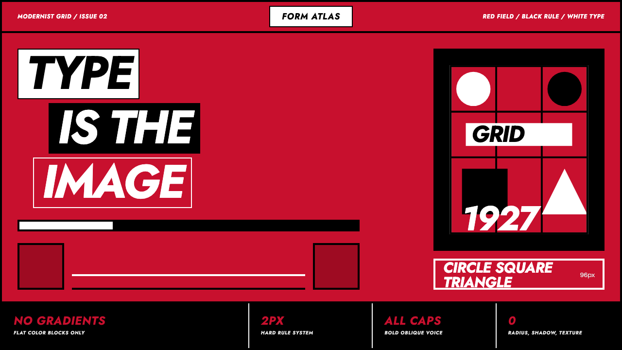 Futura Geometric PosterType becomes image. Red grid, white oblique Jost, black rules at poster scale.
 Hockney Pool BlueSerenity turns graphic. Turquoise planes, salmon edges, one white splash.