What is Spatialism (Fontana Cut, 1949)?
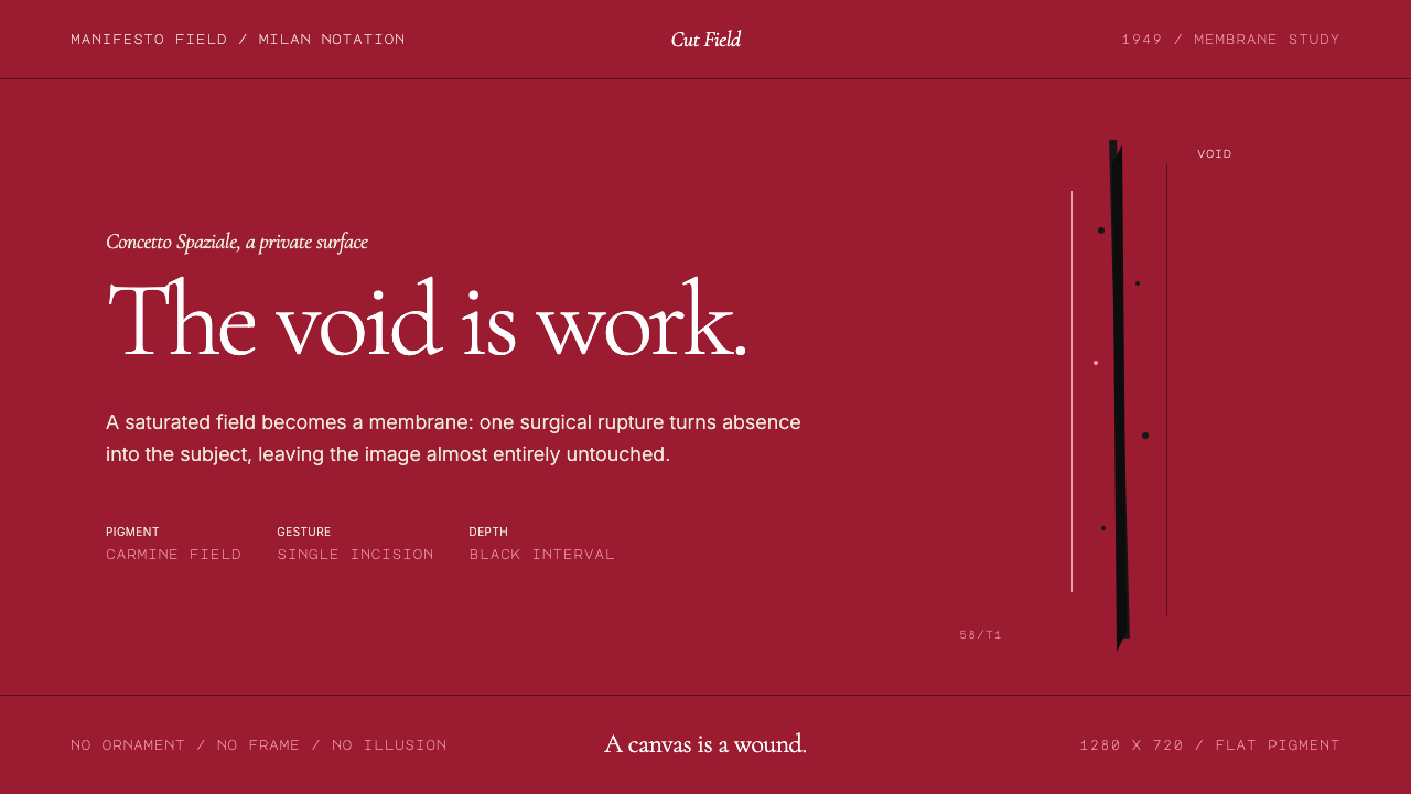
Lucio Fontana slashed a painted canvas in 1949 and made the void itself the subject — a gesture that design translates into interfaces where absence is as deliberate as presence.
Spatialism (Fontana Cut, 1949) in brief
Spatialism, as a design system, is rooted in Lucio Fontana's radical proposition that the surface of a work is not the end point but the beginning. Where conventional painting asks you to look at the canvas, Fontana's slashed and punctured canvases ask you to look through it — into the space beyond. This system translates that philosophical rupture into visual design: saturated monochrome fields interrupted by a single deliberate incision, dense color held taut against conspicuous, structured emptiness.
The aesthetic is paradoxically minimal and intense. A deep carmine or ultramarine ground occupies almost the entire composition, while a single slit — dark, precise, running parallel or at a slight angle — divides the field without resolving it. There are no decorative elements in the ordinary sense; the cut is the ornament, the wound is the composition. Typography, where present, is restrained to a near-classical register, its quiet formality thrown into relief by the visceral act of the incision below or beside it.
What distinguishes Spatialism from pure minimalism is the quality of the tension it holds. Pure minimalism seeks equilibrium and rest; Spatialism maintains unresolved energy. The saturated field pushes forward; the cut recedes; the eye is trapped in the dynamic between them. Applied to interface design, this produces screens that feel charged and considered rather than merely clean.
Where does Spatialism (Fontana Cut, 1949) come from?
Lucio Fontana was born in Argentina in 1899 to Italian parents and spent his working life oscillating between Buenos Aires and Milan. He trained as a sculptor and came to prominence in the 1930s with ceramic and terracotta works that were already pushing against the conventions of three-dimensional form. His encounter with the European avant-garde — Futurism, Constructivism, the nascent abstraction circulating through Milan's galleries — pushed him toward increasingly radical positions on what a work of art could be.
In 1946, in Buenos Aires, Fontana co-authored the Manifesto Blanco — the White Manifesto — with a group of young students. The document declared that painting, sculpture, and all the classical art forms had exhausted their possibilities. The new art, it argued, must occupy four dimensions: it must incorporate space, time, color, sound, and movement simultaneously. The manifesto was visionary and somewhat impractical, but it established the theoretical foundation for everything Fontana would make afterward under the banner of Spazialismo.
The decisive technical breakthrough came in 1949. Working in his Milan studio, Fontana began puncturing monochrome canvases with clusters of holes — the Buchi series. By 1958, he had moved from punctures to cuts: the Tagli, single or multiple precise slashes through the painted surface. These works were violently simple. A single dark slit across a field of warm red or cool black required no reading beyond itself — and yet it opened an entire philosophical position: the work of art is not an illusion of depth but an actual rupture in matter, and the void beyond is as much the subject as anything applied to the surface.
Fontana's Spazialismo attracted a circle of collaborators in postwar Milan. Roberto Crippa worked in spiraling gestural forms that referenced Fontana's spatial ideas through movement rather than incision. Cesare Peverelli brought a lighter, more lyrical application of the spatial concept. Carlo Cardazzo, the Venetian gallerist who ran the Galleria del Naviglio in Milan, became the movement's primary commercial platform, exhibiting the Concetto Spaziale works that would eventually define Fontana's legacy. Milan in the postwar decades was a particular kind of laboratory — economically resurgent, culturally open, positioned between the intellectual seriousness of Rome and the commercial energy of northern Europe — and Spazialismo was one of its most concentrated cultural products.
What defines the Spatialism (Fontana Cut, 1949) look?
Color Field
The foundational visual element is a single saturated ground that occupies nearly the entire composition — deep carmine, warm ochre, dense ultramarine, or absolute black. The color is not gradated; it is uniform and pressurized, as though the chromatic intensity is being held at maximum and barely contained. This monochrome saturation sets up the condition the cut will rupture.
The Cut
The slit — the Taglio — is both literally and conceptually the center of the system. It runs with surgical precision across the color field: straight or very slightly curved, clean-edged, its interior pulling back into shadow. In design translation, the cut appears as a dark linear element — a void incised into the composition — that carries the weight of an entire philosophy. It is simultaneously wound and window.
Negative Space as Subject
In most design traditions, negative space is a servant — it gives elements room to breathe, it aids legibility, it prevents clutter. In Spatialism, negative space is promoted to subject matter. The void behind the cut, the silence around the color field, the absence of any compositional business in the margins — these are not passive. They carry as much intentional weight as anything placed on the surface.
Typographic Restraint
When type appears in the Spatialist register, it holds itself to a near-classical composure: a single weight, generous spacing, small or medium scale relative to the dominant color field. The typography refuses to compete with the cut. It does not perform — it identifies. This restraint is not timidity; it is structural, ensuring that all visual energy converges on the incision and not on letterform elaboration.
Monochromatic Commitment
Spatialism does not mix palettes. A given composition is built around one dominant hue, and the secondary elements — the cut's shadow, any typographic element — are drawn from the far ends of that hue's tonal range: deep shadow or near-white light. Multi-color applications dilute the system's logic. The power of the cut depends on the color field being undivided; variety of hue would fraction the tension that makes the incision feel significant.
Surface and Depth Tension
The cut creates an illusion of depth without using any conventional perspectival technique. The slit's interior is darker than the field; the eye reads it as recessive space. But the color field itself is flat and frontal, pressing outward. This simultaneous push and pull — flatness asserting itself while depth opens — is Spatialism's core visual dynamic, and it should be preserved in any design application of the system.
Precision and Economy
Every element in a Spatialist composition must be able to justify its presence. The system has no tolerance for decorative accretion — no texture for richness, no secondary shapes for visual interest, no gradient for depth. What remains after all such removals is the irreducible: field, cut, and the dynamic between them. This ruthless economy means that any addition risks collapsing the system's logic entirely.
Who shaped Spatialism (Fontana Cut, 1949)?
Fontana is the irreducible origin of Spatialism. Born in Argentina in 1899, trained in Milan, he produced a body of work spanning ceramics, sculpture, and painting before arriving at the radical gesture of the cut in the late 1940s. His Manifesto Blanco of 1946 announced the theoretical framework; his Buchi series of 1949 began the material practice; his Tagli series, developed fully by 1958, produced the works by which he is now almost entirely defined. Fontana died in 1968, just a year before Conceptual Art — the movement most directly descended from his logic — reached its international peak.
A central figure in the Spazialismo circle, Crippa developed a practice of gestural spiraling forms that extended Fontana's spatial inquiry into pure movement. Where Fontana's cuts were static and definitive, Crippa's spirals imply process and duration — the trace of a hand moving through space rather than the decisive mark of a blade. His work demonstrated that Spatialism was a sensibility capable of generating multiple formal languages rather than a single prescribed look.
Cardazzo was the gallerist who gave Spazialismo its primary commercial and critical platform in postwar Italy. Through his Galleria del Naviglio in Milan and Galleria del Cavallino in Venice, he exhibited the Concetto Spaziale works that brought Fontana's practice to international attention. Cardazzo understood that the dealer's role was not merely logistical but curatorial — he shaped the context in which the cuts were seen, ensuring they were read as philosophical propositions rather than mere novelties.
Peverelli brought a more lyrical and atmospheric dimension to Spazialismo, working with diffuse chromatic fields and less rigorous surface interventions than Fontana's precise incisions. His participation in the movement illustrates that Spatialism's core proposition — that the surface is a membrane to be penetrated rather than a ground to be decorated — could accommodate a range of temperaments and degrees of formal severity.
How do you use Spatialism (Fontana Cut, 1949) today?
Spatialism transfers most powerfully to design contexts where the primary communication is a single charged idea or identity — where the goal is impact and philosophical weight rather than information density. Applying it correctly requires disciplining yourself to subtract rather than add: the system fails the moment you introduce a second color family, a decorative texture, or a second typographic personality.
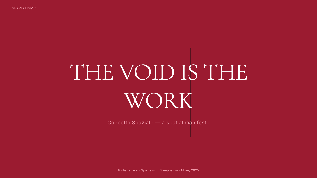
For presentation slides, the Spatialist approach is most effective on cover and section-break pages. A cover built in this register typically gives a deep saturated ground the full bleed, positions a title in restrained type at a deliberate offset from center, and introduces the cut motif as a single dark linear element crossing the lower third or middle of the composition. Content and data slides are harder to sustain in pure Spatialism because the system's power depends on compositional sparseness; for data-heavy content, borrow the color logic and the emphasis on structured negative space while relaxing the monochrome constraint.
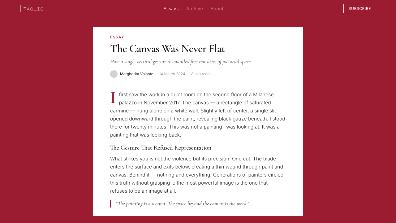
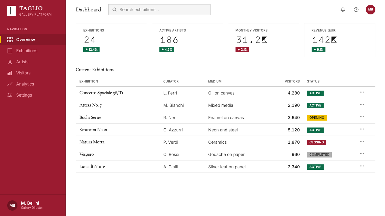
For web interfaces and dashboards, Spatialism lends itself to hero sections, modal overlays, and any screen that needs to assert identity strongly. A pricing page built in this register might commit an entire section to a single deep color field with the tier name in restrained typography and a thin horizontal rule — the cut surrogate — dividing it from the content below. Navigation should be minimal to near-invisible; the field must not be fractured by excessive UI chrome. The system is less suited to dense information interfaces where users need rapid scanning across many elements simultaneously.
For editorial and marketing applications, Spatialism produces powerful cover imagery, campaign posters, and brand identity moments. A magazine cover built on a carmine field with a single slit motif and an understated masthead is immediately arresting. The difficulty in editorial lies in sustaining the system through interior pages where practical content demands more compositional variety; here, the Spatialist influence typically filters through the color choices and the quality of the negative space rather than the literal cut motif.
A common mistake is using the cut motif decoratively — multiplying slits, varying their width, or treating them as a pattern. The single cut derives its power from isolation; the moment it is repeated without structural necessity, it becomes wallpaper. Similarly, adding secondary accent colors or using the background field as a canvas for texture or grain undermines the monochromatic logic the entire system depends on. The discipline the style demands is severe: when in doubt, remove.
Spatialism (Fontana Cut, 1949) — FAQ
Is Spatialism the same as minimalism?
They share a commitment to economy and the elimination of decorative excess, but they differ fundamentally in their underlying philosophy. Minimalism — particularly the American Minimalism of the 1960s — sought to produce objects and images of pure, self-sufficient presence: the work means only what it is. Spatialism, by contrast, is about absence and rupture. The cut invites the viewer to think about what is not there — the space beyond the surface, the void the incision opens. Minimalism aims for stillness; Spatialism sustains unresolved tension. Visually, this difference manifests in the quality of energy: Minimalist work feels resolved, Spatialist work feels charged.
Does the cut motif have to be literal to apply this style?
No — the cut is the most direct translation, but the Spatialist sensibility can be expressed through the principle it represents rather than its literal form. A design that commits to a single saturated ground, uses structured negative space as the primary compositional device, and keeps all typography and UI elements to a condition of severe economy is working in the Spatialist register even without an explicit slit. The motif deepens the system but does not define it; the defining characteristic is the treatment of absence as the primary subject.
How does this style handle light and dark mode?
Spatialism is historically a dark-ground aesthetic — Fontana's most iconic works are deep carmine, warm black, and dense ultramarine canvases with cuts that open into shadow. A dark-mode interface is therefore not an inversion of the system but its most natural expression. A light-mode adaptation is possible but requires care: the cut must read as darker than the ground, and the field's saturation must be high enough to generate the necessary chromatic pressure. A pale, pastel-toned light adaptation will lose the charged quality entirely. When working in light mode, lean toward deeply saturated warm fields — dusty rose or deep sand — rather than pale neutrals.
What kinds of products or brands is this style wrong for?
Spatialism is ill-suited to any context where warmth, approachability, or visual abundance are core product values. Children's products, consumer food brands, wellness applications, and social platforms that depend on high information density and variety of content would all be poorly served. The style is also a poor match for products that need to convey progression, optimism, or lightness — its emotional register is intense, philosophical, and somewhat severe. It works for brands willing to stake their identity on a singular aesthetic proposition and patient enough to let that proposition operate at the slow pace the system requires.
How did Spazialismo influence later movements?
Fontana's gesture anticipated several directions that became mainstream in the 1960s and after. His treatment of the canvas as a physical object to be acted upon — rather than a ground for illusionistic representation — was a direct precursor to Arte Povera, which also emphasized material actuality over pictorial illusion. His philosophical insistence that absence and void could be the primary subject of a work laid groundwork for Conceptual Art, which moved the center of gravity from the object to the idea. In design, the influence is more diffuse: Spatialism's monochromatic saturation and rigorous economy passed through Italian rational design, contributed to the postwar Italian design school's reputation for severity and elegance, and resurfaces whenever contemporary designers reach for a gesture that is simultaneously dramatic and self-denying.
Related design styles
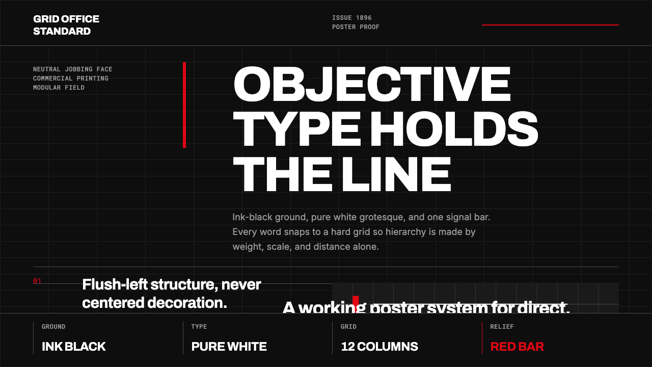 Akzidenz-Grotesk BertholdObjectivity in black ink. White grotesque type, hard grid, one rationed red b…
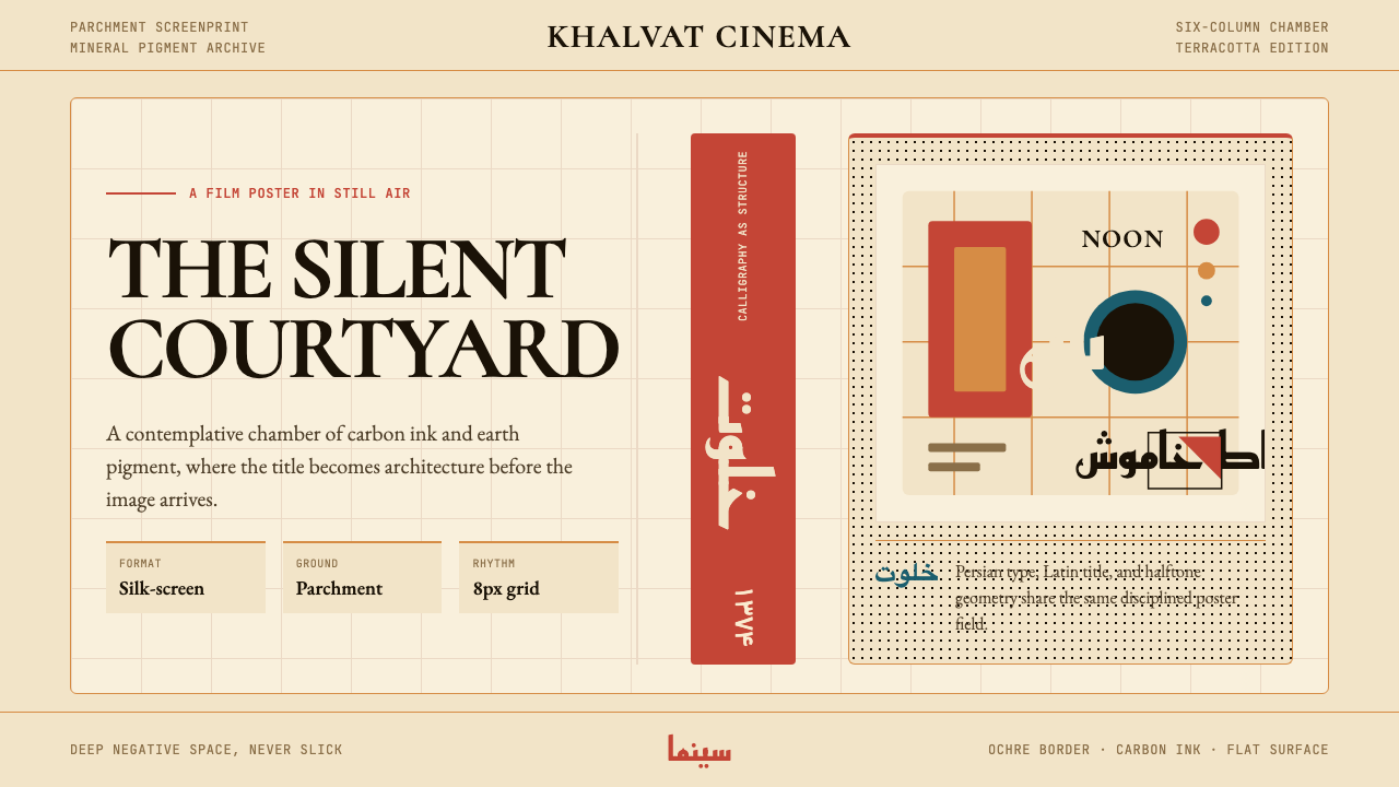 Iranian Modernist Cinema PosterStillness becomes monumental. Terracotta Kufi type breathes inside a Swiss pa…
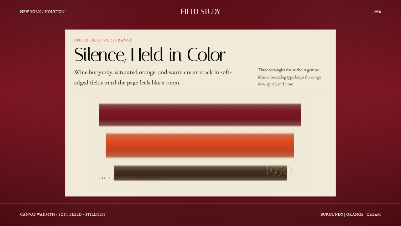 Mark Rothko Color Field (1950)Silence made visible. Burgundy, orange, and cream stack in soft-edged fields.
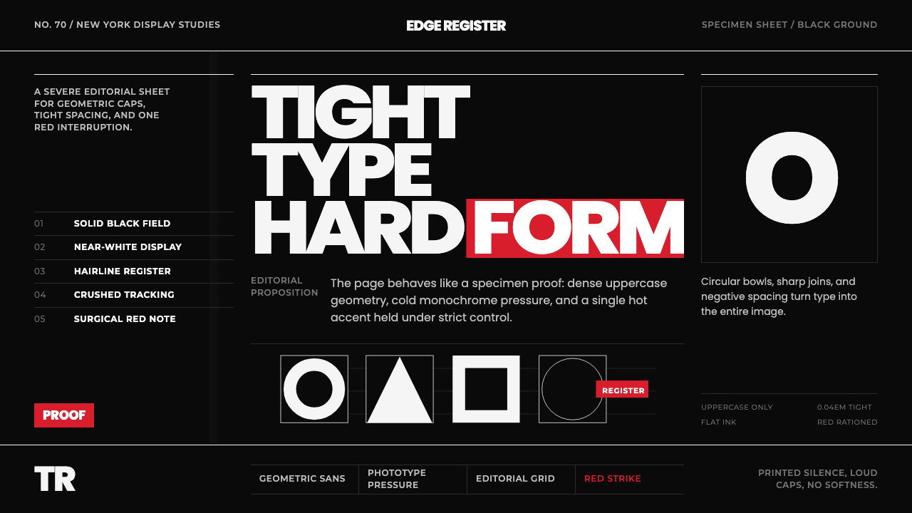 Avant Garde GothicType is the image. Tight white caps on black, ruled grids, one hot red strike.
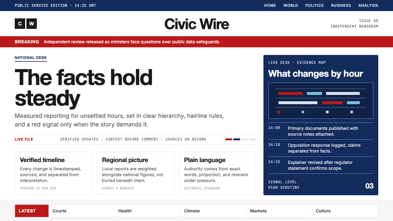 BBC NewsPublic trust, stripped bare. Red alerts, deep navy and hairline grids make ur…
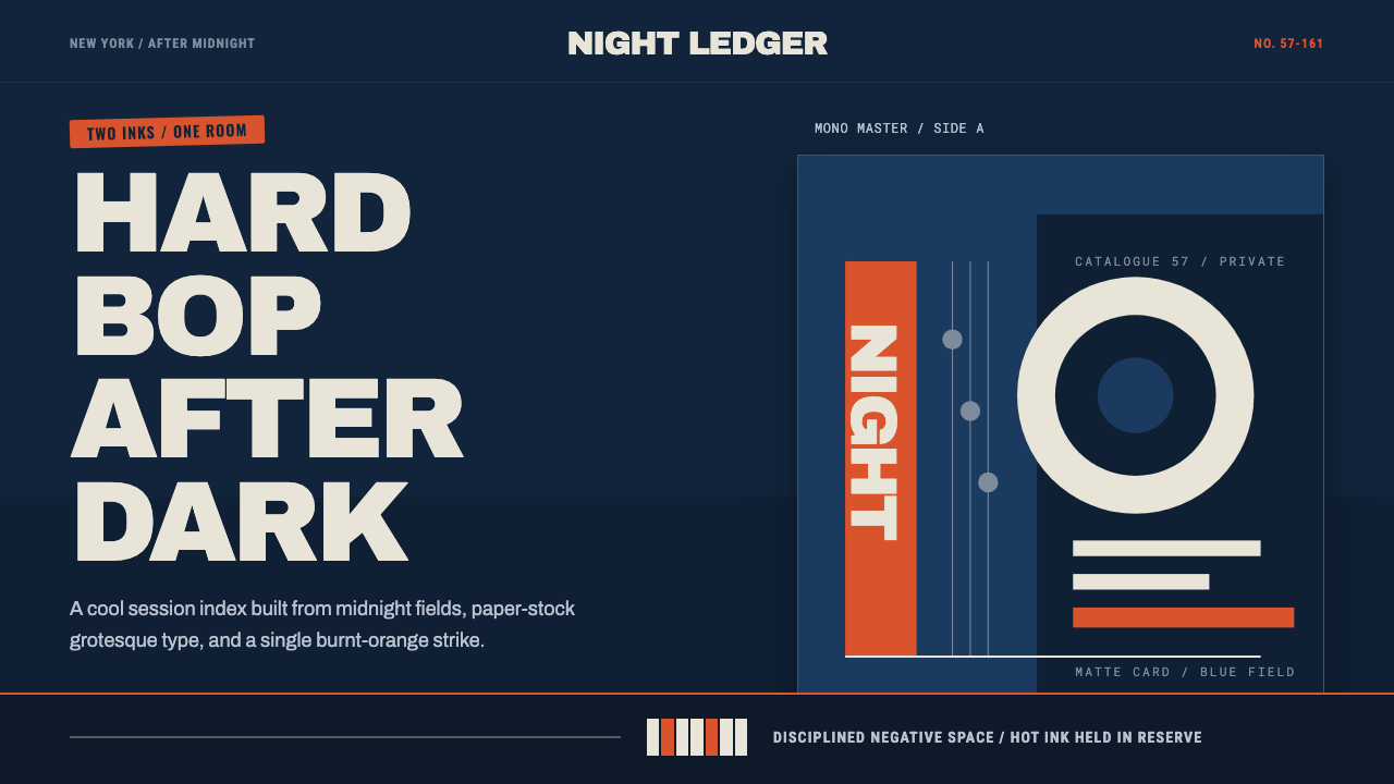 Blue Note JazzCool intelligence, printed flat. Midnight blue, paper type, and one burnt-ora…