What is Iranian Modernist Cinema Poster?什么是 Iranian Modernist Cinema Poster?
Persian calligraphy meets Swiss grid discipline on sun-baked parchment — Iranian modernist cinema posters turned stillness into a monumental art form.波斯书法与瑞士网格相遇于日晒羊皮纸之上——伊朗现代主义电影海报将静默升华为纪念碑式的艺术形态。
Iranian Modernist Cinema Poster in briefIranian Modernist Cinema Poster 速览
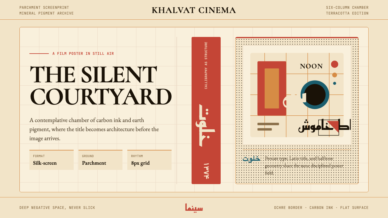
Iranian modernist cinema poster is a graphic tradition that fused the architectural logic of Persian calligraphy — particularly the Nastaliq and Kufi scripts — with the structural discipline of Swiss grid-based modernism. The resulting visual language is distinctive: warm earth-tone grounds, slow and deliberate negative space, hand-drawn letterforms that function as both image and text, and a compositional calm that invites sustained looking rather than instant legibility.伊朗现代主义电影海报是一种平面设计传统,将波斯书法的建筑逻辑——尤其是纳斯塔利克体与库法体——与瑞士现代主义网格的结构纪律融为一体。由此产生的视觉语言极具辨识度:温暖的大地色底面、迟缓而从容的留白、兼具图像与文字双重功能的手绘字形,以及一种邀请持续凝视而非即时阅读的构图静谧感。
The style arose in the context of Iran's own New Wave cinema, where directors such as Abbas Kiarostami, Bahram Beyzaie, and Dariush Mehrjui were making films of exceptional formal intelligence. Poster designers understood that the work being advertised demanded equivalent seriousness. Rather than adopting the garish photomontage dominant in commercial cinema elsewhere, they chose reduction: fewer elements, deeper silence, letterforms as primary image-making tools.这一风格兴起于伊朗新浪潮电影的语境之中。在那个时代,阿巴斯·基亚罗斯塔米、巴赫拉姆·贝扎伊、达里乌什·梅赫尔朱伊等导演正在创作形式智性极高的影片。海报设计师深知,他们所要宣传的作品需要同等严肃的对待。他们没有采用其他地区商业电影常见的艳丽照片蒙太奇,而是选择了减法:更少的元素、更深的静默、以字形作为首要的图像生成工具。
Materially, the tradition was rooted in silk-screen printing on coarse, parchment-toned paper. Terracotta, ochre, carbon black, and warm cream were the colors of the pigments available and the surfaces they stained — a palette born of material reality that later became an aesthetic signature. Contemporary applications translate this sensibility into digital form while preserving its essential qualities: the sense of something hand-made and deliberate, the earth-toned restraint, and the willingness to let a single strong letterform carry an entire composition.在材料层面,这一传统植根于粗质羊皮纸色纸张上的丝网印刷。赤陶、赭石、碳黑与温暖奶油色,是当时可用颜料的色彩,也是它们所着染的纸面颜色——一套由物质现实催生的色板,后来成为一种美学标识。当代的数字应用在保留这种感性本质的同时,将其转化为屏幕形式:手工制作的刻意感、大地色调的克制,以及让单一强劲字形撑起整张构图的意愿。
See the Iranian Modernist Cinema Poster design system查看 Iranian Modernist Cinema Poster 完整设计系统
Where does Iranian Modernist Cinema Poster come from?Iranian Modernist Cinema Poster 从何而来?
The conditions that produced Iranian modernist cinema posters were both cultural and political. In the 1950s and 1960s, Iran's urban intellectual class was deeply engaged with global modernism — European cinema, Russian constructivism, American abstract expressionism — while simultaneously seeking to reconnect with pre-Islamic and classical Persian visual heritage. This tension between internationalism and cultural rootedness gave the emerging design movement its particular character: not a straightforward adoption of Western modernism, but a negotiation between imported structural methods and indigenous visual resources.催生伊朗现代主义电影海报的条件,既是文化性的,也是政治性的。在1950至1960年代,伊朗城市知识阶层深度参与全球现代主义——欧洲电影、俄国构成主义、美国抽象表现主义——同时寻求重新连接前伊斯兰时期与古典波斯视觉遗产。这种国际主义与文化根植性之间的张力,赋予了新兴设计运动其独特性格:不是对西方现代主义的直接移植,而是在舶来的结构方法与本土视觉资源之间展开的协商。
The institutional center of this movement was Tehran, particularly the Tehran Graphic Design Society, founded in the early 1960s. The society brought together designers, typographers, illustrators, and film industry professionals who shared a conviction that Iranian graphic design should develop a voice distinct from both Western commercial design and Soviet-influenced political graphics. Morteza Momayez, who studied in France before returning to Iran, became the movement's pivotal figure — advocating for a design practice that drew on Safavid miniature painting, Persian tile geometry, and classical calligraphy while remaining formally rigorous.这一运动的机构核心在德黑兰,尤其是1960年代初成立的德黑兰平面设计协会。协会汇聚了设计师、字体设计师、插画师与电影业专业人士,他们共同确信:伊朗平面设计应当发展出一种有别于西方商业设计与苏联影响式政治图形的独立声音。曾赴法国留学后归国的莫尔塔扎·莫马耶兹成为这一运动的核心人物——他倡导一种汲取萨法维细密画、波斯几何瓷砖与古典书法的设计实践,同时保持形式上的严谨。
The golden period of the tradition runs from roughly the mid-1960s through 1979, the year of the Islamic Revolution. During this period, cinema was one of the few cultural fields where experimental formal work received public distribution and institutional support. The New Wave directors — whose films were winning international awards and being screened at European festivals — created demand for poster design of comparable ambition. Designers such as Iraj Anvari, Saed Meshki, and Reza Abedini developed poster solutions in which calligraphic forms were not decorative additions but structural elements: a single Nastaliq word-form might occupy half the poster surface, its flowing strokes implying narrative without depicting it.这一传统的黄金时期大致从1960年代中期延续至1979年伊斯兰革命。在此期间,电影是少数几个实验性形式作品能够获得公开发行与机构支持的文化领域之一。新浪潮导演的影片在国际上屡获大奖,并在欧洲电影节上放映,为同等抱负的海报设计创造了需求。伊拉吉·安瓦里、萨埃德·梅什基、雷扎·阿贝迪尼等设计师发展出一套海报方案,其中书法形态不是装饰性的附加,而是结构性元素:一个纳斯塔利克字形可能占据海报画面的一半,其流动的笔画暗示叙事却不描绘叙事。
After the 1979 revolution, the tradition underwent significant disruption. Many designers emigrated, cinema underwent politically mandated transformations, and the visual culture of public life changed dramatically. The revival of the aesthetic — and its recognition as a distinct historical style — came primarily in the 1990s, when designers like Reza Abedini, working both inside Iran and internationally, began explicitly referencing the pre-revolution visual tradition while extending it with new typographic and compositional ideas. Abedini's work in particular brought the Iranian modernist poster tradition to international attention through exhibitions in Europe and the United States, where it was recognized not as a regional curiosity but as one of the significant bodies of twentieth-century graphic design.1979年革命之后,这一传统经历了重大中断。许多设计师移居海外,电影经历了政治授权的改造,公共生活的视觉文化也发生了深刻变化。这种美学的复兴——以及对它作为一种独特历史风格的认可——主要发生在1990年代,雷扎·阿贝迪尼等设计师在伊朗国内与国际舞台上同时工作,开始明确援引革命前的视觉传统,同时以新的排印与构图观念加以延伸。阿贝迪尼的作品尤其通过在欧洲和美国举办的展览,将伊朗现代主义海报传统带入国际视野——在那里,它不是作为一种地区性珍品,而是作为二十世纪平面设计最重要的体系之一被认可。
What defines the Iranian Modernist Cinema Poster look?Iranian Modernist Cinema Poster 的视觉特征是什么?
Earth-Tone Palette大地色调色板
The color vocabulary is drawn from mineral pigments and the physical conditions of silk-screen printing on uncoated paper: terracotta reds, ochre yellows, carbon blacks, and parchment creams. These tones are warm, slightly muted, and carry the suggestion of age and materiality. Saturated cool colors — blues, greens, violets — are largely absent from the canonical tradition, making even a single cool accent feel significant. The palette is not used decoratively but structurally, with each tone assigned a role in the compositional hierarchy.这套色彩词汇源自矿物颜料与在无涂层纸张上丝网印刷的物质条件:赤陶红、赭石黄、碳黑与羊皮纸奶油色。这些色调温暖、略显沉郁,带有年代感与材料质感的暗示。高饱和的冷色——蓝色、绿色、紫色——在经典传统中几乎缺席,使得即便是单一的冷色强调也显得意义重大。色板的使用不是装饰性的,而是结构性的,每种色调在构图层级中被赋予特定角色。
Calligraphic Architecture书法的建筑感
Persian calligraphy — primarily the Nastaliq and Kufi scripts — functions as both text and primary image in this tradition. A Nastaliq letterform carries inherent gestural rhythm: its thick-to-thin strokes, oblique baseline, and flowing connections between characters create visual movement that pure geometric forms cannot. Kufi, by contrast, is angular and architectural — its squared geometry sits comfortably alongside Swiss grid structures. Designers in this tradition were typically calligraphers themselves, and the distinction between writing and drawing was deliberately collapsed.波斯书法——主要是纳斯塔利克体与库法体——在这一传统中同时承担文字与主要图像的双重功能。纳斯塔利克字形天然携带手势节奏:其由粗到细的笔画、倾斜的基线、字符间流动的连接,创造出纯几何形态无法产生的视觉运动。库法体则与此相对:棱角分明、具有建筑感——其方形几何与瑞士网格结构和谐共存。这一传统中的设计师通常本身就是书法家,书写与绘画之间的界限被刻意消解。
Monumental Negative Space纪念碑式留白
Perhaps the most immediately recognizable quality of the Iranian modernist poster is its willingness to leave vast areas of the picture surface empty — or rather, to treat emptiness as an active compositional force. This is not minimalism in the contemporary sense but a practice rooted in classical Persian poetry and painting, where silence and restraint are expressive rather than merely absent. A single calligraphic form placed in the lower third of a parchment ground generates tremendous visual pressure through the weight of what surrounds it.伊朗现代主义海报最直接可辨的品质,或许正是它愿意将画面的大片区域留空——或更准确地说,将空无视为一种主动的构图力量。这不是当代意义上的极简主义,而是植根于古典波斯诗歌与绘画的实践——在那里,沉默与克制是具有表现力的,而非仅仅是缺席。一个置于羊皮纸底面下三分之一处的单一书法形态,通过其周围的重量产生巨大的视觉张力。
Grid Discipline with Organic Relief有机舒缓的网格纪律
The Swiss grid — strict horizontal and vertical alignment, consistent margins, hierarchical text sizing — provides the invisible structure on which the compositions are built. But unlike pure Swiss International Style, the Iranian modernist tradition introduces organic relief through calligraphic forms that deliberately violate the grid's straight edges. The result is a productive tension: the rigorous structure makes the flowing strokes more powerful by contrast, while the calligraphic elements prevent the composition from feeling mechanical.瑞士网格——严格的水平与垂直对齐、一致的页边距、层级化的字体尺寸——为构图提供了不可见的骨架。但与纯粹的瑞士国际主义风格不同,伊朗现代主义传统通过有意违背网格直线边缘的书法形态引入有机的舒缓感。结果是一种富有成效的张力:严格的结构通过对比使流动笔画更具力量,而书法元素则防止构图产生机械感。
Halftone and Tactile Texture半色调与触感质地
The silk-screen printing process introduced visible texture into the color fields: halftone dot patterns in areas of intermediate tone, slight ink bleeding at edges, the tooth of the paper showing through transparent ink layers. This tactile quality — the sense that the poster was made by hand and exists as a physical object — is integral to the aesthetic. In digital applications, a light halftone grain or subtle paper texture applied to flat color areas preserves this quality without simulating it too literally.丝网印刷工艺在色块中引入了可见的质感:中间色调区域的半色调网点、边缘处轻微的油墨渗晕、纸张的纹理透过透明油墨层显露出来。这种触感品质——海报由手工制作、作为物理对象存在的感觉——是这一美学的有机组成部分。在数字应用中,在平色区域叠加轻微的半色调颗粒或微妙的纸张纹理,可以保留这种品质而不至于过于字面地模拟它。
Figuration through Silhouette通过剪影实现具象
When human figures or objects appear in the Iranian modernist poster tradition, they are rarely rendered with photographic detail. More typically, figures are reduced to high-contrast silhouettes — a technique that is simultaneously influenced by Persian shadow puppet theater (Kheimeh Shab Bazi), European modernist woodcut, and the practical constraints of silk-screen printing. The silhouette approach integrates figurative imagery into the poster's flat compositional logic without introducing naturalistic depth that would conflict with the calligraphic and geometric elements.当人物或物体出现在伊朗现代主义海报传统中时,它们很少以摄影写实的方式呈现。更常见的做法是将形象简化为高对比度剪影——这一技法同时受到波斯皮影戏(Kheimeh Shab Bazi)、欧洲现代主义木刻版画,以及丝网印刷实际限制的影响。剪影处理方式将具象图像融入海报平面构图的逻辑中,同时不引入会与书法和几何元素产生冲突的自然主义深度。
Typography as Primary Imagery字体排印作为主要图像
In the Iranian modernist poster, the distinction between typography and illustration is frequently dissolved. A single oversized Kufi letterform becomes a geometric shape to be read as composition before it is read as character. Nastaliq ligatures are cropped, rotated, or isolated so that their calligraphic energy reads as abstract mark-making. Size contrast between typographic elements is extreme — a large display character might coexist with very small auxiliary text, using scale as the primary organizing device and making the letterform itself the poster's central visual event.在伊朗现代主义海报中,排版与插图之间的界限频繁消解。一个放大的库法字形首先作为几何形状被读取,然后才被读取为字符。纳斯塔利克连字被裁切、旋转或孤立,使其书法能量被读作抽象的笔迹行为。排版元素之间的尺寸对比极为强烈——一个大型展示字符可能与极小的辅助文字共存,以尺度作为主要组织手段,使字形本身成为海报的核心视觉事件。
See the Iranian Modernist Cinema Poster design system查看 Iranian Modernist Cinema Poster 完整设计系统
Who shaped Iranian Modernist Cinema Poster?谁塑造了 Iranian Modernist Cinema Poster?
Momayez is widely considered the father of modern Iranian graphic design. After studying in France and returning to Tehran, he became both a practitioner and a theorist — arguing consistently that Iranian graphic design must develop from its own cultural roots rather than imitating Western models. His poster work for theater and cinema demonstrated that calligraphic forms could function as structural design elements rather than decorative additions. He was a founding force behind the Tehran Graphic Design Society and trained several generations of designers who carried his formal principles forward.莫马耶兹被广泛认为是伊朗现代平面设计之父。赴法留学归国后,他同时成为实践者与理论家——始终主张伊朗平面设计必须从自身的文化根源发展,而非模仿西方模式。他为戏剧与电影创作的海报作品证明,书法形态可以作为结构性设计元素而非装饰性附加物发挥功能。他是德黑兰平面设计协会的创始推动力量,并培养了数代设计师,将他的形式原则传承下去。
Abedini is the figure most responsible for bringing the Iranian modernist poster tradition to international recognition. Working across graphic design, typography, and exhibition design, he developed a personal language that extended the pre-revolution tradition while incorporating influences from conceptual art and postmodernist typography. His poster work — characterized by extreme scale contrast, fragmented calligraphy, and layers of cultural reference — won major international awards and was exhibited widely in Europe and North America in the 1990s and 2000s, establishing the tradition as a significant contribution to world design history.阿贝迪尼是最重要的推动者,将伊朗现代主义海报传统带入国际认可。在平面设计、字体设计与展览设计领域同时工作,他发展出一种个人语言,在延伸革命前传统的同时融入了观念艺术与后现代排版的影响。他的海报作品——以极端的尺度对比、碎片化书法与多层文化指涉为特征——赢得了重要的国际奖项,并在1990至2000年代广泛在欧洲与北美展出,确立了这一传统作为世界设计史重要贡献的地位。
Meshki worked extensively in cinema poster design during the New Wave period, developing a practice in which hand-drawn type and silk-screened earth tones were the primary compositional materials. His approach was notable for its restraint: where other designers might resolve a composition with figurative imagery, Meshki trusted calligraphic form and negative space to carry the visual and emotional weight of the work. His posters for films from this period remain among the most celebrated examples of the tradition.梅什基在新浪潮时期广泛从事电影海报设计,发展出一套以手绘字体与丝网印刷大地色调为主要构图材料的实践。他的方法以克制著称:在其他设计师可能用具象图像解决构图问题的地方,梅什基相信书法形态与留白足以承载作品的视觉与情感重量。他为这一时期影片创作的海报至今仍是该传统中最受推崇的范例。
Anvari represented the more experimental wing of the Iranian modernist poster tradition, pushing the geometric possibilities of Kufi script into territory that bordered on pure abstraction. His work demonstrated that the tradition's engagement with calligraphy was not conservative or nostalgic but formally radical — capable of producing visual compositions that could sit alongside European constructivism or American conceptual graphic design without apology. His influence on younger Iranian designers who came of age in the 1980s and 1990s was substantial.安瓦里代表了伊朗现代主义海报传统中更具实验性的一翼,将库法体的几何可能性推向接近纯粹抽象的领域。他的作品证明,这一传统对书法的参与不是保守或怀旧的,而是形式上激进的——能够产生可以毫不逊色地与欧洲构成主义或美国观念平面设计并置的视觉构图。他对1980至1990年代成长起来的伊朗年轻设计师产生了深远影响。
How do you use Iranian Modernist Cinema Poster today?今天怎么用 Iranian Modernist Cinema Poster?
Iranian modernist cinema poster is among the more demanding historical styles to apply well, because its power depends on what is withheld rather than what is shown. The temptation when working with this vocabulary is to fill space — with more calligraphic elements, more texture layers, more color. Authentic application requires the opposite discipline: decide on the one or two elements that will carry the composition, then build the surrounding emptiness to give them force. Every element added should be tested against the question of whether it strengthens or dilutes the central visual event.伊朗现代主义电影海报是历史风格中较难用好的一种,因为它的力量来自于被隐藏的,而非被展示的。运用这套视觉词汇时,诱惑是填满空间——更多书法元素、更多质感层次、更多色彩。真正的应用需要相反的纪律:确定将要承载构图的一两个元素,然后建构周围的空旷来赋予它们力量。每个被添加的元素都应经受这样的检验:它是强化还是稀释了核心的视觉事件。
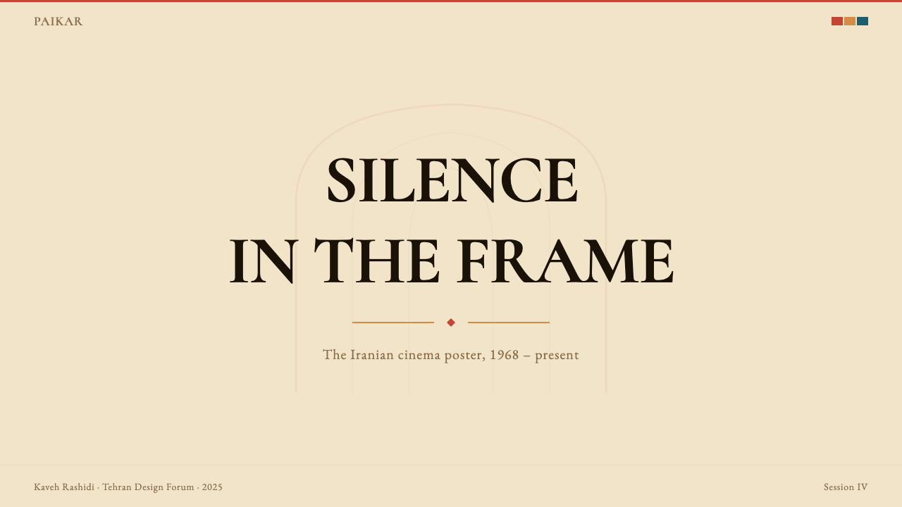
For presentation slides, the style is particularly effective for covers and section dividers rather than dense content pages. A cover built in this tradition might feature a single large calligraphic or geometric form — not necessarily an Arabic or Persian character, but any letterform treated with similar weight and isolation — positioned in the lower half of a parchment or warm cream ground, with the title in a serif face at a much smaller scale in the upper portion. Section dividers benefit from the same logic: one strong element, vast surrounding space, and a muted earth-tone field. Data and content slides should be simplified rather than fully styled — a clean grid with earth-tone accent lines and a warm background will complement cover material without competing with it.在演示文稿中,这种风格对封面与章节分隔页的效果尤为显著,而非密集的内容页。遵循这一传统构建的封面,可以呈现单一的大型书法或几何形态——不必是阿拉伯文或波斯文字符,任何以同等分量与孤立感处理的字形都可以——置于羊皮纸或温暖奶油色底面的下半部分,标题以衬线字体用小得多的尺度置于上方。章节分隔页适用同一逻辑:一个强劲元素、大量周围空间、一片静谧的大地色调底面。数据与内容页面应当简化而非完全套用风格——干净的网格配以大地色调强调线和温暖背景,将与封面素材形成互补而不产生竞争。
For web interfaces, the tradition translates most naturally into contexts where deliberate pacing and cultural seriousness are valued: cultural institution websites, art house cinema platforms, independent publisher pages, premium editorial products. Dashboard and pricing page applications are possible but require restraint — the style does not accommodate dense information architecture gracefully. When used for data-heavy screens, adopt the grid discipline without the deep negative space: warm background tones, serif or calligraphic-adjacent display type for headings, earth-tone accent colors for interactive states, and a light halftone texture applied sparingly to header areas.在网页界面设计中,这一传统最自然地转译为那些重视从容节奏与文化严肃性的语境:文化机构网站、文艺院线平台、独立出版社页面、高端编辑类产品。仪表板与定价页面的应用也是可能的,但需要极度克制——这种风格不能优雅地容纳密集的信息架构。当用于信息密集的屏幕时,采用网格纪律而不使用深度留白:温暖的背景色调、用于标题的衬线或近书法感展示字体、用于交互状态的大地色调强调色,以及克制地施用于标题区域的轻微半色调纹理。
For editorial and marketing work, the style is most powerful when given room to breathe. A full-page feature spread in this tradition might carry one dominant typographic element — a single word or phrase in a display face that occupies half the page — with body text set at a small scale in a generous margin. Marketing pages that need to convert should use the style's poster-like boldness selectively: a hero section built on these principles followed by more conventional content sections will make a strong first impression while remaining functionally accessible. Social cards and cover images are ideal applications — the constraint of a single fixed frame plays directly to the tradition's compositional strengths.在编辑与营销内容中,这种风格在获得充分呼吸空间时最为强大。遵循这一传统的整版专题版面,可能承载一个主导性的排版元素——单个词语或短语以展示字体占据半个页面——正文以小字号在宽阔的页边距中排布。需要转化的营销页面应当选择性地运用这种风格的海报式大胆感:以这些原则构建的英雄区域,接续以更为常规的内容区块,将产生强烈的第一印象同时保持功能可及性。社交媒体卡片与封面图像是理想的应用场景——单一固定画框的约束与这一传统的构图优势直接契合。
The most common mistake when applying this style is conflating earth tones with dullness and compensating by increasing saturation or adding more elements. The terracotta and ochre palette reads as richly warm rather than flat precisely because it is used against deep negative space and complemented by very dark type. Adding saturated accent colors, gradient overlays, or dense decorative patterning breaks the spell entirely. A second frequent error is using calligraphic forms purely decoratively — as background texture or ornamental frame — rather than as primary compositional structure. When calligraphy is decoration, the style loses its formal logic and becomes pastiche.应用这种风格时最常见的错误,是将大地色调等同于沉闷,并通过提高饱和度或添加更多元素来补偿。赤陶与赭石色板之所以读起来温暖而丰富而非平淡,正是因为它们被用于深度留白之中,并以极深的字体色补充。添加高饱和强调色、渐变叠加或密集装饰图案会彻底破坏这种魔力。第二个常见错误是将书法形态纯粹用作装饰——作为背景肌理或装饰框架——而非作为主要构图结构。当书法成为装饰,这种风格就失去了其形式逻辑,沦为仿制品。
See the Iranian Modernist Cinema Poster design system查看 Iranian Modernist Cinema Poster 完整设计系统
Iranian Modernist Cinema Poster — FAQIranian Modernist Cinema Poster · 常见问题
How does this style differ from other Middle Eastern or Islamic design traditions?这种风格与其他中东或伊斯兰设计传统有何区别?
The Iranian modernist cinema poster tradition is distinct in its explicit dialogue with Western modernism — particularly Swiss International Style and European constructivism — rather than developing from traditional Islamic decorative arts in isolation. Where traditional Islamic geometric ornament fills space densely and symmetrically, this tradition uses negative space aggressively and composes asymmetrically. The calligraphic forms are deployed with modernist structural logic — as primary compositional elements — rather than as surface decoration. The tradition also has a specifically secular, cinematic origin that distinguishes it from design produced in explicitly religious contexts.伊朗现代主义电影海报传统的独特之处,在于它与西方现代主义——特别是瑞士国际主义风格与欧洲构成主义——的明确对话,而非孤立地从传统伊斯兰装饰艺术发展而来。传统伊斯兰几何装饰以密集对称的方式填充空间,而这一传统则积极运用留白,并以非对称方式构图。书法形态以现代主义的结构逻辑部署——作为主要构图元素——而非作为表面装饰。这一传统还有其特定的世俗性、电影性起源,使它有别于在明确宗教语境中产生的设计。
Can this style be used without actual Persian or Arabic calligraphy?这种风格可以在没有真实波斯文或阿拉伯文书法的情况下使用吗?
Yes, and for many applications it is the appropriate choice. The core formal principles — earth-tone palette, monumental negative space, one or two primary visual elements given extreme scale prominence, tactile texture, grid structure with organic relief — can be applied using Latin, Chinese, or any other script. The key is treating the letterforms with the same architectural seriousness that Persian calligraphers brought to Nastaliq and Kufi: isolating them, giving them scale, and building the composition around their visual weight rather than treating them as labels to be accommodated. Using actual Persian calligraphy without genuine cultural knowledge risks inauthenticity; the structural principles transfer more reliably.可以,并且在许多应用场景中这是恰当的选择。核心形式原则——大地色调色板、纪念碑式留白、一两个获得极端尺度突显的主要视觉元素、触感质地、有机舒缓的网格结构——可以应用于拉丁文、中文或任何其他文字系统。关键在于以波斯书法家对待纳斯塔利克体与库法体的那种建筑严肃性来处理字形:将其孤立、赋予尺度,并围绕其视觉重量建构构图,而非将其视为需要被容纳的标签。在缺乏真实文化知识的情况下使用波斯书法有失真之虞;结构性原则则能更可靠地转移。
Why does this tradition favor parchment and warm grounds over white?为什么这一传统偏爱羊皮纸色和温暖底面而非白色?
The warm ground has both a material and a perceptual rationale. Materially, the uncoated papers commonly used for silk-screen printing in Tehran in the 1960s and 1970s were naturally warm-toned rather than optically brightened, so parchment cream became the natural baseline. Perceptually, a warm ground softens the contrast between ink and paper, creating a relationship that feels contemplative rather than confrontational — appropriate for cinema promoting work of formal seriousness. A pure white ground, by contrast, makes dark type and graphic elements feel more aggressive and immediate, which suits commercial advertising but conflicts with the tradition's meditative quality.温暖底面同时具有材料性与感知性的依据。在材料层面,1960至1970年代德黑兰丝网印刷常用的无涂层纸张本身就是温暖色调而非光学增白的,因此羊皮纸奶油色自然成为基础色。在感知层面,温暖的底面柔化了油墨与纸张之间的对比,创造出一种沉思而非对抗的关系——这对于宣传具有形式严肃性的电影作品是恰当的。相比之下,纯白底面使深色字体与图形元素感觉更具攻击性和即时性,这适合商业广告,但与这一传统的冥想品质相悖。
How do I avoid making this style feel dated or nostalgic rather than contemporary?如何避免让这种风格显得陈旧或怀旧,而非当代感?
The distinction lies in whether the historical references are being used structurally or decoratively. When the earth-tone palette, negative space discipline, and calligraphic scale are applied as genuine compositional principles — because they solve the specific design problem at hand — the result reads as contemporary design informed by a historical tradition. When the same elements are applied as a costume — adding halftone grain for atmosphere, using a calligraphic font as texture — the result reads as nostalgic pastiche. The functional test: does every element in the composition have a structural reason to be there? If calligraphic forms are present, they should be primary, not atmospheric. If texture is present, it should be integral, not applied.区别在于历史参照是被结构性地还是装饰性地使用。当大地色调色板、留白纪律与书法尺度作为真正的构图原则被应用——因为它们解决了当下具体的设计问题——结果呈现为受历史传统启发的当代设计。当同样的元素作为服装被穿上——为氛围添加半色调颗粒、将书法字体用作纹理——结果则呈现为怀旧的仿制品。功能性检验:构图中的每个元素是否都有其存在的结构理由?如果书法形态存在,它们应当是主要的,而非氛围性的。如果质感存在,它应当是有机融合的,而非外加的。
Is this style appropriate for digital products beyond visual design, such as UX writing or product voice?这种风格除了视觉设计,是否适用于更广泛的数字产品,例如用户体验文案或产品语调?
The values embedded in this visual tradition do suggest a corresponding approach to language and tone. A product that adopts this aesthetic sincerely is likely communicating authority, cultural seriousness, and an expectation that the audience will engage slowly and thoughtfully — rather than seeking instant gratification. UX writing in this register tends toward brevity and weight: fewer words, each chosen deliberately; no filler phrases or exclamation points; a preference for declarative statements over conversational hedging. The tradition's origins in cinema promotion also suggest a voice that is invitational rather than transactional — describing rather than selling, trusting the audience to draw their own conclusions.这套视觉传统所内嵌的价值观确实暗示了一种相应的语言与语调取向。真诚采用这种美学的产品,可能在传达权威性、文化严肃性,以及期待受众缓慢而深思熟虑地参与——而非寻求即时满足。这种语境下的用户体验文案倾向于简短有分量:更少的词语,每一个都经过刻意选择;没有填充性短语或感叹号;偏好陈述句而非对话式的模糊表达。这一传统起源于电影宣传的背景也暗示了一种邀请式而非交易式的声音——描述而非推销,信任受众得出自己的结论。
Related design styles相关设计风格
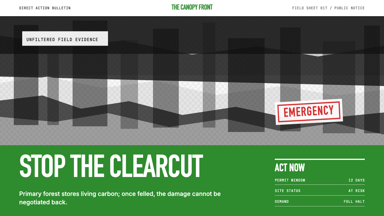 Greenpeace (Activist Poster)Protest without softness. Forest-green caps over monochrome newsprint, one de…抗议毫不柔化。森林绿大写字压住黑白画面,只留一个诉求。
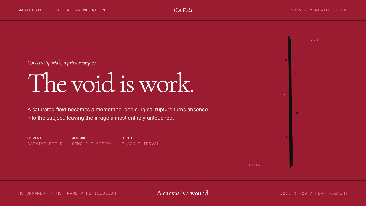 Spatialism (Fontana Cut, 1949)Absence becomes medium. Carmine field, Garamond restraint, one black incision.缺席成为媒介:胭脂红色场、Garamond克制排版、一道黑色切口。
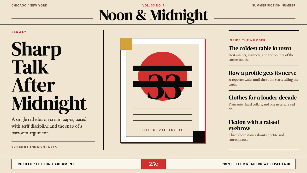 Esquire MagazineConceptual punch on paper. Cream stock, black hairlines, and one saturated re…纸上的观念重拳。米色纸、黑细线与一记饱和红。
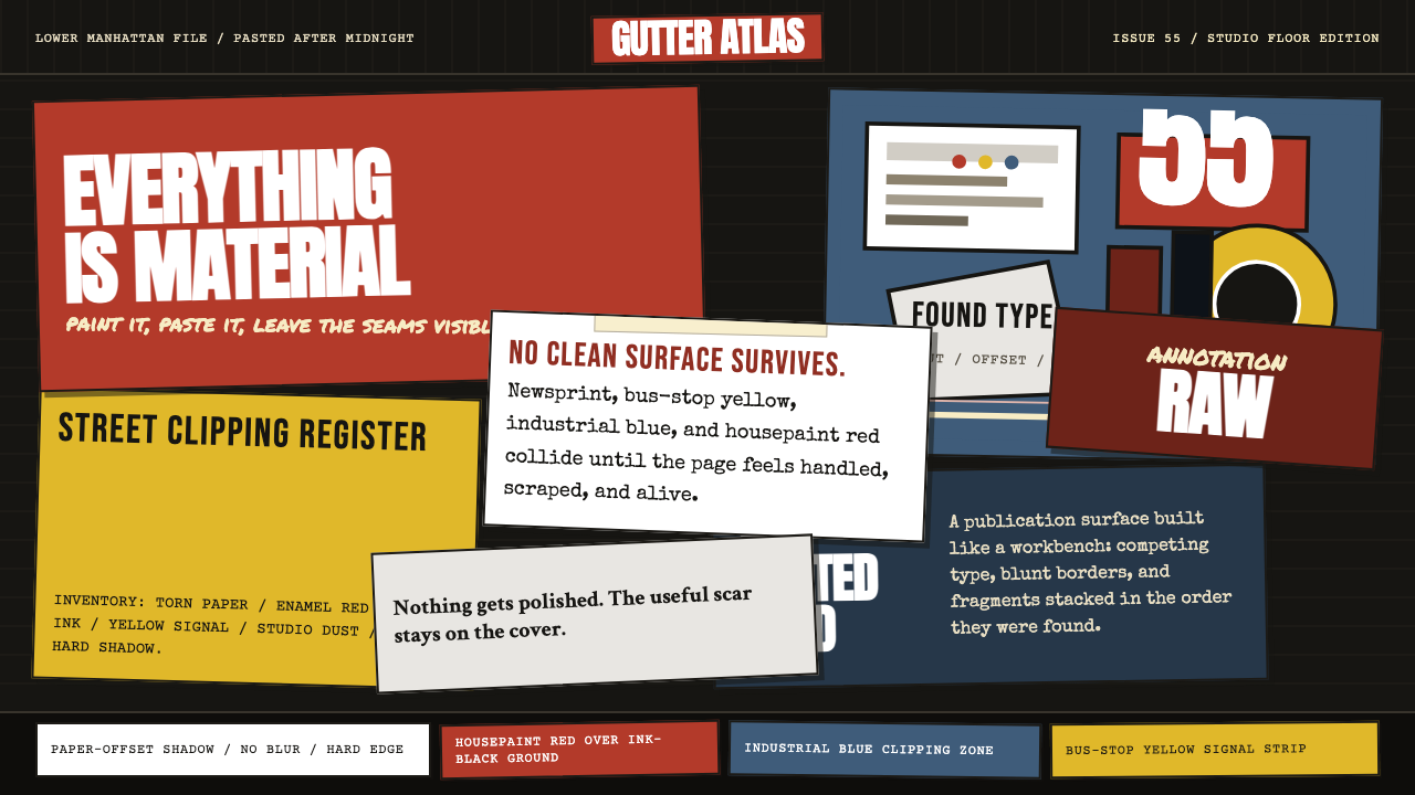 Rauschenberg Combine (1955)Street debris becomes syntax. Ink black, torn type, red-blue-yellow scraps co…街头残片成语法。墨黑底上,红蓝黄纸片与撕裂字体碰撞。
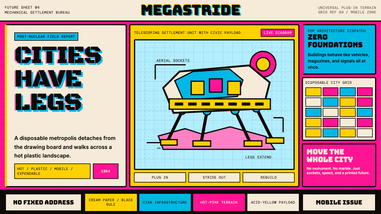 Archigram Walking City (1964)Cities refuse foundations. Hot pink, cyan, and acid yellow lock a bordered co…城市拒绝地基。热粉、青蓝与酸黄压进粗黑漫画格。
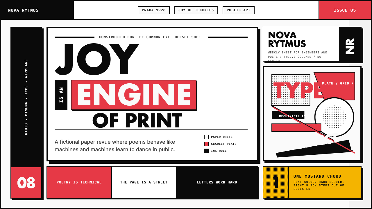 Czech Devětsil Avant-GardeJoy is engineered. Scarlet ink blocks and rotated sans type collide on an asy…欢愉被工程化:猩红墨块与旋转无衬线字撞上非对称网格。