What is Archigram Walking City (1964)?什么是 Archigram Walking City (1964)?
Archigram's Walking City imagined architecture as a living machine — giant mechanical organisms striding across continents on telescoping legs, making permanence itself obsolete.建筑电讯派的「行走城市」将建筑想象为活着的机器——巨型机械有机体用伸缩腿跨越大陆,令「永久性」这一概念彻底过时。
Archigram Walking City (1964) in briefArchigram Walking City (1964) 速览
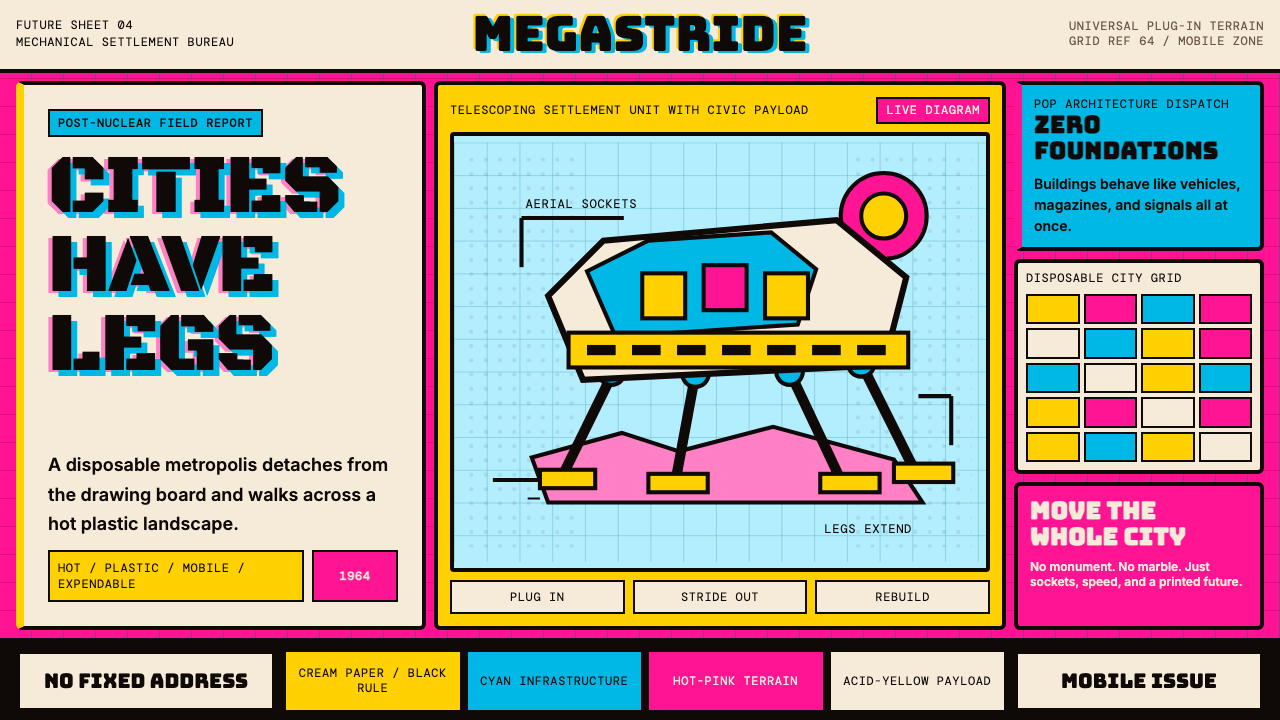
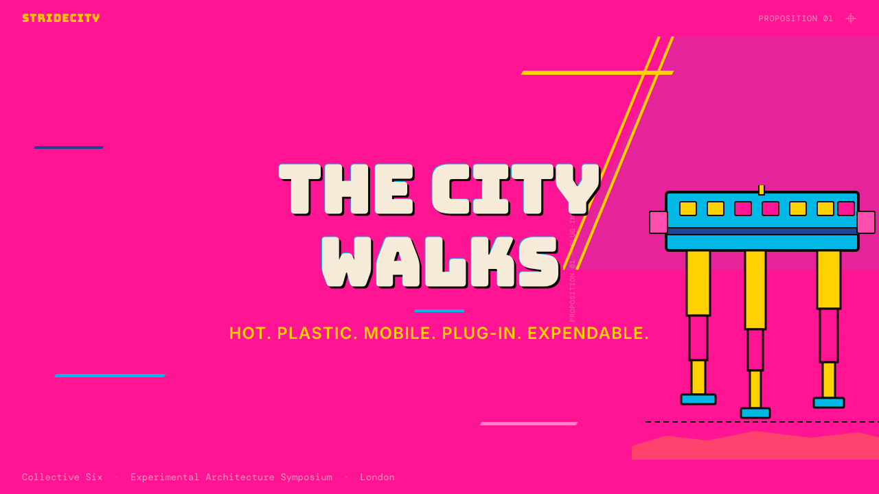
Archigram Walking City is the visual language derived from Ron Herron's landmark 1964 proposition for the British avant-garde collective Archigram — a speculative architecture in which entire cities are imagined as colossal, self-propelled machines: reptilian in silhouette, bristling with docking ports and service conduits, free to migrate across post-nuclear landscapes in search of resources or community. The aesthetic is not cool or minimalist. It is hot, dense, and deliberately excessive — a riot of saturated color, thick comic-book ink lines, collaged textures, and futurist display lettering that treats the printed page like a propaganda broadsheet for a civilization that does not yet exist.建筑电讯派「行走城市」是从罗恩·赫伦1964年里程碑式的构想中提炼出的视觉语言。在这一推测性建筑方案中,整座城市被想象为庞大的自走式机器:侧影如爬行动物,密布对接舱口与服务管道,能够在后核时代的荒原上自由迁徙,追寻资源或社群。这套美学并不冷静、不极简——它炽热、密集、刻意地过剩:饱和色彩的狂欢,厚重的漫画墨线,拼贴质感,以及未来主义展示字体,将印刷页面视作一个尚不存在的文明的宣传大字报。
Where most architectural drawing systems prioritize precision and restraint, Archigram's visual method borrows directly from mid-century science-fiction paperbacks, American pop art, and the graphic energy of the British magazine tradition. Compositions are packed to the edges. Multiple color families — hot pink, electric cyan, acid yellow, vivid orange — coexist without mediating neutrals, separated only by the thick black borders that recall both comic-strip panels and the bold outlines of Roy Lichtenstein. Type is large, chunky, and unapologetically decorative, treated as a graphic object on equal footing with the drawn machinery.大多数建筑绘图体系追求精确与克制,而建筑电讯派的视觉方法则直接借鉴了二十世纪中叶的科幻平装书、美国波普艺术以及英国杂志传统的图形能量。构图填满至边缘,毫无余地。热粉红、电子青、酸性黄、鲜橙等多个色彩家族并置共存,不设中性过渡色,仅以厚重黑色边框隔开——这种边框既让人联想到漫画分格,也令人想起罗伊·利希滕斯坦那些粗轮廓线。文字巨大、粗壮、毫不掩饰地具有装饰性,被视为与绘制机械平等的图形对象。
As a design system, Walking City codifies these qualities into transferable visual conventions: a palette of simultaneous saturated hues anchored by heavy black line-work, comic-grid spatial organization, a preference for collage over clean illustration, and lettering that performs rather than merely labels. The aesthetic communicates optimism about technology, impatience with convention, and a pop-cultural conviction that architecture — and by extension any designed artifact — should be expendable, upgradeable, and above all alive.作为设计系统,「行走城市」将这些特质编纂为可移植的视觉惯例:以厚重黑色线稿锚定的多组饱和色同时并置、漫画网格式空间组织、以拼贴代替整洁插图的偏好,以及「表演」而非仅仅「标注」的字体文字。这套美学传达出对技术的乐观、对惯例的不耐,以及一种波普文化信念:建筑——乃至任何被设计的物——都应当是可消耗的、可升级的,最重要的是,是活着的。
See the Archigram Walking City (1964) design system查看 Archigram Walking City (1964) 完整设计系统
Where does Archigram Walking City (1964) come from?Archigram Walking City (1964) 从何而来?
Archigram was founded in London in 1961 by a group of young architects — Peter Cook, Warren Chalk, Ron Herron, Dennis Crompton, Michael Webb, and David Greene — who shared a conviction that postwar British architecture had become timid, bureaucratic, and spiritually exhausted. They launched a mimeographed magazine, also called Archigram, distributing it free through architecture schools. The name fused 'architecture' and 'telegram' — the idea being that architecture should communicate with the urgency and directness of a wire transmission rather than the solemn ceremony of a stone monument. The magazine's visual style, from the first issue, was aggressive and collage-heavy, drawing on comic books, space-race imagery, consumer advertising, and the saturated graphic pop of swinging London.建筑电讯派于1961年在伦敦由一群年轻建筑师创立——彼得·库克、沃伦·查克、罗恩·赫伦、丹尼斯·克朗普顿、迈克尔·韦伯与大卫·格林——他们共同确信:战后英国建筑已变得怯懦、官僚化、精神上精疲力竭。他们推出了一份油印杂志,同样名为《Archigram》,免费发放于各建筑院校。这个名字融合了「建筑」(architecture)与「电报」(telegram)——其含义是:建筑应当以电报传输的紧迫感与直接性进行交流,而非石头纪念碑那样庄严的仪式感。这份杂志从第一期起,视觉风格便极具攻击性,拼贴感浓厚,从漫画书、太空竞赛图像、消费广告以及摇摆伦敦那饱和的图形波普中汲取养分。
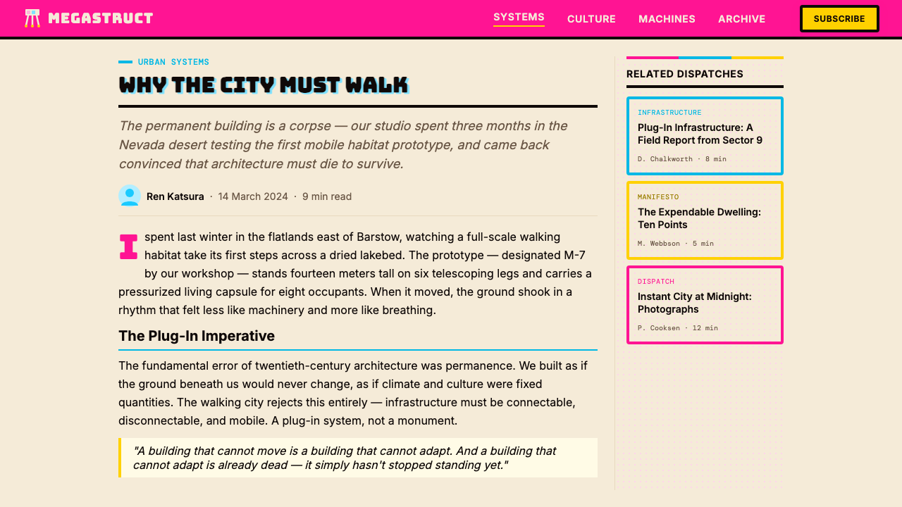
Ron Herron's Walking City appeared in Archigram issue nine in 1964. The drawings depict clusters of enormous insectoid structures — each housing a complete city — wading through water or striding across open terrain. The machine-cities have eyes, joints, and what appear to be sensory antennae; they read simultaneously as architecture, vehicle, and creature. Herron rendered them in the magazine's characteristic technique: tight pen-and-ink linework overlaid with flat areas of bold color, photographic collage fragments, and typographic elements that bleed across the image's edges. The proposition was intentionally provocative: if buildings could walk, then land ownership, national borders, zoning laws, and the entire apparatus of permanent urban settlement were suddenly contingent rather than inevitable.罗恩·赫伦的「行走城市」出现于1964年的《Archigram》第九期。这批图纸描绘了成群的巨型昆虫状结构——每一个容纳一整座城市——涉水而行或跨越开阔地形。这些机器城市有眼睛、关节,以及看起来像感知天线的突起;它们同时被读作建筑、载具与生物。赫伦以杂志的特有技法呈现它们:细密的钢笔线稿叠加大面积粗犷色块、摄影拼贴碎片,以及溢出图像边缘的字体元素。这一构想刻意具有挑衅性:如果建筑可以行走,那么土地所有权、国家边界、分区法规,以及整套永久性城市定居的装置,将突然变得是偶然的而非不可避免的。
The cultural context was crucial. 1964 was the year of the Tokyo Olympics, the launch of the Bullet Train, the first unmanned Ranger spacecraft reaching the Moon, and the height of the British pop explosion. Technology felt genuinely revolutionary rather than incremental, and the generation who had grown up during the Second World War were impatient to replace what they saw as the ruins — both physical and conceptual — of the old world. Archigram absorbed the visual language of this moment: the space suit and the pop record sleeve, the systems diagram and the comic panel, the industrial component catalog and the psychedelic poster.文化背景至关重要。1964年是东京奥运会之年,也是新干线开通、首枚无人驾驶「游侠号」探测器抵达月球、英国波普爆炸高峰的年份。技术感觉真正是革命性的而非渐进的,那一代在二战期间成长的年轻人迫不及待地想要替换他们眼中旧世界的废墟——无论是物质的还是概念的。建筑电讯派吸收了这一时刻的视觉语言:宇航服与流行唱片封套、系统图表与漫画分格、工业零件目录与迷幻招贴。
Walking City became the most widely reproduced image Archigram ever produced, appearing in architectural journals worldwide and eventually entering museum collections. The collective never built a Walking City — the proposition was always speculative, operating as critique rather than blueprint. But the visual system that Herron and his colleagues developed to express this vision proved enormously influential: it fed directly into the high-tech architecture movement of the 1970s and 1980s, shaped the graphic sensibility of magazines like Wired in its early years, and can be traced in the saturated, collage-forward aesthetics of contemporary digital design, festival branding, and speculative product visualization.「行走城市」成为建筑电讯派有史以来传播最广的图像,出现在全球建筑期刊,并最终进入博物馆馆藏。这个集体从未真正建造过行走城市——这一构想始终是推测性的,作为批判而非蓝图运作。但赫伦与同僚为表达这一愿景所发展出的视觉系统,证明了极为深远的影响:它直接滋养了1970至80年代的高技派建筑运动,塑造了早期《连线》杂志的图形感性,并可在当代数字设计、节日品牌视觉以及推测性产品可视化那些饱和、拼贴前置的美学中被追溯到。
What defines the Archigram Walking City (1964) look?Archigram Walking City (1964) 的视觉特征是什么?
Simultaneous Saturated Color饱和色同时并置
Unlike design systems that assign a single hero color, Walking City deploys multiple fully saturated hues side by side: hot pink, electric cyan, acid yellow, vivid orange, and deep red can all appear within the same composition without any neutral buffer. The colors do not harmonize in the conventional sense — they collide. This simultaneity is intentional, borrowed from pop art's assault on tasteful restraint. The palette reads as hot, urgent, and synthetic, communicating technological optimism rather than craft refinement.与只指定单一主色的设计系统不同,「行走城市」将多种充分饱和的色相并排展开:热粉红、电子青、酸性黄、鲜橙与深红可以在同一构图中同时出现,之间无任何中性缓冲。这些色彩不以惯常方式和谐相处——它们相互碰撞。这种并置是刻意的,源自波普艺术对「有品味的克制」的攻击。这套色板读来是炽热的、紧迫的、合成的,传达的是对技术的乐观,而非工艺的精进。
Heavy Comic-Book Line Work厚重漫画墨线
Every element — architectural forms, typographic blocks, image fragments, decorative borders — is outlined or contained by heavy black strokes of consistent substantial weight. This line-work serves multiple functions: it separates collaged fragments that would otherwise blur together, it gives the composition a graphic boldness that reads at distance, and it explicitly references the comic-book panel tradition that Archigram claimed as legitimate architectural discourse. The lines are not delicate engineering marks; they are declarative, ink-press-heavy, and slightly imprecise.每个元素——建筑形态、字体块面、图像碎片、装饰边框——都以重量一致的厚重黑色笔触勾勒或框定。这种线稿承担多重功能:它分隔那些否则会模糊融合的拼贴碎片,赋予构图在远处也能辨读的图形力度,并明确援引了建筑电讯派声称为合法建筑话语的漫画分格传统。这些线条不是精密的工程标注;它们是宣示性的、如印刷油墨般厚重的,且略带不精确感。
Pop Collage Density波普拼贴密度
Walking City compositions are typically packed to their edges with heterogeneous material: rendered mechanical drawings, photographic fragments, typographic elements, graphic patterns, and abstract color fields overlap without hierarchy or breathing room. This collage density is not a failure of organization but a deliberate statement — it mirrors the information overload of mass media and celebrates rather than apologizes for the visual noise of modern industrial culture. Empty space is treated as waste; every zone of the composition carries content.「行走城市」的构图通常将异质材料填塞至边缘:渲染的机械图纸、摄影碎片、字体元素、图形纹样与抽象色域相互叠压,无层级,无喘息空间。这种拼贴密度并非组织失败,而是刻意的陈述——它镜像了大众媒体的信息过载,并以此庆祝现代工业文化的视觉噪音而非为之道歉。空白被视为浪费;构图的每一区域都承载内容。
Futurist Display Type未来主义展示字体
Typography in the Walking City system is not a supporting element but a co-equal visual actor. Letters are large, often chunky and condensed, drawn or set in display faces that evoke space-age lettering, industrial stencils, or the bold sans-serifs of mid-century science fiction. Type is frequently arranged at angles, stacked vertically, or allowed to overlap imagery. The relationship between letterform and image is deliberately ambiguous — text performs pictorially, and pictures carry textual weight.「行走城市」系统中的字体排印不是辅助元素,而是平等的视觉主体。字母巨大,通常粗壮而窄缩,以展示字体绘制或排列——这些字体令人联想到太空时代的铭文、工业模板字或二十世纪中叶科幻小说的粗黑无衬线体。文字频繁以倾斜角度排布、垂直叠列,或被允许与图像叠压。字形与图像之间的关系是刻意模糊的——文字以图画方式表演,图像承担文字的重量。
Mechanical-Organic Silhouette机械有机轮廓
The characteristic drawn forms in Walking City imagery fuse mechanical components — telescoping legs, hydraulic cylinders, docking collars, ribbed conduits — with biological silhouettes: the overall shape reads as crustacean, insectoid, or reptilian even as every detail is explicitly engineered. This hybrid vocabulary communicates the proposition that technology and nature are not opposed categories but continuous ones. In design applications, this translates to forms that feel simultaneously industrial and alive, angular in component but curved and creature-like in overall mass.「行走城市」图像中的特征性绘制形态融合了机械部件——伸缩腿、液压缸、对接领环、带肋管道——与生物轮廓:整体形状读来像甲壳类、昆虫或爬行动物,即便每一细节都是明确工程化的。这套混合词汇传达了一个命题:技术与自然并非对立范畴,而是连续的。在设计应用中,这转化为一种既感觉工业化又感觉活着的形态——部件是棱角分明的,但整体体量是弯曲的、生物般的。
Comic-Grid Spatial Organization漫画网格空间组织
Rather than the clean column grids of Swiss-style design or the asymmetric balance of Bauhaus composition, Walking City layouts use the comic-book panel as their structural model. Content is distributed across bordered rectangular zones of varying sizes, some cinematic and horizontal, others narrow and tall. These panels can bleed into each other, share borders, or be interrupted by large typographic elements. The reading path is active rather than passive — the viewer is invited to scan, jump, and re-enter rather than read linearly.「行走城市」版面不采用瑞士风格的整洁栏网格或包豪斯构图的非对称平衡,而以漫画分格作为空间结构的模型。内容分布在大小不一的带边框矩形区域中,有些像宽银幕般水平展开,另一些则窄而高耸。这些分格可以相互渗透、共享边框,或被大型字体元素打断。阅读路径是主动的而非被动的——观者被邀请扫视、跳跃、重新进入,而非线性阅读。
Expendability as Aesthetic Value「可消耗性」作为美学价值
Archigram explicitly theorized that buildings — and by extension designed artifacts — should be expendable: replaceable, upgradeable, pluggable, and free of the pretension to permanence. This philosophy manifests visually as a rejection of timeless refinement in favor of vivid immediacy. The aesthetic does not aspire to age gracefully. It is deliberately of-the-moment, synthetic, and somewhat disposable in the way a magazine or a pop record is disposable — which is to say, it communicates with maximum force at first encounter.建筑电讯派明确提出理论:建筑——乃至被设计的物——都应当是可消耗的:可替换、可升级、可插拔,摆脱对永久性的自命不凡。这一哲学在视觉上表现为对永恒精致的拒绝,代之以鲜活的即时性。这套美学不追求优雅地老去。它刻意是「当下时刻的」、合成的,并在某种程度上像一本杂志或一张流行唱片那样是可丢弃的——也就是说,它在第一次相遇时以最大力度传达信息。
See the Archigram Walking City (1964) design system查看 Archigram Walking City (1964) 完整设计系统
Who shaped Archigram Walking City (1964)?谁塑造了 Archigram Walking City (1964)?
Herron was the primary author of the Walking City drawings, producing the iconic series of images that would define the Archigram collective's most famous proposition. A trained architect who worked at the London County Council before joining Archigram, Herron brought technical drafting precision into direct collision with comic-book visual culture. His pen-and-ink technique — meticulous in mechanical detail, explosive in graphic composition — established the visual template that Walking City as a design system inherits. After Archigram dissolved, Herron continued to practice and teach architecture, and his drawings entered the permanent collection of the Museum of Modern Art in New York.赫伦是「行走城市」系列图纸的主要作者,创作了那批将定义建筑电讯派最著名构想的标志性图像。他是一名受过专业训练的建筑师,在加入建筑电讯派之前曾在伦敦郡议会工作,他将技术制图的精确性与漫画书视觉文化直接碰撞在一起。他的钢笔线稿技法——机械细节一丝不苟,图形构图爆炸性强烈——确立了「行走城市」作为设计系统所继承的视觉模板。建筑电讯派解散后,赫伦继续从事建筑实践与教学,他的图纸进入了纽约现代艺术博物馆的永久馆藏。
Cook was Archigram's most prolific theorist and editor, responsible for the overall direction of the magazine and for propositions including Plug-In City — a megastructure in which standardized dwelling capsules could be inserted into or removed from a permanent infrastructure framework. Cook's thinking shaped the ideological context from which Walking City emerged: the conviction that architecture should embrace the consumer economy's logic of planned obsolescence rather than resist it. He later became a professor at the Bartlett School of Architecture in London, carrying Archigram's speculative spirit into decades of architectural education.库克是建筑电讯派最多产的理论家与编辑,负责杂志的整体方向,并提出了「插接城市」等构想——一种标准化居住舱可以被插入或从永久性基础设施框架中移除的巨构建筑。库克的思想塑造了「行走城市」得以诞生的意识形态语境:即建筑应当拥抱消费经济的「计划性淘汰」逻辑,而非抵制它。他后来成为伦敦巴特莱特建筑学院的教授,将建筑电讯派的推测精神带入了数十年的建筑教育。
Chalk brought to Archigram a particular interest in the aesthetics of technology derived from NASA's space program and the emerging consumer electronics industry. He was drawn to the visual language of capsules, pods, and systems components, and his influence can be seen in the Walking City's treatment of its structural elements as readable, almost catalogued parts. Chalk co-edited several Archigram issues and developed the Capsule Homes proposal, which imagined standardized living units as consumer products to be selected and replaced like any other durable good.查克为建筑电讯派带来了一种对技术美学的特殊兴趣,这种兴趣源自美国宇航局的太空计划与新兴的消费电子产业。他被舱体、吊舱与系统零部件的视觉语言所吸引,他的影响可以在「行走城市」对其结构元素的处理上看到——那些元素被呈现为可辨读的、几乎像目录条目般的零部件。查克参与了多期《Archigram》的联合编辑,并发展出「胶囊住宅」提案,将标准化居住单元想象为可以像任何其他耐用品一样被选择和替换的消费产品。
Crompton served as the technical and archival backbone of Archigram, managing much of the practical production of the magazine and later becoming the primary custodian of the collective's archive. His Computer City proposal from 1964 — produced in the same period as Walking City — imagined urban infrastructure as a giant information-processing network, anticipating themes that would only become culturally legible decades later with the rise of networked computing. Crompton's interest in systems thinking and information graphics gave Archigram a rigor beneath its pop-art exuberance.克朗普顿担任建筑电讯派的技术与档案支柱,负责杂志大量的实际制作工作,后来成为集体档案的主要管理人。他在1964年——与「行走城市」同期——提出的「计算机城市」构想,将城市基础设施想象为一个巨大的信息处理网络,预见了数十年后联网计算兴起才使文化上得以理解的主题。克朗普顿对系统思维与信息图形的兴趣,在建筑电讯派的波普艺术喧嚣之下赋予了它一种严谨性。
How do you use Archigram Walking City (1964) today?今天怎么用 Archigram Walking City (1964)?
Archigram Walking City is a high-energy, intentionally confrontational aesthetic that works best when the goal is to communicate ambition, technological optimism, or forward-looking irreverence. Applying it correctly means embracing its density and saturation rather than trying to soften or modernize them — the system's power comes precisely from its refusal to be tasteful in the conventional sense.建筑电讯派「行走城市」是一套高能量、刻意具有对抗性的美学,最适合用于传达雄心、技术乐观主义或前瞻性的不羁姿态。正确应用它意味着拥抱其密度与饱和度,而非试图柔化或现代化——这套系统的力量恰恰来自它对惯常「有品味」的拒绝。
For presentation slides, Walking City's visual language transforms both cover and content pages into graphic statements. A cover page benefits from the full treatment: multiple saturated color fields divided by heavy black rules, a title set in a chunky display typeface at commanding scale, and collaged imagery or diagrammatic elements that fill space aggressively. Content slides work best when designed as comic-grid layouts — bordered panels of varying proportion containing text, data, or imagery, with the borders themselves functioning as structural elements rather than mere dividers. Data visualizations take on a diagrammatic authority in this aesthetic: charts and graphs become components of a larger mechanical diagram, with fills drawn from the hot saturated palette.在演示文稿中,「行走城市」的视觉语言将封面页与内容页都转化为图形陈述。封面页适合完整呈现:多组饱和色域以厚重黑色直线分割,标题以粗壮展示字体设定在压倒性的尺度,拼贴图像或示意图元素积极填满空间。内容页以漫画网格版式设计效果最佳——带边框、比例各异的分格容纳文字、数据或图像,边框本身作为结构性元素而非仅仅是分隔线。数据可视化在这套美学中获得示意图式的权威感:图表与曲线图成为更大机械图表的组件,以热饱和色板的颜色填充。
For web interfaces and digital dashboards, Walking City's vocabulary is most effective on pages designed to project confidence and vision rather than quiet utility. A pricing page or product hero section built in this system might use vivid color blocking to separate tiers or features, with heavy bordered cards replacing conventional soft-shadow components. Navigation and labels are set in bold, display-weight type. Interactive states — hover, active, selected — use color shifts within the saturated palette rather than opacity changes. The aesthetic is not suited to long-form reading contexts; reserve it for high-impact surfaces.对于网页界面与数字仪表板,「行走城市」的词汇在那些旨在投射信心与愿景而非平静实用性的页面上最为有效。以这套系统构建的定价页面或产品主推区域,可以用鲜艳色块分隔等级或功能,以重边框卡片替代惯常的软阴影组件。导航与标签以粗体、展示字重的字体排列。交互状态——悬停、激活、选中——在饱和色板内部进行色彩移位而非不透明度变化。这套美学不适合长篇阅读语境;将其保留给高冲击力的页面表面。
For editorial and marketing work, Walking City excels at festival branding, speculative product launches, technology event identities, and any context where the message is explicitly about futures rather than present comfort. A poster or social card in this system packs its visual field: a dominant mechanical or abstract form occupies the center or bleeds off an edge, surrounded by typographic elements and color panels at the full saturation of the palette. Marketing campaigns gain distinction from the aesthetic's rarity — very few brands commit to this level of visual intensity, so those that do stand out immediately.对于编辑与营销工作,「行走城市」在节日品牌视觉、推测性产品发布、技术活动视觉识别,以及任何信息明确关于未来而非当下舒适的语境中大放异彩。这套系统中的海报或社交卡片填满其视觉场域:一个主导性的机械或抽象形态占据中心或出血至边缘,被字体元素与色板以色板的完整饱和度环绕。营销活动因这套美学的稀缺性而获得区分度——极少有品牌愿意承担这种视觉强度,因此那些愿意的品牌会立即脱颖而出。
A common mistake when applying Walking City is treating the saturated palette as license for visual chaos without underlying structure. Archigram's original compositions, however dense, are always organized by the comic-grid logic: each panel has a clear function, the heaviest black lines establish the primary reading order, and the largest typographic element anchors the hierarchy. The second common error is softening the palette — introducing gradients, muted versions of the hues, or gentle shadows in an attempt to make the style more contemporary. This reliably destroys what makes the aesthetic distinctive. Walking City is not a style that benefits from tasteful editing; it requires full commitment to its own logic.应用「行走城市」时最常见的错误,是将饱和色板理解为没有底层结构的视觉混沌的许可。建筑电讯派的原始构图,无论多么密集,始终由漫画网格逻辑组织:每个分格都有清晰的功能,最重的黑色线条确立主要阅读顺序,最大的字体元素锚定层级。第二个常见错误是柔化色板——引入渐变、色相的低饱和版本,或轻柔阴影,试图使风格更为当代。这可靠地摧毁了使这套美学与众不同的要素。「行走城市」不是一种受益于「有品味编辑」的风格;它需要对自身逻辑的全盘承诺。
See the Archigram Walking City (1964) design system查看 Archigram Walking City (1964) 完整设计系统
Archigram Walking City (1964) — FAQArchigram Walking City (1964) · 常见问题
Is Walking City just pop art applied to architecture, or is there a distinct visual system?「行走城市」只是波普艺术在建筑上的应用,还是有一套独特的视觉系统?
There is a distinct visual system, though it draws heavily on pop-art conventions. The key difference is that Walking City's visual vocabulary is explicitly in service of architectural and spatial propositions — the mechanical forms, service conduits, and structural diagrams are not purely decorative but carry the argument that buildings should be understood as machines and cities as organisms. The comic-book language is chosen because Archigram believed architectural drawing had become too specialized and exclusionary; the pop format was a political choice as much as an aesthetic one. The resulting visual system has specific conventions — simultaneous saturated color, heavy bordered panels, display-weight type, collage density — that are transferable to other design contexts while remaining recognizably distinct from generic pop art.这是一套独特的视觉系统,尽管它大量借鉴了波普艺术惯例。关键区别在于,「行走城市」的视觉词汇明确服务于建筑与空间命题——机械形态、服务管道与结构图表并非纯装饰性的,而是承载着「建筑应被理解为机器、城市应被理解为有机体」这一论证。漫画书语言之所以被选择,是因为建筑电讯派相信建筑制图已变得过于专业化和排他性;波普形式是一种政治选择,与其说是美学选择。由此形成的视觉系统具有特定惯例——饱和色同时并置、厚边框分格、展示字重字体、拼贴密度——这些可移植至其他设计语境,同时保持与泛化波普艺术的明显区别。
Can this aesthetic work for a professional or corporate context, or does it only suit countercultural brands?这套美学能用于专业或企业语境吗,还是只适合反文化品牌?
Walking City works in professional contexts when the professional aspiration is explicitly to signal disruption, frontier-thinking, or technological boldness — sectors like deep tech, space industry, synthetic biology, and advanced manufacturing have successfully adopted elements of this aesthetic because the visual intensity matches the genuine ambition of the work. It fails in contexts where trust, warmth, or institutional authority are primary values: legal services, healthcare, traditional financial institutions, or government communications. The test is whether the organization's actual proposition is as extreme as the aesthetic — if the visual makes a promise the product cannot keep, the mismatch reads as posturing.「行走城市」在专业语境中的有效前提,是该专业抱负明确旨在传达颠覆性、前沿思维或技术胆魄——深度科技、太空产业、合成生物学、先进制造等领域曾成功采纳这套美学的元素,因为视觉强度与工作的真实雄心相匹配。它在信任感、温暖感或机构权威是核心价值的语境中则会失败:法律服务、医疗健康、传统金融机构或政府传播。检验标准是:该组织的实际主张是否与美学一样极端——如果视觉许诺了产品无法兑现的承诺,这种错配会被读为摆姿态。
How does Walking City differ from the Memphis design aesthetic?「行走城市」与孟菲斯设计美学有何区别?
Both aesthetics are saturated, anti-minimalist, and deliberately reference popular culture, but they diverge in tone and origin. Memphis (emerging from Milan in 1981) is playful, decorative, and domestically scaled — its geometric forms are surface patterns applied to furniture and objects, its color combinations are chosen for surprise and visual pleasure, and its underlying mood is ironic and postmodern. Walking City is industrial, spatial, and ideologically earnest — its visual density is in service of a genuine architectural argument, its mechanical forms are meant to be taken seriously as propositions about how cities might work, and its mood is optimistic rather than ironic. Memphis patterns are additive; Walking City structures are diagrammatic. One feels like a fun party; the other feels like a manifesto.两套美学都是饱和的、反极简的,并刻意援引流行文化,但在基调与起源上存在分歧。孟菲斯(1981年兴起于米兰)是游戏性的、装饰性的、家居尺度的——其几何形态是应用于家具与物件表面的纹样,色彩组合是为了惊喜与视觉愉悦而选择的,底层情绪是反讽的与后现代的。「行走城市」是工业性的、空间性的、意识形态上认真的——其视觉密度服务于一个真正的建筑论证,其机械形态是作为关于城市如何运作的严肃命题而非装饰被提出的,情绪是乐观的而非反讽的。孟菲斯纹样是叠加性的;「行走城市」结构是示意图式的。一个感觉像派对,另一个感觉像宣言。
What happens if I use this style with a light, airy layout rather than the dense packed composition?如果我用轻盈、通透的版面而非密集的填满式构图来应用这种风格,会怎样?
You lose the essential character of the style while retaining only its most superficial markers. Walking City's power comes from the tension of simultaneous competing elements — the density is not incidental but structural, communicating the idea that more is possible, that the world is fuller than conventional design allows for. A sparse layout with Walking City colors and type will simply look like generic pop-influenced design with a loud palette. If airy composition is what the project needs, a different design system will serve better. The Walking City aesthetic is not adjustable in that direction without fundamental compromise; it should be applied fully or not at all.你将失去这种风格的核心特质,只保留其最表面的标志。「行走城市」的力量来自同时并置的竞争元素之间的张力——密度不是偶然的而是结构性的,它传达了「可能性更多、世界比惯常设计所允许的更充盈」这一理念。一个稀疏版面即便使用「行走城市」的色彩与字体,看起来也只是带着嘈杂色板的泛化波普影响设计。如果项目需要通透的构图,另一套设计系统会更适合。「行走城市」美学在那个方向上不可调整而不做根本妥协;它应该被完整应用,或者根本不应用。
Is Walking City historically a print-only aesthetic, or can it translate to digital and motion contexts?「行走城市」历史上只是印刷美学,还是能转化到数字与动态语境中?
The original Walking City work was entirely print-based — magazine pages, exhibition panels, architectural drawings. But the aesthetic translates well to digital and motion contexts, partly because its visual conventions map naturally onto digital constraints and partly because motion can amplify the sense of mechanical life that is latent in Herron's drawings. In motion design, the heavy black bordered panels can open like mechanical joints; the saturated color fields can shift and transition with a mechanical decisiveness that avoids soft easing. In digital interfaces, the comic-grid panel logic is actually well-suited to responsive layout — panels resize and reorder the way capsules dock and undock from a megastructure. The key constraint in motion is to avoid the soft, organic easing curves of contemporary interface animation in favor of hard cuts, snap transitions, and mechanical timing.原始「行走城市」作品完全是印刷媒介的——杂志页面、展览板、建筑图纸。但这套美学能很好地转化到数字与动态语境中,一方面是因为其视觉惯例能自然映射到数字限制上,另一方面是因为动态可以放大赫伦图纸中潜藏的机械生命感。在动态设计中,厚重黑边框的分格可以像机械关节一样展开;饱和色域可以以机械的决断性移位与过渡,避免柔和缓动。在数字界面中,漫画网格分格逻辑实际上非常适合响应式布局——分格的缩放与重排就像舱体从巨构中对接和脱离。动态中的关键限制是:避免当代界面动画那些柔和的有机缓动曲线,代之以硬切、卡扣式过渡与机械化的时间节奏。
Related design styles相关设计风格
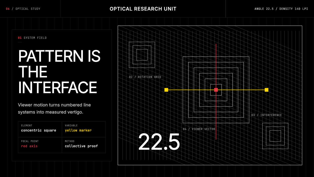 GRAV Op-Kinetic (1960)Vertigo by calculation. White line fields on black, with red and yellow as co…以计算制造眩晕。黑底白线场中,红与黄是受控变量。
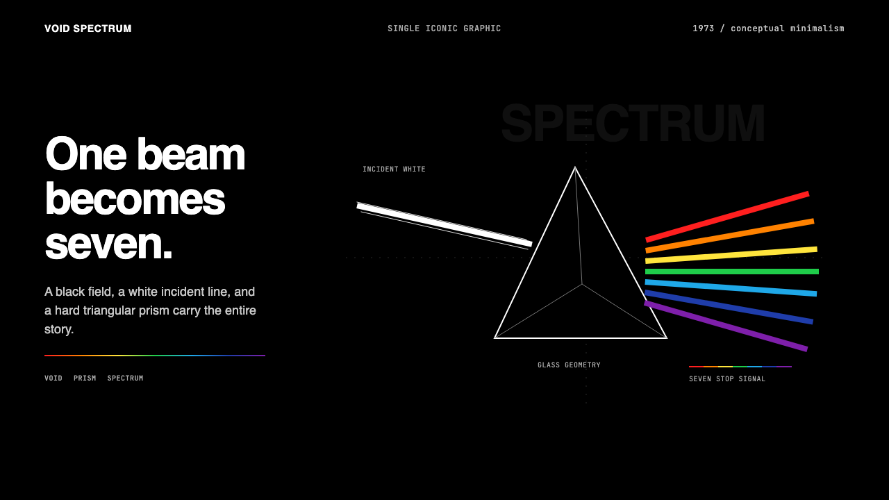 Pink Floyd — Dark Side of the MoonOne image does everything. Black void, white beam, hard prism, seven exact co…一个图像完成全部:黑色虚空、白光、硬棱镜与七色光谱。
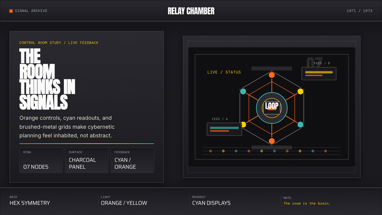 Cybernetic 1968 (Stafford Beer)Mission-control severity. Charcoal panels, orange buttons, cyan readouts, hex…控制室般冷峻。炭黑面板、橙按钮、青读数与六边环形。
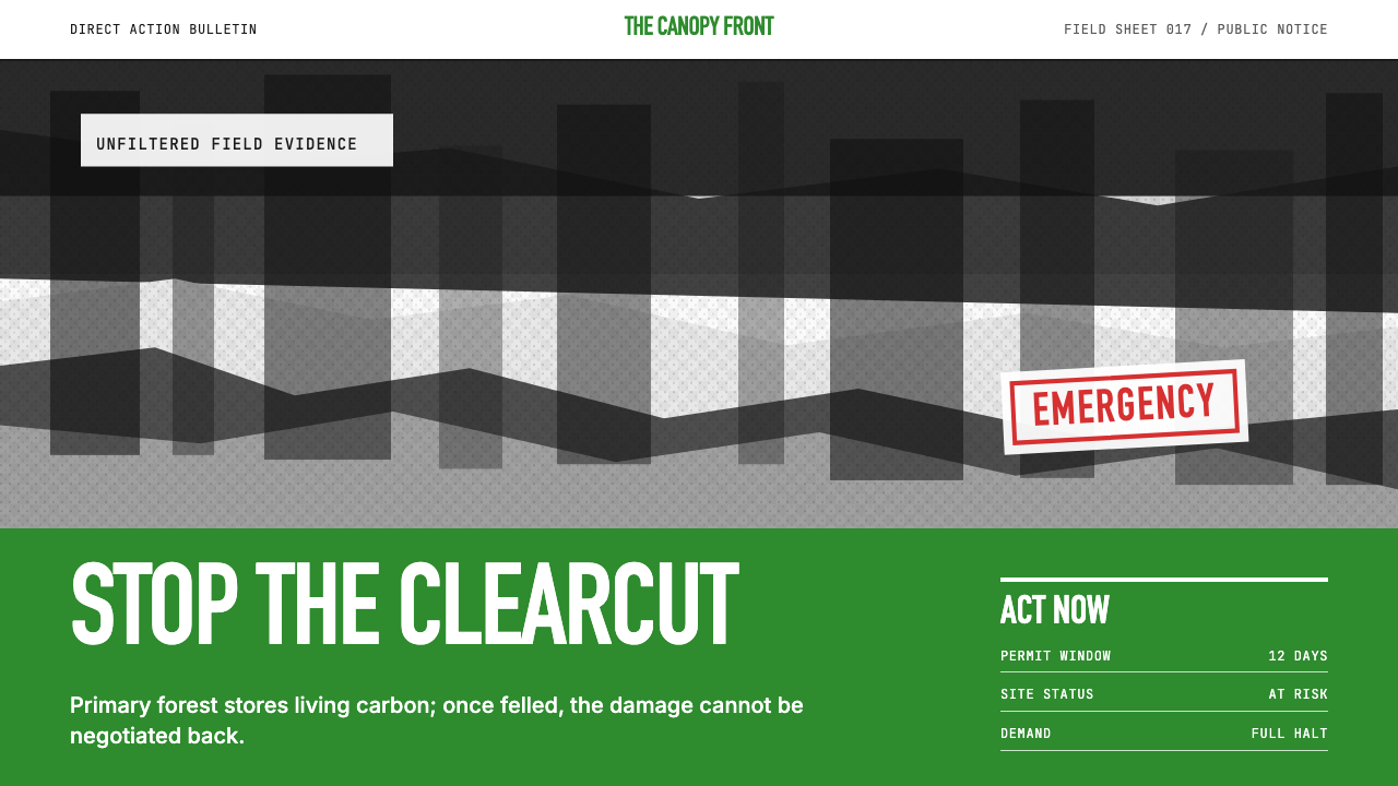 Greenpeace (Activist Poster)Protest without softness. Forest-green caps over monochrome newsprint, one de…抗议毫不柔化。森林绿大写字压住黑白画面,只留一个诉求。
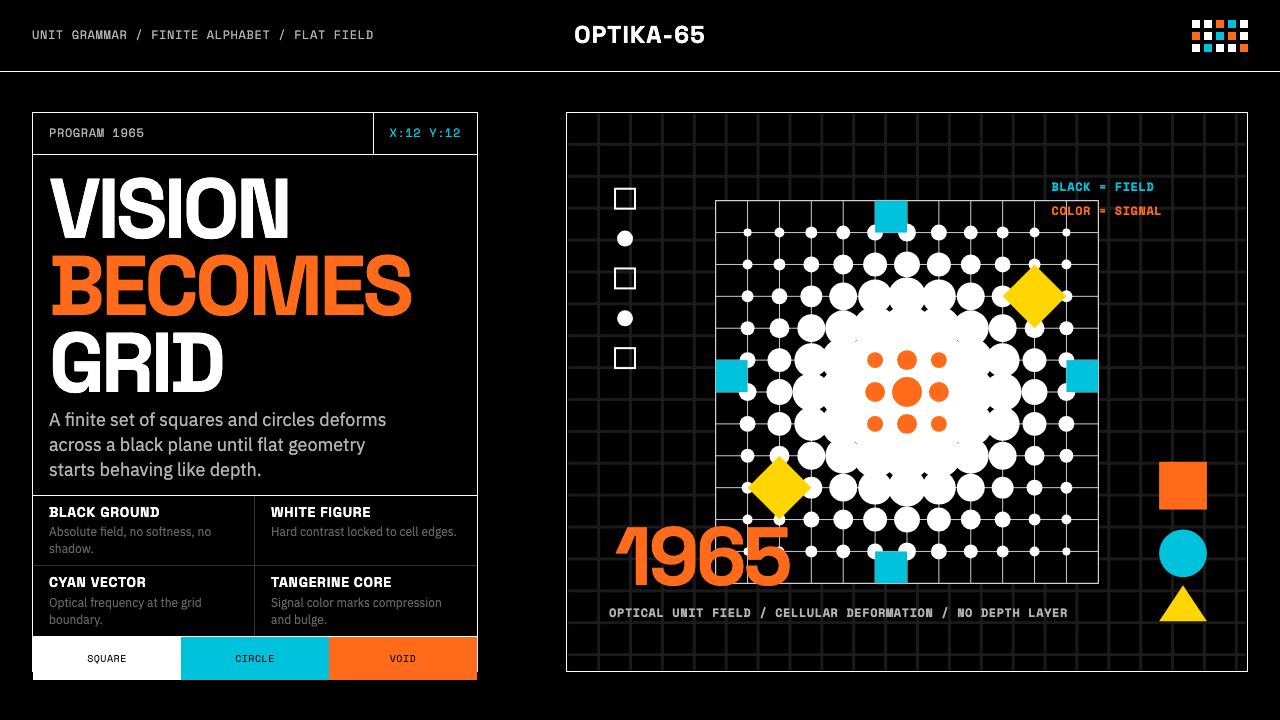 Hungarian Vasarely Op Art (1965)Mathematics makes vision pulse. Black grids, white units, cyan and tangerine…数学让视觉脉动:黑底白格与青橘单元扭曲深度。
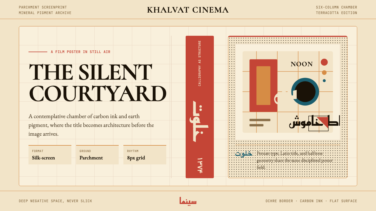 Iranian Modernist Cinema PosterStillness becomes monumental. Terracotta Kufi type breathes inside a Swiss pa…静默成碑。赤陶库法字在羊皮纸瑞士网格中呼吸。