What is Greenpeace (Activist Poster)?什么是 Greenpeace (Activist Poster)?
Greenpeace's visual language is protest stripped to bone — one black-and-white photograph, one all-caps demand, and forest green that refuses to negotiate.绿色和平的视觉语言是抗议剥至骨髓的形态——一张黑白照片、一行全大写的控诉,以及那抹拒绝妥协的森林绿。
Greenpeace (Activist Poster) in briefGreenpeace (Activist Poster) 速览
Greenpeace Activist Poster is a visual system built entirely on urgency. Its grammar is borrowed from newspaper front pages and wheatpasted street posters rather than from design studios: a single devastating photograph in monochrome, a condensed all-capitals headline that functions as a demand rather than a description, and a controlled palette of forest green, pure white, and deep black. The result is design that communicates before it is read.绿色和平活动家海报是一套完全建立在紧迫感之上的视觉系统。它的语法借自报纸头版和街头张贴海报,而非设计工作室:一张单色处理的震撼纪实照片、一行功能是控诉而非描述的压缩全大写标题,以及由森林绿、纯白与深黑构成的受控色板。结果是一种在被阅读之前便已完成传达的设计。
The style's discipline is enforced by moral conviction rather than aesthetic preference. Every element that is present must earn its place by serving the message. There is no illustration, no background pattern, no softening gradient. When photography appears — and it almost always does — it is treated as testimony: raw, high-contrast, cropped to eliminate everything that does not serve the argument.这套风格的纪律由道德信念而非审美偏好所强制执行。每一个出现的元素必须通过服务信息来证明自身存在的正当性。没有插图,没有背景图案,没有柔化的渐变。当摄影出现时——它几乎总是出现的——照片被当作证词对待:原始、高对比度,裁切至只剩下服务于论点的部分。
What makes the system coherent across five decades of campaigning is its consistency under pressure. Whether the poster demands an end to whaling, warns of rainforest loss, or calls attention to Arctic ice melt, the visual logic is identical. Recognition is instant precisely because the style never accommodates or compromises. That refusal is itself the message.让这套系统在五十年的运动中保持连贯的,是它在压力下的一致性。无论海报要求终结捕鲸、警示雨林消失,还是呼唤对北极冰盖融化的关注,视觉逻辑始终如一。这种即时辨识性,恰恰源于这种风格从不妥协、从不顺应的特质。那种拒绝本身,即是信息。
See the Greenpeace (Activist Poster) design system查看 Greenpeace (Activist Poster) 完整设计系统
Where does Greenpeace (Activist Poster) come from?Greenpeace (Activist Poster) 从何而来?
Greenpeace was founded in Vancouver in 1971 by a small group of activists — among them journalist Bob Hunter, Quaker pacifist Jim Bohlen, and Irving Stowe — who chartered a fishing vessel to protest United States nuclear testing at Amchitka Island off the Alaskan coast. They brought no professional designer. The visual material from that first voyage was made of necessity: hand-lettered protest signs, photocopied leaflets, and photographs taken aboard the boat. The graphic aesthetic was not chosen; it was imposed by circumstance, equipment, and urgency.绿色和平于1971年在温哥华由一小群活动人士创立——其中包括记者鲍勃·亨特、贵格会和平主义者吉姆·博伦与欧文·斯托——他们租用一艘渔船,前往阿拉斯加海岸外的阿姆奇特卡岛,抗议美国的核试验。他们没有带任何专业设计师。第一次航行中产生的视觉材料完全出于必要:手写的抗议标语、复印的传单,以及在船上拍摄的照片。这套图形美学不是经过选择的;它是被处境、设备与紧迫感所强加的。
That accidental visual vocabulary — black-and-white documentary photography, bold handwritten or stenciled lettering, white paper as the only available ground — proved extraordinarily durable. In the years that followed, as Greenpeace mounted campaigns against commercial whaling, toxic dumping, and nuclear testing in the Pacific, the poster format remained the primary communication tool. The style evolved from handmade urgency into a reproducible system, but it preserved the raw quality of its origins: it continued to look like evidence rather than advertising.这套偶然形成的视觉语言——黑白纪实摄影、粗体手写或模板印刷的文字、白纸作为唯一可用的底面——被证明具有非凡的持久力。在随后的岁月中,随着绿色和平展开反对商业捕鲸、有毒物质倾倒与太平洋核试验的运动,海报格式始终是主要的传播工具。这套风格从手工制作的紧迫感演变为可复制的系统,但它保留了起源时的原始品质:它继续看起来像证据,而非广告。
The forest-green color identity emerged and solidified through the 1970s and 1980s as Greenpeace grew from a regional group into an international organization with offices across Europe and eventually a global headquarters in Amsterdam. Green was not chosen for its cultural or aesthetic resonance alone; it functioned as an immediate visual claim on the territory of environmental concern at a moment when that territory was contested. The color was distinctive enough to own and simple enough to reproduce cheaply on banners, stickers, and newsprint.森林绿的色彩身份在1970至1980年代随着绿色和平从一个地区性团体成长为跨越欧洲、最终在阿姆斯特丹设立全球总部的国际组织而逐渐确立。绿色的选择不仅出于文化或审美共鸣;在环境议题的话语权仍处于争夺之际,它作为一种即时的视觉宣示发挥着功能。这种颜色鲜明到足以被独占,又简单到可以在横幅、贴纸和新闻纸上廉价复制。
By the late 1980s and through the 1990s, Greenpeace began working with professional design and advertising partners — including the Amsterdam agency KesselsKramer — who codified and extended the visual system without abandoning its essential character. The collaboration produced campaign material that was more formally rigorous but retained the confrontational directness of the original wheatpasted posters. The aesthetic had moved from protest artifact to recognizable global brand, yet it continued to function on the same emotional register: alarm, demand, witness.进入1980年代末至1990年代,绿色和平开始与专业设计及广告合作伙伴合作——包括阿姆斯特丹的KesselsKramer广告公司——这些合作者在不放弃其本质特征的前提下,对这套视觉系统进行了规范化与延伸。合作产出的运动物料在形式上更为严谨,但保留了原始张贴海报的正面交锋式直接性。这套美学已从抗议产物演变为可识别的全球品牌,却继续运作在同一情感频段上:警报、诉求、见证。
What defines the Greenpeace (Activist Poster) look?Greenpeace (Activist Poster) 的视觉特征是什么?
Color色彩
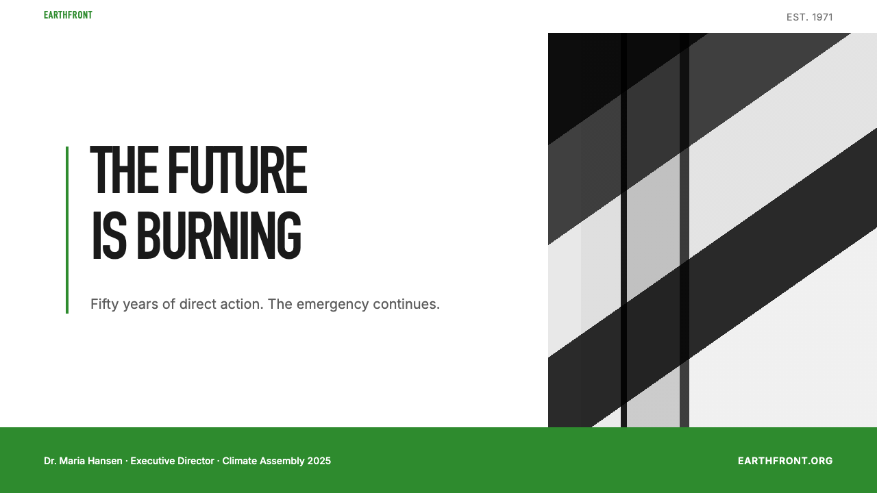
The palette is built around a single vivid accent — a deep, saturated forest green — set against fields of pure white and reinforced by an absolute black used for photographic content and typography. No secondary palette exists. No warm tones, no graduated hues, no neutrals introduced for softness. The green functions simultaneously as brand identification, environmental claim, and visual signal: it has the quality of a warning sign rather than a decorative choice. When the green appears against a white ground in combination with black photography, it achieves the visual weight of a headline.色板围绕单一的鲜明强调色构建——一种深沉、饱和的森林绿——铺设于纯白色场之上,并由用于摄影内容与文字排印的纯黑加以强化。没有第二色板。没有暖调、没有渐变色相、没有引入以柔化效果的中性色。森林绿同时承载品牌辨识、环境诉求与视觉信号三重功能:它具有警示标志的品质,而非装饰性的选择。当绿色在白底上与黑白摄影并置时,它实现了标题级别的视觉重量。
Photography as Argument摄影作为论据
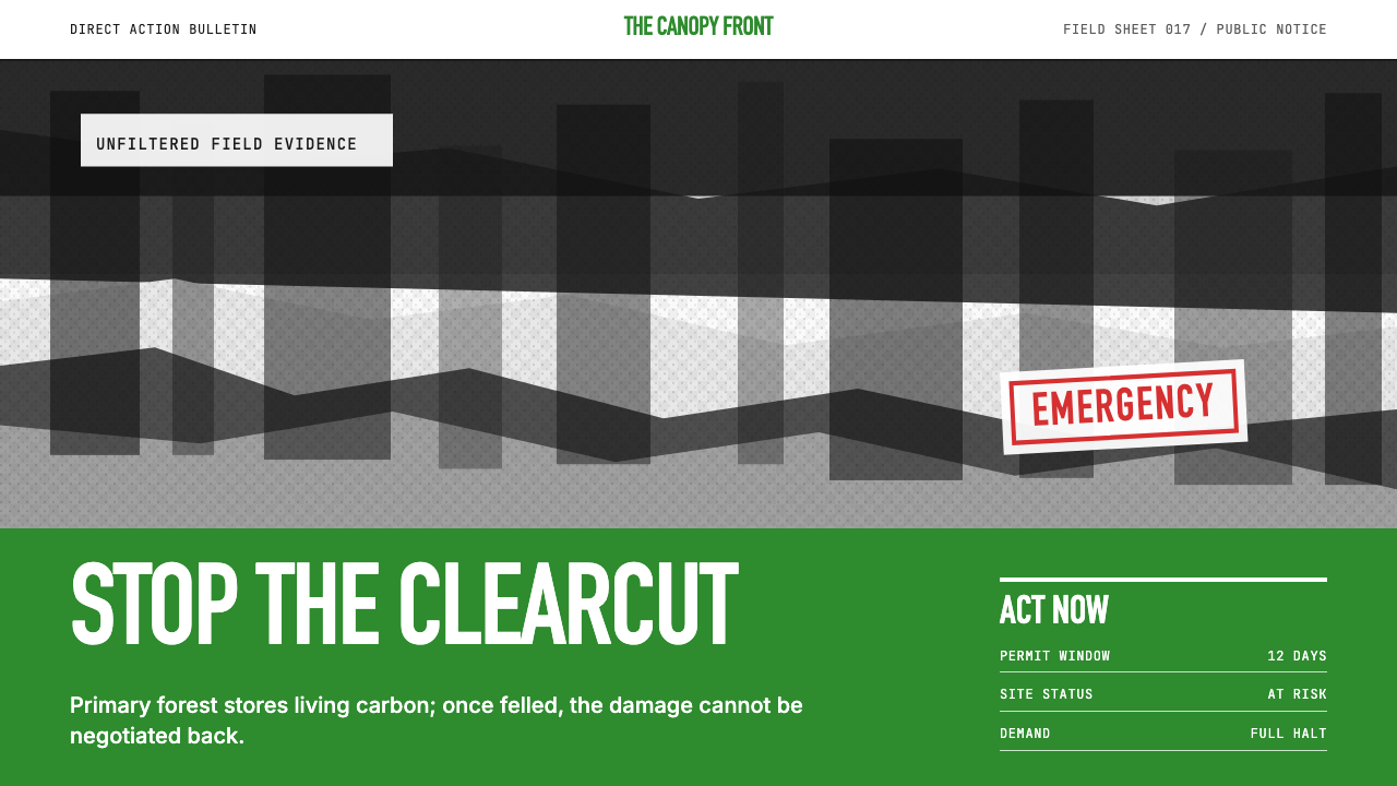
Documentary photography is not decoration in this system — it is the primary load-bearing element. Images are always monochromatic, always high-contrast, and always chosen for their capacity to produce discomfort: a whale's body being processed on a factory ship, oil-blackened seabirds, a clearcut hillside. The photograph is cropped to foreground the subject with maximum impact, eliminating context that might dilute the argument. Photography functions as testimony: the image is evidence that the injustice exists, and the headline names it.在这套系统中,纪实摄影不是装饰——它是主要的承重元素。图像始终是单色处理的,始终是高对比度的,并且始终以其产生不适感的能力作为选择标准:鲸鱼的躯体正在工厂船上被处理、被石油染黑的海鸟、被皆伐后光秃秃的山坡。照片被裁切以最大冲击力将主体置于前景,消除一切可能稀释论点的背景。摄影作为证词运作:图像是不公正存在的证据,标题则将其命名。
Typography字体排印
All caps condensed letterforms dominate the headline register. The type is set heavy and large — occupying as much real estate as the image itself in the most confrontational compositions — and it reads more as shout than statement. Body text, where it appears, is set small and in plain upright roman: its role is to specify and document, not to compete. The typographic contrast between the massive headline and subordinate copy is extreme by design, mirroring the editorial logic of a breaking news front page. Serif forms appear rarely; the style defaults to bold, industrial grotesque shapes.全大写压缩字形主导标题层级。字体排印粗重而巨大——在最具对抗性的构图中,它与图像本身占据同等面积——读起来更像呼喊而非陈述。正文(若有)以小号直立罗马体排印:其作用是具体说明与记录,而非竞争注意力。巨型标题与从属正文之间的排版对比极为悬殊,这是经过设计的,镜像了突发新闻头版的编辑逻辑。衬线字体极少出现;这套风格默认选用粗重、工业感的无衬线哥特式字形。
Zero Ornament零装饰
There is no decorative element in the Greenpeace poster tradition that does not serve the argument. No borders, no background textures, no illustrative flourishes, no color fills applied for visual interest. The white space is not negative space in the design-school sense — it is the natural ground of newsprint and protest paper, the material context the style emerged from. Any element present is either the photograph or the text. This absolute discipline means that small additions — a single colored rule, a logo lockup — read at full weight because nothing competes with them.在绿色和平的海报传统中,不存在任何不服务于论点的装饰元素。没有边框、没有背景纹理、没有装饰性线条、没有为视觉趣味而填充的色块。空白不是设计学校意义上的负空间——它是新闻纸和抗议用纸的自然底面,是这套风格从中生长出来的材料语境。存在的每一个元素,不是照片就是文字。这种绝对的自律意味着微小的添加——一条有色线条、一个标志组合——都以完整的重量被阅读,因为没有任何东西与之竞争。
Scale and Confrontation尺度与对抗
The style is engineered for legibility at distance. Its origins in street-posted paper and protest banners demanded that the core message read at a run, across a crowded street, or from a moving vehicle. This origin requirement shaped the compositional logic: one dominant image, one dominant headline, maximum contrast at every junction. The contemporary application of this principle produces work that retains its legibility when scaled to a phone screen or reduced to a social media thumbnail, because the essential information was never more complex than a photograph and five words.这套风格是为远距可读性而设计的。它源于街头张贴海报和抗议横幅,这些媒介要求核心信息在奔跑中、在拥挤街道的另一侧、或从行进中的车辆上依然可读。这一原始要求塑造了构图逻辑:一个主导图像,一行主导标题,每个交界处实现最大对比。这一原则的当代应用产出的作品在缩放至手机屏幕或缩减为社交媒体缩略图时依然保持可读性,因为其核心信息从来没有比一张照片加五个字更复杂。
Green-on-White Lockup绿白组合锁定
The canonical Greenpeace composition positions the green element — logo, headline in a green field, or a green bar — as an anchor against the white ground, with the photographic content occupying a distinct zone. This lockup is so consistent that the forest-green-plus-white combination alone, without any text, evokes the organization and its cause. The color pairing is exclusive rather than welcoming: it asserts ownership of a territory rather than inviting participation in a community.绿色和平的经典构图将绿色元素——标志、绿底白字的标题或绿色色条——定位为白色底面上的锚点,摄影内容占据另一个独立区域。这种组合锁定如此一致,以至于森林绿与白色的搭配单独出现、不含任何文字,便能唤起对该组织及其事业的联想。这种色彩配对是排他性的而非欢迎性的:它宣示对一片领地的所有权,而非邀请人们加入一个社群。
Single-Demand Clarity单一诉求的清晰性
Every campaign poster in this tradition is organized around one demand, one image, one moment of moral clarity. There is no secondary message, no subhead hedging the argument, no supporting bullet points softening the ask. This is not a limitation of the format — it is the format's governing principle. A poster that makes two demands makes none; a headline that qualifies its claim loses the authority of a demand. The visual system enforces the rhetorical discipline: the single clear frame is all it accommodates.这一传统中的每一张运动海报都围绕一个诉求、一张图像、一个道德清明的瞬间组织。没有副信息,没有对主要论点进行折中的副标题,没有柔化诉求的支撑要点。这不是格式的局限——它是格式的支配性原则。提出两个诉求的海报等于一个都没提出;对自身主张有所保留的标题失去了诉求的权威。视觉系统强制执行修辞纪律:单一清晰的框架是它所容纳的全部。
See the Greenpeace (Activist Poster) design system查看 Greenpeace (Activist Poster) 完整设计系统
Who shaped Greenpeace (Activist Poster)?谁塑造了 Greenpeace (Activist Poster)?
Hunter was a Vancouver journalist and one of Greenpeace's founders who understood from the outset that the organization's power depended as much on image-making as on direct action. His concept of the 'mind bomb' — a single image or action so arresting that it lodged permanently in public consciousness — became the organizing principle of Greenpeace's visual communication. The photographs taken during the 1975 anti-whaling campaign in the Pacific, which showed inflatable boats positioned between harpoons and whales, are among the most consequential environmental images ever made, and they embody Hunter's theory that the right image at the right moment changes minds more effectively than any argument.亨特是温哥华记者,也是绿色和平的创始人之一,他从一开始就明白:这个组织的力量在同等程度上依赖图像制造与直接行动。他提出的「心灵炸弹」概念——一张图像或一次行动,其震撼力足以永久嵌入公众意识——成为绿色和平视觉传播的组织性原则。1975年太平洋反捕鲸运动中拍摄的照片——充气艇被置于鱼叉与鲸鱼之间——是有史以来最具影响力的环境图像,它们体现了亨特的理论:正确时机的正确图像比任何论点更有效地改变人心。
Bohlen, a Quaker and Sierra Club activist, co-founded Greenpeace with a conviction that nonviolent direct action could force media coverage of environmental destruction that was otherwise being ignored. His background in the American civil-rights movement and anti-Vietnam War protest shaped Greenpeace's understanding that visual documentation of confrontation was not an adjunct to activism but its primary vehicle. The organization's early habit of bringing photographers on every action — ensuring that the resulting images would be available to wire services and newspapers — was a strategic choice that Bohlen helped establish and that defined the organization's visual culture for decades.博伦是一位贵格会教徒和塞拉俱乐部活动人士,他以非暴力直接行动能够迫使媒体关注正被忽视的环境破坏这一信念共同创立了绿色和平。他在美国民权运动和反越战抗议中形成的背景,塑造了绿色和平对对抗的视觉记录不是行动主义的附属品、而是其主要载体这一认识。该组织早期在每次行动中带上摄影师——确保由此产生的图像可供通讯社和报纸使用——是博伦帮助确立的战略选择,并在此后数十年间定义了该组织的视觉文化。
Stowe was a Yale-educated lawyer and Quaker who brought to the founding of Greenpeace the tradition of Quaker testimony — the practice of placing one's body in visible witness against injustice. This concept of physical witness shaped the organization's understanding of what a photograph should do: it should show the witness, show the injustice, and make the viewer unable to claim ignorance. The visual language that emerged from Greenpeace's early campaigns — particularly the insistence on unretouched, documentary-style photography — carries Stowe's Quaker conviction that the truth, plainly shown, is persuasive enough on its own.斯托是一位受过耶鲁教育的律师和贵格会教徒,他为绿色和平的创立带来了贵格会见证的传统——将自己的身体置于对不公正的可见见证中的实践。这种身体见证的概念塑造了组织对照片应当做什么的理解:它应当展示见证者,展示不公正,并让观看者无法声称自己不知情。绿色和平早期运动中形成的视觉语言——尤其是对未经修饰的纪实风格摄影的坚持——承载着斯托的贵格会信念:真相,被坦率地展示,本身就具有足够的说服力。
The Amsterdam-based creative agency KesselsKramer worked with Greenpeace International on several major campaigns from the 1990s onward, helping the organization translate its rawer protest-poster tradition into a more formally consistent global visual system without stripping out the confrontational quality that gave the aesthetic its authority. Their contribution was structural: they applied professional art-direction discipline — tighter typographic hierarchies, more precise compositional grids — while maintaining the foundational commitments to monochrome photography, single-demand clarity, and the green-white-black palette. Their work demonstrates how an activist aesthetic can be professionalized without being domesticated.总部位于阿姆斯特丹的创意机构KesselsKramer从1990年代起与绿色和平国际合作多个重大运动,帮助该组织将其较为原始的抗议海报传统转化为更具形式一致性的全球视觉系统,同时未剥去赋予这套美学以权威的对抗性品质。他们的贡献是结构性的:他们引入了专业的美术指导纪律——更严谨的排印层级、更精确的构图网格——同时维持了对单色摄影、单一诉求清晰性与绿白黑色板的根本承诺。他们的工作展示了一种活动家美学如何能够被专业化而不被驯化。
Weyler was a photographer and journalist who joined Greenpeace in the mid-1970s and documented the anti-whaling campaigns in the Pacific with images that became central to the organization's visual identity. His photographs of crew members in inflatable boats directly confronting whaling vessels — taken at sea, in rough conditions, without controlled lighting — established the aesthetic template for Greenpeace campaign photography: participatory, present, unmediated. These images were distributed to news organizations worldwide and appeared on front pages that in turn became the model for the organization's own poster design, cementing the relationship between documentary news photography and activist visual communication.韦勒是一位摄影师和记者,于1970年代中期加入绿色和平,用成为该组织视觉身份核心的图像记录了太平洋的反捕鲸运动。他拍摄的充气艇上的船员直面捕鲸船的照片——在海上、在恶劣条件下、没有受控光线的情况下拍摄——为绿色和平的运动摄影建立了美学模板:参与性的、在场的、无中介的。这些图像被分发给全球各地的新闻机构,出现在反过来又成为该组织自身海报设计范本的头版上,巩固了纪实新闻摄影与活动家视觉传播之间的关系。
How do you use Greenpeace (Activist Poster) today?今天怎么用 Greenpeace (Activist Poster)?
The Greenpeace Activist Poster style is most effectively applied in contexts where the goal is to produce immediate emotional impact and to position the communicator as unambiguous in their stance. It is a style of moral authority, not of persuasion: it does not coax or invite, it declares. Applied correctly, it works exceptionally well for cause-driven campaigns, advocacy organizations, impact reports, and any communication where the audience is expected to take a side. It also functions well for thought-leadership content that needs to stand out sharply in visually crowded feeds or inboxes — its high contrast and typographic boldness make it legible and arresting even at small screen sizes.绿色和平活动家海报风格最有效地适用于目标是产生即时情感冲击、并将传播者定位为立场明确的语境。它是一种道德权威的风格,而非说服的风格:它不哄骗、不邀请,它宣告。正确应用时,它在事业驱动的运动、倡导组织、影响力报告,以及任何期待受众选边站队的传播中表现出色。它也适用于需要在视觉拥挤的信息流或收件箱中脱颖而出的思想领导力内容——其高对比度与排版粗重感使其即便在小屏幕尺寸下也清晰可辨且引人注目。
For presentation slides, the style works best on advocacy decks, annual impact reports, and campaign launches where urgency is the appropriate register. Cover slides should use a full-bleed monochrome photograph with a high-contrast overlay panel — white or forest-green — carrying a single capitalized headline. The image should be chosen for emotional weight rather than pictorial beauty. Content slides should strip the layout to a minimum: one key finding per slide, presented in the largest readable type that fits without crowding, with supporting data treated as caption rather than body copy. Avoid multi-column text layouts and avoid decorative dividers; let the white space and typographic scale do the work of hierarchy.对于演示文稿,这种风格在倡导演示、年度影响力报告以及紧迫感是恰当基调的运动发布场合中表现最佳。封面幻灯片应使用全出血单色摄影,叠加一个高对比度的面板——白色或森林绿——承载单行大写标题。图像的选择应以情感重量而非画面美感为标准。内容幻灯片应将版面精简至最低限度:每张幻灯片一个关键发现,以不造成拥挤的最大可读字号呈现,配套数据作为图注而非正文处理。避免多栏文字布局和装饰性分割线;让空白和排版尺度承担层级建立的工作。
For web interfaces, this style applies most naturally to awareness pages, campaign landing pages, pricing pages where a single offer is being made, and modal overlays communicating critical information. The approach requires committing to a high-contrast foundation: near-black backgrounds or pure-white grounds, with forest green reserved for primary calls to action or urgent state indicators. Navigation elements should be typographic and stripped of decorative icons. Hero sections should use full-width photographic content treated in high-contrast monochrome, overlaid by the headline in the largest weight and size the layout can support. Dashboard interfaces can borrow the palette for alert and status systems — the green-white-black combination is immediately readable as a state signal — but the full confrontational register of the style is too demanding for sustained data-reading contexts.对于网页界面,这种风格最自然地适用于意识唤醒页、运动落地页、只提供单一方案的定价页,以及传达关键信息的弹窗覆盖层。这种方式要求承诺于高对比度基础:近黑色背景或纯白底面,森林绿保留给主要的行动号召或紧急状态指示器。导航元素应当是字体性的,去除装饰性图标。主视觉区应使用全宽摄影内容、经高对比度单色处理,叠加版面能够承载的最大字重和字号的标题。仪表板界面可以借鉴这套色板用于警报和状态系统——绿白黑组合作为状态信号具有极强的即时可读性——但这种风格完整的对抗性基调对于持续数据阅读的场景过于要求苛刻。
For editorial and marketing work, the style is powerful for materials that need to project conviction and authority: white papers, advocacy newsletters, social media campaign graphics, and print or digital advertising that makes a single bold claim. A Greenpeace-derived editorial layout pairs an edge-to-edge monochrome photograph at the top with a heavy capitalized headline below it, the green accent appearing in the organization name or a single callout. Marketing emails in this style should resist the temptation to add warm imagery or lifestyle photography; the palette and compositional logic function only when the commitment to urgency and simplicity is maintained throughout.对于编辑与营销内容,这种风格对于需要传达信念与权威的材料具有强大的效果:白皮书、倡导通讯、社交媒体运动图形,以及提出单一大胆主张的平面或数字广告。源自绿色和平传统的编辑版面在顶部放置边缘到边缘的单色摄影,其下是粗重大写的标题,绿色强调出现在机构名称或单个引用中。这种风格的营销电件应抵制添加温馨图像或生活方式摄影的诱惑;色板与构图逻辑只有在对紧迫感与简洁性的承诺贯穿始终时才能发挥作用。
The most common mistake when applying this style is softening it — introducing warm photography, approachable pastel accents, or multiple simultaneous messages in response to the fear that the original register is too aggressive for the audience. This mistake dissolves what makes the style effective. A second common error is using the green as a background fill rather than as a typographic or structural accent: large areas of saturated forest green are harder to read against and can tip the composition from authoritative into heavy. The style is designed for a specific emotional frequency — alarm, witness, demand — and works only when that frequency is the one the communicator genuinely intends to occupy.应用这种风格时最常见的错误是软化它——引入温暖的摄影、亲切的柔和强调色,或出于担忧原始基调对受众过于强硬而同时传达多条信息。这种错误消解了让这种风格有效的一切。第二个常见错误是将绿色作为背景填充使用,而非作为排印性或结构性强调:大面积的饱和森林绿作为阅读底面更为困难,可能使构图从权威感滑向沉重感。这种风格是为特定的情感频率设计的——警报、见证、诉求——并且只有当这种频率是传播者真正意图所在时才会奏效。
See the Greenpeace (Activist Poster) design system查看 Greenpeace (Activist Poster) 完整设计系统
Greenpeace (Activist Poster) — FAQGreenpeace (Activist Poster) · 常见问题
Can this style work for commercial brands, or is it only appropriate for nonprofits and advocacy organizations?这种风格适合商业品牌吗,还是只适合非营利组织和倡导机构?
It can work for commercial brands, but only when the brand has a genuine and consistent commitment it is willing to declare rather than hedge. The style is effective for B-Corp certified companies, sustainable product brands, and any organization that positions itself through conviction rather than aspiration. What it cannot do is serve as visual camouflage for a position that the brand has not actually taken — the aesthetic is readable enough that audiences quickly identify when the confrontational register is borrowed without the substance to back it up. Used inauthentically, it tends to produce skepticism rather than belief.它可以为商业品牌服务,但只有在品牌拥有真实且一致的承诺、并愿意宣告而非回避时才奏效。这种风格对获得B型企业认证的公司、可持续产品品牌,以及任何通过信念而非渴望来定位自身的组织具有实效。它无法做到的是为品牌尚未真正采取的立场提供视觉掩护——这套美学有足够的可读性,让受众很快识别出对抗性基调在没有实质内容支撑的情况下被借用的情况。不真实地使用,它往往产生怀疑而非信任。
Does the style require real documentary photography, or can illustrated or composed images work?这种风格需要真实的纪实摄影吗,还是插图或合成图像也可以使用?
The style's authority is grounded in the documentary photograph's claim to witness — the image derives its power from the fact that it shows something that happened. Illustration can approximate the visual qualities of high-contrast monochrome work, but it surrenders the 'this is real' quality that makes the activist poster register function. Composed or staged photographs are a middle case: they can work if they have the quality of testimony and not of lifestyle advertising. The safest guidance is to use documentary photography where it exists, and to choose composed imagery that has the same quality of directness and discomfort that documentary work produces.这种风格的权威建立在纪实照片对见证的主张之上——图像的力量来自于它展示的是真实发生过的事情。插图可以近似高对比度单色作品的视觉品质,但它放弃了让活动家海报基调发挥作用的「这是真实的」品质。合成或摆拍的照片是中间情形:如果它们具有证词的品质而非生活方式广告的品质,则可以奏效。最安全的指导原则是:在纪实摄影存在的地方使用纪实摄影,并选择与纪实作品所产生的同等直接性与不适感品质的合成图像。
How do you apply this style to digital interfaces without making them feel inaccessible or aggressive to regular users?如何在数字界面中应用这种风格,同时避免让普通用户感到难以亲近或受到攻击?
The key is to use the style selectively rather than comprehensively. The full confrontational register — black-and-white photography, all-caps headline, forest green, no softening — is appropriate for the moments in an interface where urgency is genuinely required: critical alerts, campaign launches, zero-state prompts, or calls to action. For the supporting infrastructure of the interface — navigation, forms, data tables, help text — the palette can be maintained while the confrontational intensity is dialed back. Use the green sparingly as an accent on a predominantly white or light ground, use mixed case for body copy, and allow photography to include some tonal range rather than pushing every image to maximum contrast.关键是有选择性地而非全面地使用这种风格。完整的对抗性基调——黑白摄影、全大写标题、森林绿、无柔化——适用于界面中真正需要紧迫感的时刻:关键警报、运动发布、空状态提示或行动号召。对于界面的支撑性基础设施——导航、表单、数据表格、帮助文本——可以维持色板同时降低对抗强度。将绿色作为主要白色或浅色底面上的点缀色节制使用,正文使用混合大小写,并允许摄影保留一定的色调范围而非将每张图像推至最高对比度。
What is the difference between this style and generic minimalism?这种风格与通用极简主义有何区别?
Generic minimalism reduces elements in service of elegance and calm — it creates space so the product or content can be appreciated without distraction. The Greenpeace style reduces elements in service of urgency and moral clarity — it removes everything that might dilute, hedge, or soften the single argument being made. The emotional registers are opposite: minimalism invites attention; the activist poster demands it. The practical difference shows up in how each style handles photography. Minimalism chooses clean, light, airy images that reinforce a sense of ease. The activist poster chooses hard, dark, uncomfortable images that force a response. Both use restraint, but restraint in the service of entirely different ends.通用极简主义以服务优雅与平静的方式减少元素——它创造空间,使产品或内容能够在不受干扰的情况下被欣赏。绿色和平风格以服务紧迫感与道德清明的方式减少元素——它移除一切可能稀释、回避或柔化所提论点的事物。两者的情感基调截然相反:极简主义邀请注意力;活动家海报要求注意力。这种实质差异在每种风格处理摄影的方式上显现。极简主义选择干净、明亮、轻盈的图像,强化一种轻松感。活动家海报选择艰难、黑暗、令人不适的图像,迫使产生回应。两者都使用克制,但克制服务于完全不同的目的。
How should this style handle color when a dark or inverted layout is needed?当需要深色或反色版面时,这种风格应如何处理色彩?
The canonical Greenpeace palette is light-ground — white paper with black photography and green type or accents. An inverted version is possible and appears in some campaign material: black or very deep-toned backgrounds with the headline reversed to white and the green maintained as an accent. The inversion works when it serves the image rather than just the layout — a photograph with a naturally dark subject reads well against a black ground in a way it does not against white. What should not change in the inversion is the commitment to a single dominant color: white text on black is still one decision, not an opening for introducing warm secondary tones or softening the overall palette.绿色和平的经典色板以浅色为底——白色纸张,搭配黑色摄影和绿色文字或强调。反色版本是可能的,在一些运动物料中也有出现:黑色或极深色调的背景,标题反白,绿色作为强调色保留。当反色服务于图像而非仅仅服务于版面时,这种处理是有效的——以自然暗色调为主体的照片在黑色底面上的呈现效果,优于在白色底面上的效果。在反色中不应改变的是对单一主导色的承诺:黑底白字依然是一个决定,而非引入温暖辅色或柔化整体色板的开口。
Related design styles相关设计风格
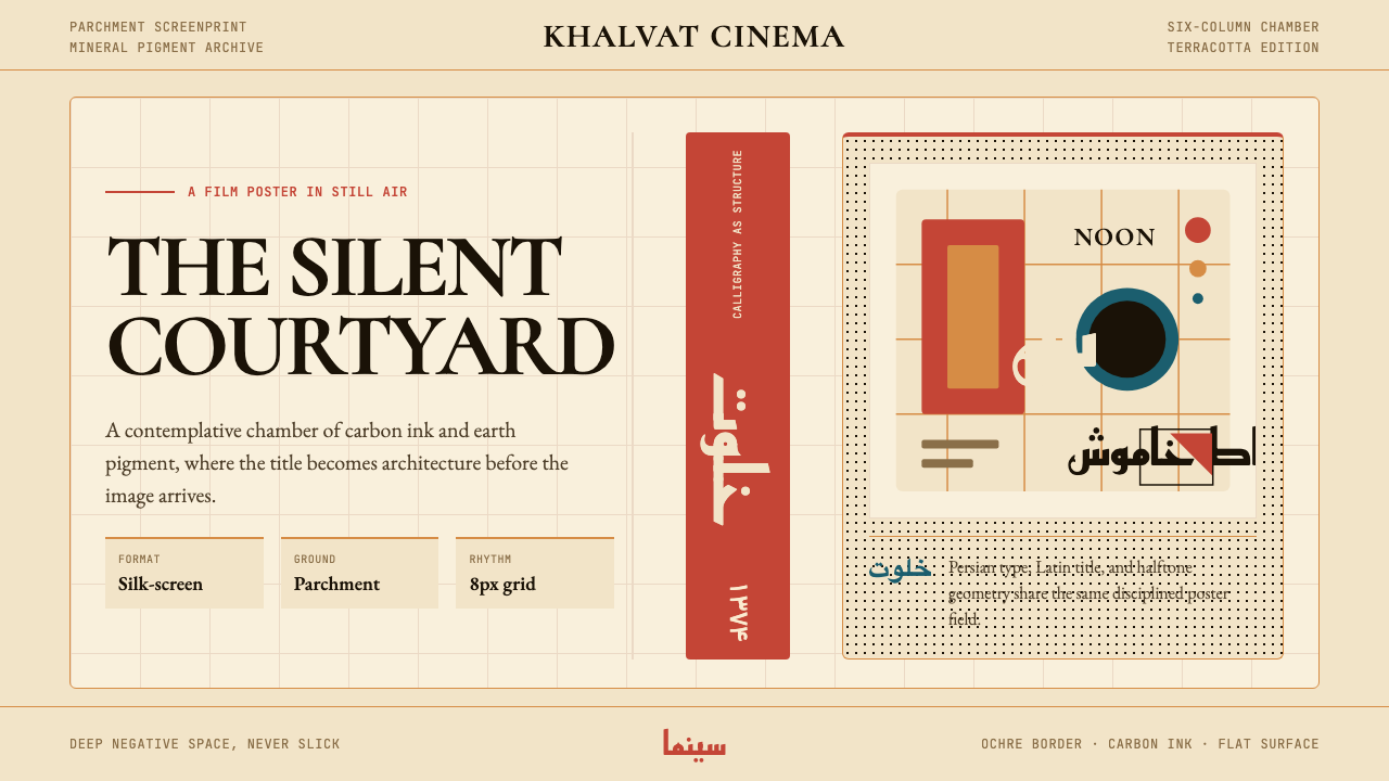 Iranian Modernist Cinema PosterStillness becomes monumental. Terracotta Kufi type breathes inside a Swiss pa…静默成碑。赤陶库法字在羊皮纸瑞士网格中呼吸。
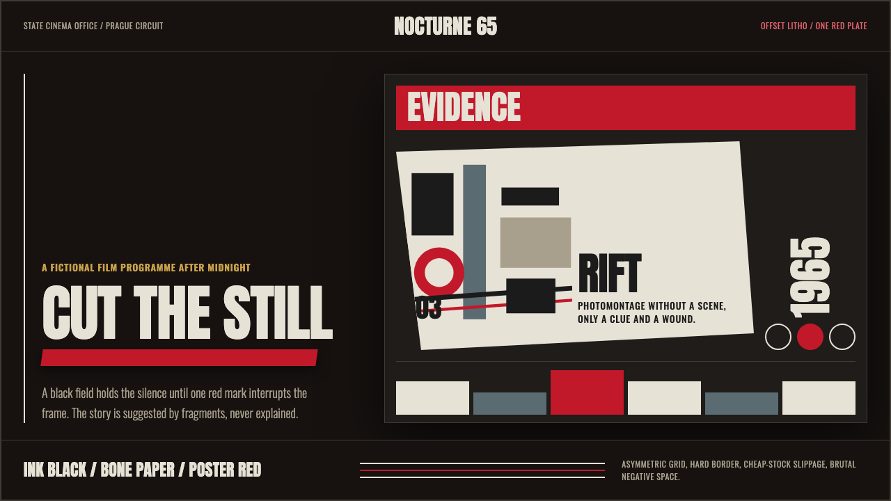 Czech New Wave PosterConcept before spectacle. Ink black, bone type and one poster-red incision fr…观念先于奇观。墨黑、骨白窄体与一道海报红切开网格。
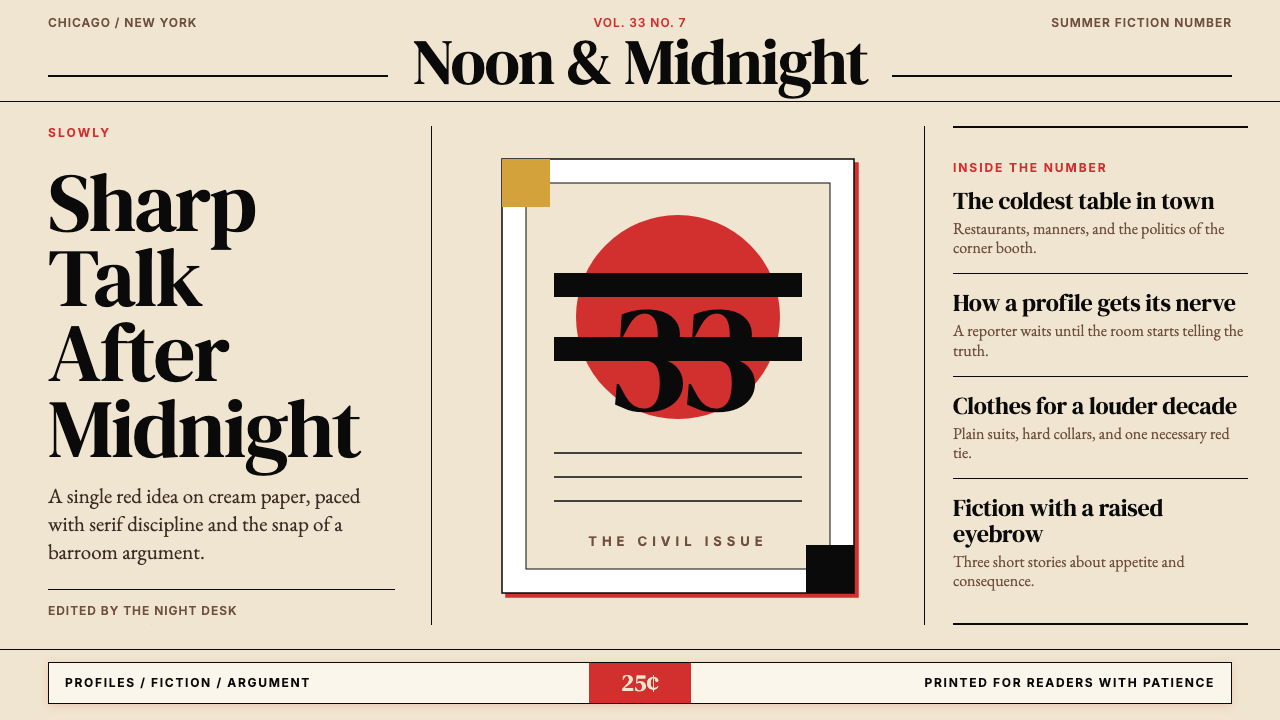 Esquire MagazineConceptual punch on paper. Cream stock, black hairlines, and one saturated re…纸上的观念重拳。米色纸、黑细线与一记饱和红。
 Rauschenberg Combine (1955)Street debris becomes syntax. Ink black, torn type, red-blue-yellow scraps co…街头残片成语法。墨黑底上,红蓝黄纸片与撕裂字体碰撞。
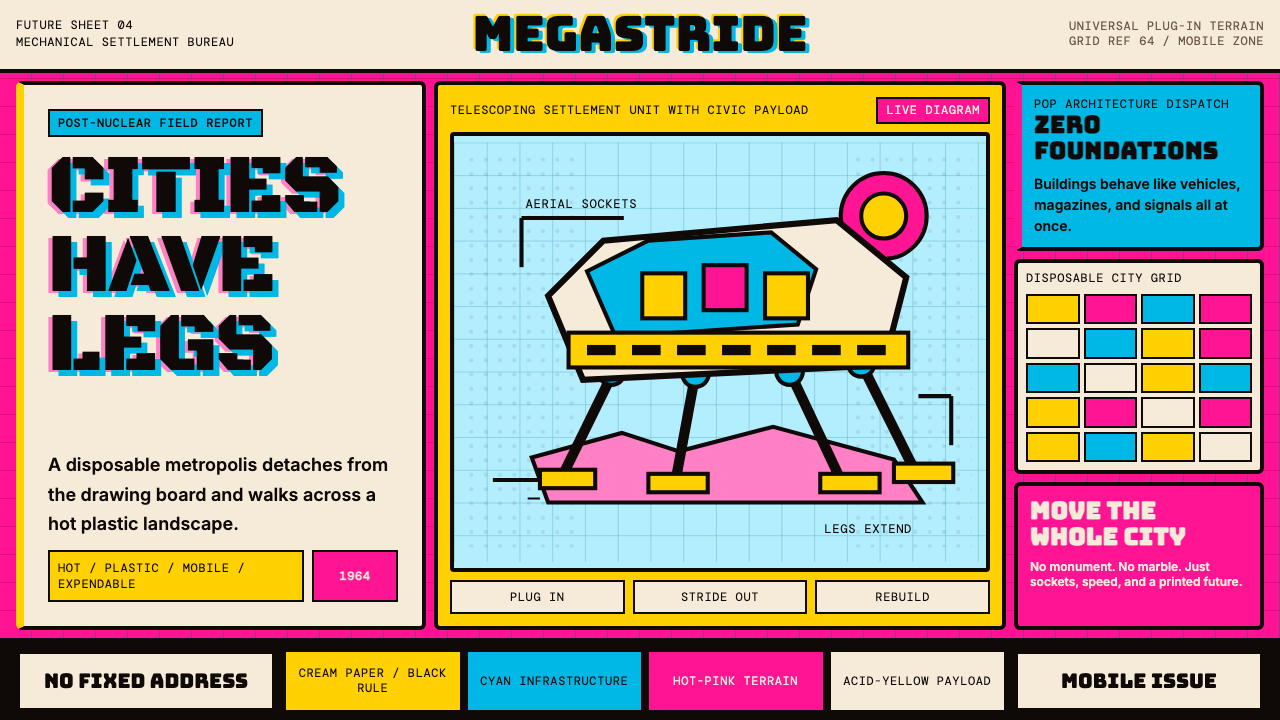 Archigram Walking City (1964)Cities refuse foundations. Hot pink, cyan, and acid yellow lock a bordered co…城市拒绝地基。热粉、青蓝与酸黄压进粗黑漫画格。
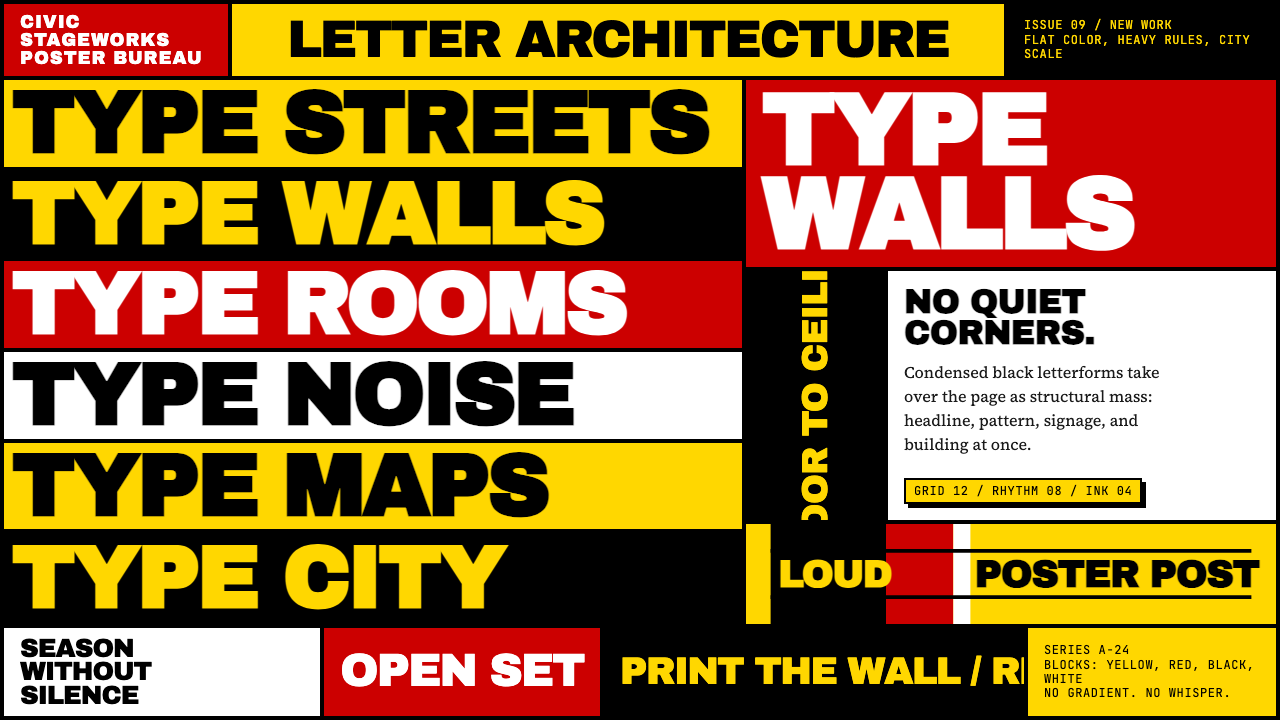 Paula Scher / PentagramType becomes architecture. Yellow-red-black blocks and stacked condensed caps…字体成为建筑:黄红黑色块与密排粗窄大写填满画面。