Design style guide设计风格指南
What is Rauschenberg Combine (1955)?什么是 Rauschenberg Combine (1955)?
Rauschenberg proved that a stuffed eagle and a tire could share a canvas with oil paint — and that the collision itself was the art.劳森伯格证明了一只标本鹰和一条轮胎可以与油彩共享同一画布——而这场碰撞本身就是艺术。
Rauschenberg Combine (1955) in briefRauschenberg Combine (1955) 速览
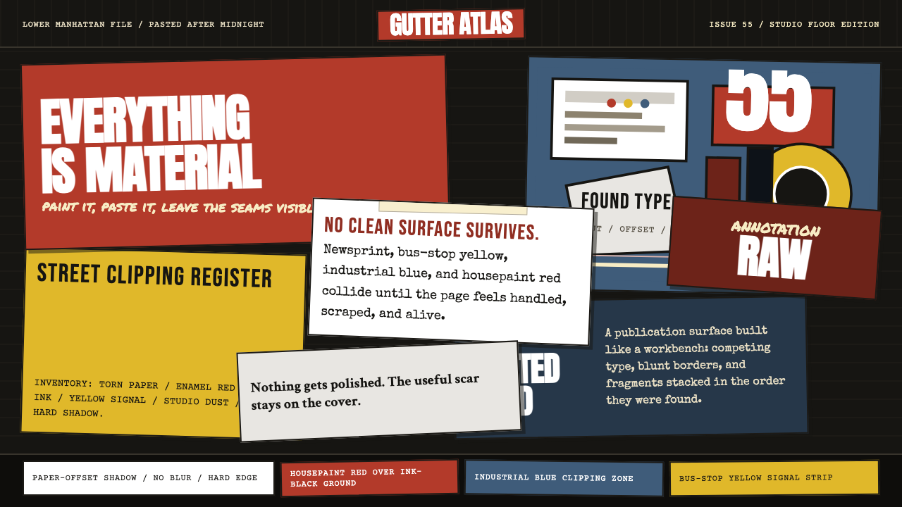
Rauschenberg Combine is the design language born from Robert Rauschenberg's series of mixed-media works made between roughly 1954 and 1964, in which he attached newspaper clippings, found objects, fabric scraps, and housepaint drips to canvases and three-dimensional structures. The resulting aesthetic treats the surface as an archive of the present moment — ink-black grounds layered with torn imagery, competing typefaces pulled from different decades, and dense overlapping passages that refuse to resolve into a single focal point.劳森伯格”组合”是由罗伯特·劳森伯格约在1954至1964年间创作的一系列混合媒材作品所催生的设计语言。他将报纸剪贴、拾得物、布料碎片和房漆泼溅附着于画布及三维结构之上。由此形成的美学将表面视为当下时刻的档案馆——墨黑底色上层叠着撕碎的图像,来自不同年代的字体相互争夺,密集重叠的笔触拒绝汇聚为单一视觉焦点。
Where Abstract Expressionism demanded an interior emotional truth, the Combines embraced exterior noise. The subway advertisement, the radio news fragment, the matchbook cover — all of it had the same claim on the picture plane as deliberate brushwork. This radical equivalence between high art material and street detritus became the visual logic of the style: nothing is more important than anything else, and importance itself is a fiction to be dismantled.抽象表现主义要求一种内在的情感真实,而”组合”系列则拥抱外部的噪声。地铁广告、电台新闻片段、火柴盒封面——一切都与精心布置的笔触享有同等的画面权利。这种高雅艺术材料与街头垃圾之间的根本平等,成为该风格的视觉逻辑:没有任何东西比其他东西更重要,而”重要性”本身就是一个有待拆解的虚构。
As a design system, Rauschenberg Combine inherits that layered, accumulative energy. Surfaces are never empty; they carry the residue of previous information. Type is treated as found material — cropped, rotated, smudged, or overprinted. Color arrives in bursts and scraps rather than in planned fields. The overall effect is one of deliberate maximalism held together not by a compositional grid but by density and tension.作为设计系统,劳森伯格”组合”继承了那种层叠的、累积性的能量。表面从不空白,它承载着先前信息的残余。文字被当作拾得材料处理——裁切、旋转、涂抹或叠印。色彩以迸发的碎片形式到来,而非铺展为规划好的色域。整体效果是一种刻意的繁复主义,其凝聚力来自密度与张力,而非构图网格。
See the Rauschenberg Combine (1955) design system →查看 Rauschenberg Combine (1955) 完整设计系统 →
Where does Rauschenberg Combine (1955) come from?Rauschenberg Combine (1955) 从何而来?
Robert Rauschenberg arrived in New York City in the early 1950s after studying at Black Mountain College in North Carolina, where he encountered the composer John Cage and the choreographer Merce Cunningham. Cage's principle of non-hierarchical composition — in which silence, noise, and musical tone held equivalent standing — would prove decisive for Rauschenberg's approach to the picture plane. If all sounds could coexist in a score, all visual materials could coexist on a canvas.罗伯特·劳森伯格于1950年代初来到纽约,此前他曾就读于北卡罗来纳州的黑山学院,在那里遇见了作曲家约翰·凯奇与编舞家摩斯·坎宁汉。凯奇的非等级制构成原则——沉默、噪声与乐音享有同等地位——对劳森伯格处理画面平面的方式产生了决定性影响。如果所有声音都能在一部乐谱中共存,那么所有视觉材料也能在一张画布上共存。
The Combines emerged from Rauschenberg's Pearl Street studio in Lower Manhattan, where the density of the city itself became a source material. Working in the mid-1950s, Rauschenberg was responding directly to the dominance of Abstract Expressionism — particularly the heroic self-mythology that surrounded figures like Jackson Pollock and Willem de Kooning. Where the Ab-Ex generation treated the canvas as a site of personal revelation, Rauschenberg treated it as a site of quotation, accumulation, and the collision of anonymous imagery. His famous statement that he worked in the gap between art and life was not a manifesto slogan but an accurate description of the studio practice.”组合”系列诞生于劳森伯格在曼哈顿下城珍珠街的工作室,城市本身的密度成为他的原材料。1950年代中期,劳森伯格在创作中直接回应着抽象表现主义的统治地位——尤其是笼罩在波洛克、德·库宁等人周围的英雄式自我神话。抽象表现主义那一代人将画布视为个人启示的场所,而劳森伯格则将其视为引用、积累与匿名图像碰撞的场所。他那句著名的话——他工作于艺术与生活的罅隙之间——并非宣言式的口号,而是对工作室实践的准确描述。
Jasper Johns, with whom Rauschenberg maintained a close artistic dialogue throughout the late 1950s, was pursuing parallel investigations into the status of the painted sign — flags, targets, numbers — as objects with both pictorial and literal existence. Together, their work is frequently described as Neo-Dada, drawing on the European Dada tradition's embrace of chance, found materials, and the deliberate deflation of artistic seriousness. The connection to Marcel Duchamp's readymades was explicit: Rauschenberg was also asking what happens when an everyday object is relocated into an art context.贾斯珀·约翰斯与劳森伯格在整个1950年代末保持着密切的艺术对话,他也在平行探究绘画符号的身份——旗帜、靶心、数字——作为同时具有图像性与字面性存在的对象。他们的作品常被归类为新达达主义,承接了欧洲达达传统对偶然性、拾得材料以及对艺术严肃性的刻意消解。与马塞尔·杜尚”现成品”的联系是明确的:劳森伯格同样在追问,当一件日常物品被挪移进艺术语境时会发生什么。
Dealer Leo Castelli began representing Rauschenberg in 1958, and the critical infrastructure of the New York art world rapidly formalized what had been a countercultural studio practice into an internationally recognized movement. By the time Rauschenberg won the grand prize at the 1964 Venice Biennale — the first American to do so — the Combines had been absorbed into art history as one of the pivotal ruptures between modernism and what would become postmodernism. The visual language they established — layered, archival, typographically promiscuous, and allergic to closure — became foundational for subsequent movements including proto-Pop, Fluxus, and the appropriation art of the 1980s.画廊主利奥·卡斯泰利从1958年开始代理劳森伯格,纽约艺术世界的批评体制迅速将这一曾属于反主流文化的工作室实践正式化为国际公认的运动。到1964年劳森伯格在威尼斯双年展上荣获大奖——成为首位获此殊荣的美国人——“组合”系列已经被艺术史吸纳为现代主义与后来的后现代主义之间的关键断裂点之一。它们所确立的视觉语言——层叠的、档案式的、排印上的”滥交性”以及对封闭性的抵制——成为此后众多运动的基础,包括原始波普艺术、激浪派以及1980年代的挪用艺术。
What defines the Rauschenberg Combine (1955) look?Rauschenberg Combine (1955) 的视觉特征是什么?
Ground and Surface底色与表面
The foundational layer is typically a deep, near-black ground — the color of newsprint ink, of studio walls, of urban shadow. This dark base absorbs the materials layered on top of it rather than providing a clean neutral field. The surface is never pristine: it carries the evidence of process, with drips, smears, and transfer marks treated as part of the composition rather than errors to be corrected.基础层通常是深沉的、近乎纯黑的底色——报纸油墨的颜色,工作室墙壁的颜色,城市阴影的颜色。这层深色底面吸纳叠于其上的材料,而非提供一个干净的中性背景。表面从不洁净:它承载着过程留下的痕迹,泼溅、涂抹与转印的印记被视为构图的一部分,而非需要纠正的错误。
Collage Density拼贴密度
Multiple image sources compete simultaneously on the same surface. A fragment of newspaper photograph overlaps a patch of painted color which overlaps a piece of fabric which overlaps printed type. There is no single dominant element; instead, the eye moves through successive layers of information without coming to rest. This density is the primary visual signature of the style — it communicates accumulation, urban velocity, and the impossibility of hierarchy.多个图像来源同时在同一表面上竞争。一片报纸照片碎片与一块涂色色块叠压,后者又与一片布料叠压,布料再与印刷文字叠压。没有单一的主导元素;视线在一层层信息中穿梭流动,找不到落脚之处。这种密度是该风格最主要的视觉标记——它传达出积累感、城市速度感以及等级秩序的不可能性。
Typography as Found Object文字作为拾得物
Type in the Rauschenberg Combine aesthetic is not selected and set; it is discovered and extracted. Headline type from different newspapers, advertising slogans in different scales, hand-lettered captions, and mechanical body text coexist without typographic harmony. The visual effect is of a typography that has been stripped of its original context and press-ganged into a new one. Letters may be partially obscured, overprinted, or cropped; legibility is secondary to material presence.在劳森伯格”组合”美学中,文字不是被选择和排版的,而是被发现和提取的。来自不同报纸的大标题字体、不同比例的广告口号、手写标注与机械正文体共存,毫无字体排印上的和谐可言。视觉效果仿佛是一种被剥离了原始语境、强行征召进新语境的排印。字母可能被部分遮挡、叠印或裁切;可读性让位于材料的物质性存在。
Color as Accident and Incident色彩作为偶然与事件
Color in this system is not planned into a cohesive palette. It arrives through the found materials themselves — the red of a newspaper masthead, the blue of a printed advertisement, the yellow of aged newsprint — and through paint applied with housepainter's directness: dripped, brushed, or rolled rather than blended. Saturated primaries appear suddenly against the dark ground, functioning less as design decisions and more as visual accidents that demand attention.在这套系统中,色彩并非被规划进一个统一的色板。它通过拾得材料本身到来——报纸报头的红,印刷广告的蓝,泛黄旧报纸的黄——以及以房屋油漆工的直接手法施加的颜料:泼洒、涂刷或滚涂,而非调和。饱和的原色突然出现在深色底面上,其功能与其说是设计决策,不如说是要求被注意的视觉事件。
Object Integration物体整合
The original Combines literally incorporated three-dimensional objects — a tire, a pillow, a stuffed animal — into painted surfaces. As a design system, this principle translates into the integration of photographic objects, material textures, and diagrammatic imagery into otherwise flat compositions. The surface develops an almost haptic quality: some elements seem to project forward, others recede, not through perspectival illusion but through the literal or implied weight of layered materials.原始的”组合”作品字面意义上将三维物体——轮胎、枕头、填充动物标本——融入了绘画表面。作为设计系统,这一原则转化为将摄影物体、材料质感与图示性图像整合进原本平面的构图之中。表面发展出一种近乎触觉的品质:某些元素仿佛向前突出,另一些则向后退缩,这不是通过透视幻觉,而是通过层叠材料的字面或隐含重量实现的。
Anti-Closure Composition反封闭式构图
Where classical composition resolves — leading the eye to a resting point and providing a sense of completion — the Combine aesthetic deliberately avoids resolution. Imagery is cropped at the edges without framing; text trails off or is interrupted; layered forms create competing entry points. The composition feels like a fragment of something larger rather than a self-contained statement. This incompleteness is not a flaw but a structural argument: the world does not resolve, so the image should not either.古典构图趋向封闭——引导视线到达一个落脚点,给予完结感——而”组合”美学刻意回避解决。图像在边缘被裁切而不加框;文字中断或消失;层叠形态制造出相互竞争的入口点。构图感觉像是某个更大整体的碎片,而非一个自足的陈述。这种不完整性不是缺陷,而是一种结构性论点:世界不会解决,图像也不应该。
Transfer and Trace转印与痕迹
Rauschenberg developed a technique of solvent transfer, using turpentine to lift printed imagery from magazine pages directly onto paper or canvas. The resulting marks are ghostly, degraded, and imprecise — the image half-remembered rather than clearly stated. In the design system, this quality of trace translates into textures that suggest prior content: washed-out imagery, faint overprinted marks, surfaces that appear scraped or rubbed. The aesthetic preference is for the degraded and the partial over the pristine and complete.劳森伯格发展出一种溶剂转印技术,用松节油将杂志页面上的印刷图像直接提取到纸张或画布上。由此产生的痕迹是幽灵般的、降解的、不精确的——图像处于半记忆而非清晰陈述的状态。在设计系统中,这种痕迹的品质转化为暗示先前内容的质感:褪色的图像,隐约的叠印痕迹,看起来被刮擦或摩擦过的表面。这种美学偏好降解和残缺,而非洁净和完整。
See the Rauschenberg Combine (1955) design system →查看 Rauschenberg Combine (1955) 完整设计系统 →
Who shaped Rauschenberg Combine (1955)?谁塑造了 Rauschenberg Combine (1955)?
Rauschenberg (1925–2008) grew up in Port Arthur, Texas, studied at Black Mountain College and the Art Students League, and established himself in Lower Manhattan in the early 1950s. The Combines — made roughly between 1954 and 1964 — represent the period of his most radical formal invention. His 1964 Venice Biennale grand prize marked the first time an American had won the award and signaled the international recognition of the New York avant-garde. Later in his career, Rauschenberg pursued large-scale collaborative projects through the Rauschenberg Overseas Culture Interchange, traveling to countries including Cuba, Chile, China, and India to create works in response to local materials and communities.劳森伯格(1925—2008年)成长于德克萨斯州波特阿瑟,曾就读于黑山学院与艺术学生联盟,1950年代初在曼哈顿下城确立了自己的地位。”组合”系列——约创作于1954至1964年间——代表了他形式创新最为激进的时期。1964年的威尼斯双年展大奖标志着他成为首位获此殊荣的美国人,也是纽约前卫艺术获得国际认可的信号。职业生涯后期,劳森伯格通过”劳森伯格海外文化交流”项目开展大规模合作,前往古巴、智利、中国、印度等国,以回应当地材料与社区的方式进行创作。
Cage (1912–1992) was the composer and theorist whose influence on Rauschenberg was perhaps the most formative of any single figure. At Black Mountain College in the early 1950s, Cage organized the event frequently described as the first Happening — a simultaneous performance of dance, poetry, music, film, and painting that dispensed with conventional staging and hierarchy. His central concept — that all sounds deserve equal compositional standing and that silence is itself a form of music — gave Rauschenberg the philosophical framework for treating all visual materials as equally valid. Cage also introduced Rauschenberg to the I Ching and to chance-based methods of composition, which directly influenced the Combines' non-hierarchical accumulation.凯奇(1912—1992年)是作曲家与理论家,他对劳森伯格的影响或许是所有人物中最为深远的。1950年代初在黑山学院,凯奇组织了那场常被称为第一个”偶发事件”的活动——一场同时进行的舞蹈、诗歌、音乐、电影与绘画的表演,摒弃了常规的舞台安排与等级秩序。他的核心概念——所有声音都值得获得平等的构成地位,沉默本身也是音乐的一种形式——为劳森伯格提供了将一切视觉材料视为同等有效的哲学框架。凯奇还将劳森伯格引介给《易经》以及基于偶然性的构成方法,这直接影响了”组合”系列非等级制积累的特质。
Johns (born 1930) and Rauschenberg maintained a close personal and artistic relationship from roughly 1954 to 1961. Johns's paintings of flags, targets, numbers, and maps explored the boundary between a painted image and a painted object — between representation and literal thing. This parallel inquiry into the status of everyday objects and signs reinforced Rauschenberg's own project, and the two artists developed their ideas in constant dialogue. Johns was also crucial to the practical survival of Rauschenberg's studio practice: working as a commercial display artist for Tiffany & Co. under the pseudonym Matson Jones, Johns provided the income that allowed both artists to maintain their independent work.约翰斯(1930年生)与劳森伯格在约1954至1961年间保持着密切的个人与艺术关系。约翰斯描绘旗帜、靶心、数字与地图的绘画探索了绘画图像与绘画物体之间的边界——在再现与字面之物之间。这种对日常物品与符号之身份的平行探询强化了劳森伯格自己的创作项目,两位艺术家在持续对话中发展各自的思想。约翰斯对劳森伯格工作室实践的实际维系也至关重要:他以”马特森·琼斯”的假名为蒂芙尼公司担任商业橱窗设计师,由此提供的收入让两位艺术家得以维持各自的独立创作。
Castelli (1907–1999) opened his gallery on the Upper East Side of Manhattan in 1957 and began representing Rauschenberg in 1958. As a dealer, Castelli did more than sell work: he built the critical infrastructure — the writer relationships, the museum connections, the European contacts — that transformed the New York avant-garde from a local scene into the dominant force in international contemporary art. His decision to represent both Rauschenberg and Johns simultaneously, and later Andy Warhol and Roy Lichtenstein, positioned the gallery as the institutional home of the movement that would become Pop Art, cementing the line of influence that ran from the Combines forward.卡斯泰利(1907—1999年)于1957年在曼哈顿上东区开设画廊,并从1958年开始代理劳森伯格。作为一位经销商,卡斯泰利的工作远不止于销售作品:他建立了批评基础设施——与撰稿人的关系、与美术馆的联系、欧洲人脉网络——将纽约前卫艺术从一个地方场景转化为国际当代艺术中的主导力量。他同时代理劳森伯格与约翰斯,后来又代理安迪·沃霍尔与罗伊·利希滕斯坦,将画廊定位为那场将发展为波普艺术的运动的机构之家,巩固了从”组合”系列向前延伸的影响脉络。
Though not directly associated with Rauschenberg's generation, Duchamp (1887–1968) provided the historical precedent without which the Combines would be difficult to conceptualize. His readymades — mass-produced objects presented as art simply by virtue of the artist's selection and the gallery's context — established the philosophical ground for treating found material as a legitimate artistic medium. Duchamp was also personally present in New York throughout the 1950s and 1960s, and his visible endorsement of the younger generation's work — including his friendship with Cage and his attendance at key events — functioned as a living bridge between the European avant-garde of the 1910s and the American neo-avant-garde of the postwar decades.尽管与劳森伯格那一代人没有直接关联,杜尚(1887—1968年)提供了历史先例,没有他,”组合”系列将难以从概念上加以理解。他的”现成品”——仅凭艺术家的选择与画廊语境而被呈现为艺术的量产物品——确立了将拾得材料视为合法艺术媒介的哲学基础。杜尚在整个1950至60年代也亲身活跃于纽约,他对年轻一代作品的显见认可——包括与凯奇的友谊以及出席重要活动——起到了活的桥梁作用,连接了1910年代的欧洲前卫艺术与战后数十年的美国新前卫艺术。
How do you use Rauschenberg Combine (1955) today?今天怎么用 Rauschenberg Combine (1955)?
Rauschenberg Combine is one of the most demanding historical styles to apply in contemporary design work, because its maximalism must be intentional rather than merely cluttered. The distinction between controlled density and visual chaos is not a matter of how many elements are present but of whether each element was placed with purpose — even if that purpose is to suggest purposelessness. Understanding the original works is essential: the Combines achieve their effect through contrast between the dark ground and the violent intrusion of color, and between the controlled handling of paint and the raw edge of found material.劳森伯格”组合”是当代设计实践中最难驾驭的历史风格之一,因为它的繁复主义必须是刻意为之,而非仅仅杂乱无章。精控密度与视觉混乱之间的区别,不在于存在多少元素,而在于每个元素是否经过有目的的放置——即便这种目的是为了暗示无目的性。深入理解原始作品至关重要:”组合”通过深色底面与色彩的猛烈闯入之间的对比,以及颜料的克制处理与拾得材料的粗粝边缘之间的张力,来实现其效果。
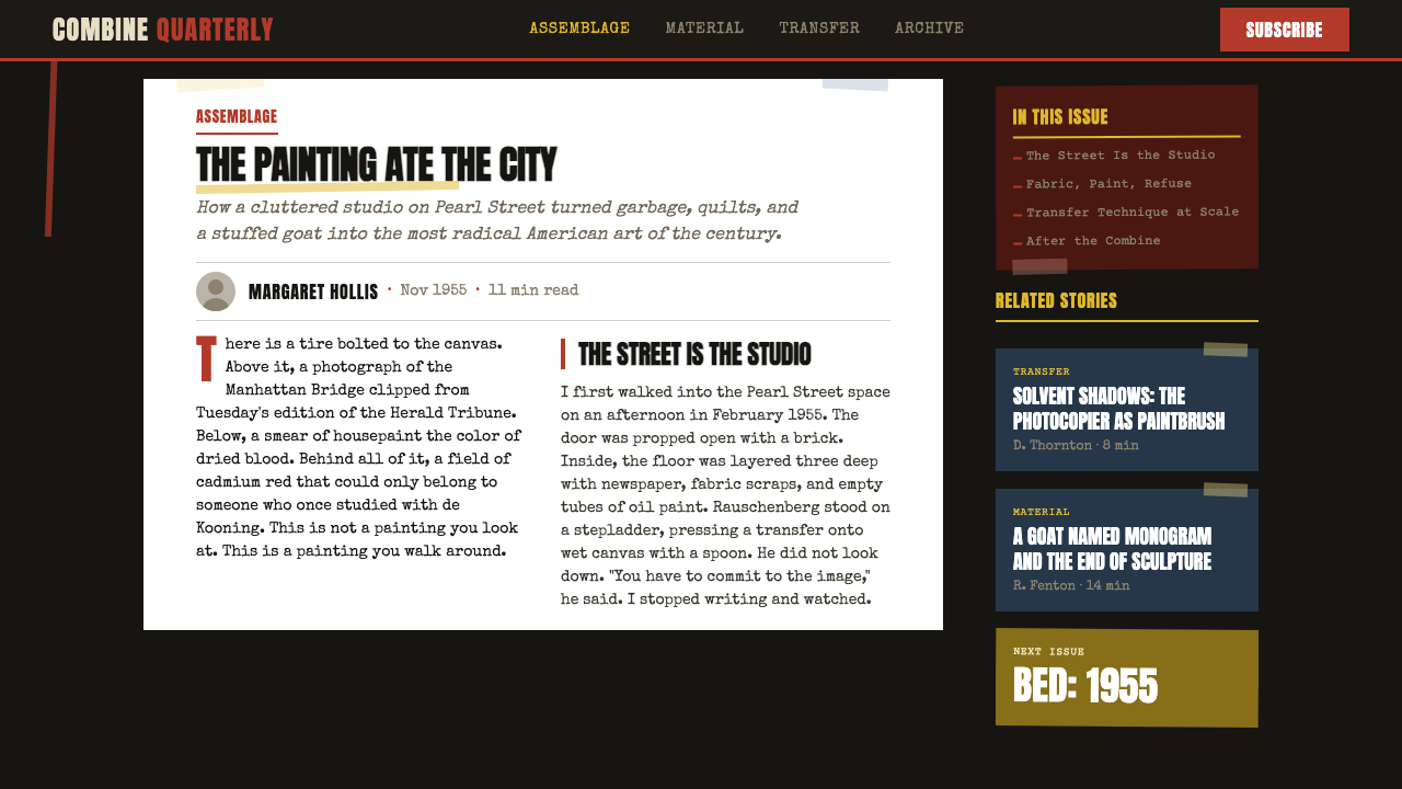
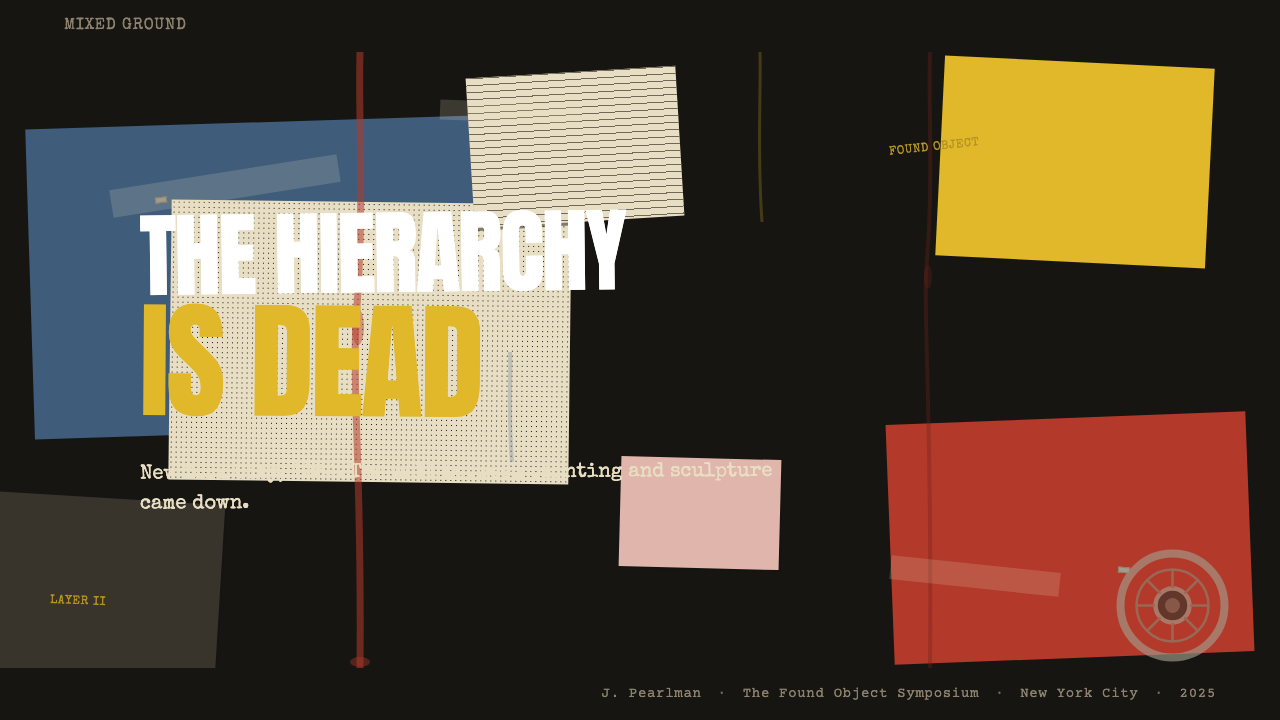
For presentation slides, the style suits cover pages and statement slides more than it suits data-heavy content pages. A Combine-influenced cover might use a deep, near-black ground with fragments of photographic imagery set at competing scales, a headline in heavy type that reads as cut-and-pasted rather than typeset, and a burst of a single saturated color — a red patch, a blue smear — placed asymmetrically. Data slides work against the style: complex charts require the kind of spatial clarity that Combine's layering actively undermines. If data must appear, keep it isolated on a near-white inset panel that reads as a found document embedded in the composition.在演示文稿中,这种风格更适合封面页和陈述性幻灯片,而非数据密集的内容页。受”组合”影响的封面可以使用深沉近黑的底面,搭配以相互竞争的比例设置的摄影图像碎片,一个读起来像剪贴而非排版的粗重字体标题,以及不对称放置的一抹饱和色——一块红色涂层,一道蓝色涂抹。数据幻灯片与这种风格相悖:复杂图表需要的空间清晰度,正是”组合”式层叠所主动破坏的。若必须呈现数据,将其隔离在一个近白色的嵌入面板上,让它读起来像是埋入构图的一份拾得文件。
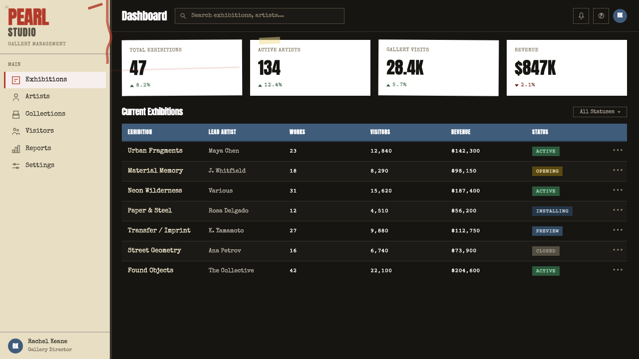
For web interfaces, the style is best applied selectively rather than as a full-system approach. A dark ground with layered typographic elements works exceptionally well for editorial landing pages, artist portfolios, and cultural institution sites where the content itself is archival or performative. Dashboard and data-heavy interfaces will fight the style at every turn — the eye cannot track information efficiently when multiple competing layers are present. If applying to a web UI, consider limiting the Combine aesthetic to hero sections, interstitial screens, or loading states, while keeping functional interface elements — navigation, forms, data tables — in a cleaner register.对于网页界面,这种风格最好有选择地应用,而非作为全系统方案。深色底面搭配层叠排印元素,对于编辑类落地页、艺术家个人作品集以及内容本身具有档案性或表演性的文化机构网站效果极佳。数据密集的仪表板界面将在每个环节与这种风格产生冲突——当多个竞争层面同时存在时,眼睛无法有效追踪信息。若应用于网页界面,考虑将”组合”美学限制在主视觉区段、过渡屏或加载状态,同时让功能性界面元素——导航、表单、数据表格——保持更为清晰的语调。
For editorial and marketing work, the style has a natural affinity with culture, music, contemporary art, and fashion contexts where layered complexity reads as sophisticated rather than confusing. A magazine spread or event poster designed in this register might treat the background as a collage surface — printed type at one scale overlaid with photographic texture overlaid with a sweep of paint-like color — with the main headline as the only element that punches through the density at full legibility. The key discipline is that one element must win: the layers can compete, but there must be a clear victor in the visual hierarchy, even if that victor is established through scale alone rather than through contrast or isolation.对于编辑与营销内容,这种风格与文化、音乐、当代艺术和时尚等语境有着天然的亲和力,在这些领域,层叠的复杂性被读解为精致而非混乱。以这种语调设计的杂志版面或活动海报,可以将背景处理为一个拼贴表面——一种比例的印刷字体叠印在摄影质感上,再叠印上一片油漆般的色彩扫过——主标题作为唯一以完整可读性穿透密度的元素。关键的自律在于:必须有一个元素获胜。各层可以竞争,但视觉等级中必须有一个清晰的胜者,即便这种胜利仅通过比例确立,而非通过对比或隔离。
The most common mistake when applying this style is confusing it with general grunge or distressed aesthetics. Combine is not dirty for the sake of being dirty; it is layered because accumulation is the argument. Adding texture overlays, paper grain filters, or ink-bleed effects without a structural rationale produces pastiche rather than Combine. A second frequent error is using the dark ground as an excuse to darken the entire interface, including functional areas that should remain clear. The dark, layered ground belongs to the expressive surface — it should not migrate to menus, modals, or utility interfaces where legibility is non-negotiable.应用这种风格时最常见的错误,是将它与一般意义上的垃圾摇滚或做旧美学相混淆。”组合”不是为了脏而脏;它的层叠是因为积累本身就是论点。在没有结构性依据的情况下添加质感叠加、纸张颗粒滤镜或墨水晕染效果,产生的是仿制品而非”组合”。另一个常见错误是将深色底面当作整个界面变暗的借口,包括那些应当保持清晰的功能性区域。深色的层叠底面属于表现性表面——它不应迁移至菜单、模态框或可读性不容妥协的工具性界面。
See the Rauschenberg Combine (1955) design system →查看 Rauschenberg Combine (1955) 完整设计系统 →
Rauschenberg Combine (1955) — FAQRauschenberg Combine (1955) · 常见问题
How is Rauschenberg Combine different from general collage aesthetics?劳森伯格”组合”与一般拼贴美学有何不同?
General collage aesthetics can be decorative or compositionally resolved — a scrapbook page or a mood board assembles disparate materials into a pleasing arrangement. Combine is structured around non-resolution: the elements are not harmonized, the eye is not guided to a resting point, and the surface carries the deliberate suggestion that it could continue infinitely in any direction. The philosophical basis matters: Combine is making an argument about the equivalence of all visual material and the artificiality of aesthetic hierarchy. Applying this style means accepting and perpetuating that argument, not just borrowing the layered look.一般拼贴美学可以是装饰性的或构图上趋于解决的——一页剪贴簿或一张情绪板将各异的材料组合成令人愉悦的排列。”组合”则以不解决性为结构基础:元素并不被和谐化,视线不被引导至落脚点,表面刻意暗示它可以向任何方向无限延伸。哲学基础很重要:”组合”是在提出一个关于所有视觉材料等价性以及美学等级秩序之人为性的论点。应用这种风格意味着接受并延续这一论点,而不仅仅是借用层叠的外观。
Can this style work on a light or white background?这种风格能在浅色或白色背景上使用吗?
The dark ground is not incidental — it is what allows the found color to read as intrusion rather than decoration. On a white or light ground, the same layering of type fragments and image scraps tends to flatten into generic collage territory rather than the specific tension the style depends on. A light-ground variant is possible but requires a different strategy: instead of color as intrusion, you would need to work with layered transparency and overprinting, where forms read through each other rather than competing for the same opaque space. This is a valid approach but produces a more subdued, graphic result than the canonical dark-ground Combine.深色底面并非偶然——正是它让拾得的色彩被读解为入侵而非装饰。在白色或浅色底面上,同样的文字碎片与图像残片的层叠,往往会退化为普通的拼贴领域,而非这种风格所依赖的特定张力。浅色底面的变体是可能的,但需要不同的策略:取代色彩作为入侵的手法,你需要运用层叠的透明度与叠印,让形态相互透视而非争夺同一不透明空间。这是一种有效的方法,但产生的是比经典深色底面”组合”更为内敛、更偏平面设计性的结果。
Is legibility a concern in this style, or is it intentionally sacrificed?这种风格中可读性是一个顾虑,还是被刻意牺牲?
Both. In the original Combines, legibility of any single text fragment is often sacrificed, but there is usually one element — a word, a number, a photographic form — that achieves full legibility and functions as an anchor for the composition. The practical design principle is: you can layer and obscure freely, but the single most important piece of information in any composition must punch through the density and be immediately readable. Everything else can compete, degrade, or disappear — but the anchor must be clear. If you find yourself in a situation where nothing is legible, the composition has lost the tension that makes the style interesting and become noise.两者皆有。在原始的”组合”作品中,任何单一文字碎片的可读性往往被牺牲,但通常有一个元素——一个词语、一个数字、一种摄影形态——达到完整的可读性,并充当构图的锚点。实用的设计原则是:你可以自由地层叠和遮蔽,但任何构图中最重要的那条信息必须穿透密度,立即可读。其他一切可以竞争、降解或消失——但锚点必须清晰。如果你发现自己处于一种什么都无法辨认的状态,那么构图已经失去了使这种风格有趣的张力,沦为噪声。
How does this style relate to proto-Pop Art?这种风格与原始波普艺术有何关联?
The Combines are widely regarded as a bridge between Abstract Expressionism and Pop Art. Where Abstract Expressionism privileged the interior and the gestural, and Pop Art — in the work of Warhol, Lichtenstein, and others — embraced commercial imagery with flat, graphic clarity, the Combines occupy the transitional space: they use the mass-media imagery that Pop would later celebrate, but without Pop's ironic distance and graphic cleanliness. Combine is rawer, more physically dense, and less resolved. In design terms, if Pop Art produces clean, high-contrast, brand-ready graphics, Combine produces the cut-up, overprinted, torn-edge version of the same cultural material.”组合”系列被普遍视为抽象表现主义与波普艺术之间的桥梁。抽象表现主义推崇内在性与姿态性,波普艺术——在沃霍尔、利希滕斯坦等人的作品中——以平面、图形化的清晰度拥抱商业图像,而”组合”系列占据了过渡空间:它使用大众媒体图像(波普艺术后来将加以庆颂的那些),但没有波普的反讽距离与图形化洁净度。”组合”更为粗粝,物质感更为浓密,解决性更低。以设计语言来说,如果波普艺术产生干净、高对比度、品牌就绪的图形,”组合”则产生同样文化材料的剪切、叠印、撕裂边缘版本。
What kinds of projects or brands should avoid this style entirely?哪类项目或品牌应当完全回避这种风格?
Any context where trust, clarity, and legibility are the primary communication goals should avoid this style entirely. Financial services, healthcare, legal platforms, children's education, food safety, and emergency services — these are domains where the user's relationship with the interface depends on confident, unambiguous information delivery. The Combine aesthetic's deliberate density and refusal of hierarchy actively undermine that goal. Similarly, brands built around simplicity, cleanliness, or minimalism as core values will find the style antithetical: you cannot apply Combine-style layering to a premium cosmetics brand or a Scandinavian furniture company without creating a tonal contradiction that audiences will sense even if they cannot name it.任何以信任、清晰和可读性为首要传达目标的场景都应当完全回避这种风格。金融服务、医疗保健、法律平台、儿童教育、食品安全和紧急服务——这些领域中用户与界面的关系依赖于自信、明确的信息传达。”组合”美学刻意的密度与对等级秩序的拒绝,主动破坏了这一目标。同样,以简洁、纯净或极简主义为核心价值而构建的品牌,也会发现这种风格与之背道而驰:你无法将”组合”式层叠应用于一个高端化妆品品牌或一家斯堪的纳维亚家具公司,而不制造出一种调性矛盾——受众即便无法将其命名,也会感知到。
Related design styles相关设计风格
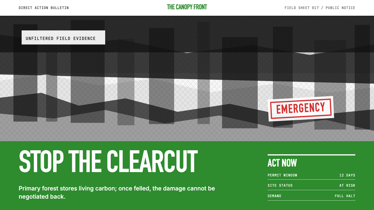 Greenpeace (Activist Poster)Protest without softness. Forest-green caps over monochrome newsprint, one de…抗议毫不柔化。森林绿大写字压住黑白画面,只留一个诉求。
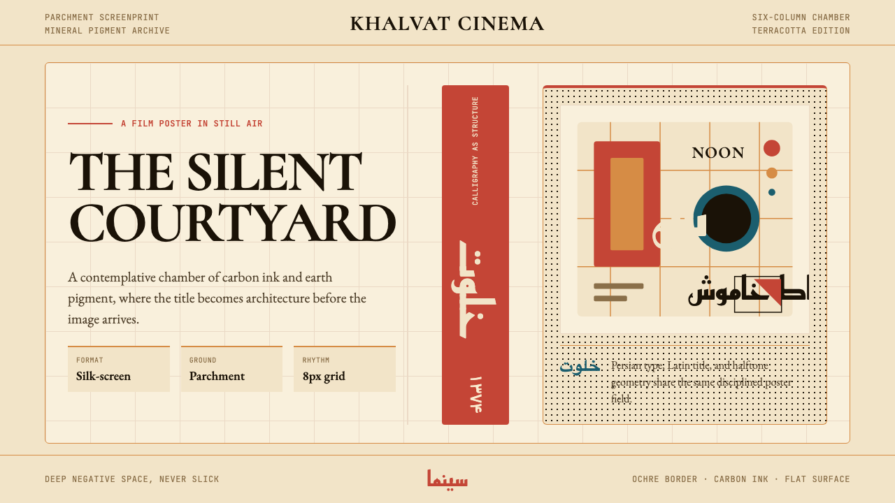 Iranian Modernist Cinema PosterStillness becomes monumental. Terracotta Kufi type breathes inside a Swiss pa…静默成碑。赤陶库法字在羊皮纸瑞士网格中呼吸。
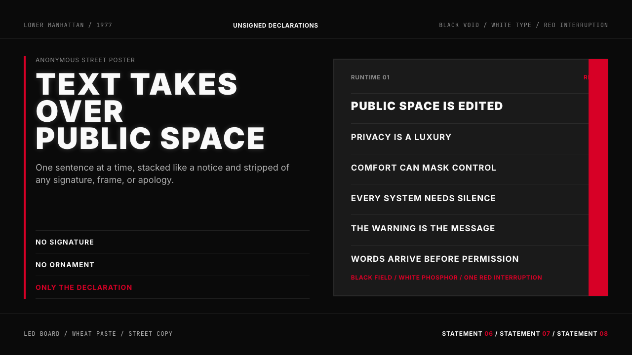 Jenny Holzer Truisms (1977)Austere declarations. White all-caps on black, cut by a single red warning.克制宣言。黑底白字,全大写排成LED板,红色只作警示。
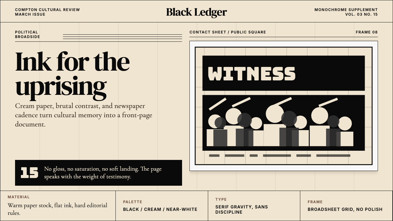 Kendrick — To Pimp a ButterflyPolitical weight, printed cold. Cream paper, hard serif type, monochrome crow…政治重量冷静落纸。米黄纸、硬衬线与黑白群像几何。
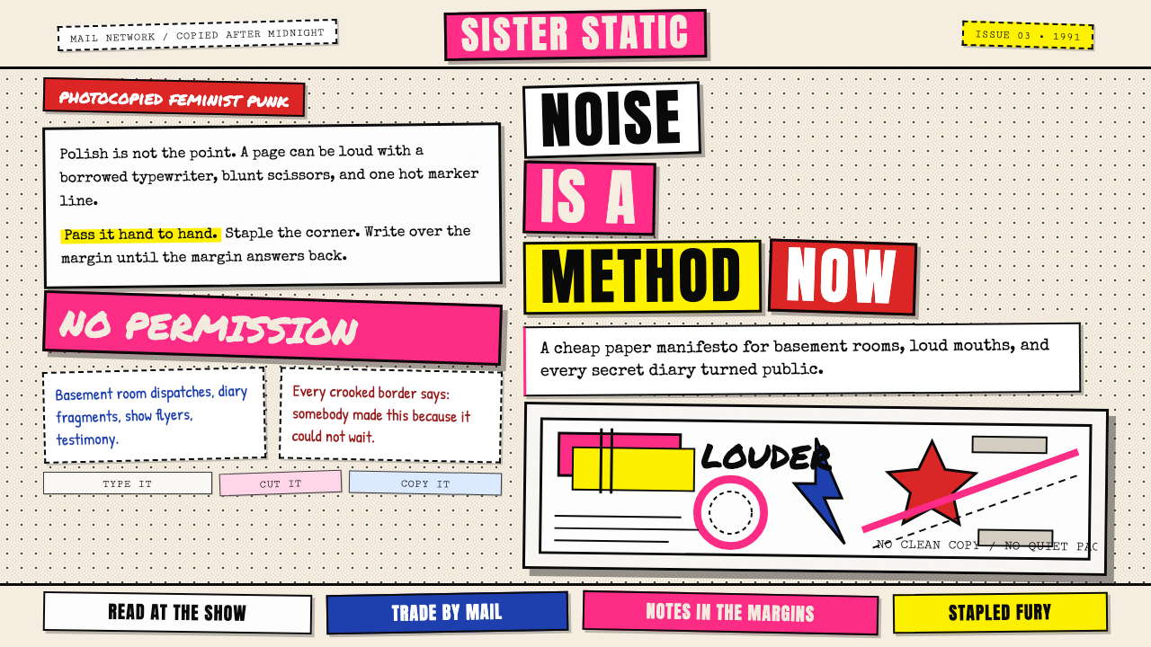 Riot Grrrl Zine (1991)DIY fury, unpolished. Cream Xerox grain, black toner type, hot-pink marker co…DIY怒火,拒绝精致。米色复印颗粒、黑碳粉字与荧光粉拼贴。
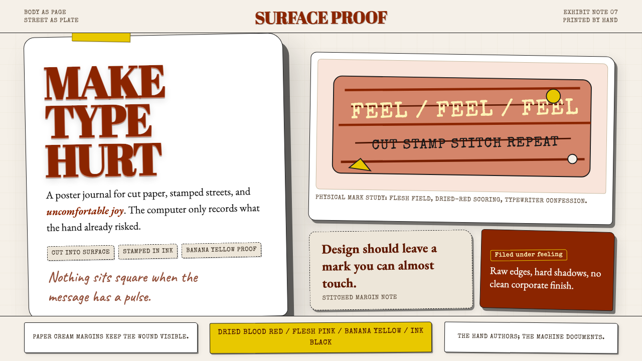 Stefan SagmeisterPain becomes typography. Flesh pink, dried blood red, banana yellow; broken p…痛感变成字体:肉粉、血红与香蕉黄堆成破格纸面。