What is Jenny Holzer Truisms (1977)?什么是 Jenny Holzer Truisms (1977)?
Jenny Holzer reduced art to a single weapon: a declarative sentence set in all-caps type, pasted anonymously onto Lower Manhattan walls in 1977 — no signature, no gallery, just language invading public space.1977年,珍妮·霍尔泽将艺术缩减为一件武器:一条全大写字体的宣言式短句,匿名张贴于纽约下曼哈顿的街头——没有署名,没有画廊,只有语言入侵公共空间。
Jenny Holzer Truisms (1977) in briefJenny Holzer Truisms (1977) 速览
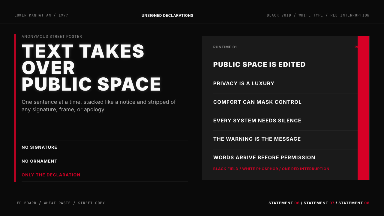
Jenny Holzer Truisms is a visual system built entirely on language as image. Beginning in 1977, Jenny Holzer produced a series of anonymous broadsheets — hundreds of declarative sentences set in all-capitals, wheat-pasted across Lower Manhattan without attribution or explanation. The sentences ranged from the darkly ironic to the genuinely unsettling: statements that sounded like proverbs but twisted mid-thought. There was no author to argue with; there was only the words on the wall.珍妮·霍尔泽真言(Truisms)是一套完全以语言为图像构建起来的视觉系统。1977年起,珍妮·霍尔泽制作了一系列匿名传单——数百条以全大写字母排印的宣言式短句,在纽约下曼哈顿匿名张贴,没有署名,没有解释。这些句子游走于黑色幽默与真实不安之间:听起来像格言,却在中途扭转。没有作者可以质疑,只有墙上的文字。
The design system that emerged from this practice is defined by its radical austerity: a void black ground, high-contrast white type set in a blunt, industrial letterform, and a single red accent reserved for warnings or the sharpest provocations. Color is not decoration here — it is syntax. White speaks; red screams; black swallows everything else. The result is an aesthetic that functions equally well as a street poster, an LED scrolling board, or a digital interface: a surface that is entirely type, entirely statement, with nothing softening the collision between viewer and text.这套设计系统以极端克制为核心:纯黑虚空底面、高对比度的白色字体以粗直的工业字形排列,以及仅用于警示或最尖锐挑衅的单一红色。色彩在这里不是装饰,它是语法:白色在说话,红色在呐喊,黑色则吞噬其他一切。由此产生的美学在街头海报、LED滚动屏或数字界面上同样奏效:一个完全由文字构成、完全由声明构成的表面,没有任何东西缓和观看者与文本之间的碰撞。
What distinguishes this system from generic dark-mode minimalism is its conceptual backbone. Every formal decision — the all-caps setting, the absence of punctuation hierarchy, the near-total suppression of imagery — is in service of a specific communicative posture: the anonymous public declaration. The text is not labeled, not attributed, not framed. It arrives as if from nowhere and demands to be reckoned with.将这套系统与普通深色极简主义区别开来的,是其概念骨架。每一个形式决定——全大写排印、标点层级的缺席、图像的近乎全面压制——都服务于一种特定的传达姿态:匿名的公共宣告。文本没有标签,没有归属,没有框架。它仿佛从虚空中到来,要求被正视。
See the Jenny Holzer Truisms (1977) design system查看 Jenny Holzer Truisms (1977) 完整设计系统
Where does Jenny Holzer Truisms (1977) come from?Jenny Holzer Truisms (1977) 从何而来?
In the autumn of 1977, Jenny Holzer was a recent arrival to New York City, studying in the Whitney Museum's Independent Study Program. The program assigned students a reading list of dense critical theory — texts by Marx, Freud, structural linguists, feminist theorists. Holzer found herself fascinated and alienated in equal measure. Her response was to distill the contradictions she encountered into short, declarative sentences and take them directly to the street. She typed them up, printed them on inexpensive broadsheet paper, and began wheat-pasting them across Lower Manhattan — on construction hoardings, building walls, telephone poles — without her name attached.1977年秋,珍妮·霍尔泽刚刚来到纽约,在惠特尼博物馆独立研究项目就读。该项目为学生布置了大量艰深的批判理论读物——马克思、弗洛伊德、结构主义语言学家、女性主义理论家的文本。霍尔泽同时感到着迷与疏离。她的回应方式是将自己所遭遇的种种矛盾提炼为简短的宣言式短句,直接带上街头。她将这些句子打印在廉价的宽版纸上,开始在纽约下曼哈顿各处匿名张贴——建筑工地围挡、楼宇外墙、电话杆——不附署名。
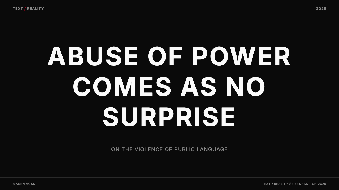
The initial Truisms series comprised approximately 250 individual statements. They were presented as a list, alphabetized with no hierarchy: 'A little knowledge can go a long way' sat beside 'Abuse of power comes as no surprise.' The alphabetical ordering was deliberate: it refused to rank the statements by importance, refused to impose a narrative. Each sentence arrived on equal footing, which made the cumulative effect stranger and more disorienting than any single statement. Passersby who saw only a fragment encountered a different work than those who read the full list; this contingency was built into the project from the start.最初的真言系列共约250条陈述,按字母顺序列举,没有层级区分:「一点知识可以走很长的路」与「滥用权力并不令人意外」并排呈现。字母排序是刻意为之:它拒绝按重要性对语句排名,拒绝施加叙事结构。每一条句子以平等的姿态到来,这使得累积的效果比任何单一陈述都更为奇异和令人迷失方向。只看到片段的路人所遇到的,是与读完全部列表之人截然不同的作品;这种偶然性从一开始就被嵌入项目之中。
The Truisms were immediately contextually radical because they occupied the same visual register as commercial advertising and political signage — mass-printed text in public space — but without a product, a party, or an author. This confusion of categories was intentional. Holzer was working in the tradition of Conceptual and language-based art pioneered by Lawrence Weiner and Joseph Kosuth, artists who argued that an idea stated in language is itself a complete artwork. She was also, whether explicitly or not, operating within a feminist-conceptual practice that questioned who gets to speak in public and on what terms.真言系列之所以即刻具有语境上的激进性,是因为它占据了与商业广告和政治标语相同的视觉寄存器——公共空间中大批量印刷的文字——却没有产品、没有政党、没有作者。这种类别混淆是刻意的。霍尔泽在劳伦斯·韦纳和约瑟夫·科苏斯所开创的观念艺术与语言艺术传统中工作——这些艺术家主张,以语言陈述的一个想法本身即是完整的艺术作品。她同时也在一种女性主义观念实践中运作,无论是否明确,这种实践质疑的是:谁有权在公共空间发言,以何种方式发言。
By the early 1980s, the project expanded into new media. Holzer began working with electronic LED signs — the scrolling boards then appearing in commercial spaces — and produced work for Times Square's Spectacolor board in 1982, one of the first works of public digital art. The LED medium was a perfect match: the scrolling text mimicked the language of news tickers and stock displays, embedding her statements inside the visual infrastructure of financial and informational power. Later works appeared in museum atria, government buildings, and stadiums. The formal vocabulary remained constant across all these scales — all-caps type, high contrast, minimal color — because the posture of anonymous declaration required no elaboration.进入1980年代初,这一项目扩展至新的媒介。霍尔泽开始使用电子LED标牌——当时出现在商业空间的滚动屏——并于1982年为时代广场的Spectacolor屏创作作品,这是最早的公共数字艺术作品之一。LED媒介与她的创作高度契合:滚动文字模仿新闻播报字幕与股票行情显示的视觉语言,将她的陈述嵌入金融与信息权力的视觉基础设施之中。此后的作品陆续出现在博物馆中庭、政府建筑和体育场馆。形式词汇在所有这些尺度上保持不变——全大写字体、高对比度、极简色彩——因为匿名宣告的姿态无需任何修饰。
What defines the Jenny Holzer Truisms (1977) look?Jenny Holzer Truisms (1977) 的视觉特征是什么?
Black Ground as Void黑色底面即虚空
The background in Holzer's system is not dark gray or charcoal — it is an absolute, light-absorbing black. This is not a design choice for legibility or sophistication; it is a conceptual stance. The void black ground eliminates all environmental context, all surface warmth. Text floats in it as if projected rather than printed. Nothing competes with the words. Every other color — white, red — reads with maximum intensity against this ground precisely because the ground offers nothing of its own.霍尔泽系统中的背景不是深灰色或炭色——它是一种绝对的、吸光的黑色。这不是出于可读性或精致感的设计选择,而是一种概念立场。虚空的黑色底面消除了所有环境语境、所有表面温度。文字在其中漂浮,如同投影而非印刷。没有任何东西与文字竞争。正是因为这个底面自身不提供任何东西,其他所有颜色——白色、红色——在其上都以最大强度被读取。
All-Capitals as Tone全大写即语气
Setting text in all capitals removes the visual cues we normally use to infer tone — question marks, italics, mixed case that signals proper nouns versus common speech. The result is a flattened, assertive register: every statement arrives with equal authority, whether it is genuinely provocative or deceptively bland. All-caps also reads at a distance, functioning as signage rather than reading text. This double function — readable up close as statement, legible at a distance as signal — is built into the typographic choice from the outset.全大写排印去除了我们通常用于推断语气的视觉线索——问号、斜体、区分专有名词与普通话语的大小写混用。结果是一种被压平的、断言式的语域:每一条陈述都以同等的权威到来,无论它是真正的挑衅还是表面平淡的欺骗。全大写在远处同样可读,作为标识发挥功能,而非作为阅读文本。这种双重功能——近处作为陈述可读、远处作为信号可辨——从一开始就被嵌入这个字体排印选择之中。
Red as Alarm红色即警报
Red appears in the system only when the content or context demands an escalation of urgency — a warning, a provocation at the limit of what white text can carry. It is never decorative, never applied to a header simply for visual interest. Because red is withheld almost everywhere, its appearance carries disproportionate weight: the eye goes to it immediately, and the content it marks is understood as charged. This scarcity is the mechanism. Using red liberally would collapse the system into generic alert design.红色在这套系统中只在内容或语境要求紧迫感升级时出现——一个警示,一个白色文字所无法承载的极限挑衅。它从不用于装饰,从不仅仅为了视觉趣味而施加于标题。正因为红色几乎在所有地方都被克制,它一旦出现便承载着不成比例的重量:眼睛立即被它吸引,它所标记的内容被理解为带电荷的。这种稀缺性就是机制所在。如果大量使用红色,这套系统就会崩解为普通的警示设计。
Text as the Only Image文字即唯一图像
Holzer's system contains no illustration, no photography, no iconography beyond the letterform itself. The type is not a label on top of an image; it is the entire surface. This is a radical inversion of most communication design, where text explains images. Here the text must carry all the visual weight, all the emotional load, and all the information simultaneously. This constraint demands that every typographic decision — size, weight, spacing, case — work harder than it would in a mixed image-text environment.霍尔泽的系统不包含插图、摄影,也不包含字形以外的任何图像符号。文字不是叠加在图像之上的标签,它就是整个表面。这是对大多数传播设计的彻底颠覆——在那些设计中,文字解释图像。在这里,文字必须同时承载所有视觉重量、所有情感负荷和所有信息。这一约束要求每一个字体排印决定——大小、字重、字距、大小写——比在图文混排环境中工作得更为努力。
LED Register and Scrolling TemporalityLED语域与滚动时间性
The LED scrolling board — where a single sentence moves across a dark field letter by letter or word by word — is the system's most characteristic output. The temporality this imposes is essential: the viewer cannot take the whole statement in at once. Reading becomes a form of waiting; revelation is rationed. This has direct design implications. Layouts and interfaces inspired by this system should treat text as event rather than as static label — something that arrives, commands attention, and passes. The pacing is part of the content.LED滚动屏——单一句子逐字或逐词在暗色画面上移动——是这套系统最具特征性的输出形式。它所施加的时间性至关重要:观看者无法一次性接收整条陈述。阅读成为一种等待;启示被定量分配。这具有直接的设计含义。受这套系统启发的版面与界面应当将文字视为事件而非静态标签——某种到来、要求关注、然后流逝的东西。节奏是内容的一部分。
Anonymity as Formal Device匿名性即形式装置
The original Truisms carried no byline, no brand mark, no URL. This absence of attribution is not an oversight — it is a structural decision that changes how the text is received. An authored statement invites arguments about the author's credibility, intention, or agenda. An anonymous statement must be argued with on its own terms. Design systems inspired by this work sometimes misapply this principle by adding prominent logos and authorship signals, which dissolves the tension entirely. The aesthetic works best when the communicative surface is allowed to stand without an owner.最初的真言没有署名、没有品牌标识、没有网址。这种归属的缺失不是疏忽——它是一个改变文本接收方式的结构性决定。有作者的陈述会引发关于作者可信度、意图或议程的争论。匿名的陈述必须在其自身的条件上被争论。受这一作品启发的设计系统有时会通过添加醒目的标志和作者信号来误用这一原则,这会彻底消解这种张力。当传播表面被允许独立存在而无需一个所有者时,这套美学最为有效。
Compression and Aphoristic Rhythm压缩性与格言节奏
Every Truism is a single sentence. No sub-clauses extend into a second line of thought; no qualifications hedge the assertion. This compression is formal as well as rhetorical — short, blunt statements fill a line without awkward widows or orphans, read quickly at a glance, and embed in memory. Design work in this mode should resist the urge to expand: a five-word header operates differently than a fifteen-word one, and the system's power diminishes with each additional word that could have been cut.每一条真言都是单一句子。没有延伸至第二层思路的从句,没有对断言加以限定的修饰语。这种压缩既是形式上的也是修辞上的——简短、直接的陈述填满一行而不产生尴尬的孤行或寡行,可以一眼迅速阅读,并嵌入记忆。遵循这种模式的设计作品应当抵制扩展的冲动:五个词的标题与十五个词的标题运作方式截然不同,每多一个原本可以删去的词,这套系统的力量便减损一分。
See the Jenny Holzer Truisms (1977) design system查看 Jenny Holzer Truisms (1977) 完整设计系统
Who shaped Jenny Holzer Truisms (1977)?谁塑造了 Jenny Holzer Truisms (1977)?
Born in 1950 in Gallipolis, Ohio, Holzer studied painting before arriving in New York in 1977. Her shift from studio painting to anonymous street intervention was rapid and deliberate: she recognized that the gallery system framed art in ways that neutralized its confrontational potential. By taking text to the street — and later to LED boards, projections on buildings, stone benches engraved with charged phrases, and museum atria — she maintained the work's ability to surprise and implicate unprepared viewers. Major public projects include the 1982 Times Square Spectacolor board, installations at the Guggenheim Museum New York in 1989, and the United States Pavilion at the 1990 Venice Biennale, where she became the first woman to represent the United States solo.霍尔泽1950年生于俄亥俄州加利波利斯,曾学习绘画,1977年来到纽约。她从画室绘画转向匿名街头干预的过程迅速而有意为之:她意识到画廊系统以一种中和作品对抗性潜力的方式框定艺术。通过将文字带上街头——后来又延伸至LED屏、建筑投影、刻有带电荷短句的石凳和博物馆中庭——她维持了作品令毫无防备的观看者感到意外和被牵连的能力。重要的公共项目包括1982年时代广场Spectacolor屏作品、1989年古根海姆博物馆纽约馆装置,以及1990年威尼斯双年展美国馆——她在那里成为第一位独立代表美国参展的女性艺术家。
A peer and near-contemporary of Holzer, Kruger developed a related but distinct practice: she combined cropped black-and-white photography with bold red banner text in a style derived explicitly from magazine advertising layouts of the 1950s and 1960s. Where Holzer's system is pure language on void, Kruger's appropriates the visual grammar of mass media. The two practices are frequently paired in discussions of language-based feminist-conceptual art, and together they established the template for text-driven public visual art that has been widely imitated in graphic design, street art, and social media visual culture.与霍尔泽同时代的同辈艺术家克鲁格发展出一种相关但有所区别的实践:她将裁切的黑白摄影与大胆的红色横幅文字相结合,风格明确来源于1950至60年代的杂志广告版面。霍尔泽的系统是虚空之上的纯粹语言,克鲁格则挪用大众媒体的视觉语法。两者在语言导向的女性主义观念艺术讨论中经常被并置,它们共同确立了文字驱动的公共视觉艺术模板,并在平面设计、街头艺术和社交媒体视觉文化中被广泛效仿。
Weiner is one of the founding figures of Conceptual art's language-based wing. Beginning in the late 1960s, he produced works consisting entirely of text — declarative statements about actions, materials, and conditions — that could exist as printed matter, wall text, or simply as a verbal statement. He argued that the idea conveyed in language was the art; the physical object was optional. Holzer's Truisms are in direct dialogue with this position, extending it from the gallery context into truly anonymous public space and adding the dimension of ideological provocation.韦纳是观念艺术语言导向一翼的创始人物之一。从1960年代末开始,他创作完全由文字构成的作品——关于行动、材料和状态的宣言式陈述——这些作品可以以印刷品、墙面文字或仅仅以口头陈述的形式存在。他主张:以语言传达的想法就是艺术;物理对象是可选的。霍尔泽的真言与这一立场直接对话,将其从画廊语境延伸至真正匿名的公共空间,并增加了意识形态挑衅的维度。
A central figure of the Pictures Generation — the loose grouping of New York-based artists working in the late 1970s and 1980s who interrogated mass media, originality, and authorship — Levine is best known for re-photographing the canonical photographs of modernist masters and presenting them as her own. Like Holzer, she used appropriation and the removal of authorship as a critical tool. The Pictures Generation context is essential for understanding what made the Truisms radical: they emerged in an art world actively dismantling the authority of the singular author-genius and investigating how meaning is produced by systems rather than by individuals.莱文是「图像一代」的核心人物——这是1970年代末至1980年代活跃于纽约的一批艺术家的松散集合,他们审问大众媒体、原创性与作者身份。她最为人知的是重新拍摄现代主义大师的经典照片并将其作为自己的作品呈现。如同霍尔泽,她将挪用与去除作者身份作为批判工具。「图像一代」的语境对于理解真言的激进性至关重要:它们出现在一个正在积极拆解单一作者-天才权威、并探究意义如何由系统而非个人产生的艺术界。
How do you use Jenny Holzer Truisms (1977) today?今天怎么用 Jenny Holzer Truisms (1977)?
The Holzer Truisms system is well-suited to any design context where language must bear the full communicative burden and where an authoritative, confrontational register is appropriate. Unlike decorative or illustrative styles, this system demands that the content itself be strong — the aesthetic cannot rescue weak copy. Before applying it, ensure that the statements, headlines, or messages it will carry are genuinely worth presenting at full intensity.霍尔泽真言系统适用于语言必须承担全部传达负荷、且具有权威性和对抗性语域适宜的任何设计语境。与装饰性或插图性风格不同,这套系统要求内容本身足够有力——美学无法拯救薄弱的文案。在应用之前,请确认它所承载的陈述、标题或信息确实值得以全强度呈现。
For presentation slides, this system is most powerful used selectively rather than throughout. A cover slide that foregrounds a single bold declaration in all-capitals against a void black ground sets a tone of urgency and authority that primes the audience before the first content slide appears. Content slides in a complementary minimal style — high-contrast, typographic, without decorative elements — can sustain the register without requiring every page to be as confrontational as the cover. Data slides benefit from the system's diagrammatic quality: visualizations rendered in white with a single red element for the primary finding, all against black, communicate a clear priority hierarchy without legend clutter.在演示文稿中,这套系统以选择性而非全程使用最为有力。一张封面页将单一的全大写粗体宣言置于纯黑底面之上,营造出紧迫感与权威感的基调,在第一张内容页出现之前便已为听众做好铺垫。后续内容页以互补的极简风格呈现——高对比度、字体导向、无装饰元素——可以维持这种语域,而无需每一页都像封面那样具有对抗性。数据页从这套系统的示意图品质中获益:将可视化图表以白色绘制,以单一红色标记主要发现,全部置于黑色底面,无需图例堆砌便传达出清晰的优先层级。
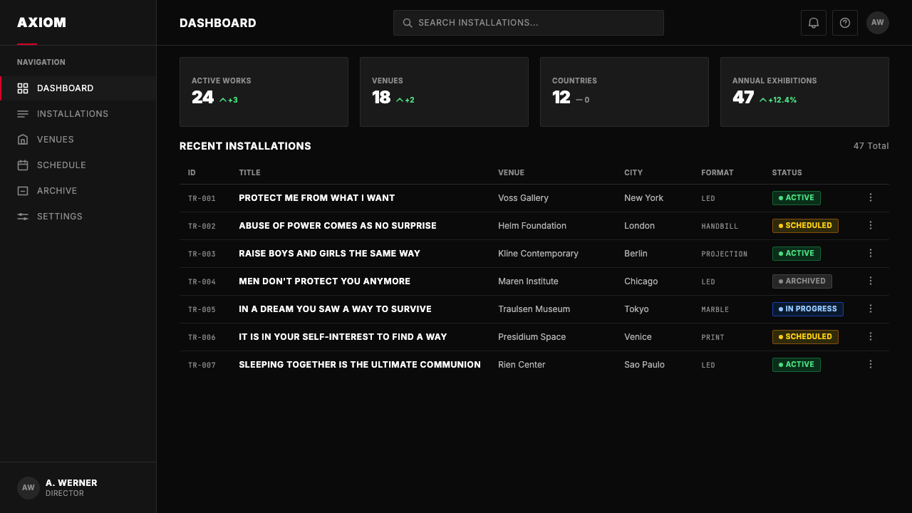
For web interfaces, the system applies well to dashboards, alert systems, pricing pages, and any product where the primary interaction is reading and deciding rather than browsing. The approach prioritizes typographic hierarchy above all else: use a bold, industrial, uppercase treatment for primary labels, a lighter weight for supporting information, and reserve any accent color exclusively for the most urgent state — an overdue item, a critical alert, a top-tier pricing option. Navigation should be purely typographic; any iconography should be reduced to the simplest possible geometric marker rather than a pictograph. The interface should feel like a display board, not a decorated application.对于网页界面,这套系统适用于仪表板、告警系统、定价页面,以及任何主要交互是阅读与决策而非浏览的产品。方法上将字体排印层级置于首位:对主要标签使用粗重、工业感、全大写的处理,对辅助信息使用较轻的字重,将任何强调色仅保留给最紧迫的状态——逾期项目、关键告警、最高定价选项。导航应当完全字体化;任何图标符号都应简化为最简几何标记,而非象形图。界面应当感觉像一块显示板,而非一个有装饰的应用程序。
For editorial and marketing work, the style is effective for campaigns that need to communicate conviction and cut through visual noise. Full-bleed black panels with a single declarative statement work as hero sections, billboard treatments, or social media assets. The key is treating each surface as a poster rather than a page: one idea, one moment, maximum contrast. For email layouts or multi-column editorial formats, the system can be adapted by using a dominant black header band with white all-caps text above a lighter body-text region — maintaining the declaration-as-opening-gesture while allowing room for narrative detail below.对于编辑与营销内容,这种风格适用于需要传达信念感并穿透视觉噪音的项目。以单一宣言式短句铺满的纯黑画面,可作为英雄区块、户外广告版面或社交媒体素材。关键在于将每个表面当作海报而非页面处理:一个想法、一个时刻、最大对比度。对于电子邮件版面或多栏编辑格式,可以通过在较浅的正文区域上方使用主导性黑色标题带配以白色全大写文字来适配这套系统——保持声明作为开场姿态,同时在下方为叙事细节留出空间。
A common mistake is applying the Holzer aesthetic purely at the surface level — black backgrounds, white text, occasional red — without committing to the tonal discipline the system requires. The most frequent failure mode is hedging: softening the type treatment with mixed case, adding decorative supporting elements, using red as a general accent color rather than a reserved alarm. Each of these compromises individually seems minor, but together they dissolve the system's defining quality: the sense that the text arrived from nowhere and demands an answer. If the visual environment feels comfortable, the system has been misread.一个常见的错误是仅在表面层面应用霍尔泽美学——黑色背景、白色文字、偶尔的红色——而不坚守这套系统所要求的语调纪律。最常见的失败模式是回避:用大小写混用软化字体处理,添加装饰性辅助元素,将红色用作一般强调色而非保留的警报。这些妥协中的每一项单独来看似乎都微不足道,但合在一起,它们消解了这套系统的决定性品质:文字仿佛从虚空中到来并要求得到回应的感觉。如果视觉环境让人感到舒适,这套系统就被误读了。
See the Jenny Holzer Truisms (1977) design system查看 Jenny Holzer Truisms (1977) 完整设计系统
Jenny Holzer Truisms (1977) — FAQJenny Holzer Truisms (1977) · 常见问题
Is this system appropriate only for dark themes, or can it work on light backgrounds?这套系统只适合深色主题,还是也能用在浅色背景上?
The canonical Holzer Truisms format is black ground with white type, and the void-black quality is essential to the system's confrontational posture. A light-background inversion — white or near-white ground with black all-caps text — is possible but significantly changes the character of the work. The light version reads as more institutional, less urgent; it loses the sense of text materializing out of darkness. The light inversion works best as a secondary register within a system that leads with the dark canonical form — for example, body content pages in a presentation that opened with a black-ground cover statement.经典的霍尔泽真言格式是黑色底面配白色文字,这种虚空感的黑色品质对于系统的对抗性姿态至关重要。浅色底面的反转版本——白色或近白底面配黑色全大写文字——是可能的,但会显著改变作品的性格。浅色版本读起来更具机构感,紧迫感减弱;它失去了文字从黑暗中显现的感觉。浅色反转最好作为系统内的次级语域使用——例如,在以黑色底面封面声明开场的演示文稿中,后续的正文内容页使用浅色版本。
How does this system differ from generic dark-mode design?这套系统与一般的深色模式设计有何不同?
Generic dark-mode design uses dark backgrounds primarily for visual comfort in low-light environments, and it typically preserves a full typographic hierarchy — various weights, sizes, and colors creating a layered informational structure. The Holzer system uses black as a conceptual void, not a comfort measure. It suppresses hierarchy rather than elaborating it: all-caps flattens the typographic register; the near-absence of imagery removes any visual relief from the text encounter; color is rationed rather than applied for visual variety. The test is whether the design could function equally well in the opposite (light) mode without loss — if yes, it is dark-mode design, not Holzer-derived design.一般的深色模式设计主要使用深色背景以提供低光环境下的视觉舒适度,并且通常保留完整的字体排印层级——不同字重、大小和颜色创造出层叠的信息结构。霍尔泽系统将黑色用作概念上的虚空,而非舒适性措施。它压制层级而非发展层级:全大写压平了字体排印语域;图像的近乎缺席消除了文字遭遇中的任何视觉缓解;色彩被定量使用,而非为了视觉多样性而施加。检验标准是:这个设计能否在相反的(浅色)模式下同样有效运作而无所损失——如果可以,它是深色模式设计,而非霍尔泽衍生设计。
Can this system be used for branding, or does the anonymity principle conflict with brand identity?这套系统可以用于品牌设计吗?匿名性原则是否与品牌识别相冲突?
There is an inherent tension, but it can be managed productively. Holzer's work deliberately suppressed authorship; brand identity work necessarily asserts it. The resolution lies in applying the system's aesthetic vocabulary — the typographic discipline, the color severity, the confrontational text treatment — while allowing the brand mark to occupy a clearly designated position that does not compete with the declarative surface. Brands that successfully reference this system tend to use it for campaign work rather than identity systems: a product launch, a manifesto moment, a campaign that needs to feel like it arrived from outside the usual advertising register. Using it as the primary identity system requires a very high tolerance for severity and a product whose values genuinely align with what the aesthetic communicates.这里存在固有的张力,但可以有效管理。霍尔泽的作品刻意压制作者身份;而品牌视觉识别工作必然要主张它。解决之道在于应用这套系统的美学词汇——字体排印的纪律、色彩的严峻、文字处理的对抗性——同时允许品牌标识占据一个清晰划定的位置,不与声明式表面相竞争。成功引用这套系统的品牌往往将其用于推广活动而非视觉识别系统:一次产品发布、一个宣言时刻、一个需要感觉像是从常规广告语域之外到来的活动。将其作为主要识别系统使用,需要对严峻感有极高的容忍度,并且要求产品价值观与这套美学所传达的内容真正契合。
What types of content work well as text in this system, and what falls flat?哪些类型的内容适合作为这套系统中的文字,哪些会显得空洞?
The system rewards declarative, assertive language: statements that take a position, name a condition, or demand a response. Short sentences of five to twelve words tend to work best — long enough to contain a complete thought, short enough to land with impact. Superlatives, process descriptions, feature lists, and hedged claims ('we strive to,' 'we believe in') all struggle in this system: they lack the blunt weight that the visual environment demands. The aesthetic is essentially a magnifier — it amplifies the quality of the text beneath it. Strong, surprising, or genuinely true statements become powerful. Weak or corporate-safe language becomes visibly inadequate.这套系统适合宣言式、断言式的语言:采取立场、命名某种状态或要求回应的陈述。五到十二个词的短句往往最为有效——足够长以包含一个完整思想,足够短以产生冲击力。最高级词汇、过程描述、功能列表和有所保留的声明(「我们致力于」、「我们相信」)在这套系统中都表现不佳:它们缺乏视觉环境所要求的那种直白重量。这套美学本质上是一个放大器——它放大其下文本的品质。有力的、令人意外的或真正真实的陈述会变得有力量。薄弱或企业安全型的语言则会显得明显不足。
Is it appropriate to use actual Jenny Holzer Truisms texts in a design project?在设计项目中直接使用珍妮·霍尔泽的真言文本是否合适?
The Truisms texts are Jenny Holzer's copyrighted literary works, not public domain material, despite their anonymous origins and public dissemination. Using them verbatim in a commercial design project without permission would constitute copyright infringement. The appropriate approach is to draw on the formal system — the typographic treatment, the color vocabulary, the compositional approach — while writing original declarative text suited to the project's actual content. The formal system can be legitimately referenced and applied; the specific texts cannot be reproduced without authorization. When the system is applied well, original text written in its spirit can carry equal authority to the source material.尽管真言最初匿名传播于公共空间,这些文本是珍妮·霍尔泽受版权保护的文学作品,并非公有领域材料。在未经许可的情况下,在商业设计项目中逐字使用它们将构成版权侵权。恰当的做法是借鉴这套形式系统——字体排印处理、色彩词汇、构图方式——同时为项目的实际内容撰写原创的宣言式文字。这套形式系统可以被合法引用和应用;具体文本未经授权不得复制。当这套系统被恰当应用时,以其精神写就的原创文字可以与原始素材具有同等的权威性。
Related design styles相关设计风格
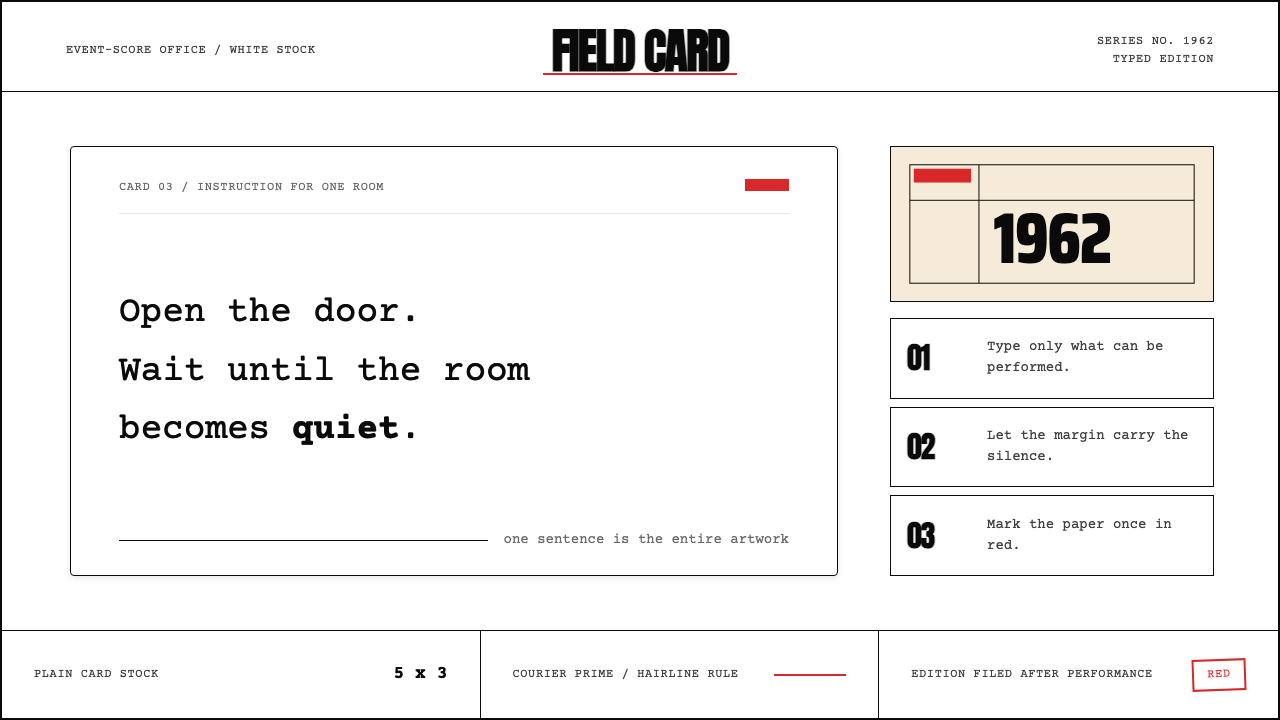 Fluxus Event Score (1962)Instruction becomes art. Courier on white card, hairline rules, one sharp red…指令即艺术:白卡上的Courier、细线框与一记红色标记。
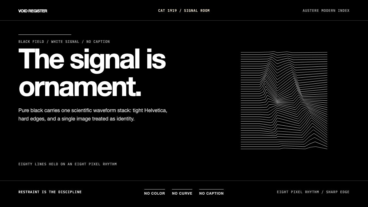 Joy Division — Unknown PleasuresRestraint becomes signal. Black field, tight Helvetica, and white pulsar line…克制成为信号。黑场、紧排Helvetica与白色脉冲线完成全部表达。
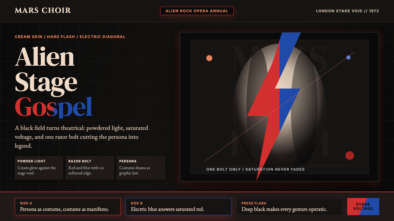 Bowie — Ziggy StardustTheater at full voltage. Cream-on-black portrait cut by one red and electric-…满电压的剧场感:黑底奶油肖像,被红与电蓝闪电劈开。
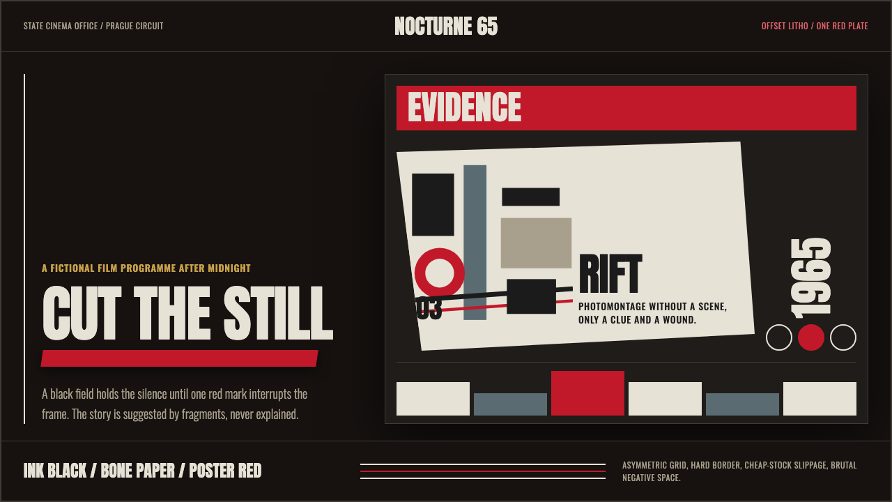 Czech New Wave PosterConcept before spectacle. Ink black, bone type and one poster-red incision fr…观念先于奇观。墨黑、骨白窄体与一道海报红切开网格。
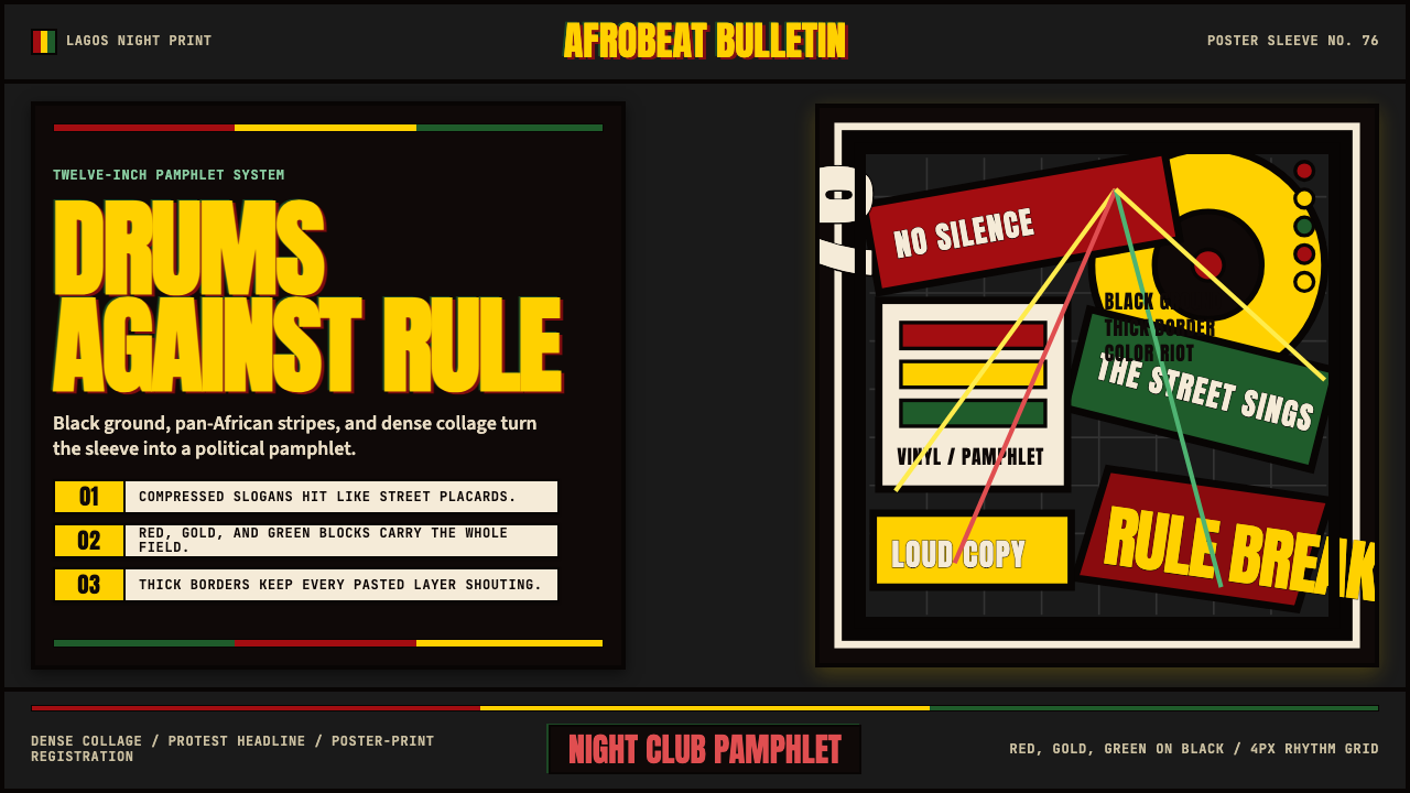 Fela Kuti Afrobeat Album (1976)Protest rhythm made visual. Red-yellow-green blocks and compressed Anton shou…抗议节奏视觉化。红黄绿块与压缩Anton黑底呐喊。
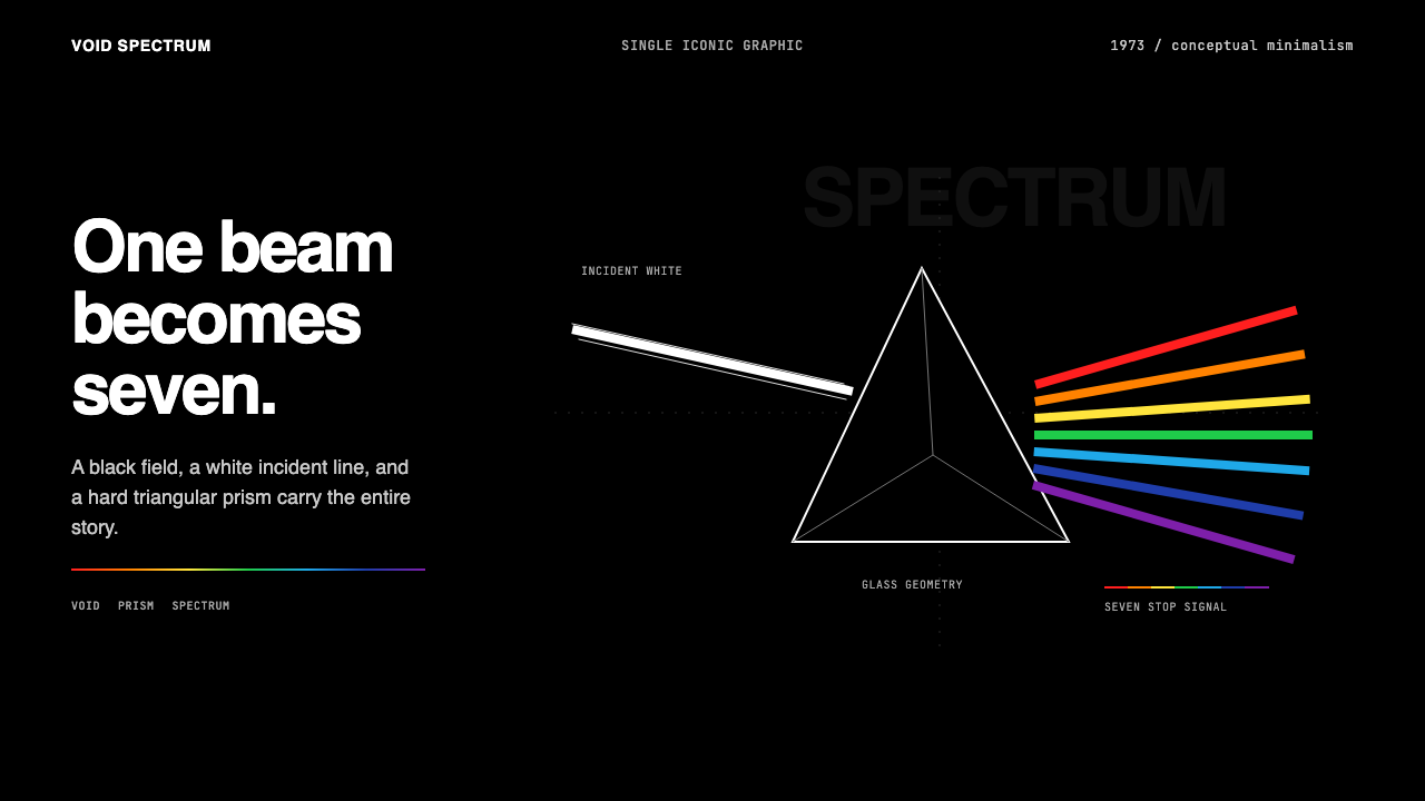 Pink Floyd — Dark Side of the MoonOne image does everything. Black void, white beam, hard prism, seven exact co…一个图像完成全部:黑色虚空、白光、硬棱镜与七色光谱。