What is Joy Division — Unknown Pleasures?什么是 Joy Division — Unknown Pleasures?
A single astronomy diagram — eighty stacked pulsar radio waves on pure black — became post-punk's most enduring visual signal.一张天文图表——纯黑底上八十道叠起的脉冲星电波——成为后朋克时代最经久不衰的视觉信号。
Joy Division — Unknown Pleasures in briefJoy Division — Unknown Pleasures 速览
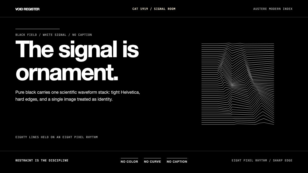
The Unknown Pleasures aesthetic is a visual system built entirely on restraint. Its foundation is a deep, field-filling black ground that refuses any warmth or ambiguity, carrying a single white line-art graphic and type set so tightly that no air seems to breathe between letters. Every element is stripped to the minimum required to communicate — and then the minimum is stripped again.《Unknown Pleasures》的视觉体系建立在彻底的克制之上。它的基础是一片填满画面的深黑底,拒绝任何温度或模糊,承载着一幅白线图形和一行字距压到极紧的文字——紧到字母之间几乎没有空气可以呼吸。每个元素都被剥到传达所需的最低限度,然后再剥一次。
The central image — eighty successive radio-pulse profiles from pulsar CP 1919, redrawn from a 1971 Cambridge astronomy paper — is not used as scientific illustration. It is used as pure form: a dense stack of irregular white mountain-ridge lines that vibrate with rhythmic energy, each wave slightly different from the last, the whole mass suggesting both data and landscape, both signal and noise. The graphic is placed without caption, without annotation, without any framing device. It simply exists against the black, unexplained.核心图形——脉冲星 CP 1919 的八十条连续电波轮廓线,重绘自 1971 年剑桥大学一篇天文学论文——并非作为科学插图使用,而是作为纯粹的形态:一叠密集的不规则白色山脊线,以节律性的能量震颤,每道波形与前一道略有差异,整体既像数据,又像地景,既像信号,又像噪声。图形被放置在版面上,没有说明文字,没有注释,没有任何框架装置。它就那样存在于黑色之中,无需解释。
This is a style where the ground is the statement. Black does not merely function as background — it is the dominant material, the surface that everything else cuts into. Type appears as incision rather than addition. The graphic reads as transmission rather than decoration. The total absence of color, texture, and hierarchy beyond the single image produces a visual atmosphere that is simultaneously scientific and emotional, cool and charged.这是一种以底色作为陈述本身的风格。黑色不仅仅充当背景——它是主导性的材料,是其他一切刻入其中的表面。文字是刻痕,而非附加。图形是传输,而非装饰。除单一图形之外,颜色、质感与层级的彻底缺席,制造出一种同时具有科学性与情感性、冷静却充满张力的视觉氛围。
See the Joy Division — Unknown Pleasures design system查看 Joy Division — Unknown Pleasures 完整设计系统
Where does Joy Division — Unknown Pleasures come from?Joy Division — Unknown Pleasures 从何而来?
The cover of Joy Division's debut album Unknown Pleasures was released in June 1979 on Factory Records, the Manchester independent label co-founded by Tony Wilson. The design was the work of Peter Saville, then twenty-three years old, who had become Factory's in-house designer without a formal brief or budget — Wilson simply allowed him to do as he wished. The source image Saville chose had appeared two years earlier in the Scientific American article 'The Geometry of Radio Galaxies' in 1977, adapted from an original graph in Harold Craft's 1970 doctoral dissertation at Cornell. The radio pulses of CP 1919 — the first pulsar ever identified, discovered in 1967 by Jocelyn Bell Burnell — had been stacked into an offset-perspective waterfall plot that read simultaneously as data visualization and terrain. Saville inverted the image from black-on-white to white-on-black, stripped all labeling, and placed it without explanation.Joy Division 首张专辑《Unknown Pleasures》的封面于 1979 年 6 月随唱片在 Factory Records 发行,这家曼彻斯特独立厂牌由 Tony Wilson 等人联合创立。设计者是当时年仅二十三岁的 Peter Saville——他成为 Factory 的内部设计师时,没有正式的创作简报,也没有预算,Wilson 只是允许他随心所欲地做。Saville 选用的图像此前曾出现在 1977 年《科学美国人》的一篇文章中,原始来源是 Harold Craft 于 1970 年在康奈尔大学完成的博士论文。CP 1919——1967 年由 Jocelyn Bell Burnell 发现的第一颗脉冲星——的射电脉冲信号被叠放成一个偏移透视瀑布图,同时读作数据可视化与地形图景。Saville 将图像从黑底白线反转为白底黑线再变为白线黑底,去除全部标注,不加任何解释地呈现在版面上。
Factory Records was itself a deliberate aesthetic project. Wilson and his partner Alan Erasmus launched it in 1978 with an ethos that was explicitly opposed to the commercial logic of the major-label industry. The label's catalogue was catalogued obsessively — every Factory release, including meeting minutes and the building lease, received a FACT number — and its visual output was treated with the same seriousness as the music. Saville was given complete creative autonomy; Factory famously had no contracts with its artists. This institutional attitude made Factory records among the most visually coherent output of any label in the period, and Saville's work for Joy Division, New Order, and Orchestral Manoeuvres in the Dark set a standard for album art that influenced independent graphic design for decades.Factory Records 本身就是一个刻意的美学工程。Wilson 与合伙人 Alan Erasmus 于 1978 年创立这家厂牌,其理念明确反对主流唱片工业的商业逻辑。厂牌的目录被强迫症式地编号——每一个 Factory 发行物,包括会议纪要和建筑租约,都获得一个 FACT 编号——其视觉产出与音乐本身受到同等程度的认真对待。Saville 被授予完全的创作自主权;Factory 出了名地不与艺人签订合同。这种机构态度使 Factory 的唱片成为那个时期视觉上最具连贯性的厂牌产出之一,而 Saville 为 Joy Division、New Order 以及 Orchestral Manoeuvres in the Dark 所做的设计,树立了一个影响独立平面设计数十年的唱片艺术标准。
Post-punk Manchester in the late 1970s was a specific cultural environment: industrial decline, cheap rehearsal spaces, a network of venues anchored by the Electric Circus and later the Factory club itself, and an art-school sensibility that overlapped with music in ways that were unusual for British pop. Joy Division — Ian Curtis on vocals, Bernard Sumner on guitar, Peter Hook on bass, Stephen Morris on drums — emerged from this milieu having absorbed both the aggression of punk and the art-damaged alienation of German electronic music, particularly Kraftwerk and Can. Their sound was bleak, rhythmically locked, and emotionally raw. Saville's design found the visual equivalent of that affect without illustrating it literally.1970 年代末曼彻斯特的后朋克文化环境具有相当的特殊性:工业衰退、廉价的排练空间、以 Electric Circus 和后来的 Factory 俱乐部本身为锚点的演出场所网络,以及以一种在英国流行乐中不寻常的方式与音乐重叠的艺术学院感性。Joy Division——主唱 Ian Curtis、吉他 Bernard Sumner、贝斯 Peter Hook、鼓手 Stephen Morris——从这一氛围中生长出来,同时吸收了朋克的攻击性与德国电子音乐(尤其是 Kraftwerk 和 Can)的艺术性疏离感。他们的声音阴郁、节奏锁紧、情感原始。Saville 的设计找到了那种情感状态的视觉对等物,而无需字面描绘它。
The image passed almost immediately into the permanent visual lexicon of popular culture. It appeared on posters, T-shirts, and eventually on objects ranging from coffee mugs to phone cases, often reproduced by people who had no idea of its scientific origin. The pulsar diagram became a free-floating signifier of a certain aesthetic sensibility — dark, serious, spare, resistant — detached from Joy Division entirely and available for adoption by anyone who wished to signal those values. This is the peculiar fate of truly successful design: it becomes a commons, and its origins recede into background.这张图像几乎立刻进入了流行文化的永久视觉词汇。它出现在海报、T 恤上,最终出现在从咖啡杯到手机壳的各类物品上,往往由毫不知晓其科学来源的人复制。这张脉冲星图表成为某种美学感性的自由漂浮能指——黑暗、严肃、简约、抗拒——完全脱离了 Joy Division 本身,向任何希望传递这些价值观的人开放采用。这是真正成功的设计的奇异命运:它成为公共资源,而其来源则退入背景之中。
What defines the Joy Division — Unknown Pleasures look?Joy Division — Unknown Pleasures 的视觉特征是什么?
Ground底场
The black field is not a background — it is the primary material. It is deep, absolute, and non-negotiable: no warmth, no texture, no gradient softening the edges. Everything else on the composition is cut from this ground rather than placed on it. This inversion of figure-ground hierarchy is the style's most fundamental characteristic: the light marks are intrusions into darkness, not additions to a neutral surface.黑色底场不是背景——它是主要材料。它深邃、绝对、没有商量余地:无温度,无质感,无渐变柔化边缘。构图中的其他一切都是从这片底场中刻出的,而非放置其上的。这种图底层级关系的反转,是该风格最根本的特征:白色线迹是刺入黑暗中的入侵,而非在中性表面上的附加。
Line-Art Graphic线稿图形
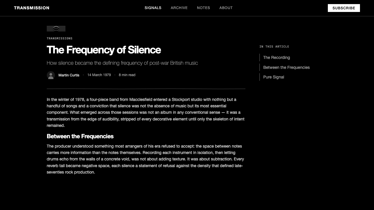
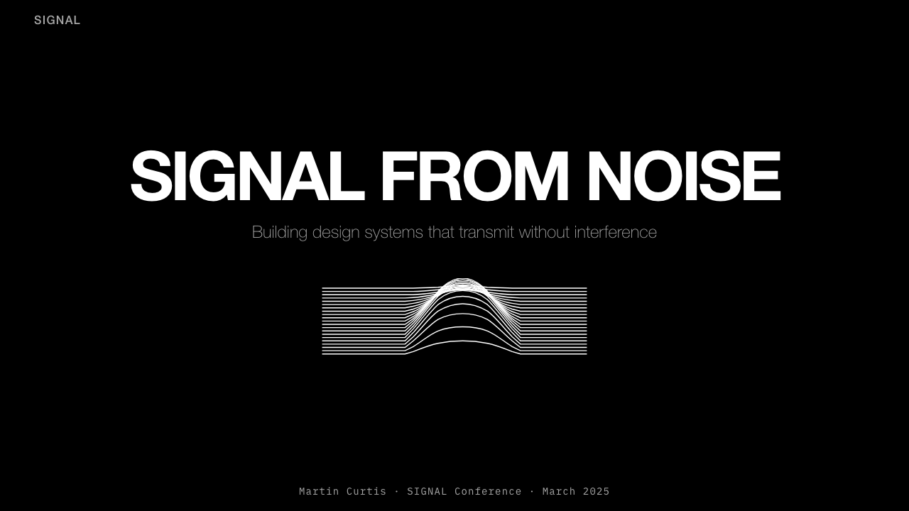
The defining visual element is a stacked, oscilloscope-style line drawing — waveforms or contour lines plotted sequentially so that they build into a dense, ridge-like mass. The individual lines are thin and precise; the cumulative form is organic and almost topographic. Critically, the image carries no label, no axis, no legend. It is scientific data presented as pure form, stripped of the apparatus that would make it legible as science.核心视觉元素是叠放的示波器式线稿——波形或等高线依次绘制,堆积成密集的山脊状整体。单条线细而精准;累积的形态则有机而近乎地形化。关键在于,图像没有标签,没有坐标轴,没有图例。这是作为纯粹形态呈现的科学数据,被剥去了使其作为科学可读的全部装置。
Monochrome Palette单色调色板
The palette is two values: pure black and pure white, with no intermediate tones, no gray, no color. This binary reduction is not minimalism as aesthetic preference but as philosophical commitment — the elimination of every tonal ambiguity that might soften the contrast or introduce a mood beyond the stark. In contemporary applications, this monochrome logic can accommodate a single muted accent, but the moment a second hue appears, the system's tension collapses.调色板只有两种值:纯黑与纯白,没有中间调,没有灰,没有颜色。这种二元简化不是作为审美偏好的极简主义,而是哲学性的承诺——消除一切可能软化对比或引入冷峻之外情绪的色调模糊。在当代应用中,这种单色逻辑可以容纳一个单一的低饱和强调色,但一旦出现第二种色相,系统的张力便随之崩溃。
Extreme Type Compression极紧字距
Type in this system is set with tracking compressed far beyond conventional comfort — letters sit against each other with almost no air between them, producing a wordmark-like density even in running text. The typeface itself is characteristically clean and modern, its geometry precise and its stroke weight uniform. The effect of extreme compression is that text reads as a solid mark before it is read as language — weight precedes word.这套体系中的文字字距被压缩到远超常规舒适度的程度——字母几乎紧贴在一起,字间几乎没有空气,即便是正文也呈现出商标式的密度。字体本身特征鲜明地干净现代,几何精准,笔画粗细均一。极度压缩的效果是:文字在被阅读为语言之前,先被阅读为一个实心的标记——重量先于文字。
Isolation and Silence孤立与沉默
The composition is structured around generous amounts of empty black space surrounding the central graphic. This is not negative space in the conventional design sense — it is silence as content. The emptiness is not a frame; it is part of the signal. A single image or text element placed within a vast dark field acquires a different weight and urgency than the same element placed within a busy composition. The style depends on this isolation as much as on any graphic element.构图围绕核心图形周围大量的空黑空间展开。这不是常规设计意义上的负空间——它是作为内容的沉默。空无不是框架;它是信号的一部分。置于大片黑暗底场中的单一图像或文字,与置于繁忙构图中的相同元素相比,获得了截然不同的分量与紧迫感。这种风格对孤立感的依赖,不亚于对任何图形元素的依赖。
Scientific Detachment科学疏离感
The aesthetic borrows the visual grammar of scientific and technical illustration — graphs, oscilloscope traces, survey maps, data prints — and deploys it without the apparatus of scientific communication. No labels, no scales, no explanatory text. The borrowed authority of the scientific image is used to produce not understanding but atmosphere: a sense that the design is indexing something real, something measured, something beyond personal expression or commercial intent.这种美学借用了科学与技术插图的视觉语法——图表、示波器轨迹、测量地图、数据打印——却在没有科学传达装置的情况下运用它。没有标签,没有刻度,没有解释文字。科学图像所借用的权威性被用来制造的不是理解,而是氛围:一种设计在索引某种真实之物、某种被测量之物、某种超越个人表达或商业意图之物的感觉。
Structural Austerity结构简朴
There is no ornamentation, no border, no rule line, no decorative device of any kind. The composition's structure is entirely load-bearing: where something sits, how large it is, how much space surrounds it — these decisions carry the full visual and emotional weight of the design. This is not the austerity of poverty or limitation; it is the austerity of a system that has decided what it wants to say and removed everything that does not serve that saying.没有装饰,没有边框,没有规则线,没有任何种类的装饰手法。构图的结构完全是承重性的:某物放在哪里、有多大、周围有多少空间——这些决定承载着设计的全部视觉与情感重量。这不是匮乏或限制的简朴;而是一套已经决定了自己想说什么、并去除了一切不服务于此表达之物的系统的简朴。
See the Joy Division — Unknown Pleasures design system查看 Joy Division — Unknown Pleasures 完整设计系统
Who shaped Joy Division — Unknown Pleasures?谁塑造了 Joy Division — Unknown Pleasures?
Saville co-founded Factory Records' visual identity from its inception in 1978 and served as the label's unofficial creative director for the following decade. Trained at Manchester Polytechnic, he brought a deep knowledge of European modernism — particularly Swiss International Style and Constructivism — to a context that was otherwise dominated by punk's raw immediacy. His Unknown Pleasures design demonstrated that album art could operate as autonomous graphic work rather than promotional packaging. Saville went on to design for New Order, Orchestral Manoeuvres in the Dark, and later for fashion houses including Givenchy and Burberry, becoming one of the few designers whose work is recognizable as a distinct body across commercial and cultural contexts.Saville 自 1978 年 Factory Records 创立之初便共同塑造了厂牌的视觉身份,在此后十年间担任厂牌非正式的创意总监。他毕业于曼彻斯特理工学院,将对欧洲现代主义——尤其是瑞士国际主义风格与构成主义——的深刻认识带入一个彼时被朋克的原始即时感所主导的语境中。他为《Unknown Pleasures》所做的设计证明了唱片封面可以作为自主的平面作品运作,而非促销包装。Saville 后来继续为 New Order、Orchestral Manoeuvres in the Dark 设计,并进入时尚领域,为纪梵希、巴宝莉等品牌工作,成为为数不多的其作品在商业与文化语境中皆可辨认为一个独特整体的设计师。
Wilson was a Granada Television presenter, cultural impresario, and the co-founder of Factory Records. His contribution to the Unknown Pleasures aesthetic was largely institutional: he created the conditions — no contracts, unlimited creative autonomy, no commercial pressure on design — under which Saville's work was possible. Wilson's philosophy held that art and commerce were not merely compatible but that commercial context was the proper site for serious artistic ambition. He later co-founded the Hacienda club, which became central to the Manchester music scene of the 1980s and early 1990s. His legacy is less a body of designed work than a set of institutional decisions that enabled others' work.Wilson 是格拉纳达电视台的主持人、文化经纪人,也是 Factory Records 的联合创始人。他对《Unknown Pleasures》美学的贡献主要是机制性的:他创造了使 Saville 的工作成为可能的条件——没有合同,完全的创作自主权,设计上没有商业压力。Wilson 的哲学认为艺术与商业不仅仅是相容的,商业语境正是严肃艺术抱负的恰当场所。他后来联合创立了 Hacienda 俱乐部,该俱乐部成为 1980 年代和 1990 年代初曼彻斯特音乐场景的核心。他的遗产与其说是一批设计作品,不如说是一系列使他人作品成为可能的机制性决定。
The vocalist and lyricist of Joy Division, Curtis was the human source of the music's emotional character — his lyrics drawn from literature (Dostoevsky, J.G. Ballard), his performance style physically intense and almost involuntary in its abandon. Curtis died by suicide in May 1980, at twenty-three, on the eve of Joy Division's first North American tour. His death fixed the band — and the album's aesthetic — in a particular emotional register that has made separation of the music from its visual presentation nearly impossible. The Unknown Pleasures image is inseparable, in cultural memory, from the sense of a signal transmitted from somewhere unreachable.Joy Division 的主唱与词曲作者,Curtis 是这支乐队音乐情感特质的人类来源——他的歌词汲取自文学(陀思妥耶夫斯基、J.G. 巴拉德),他的表演风格在身体上极具强度,近乎无意识地放弃自我控制。Curtis 于 1980 年 5 月,在 Joy Division 第一次北美巡演前夕,以二十三岁之龄自杀离世。他的死将这支乐队——以及这张专辑的美学——固定在一种特定的情感基调上,使音乐与其视觉呈现几乎无法分离。在文化记忆中,《Unknown Pleasures》的图像与一种来自某个无法抵达之处的信号传输的感觉,是不可分割的。
The astrophysicist who, as a Cambridge doctoral student in 1967, first identified the radio pulsar CP 1919 — the source of the signal whose profile forms the Unknown Pleasures graphic. Bell Burnell's discovery was among the most significant in twentieth-century astronomy; her supervisor Antony Hewish received the Nobel Prize in Physics in 1974 for the work, a decision that remained controversial for decades given Bell Burnell's central role. She was not involved in the album's design and was reportedly unaware that the pulsar chart had been used in this way until years after the release. Her scientific work, intended entirely as astronomy, became one of the most recognized visual artifacts in popular music history.天体物理学家,1967 年在剑桥攻读博士期间首次识别出射电脉冲星 CP 1919——其信号轮廓构成了《Unknown Pleasures》图形的来源。Bell Burnell 的发现是二十世纪天文学中最重要的成就之一;她的导师 Antony Hewish 于 1974 年因这项工作获得诺贝尔物理学奖,而这一决定因 Bell Burnell 在其中的核心作用而在数十年间持续引发争议。她没有参与这张专辑的设计,据报道直到发行数年后才得知脉冲星图表以这种方式被使用。她的科学工作,原本完全属于天文学领域,成为了流行音乐史上最广为人知的视觉制品之一。
Guitarist and co-founder of Joy Division, Sumner co-wrote the music that the Unknown Pleasures design was built to represent. After Curtis's death, Sumner became the vocalist and primary musical voice of New Order — the band Joy Division's remaining members formed in 1980 — and continued working with Saville on a sustained series of influential sleeve designs. New Order's run of Saville-designed releases through the 1980s extended and evolved the visual language begun with Unknown Pleasures, establishing that the aesthetic was a genuinely systematic design approach rather than a one-off creative gesture.吉他手与 Joy Division 联合创始人,Sumner 共同创作了《Unknown Pleasures》设计所要呈现的音乐。Curtis 去世后,Sumner 成为 New Order 的主唱和主要音乐声音——这支由 Joy Division 剩余成员于 1980 年组成的乐队——并继续与 Saville 合作,持续推出一系列有影响力的封面设计。New Order 整个 1980 年代由 Saville 设计的一连串发行物延续并发展了始于《Unknown Pleasures》的视觉语言,证明这套美学是一种真正系统性的设计方式,而非一次性的创意姿态。
How do you use Joy Division — Unknown Pleasures today?今天怎么用 Joy Division — Unknown Pleasures?
The Unknown Pleasures visual system is highly transferable to contemporary design contexts precisely because its principles are structural: a dominant dark field, a single precise graphic, compressed type, and disciplined silence. Applying it correctly requires understanding that the system's power comes from what it refuses rather than what it includes. Every element added beyond the minimum erodes the tension that makes the style effective.《Unknown Pleasures》的视觉体系之所以高度可移植到当代设计语境,正是因为它的原则是结构性的:主导性的黑暗底场、单一精准的图形、压缩的文字、有纪律的沉默。正确应用它,需要理解这套体系的力量来自于它拒绝的东西,而非它包含的东西。每增加一个超出最低限度的元素,都会侵蚀使这种风格有效的张力。
For presentation slides, the style is most effective when the dark field is treated as the primary surface throughout — not just on a cover — and each slide contains only one central visual idea. A cover built in this language should use a single data-inspired or waveform-derived graphic: an oscilloscope trace, a topographic contour, a signal plot, or a grid of precisely spaced lines, centered or offset slightly from center, with the title in tightly tracked clean type beneath or above it. Content slides benefit from generous black margins, a single image or diagram treated as the sole visual anchor, and type that appears as a precise incision rather than a decorative element. Data visualization slides can use the waveform-stacking logic directly: time-series data, audio waveforms, or comparative frequency plots rendered as white lines on black become both functionally legible and visually charged.在演示文稿中,这种风格最有效的做法是将黑暗底场作为贯穿始终的主要表面——不仅仅用于封面——每张幻灯片只包含一个核心视觉概念。以这套语言构建的封面应使用单一受数据启发或波形衍生的图形:示波器轨迹、地形等高线、信号图,或精确等间距的线条网格,居中或略微偏离中心,标题以字距紧缩的干净字体置于其上方或下方。内容页得益于宽阔的黑色留白、作为唯一视觉锚点的单一图像或图表,以及作为精准刻痕而非装饰元素出现的文字。数据可视化幻灯片可以直接运用波形叠加的逻辑:时间序列数据、音频波形,或以白线在黑底上呈现的比较频率图,既在功能上清晰可读,又在视觉上充满张力。
For web and product interfaces, the system translates well to contexts where seriousness, technical authority, and focus are product values — developer tools, analytics dashboards, security platforms, and high-end audio or music applications. The approach: set the entire interface on a near-black or deep charcoal ground, use white or near-white for all primary text and interface elements, and introduce a single muted accent — a deep amber, a cool white-blue, or a reduced-saturation green — only for interactive states and active selections. Borders should be fine and precise rather than heavy; spacing should be generous and consistent. Avoid introducing multiple accent colors or warm gradients: either collapses the system immediately.对于网页与产品界面,这套体系在严肃性、技术权威性与专注度是产品价值的语境中转化良好——开发者工具、分析仪表板、安全平台,以及高端音频或音乐应用。方法如下:将整个界面设置在近黑色或深炭灰底面上,所有主要文字与界面元素使用白色或近白色,仅为交互状态和活跃选择引入单一低饱和强调色——深琥珀色、冷调白蓝色,或降低饱和度的绿色。边框应细腻精准而非粗重;间距应宽裕一致。避免引入多种强调色或暖色渐变:任何一种都会立即瓦解这套体系。
For editorial and marketing design, the style supports a poster-logic where one graphic carries the full communicative weight. A feature article using this language might use a full-bleed dark ground on the opener, with the headline set in tightly tracked type and a single abstract image — waveform, terrain plot, spectrographic pattern — as the sole visual. Interior content pages can relax to a lighter ground while maintaining the typographic compression and the single-image-per-spread discipline. Marketing pages work well when they treat each section as a contained dark composition with one idea, one image, and restrained type, rather than building up multiple competing visual elements.对于编辑与营销设计,这种风格支持一种海报逻辑,即由单一图形承载全部传达重量。使用这套语言的专题文章,可以在开篇使用满版黑暗底场,标题以字距紧缩的字体呈现,并以单一抽象图像——波形、地形图、频谱图案——作为唯一视觉。内页可以向较浅的底面放宽,同时保持排版压缩和每跨页单一图像的纪律。当营销页面将每个版块都视为一个只有一个概念、一张图像和克制文字的独立黑暗构图,而非堆叠多个相互竞争的视觉元素时,效果最佳。
A common mistake when applying this aesthetic is using it as a dark-mode template, adding gradients, lens flares, or atmospheric glow effects in the belief that these heighten the drama. They do not — they dissolve exactly the quality that makes the system work, which is the flatness and precision of the marks against an absolute dark. The style's power is archival and diagrammatic, not cinematic. A second common error is allowing the type to drift toward decorative spacing or mixed weights, losing the compressed uniformity that makes the wordforms read as marks before they read as language. The discipline of the original is: one image, one typeface, one weight, one size per hierarchy level, maximum black, minimum everything else.应用这种美学时最常见的错误,是将它用作深色模式模板,添加渐变、镜头光晕或氛围发光效果,以为这些会增强戏剧感。它们不会——它们恰恰溶解了使这套体系有效的品质,即标记在绝对黑暗中的平整性与精准性。这种风格的力量是档案性和图表性的,不是电影性的。第二个常见错误是让文字漂向装饰性的字距或混合字重,失去使字形在被阅读为语言之前先被阅读为标记的压缩均一性。原版的纪律是:一张图像、一种字体、每个层级一种字重一种字号、最大化黑色、其余一切最小化。
See the Joy Division — Unknown Pleasures design system查看 Joy Division — Unknown Pleasures 完整设计系统
Joy Division — Unknown Pleasures — FAQJoy Division — Unknown Pleasures · 常见问题
Is this style just dark mode design?这种风格只是深色模式设计吗?
No, and the distinction matters. Dark mode is a display preference that inverts a light-ground interface for reduced eye strain — it is a technical accommodation, not an aesthetic system. The Unknown Pleasures aesthetic uses black as a positive material: the darkness is the content, not a setting. Dark-mode interfaces typically maintain the same compositional logic, color accents, gradients, and spatial hierarchy as their light counterparts. The Unknown Pleasures system requires a fundamentally different compositional approach — single graphic, extreme typographic compression, no gradients, no layering, disciplined silence. You can have a beautiful dark-mode interface that has nothing in common with this style, and you can apply this style's principles in ways that are not technically dark mode at all.不是,而且这一区别很重要。深色模式是一种显示偏好,它将浅色底面界面反转以减少视觉疲劳——这是一种技术性的调整,不是一套美学体系。《Unknown Pleasures》的美学将黑色用作正面的材料:黑暗是内容,而不是设置。深色模式界面通常与浅色版本保持相同的构图逻辑、色彩强调、渐变和空间层级。《Unknown Pleasures》体系需要根本不同的构图方式——单一图形、极度排版压缩、无渐变、无叠加、有纪律的沉默。你可以拥有一个与这种风格毫无共同之处的精美深色模式界面,你也可以以并非技术上的深色模式的方式应用这种风格的原则。
Can this aesthetic work with color?这种美学能与色彩共存吗?
With extreme care and in very limited quantities. The original system is binary — black and white only — and the full tension of the aesthetic depends on that binary quality. If color is introduced, it must be a single hue, kept to a very low saturation, and used only for one specific function — typically an active interactive state, a single highlight, or a data encoding in a visualization. The moment two distinct colors appear simultaneously in the composition, the system's severity begins to relax in ways that are difficult to control. Color in this context should feel like a finding — something discovered in the signal — not like a design decision made to enliven the palette.需要极度谨慎,且只能非常有限地使用。原始体系是二元的——仅黑与白——美学的全部张力依赖于那种二元性。如果引入颜色,必须是单一色相,保持非常低的饱和度,且仅用于一种特定功能——通常是活跃交互状态、单一高亮,或可视化中的数据编码。一旦构图中同时出现两种不同颜色,体系的严峻性便开始以难以控制的方式松弛。在这个语境中,颜色应该感觉像一个发现——在信号中发现的某种东西——而不是像一个为了活跃色板而做出的设计决定。
How is this different from generic post-punk or goth dark aesthetics?这与泛泛的后朋克或哥特黑暗美学有何不同?
The Unknown Pleasures aesthetic is distinguished by its scientific and diagrammatic quality rather than its darkness per se. Post-punk and goth dark aesthetics frequently use texture — distressed surfaces, halftone noise, torn-edge treatments, atmospheric grain — as expressive material. The Unknown Pleasures system refuses all texture: its marks are precise, its lines are clean, its type is uniform. The darkness is not moody or atmospheric in a romantic sense; it is absolute and technical. The source material is a scientific diagram, and the design retains that diagram's quality of measured exactness even as it strips the scientific context. This makes it closer, in spirit, to scientific instrument readouts and data print aesthetics than to the painterly or handcraft sensibilities that often underpin dark style movements.《Unknown Pleasures》的美学以其科学性和图表性品质而有别于其他,而非仅仅是其黑暗本身。后朋克和哥特黑暗美学经常使用质感——做旧表面、半调噪点、撕裂边缘处理、氛围颗粒——作为表现性材料。《Unknown Pleasures》体系拒绝一切质感:其标记是精准的,其线条是干净的,其文字是均一的。黑暗在浪漫意义上既不阴郁也不氛围化;它是绝对的和技术性的。素材来源是一张科学图表,设计在剥去科学语境的同时,保留了那张图表的测量精确性品质。这在精神上使其更接近科学仪器读数和数据打印美学,而非经常支撑黑暗风格运动的绘画性或手工艺感性。
What kinds of products or brands is this aesthetic wrong for?哪些类型的产品或品牌不适合这种美学?
The Unknown Pleasures aesthetic communicates seriousness, technical authority, and emotional restraint — it is fundamentally a cool and closed visual register. It is wrong for any context that requires warmth, accessibility, playfulness, or cultural openness. Consumer products aimed at families, children, or mass-market audiences will find the severity alienating. Health and wellness brands depend on approachability and organic warmth that this system structurally excludes. Food and hospitality brands need sensory richness — the suggestion of texture, temperature, and pleasure — that an absolutely flat monochrome system cannot provide. The aesthetic is also poorly suited to contexts where inclusivity and welcome are core values: the visual language signals membership in a specific, somewhat exclusive, cultural sensibility, which can feel excluding rather than inviting to audiences outside that sensibility.《Unknown Pleasures》的美学传达的是严肃、技术权威和情感克制——它根本上是一种冷静而封闭的视觉基调。它不适合任何需要温暖感、可及性、趣味性或文化开放性的语境。面向家庭、儿童或大众市场受众的消费品会发现这种严峻令人疏远。健康与养生品牌依赖于亲近感和有机温度,而这套体系在结构上排除了这些。食品与餐饮品牌需要感官丰富性——质感、温度与愉悦的暗示——这是绝对平整的单色体系无法提供的。这种美学也不适合包容性与欢迎感是核心价值的语境:这套视觉语言表达的是对某种特定的、某种程度上带有排他性的文化感性的归属,这对该感性之外的受众而言可能感觉是排斥而非邀请。
Is the waveform graphic required, or can the system work with other imagery?必须使用波形图形吗?还是这套体系可以配合其他图像运作?
The waveform is the original's specific graphic, not a required element of the style. The underlying principle is a single precise line-art image of scientific or technical derivation — something that reads as measurement, signal, or data. Other images that share this quality can work within the system: seismic traces, topographic contour plots, architectural section drawings, sound spectrograms, mathematical function plots, circuit diagrams simplified to their essential lines. What does not work is illustrative imagery, photography, or anything with tonal range or organic texture — these reintroduce the very qualities the system is designed to exclude. The test is whether the image could plausibly have come from a technical instrument or a scientific publication: if yes, it may belong in this system. If it could as easily have come from a photography session or an illustration commission, it does not.波形是原版的特定图形,而非这种风格的必要元素。其底层原则是单一精准的、具有科学或技术来源的线稿图像——某种读作测量、信号或数据的东西。具有这种品质的其他图像可以在这套体系中运作:地震轨迹、地形等高线图、简化到基本线条的建筑剖面图、声音频谱图、数学函数图、电路图。无效的是插图图像、摄影,或任何具有色调范围或有机质感的东西——这些重新引入了这套体系旨在排除的确切品质。测试标准是:这张图像是否有可能来自技术仪器或科学出版物——如果是,它可能属于这套体系。如果它同样可能来自摄影拍摄或插图委托,那么它不属于这套体系。
Related design styles相关设计风格
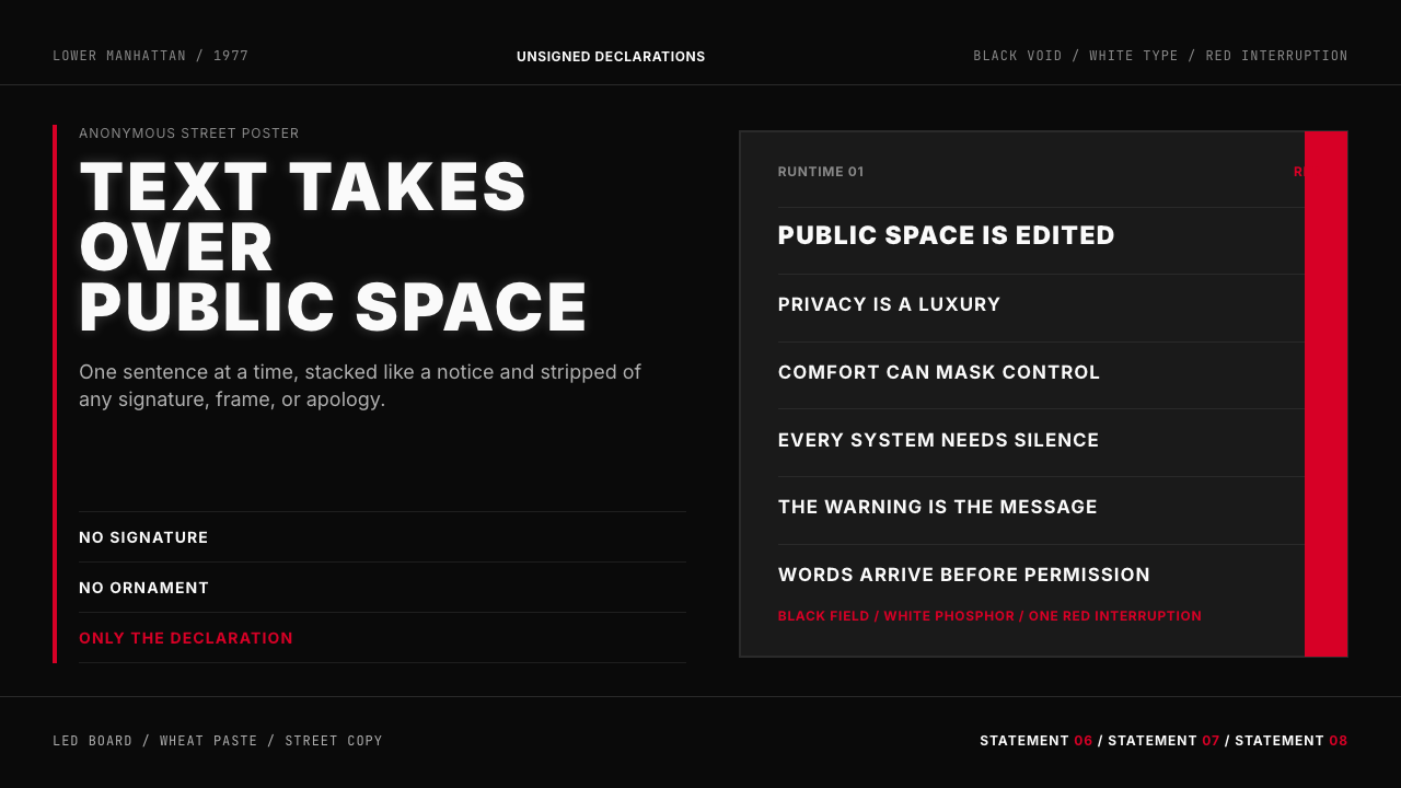 Jenny Holzer Truisms (1977)Austere declarations. White all-caps on black, cut by a single red warning.克制宣言。黑底白字,全大写排成LED板,红色只作警示。
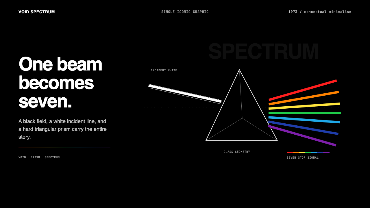 Pink Floyd — Dark Side of the MoonOne image does everything. Black void, white beam, hard prism, seven exact co…一个图像完成全部:黑色虚空、白光、硬棱镜与七色光谱。
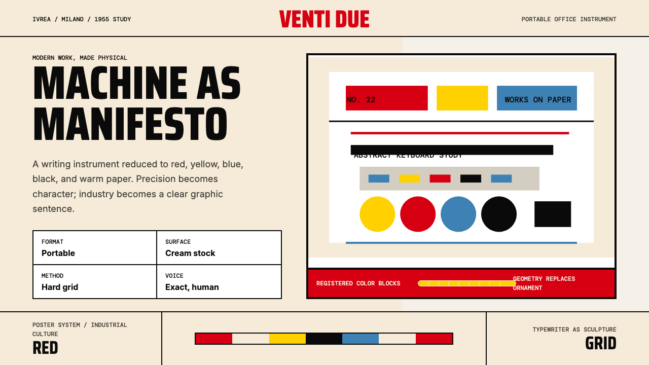 Olivetti Pintori (1955)Industry becomes poetry. Cream paper, machine red, and hard geometry abstract…工业成为诗:奶油纸、机器红与硬朗几何,将打字机抽象化。
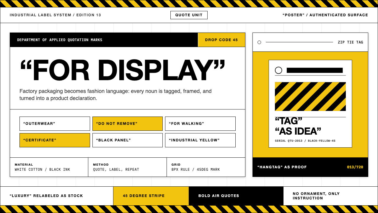 Off-White (Virgil Abloh era)Industrial irony, labeled. Yellow stripes and Helvetica quotes turn luxury in…工业反讽标签化:黄黑斜纹与粗黑无衬线引号,把奢侈变成工厂库存。
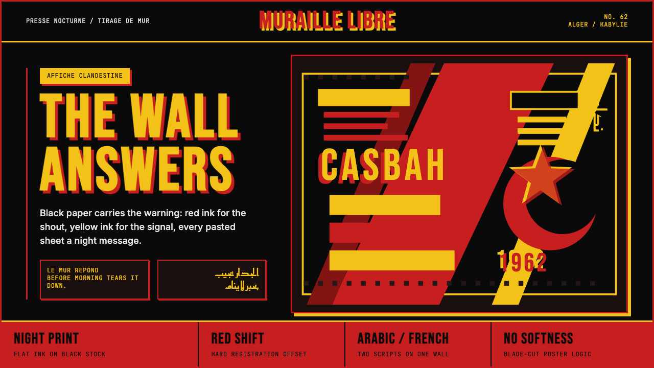 Algerian Casbah Poster (1954–1962)Every surface is a manifesto. Blood red, warning yellow, and stencil type hit…每个表面都是宣言:血红、警示黄与模板字撞上黑色新闻纸。
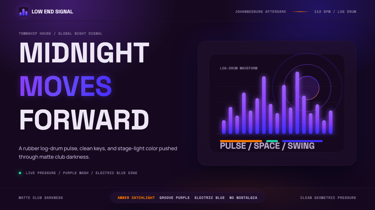 AmapianoClub darkness, fully awake. Purple-blue waveforms pulse through geometric typ…午夜黑场醒着:紫蓝声波穿过几何字体。