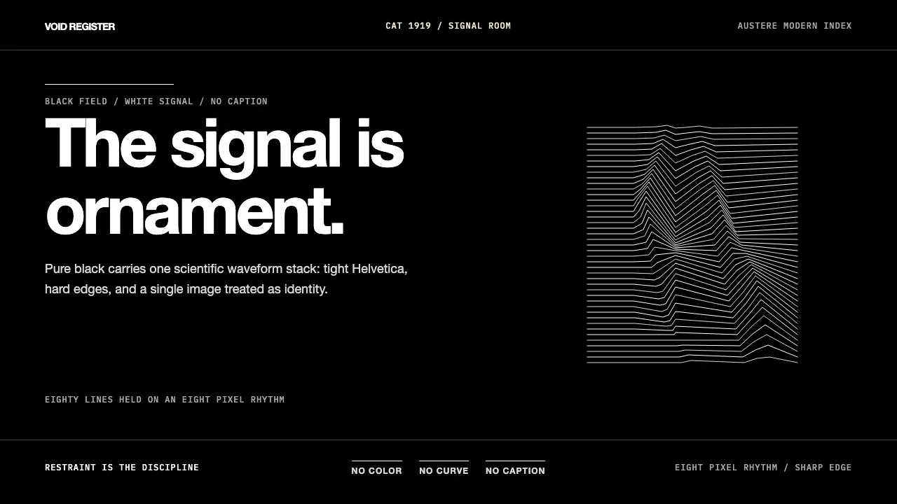
About Joy Division — Unknown Pleasures
Joy Division's 1979 *Unknown Pleasures* sleeve — Peter Saville's pure-black field carrying 80 stacked white pulsar-wave-lines from a 1971 Cambridge astronomy diagram of CP 1919 — became post-punk's defining visual gesture. Manchester's Factory Records turned austere modernism into music identity.
The system is strict: deep black ground, pure white type, extreme-tight Helvetica tracking, Bauhaus-sharp edges, single iconic graphic. Restraint is the discipline. The signal is the ornament.
- Origin
- Manchester, UK
- Era
- 1976–1980 Joy Division; 1979 Unknown Pleasures (Factory Records FACT 10); Peter Saville design-system 1978–1991
- Key figures
- Ian Curtis · Peter Saville · Tony Wilson · Bernard Sumner
- Movements
- Manchester post-punk · Factory Records visual design · Modernist-minimalist album art
Joy Division — Unknown Pleasures design spec
Colors
Background
Surface
Primary
Secondary
Accent
Text
Typography
Helvetica NeueHeadings
IBM Plex MonoMono
Unlock for 1 credit
The other 11 sections — buttons, cards, spacing, motion, techniques and more — open once you unlock. Download the DESIGN.md or send it to your AI in one click. Unlock once, yours forever.
Sign up nowHave an account? Sign in
Styles similar to Joy Division — Unknown Pleasures
Also inspired by film, games & music, with a close feel.
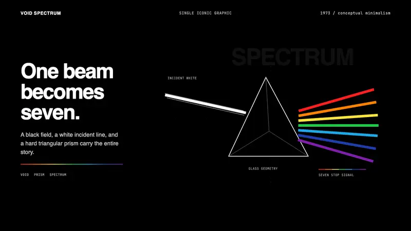 Pink Floyd — Dark Side of the MoonOne image does everything. Black void, white beam, hard prism, seven exact color stops.
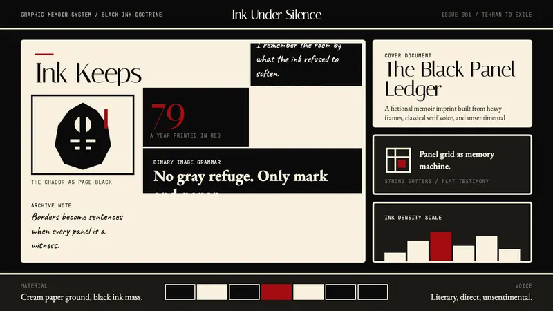 Persepolis (Marjane Satrapi, 2000)Stark memory, pure ink. Cream panels, heavy black borders, one revolution-red strike.
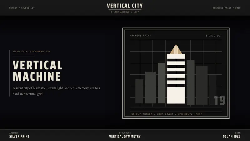 Metropolis (Fritz Lang, 1927)Monumental and severe. Black grid, cream type, sepia shadows.
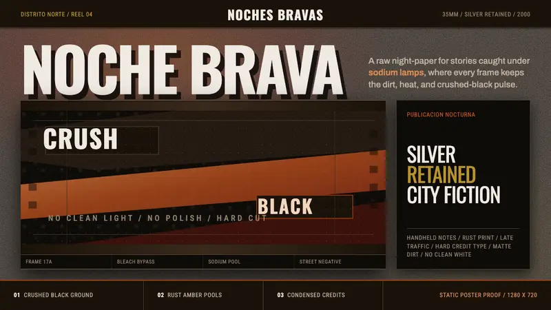 Amores Perros New WaveRaw street cinema. Crushed black, sodium amber, Oswald credits, heavy 35mm grain.