About Pink Floyd — Dark Side of the Moon
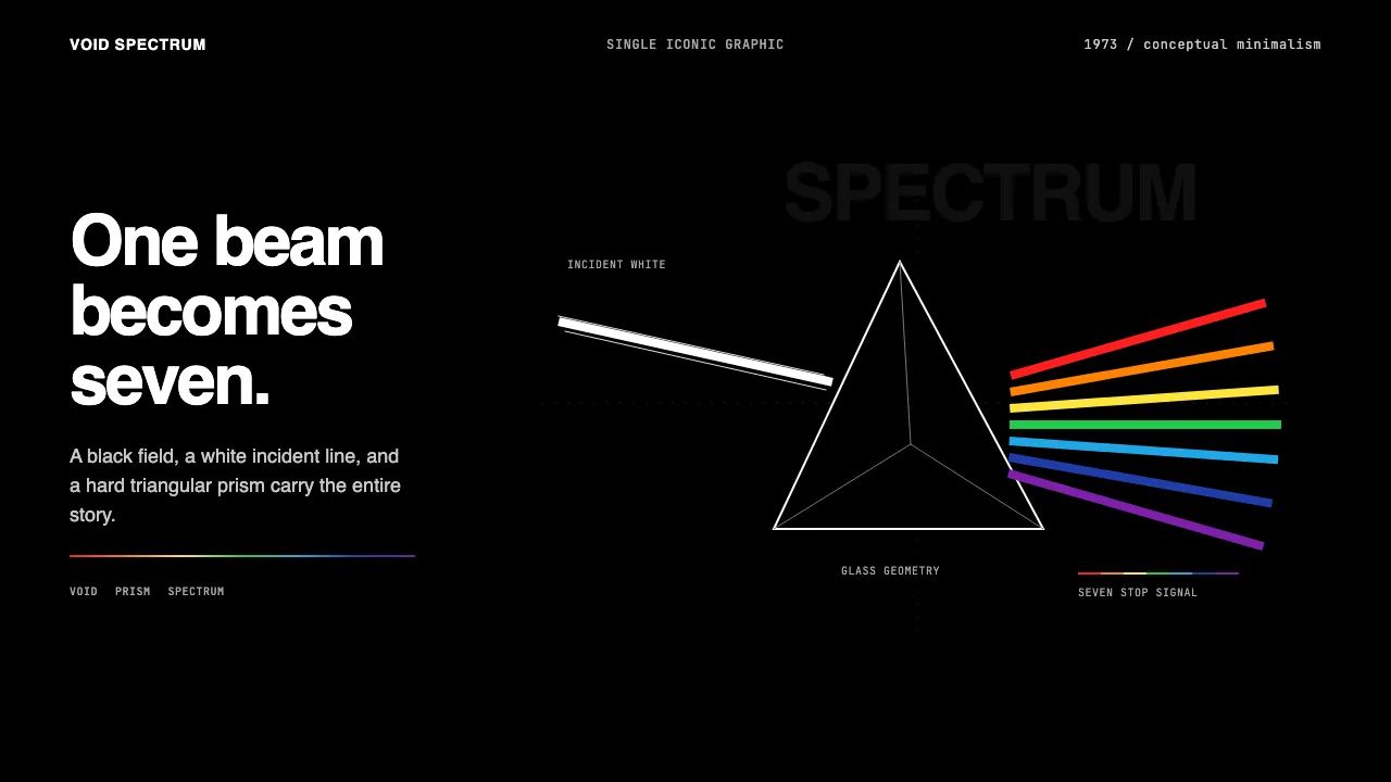
Pink Floyd's *The Dark Side of the Moon* (1973), designed by Hipgnosis with illustrator George Hardie, is the most-iconic album cover ever made: a single isosceles prism splitting a white beam into a saturated 7-color spectrum against pure black. It is conceptual-minimalism distilled — one image, one geometry, one idea.
The Curio system inherits that discipline. Deep-black void is the substrate. Sans-serif type (Helvetica / Inter / Akzidenz-Grotesk) sits in pure white or single rainbow stops. Composition is single-iconic-graphic, not maximalist — every screen is a prism moment, not a collage.
Learn more about the Pink Floyd — Dark Side of the Moon style
- Origin
- UK (London); global rock album-art canon
- Era
- Pink Floyd founded 1965; The Dark Side of the Moon released March 1973; Hipgnosis design-studio 1968–1983
- Key figures
- Storm Thorgerson · Aubrey Powell · George Hardie · Roger Waters
- Movements
- Hipgnosis conceptual-photography · prog-rock album-art canon · 1970s rock visual-design
Pink Floyd — Dark Side of the Moon design spec
Colors
Typography
The other 11 sections — buttons, cards, spacing, motion, techniques and more — open once you unlock. Download the DESIGN.md or send it to your AI in one click. Unlock once, yours forever.
Sign up nowStyles similar to Pink Floyd — Dark Side of the Moon
Also inspired by film, games & music, with a close feel.
 Joy Division — Unknown PleasuresRestraint becomes signal. Black field, tight Helvetica, and white pulsar lines do all the work.
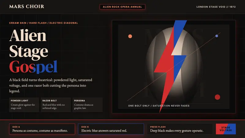 Bowie — Ziggy StardustTheater at full voltage. Cream-on-black portrait cut by one red and electric-blue bolt.
 Dub SoundsystemStudio-dark and heavy. Vinyl grooves, manila stamp, green-gold-red echo type.
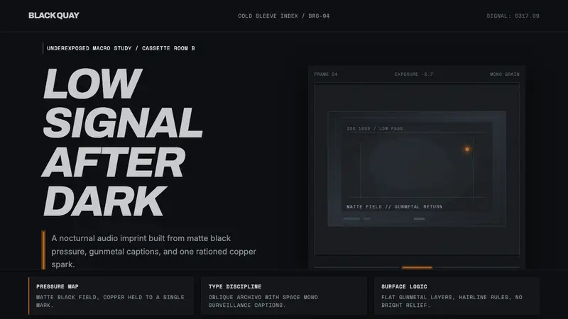 Bristol Trip-HopMenace through minimalism. Near-black grain, gunmetal type, one copper spark.