What is Pink Floyd — Dark Side of the Moon?什么是 Pink Floyd — Dark Side of the Moon?
One isosceles prism, one white beam, seven saturated color stops, and pure black — the most iconic album cover ever made became a design system built on absolute restraint.一块等腰三棱镜、一束白光、七道饱和光谱、纯粹的黑——史上最具标志性的唱片封面,成为一套以绝对克制为基石的设计体系。
Pink Floyd — Dark Side of the Moon in briefPink Floyd — Dark Side of the Moon 速览
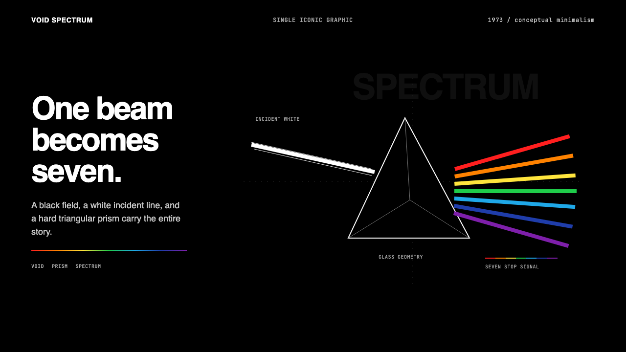
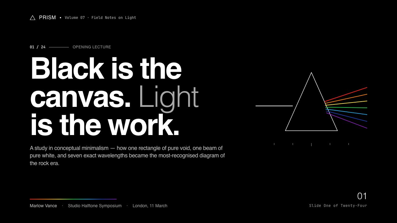
Pink Floyd's The Dark Side of the Moon (1973) visual identity is conceptual minimalism at its most complete: a single geometric object — a prism — performs a single physical act — splitting white light into a spectrum — against a field of unbroken black. There are no words on the cover image itself, no textures, no graduated tones beyond the hard spectral band. Every decision has been stripped to its irreducible minimum, and what remains is total.Pink Floyd 1973年《月之暗面》的视觉识别是观念极简主义最彻底的实现:一个几何物体——棱镜——在一片无间断的纯黑底面上执行一个单一的物理动作——将白光分解为光谱。封面图像本身没有文字,没有纹理,除了那道硬朗的光谱带之外没有任何过渡色调。每一个决定都被剥离至不可再减的最小值,剩下的就是全部。
As a design language, Dark Side distills that discipline into three governing elements: the deep-black void as substrate, pure white or single-hue type as the only text treatment, and one iconic graphic moment per composition. The rainbow spectrum is not decoration — it is the entire statement. Color appears in hard, saturated bands that transition sharply rather than blending softly, echoing the physics of actual prismatic dispersion rather than romantic gradation.作为设计语言,《月之暗面》将这种自律提炼为三个支配性元素:深黑的虚空作为底面,纯白或单色调字体作为唯一的文字处理方式,每个构图只允许一个标志性的图形瞬间。彩虹光谱不是装饰——它是整个陈述。色彩以硬朗、饱和的色带呈现,彼此之间是截然的跃迁而非柔和的混融,呼应真实棱镜色散的物理现实,而非浪漫化的渐变想象。
The aesthetic sits at the intersection of scientific illustration and rock-era counterculture, combining the cold precision of optical physics diagrams with the saturated intensity of psychedelic album art. It is neither warm nor cold in any conventional sense — it is exact. That exactness is what gives the style its lasting authority and its unusual capacity to read as simultaneously intellectual and visceral.这种美学处于科学插图与摇滚时代反文化的交汇处,将光学物理图解的冷峻精确与迷幻唱片封面的饱和强度融合在一起。它既非传统意义上的温暖,也非传统意义上的冷漠——它是精确的。正是这种精确赋予了这套风格持久的权威感,以及同时读作知性与感官的非凡能力。
See the Pink Floyd — Dark Side of the Moon design system查看 Pink Floyd — Dark Side of the Moon 完整设计系统
Where does Pink Floyd — Dark Side of the Moon come from?Pink Floyd — Dark Side of the Moon 从何而来?
The Dark Side of the Moon was released on 1 March 1973 on Harvest Records in the United Kingdom. The album was recorded at Abbey Road Studios in London between 1972 and 1973, and it went on to spend more than 900 weeks on the Billboard album chart — a commercial longevity without parallel in rock history. The cover was designed by the Hipgnosis studio, founded in London in 1968 by Storm Thorgerson and Aubrey Powell, who had met as schoolmates alongside Roger Waters. Hipgnosis became the preeminent rock album-art studio of the 1970s, responsible for covers by Led Zeppelin, Peter Gabriel, and dozens of other artists, but The Dark Side of the Moon remains the work for which the studio is most remembered.《月之暗面》于1973年3月1日由英国 Harvest 唱片发行。专辑于1972至1973年间在伦敦艾比路录音室录制,此后在 Billboard 专辑榜上停留超过900周——这是摇滚历史上无可比拟的商业寿命。封面由 Hipgnosis 工作室设计。Hipgnosis 由 Storm Thorgerson 与 Aubrey Powell 于1968年在伦敦共同创立,两人是与 Roger Waters 同窗的校友。Hipgnosis 成为1970年代最重要的摇滚唱片封面工作室,为 Led Zeppelin、Peter Gabriel 及数十位艺人操刀封面,但《月之暗面》始终是人们对这家工作室最深的记忆。
The brief from Roger Waters was specific: the band wanted something clean, elegant, and 'grown-up' — explicitly rejecting the psychedelic collage style that had dominated album art in the late 1960s. Waters described wanting an image that was sophisticated and in keeping with the album's themes of time, money, mortality, and the pressures of modern life. Thorgerson and Powell settled on the prism concept after Powell discovered a physics-textbook diagram of prismatic light dispersion. The geometric clarity of that diagram — beam enters, spectrum exits — was already a perfect visual argument. The challenge was to execute it with the material precision of scientific illustration rather than the painterly approximation of record-cover art.Roger Waters 提出的要求十分明确:乐队希望得到一个干净、优雅、「成熟」的形象——明确拒绝1960年代末主导唱片封面的迷幻拼贴风格。Waters 描述说,他想要一个既精致、又契合专辑主题的图像——那些主题包括时间、金钱、死亡,以及现代生活的重压。Thorgerson 与 Powell 在 Powell 发现一幅物理教科书中的棱镜色散图解后,确定了棱镜这一概念。那幅图解的几何清晰度——光束进入,光谱射出——已经是一个完美的视觉论点。挑战在于以科学插图的材料精确性而非唱片封面惯用的绘画式近似来执行它。
The execution was handled by George Hardie, a London illustrator and graphic designer who had studied at the Royal College of Art. Hardie rendered the prism and spectrum with ruling pen and airbrush, achieving the hard edges and smooth tonal transitions that distinguished the image from hand-painted contemporaries. The white beam entering from the left edge, the precise triangular prism, and the seven-band spectrum exiting to the right were laid out against a field of pure black — achieved in final print through a special dense black ink specified by the studio. The inside gatefold sleeve extended the spectrum into a heartbeat line traced in green, a visual motif that echoed the album's opening and closing heartbeat sounds.具体执行由伦敦插画师、平面设计师 George Hardie 完成,他曾就读于英国皇家艺术学院。Hardie 用直线笔与气刷绘制棱镜与光谱,实现了将这幅图像与同时代手绘作品区分开来的硬朗边缘与平滑色调过渡。从左侧边缘射入的白光束、精确的三角形棱镜、向右射出的七色光谱,被布置在一片纯黑的底面上——在最终印刷中,这片黑通过工作室特别指定的高密度黑色油墨实现。内页展开封套将光谱延伸为一条以绿色描绘的心跳波形线——这个视觉母题呼应了专辑开场与收尾的心跳音效。
Hipgnosis as a studio operated on a philosophy that was conceptual rather than illustrative: images should carry an idea, not merely decorate a product. This approach was itself a rejection of the hand-lettered psychedelic style of the immediately preceding era — the Grateful Dead posters, the Jefferson Airplane covers — in favor of something more controlled, more graphic, and more reducible to a single transferable image. Thorgerson later described the Hipgnosis method as starting from the music's emotional and conceptual content and working backward to the simplest image that could carry it. For Dark Side, the prism was not a metaphor chosen from a list — it was the only object that could simultaneously represent enlightenment, transformation, refraction of experience, and scientific beauty in a single, instantaneously legible form.Hipgnosis 工作室秉持的是观念先于插图的哲学:图像应当承载一个想法,而不仅仅是装饰一件产品。这种方法本身就是对紧前一个时代的手写体迷幻风格——感恩至死的演出海报、杰佛逊飞机的唱片封面——的拒绝,转而追求更可控、更图形化、更能简化为单一可传播图像的东西。Thorgerson 后来描述 Hipgnosis 的方法是:从音乐的情感与观念内容出发,逆向推导出能承载它的最简单图像。对于《月之暗面》,棱镜并非从候选清单中挑选的一个隐喻——它是唯一一个能在单一的、瞬间可读的形态中同时代表启示、转化、经验的折射与科学之美的物体。
What defines the Pink Floyd — Dark Side of the Moon look?Pink Floyd — Dark Side of the Moon 的视觉特征是什么?
Black Void Ground黑色虚空底面
The absolute, unrelieved black ground is the defining substrate of the Dark Side palette. It is not a dark grey, not a near-black — it is the maximum density of absence, specified to print at full saturation. Against this void, all other elements achieve their maximum contrast. White becomes blinding, spectral color becomes electric. The black does not recede behind the image; it is as present as the prism itself, functioning as both empty space and active compositional element.那片绝对、毫无缓和的黑色底面,是《月之暗面》调色板最决定性的底层。它不是深灰,不是接近黑色——它是缺席的最大密度,指定以最高饱和度印刷。在这片虚空之上,所有其他元素实现了最大对比度。白色变得炫目,光谱色变得通电。黑色并不后退于图像之后;它与棱镜本身同样在场,同时作为空无的空间与主动的构图元素而存在。
Hard Spectral Color硬朗的光谱色彩
Color in this system appears as hard, fully saturated bands arranged in the sequence of visible light — the exact order that a prism produces. The transitions between hues are sharp rather than gradated, honoring the physics of actual light dispersion. When applied to design, this means each color stop is used at full intensity, as a distinct zone rather than a blended wash. The palette's power comes from this precision: every color is exactly itself, defined by its position in the sequence, not by any decorative intention.在这套体系中,色彩以硬朗、完全饱和的色带呈现,按照可见光的排列顺序——棱镜实际产生的精确顺序——依次排布。色相之间的过渡是截然的而非渐进的,遵从真实光色散的物理现实。应用于设计时,这意味着每个色阶以最高强度使用,作为一个独立的色域而非混融的色晕。这套调色板的力量正来自这种精确:每种颜色完全是它自身,由其在序列中的位置定义,而非由任何装饰意图决定。
Single Iconic Graphic单一标志性图形
The Dark Side composition law is one image, one idea. A single geometric object performs a single action. There is no secondary graphic, no background texture, no supporting iconography. Each application of the style should commit to one central visual statement and remove everything that competes with it. The corollary is that the one image must be chosen with corresponding care — it carries the entire communicative load alone, with no supporting cast.《月之暗面》的构图法则是:一个图像,一个想法。单一几何物体执行单一动作。没有次级图形,没有背景纹理,没有辅助图标。运用这套风格的每个应用场景,都应当坚定地致力于一个核心视觉陈述,并移除一切与之竞争的元素。由此推论:那一个图像必须以相应的谨慎来选择——它独自承担全部的传达重量,没有配角。
White as Signal白色作为信号
White in this system is not a neutral background — it is the source of all color. The white beam is the thing that becomes the spectrum. In typographic application, white carries this same charge: it is the sharpest possible contrast against the black ground, and it should be used for elements of primary importance. When white and spectral color coexist in a layout, white functions as the entry point — the unrefracted, undifferentiated beginning — and spectral color as the resolved, differentiated outcome.在这套体系中,白色不是中性背景——它是所有色彩的源头。那束白光是变成光谱的东西。在字体应用中,白色承载同样的电荷:它是在黑色底面上最锐利的对比,应当用于最重要的元素。当白色与光谱色在版面中共存时,白色充当入口——那个未折射、未分化的起始——而光谱色则是已解析、已分化的结果。
Geometric Precision几何精确性
Every form in the Dark Side visual language is constructed rather than drawn — the prism is an exact isosceles triangle, the beam is a perfectly straight line, the spectrum bands are parallel and equal-width. There is nothing hand-made about the image; it has the quality of a technical diagram. In application, this means type should sit at rigorous alignments, graphic elements should meet at clean angles, and compositions should feel as though they were plotted rather than arranged by intuition.《月之暗面》视觉语言中的每个形态都是被构造的,而非被描绘的——棱镜是精确的等腰三角形,光束是完美的直线,光谱色带是平行且等宽的。图像中没有任何手工感;它具有技术图解的品质。在应用中,这意味着字体应当以严格的对齐方式落定,图形元素应当以干净的角度相交,构图应当给人一种被绘制而非被直觉排列的感觉。
Zero Decorative Texture零装饰纹理
The original cover contains no grain, no halftone, no paper texture, no noise, no glow, no lens flare. Its surfaces are immaculate. In digital application, this discipline translates directly: no drop shadows with soft falloff, no blurred backgrounds, no frosted-glass effects, no ambient light simulations. If an element cannot be described as a flat, bounded, fully saturated geometric form or a clean type element, it probably does not belong in the system.原始封面不含任何颗粒、网点、纸张纹理、噪点、光晕或镜头耀斑。其表面无可挑剔的洁净。在数字应用中,这种自律直接对应:不使用软化衰减的投影,不使用模糊背景,不使用磨砂玻璃效果,不使用环境光模拟。如果一个元素无法被描述为一个平面、有界、完全饱和的几何形态或干净的字体元素,它很可能不属于这套体系。
Asymmetric Directionality非对称方向性
The prism image has a strong left-to-right directionality — white enters from the left, the spectrum exits to the right — that creates an implicit reading sequence built into every composition. Light travels. Transformation happens across the frame. Layouts that employ this style benefit from encoding a similar directional logic: a beginning, a moment of transformation, and an outcome. Symmetrical arrangements undercut this energy; the style works best when composition has somewhere to go.棱镜图像具有强烈的从左到右的方向性——白光从左侧进入,光谱从右侧射出——这在每个构图中内置了一个隐性的阅读顺序。光在传播。转化在画框中发生。运用这种风格的版面,若能编码类似的方向性逻辑——一个起始,一个转化时刻,一个结果——将大有裨益。对称排列会削弱这种能量;这套风格在构图有所去向时表现最佳。
See the Pink Floyd — Dark Side of the Moon design system查看 Pink Floyd — Dark Side of the Moon 完整设计系统
Who shaped Pink Floyd — Dark Side of the Moon?谁塑造了 Pink Floyd — Dark Side of the Moon?
Co-founder of Hipgnosis alongside Aubrey Powell, Thorgerson was the primary creative director behind the Dark Side cover concept. A childhood friend of Roger Waters and Syd Barrett, he brought a literary and conceptual sensibility to rock album art at a moment when the field was dominated by psychedelic illustration. Thorgerson's method — starting from an idea and finding its simplest possible visual embodiment — produced some of the most durable images in rock history, including covers for Led Zeppelin, Genesis, and Peter Gabriel. He continued working until his death in 2013, and his insistence on concept-first design remains the clearest precedent for the Dark Side visual philosophy.Thorgerson 与 Aubrey Powell 共同创立了 Hipgnosis,是《月之暗面》封面概念背后的主要创意总监。作为 Roger Waters 与 Syd Barrett 的童年好友,他在一个被迷幻插图主导的时代,将文学性与观念性带入了摇滚唱片封面艺术。他的方法——从一个想法出发,寻找其最简可能的视觉具象——创造出了摇滚历史上一些最经久不衰的图像,包括 Led Zeppelin、Genesis 与 Peter Gabriel 的封面。他一直工作至2013年辞世,他对观念优先设计的坚持,至今仍是《月之暗面》视觉哲学最清晰的先例。
Powell co-directed Hipgnosis with Thorgerson and shared creative responsibility for the Dark Side cover. His discovery of the prism diagram in a physics textbook provided the seed image from which the final cover developed. Powell's contribution to Hipgnosis was often more photographic and production-focused than Thorgerson's more conceptual orientation, and together they created a studio whose output spanned photography, illustration, and graphic design in ways that were unusual for a commercial album-art practice. Powell has continued to discuss and document the Dark Side cover extensively in interviews and publications, providing the most detailed public account of the design process.Powell 与 Thorgerson 共同执导 Hipgnosis,并共同承担《月之暗面》封面的创意责任。他在一本物理教科书中发现的棱镜图解,提供了最终封面由此生长的种子图像。Powell 对 Hipgnosis 的贡献,往往比 Thorgerson 更具观念取向的方向更偏向摄影与制作,两人共同创建了一家以不寻常的方式跨越摄影、插图与平面设计的工作室。Powell 在采访与出版物中持续深入讨论并记录《月之暗面》封面,提供了对这一设计过程最详尽的公开陈述。
The illustrator who gave the prism its final, immaculate form. Hardie studied at Saint Martin's School of Art and the Royal College of Art in London, and his training in technical illustration gave him the precision that the Dark Side image required. Where Hipgnosis developed the concept, Hardie executed it with ruling pen, airbrush, and an exacting eye for the quality of each edge and transition. He went on to design other album covers including the original Led Zeppelin debut, and continued working as a graphic designer and illustrator. The Dark Side prism remains the most reproduced single image to emerge from his career.是他赋予了棱镜其最终的、无可挑剔的形态。Hardie 就读于伦敦圣马丁艺术学院与英国皇家艺术学院,他在技术插图方面的训练,赋予了他《月之暗面》图像所需要的精确性。Hipgnosis 发展了概念,Hardie 则用直线笔、气刷以及对每条边与每处过渡质量严苛审视的眼光加以执行。他后来还设计了其他唱片封面,包括 Led Zeppelin 的首张专辑,并继续从事平面设计师与插画师的工作。《月之暗面》棱镜至今仍是他职业生涯中被复制最多的单一图像。
As Pink Floyd's primary lyricist and conceptual architect for The Dark Side of the Moon, Waters defined the brief that Hipgnosis worked from. His insistence on sophistication over psychedelia — on visual work that matched the album's philosophical ambitions about mortality, greed, and the fragmentation of identity — was the constraint that pushed Hipgnosis toward the prism solution. Waters's role in the visual outcome is often underestimated: the clarity and restraint of the final image are direct consequences of the clarity of his creative brief. He has been consistent across decades of interviews in describing the album and its art as unified expressions of the same ideas.作为 Pink Floyd 的主要词作者与《月之暗面》的观念架构者,Waters 定义了 Hipgnosis 据此工作的委托要求。他对精致而非迷幻的坚持——对能与专辑关于死亡、贪婪与身份碎裂的哲学抱负相匹配的视觉作品的坚持——正是推动 Hipgnosis 走向棱镜方案的那个约束。Waters 在视觉结果中的作用常被低估:最终图像的清晰与克制,直接源于他创意委托的清晰。他在数十年的采访中始终如一地将这张专辑与其艺术描述为同一想法的统一表达。
How do you use Pink Floyd — Dark Side of the Moon today?今天怎么用 Pink Floyd — Dark Side of the Moon?
The Dark Side visual language is among the most transferable of any rock-era aesthetic because its rules are optical rather than decorative. Applying it correctly requires understanding what the system is actually doing: using the maximum contrast of black-void ground to make every element register at full intensity, reserving color for moments of singular importance, and committing each composition to one central visual act. The common error is treating it as a dark theme with rainbow accents — that is the shell without the logic.《月之暗面》视觉语言是摇滚时代美学中可移植性最强的之一,因为它的规则是光学性的,而非装饰性的。正确应用它,需要理解这套体系实际上在做什么:用黑色虚空底面的最大对比度让每个元素以最高强度呈现,将色彩保留给单一重要的时刻,并让每个构图致力于一个中心视觉动作。最常见的错误是将它当作一个带彩虹点缀的深色主题——那是去除了逻辑的外壳。
For presentation slides, the style produces some of its most powerful results. Cover slides benefit from a single centered or asymmetrically placed geometric form — a triangle, a beam, or an abstract spectral band — against pure black, with the title in clean white type at a scale that commands the frame. Content slides should maintain the black ground and use white for all body text, reserving a single spectral color — one stop from the sequence — to mark the single most important element on the slide: a key number, a highlighted term, or a categorical label. Data slides gain particular impact: bar charts and line graphs rendered in spectral sequence against a black field look authoritative and precise, as though they belong to a scientific instrument rather than a business deck.对于演示文稿,这套风格能产生一些最强有力的效果。封面页受益于单一居中或非对称放置的几何形态——一个三角形、一束光线或一道抽象光谱带——置于纯黑底面上,标题以干净的白色字体以统领画面的尺度呈现。内容页应当保持黑色底面,所有正文用白色,保留一种光谱色——序列中的一个色阶——来标记页面上唯一最重要的元素:一个关键数字、一个高亮术语或一个类别标签。数据页获得特别的力量:在黑色底面上以光谱顺序呈现的柱状图与折线图,看起来权威而精确,仿佛属于一台科学仪器而非一份商业文稿。
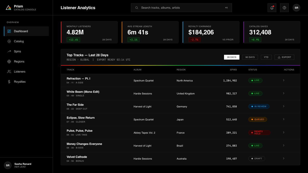
For web interfaces — dashboards, analytics tools, pricing pages, and dark-mode applications — the Dark Side palette is immediately at home. The approach is to commit fully to the black ground as the page background, use white for all primary text and interface labels, and draw on the spectral sequence for status indicators, tier differentiation, and data visualization. Interactive states can use a shift along the spectrum — hover states progress from one hue to an adjacent one — rather than conventional lightening or darkening. Hard borders replace soft card shadows; flat geometric dividers replace decorative separators. Navigation and headers should be typographic and spare.对于网页界面——仪表板、分析工具、定价页面与深色模式应用——《月之暗面》调色板立刻如鱼得水。方法是完全致力于将黑色底面作为页面背景,用白色处理所有主要文本与界面标签,并从光谱序列中取用色彩来表示状态指示符、层级区分与数据可视化。交互状态可以使用光谱上的位移——悬停状态从一个色相推进到相邻的色相——而非常规的变亮或变暗。硬边边框替代软阴影卡片;平面几何分割线替代装饰性分隔符。导航与标题应当字体化且简洁。
For editorial layouts — long-form articles, feature covers, annual reports, or any context where a single strong image anchors the visual identity — the style supports a poster-like compositional logic: one image, one hierarchy, maximum black ground. An editorial spread using this language would place a full-bleed black field across both pages, use a single spectral element as the chapter or section identifier, and set all body text in white or a soft near-white at a comfortable reading weight. Marketing applications follow the same logic at higher intensity: campaign pages built around a single prism moment, with calls to action marked by the single most saturated color in the sequence rather than conventional button styles.对于编辑版面——长篇文章、特稿封面、年度报告,或任何以单一强烈图像锚定视觉识别的场景——这套风格支持海报式的构图逻辑:一个图像,一个层级,最大面积的黑色底面。使用这种语言的编辑跨页,会将全出血黑色底面铺设在两页上,用单一光谱元素作为章节或段落的标识,并以舒适的阅读字重在白色或柔和的近白色下排版所有正文。营销应用以更高强度遵循同样的逻辑:围绕单一棱镜时刻构建的活动页面,行动号召用序列中饱和度最高的单一色彩标记,而非常规按钮样式。
A common mistake when applying this aesthetic is importing softness — blurred glows around spectral elements, semi-transparent overlays, gradient fades at the edges of color bands, or drop shadows with any diffusion. Each of these choices undermines the system's core argument, which is that edges are decisions and every transition is accounted for. A soft glow around a spectral band replaces the physics of dispersion with the aesthetics of neon signage — visually similar, conceptually opposite. Similarly, using too many spectral colors simultaneously, or allowing colors to blend rather than band, collapses the prism metaphor into decorative rainbow, losing the precision that makes the style legible as a system rather than a mood.应用这种美学时,一个常见错误是引入柔软性——光谱元素周围的模糊光晕、半透明叠加层、色带边缘的渐变消隐,或任何带有扩散的投影。这些选择中的每一个,都削弱了这套体系的核心论点——边界是决定,每一处过渡都有据可查。光谱带周围的柔和光晕,用霓虹灯招牌的美学替代了色散的物理现实——视觉上相似,观念上相反。同样,同时使用过多光谱色,或允许颜色混融而非分带,会将棱镜隐喻崩塌为装饰性的彩虹,失去使这套风格作为体系而非氛围可读的那种精确性。
See the Pink Floyd — Dark Side of the Moon design system查看 Pink Floyd — Dark Side of the Moon 完整设计系统
Pink Floyd — Dark Side of the Moon — FAQPink Floyd — Dark Side of the Moon · 常见问题
Can the Dark Side style work on a light or white background?《月之暗面》风格能在浅色或白色背景上使用吗?
It can be adapted, but the fundamental logic changes. The spectral colors derive their intensity from the black ground — on white, they read as bright but not electric, losing the quality of light emerging from darkness. A white-ground adaptation works best if it commits to a single spectral color as an accent against an otherwise entirely monochrome layout: black type, white field, one hard-edged color band as the sole accent element. Using multiple spectral colors on a light ground risks reading as generic rainbow decoration rather than prismatic precision. The original force of the style lives in the contrast ratio that only the black void provides.可以适应,但基本逻辑会改变。光谱色从黑色底面获得其强度——在白色上,它们看起来明亮,但没有通电感,失去了光从黑暗中涌现的品质。白色底面的适应版本,在将单一光谱色作为强调色——置于其他方面完全黑白的版面之上——时效果最佳:黑色字体,白色底面,一道硬边色带作为唯一强调元素。在浅色底面上使用多种光谱色,有被读作普通彩虹装饰而非棱镜精确的风险。这套风格的原始力量,存在于只有黑色虚空才能提供的对比度中。
How is this different from general dark-mode design?这与一般的深色模式设计有何不同?
Dark-mode design in contemporary UI practice typically uses dark greys rather than pure black, applies desaturated colors to reduce eye strain, and prioritizes softness — soft shadows, gentle gradients, low-contrast borders. The Dark Side style is the opposite of this in almost every dimension: it uses the deepest achievable black, fully saturated color, hard edges, and maximum contrast. It makes no accommodation for fatigue or extended reading comfort — it is designed for impact at first encounter. Applying standard dark-mode softening conventions to this style produces something that resembles neither dark-mode UI nor Dark Side — it is the zone where both logics break down. Choose one.当代用户界面实践中的深色模式设计,通常使用深灰色而非纯黑,采用低饱和色以减少眼疲劳,并以柔软性为优先——柔和的投影、轻缓的渐变、低对比边框。《月之暗面》风格在几乎每个维度上都与此相反:它使用可实现的最深黑色、完全饱和的色彩、硬朗的边缘与最大的对比度。它不为疲劳或长时间阅读舒适度作任何妥协——它是为第一次相遇时的冲击而设计的。将标准深色模式的柔化惯例应用于这套风格,会产生一种既不像深色模式用户界面、也不像《月之暗面》的东西——那是两种逻辑同时崩溃的地带。选择其一。
Should all seven spectral colors be used in every application?每个应用场景都应当使用全部七种光谱色吗?
No — and using all seven simultaneously is one of the surest ways to undermine the style. The prism image works because the spectrum reads as a unified phenomenon: one event with seven consequences. When all seven colors are assigned to separate interface elements or data categories simultaneously, the unified-event reading collapses into visual noise. The most effective applications of this palette use one or two colors from the spectrum for functional differentiation — red and violet for opposite poles of a scale, yellow for the single critical alert, green for a positive state — and reserve the full seven-band rendering for moments of genuine display, such as a hero image or a loading screen.不——同时使用全部七种色彩,是破坏这套风格最可靠的方式之一。棱镜图像之所以有效,是因为光谱被读作一个统一的现象:一个事件,七个后果。当全部七种颜色同时被分配给独立的界面元素或数据类别时,统一事件的阅读感会崩塌为视觉噪音。这套调色板最有效的应用,是从光谱中取用一到两种颜色进行功能性区分——红色与紫色代表量表的两个极端,黄色代表唯一的关键警示,绿色代表正常状态——并将完整的七色带呈现保留给真正需要展示的时刻,如主视觉图像或加载界面。
What typography works best with this aesthetic?哪种字体排印最适合这种美学?
The Dark Side cover itself uses no body type — the image is the entire communication. When typography enters the system, it should match the image's qualities: clean, geometric, and constructed rather than calligraphic. Neutral sans-serif typefaces with even stroke widths and no humanist warmth are the correct register. Condensed or extended proportions can reinforce the horizontal or vertical directionality of a composition. Type should be set in pure white against the black ground, or in a single spectral color when hierarchy demands differentiation. Mixing typefaces, using script or display faces with calligraphic origins, or allowing any softness in letterform construction — rounded terminals, ink traps, optical corrections — works against the system's technical precision.《月之暗面》封面本身不使用正文字体——图像是全部的传达。当字体排印进入这套体系时,它应当与图像的品质相匹配:干净的、几何的、被构造的而非书法性的。笔画粗细均匀、没有人文主义温度的中性无衬线字体,是正确的基调。紧缩或拉伸的字宽比例,可以强化构图的水平或垂直方向性。字体应当在黑色底面上以纯白设置,或在层级需要区分时以单一光谱色设置。混用字体、使用具有书法起源的手写体或展示字体,或在字形构造中允许任何柔软性——圆润的字端、墨水陷阱、光学修正——都与这套体系的技术精确性相悖。
Is this style appropriate for brands that want to appear approachable or friendly?这套风格适合希望显得平易近人或友好的品牌吗?
Rarely. The Dark Side aesthetic is authoritative, exact, and demanding of the viewer's full attention. Those are assets for products and brands where precision, mastery, and intellectual seriousness are desired associations: developer tools, scientific instruments, premium audio equipment, advanced analytics platforms, or any context where the experience of encountering something genuinely powerful is part of the product promise. They are liabilities for contexts that depend on warmth, accessibility, playfulness, or community — consumer social applications, children's educational tools, wellness products, or brands whose primary positioning is around belonging rather than capability. The style does not bend toward friendliness without losing itself; better to use a style that is authentically warm than to force this one into an affect it was never designed to carry.很少如此。《月之暗面》美学是权威的、精确的,并要求观者全情投入。这些特质对于精准、掌控与知性严肃是期望联想的产品与品牌而言是资产:开发者工具、科学仪器、高端音频设备、高级分析平台,或任何将遭遇真正强大之物的体验作为产品承诺一部分的场景。对于依赖温暖感、可及性、趣味性或社群感的场景,它们则是负担——消费级社交应用、儿童教育工具、健康产品,或主要定位于归属感而非能力感的品牌。这套风格无法在不失去自身的情况下弯向友好;与其强行将它套入一种它从未被设计来承载的情感基调,不如使用一种本真温暖的风格。
Related design styles相关设计风格
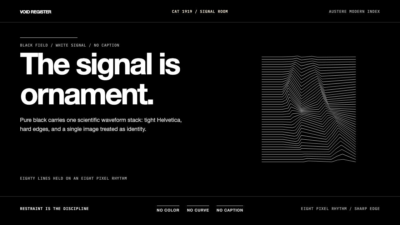 Joy Division — Unknown PleasuresRestraint becomes signal. Black field, tight Helvetica, and white pulsar line…克制成为信号。黑场、紧排Helvetica与白色脉冲线完成全部表达。
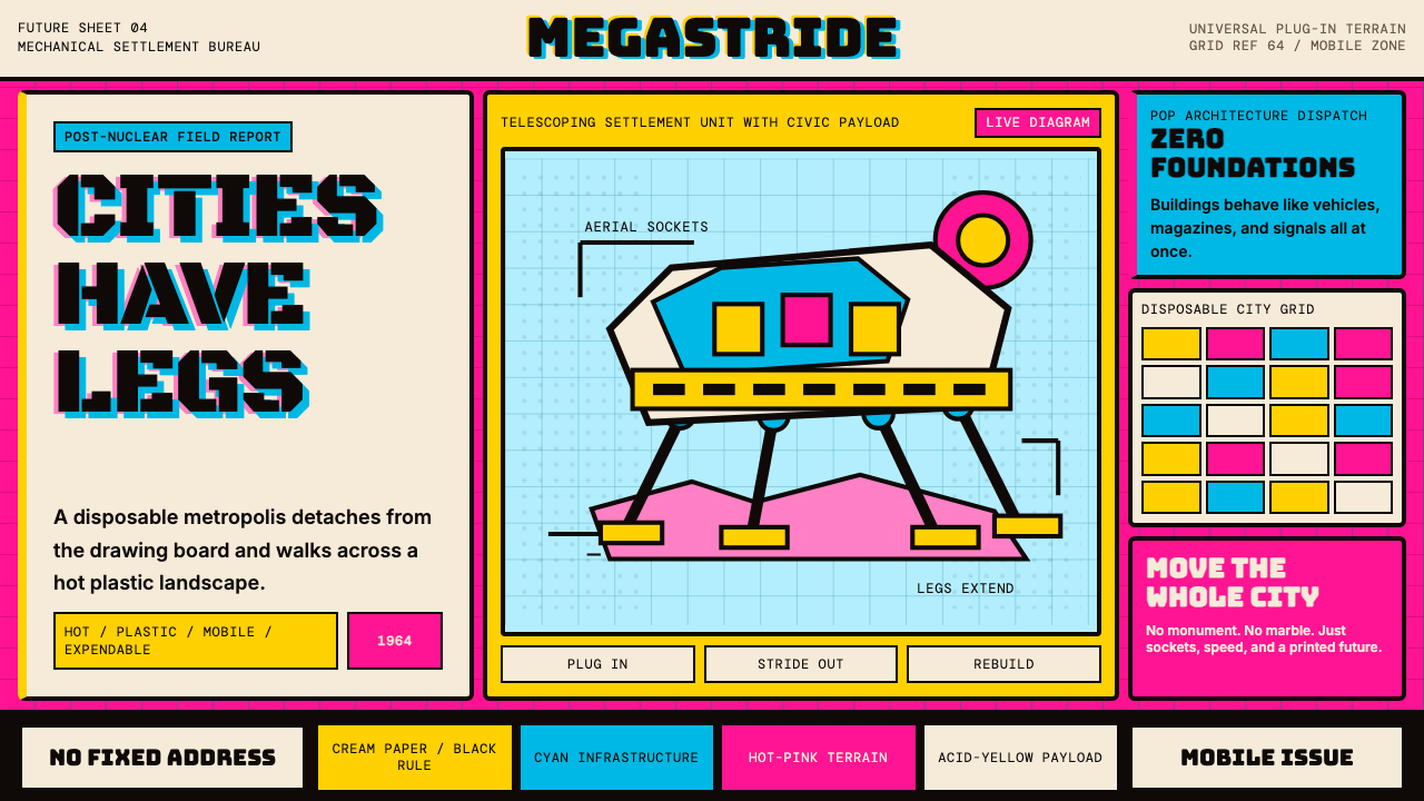 Archigram Walking City (1964)Cities refuse foundations. Hot pink, cyan, and acid yellow lock a bordered co…城市拒绝地基。热粉、青蓝与酸黄压进粗黑漫画格。
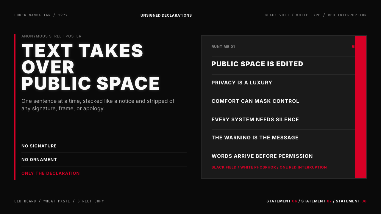 Jenny Holzer Truisms (1977)Austere declarations. White all-caps on black, cut by a single red warning.克制宣言。黑底白字,全大写排成LED板,红色只作警示。
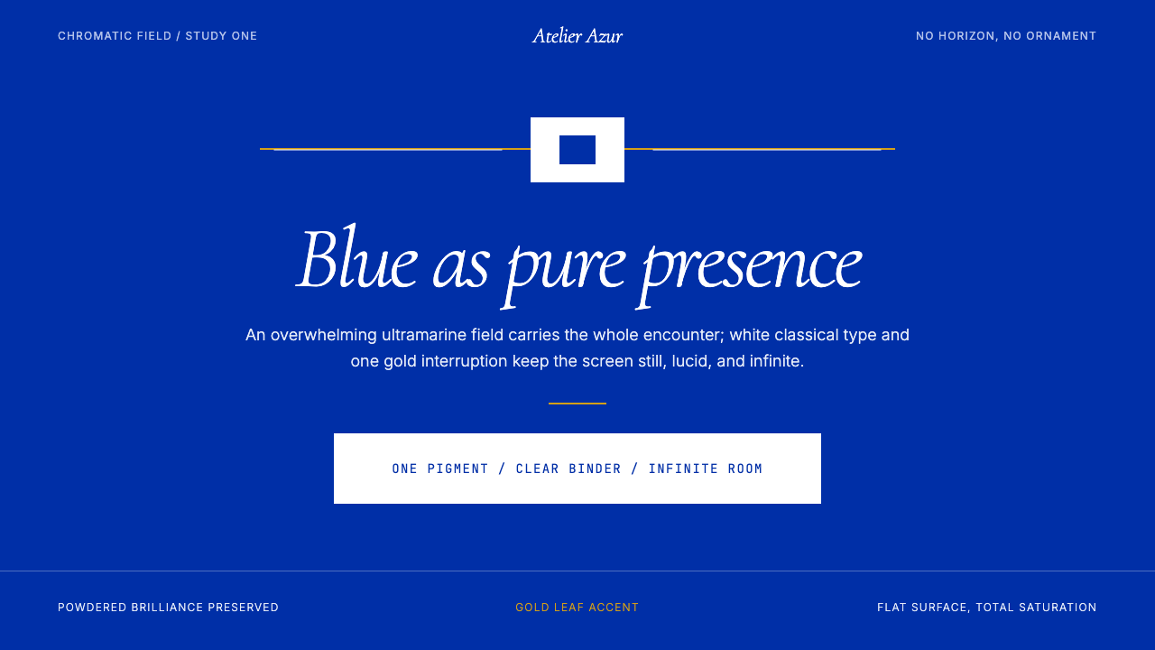 Klein Blue (IKB)Color becomes the content. Pure ultramarine field, white italic serif, one go…色彩即内容:纯群青场域、白色斜体衬线与一线金色。
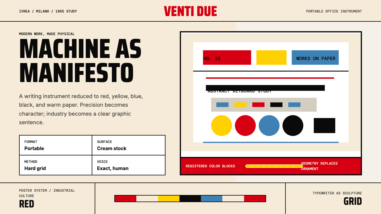 Olivetti Pintori (1955)Industry becomes poetry. Cream paper, machine red, and hard geometry abstract…工业成为诗:奶油纸、机器红与硬朗几何,将打字机抽象化。
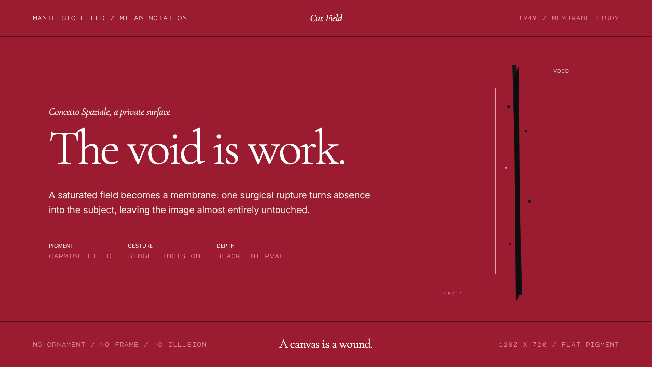 Spatialism (Fontana Cut, 1949)Absence becomes medium. Carmine field, Garamond restraint, one black incision.缺席成为媒介:胭脂红色场、Garamond克制排版、一道黑色切口。