What is Klein Blue (IKB)?什么是 Klein Blue (IKB)?
International Klein Blue is not a color applied to a surface — it is a surface that has become entirely, overwhelmingly, undeniably color.国际克莱因蓝不是涂在表面上的颜色——它本身就是表面,彻底、压倒性、无可辩驳地成为颜色本身。
Klein Blue (IKB) in briefKlein Blue (IKB) 速览
International Klein Blue — abbreviated IKB — is the specific ultramarine pigment formulated by French artist Yves Klein in 1957 and officially registered in 1960. Klein developed the color in collaboration with Parisian art supplier Edouard Adam, suspending pure ultramarine powder in a synthetic resin binder that preserved the pigment's raw, powdery luminosity without the dulling effect that traditional oil or acrylic binders produced. The result was a color of extraordinary saturation: a deep, resonant blue that appeared almost to emit light rather than reflect it.国际克莱因蓝(缩写IKB)是法国艺术家伊夫·克莱因于1957年配制、1960年正式注册的特定群青色素。克莱因与巴黎艺术品供应商爱德华·亚当合作,将纯群青粉末悬浮于合成树脂粘合剂中,在不损失粉质光辉的前提下保留了色素的原始生命力——传统油性或丙烯粘合剂会使色彩变得暗淡,而这种配方完全回避了这一问题。最终诞生的色彩饱和度非凡:深邃而共鸣的蓝,看起来近乎在发光,而非反射光线。
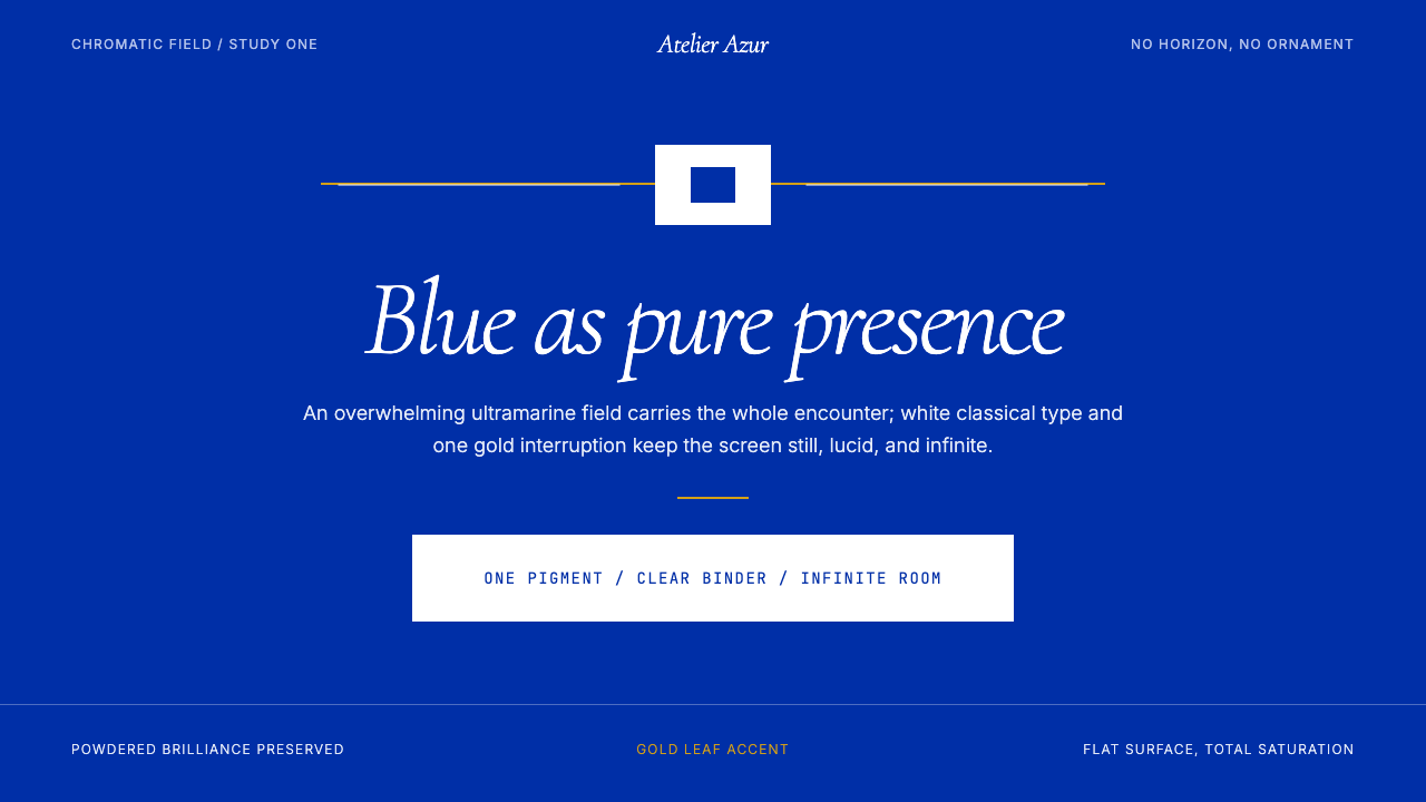
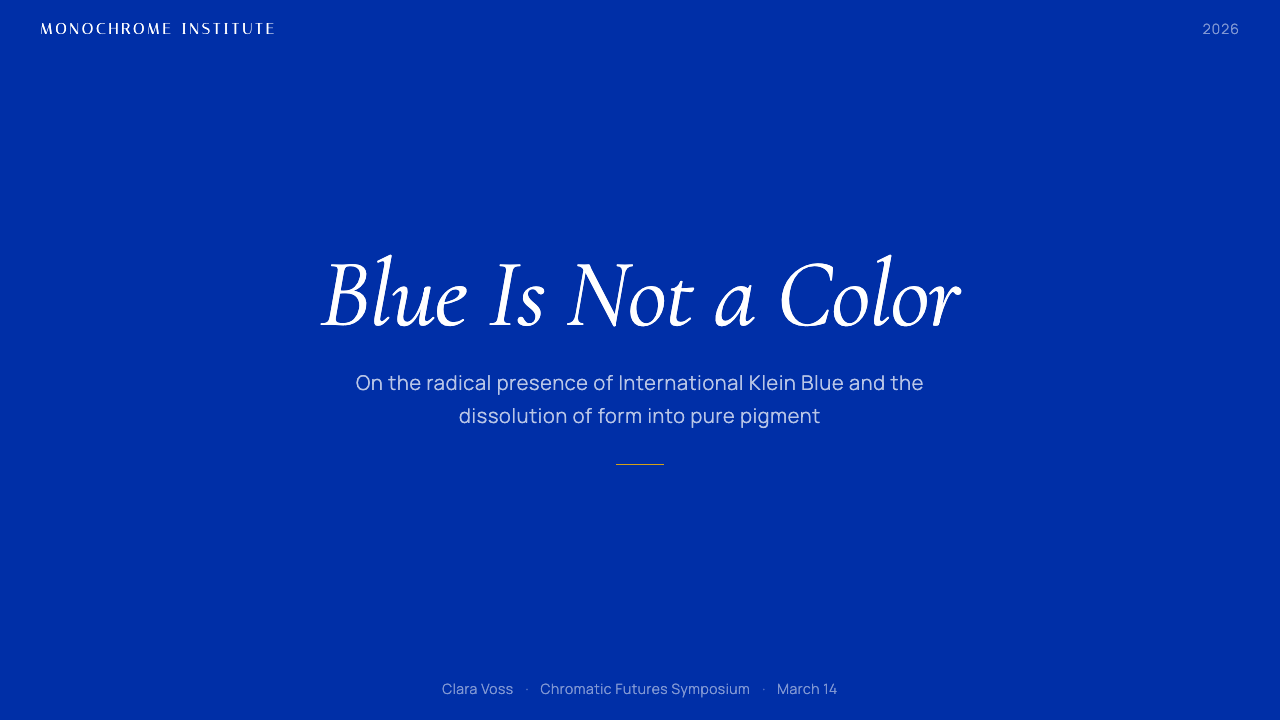
As a design system, Klein Blue draws directly from Klein's radical conviction that color could be experienced as pure presence — not as a descriptor of objects but as a total environment. The visual language built around IKB rests on three structural decisions: an overwhelming chromatic field of that singular blue covering most or all of a composition; white typography in a classical, often italic serif that reads as an inscription floating above the blue; and a restrained use of gold as the sole accent, referencing both Klein's own deployment of gold leaf in his monochromes and the classical tradition of illuminated manuscripts. Everything else — gradients, secondary colors, decorative ornament — is refused on principle.作为设计系统,克莱因蓝直接汲取了克莱因的激进信念——色彩可以作为纯粹的「存在」被体验,不是对物体的描述,而是一种完整的环境。围绕IKB构建的视觉语言依赖三个结构性决定:以那种单一蓝色覆盖构图的大部分或全部空间,形成压倒性的色彩场域;以白色的古典斜体衬线字体作为悬浮于蓝色之上的铭文;以及以金色作为唯一的点缀——既呼应克莱因本人在单色画中使用金箔的做法,也指涉泥金装饰手稿的古典传统。其余一切——渐变、次级色彩、装饰性元素——均被原则性地拒绝。
The effect is immediately distinctive and, when handled correctly, deeply authoritative. The blue field functions less like a background and more like a medium — something the viewer or reader enters into rather than looks at. This makes IKB one of the most powerful and most demanding design systems in the Curio library: it rewards restraint absolutely and punishes overloading with equal absoluteness.当处理得当时,这种效果立刻令人印象深刻,且具有深度的权威感。蓝色场域的功能不像背景,更像一种媒介——观者或读者进入其中,而非从外部观看它。这使IKB成为Curio设计库中最有力量、同时也最苛刻的设计系统之一:它对克制的回报是绝对的,对过度填充的惩罚同样是绝对的。
See the Klein Blue (IKB) design system查看 Klein Blue (IKB) 完整设计系统
Where does Klein Blue (IKB) come from?Klein Blue (IKB) 从何而来?
Yves Klein was born in Nice in 1928, the son of two painters, and grew up surrounded by the Mediterranean light that would eventually animate his obsession with the immaterial. As a young man he trained in judo in Japan, an experience that deepened his interest in Zen philosophy and the concept of emptiness as presence rather than absence. By the mid-1950s, working in Paris, Klein had developed a conviction that most painting was compromised by the very act of composition — by the artist's decision to arrange marks, to tell the color where to go. The monochrome, Klein argued, was the only form that allowed color to exist on its own terms.伊夫·克莱因1928年生于尼斯,父母均为画家,自幼沐浴在地中海的光线中——正是这种光线最终点燃了他对非物质性的痴迷。年轻时,他赴日本习柔道,这段经历加深了他对禅宗哲学的兴趣,特别是关于「空」作为存在而非缺席的概念。到1950年代中期,身处巴黎的克莱因已形成一种信念:大多数绘画都因构图行为本身而受到损害——艺术家决定如何排列笔触,决定让色彩去往何处。克莱因认为,单色画是唯一能让色彩以自身条件存在的形式。
His first monochrome exhibitions in the early 1950s used a range of colors — orange, pink, yellow — but Klein became increasingly convinced that ultramarine was uniquely suited to his purpose. Blue, he wrote, has no dimensions; it is beyond dimensions. Unlike red, which advances, or yellow, which agitates, blue recedes infinitely, suggesting boundlessness rather than boundary. The problem was that commercially available blue paints — bound in oil or standard acrylic — lost the powdery, almost tactile quality of raw ultramarine pigment. In collaboration with Edouard Adam, Klein solved this by suspending the pigment in Rhodopas M60A, a synthetic resin that bonded the particles without coating them. The resulting paint preserved the pigment's full chromatic intensity.1950年代初的早期单色画展览使用了多种颜色——橙色、粉色、黄色——但克莱因越来越确信群青色独特地适合他的目的。他写道,蓝色没有维度,它超越了维度。与向前推进的红色或令人躁动的黄色不同,蓝色无限退后,暗示的是无边而非边界。问题在于,市售的蓝色颜料——以油性或标准丙烯为粘合剂——会丧失原始群青色素那种粉质的、近乎触感性的品质。克莱因与爱德华·亚当合作,将色素悬浮于Rhodopas M60A合成树脂中,在不包裹颗粒的前提下使其成型,从而解决了这一问题。由此产生的颜料完整保留了色素的全部色度强度。
Klein registered International Klein Blue on May 19, 1960, with the Institut National de la Propriété Industrielle in Paris — one of the very few instances in art history of an artist attempting to legally own a color. The registration was symbolic as much as legal; Klein understood that ownership of a color was philosophically absurd, but the act itself was a statement about authorship, originality, and the relationship between art and commerce that anticipated conceptual art by a decade. In the same year, he produced his Anthropometries series, in which models covered in IKB were pressed against canvases, leaving body-shaped impressions in pure blue — a process he conducted in front of a live audience in evening dress, with an orchestra playing his Monotone-Silence Symphony.克莱因于1960年5月19日在巴黎国家工业产权局注册了国际克莱因蓝——这是艺术史上极少数艺术家试图在法律层面拥有一种颜色的案例之一。注册行为与其说是法律手段,不如说是象征性姿态;克莱因深知拥有一种颜色在哲学上是荒诞的,但这一行为本身是关于作者权、原创性以及艺术与商业关系的宣言——比概念艺术早了整整十年。同年,他创作了「人体测量」系列:涂满IKB的模特被压贴在画布上,留下纯蓝色的人体印痕。这一过程在身着晚礼服的现场观众面前进行,配以乐队演奏他创作的《单音-沉默交响曲》。
Klein died in 1962 at thirty-four, leaving behind a body of work that would become enormously influential from the 1980s onward as appropriation art, monochrome painting, and institutional critique brought renewed attention to questions of color, authorship, and the limits of painting. IKB re-entered popular cultural consciousness in the early twenty-first century through fashion, luxury branding, and digital design, where its combination of overwhelming saturation and historical weight gave it a presence that no synthetically invented color could match.克莱因于1962年辞世,年仅三十四岁,身后留下了一批作品。从1980年代起,随着挪用艺术、单色绘画与机构批评重新将注意力引向色彩、作者权与绘画边界等议题,这些作品变得极具影响力。IKB在二十一世纪初通过时尚、奢侈品牌与数字设计重新进入大众文化意识,其压倒性饱和度与历史分量的结合,赋予了它任何人工合成色彩都无法匹敌的存在感。
What defines the Klein Blue (IKB) look?Klein Blue (IKB) 的视觉特征是什么?
Chromatic Field色彩场域
The defining visual element of the Klein Blue system is not the color itself but the quantity of it. IKB functions through saturation of the visual field — not as a background behind other elements but as the dominant presence that other elements float within. A half-hearted application that confines the blue to a header bar or an accent stripe misses the system's logic entirely. The blue must be felt as total, which means it should occupy the majority of a composition's area, or it should be absent altogether.克莱因蓝系统的决定性视觉元素不是色彩本身,而是它的数量。IKB通过饱和视觉场域发挥作用——不是作为其他元素背后的背景,而是作为其他元素悬浮其中的主导存在。将蓝色局限于标题栏或点缀条纹的半心半意应用,完全误解了这套系统的逻辑。蓝色必须被感受为完整的存在,这意味着它应当占据构图的大部分区域——否则就干脆不用。
Typography as Inscription字体作为铭文
White text on the blue field should read not as a label but as an inscription — something carved into or floating above a unified surface. This effect is best achieved with a classical serif in italic or upright roman, set at a generous size with open letter-spacing. The typeface should carry some historical weight: the contrast between ancient letterforms and a hyper-modern pigment is part of the system's meaning. Tight sans-serif settings undermine this; they belong to rationalist systems that IKB explicitly rejects.蓝色场域上的白色文字应当读来不像标签,而像铭文——像是刻入或悬浮于统一表面之上的文字。这种效果最好通过古典衬线字体的斜体或直立罗马体来实现,以宽裕的字号和开放的字距排设。字体应带有某种历史厚重感:古老字形与超现代色素之间的张力,是这套系统意义的一部分。紧凑的无衬线字体设置会破坏这种效果;它们属于IKB明确拒绝的理性主义系统。
Gold as the Only Accent金色作为唯一点缀
Klein's own monochromes often incorporated gold leaf panels alongside IKB canvases, treating the two as complementary absolutes — blue for the immaterial void, gold for the radiance of pure energy. Within a design system, gold functions as the sole permitted accent: a single rule, a logotype element, a call-to-action border, or a highlighted figure in a data table. Warm yellow functions as a gold stand-in when material effects are unavailable. Any other accent color — silver, white used decoratively, red — collapses the system's tonal unity.克莱因自己的单色画常将金箔面板与IKB画布并置,将两者视为互补的绝对——蓝色代表非物质的虚空,金色代表纯粹能量的光辉。在设计系统中,金色作为唯一允许的点缀色:一条分隔线、一个标志元素、一个行动号召的边框,或数据表格中的高亮数字。当无法实现材质效果时,暖黄色可作为金色的替代。任何其他点缀色——银色、装饰性白色、红色——都会瓦解这套系统的色调统一性。
Negative Space as Breathing Room留白作为呼吸空间
Despite — or because of — the overwhelming chromatic field, successful Klein Blue layouts use generous margins and interior spacing. The blue itself is the content, so crowding it with elements defeats the purpose. Wide margins on text blocks, tall vertical spacing between typographic elements, and deliberate emptiness in the lower portions of a composition all contribute to the meditative quality that distinguishes IKB design from merely monochromatic design. Space here is not emptiness; it is the blue continuing uninterrupted.尽管——或者正因为——有压倒性的色彩场域,成功的克莱因蓝版面会使用宽裕的边距与内部间距。蓝色本身就是内容,因此用元素填满它反而会适得其反。文本块的宽边距、排版元素之间高耸的垂直间距,以及构图下部刻意的空旷,共同营造出冥想式的品质——这正是IKB设计与单纯单色设计的区别所在。这里的空间不是空洞;它是蓝色不间断地延续。
Flatness and Anti-Illusion平面性与反幻觉
Klein Blue rejects every device that would introduce spatial illusion into the composition: no drop shadows of any kind, no gradients, no texture overlays, no depth metaphors. The blue field is flat and opaque. This flatness is not a limitation imposed by the system — it is philosophically fundamental. Klein's IKB was meant to eliminate the distinction between surface and space, between the pigment and the infinite. Any technique that re-introduces the conventional reading of 'a colored thing in a space' — even a subtle vignette at the edges — betrays the premise.克莱因蓝拒绝一切会在构图中引入空间幻觉的手段:任何形式的投影、渐变、纹理叠加、深度隐喻,都被排除在外。蓝色场域是平坦而不透明的。这种平面性不是系统强加的限制——它在哲学上是根本性的。克莱因的IKB意在消除表面与空间、色素与无限之间的区别。任何重新引入「空间中的有色物体」这一传统读法的技法——哪怕是边缘处微妙的暗角——都背叛了这一前提。
Economy of Elements元素的节制
The more elements a Klein Blue composition contains, the weaker it becomes. The system is strongest when a page contains the blue field, one to three typographic elements, and possibly a single gold accent. Adding icons, illustrations, photography, UI chrome, or secondary color elements erodes the clarity that gives the system its power. Designers accustomed to information-dense interfaces will find IKB genuinely uncomfortable to work with — this discomfort is diagnostic. If the blue field is competing with other visual information, the other visual information should be removed.一幅克莱因蓝构图包含的元素越多,它就越弱。当一个页面仅包含蓝色场域、一到三个排版元素,以及可能的一处金色点缀时,这套系统最为强大。添加图标、插图、摄影、UI界面元素或次级色彩元素,会侵蚀赋予系统力量的清晰度。习惯于信息密集界面的设计师会发现IKB令人不舒服——这种不舒服本身就是一种诊断。如果蓝色场域在与其他视觉信息竞争,那么其他视觉信息应当被去除。
Historical-Contemporary Tension历史与当代的张力
Part of IKB's visual power comes from the productive friction between its elements: the pigment was registered in 1960 and carries the weight of postwar French art history; the serif typography references classical inscription; yet the overall composition reads as rigorously contemporary. This tension between depth and modernity is not accidental — it should be cultivated. Choosing typefaces that are too aggressively modern flattens this tension; choosing those that are too decoratively historical collapses it in the other direction. The aim is a letterform that would look equally at home carved in marble and set on a screen.IKB视觉力量的一部分来自其元素之间富有成效的摩擦:这种色素注册于1960年,承载着战后法国艺术史的重量;衬线排版指涉古典铭刻的传统;然而整体构图读来又严格地属于当代。这种深度与现代性之间的张力不是偶然的——它应当被刻意培养。选用过于激进的当代字体会压平这种张力;选用过于繁复的历史性字体则会从另一个方向将其瓦解。目标是一种字形,无论刻在大理石上还是显示在屏幕上,都同样自然。
See the Klein Blue (IKB) design system查看 Klein Blue (IKB) 完整设计系统
Who shaped Klein Blue (IKB)?谁塑造了 Klein Blue (IKB)?
Klein (1928–1962) is the originating figure without whom IKB does not exist. His practice moved systematically from color to void: he exhibited empty gallery spaces as artworks, sold 'zones of immaterial pictorial sensibility' for gold leaf, and proposed architectural projects — including a 'roof of fire' and an 'air architecture' requiring no walls — that treated the atmosphere itself as a designed medium. His influence on conceptual art, performance art, and installation art was enormous; his influence on design culture came decades later, when his color became a touchstone for luxury brands and digital aesthetics seeking a combination of historical legitimacy and extreme visual impact.克莱因(1928—1962年)是IKB得以存在的原点人物。他的艺术实践从色彩向虚空系统性推进:他将空荡荡的展览空间作为艺术品展出,以金箔出售「非物质绘画感知区域」,并提出建筑方案——包括「火焰屋顶」和无需墙壁的「空气建筑」——将大气本身作为被设计的媒介。他对概念艺术、行为艺术与装置艺术的影响巨大;他对设计文化的影响则在数十年后才显现——当他的色彩成为奢侈品牌与数字美学寻求历史合法性与极端视觉冲击力之组合的参照点时。
Adam was the Parisian art materials supplier who worked with Klein on the technical problem of binding ultramarine pigment without diminishing its optical intensity. His contribution was practical and essential: the Rhodopas resin formulation that Klein used was the direct result of Adam's material expertise. In design history, the collaboration between artist and supplier is easily overlooked, but the specific visual quality of IKB — its matte, powdery, light-absorbing surface — is inseparable from this technical solution. No binder change would produce the same effect, and Klein understood this, which is why he sought registration.亚当是与克莱因合作解决技术问题的巴黎艺术材料供应商——如何在不减损群青色素光学强度的前提下将其固结。他的贡献是实际而根本的:克莱因所使用的Rhodopas树脂配方,正是亚当材料专业知识的直接成果。在设计史上,艺术家与供应商之间的合作容易被忽视,但IKB的特定视觉品质——其哑光、粉质、吸光的表面——与这一技术解决方案不可分离。任何粘合剂的改变都无法产生相同的效果,克莱因对此心知肚明,这也是他寻求注册的原因。
Restany was the French critic who co-founded Nouveau Réalisme with Klein in 1960, writing the movement's founding manifesto and situating Klein's work within a broader critique of abstract expressionism's romantic individualism. As an art critic and theorist, Restany gave Klein's essentially physical and mystical practice an intellectual framework that made it legible to the European art world. His framing of IKB as a statement about the 'new perceptual approach to the real' — rather than simply a painterly choice — helped establish the color as a philosophical position, which is precisely the quality that makes it so potent as a design system signal.雷斯塔尼是法国批评家,1960年与克莱因共同创立新现实主义,撰写了运动的创始宣言,并将克莱因的作品置于对抽象表现主义浪漫个人主义的更广泛批判框架之内。作为艺术批评家与理论家,雷斯塔尼为克莱因本质上属于身体性与神秘性的实践提供了知识框架,使其在欧洲艺术界变得清晰可读。他将IKB界定为关于「对现实的新感知方式」的宣言——而非单纯的绘画选择——这帮助确立了这种色彩作为哲学立场的地位,而这正是它作为设计系统信号如此有力的品质所在。
Arman (Armand Pierre Fernandez) was a fellow Nouveau Réaliste and Klein's closest collaborator and friend, whose practice of accumulating and destroying everyday objects formed a counterpoint to Klein's dematerialization. Understanding Arman clarifies Klein by contrast: where Arman filled spaces with accumulated material, Klein emptied them of everything except saturated presence. This dialectic between accumulation and void, between material density and chromatic immateriality, remains structurally useful for designers who want to understand what IKB is doing at a compositional level — the blue field is not a background, it is a refusal of accumulation.阿尔芒(阿尔芒·皮埃尔·费尔南德斯)是新现实主义的同仁,也是克莱因最亲密的合作者与朋友。他以积累和销毁日常物品为实践,与克莱因的非物质化形成对位。理解阿尔芒能以对比的方式阐明克莱因:阿尔芒用堆积的材料填满空间,而克莱因将空间清空至只剩饱和的存在。积累与虚空之间、物质密度与色彩非物质性之间的这种辩证关系,对于希望在构图层面理解IKB所做之事的设计师而言,在结构上依然有用——蓝色场域不是背景,它是对积累的拒绝。
How do you use Klein Blue (IKB) today?今天怎么用 Klein Blue (IKB)?
Klein Blue is a system that imposes its logic on content rather than adapting to it. Before applying it, the designer must accept a fundamental constraint: the more the content demands visual complexity, the less suitable this system becomes. IKB is not a neutral container for information — it is an argument about experience. The projects it suits best are those where the primary goal is to produce a strong emotional or aesthetic impression, with informational density deliberately subordinated to that impression. Luxury brand materials, cultural institution communications, high-stakes pitch decks, and limited-edition campaign pages are natural contexts. Analytics dashboards with twenty data layers are not.克莱因蓝是一套将自身逻辑强加于内容的系统,而非适应内容。在应用它之前,设计师必须接受一个根本性的限制:内容对视觉复杂度的要求越高,这套系统就越不适合。IKB不是信息的中立容器——它是关于体验的一种论点。最适合它的项目是那些首要目标为产生强烈情感或审美印象的项目,信息密度被刻意服从于这种印象。奢侈品牌材料、文化机构传播物、高风险的演讲幻灯片、限量版推广页面,都是自然的应用场景。包含二十层数据的分析仪表板则不是。
For presentation slides, Klein Blue works most effectively when the cover and section-break slides are treated as full-bleed chromatic statements and content slides are stripped to near-nothing. A cover slide should present the title in large white classical serif, positioned in the upper or lower third with generous breathing room, against the unbroken blue field. A single gold rule or logotype is the only permitted decoration. Content slides inside the deck should follow a strict economy: one headline, one block of supporting text, and — if data must appear — one chart treated as a geometric object in white and gold against the blue. Avoid tables with multiple columns; if detailed data is required, relegate it to an appendix in a neutral white ground.在演示文稿中,克莱因蓝最有效的使用方式是将封面页和章节间隔页处理为满版的色彩宣言,内容页则精简至近乎空无。封面页应以大号白色古典衬线字体呈现标题,置于上三分之一或下三分之一处,留有宽裕的呼吸空间,背景是不间断的蓝色场域。唯一允许的装饰是一条金色分隔线或标志。演示文稿内部的内容页应遵循严格的节制:一个标题,一段支撑性文字,以及——若必须呈现数据——一张以白色和金色处理的图表,作为几何对象浮于蓝色之上。避免多列表格;若需要详细数据,将其移至以中性白色为底的附录。
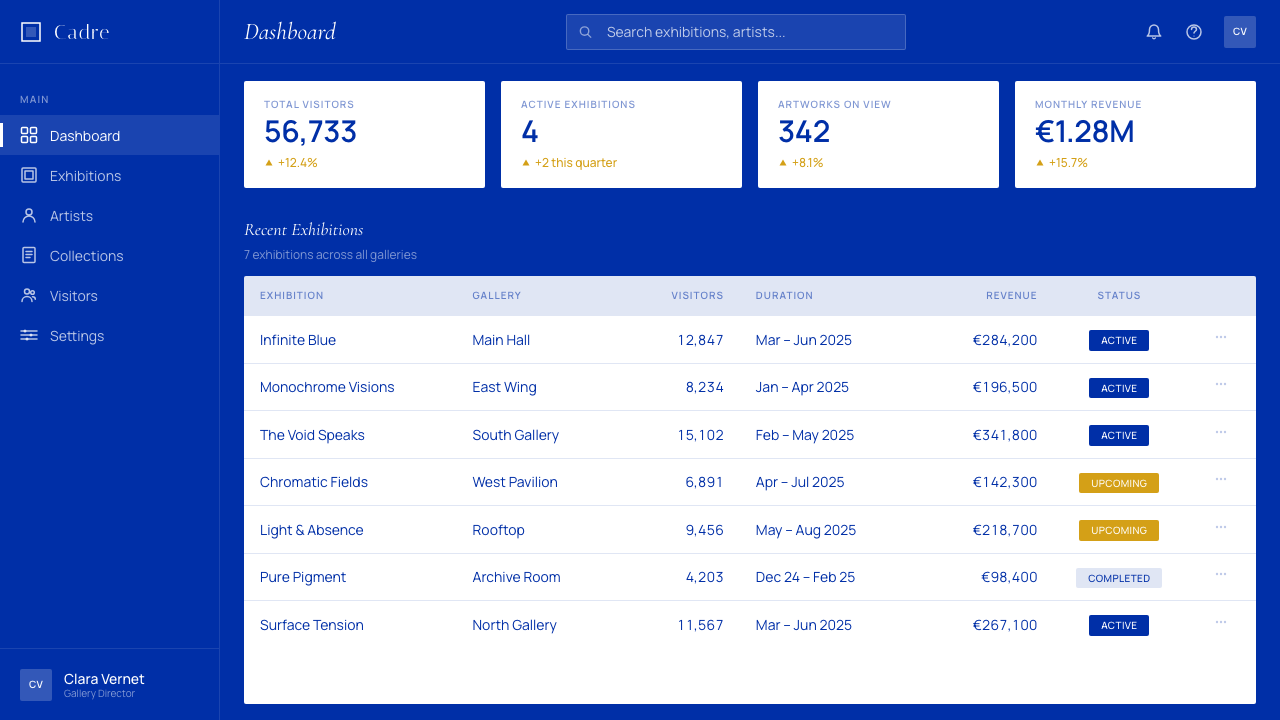
For web interfaces, IKB suits hero sections, splash pages, modal overlays, and pricing tier callouts where the goal is to hold attention completely for a brief moment. A full-screen hero in IKB with a centered headline and a gold-bordered call-to-action button creates immediate visual authority. For dashboard or product interfaces where users spend extended time, the blue field is best deployed as a navigation panel or sidebar — a persistent chromatic anchor — while the main content area shifts to a neutral near-white. This maintains the system's emotional signature without fatiguing users who need to process data across long sessions.在网页界面中,IKB适合主视觉区、引导页、模态覆盖层,以及需要在短暂时刻完全吸引注意力的定价层级标注。以IKB为底的全屏主视觉区,配以居中标题和金边行动号召按钮,立刻建立起视觉权威。对于用户长时间使用的仪表板或产品界面,蓝色场域最好作为导航面板或侧边栏使用——一个持续性的色彩锚点——而主要内容区转移至接近白色的中性底面。这既维持了系统的情感特征,又不会使需要长时间处理数据的用户产生视觉疲劳。
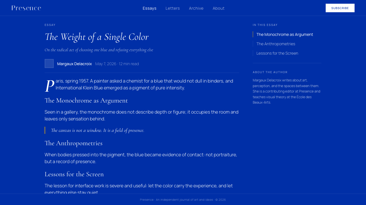
For editorial and marketing applications, the style supports high-impact single-page layouts: event posters, campaign landing pages, book covers, journal covers, and institutional annual reports. A full-bleed IKB cover with a white title in generous classical serif, a gold line separating title from subtitle, and a wide lower margin where supporting information sits in smaller roman type achieves the balance of authority and restraint that defines the system at its best. In marketing sequences — email campaigns, social cards, or printed inserts — maintain the blue as the consistent ground across all pieces, varying only the typographic content. The chromatic consistency becomes the brand signal.在编辑与营销应用中,这种风格支持高冲击力的单页面版面:活动海报、推广落地页、书籍封面、期刊封面与机构年报。满版IKB封面配以宽裕的白色古典衬线标题,一条金色线条分隔标题与副标题,宽阔的下边距中以较小罗马体排设辅助信息——这实现了定义这套系统最佳状态的权威与克制的平衡。在营销序列——电子邮件活动、社交卡片或印刷插页——中,以蓝色作为所有素材的一致底面,仅变换排版内容。色彩上的一致性成为品牌信号。
The most common mistake when applying Klein Blue is treating it as a color accent rather than a total field. Designers frequently attempt to use IKB as one element among many — a button color, a card background, a navigation bar — within an otherwise neutral interface. This approach dilutes the system entirely. A blue that is competing with other visual elements is not IKB; it is simply blue. A second common mistake is introducing gradients, shadows, or glass-morphism effects into the blue field — any technique that makes the surface look translucent, dimensional, or lit from behind destroys the flat opaque presence that gives IKB its power. A third mistake is over-populating the gold accent: if every heading has a gold underline, every button has a gold border, and every icon is rendered in gold, the accent becomes noise. One deliberate gold element per composition is the correct proportion.应用克莱因蓝时最常见的错误,是将它当作点缀色而非完整场域来使用。设计师常常试图在以中性色为主的界面中将IKB作为众多元素之一——按钮颜色、卡片背景、导航栏——这种做法会完全稀释这套系统。与其他视觉元素竞争的蓝色不是IKB,它只是蓝色。第二个常见错误是在蓝色场域中引入渐变、投影或玻璃拟态效果——任何使表面看起来半透明、立体或从背后打光的技法,都会摧毁赋予IKB力量的平坦不透明的存在感。第三个错误是过度使用金色点缀:如果每个标题都有金色下划线,每个按钮都有金边,每个图标都以金色呈现,点缀色就变成了噪音。每幅构图一处刻意的金色元素,才是正确的比例。
See the Klein Blue (IKB) design system查看 Klein Blue (IKB) 完整设计系统
Klein Blue (IKB) — FAQKlein Blue (IKB) · 常见问题
Is IKB a trademarked color that cannot be used freely?IKB是一种受商标保护、不能自由使用的颜色吗?
Klein's 1960 registration was with the French industrial property office and covered a specific formulation — the pigment suspended in Rhodopas resin — not the color itself as a visual phenomenon. The registration has also lapsed. In practice, no one holds enforceable rights over the visual appearance of deep ultramarine blue, and the color appears in design, fashion, and digital contexts freely. What remains protected, in a cultural rather than legal sense, is the name 'International Klein Blue' and its association with Klein's artistic legacy. Using the system without acknowledging that lineage is not illegal — but it is worth knowing where the color comes from, because that history is part of what gives it its weight.克莱因1960年的注册是向法国工业产权局提交的,涵盖的是一种特定配方——悬浮于Rhodopas树脂中的色素——而非颜色本身作为视觉现象的保护。该注册也已失效。实际上,没有任何人对深群青蓝的视觉外观拥有可执行的权利,这种颜色在设计、时尚与数字领域被自由使用。在文化意义上(而非法律意义上)受到保护的,是「国际克莱因蓝」这个名称及其与克莱因艺术遗产的关联。在不承认这一传承的情况下使用这套系统并不违法——但了解这种颜色的来源是值得的,因为那段历史是赋予它分量的一部分。
Can Klein Blue work alongside photography or illustration?克莱因蓝能与摄影或插图并用吗?
Technically yes, but the integration requires extreme care. Klein Blue is hostile to representational imagery — any photograph or illustration that introduces a naturalistic scene, multiple colors, or organic texture competes directly with the blue field rather than coexisting with it. The most successful integrations treat imagery the way Klein treated his Anthropometries: as traces or silhouettes rather than windows. A high-contrast duotone photograph reduced to near-monochrome — white and the blue, no other tones — can work. A silhouetted figure in white against the blue field can work. A full-color lifestyle photograph placed on a blue background cannot; the color values of the photo will make the blue look arbitrary, and the blue will make the photo look garish.技术上可以,但整合需要极度谨慎。克莱因蓝对具象图像具有排斥性——任何引入自然主义场景、多种颜色或有机纹理的摄影或插图,都会与蓝色场域直接竞争,而非与之共存。最成功的整合方式是像克莱因处理「人体测量」一样处理图像:作为痕迹或剪影,而非窗口。一张简化为近乎单色的高对比度双色调照片——白色与蓝色,无其他色调——可以奏效。白色剪影人物衬于蓝色场域可以奏效。将全彩生活方式照片置于蓝色背景上则不行:照片的色彩值会使蓝色显得随意,而蓝色又会使照片显得刺眼。
How does Klein Blue differ from navy blue, cobalt, or other deep blues used in design?克莱因蓝与海军蓝、钴蓝或设计中常用的其他深蓝色有何不同?
The difference is partly chromatic and partly conceptual. Chromatically, IKB sits in the ultramarine range — a pure, highly saturated blue without significant gray, green, or purple contamination. Navy blue is darker and grayer, traditionally evoking authority and conservatism. Cobalt is somewhat lighter and warmer. Indigo shifts toward purple. IKB is distinct from all of these: it is neither institutional nor moody nor romantic, but overwhelming and singular. Conceptually, what separates IKB from other deep blues in design use is the system it implies — the total field, the classical typography, the gold accent, the anti-illusionistic flatness. You can use navy in a layout the same way you use cream or charcoal. You cannot use IKB that way without evacuating its meaning.差异一半是色度上的,一半是概念上的。在色度上,IKB属于群青色系——一种纯粹、高度饱和的蓝色,没有明显的灰色、绿色或紫色污染。海军蓝更深更灰,传统上唤起权威与保守主义。钴蓝略浅略暖。靛蓝偏向紫色。IKB与所有这些都不同:它既不是制度性的,也不是忧郁或浪漫的,而是压倒性的、独一无二的。在概念上,将IKB与设计中其他深蓝色区分开来的,是它所暗示的系统——完整场域、古典排版、金色点缀、反幻觉的平面性。你可以像使用奶油色或木炭色一样在版面中使用海军蓝。你无法用同样的方式使用IKB,而不将其意义彻底掏空。
Is Klein Blue suitable for accessibility-compliant design?克莱因蓝适合符合无障碍标准的设计吗?
White text on deep ultramarine achieves strong contrast ratios that comfortably meet accessibility standards for normal and large text. The system's core — white or gold on the blue field — presents no intrinsic accessibility barrier for sighted users without color vision deficiencies. The challenge arises with gold accents: warm gold on deep blue can fall below recommended contrast thresholds depending on the exact tones used, particularly for small text or fine rules. Gold should therefore be used for decorative and structural elements rather than for body text or interactive affordances that require legible labels. For users with certain forms of color vision deficiency, deep blue and black are easier to distinguish than deep blue and dark navy, so the IKB system — with its high-contrast white typography — is more accessible than many muted palette systems.深群青底面上的白色文字达到了很高的对比度,轻松满足普通文字和大号文字的无障碍标准。这套系统的核心——蓝色场域上的白色或金色——对没有色觉障碍的视力正常用户不存在本质上的无障碍障碍。挑战出现在金色点缀上:暖金色与深蓝色的组合,根据所用色调的不同,可能低于推荐的对比度阈值,尤其对于小字体或细线条而言。因此,金色应用于装饰性和结构性元素,而非需要清晰标签的正文文字或交互控件。对于某些色觉障碍用户,深蓝与黑色比深蓝与深海军蓝更容易区分,因此IKB系统——凭借其高对比度的白色排版——比许多低饱和度配色系统更具无障碍优势。
How should the system handle dark mode or light mode variants?这套系统应如何处理深色模式或浅色模式的变体?
Klein Blue as a system does not have a conventional light mode variant — the blue field is both the dark and the light simultaneously; it is neither a dark-mode color nor a light-mode color but a chromatic absolute that exists outside that binary. Forcing IKB into a light-mode inversion — white background with blue type — produces something that reads as corporate stationery rather than as anything related to Klein's vision. If a light-mode context is genuinely required, the better approach is to treat the blue as a structural accent in a cream or white layout, reserving the full blue field only for hero or feature moments. This is a compromise, not a variant — the IKB system proper has no light mode, and acknowledging that clearly is more honest than constructing a diluted alternate that misrepresents the original intention.克莱因蓝作为一套系统,没有传统意义上的浅色模式变体——蓝色场域同时既是深色又是浅色;它既不是深色模式颜色,也不是浅色模式颜色,而是存在于这一二元之外的色彩绝对。将IKB强制反转为浅色模式——白色背景配蓝色字体——会产生看起来像企业信纸的东西,而非任何与克莱因愿景相关的事物。若确实需要浅色模式背景,更好的做法是在奶油色或白色版面中将蓝色作为结构性点缀,仅在主视觉或特色时刻保留完整的蓝色场域。这是一种妥协,而非一种变体——IKB系统本身没有浅色模式,清晰地承认这一点,比构建一个歪曲原始意图的稀释替代版本更为诚实。
Related design styles相关设计风格
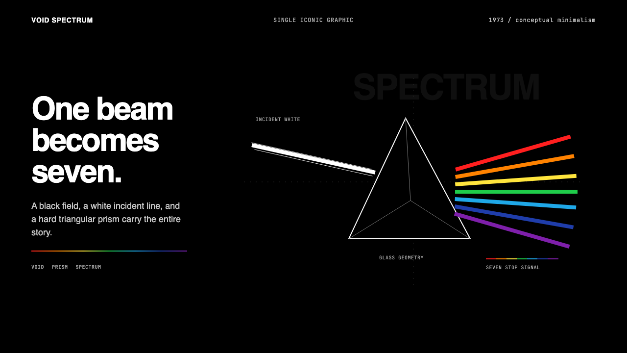 Pink Floyd — Dark Side of the MoonOne image does everything. Black void, white beam, hard prism, seven exact co…一个图像完成全部:黑色虚空、白光、硬棱镜与七色光谱。
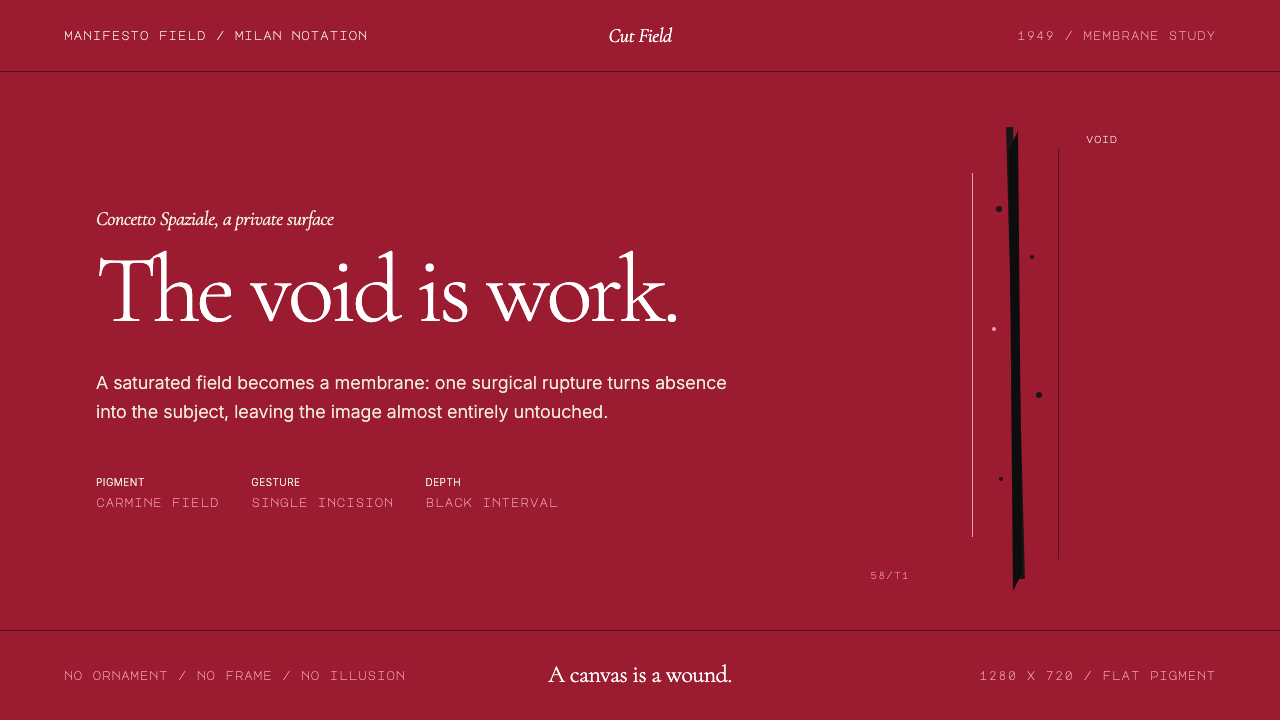 Spatialism (Fontana Cut, 1949)Absence becomes medium. Carmine field, Garamond restraint, one black incision.缺席成为媒介:胭脂红色场、Garamond克制排版、一道黑色切口。
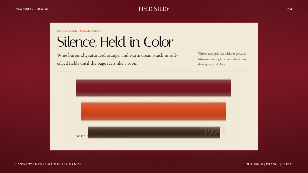 Mark Rothko Color Field (1950)Silence made visible. Burgundy, orange, and cream stack in soft-edged fields.把沉默变成可见。酒红、橙与奶油柔边堆叠成色域。
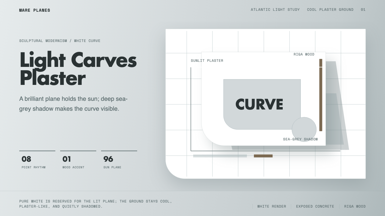 Alvaro Siza WhiteLight makes the form. White planes on cool plaster throw sea-grey shadow and…光塑造体量:冷灰抹灰底上,白色平面投下海灰阴影。
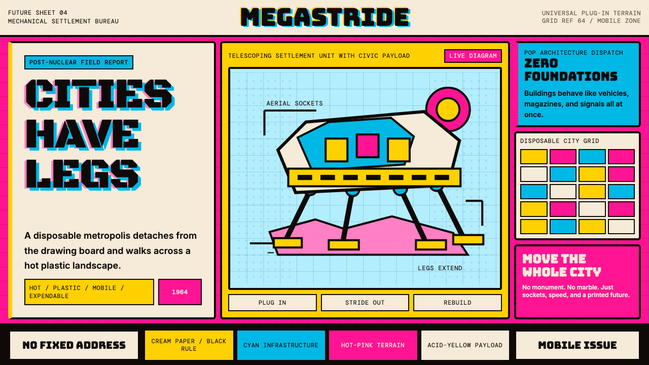 Archigram Walking City (1964)Cities refuse foundations. Hot pink, cyan, and acid yellow lock a bordered co…城市拒绝地基。热粉、青蓝与酸黄压进粗黑漫画格。
 Balenciaga (Demna era)Threatening restraint. Black grids, white hairlines, spaced sans at brutal sc…危险的克制。黑底网格、白色发丝线与巨型宽字距无衬线制造压迫。