What is Alvaro Siza White?
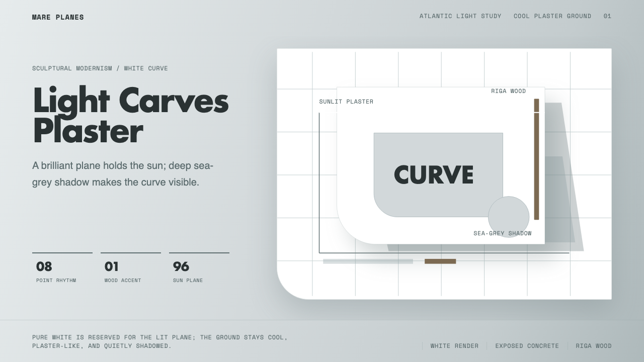
White plaster catches the Atlantic sun and throws sea-grey shadow — a sculptural modernism where light itself does the work of form.
Alvaro Siza White in brief
Alvaro Siza White is a design system distilled from the sculptural modernist architecture of Portuguese architect Álvaro Siza Vieira, whose brilliant white-rendered plaster buildings along Portugal's Atlantic coast — most famously the Leça swimming pools and the Boa Nova tea house — use hard coastal sunlight as a design material in its own right. The style's central discovery is that pure white is not a flat, neutral background but a lit plane that only reveals its full brilliance in contrast with the deep sea-grey shadow it throws onto itself.
Rather than treating white as an easy default, this system reads plaster in its shadow tone — a cool, sea-grey-tinted pale grey serves as the ground, with pure brilliant white reserved specifically for the signature lit plane that the composition is organized around. This inversion of expectation — grey as ground, white as accent — is what gives the style its restrained, considered quality rather than a washed-out, generic 'minimalist white' feel.
Supporting this cool duo are two warmer notes used sparingly: exposed concrete in its natural cool grey, and a single note of warm wood tone recalling Riga pine, Siza's material of choice for furniture and fittings. Typography throughout is clean, geometric sans-serif — legible and unadorned, matching the architecture's own refusal of ornament in favor of pure sculptural form.

Where does Alvaro Siza White come from?
Álvaro Siza Vieira was born in 1933 in Matosinhos, a coastal town near Porto, and studied architecture at the University of Porto's School of Fine Arts, where he would later teach and become the central figure of what came to be known as the Porto School — a distinct current within Portuguese modernism that emphasized close attention to site, climate, and local material culture over the more universalizing tendencies of international modernist architecture.
Siza's early and defining works were built along the rugged Atlantic coastline near his native Porto during the 1950s and 1960s, a period when Portugal remained relatively isolated from mainstream international architectural discourse under the Estado Novo dictatorship. This isolation, combined with Siza's deep sensitivity to the specific quality of Atlantic light and the rocky coastal terrain, produced an architecture that responded to place with unusual intimacy — buildings that seem to grow out of the rock rather than being imposed upon it.
The Leça da Palmeira swimming pools, completed in 1966, and the Boa Nova tea house, completed in 1963, both sited directly on the rocky Atlantic shoreline, exemplify this approach. Their white-rendered concrete and plaster walls follow the irregular contours of the coastal rock formations, and their compositions are organized around how the harsh, direct Atlantic sun strikes each plane — casting the deep sea-grey shadows that became Siza's signature. Rather than uniform, evenly lit facades, Siza designed for the specific angle and intensity of coastal light at these sites, treating shadow as a co-equal design element alongside form itself.
Siza's reputation grew steadily through the following decades, and in 1992 he received the Pritzker Architecture Prize, architecture's highest honor, which brought international recognition to the Porto School's quiet, site-responsive sculptural modernism. His influence extended well beyond Portugal, shaping a generation of architects who came to see white-rendered plaster not as a neutral, universal modernist gesture but as a material whose meaning depends entirely on the specific quality of light it is designed to catch.
What defines the Alvaro Siza White look?
Color
The palette is built on a cool foundation: sea-grey-tinted pale grey as the primary ground, with pure brilliant white reserved specifically for the sunlit accent plane. Cool exposed concrete grey and a single warm wood note support the composition, but neither yellow, beige, nor any warm neutral appears as a base.
Light as Material
Compositions should be organized around a single implied light source, with the resulting shadow treated as an intentional, deep sea-grey design element rather than an incidental effect. The relationship between lit plane and shadowed plane is the primary compositional device, more important than color variety or ornament.
Typography
Type is clean, geometric sans-serif with no ornamental flourish, echoing the architecture's own rejection of applied decoration. Letterforms should feel unadorned and legible rather than expressive, letting the light-and-shadow composition carry the visual interest.
Sculptural Curves
Forms favor soft, sculptural curves that follow implied topography — organic contours rather than rigid rectilinear grids. Panels and shapes can curve gently, echoing the way Siza's buildings follow the irregular contours of coastal rock rather than imposing a strict geometric plan.
Restrained Material Palette
Only a small number of material references appear — rendered plaster, exposed concrete, and wood — and each is used sparingly and deliberately. This restraint mirrors Siza's own preference for a minimal material vocabulary applied with great precision rather than a wide range used loosely.
Negative Space
Generous negative space is essential — large areas of unbroken grey or white ground allow the light-shadow relationship to read clearly. Cluttered layouts undermine the calm, contemplative quality the style depends on.
Site-Specific Feel
Compositions should feel grounded and specific rather than generically 'minimalist' — a sense that the light and form respond to a particular place and moment, echoing Siza's deep responsiveness to the specific Atlantic coastal conditions of his sites.

Who shaped Alvaro Siza White?
The Portuguese architect whose sculptural, site-responsive modernism — most famously the Leça swimming pools and Boa Nova tea house — established the white-plaster-and-sea-grey-shadow visual language this style is built from. Winner of the 1992 Pritzker Architecture Prize, he became the central figure of the Porto School and shaped how a generation of architects understood the relationship between light, shadow, and form.
How do you use Alvaro Siza White today?
Applying this style well starts with reversing the usual assumption about white and grey — treat sea-grey as the ground and reserve pure white specifically for a single lit accent plane, rather than defaulting to an all-white layout.
For presentation slides, the style makes a quietly striking cover treatment: a curved, sculptural white shape sits against a sea-grey ground, with a single hard shadow cast beneath it to signal depth. Content slides should keep generous negative space, using shadow-edge dividers rather than hard rules to separate sections, and data can be presented in simple, unadorned geometric blocks rather than colorful charts.
For web interfaces, the style suits portfolio sites, architecture and design-adjacent products, and any context where calm, considered restraint is a desired brand quality — dashboards can use sea-grey as the dominant background with white cards catching a subtle shadow to imply depth, and a single warm wood-tone accent can mark primary actions. Curved corners on cards and buttons echo the style's sculptural sensibility better than hard right angles.
For editorial and marketing contexts, the style rewards large, uninterrupted fields of grey or white with a single striking image or curved shape as the visual anchor — captions and body text set in clean geometric sans-serif, with generous margins reinforcing the contemplative, unhurried mood.
A common mistake is defaulting to plain white as the ground rather than reading it in its cool shadow tone, which flattens the light-shadow relationship the style depends on. Another mistake is introducing warm beige or cream tones broadly rather than confining warmth to a single accent note of wood or concrete, which dilutes the cool Atlantic character.

Alvaro Siza White — FAQ
Why is the ground grey rather than white in a style named after 'white curve'?
Because pure brilliant white in Siza's architecture only exists as a lit plane — it is what sunlight does to plaster, not the plaster's resting state. The resting, shadowed state of the same plaster reads as a cool sea-grey. Using grey as the ground and reserving white for a single accent plane preserves this light-dependent logic, rather than flattening everything into an undifferentiated white field.
Can this style work with rectilinear, angular forms instead of curves?
Siza's own body of work includes both curved and rectilinear buildings, so angular forms are not foreign to the tradition. However, this particular style leans on the sculptural curve as its signature move — if angular forms are used, the light-and-shadow relationship and the restrained cool-grey-and-white palette should still carry the primary visual identity.
How much warm wood tone should appear before it overwhelms the cool palette?
The wood note should function as a single accent — a furniture element, a border detail, a small highlighted call-to-action — never as a dominant field. If wood tone begins to compete with the white-and-sea-grey relationship for visual attention, it has exceeded its proper role in the system.
Does this style suit high-energy, bold marketing contexts?
Not naturally. The style's entire character depends on calm, contemplative restraint and generous negative space — introducing bold saturated color or dense, energetic composition would work directly against the quiet sculptural quality that defines it. It suits contexts valuing quiet confidence over loud energy.
What typography weight best suits this style?
Light to regular weights suit the style's calm, unhurried character best, reserving heavier weights only for a single title or focal moment. Overly bold, heavy type throughout would contradict the restrained, quiet confidence the style is built around.
Related design styles
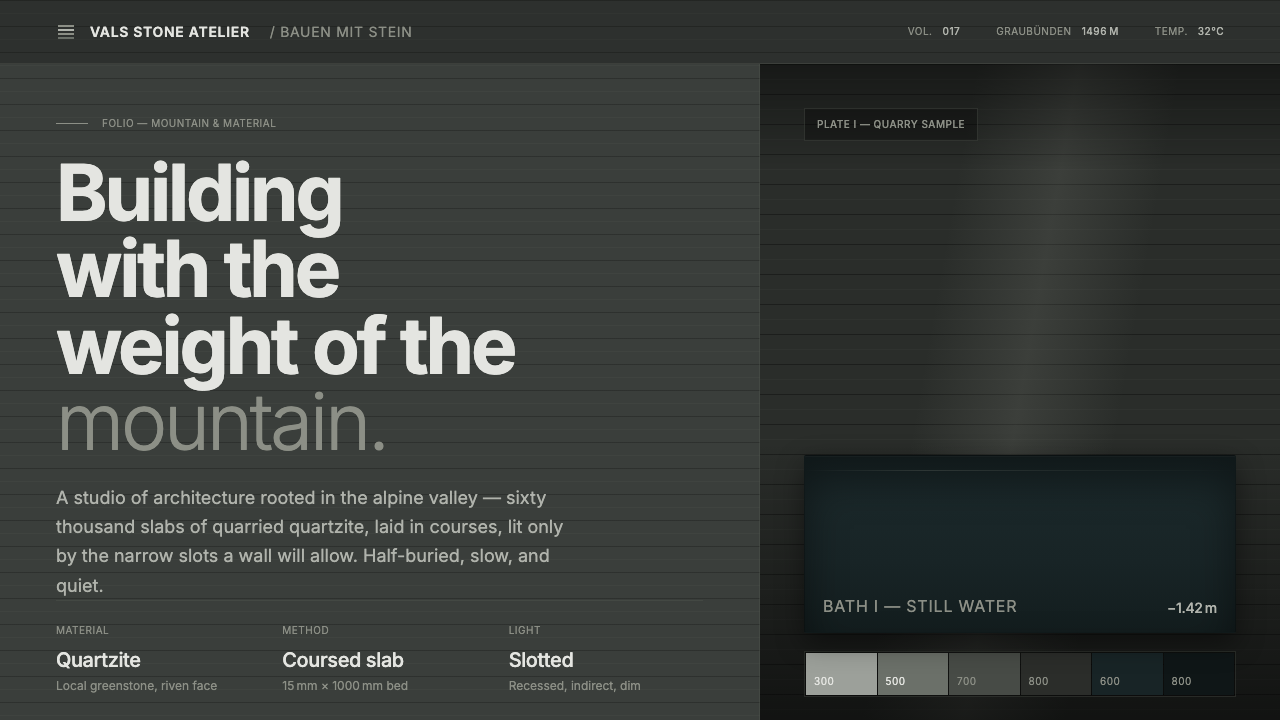 Zumthor Thermal BathsArchitecture as atmosphere. Greenish-slate stone, stratified courses, dim lig…
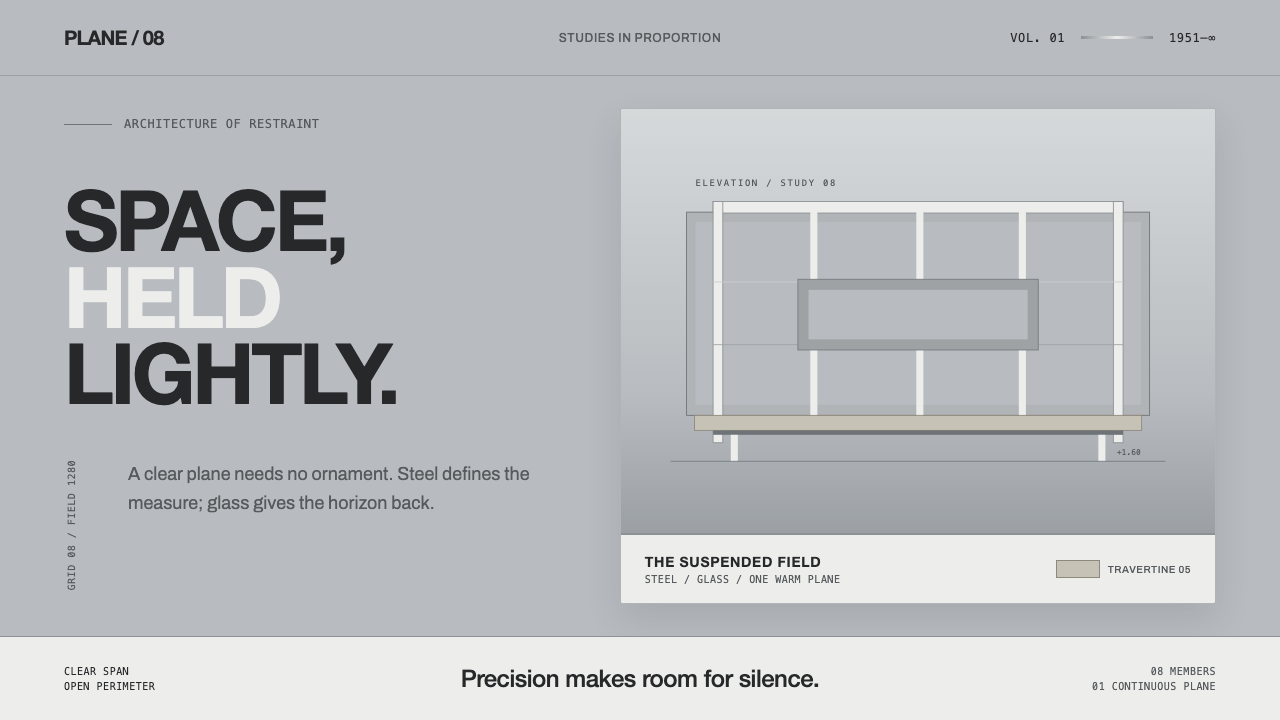 Farnsworth HouseWeightless by precision. White steel planes float across reflective gray with…
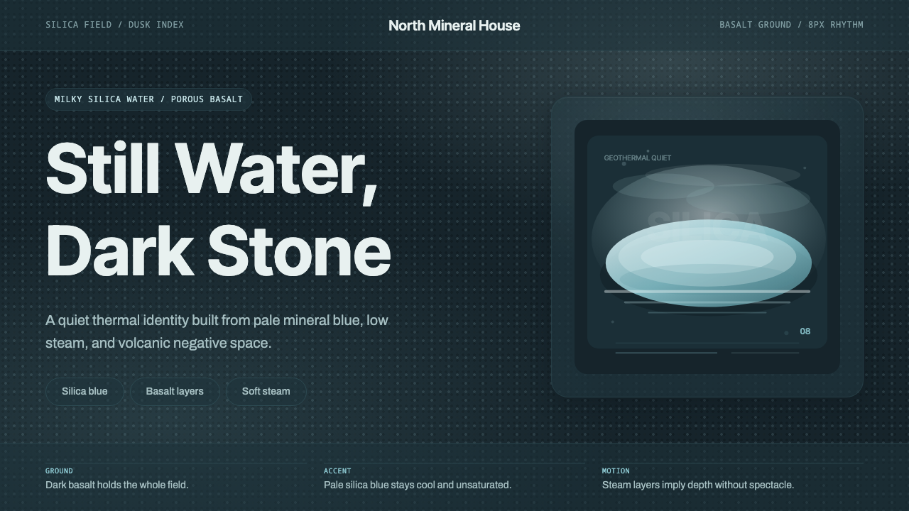 Glacial Teal LagoonQuiet feels elemental. Basalt darks and milky silica blue drift in a low-cont…
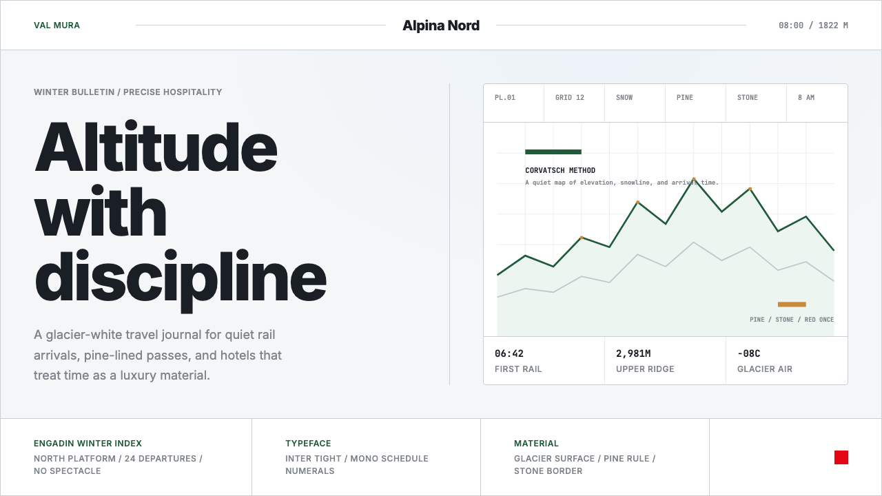 Swiss Alps GraubündenAlpine precision, restrained. Glacier white, pine rules, and tight Inter grid…
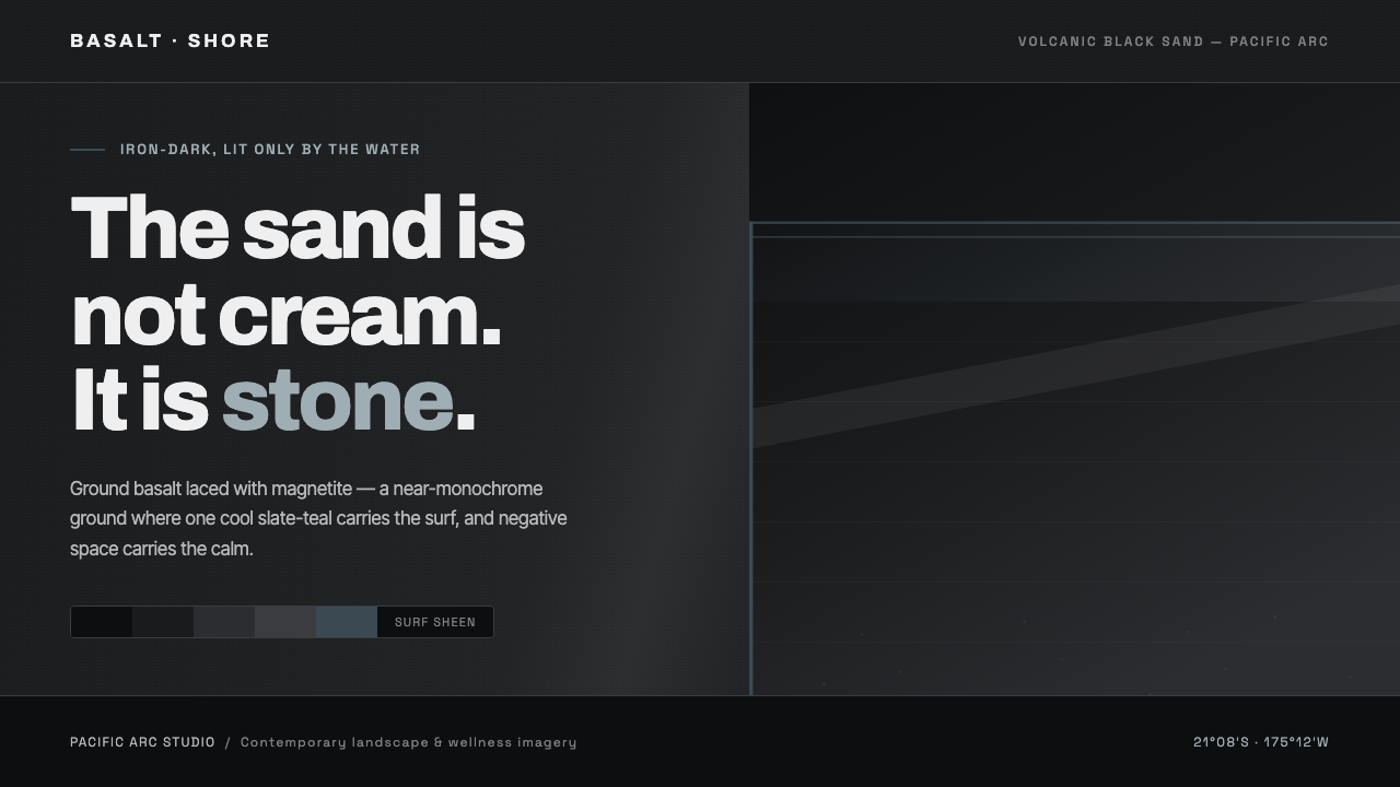 Tongan Black SandThe sand is stone, not cream. Iron-dark basalt grays with one cool slate-teal…
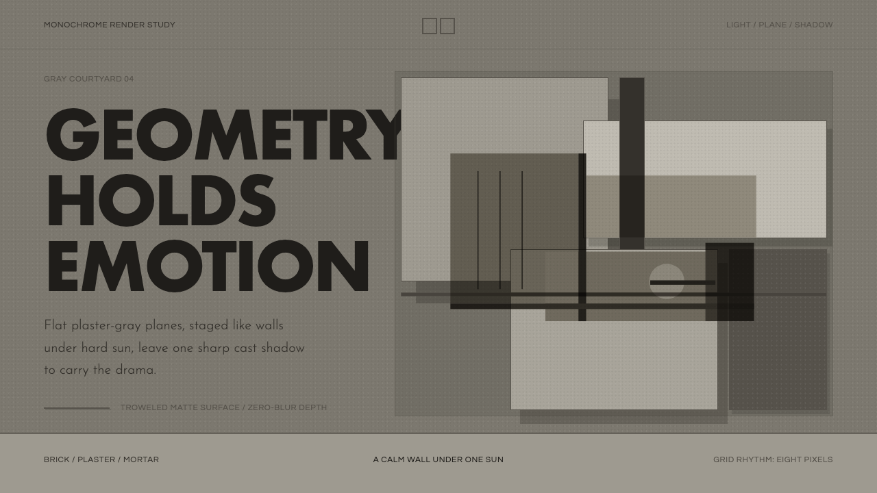 Barragán Render in GrayEmotion made grayscale. Plaster-gray planes and hard shadows carry the geomet…