What is Barragán Render in Gray?
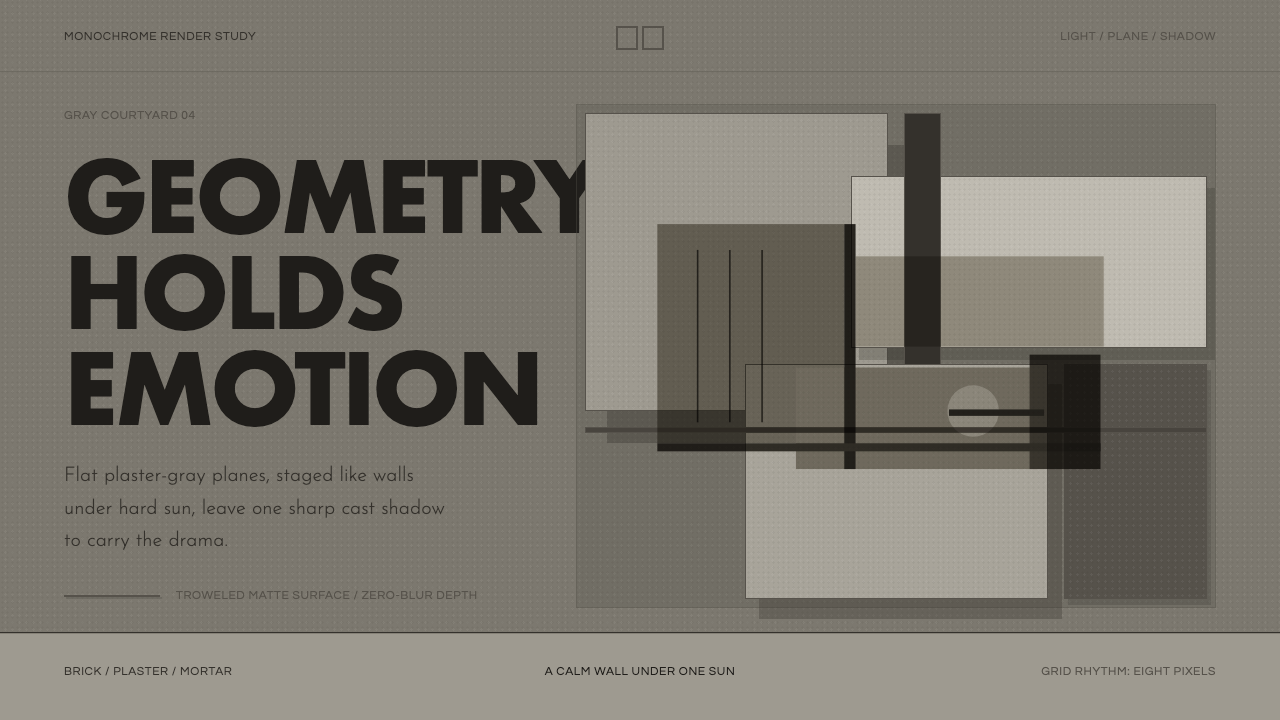
Luis Barragán turned walls, light, and silence into an emotional architecture — this system asks what survives when every one of his famous colors is removed.
Barragán Render in Gray in brief
Luis Barragán (1902–1988) was a Mexican architect who spent his career arguing that architecture's real subject was not shelter but feeling — serenity, mystery, magic, the pleasure of solitude. He built almost nothing outside Mexico, worked in relative obscurity for decades, and yet became, in 1980, the first Latin American to win the Pritzker Prize, architecture's highest honor. His vocabulary was deliberately narrow: thick plastered walls, courtyards, water, and light, arranged with the discipline of a geometric abstraction rather than the ornament of colonial revival.
Barragán's work is most often remembered for its color — the saturated Mexican pink, the deep ochre, the cobalt blue that turned his courtyard walls into fields of pure hue. This system deliberately removes that color. What is left, rendered in muted plaster grays, is the structure Barragán actually built the emotion on top of: flat rectilinear planes meeting at right angles, walls positioned purely to catch and block sunlight, and openings cut with surgical restraint. Stripped of hue, the architecture reads less like a place and more like a diagram of light itself.
The result is a grayscale study in mass and shadow. Matte plaster surfaces absorb light rather than reflecting it, so the only true ornament left in the composition is the shadow line — the crisp, knife-edged boundary where a wall's plane meets direct sun. Nothing curves, nothing gradients, nothing is textured for its own sake. The mood this produces is not cold; it is contemplative, closer to a monastery cloister than a modern office. Silence, in Barragán's own words, was one of his primary building materials, and grayscale is the register that lets silence be seen.
Where does Barragán Render in Gray come from?
Barragán trained first as a civil engineer in Guadalajara, graduating in 1923 with no formal architectural education. What shaped his eye instead was travel. Between 1924 and 1926 he made an extended trip through Spain, France, and Morocco, and it was in the south of France that he encountered the work of the French-Lebanese landscape designer and writer Ferdinand Bac, whose Mediterranean gardens combined high enclosing walls, still water, and framed views in a way that fused Islamic, Moorish, and Mediterranean garden traditions. Barragán bought Bac's books on the spot and carried that walled, water-centered logic back to Mexico, where he began fusing it with the vernacular hacienda architecture of his native Jalisco — thick adobe and masonry walls built for a hot, dry climate, whitewashed or color-washed, punctuated by small deliberate openings.
For his first two decades of practice, Barragán worked largely as a developer-architect in Guadalajara and then Mexico City, building functionalist houses in the international style fashionable at the time. The turn toward the mature, emotionally charged language he is remembered for came in the late 1940s, catalyzed by his friendship and collaboration with the German-Mexican sculptor Mathias Goeritz. In 1953 the two co-signed a short, deliberately provocative text — the manifesto of arquitectura emocional, or emotional architecture — which argued that architecture's highest function was not efficiency or shelter but the production of feeling, and that a building succeeded only insofar as it moved the person standing inside it.
Barragán's own house and studio in Mexico City, Casa Barragán, completed in 1948, became the laboratory where this philosophy was tested: a plain, almost windowless street facade concealing a sequence of interior rooms and a garden calibrated purely around how light entered at different hours. Casa Barragán and its garden remain so significant to twentieth-century architecture that UNESCO inscribed the property as a World Heritage Site in 2004 — one of the few modern houses anywhere to receive that designation.
His late masterwork, Cuadra San Cristóbal, built between 1966 and 1968 in the Los Clubes district on the edge of Mexico City for a client who bred and rode horses, pushed the vocabulary to its most reduced and most photographed form: high plaster walls in saturated color, a shallow reflecting trough for the horses to drink from, and a single wall-mounted water spout whose falling stream is the only moving element in an otherwise perfectly still composition. It is this project — reduced here to plaster gray, hard shadow, and geometry alone — that gives this system its clearest architectural reference point.
What defines the Barragán Render in Gray look?
Plaster and Mass
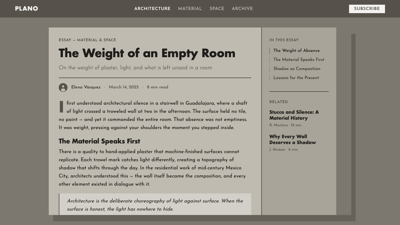
Every surface in this system reads as thick, hand-troweled plaster rather than a thin painted skin — the visual weight of adobe or block construction rendered in careful gradients of gray. Surfaces are matte and light-absorbing rather than glossy, so the material itself never competes with the shadow patterns falling across it. This is mass-first design: walls exist as solid volumes with real thickness, not as flat dividing lines.
Hard Shadow as Ornament
With color removed, shadow becomes the system's only decorative device. Shadows are rendered with crisp, knife-edge boundaries at a consistent angle, never softened or blurred — the same discipline Barragán used to let a wall register the specific hour and season of the Mexican sun. A shadow here is treated as a deliberate compositional shape, not an incidental lighting effect.
Silence and Negative Space
Composition favors long unbroken planes and generous empty ground over dense arrangement. A single opening, a single line, a single change in plane is allowed to carry the entire weight of a composition. This restraint is not absence of content — it is the deliberate creation of stillness, the visual equivalent of the acoustic silence Barragán prized in his courtyards.
Rectilinear Geometry
Nearly every line in the system meets its neighbor at a right angle. Curves are essentially absent; the vocabulary is built from planes, thresholds, and apertures cut cleanly from a rectilinear grid. This gives even small interface elements — a card, a divider, a button — the quiet monumentality of a courtyard wall.
Framed Views
Barragán rarely opened a wall fully; he cut a single deliberate aperture and let it frame one specific view — a patch of sky, a plane of water, a tree. This system borrows that logic for how content is windowed: a single clear focal element per panel, isolated by generous surrounding space rather than competing with neighboring content.
Water as Reflective Plane
Water appears throughout Barragán's work not as decoration but as a second, flat, reflective surface that doubles the architecture above it and introduces the only motion in an otherwise static scene. Rendered in grayscale, water becomes a mid-tone plane distinct from both the pale sky and the dark plaster — a horizontal counterpart to the vertical walls, calm rather than turbulent.

Who shaped Barragán Render in Gray?
The architect at the center of this system. Trained as an engineer, self-taught in architecture through travel and observation, Barragán spent six decades refining a personal language built from walls, water, and light rather than structural innovation. He built almost exclusively in and around Mexico City and Guadalajara, accepted very few commissions, and worked in relative obscurity until his 1980 Pritzker Prize brought international attention to a body of work he had spent decades perfecting largely for himself.
A German-born sculptor who emigrated to Mexico in 1949, Goeritz became Barragán's closest collaborator and intellectual sparring partner. Together they co-wrote the 1953 manifesto of arquitectura emocional and later co-designed the Torres de Satélite (1957–58), five brightly colored concrete towers marking a Mexico City highway interchange. Goeritz pushed Barragán to think of his walls as sculptural, emotional objects rather than purely functional enclosures.
A Guadalajara-born painter and collector, Reyes was a close friend who is widely credited with sharpening Barragán's instinct for the saturated, vernacular Mexican color that made his walls famous — the pinks, ochres, and purples this particular grayscale system deliberately sets aside. Reyes's own painted screens and folk-art collection were a constant reference point in Barragán's circle.
A French-Lebanese writer, caricaturist, and self-taught landscape designer, Bac's Mediterranean gardens on the French Riviera gave the young Barragán his first working model for walled, water-centered outdoor space during his 1924–26 European trip. The high enclosing wall, the still reflecting basin, and the single framed view — devices Bac drew from Islamic and Moorish garden traditions — became permanent fixtures of Barragán's own vocabulary.
How do you use Barragán Render in Gray today?
This grayscale rendering of Barragán is best applied wherever a product wants to communicate calm authority without leaning on brand color — a portfolio, an architecture or real-estate platform, a meditation or wellness product, or any premium context that wants to feel considered rather than loud. Because the system's entire expressive range comes from tone, mass, and shadow rather than hue, it holds up unusually well in contexts that need to sit quietly behind photography or product imagery.
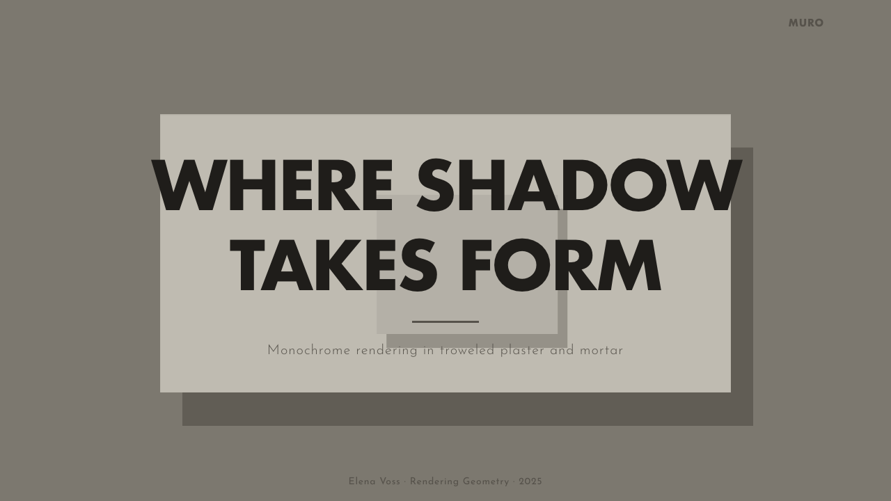
On a presentation cover slide, the system works best as a single large plane in mid-gray with one hard-edged shadow crossing it diagonally and a short, confidently placed title sitting in the light half of the frame — resisting the urge to center everything. Content slides should keep a wide plaster-gray margin and a single strong horizontal or vertical rule rather than boxes or bullet ornament; let one idea occupy most of the frame the way a single courtyard occupies a whole photograph. For data, treat charts as flat gray planes with tonal contrast standing in for categorical color — a bar chart becomes a series of solid rectangles distinguished by depth of gray rather than hue, which keeps the diagrammatic calm the rest of the deck establishes.
In a dashboard, the plaster-gray palette works well as a base with a single darker plane reserved for the primary action or the most important metric — echoing how Barragán used one strong wall to organize an entire courtyard. Pricing pages benefit from wide, still negative space around each tier card, cards separated by shadow rather than by borders or color-blocking, so the eye moves the way it would move through a sequence of framed courtyards rather than scanning a busy grid.
Editorial layouts suit the system's love of a single framed focal image per section — one large photograph treated the way Barragán treated a single tree or a patch of sky, isolated by generous surrounding space rather than tiled alongside others. Marketing pages read well as a slow sequence of full-bleed gray planes, each revealing one clear idea before the next, mimicking the way a visitor moves through Barragán's courtyards one threshold at a time rather than seeing everything at once.
The most common mistake is treating this as a generic gray theme and filling it with even, ambient shadow or soft drop-shadows for depth — that softness is precisely what the system is built to reject. Every shadow needs a hard, consistent-angle edge, and empty space should be read as intentional silence, not as unfinished layout. Filling that silence with extra ornament, rounded corners, or gradient fills collapses the entire emotional logic the system depends on.
Barragán Render in Gray — FAQ
Why remove Barragán's famous color? Isn't color the whole point of his work?
Color is certainly central to how Barragán is remembered, but it was never the mechanism that made his architecture work emotionally — mass, proportion, and light were. Barragán himself worked from grayscale studies and photographs for much of his design process before committing to a final palette; the composition had to succeed in tone before color was added. Removing color here is not a denial of Barragán's legacy but a way of isolating the structural logic that made the color meaningful in the first place, useful for anyone who wants the calm and gravity of his work without the specific cultural weight of Mexican pink.
Does this system work for dark-mode interfaces, or only light backgrounds?
It works in both directions, because the system is built entirely from tonal relationships rather than a fixed light or dark ground. A light rendering keeps the pale plaster tones dominant with dark shadow as the accent, closer to how Barragán's courtyards read at midday. A dark rendering inverts that relationship, letting deep charcoal planes dominate with lighter gray reserved for the plaster highlights and reflective water — closer to how those same courtyards read at dusk. What must stay constant either way is the hard, consistent shadow edge; softening it in dark mode to create ambient glow is the fastest way to break the system's logic.
How is this different from a generic 'concrete' or 'brutalist' gray theme?
Brutalism and Barragán share a material palette of unadorned masonry, but their emotional registers are nearly opposite. Brutalist concrete is typically rough, board-marked, and monumental at the scale of a public institution — its texture is meant to be felt as raw and unfinished. Barragán's plaster, even in grayscale, is smooth, hand-finished, and domestic in scale, built around courtyards and thresholds rather than imposing civic mass. Where Brutalism confronts, Barragán encloses; where Brutalism displays its structure, Barragán hides structure behind a plane calibrated purely for how light will fall on it.
What kind of imagery or photography pairs well with this system?
Black-and-white or desaturated architectural and landscape photography pairs most naturally — images with strong directional light, deep shadow, and simple geometric subjects read as a continuation of the interface rather than a decoration on top of it. Portraits and product photography work best isolated against a plain plaster-gray ground rather than busy backgrounds, echoing the way Barragán always gave a single object — a tree, a horse, a sculpture — an entire wall to itself. Avoid saturated color photography or busy textured imagery; both compete with the tonal calm the rest of the system is built to hold.
Related design styles
 Alvaro Siza WhiteLight makes the form. White planes on cool plaster throw sea-grey shadow and…
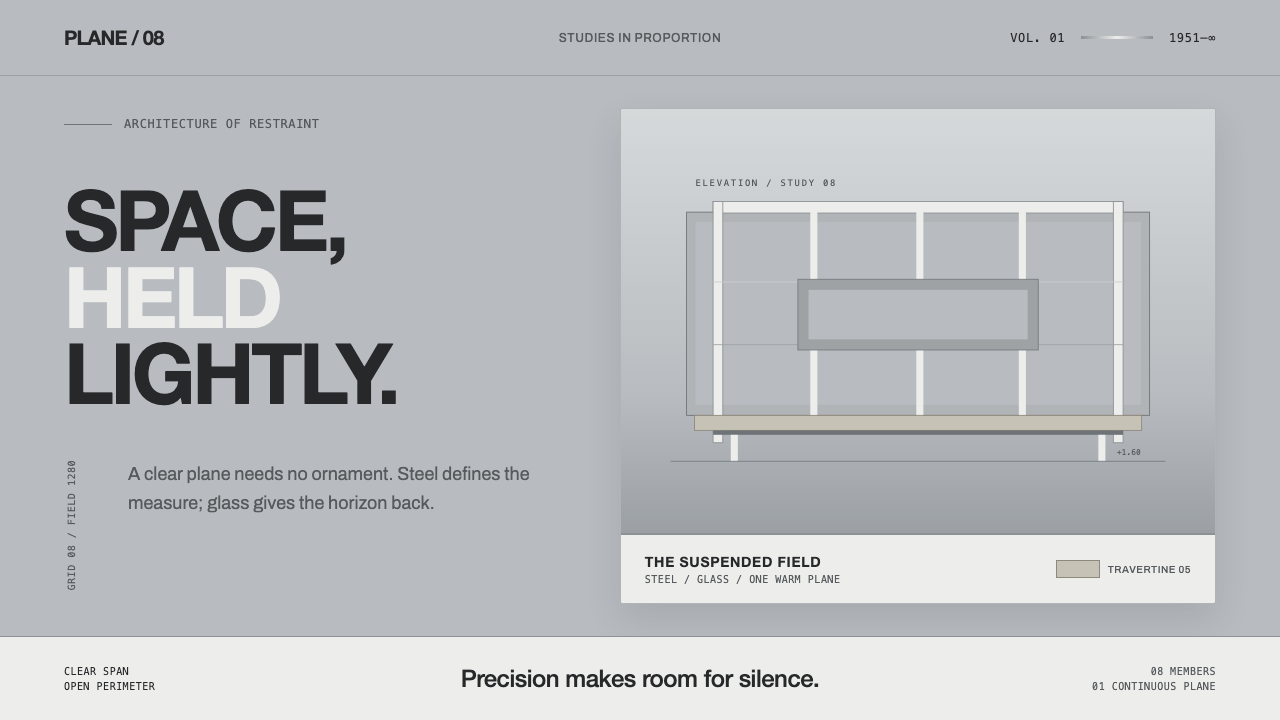 Farnsworth HouseWeightless by precision. White steel planes float across reflective gray with…
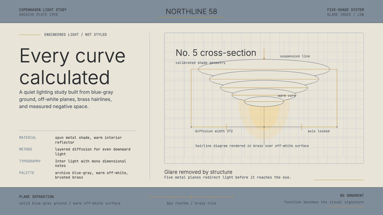 Danish PH5 Louis Poulsen (1958)Engineered, not styled. Blue-gray ground, brass hairlines, and a precise shad…
 Kyiv VDNH Soviet ModernismRestraint made monumental. Cool travertine grey, geometric Jost type, wheat-s…
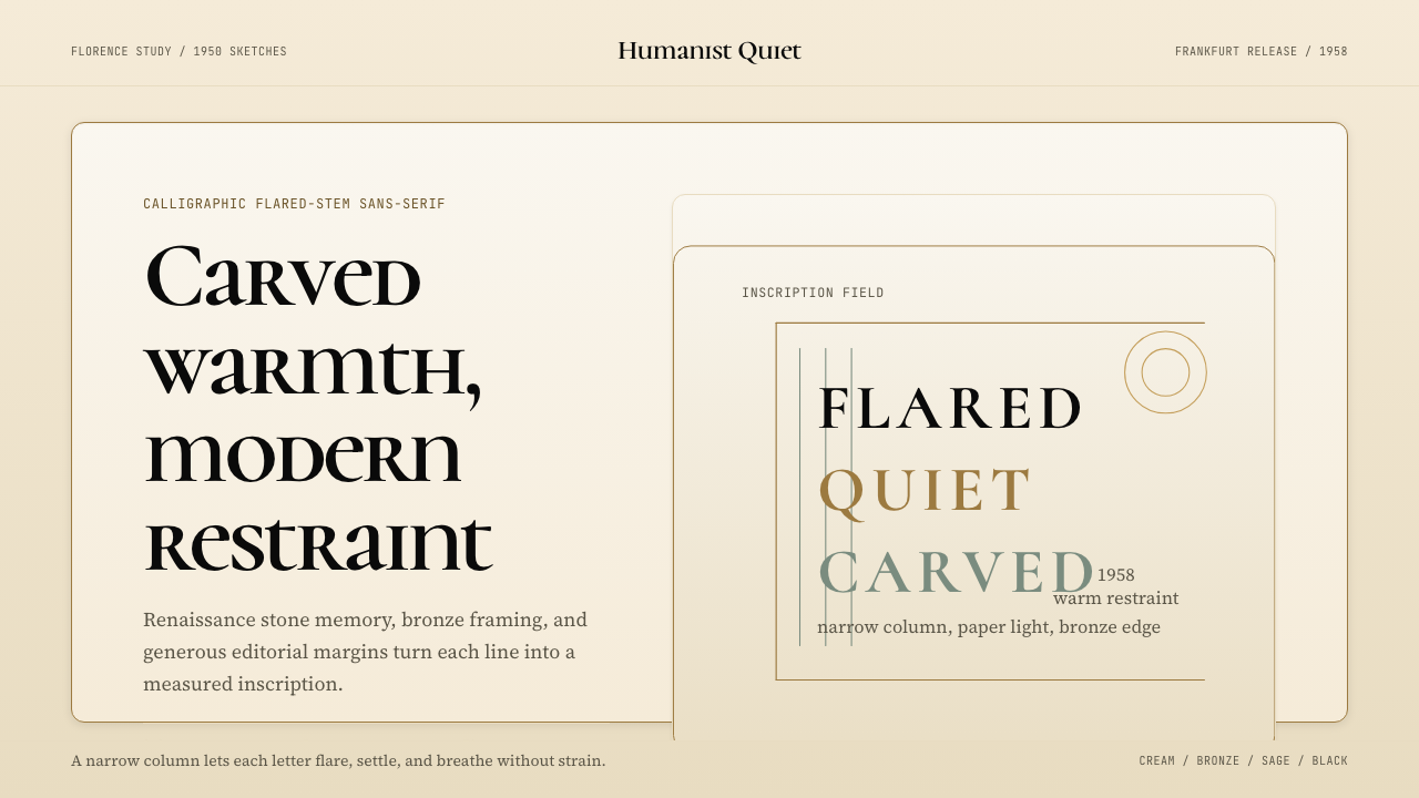 Optima (Hermann Zapf, 1958)Calligraphic calm, cut in cream and bronze. Narrow margins let the letters br…
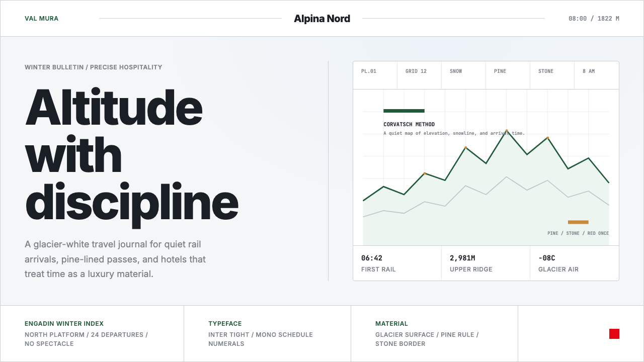 Swiss Alps GraubündenAlpine precision, restrained. Glacier white, pine rules, and tight Inter grid…