What is Farnsworth House?
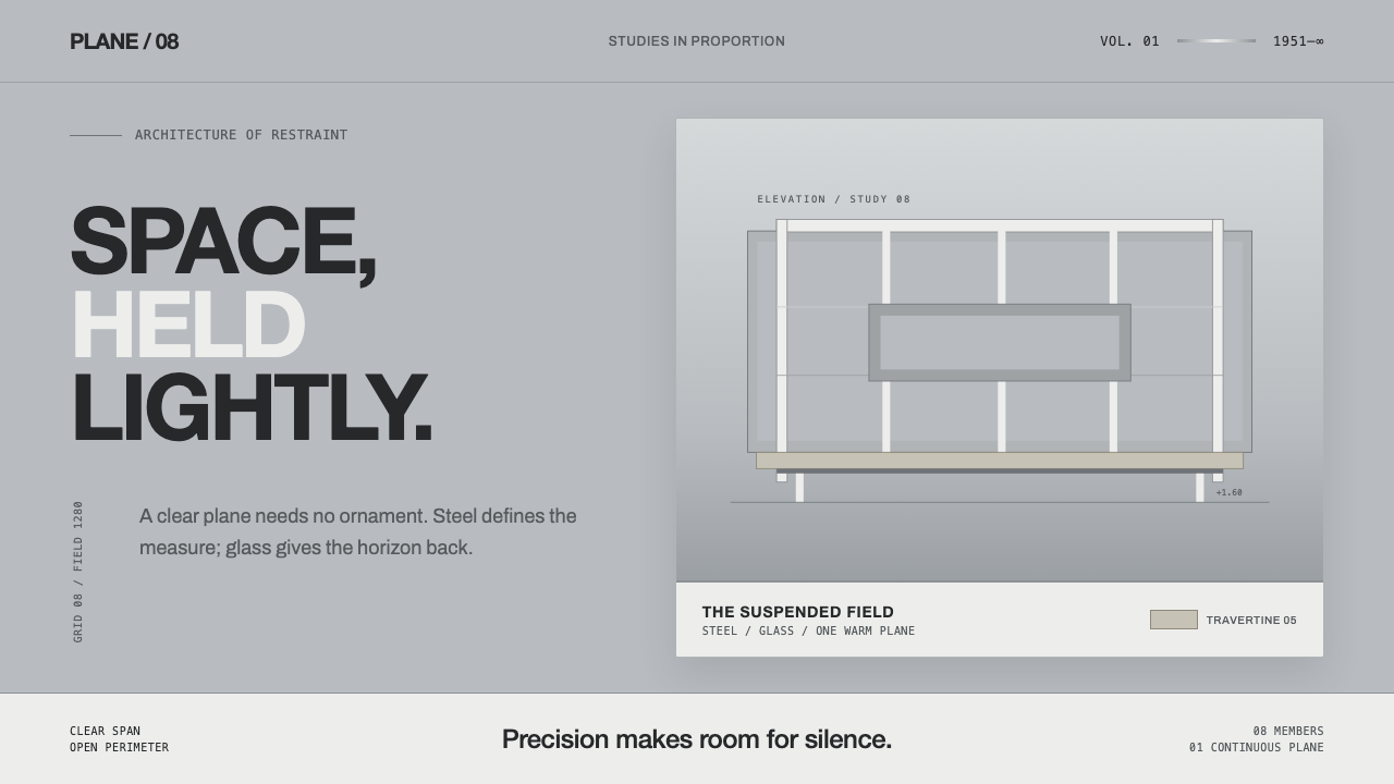
Farnsworth House turns precision into weightlessness — white steel planes, reflective cool gray, and one warm travertine note suspended above the river floodplain.
Farnsworth House in brief
Farnsworth House distills Ludwig Mies van der Rohe’s principle of less is more into a visual language of planes, lines, glass, and restraint. White-painted steel I-beams suspend a travertine floor and a floor-to-ceiling glass envelope above the Fox River floodplain, producing an architecture that appears almost detached from the ground.
The style is not defined by emptiness alone. Its clarity comes from exact alignment: every edge is orthogonal, every horizontal plane feels deliberately placed, and every structural line carries visual authority. Weight is suggested through shadow and reflection rather than through heavy mass.
Color remains deliberately restrained. Bright off-white steel meets a cool reflective steel-gray field created by glass, sky, water, and shadow. The warm travertine accent is the only chromatic relief, giving the composition a human and material counterpoint without disturbing its austerity.

Where does Farnsworth House come from?
Farnsworth House belongs to the high International Style and to the Miesian minimalist tradition. It is located in Plano, Illinois, in North America, and is associated with the period from 1950 to 1990. Its design dates to 1945, while completion followed in 1951.
The house is organized around a small number of unmistakable architectural facts: eight white-painted steel I-beams, a travertine plane, and a continuous glass envelope. These elements do not compete for attention. Together they create a controlled relationship between structure, surface, reflection, and the floodplain beneath.
As a design reference, the house matters because its restraint is structural rather than decorative. The absence of visual noise is not an empty gesture; it is produced by alignment, material contrast, and the disciplined separation of cool and warm tones. The result is an architecture that feels precise without becoming visually heavy.
What defines the Farnsworth House look?
Reflective Cool Gray
The dominant field is not pure white but a cool reflective gray, evoking glass, sky, water, and shadow. It gives the composition depth without introducing visual clutter. Gray functions as an atmospheric surface rather than a neutral blank.
White Steel Lines
White-painted steel members appear as precise, luminous lines against the cooler field. They should feel structural but almost weightless, defining edges and intervals without becoming heavy borders. Their brightness is controlled by surrounding gray.
Orthogonal Alignment
Every major relationship is horizontal or vertical. Corners remain clean, surfaces meet decisively, and the composition avoids expressive diagonals or ornamental curves. Order comes from alignment rather than from decoration.
Floating Planes
Horizontal planes should appear suspended rather than rooted. Separation from the ground is communicated through open space, fine lines, and restrained shadow. The effect is architectural suspension: surfaces occupy space without visually filling it.
Material Contrast
Glass, painted steel, shadow, and travertine are kept visually distinct. Glass supplies reflection, steel supplies line, shadow supplies separation, and travertine supplies warmth. The identity depends on these materials remaining legible rather than blending into a generic neutral surface.
Warm Travertine Accent
Warm travertine is used as a singular relief within an otherwise achromatic system. Its role is not to decorate the field but to prevent the cool palette from becoming anonymous. The accent should feel grounded, tactile, and deliberately limited.

Who shaped Farnsworth House?
Mies van der Rohe is the architect named in the approved source material and the figure most directly associated with the house’s design language. Through Farnsworth House, the principle of less is more becomes a system of aligned planes, exposed structure, glass, reflection, and controlled absence.
Edith Farnsworth is identified as a key figure alongside Mies van der Rohe. Her name gives the house its personal identity, balancing the abstract rigor of International Style with a specific human presence.
The house itself is the clearest figure in this design system: a glass enclosure and travertine plane held above the floodplain by white steel. Its architectural identity comes from the precise relationship among these elements, not from applied ornament.
How do you use Farnsworth House today?
Farnsworth House is transferable to contemporary design when the goal is calm authority, spatial clarity, and material discipline. Its lesson is not to make everything white, but to let a limited tonal field, precise alignment, and carefully separated materials do the organizing work.
For presentation slides, use the reflective cool gray field as the continuous ground. A cover can place a bright off-white title beside or across a thin horizontal plane, leaving generous open space around it. Content slides should preserve the orthogonal structure and quiet spacing. Data slides should treat charts as floating planes and steel lines, with travertine warmth reserved for the one category that deserves emphasis.
For web interfaces, the language suits dashboards and pricing pages that need to feel exact without becoming aggressive. Use cool gray as the main surface, off-white for active structural elements, and restrained lines to separate information groups. Cards should appear lightly suspended through spacing and fine shadow, while the warm travertine accent should signal a selected tier, a key value, or a decisive action.
For editorial and marketing work, the style supports a spacious, architectural reading rhythm. Headlines can sit against broad reflective fields, while narrow text blocks and fine rules create a sense of measured construction. Marketing pages benefit from material storytelling: glass for openness, steel for precision, shadow for separation, and travertine for human warmth.
The common mistake is reducing the style to white backgrounds and thin borders. That produces generic minimalism rather than Farnsworth House. The defining contrast is between cool reflection and warm material, between suspended planes and open space, and between visible structure and visual lightness. If every element is equally pale, equally thin, or equally neutral, the system loses its hierarchy.

Farnsworth House — FAQ
Is Farnsworth House simply a white minimalist style?
No. White-painted steel is only one part of the system. The identity depends equally on the cool reflective gray of glass, sky, water, and shadow, as well as the singular warmth of travertine. Remove those contrasts and the style becomes generic.
Why is the background reflective gray rather than pure white?
The gray field expresses the house’s glass envelope and its relationship to sky, water, and shadow. It creates depth while preserving restraint. Pure white would erase the reflective and atmospheric quality that makes the composition feel suspended.
Can the warm travertine accent be replaced by several accent colors?
That would change the governing logic. Travertine works because it is a singular warm interruption within an achromatic field. Several bright accents would compete with the steel, glass, and shadow instead of clarifying their relationship.
Does the style work on a dark background?
The approved direction is light and reflective: off-white steel, cool gray, glass, shadow, and warm travertine. A dark inversion may be possible as an adaptation, but it would no longer express the same relationship between luminous structure and reflective field.
What makes the style suitable for information-heavy interfaces?
Its hierarchy comes from alignment, spacing, tonal contrast, and material roles rather than decoration. That makes it useful when many elements must coexist without competing. The discipline is especially effective when the interface needs to feel precise, calm, and structurally legible.
Related design styles
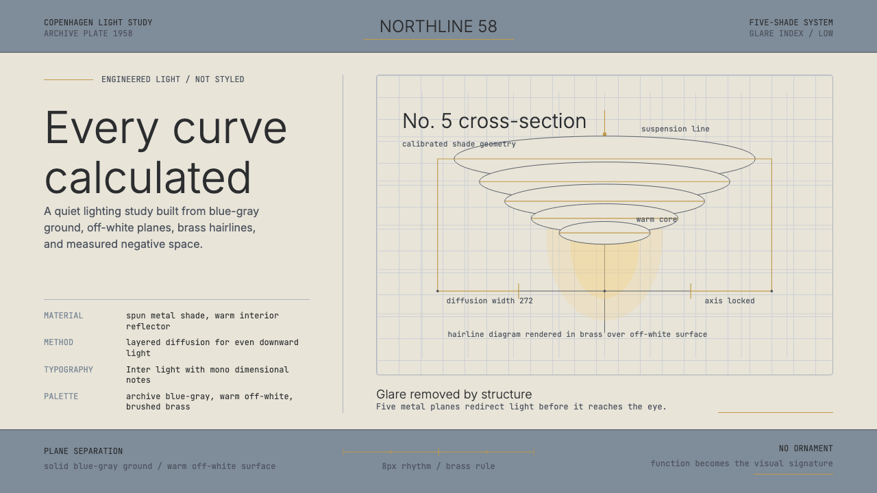 Danish PH5 Louis Poulsen (1958)Engineered, not styled. Blue-gray ground, brass hairlines, and a precise shad…
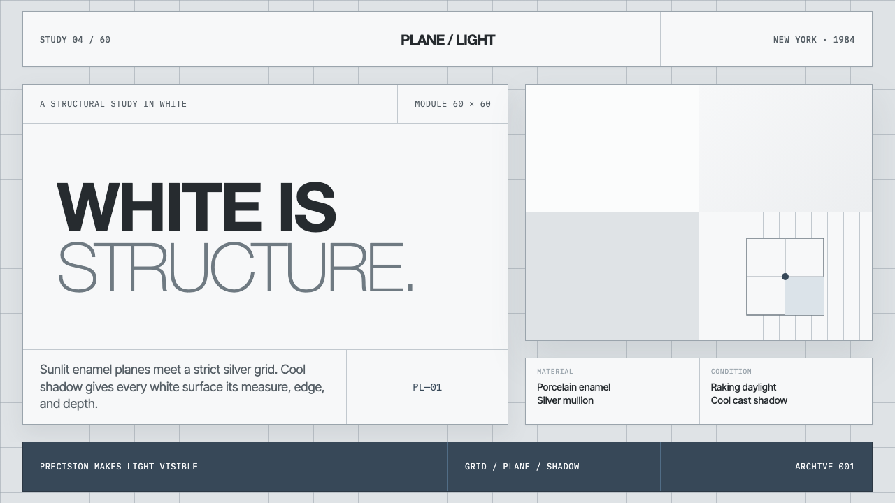 Richard Meier White ArchitectureWhite becomes structure. Cool enamel planes emerge through silver grids and b…
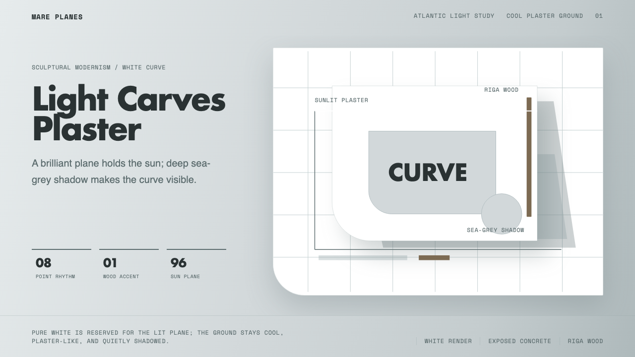 Alvaro Siza WhiteLight makes the form. White planes on cool plaster throw sea-grey shadow and…
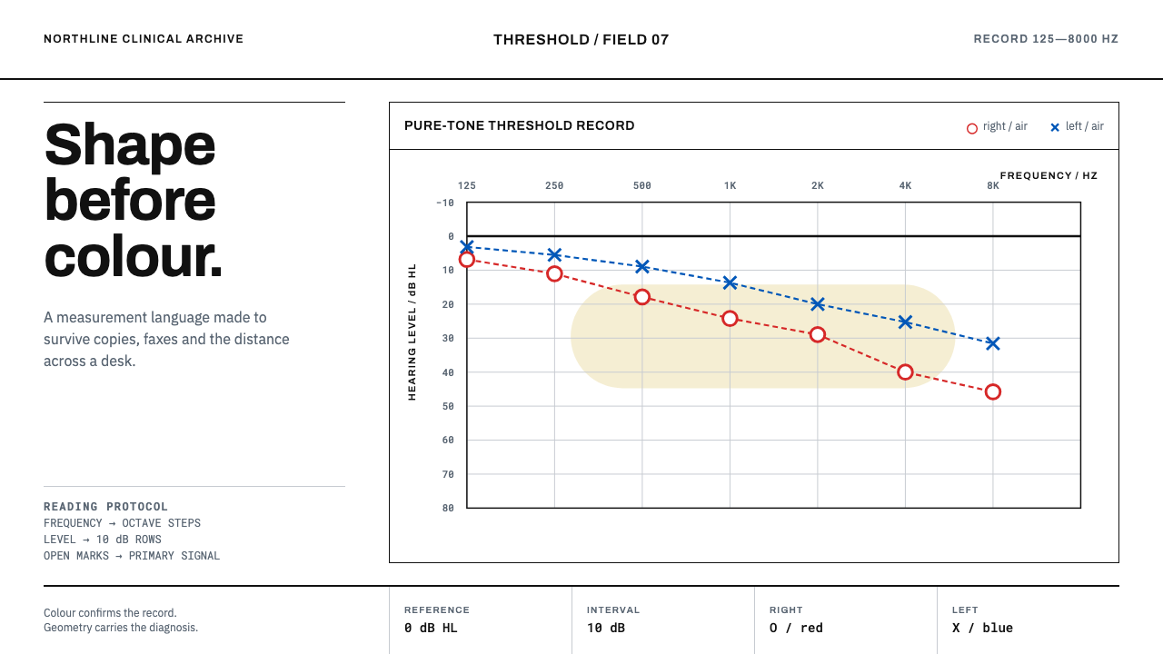 Audiogram ChartShape carries the diagnosis. Open red and blue marks cross a disciplined clin…
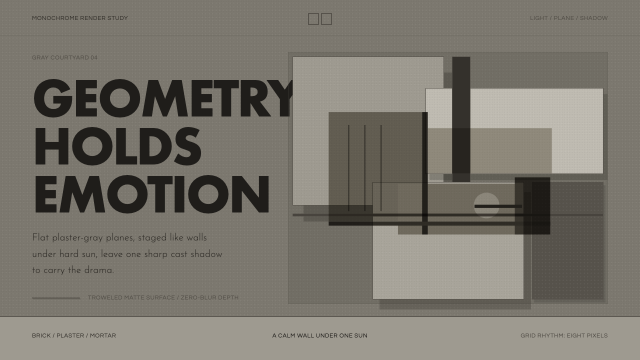 Barragán Render in GrayEmotion made grayscale. Plaster-gray planes and hard shadows carry the geomet…
 Doctor's Clinical Lab CoatSterile by design. Cool clinical white, teal signals, and seam-line grids enf…