What is Doctor's Clinical Lab Coat?
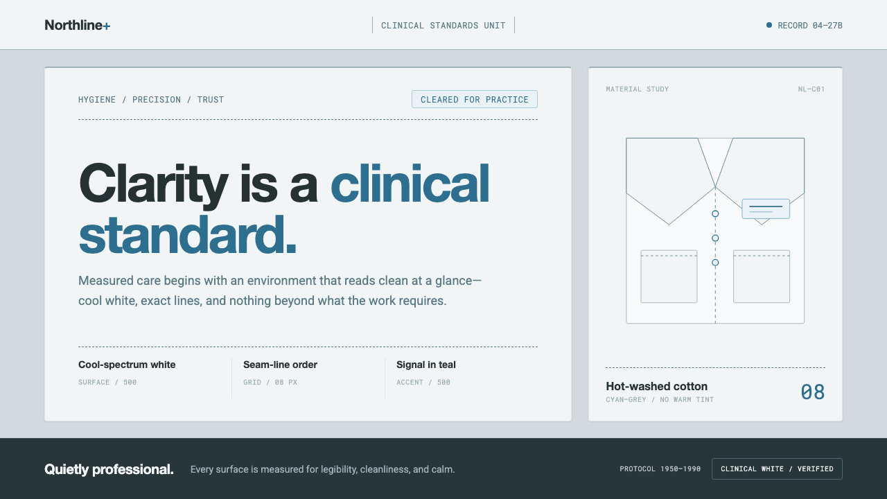
The clinical lab coat turns hygiene into a visual language: cool white, teal signals, and seam-line order make professionalism feel calm, precise, and quietly reassuring.
Doctor's Clinical Lab Coat in brief
The Doctor’s Clinical Lab Coat style is a visual interpretation of the modern clinical white-coat convention associated with hospitals and clinical practice in North America from 1950 to 1990. Its whiteness is not the warmth of old paper or domestic linen. It is a cooler, deliberate white: bright, hygienic, and almost self-monitoring. Against its own folds, the fabric turns cyan-grey; its stitching reads as a colder teal-grey; its functional details gather into clinical teal.
The aesthetic is built from disciplined contrast. A shadowed cyan-grey ground supports near-pure clinical white surfaces, while seam-like rules and pocket rectangles divide the field into calm working zones. Teal is reserved for signals, badges, labels, and other moments that need to be noticed. A neutral sans-serif carries the information with signage-grade clarity. The result is not luxury, softness, or domestic comfort. It is measured cleanliness.
Everything in the system suggests a coat that has been buttoned, washed, folded, and placed correctly. Sharp lapels, orderly plackets, rectangular pockets, restrained borders, and generous white space create a sense of professional readiness. The style feels sterile by design, but not severe: its quiet confidence comes from consistency, legibility, and the visible absence of ornamental distraction.

Where does Doctor's Clinical Lab Coat come from?
The modern clinical white-coat standard belongs to the hospital and clinical culture of North America, especially across the period from 1950 to 1990. Its visual identity is connected to two related movements named in the source material: the Clinical white-coat convention and Hygienic modernism. Together they describe an environment in which cleanliness, professional authority, and orderly procedure become visible through the objects used in practice.
The coat’s color is central to that convention. It is kept bright through hot washing, so its whiteness communicates maintenance rather than nostalgia. This is why the style avoids creamy, yellowed, or paper-like grounds. The white is intentionally clinical. In shadow, it reveals a cyan-grey cast, while seams and folds introduce colder teal-grey notes. These subtle shifts make the garment feel like a material system rather than a blank background.
Physicians and laboratory clinicians are the defining figures of this visual world. The coat is not treated as a fashion statement or a decorative costume; it is a shared professional surface whose lapels, placket, buttons, and pockets express functional readiness. Its repeated presence in hospitals and clinical practice gives the style an institutional grammar: information should be easy to find, boundaries should be clear, and visual choices should support calm attention.
As a design language, the style translates the garment into a complete field system. Cyan-grey becomes the shadowed ground, clinical white becomes the primary surface, seam lines become rules and dividers, pocket shapes become containers for information, and clinical teal becomes the signal color. The historical convention therefore survives not through literal illustration alone, but through the disciplined relationship between material, structure, and professional use.
What defines the Doctor's Clinical Lab Coat look?
Clinical White
White is the dominant surface, but it must remain cool, bright, and hygienic rather than warm or nostalgic. Near-pure white areas create the impression of freshly maintained fabric and provide maximum contrast for information. The white should feel intentional: clean enough to signal care, restrained enough to avoid luxury, and quiet enough to let structure carry the visual authority.
Cyan-Grey Ground
The background is not a neutral grey and not a warm off-white. It carries the cool cyan-grey cast found in the coat’s folds and shadowed fabric. This ground gives the white surfaces somewhere to register, creating depth without atmospheric effects. It should feel like the cooler side of a clean textile, not like a technological blue interface or a dramatic dark backdrop.
Teal Signals
Clinical teal is an accent and a signaling device, not a decorative palette. It marks badges, labels, status cues, and functional details that deserve attention. The hue remains within a cool cyan-teal register, avoiding warm saturation and visual cheerfulness. Used sparingly, it makes important information feel identified and controlled rather than advertised.
Seam-Line Grid
Rules and dividers borrow their authority from garment seams. They are orderly, cool, and visibly functional, organizing content without becoming ornamental borders. Pocket rectangles provide a second structural motif: compact containers for labels, metadata, or grouped controls. The grid should feel sewn into the surface, with each line reinforcing the impression of construction and repeatable procedure.
Signage Sans
Typography is neutral, direct, and built for quick recognition. A signage-grade sans-serif keeps headings, labels, and supporting text within one coherent voice. Hierarchy comes from scale, spacing, and weight rather than expressive lettering or ornamental display type. The typography should feel posted, indexed, and easy to locate, as though every phrase belongs to a well-maintained clinical system.
Calm White Space
Generous white space is not emptiness; it is the visual equivalent of a clear work surface. It separates tasks, protects legibility, and prevents the cool palette from becoming crowded or anxious. Dense decoration would contradict the coat’s professional purpose. Open areas allow the seam lines, pockets, and teal signals to perform their roles with composure.

Who shaped Doctor's Clinical Lab Coat?
Physicians embody the public-facing professional authority of the clinical white-coat convention. In this system, their role is represented through clarity and readiness rather than personal decoration: sharp structure, buttoned order, visible identification, and a calm visual presence.
Laboratory clinicians represent the precise, procedural side of the style. Their association with the coat supports pocket-like information containers, seam-line organization, cool surfaces, and a visual language in which every signal appears placed for a reason.
This convention is the collective figure behind the style: a shared hospital and clinical practice in North America that makes hygiene, order, and professional calm visible through a repeated garment and its recognizable details.
How do you use Doctor's Clinical Lab Coat today?
For presentation work, the style is strongest when the cover establishes the coat as a composed surface and the content slides continue its internal logic. A cover can use a broad clinical-white field against cyan-grey, with one teal badge or seam-like rule creating the point of recognition. Content slides should rely on clear bands, pocket-like information blocks, restrained headings, and generous breathing room. Data slides should look indexed rather than theatrical: charts, labels, and status cues are arranged as functional compartments, with teal reserved for the signal that matters most.
For web interfaces, the Doctor’s Clinical Lab Coat system suits dashboards, monitoring tools, administrative portals, and pricing pages that need calm authority. Use the cyan-grey ground to distinguish the overall environment from white content surfaces. Treat cards as pockets or labeled panels, and use seam-line rules to establish relationships between values, labels, and actions. Pricing tiers can be differentiated through structure and teal signals rather than bright color competition. Buttons and alerts should feel like clinical indicators: clear, quiet, and impossible to misread.
For editorial and marketing work, the style supports articles, reports, service explainers, and professional campaigns whose promise is competence. A narrow reading measure can sit within a broad pale field, while metadata and pull quotes occupy pocket-like side blocks. Section changes work best through rules, labels, and shifts in surface rather than decorative flourishes. Marketing pages can present a strong central statement on clinical white, supported by cyan-grey context and a single teal action cue that feels like an identified next step.
The common mistake is to interpret the theme as a generic medical aesthetic and fill the page with symbols, bright turquoise, glossy surfaces, or hospital imagery. That approach turns calm order into costume. The system depends on the cooler quality of the white, the restrained cyan-teal register, and the functional character of seams and pockets. It also fails when every element receives the same teal emphasis, when panels become crowded, or when typography becomes friendly and expressive at the expense of signage-like clarity.

Doctor's Clinical Lab Coat — FAQ
Is this style meant to look like a literal hospital interface?
No. The hospital and clinical context is the source of its visual discipline, not a requirement for literal imagery. The essential qualities are cool clinical white, cyan-grey grounding, restrained teal signals, seam-like organization, and calm professional typography. A literal medical symbol may be unnecessary if the structure already communicates care, order, and precision.
Why is the white cooler than cream or ordinary off-white?
Because the reference is a clinically maintained lab coat rather than old paper, natural linen, or domestic fabric. Hot washing keeps the coat bright and hygienic, while folds and shadows reveal a cyan-grey cast. A warmer white would shift the mood toward comfort, nostalgia, or craft and would weaken the deliberate clinical identity.
Can teal become the main color instead of an accent?
It can be expanded carefully, but it should remain a signal color in spirit. Teal is most effective when it identifies a badge, status, label, action, or other functional detail. If it covers every surface, it loses its signaling role and the composition becomes more saturated and promotional than clinical. White and cyan-grey should continue to carry the main spatial structure.
What makes a divider feel like a seam rather than decoration?
A seam-like divider has a clear structural job. It aligns related information, defines a pocket-like container, separates working zones, or reinforces the order of a placket. Its color stays quiet, its direction remains disciplined, and it does not multiply simply to fill empty space. The test is practical: remove the line and ask whether the organization becomes less clear.
Where does the Doctor’s Clinical Lab Coat style work best?
It works best wherever calm professionalism, hygiene, indexing, and clear procedure are valuable qualities: clinical services, analytical dashboards, laboratory tools, administrative systems, pricing pages, reports, and educational explanations. It is less suited to products that depend on warmth, ornament, domestic softness, or strong sensory richness. The style should be chosen when measured clarity is part of the product’s promise.
Related design styles
 Frutiger CDG AirportLegibility at runway scale. Navy panels, white humanist sans, arrow-led grids.
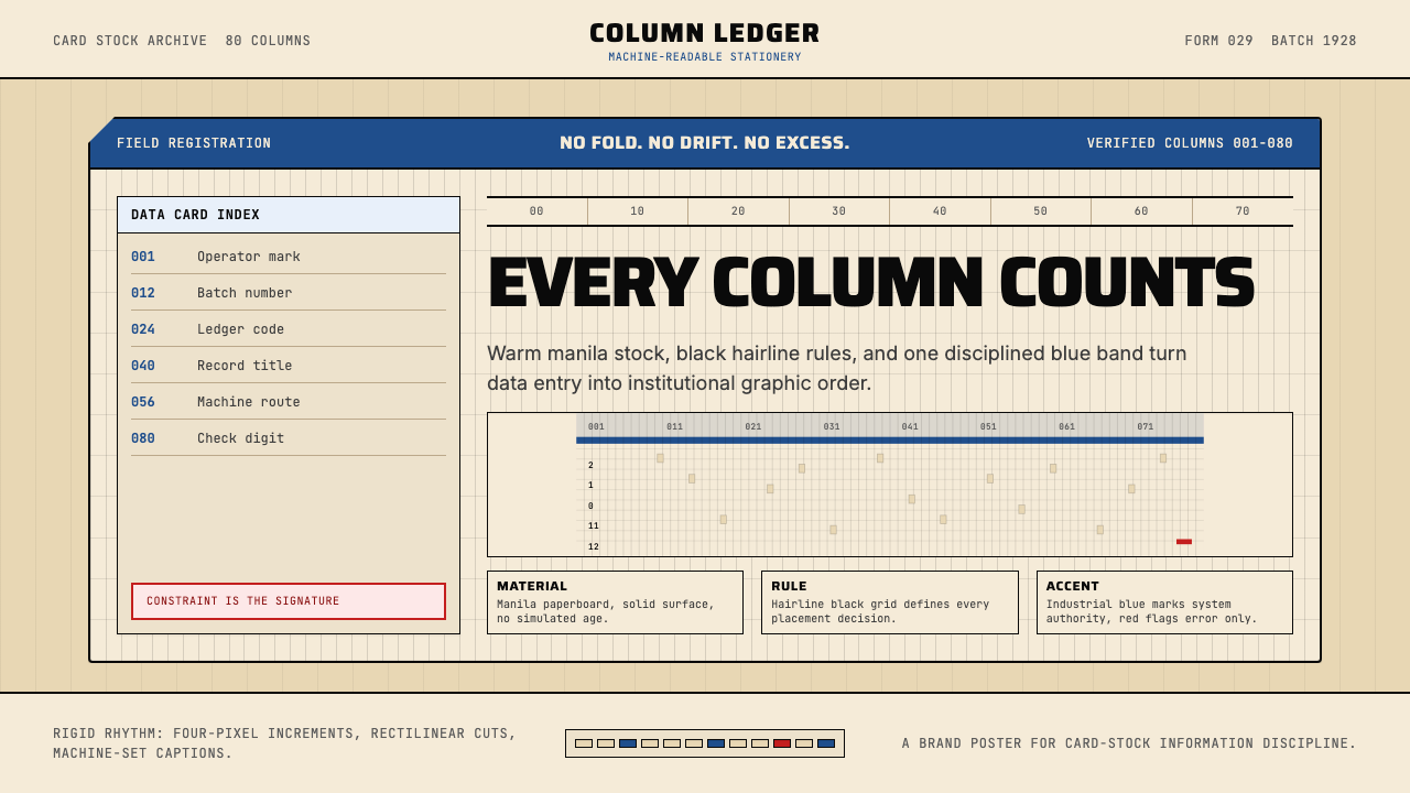 IBM Punchcard 029 (1928)Constraint becomes authority. Manila stock, hairline grid, industrial blue.
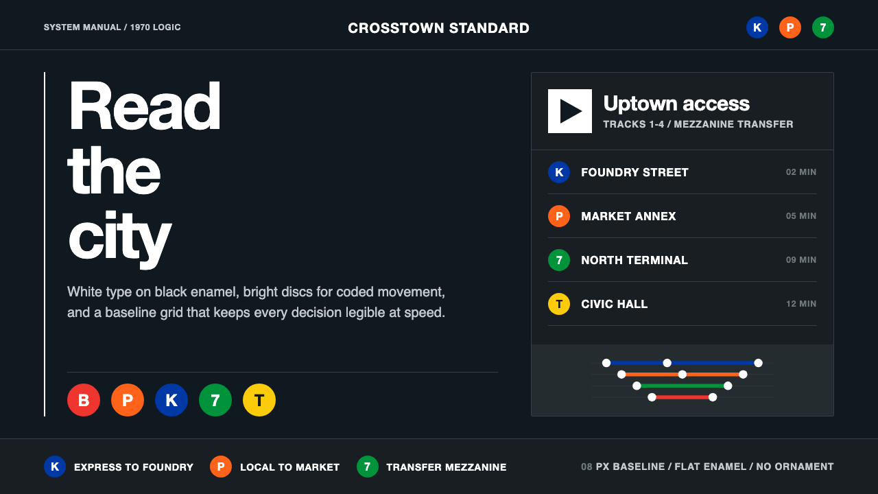 NYC Transit HelveticaOrder made visible. White type, black enamel, route discs, and a grid that ne…
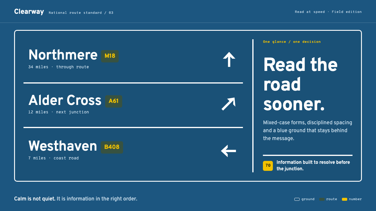 Transport UK Road SignsClarity at seventy. White mixed-case lettering advances across recessive moto…
 Graphite Technical DrawingDrafting-room precision. Non-photo-blue grid and graphite DIN lettering do th…
 Hilfiker Railway ClockEverything exact, one thing live. Black hands on cool enamel white — one red…