What is Frutiger CDG Airport?

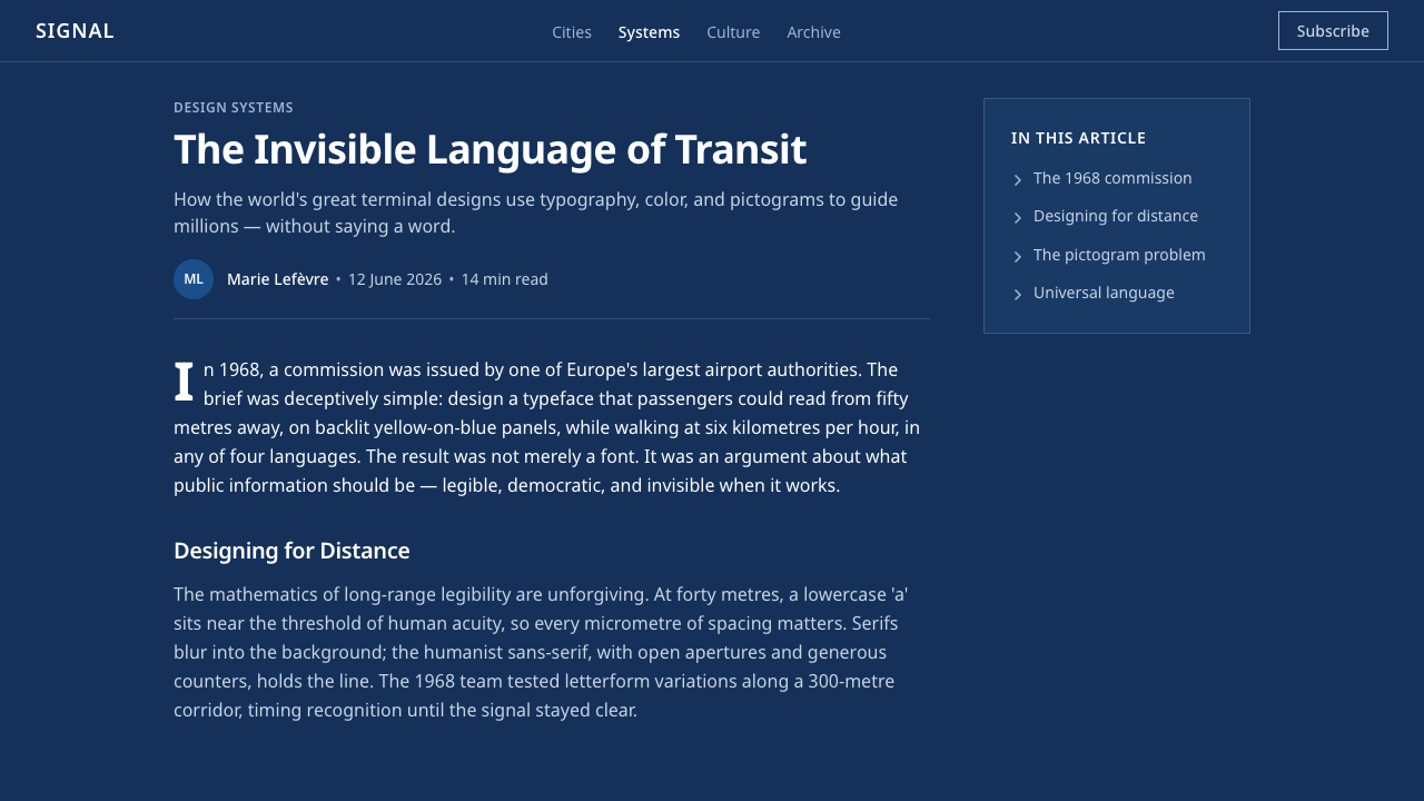
Frutiger CDG Airport turns the pressure of travel into visual calm — dark blue fields, open white letters, and arrows that make direction readable before language is fully processed.
Frutiger CDG Airport in brief
Frutiger CDG Airport is the visual language of the directional sign system developed for Paris–Charles de Gaulle Airport, especially Paul Andreu's circular Aerogare 1. White humanist sans-serif lettering is reversed out of dark Aeroports de Paris blue panels and organized with arrows and pictograms into a hierarchy designed to remain clear across the immense viewing distances of an airport.
Its defining typeface began as Roissy, drawn by Adrian Frutiger specifically for the terminal and later released under the name Frutiger. The letterforms combine modernist economy with visibly human construction: openings remain generous, similar characters stay distinct, and strokes feel firm without becoming mechanically rigid. These qualities support rapid recognition when a traveler is moving, distracted, carrying luggage, or reading from an uncertain angle.
The aesthetic is therefore not decoration applied to infrastructure but a direct expression of operational need. Deep navy panels isolate information from the surrounding brutalist concrete; white lettering creates decisive contrast; arrows establish movement; pictograms cross language barriers. Surfaces remain flat and illuminated, while every grouping answers an urgent sequence of questions: where am I, which direction should I take, and what destination will I reach?
Where does Frutiger CDG Airport come from?
The system emerged at Roissy during the development of Paris–Charles de Gaulle Airport, within a broader period extending from the postwar expansion of modernist information design to the late twentieth century. Airport architecture presented an unusually demanding communication problem: terminals joined vast architectural spaces, international audiences, unfamiliar procedures, and constant movement. Signage had to function less like printed reading material and more like part of the transport machinery.
Paul Andreu's Aerogare 1 gave that problem a powerful architectural setting. Opened in 1974, the terminal was circular, monumental, and materially dominated by brutalist concrete. Its spatial scale required information that could hold its own against the building without competing through ornament. Dark blue sign panels created visually stable islands on the concrete, while illuminated white lettering remained conspicuous across concourses and changing sightlines.
Adrian Frutiger designed Roissy between 1968 and 1972 for this environment. Rather than treating the alphabet as a collection of abstract geometric signs, he tuned it for recognition from distances ranging from ten to one hundred metres. The face needed to survive reduction by distance, motion, glare, and partial attention. Its humanist proportions and open forms preserved the identity of letters while maintaining the orderly neutrality expected of public infrastructure.
Aerogare 1 opened in 1974, the signage was installed in 1975, and the typeface was released as Frutiger in 1976. That sequence matters: the type was first tested as an architectural instrument and only afterward became a broadly available face. The airport system joined modernist information design to brutalist architecture without imitating the building's mass. Concrete supplied permanence and weight; the signs supplied orientation, contrast, and an intelligible path through it.
What defines the Frutiger CDG Airport look?
Color and Contrast
The palette is dominated by deep Aeroports de Paris blue and luminous white. Navy gives the information field authority while separating it from concrete, crowds, and visual noise; white type appears to project forward from the dark ground. Color is functional rather than expressive. Secondary accents should identify a distinct category or condition, never dilute the primary contrast through decorative variety.
Humanist Typography
Frutiger's letterforms are clean but not impersonal. Their open counters, differentiated silhouettes, and balanced proportions help words remain recognizable when viewed from far away or in motion. Headlines, destinations, and supporting information belong to one typographic family; hierarchy comes from scale, placement, and controlled emphasis. Excessively condensed, eccentric, or ornamental companions weaken the system's calm authority.
Arrow-Led Hierarchy
Direction is treated as the first layer of meaning. Arrows occupy clear, repeatable positions and align with destination names and pictograms rather than floating as illustrations. Their shape should be simple enough to register instantly, with generous space around the point and shaft. Grouping destinations by direction allows the eye to decide where to move before it finishes reading every label.
Pictogram Bands
Pictograms compress services, transport modes, and facilities into forms that can be scanned across languages. They work best as a coordinated band beside or beneath verbal information, sharing consistent visual weight and alignment. Each symbol must remain subordinate to the journey decision: it clarifies a destination or service, but does not become a collection of decorative icons competing for attention.
Distance-Based Spacing
Spacing is judged by recognition under pressure, not by how densely a panel can be filled. Destination groups are separated decisively, arrows never crowd labels, and the outer field protects the message from its surroundings. Empty space behaves like a safety margin for perception. The composition may feel unusually generous at close range because it is designed to remain coherent when seen across a terminal.
Flat Illumination
Depth comes from the physical presence and illumination of the sign, not from simulated surfaces. Panels read as continuous dark fields with crisp foreground information. Gradients, atmospheric shadows, glossy decoration, and layered translucency interfere with the optical certainty required for wayfinding. The ideal effect is steady and almost infrastructural: the sign appears available at once, without asking the viewer to interpret its material styling.
Who shaped Frutiger CDG Airport?
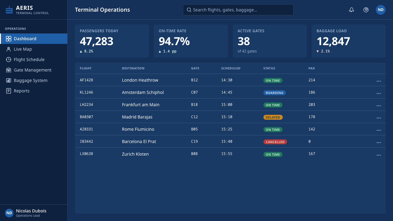
Frutiger designed Roissy specifically for Aerogare 1 between 1968 and 1972, shaping the alphabet around the demands of long-distance airport reading. His contribution was not merely a recognizable typeface but a method of balancing neutrality with human distinction. When Roissy was released as Frutiger in 1976, a tool created for one terminal became the portable typographic core of a much broader information-design language.
Andreu designed the circular Aerogare 1 whose brutalist concrete gave the sign system its architectural context. The building's monumentality made timid graphics untenable, while its complex movement patterns made clarity essential. The relationship between his architecture and the signage is complementary rather than imitative: massive concrete establishes the spatial world, and the dark illuminated panels cut intelligible routes through that world.
The airport identity supplied the dark signage blue against which Frutiger's white forms achieved their characteristic visibility. Within the source system, this institutional field is more than a brand color: it standardizes recognition across a changing architectural environment. Repetition turns each panel into part of one continuous guidance network, allowing travelers to recognize official directional information before reading its specific contents.
How do you use Frutiger CDG Airport today?
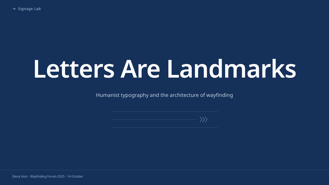
For presentation covers, translate airport scale into decisive hierarchy rather than literal terminal imagery. Use a broad navy field, one short white title, and a directional arrow that establishes the reading path. Content slides should behave like destination boards: group related statements, align labels consistently, and let spacing separate categories. A compact pictogram may identify the subject of each section, but the words remain primary.
Data slides benefit from the system's operational clarity. Treat chart titles as destinations, legends as pictogram bands, and annotations as secondary routing information. Use white and navy as the stable framework, introducing another color only when it carries a specific analytical meaning. Avoid crowded labels and ornamental chart effects; the audience should understand the direction of the evidence before examining individual values.
For web dashboards and pricing pages, the style creates interfaces that feel controlled, public, and dependable. Organize navigation as a persistent guidance band, pair concise labels with familiar symbols, and make states distinguishable through wording and contrast. Pricing tiers can read like parallel destinations, each with a clear name, outcome, and next action. Dense administrative screens especially benefit from its disciplined grouping and generous separation.
Editorial and marketing layouts can borrow the airport's rhythm without becoming signage pastiche. Use dark information bands for section openings, white humanist type for decisive statements, and arrow motifs only where they genuinely advance the narrative. In articles, metadata can behave like route information beside a calmer reading column. Campaign pages work best when each section presents one destination-like promise followed by a direct path forward.
The common mistake is to equate legibility with oversized white text placed indiscriminately on dark blue. The original logic depends on sequence, grouping, distance, and directional priority. Too many arrows create contradictory movement; too many pictograms turn guidance into visual chatter; too many text sizes fracture recognition. Begin with the traveler's decision, assign each element a role in that decision, and remove anything that does not shorten the path to understanding.
Frutiger CDG Airport — FAQ
Is Frutiger CDG Airport simply a dark interface using the Frutiger typeface?
No. The typeface and navy ground are highly visible ingredients, but the system is defined by how information directs movement. Arrows appear in predictable positions, destinations are grouped by route, pictograms bridge language differences, and spacing protects recognition at distance. An interface can use Frutiger and dark blue yet miss the style completely if its hierarchy is ambiguous or its controls compete equally for attention.
Why is a humanist sans serif better suited to this system than a rigid geometric face?
Airport reading depends on distinguishing forms quickly under imperfect conditions. Humanist construction gives letters varied silhouettes, open internal spaces, and proportions that retain recognizable word shapes across distance and motion. A rigid geometric face may look orderly at close range but can make related characters converge visually. Frutiger's strength is that it appears neutral without erasing the small differences on which recognition depends.
Can the style be adapted to a light-background design?
Yes, provided the contrast and routing logic remain decisive. A light page can use navy for typography and directional bands, reserving white for reversed information inside those bands. What should survive is the immediate separation between guidance and environment, the stable alignment of arrows and labels, and the restrained pictogram vocabulary. If the inversion introduces delicate contrast or ornamental softness, the airport character disappears.
How should arrows and pictograms be used without making an interface look like a novelty airport sign?
Use them as operational language, not thematic decoration. An arrow should correspond to navigation, progression, expansion, or a clear relationship between areas. A pictogram should identify a service or category that users repeatedly need to scan. Keep both aligned with text and consistent across the product. Decorative airplanes, boarding references, and arbitrary route lines imitate the setting while ignoring the information system that made the original persuasive.
Where does Frutiger CDG Airport work poorly?
It struggles where atmosphere, intimacy, or expressive irregularity matters more than rapid orientation. The authoritative navy field and directive arrows can feel institutional in personal storytelling, artisanal branding, or leisurely cultural experiences. It is strongest when users must scan choices, trust instructions, and move toward an outcome. Applying it well means accepting its operational temperament rather than softening every element until only a generic dark theme remains.
Related design styles
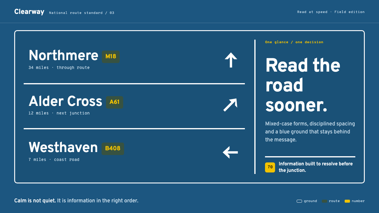 Transport UK Road SignsClarity at seventy. White mixed-case lettering advances across recessive moto…
 Doctor's Clinical Lab CoatSterile by design. Cool clinical white, teal signals, and seam-line grids enf…
 Graphite Technical DrawingDrafting-room precision. Non-photo-blue grid and graphite DIN lettering do th…
 Hilfiker Railway ClockEverything exact, one thing live. Black hands on cool enamel white — one red…
 Ulm School (HfG Ulm)Clarity becomes discipline. Black-white grid, Inter grotesk, and one surgical…
 Architect CyanotypePrecision in negative. Prussian blue ground, paper-white grid, mono dimension…