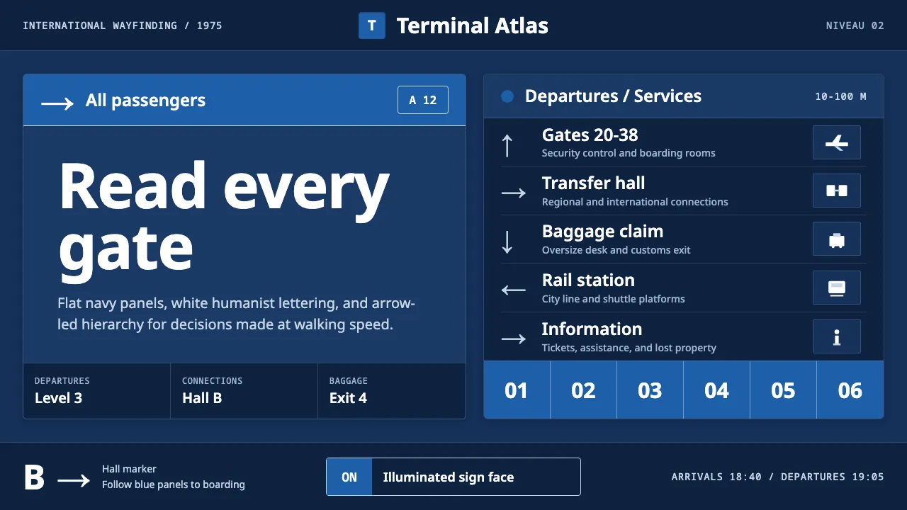
About Frutiger CDG Airport
The directional sign system of Paris–Charles de Gaulle: white Frutiger letters reversed out of dark Aeroports de Paris signage blue, mounted on the brutalist concrete of Paul Andreu's circular Aerogare 1. Adrian Frutiger designed the face 'Roissy' specifically for this terminal, tuned for maximum legibility from 10 to 100 metres.
This system distills that wayfinding logic into an interface language: deep navy panels, crisp white humanist sans, arrow-and-pictogram bands, and a hierarchy built for reading at distance. Flat, illuminated, and relentlessly legible.
- Origin
- Roissy, Paris, France (Western Europe)
- Era
- 1950–1990 (typeface 'Roissy' 1968–72; Aerogare 1 opened 1974, signage installed 1975; released as Frutiger 1976)
- Key figures
- Adrian Frutiger · Paul Andreu
- Movements
- Brutalist airport architecture · Modernist signage / information design
Frutiger CDG Airport design spec
Colors
Typography
The other 11 sections — buttons, cards, spacing, motion, techniques and more — open once you unlock. Download the DESIGN.md or send it to your AI in one click. Unlock once, yours forever.
Sign up nowStyles similar to Frutiger CDG Airport
Also inspired by architecture & places, with a close feel.
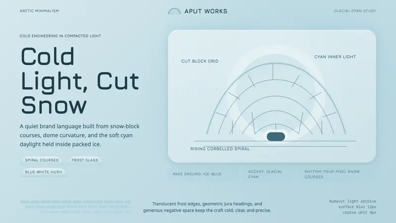 Inuit IglooCold craft, clear light. Glacial cyan and Jura type trace a spiral-block dome on ice-blue.
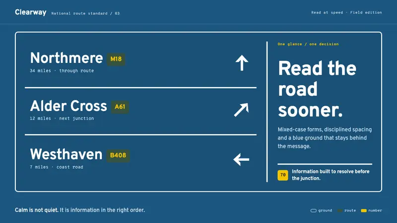 Transport UK Road SignsClarity at seventy. White mixed-case lettering advances across recessive motorway blue.
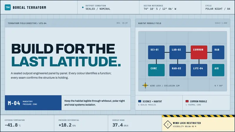 Arctic Terraform StationEvery colour carries a duty. Sky-blue panels, coded modules and hard seams enforce polar order.
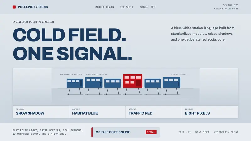 Antarctic StationCold precision, one red signal. Archivo modules ride a blue-white horizon grid.