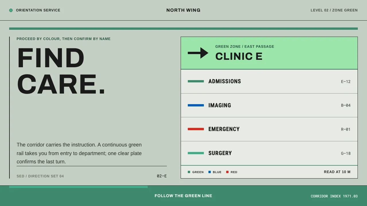
About Hospital Wayfinding 1970
A hospital that answers "where do I go" with paint before it answers with words. Duke's SEDO system cut the medical centre into eight colour zones in 1971 — signage, elevator cars and stairway doors all painted to match the zone they stood in.
The design lives in the room, not on a poster. Pale institutional green enamel, a guide stripe carried along the floor, and short uppercase grotesque with one arrow, sized for someone frightened and in a hurry.
- Origin
- North America — Duke University Medical Center, Durham, North Carolina; parallel UK NHS practice
- Era
- 1950s–1990s institutional practice; peak c. 1971 (Duke SEDO, March 1971)
- Key figures
- Harry Sherman · Faber Birren · Max Miedinger · Eduard Hoffmann
- Movements
- institutional colour engineering · International Typographic Style signage · environmental graphic design
Hospital Wayfinding 1970 design spec
Colors
Background
Surface
Primary
Secondary
Accent
Text
Typography
ArchivoHeadings
ArimoBody
Roboto MonoMono
Unlock for 1 credit
The other 11 sections — buttons, cards, spacing, motion, techniques and more — open once you unlock. Download the DESIGN.md or send it to your AI in one click. Unlock once, yours forever.
Sign up nowHave an account? Sign in
Styles similar to Hospital Wayfinding 1970
Also inspired by architecture & places, with a close feel.
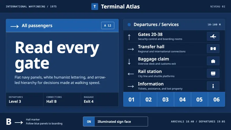 Frutiger CDG AirportLegibility at runway scale. Navy panels, white humanist sans, arrow-led grids.
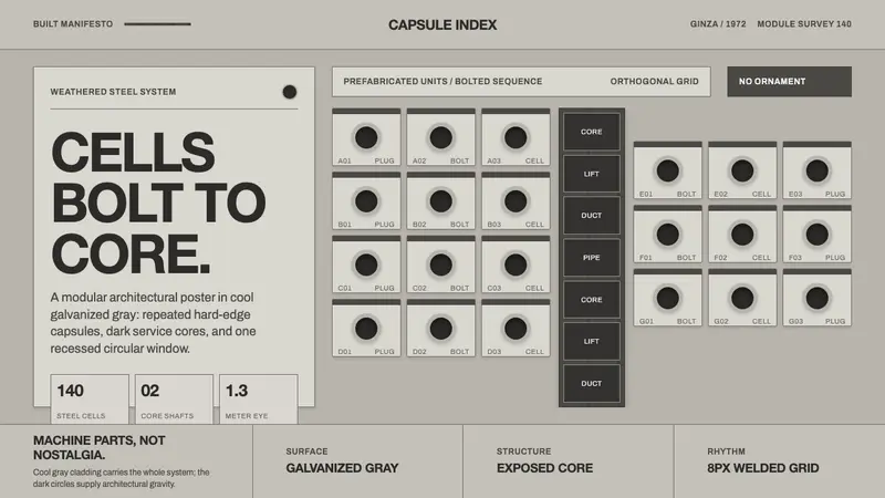 Nakagin Capsule TowerArchitecture as cells. Cool gray modules, dark cores, and porthole circles lock into grid.
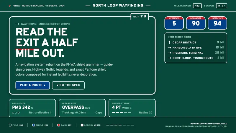 Interstate Highway ShieldEngineered for 70 mph. Guide-sign green, Pantone shield blue and red, Highway Gothic in all caps.
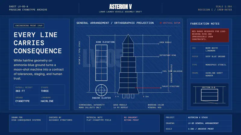 NASA Saturn V BlueprintPrecision carries risk. Prussian blue grids and white mono callouts frame a launch stack.