What is Hospital Wayfinding 1970?
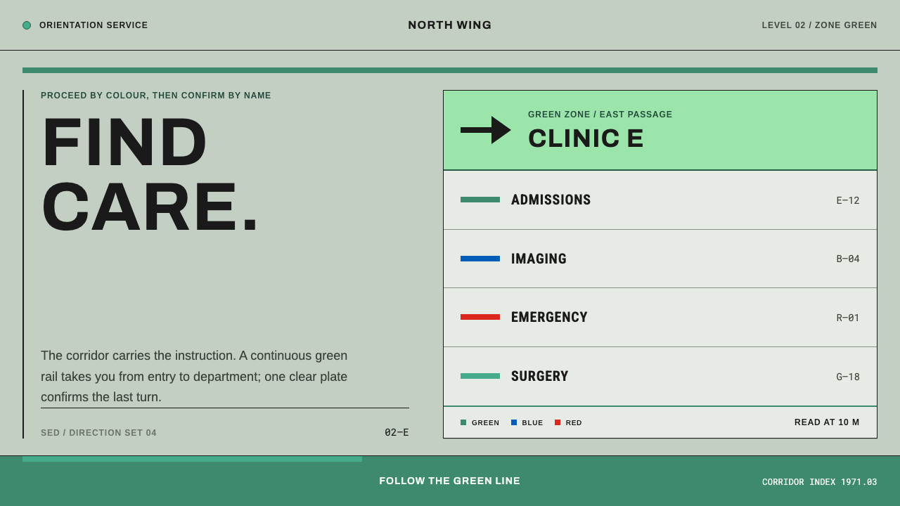
Hospital Wayfinding 1970 answers 'where do I go?' with paint before it answers with words — colored zones, pale enamel green, and one bold arrow for someone who is frightened and in a hurry.
Hospital Wayfinding 1970 in brief
Hospital Wayfinding 1970 is a design language drawn from the color-coded signage and interior painting practice of mid-century hospitals. That body of institutional work ran from the 1950s into the 1990s and reached its clearest form around 1971 at Duke University Medical Center in Durham, North Carolina. Its premise is that a person walking into a hospital is not browsing. They are frightened, late, or both, and a building that makes them read paragraphs of directions has already failed them.
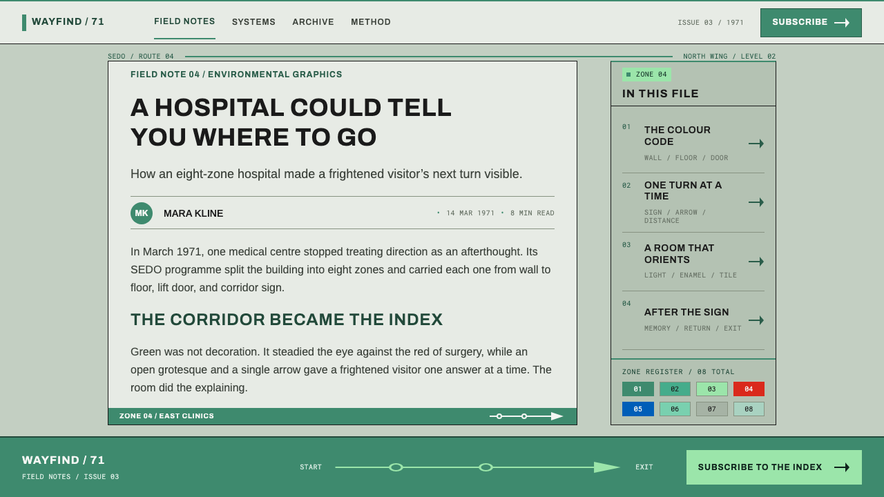
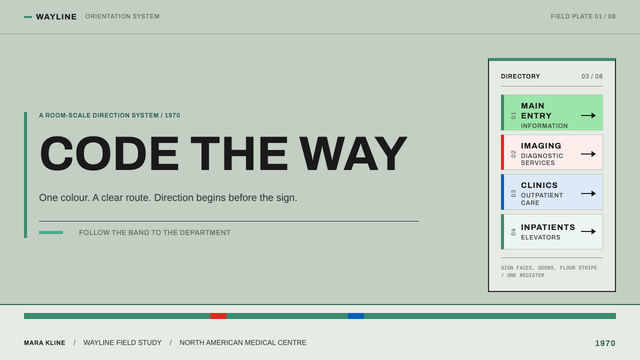
The solution was to move the information off the sign and into the room. In March 1971 Duke introduced a system called SEDO that divided the medical center into eight color zones. Signs, elevator cars and stairway doors were all painted to match the zone they stood in, so finding a department became a color-matching problem before it became a reading problem. Words were still present, but they confirmed what the walls had already said.
Visually the style is calm to the point of blandness, and that is deliberate. Walls take a pale, slightly muted institutional green in a semi-gloss enamel, floors carry a guide stripe that runs along the route, and sign plates hold one short uppercase word in a plain grotesque beside a single solid arrow. There is no photography, no illustration and no ornament. Every surface has a job: to remove a moment of hesitation from the person who can least afford one.
Where does Hospital Wayfinding 1970 come from?
Hospitals are among the least legible buildings people ever have to navigate. They grow by accretion — a wing added in one decade, a tower in another, a corridor that was a loading dock a generation earlier — and the people who arrive are rarely in a state to study a floor plan. Before wayfinding became a discipline, directions lived in the heads of staff and on hand-lettered cards taped beside doors. The institutional color-engineering tradition that Hospital Wayfinding 1970 inherits treated color as working equipment, as much a part of a building's operation as lighting or ventilation, to be chosen for what it does to the eye and the nerves rather than for taste.
The clearest single episode is Duke's. SEDO, introduced in March 1971, cut the medical center into eight color zones and committed the whole building to them: not just signs but elevator cars and stairway doors, so a visitor who stepped out of a lift into the wrong zone would know it from the paint before reading a word. The name most closely attached to the Duke scheme in the research behind this style is Harry Sherman. The public record is thin, which is itself characteristic of the genre: institutional wayfinding is rarely signed, and the people who solved it usually disappear into the building they fixed.
The green has a specific lineage. Surgical environments favor a muted green because it is the complement of blood red; staring at red tissue leaves a ghost image in the eye, and green surroundings help cancel that afterimage for the surgeon. Carried into corridors and waiting rooms, the same hue brings a borrowed association — clean, calm, medical — and becomes the signature ground of the whole system. It is not green because green is soothing in some general way. It is green because the operating room made green the color of clinical competence.
The lettering comes from a different tradition. Alongside color engineering, the style leans on the International Typographic Style and the neutral grotesque letterforms it preferred: open, even sans serifs of the kind associated with Max Miedinger and Eduard Hoffmann. Combined with the emerging field of environmental graphic design — which treats walls, floors and signs as one designed space rather than as a building with posters on it — this gave hospital signage a vocabulary that contractors could apply and strangers could read. Similar thinking developed in parallel in the United Kingdom's National Health Service, which is why the style is better understood as a shared institutional practice peaking around 1971 than as one hospital's invention.
What defines the Hospital Wayfinding 1970 look?
Color as Address
Each of the eight zones owns one color, and that color is the primary piece of information in the system. It appears on signs, elevator cars, stairway doors and the guide stripe, so a person can carry a single fact — 'my zone has this color' — through the whole building. For this to work, the zones must be distinguishable at a glance and each must be used consistently; a color that carries two meanings is worse than no color at all.
Institutional Green Enamel
The default ground is a pale, slightly dull green, as if the paint had been mixed to avoid having any opinion. It is applied as semi-gloss enamel on plaster and masonry block, a finish chosen because it can be scrubbed. The sheen is subtle: enough to read as a hard, cleanable surface, not enough to throw glare. In a digital translation the equivalent is a flat, softly muted green field with a faint suggestion of surface — never a saturated brand green and never a gradient.
The Guide Stripe
A band of color runs along the floor tile and, in places, along the wall, turning every corridor into a line you can follow with your feet. It is the one continuous element in the system, and its job is reassurance: as long as the stripe is underfoot, you are on a route. On a screen it becomes a rail, a progress line or a side border that holds a section together and shows the reader where the path continues.
Short Uppercase Grotesque
Lettering is set in capitals, in an open, even sans serif with generous spacing between the letters, and is kept to one word wherever possible. The loose spacing is not a stylistic whim; it lets a whole word be recognized in a single glance from across the corridor by someone who will not slow down to read. There are no italics, no decorative faces and no mixing of families — the voice of the building should be uniform, plain and slightly impersonal.
One Arrow, One Direction
Each plate carries a single solid arrow pointing one way. The system never presents three equal options and asks the visitor to choose; it makes the choice for them. This is the philosophical center of the style: wayfinding as the removal of hesitation. Where a route really does split, the split is handled by separate plates in separate places, not by a menu.
Flat Plates, Square Edges
Sign plates are plain enamel-finished panels in the color of their zone, with square corners and a quiet margin around the lettering. They sit on the wall like part of the wall. There is no drop shadow, no bevel and no decorative icon set at the edges; hierarchy is carried by color, letter size and position alone, and the empty margin around a word does more work than any border could.
Who shaped Hospital Wayfinding 1970?
Harry Sherman is the name most often attached to the Duke SEDO scheme of March 1971 in the research behind this style. The surviving public account is thin, so his significance here is as a marker of the idea rather than as a biography: that a whole medical center can be zoned by color, and that doing so is a design act as serious as drawing the building. The scheme as it is remembered shows the principle at full scale, with signs, elevator cars and stairway doors all repainted to one logic.
Faber Birren is remembered as a color consultant who argued that color in workplaces, factories and hospitals should be chosen for function — safety, visibility, visual fatigue — rather than for decoration. His thinking is a pillar of the institutional color-engineering tradition behind this style, and the idea that a wall color can reduce eye strain, mark a hazard or identify a zone is one of its central inheritances.
Miedinger was the Swiss type designer behind the neutral mid-century grotesque that was later renamed Helvetica. His letterforms stand for the International Typographic Style's belief that lettering should be even and clear enough to disappear into its message, which is exactly what a sign in a corridor needs to do. The open, evenly spaced capitals typical of this style descend from that tradition.
Hoffmann directed the Haas type foundry when the grotesque associated with Miedinger was commissioned, and is credited alongside him in the lineage of Swiss neutral sans serifs. His place in this style is as the other half of a partnership that made plain lettering a respectable ambition: a typeface meant to carry any message in any context, from a corporate report to a hospital corridor, without adding a personality of its own.
How do you use Hospital Wayfinding 1970 today?
Hospital Wayfinding 1970 is best used when the job is to direct, reassure and organize rather than to impress. Its strength is that it treats color and position as information, not as mood. Applying it correctly means asking which color means what, where the arrow points, and what the person looking at this screen or slide needs to do next, rather than simply painting everything pale green and setting it in capitals.
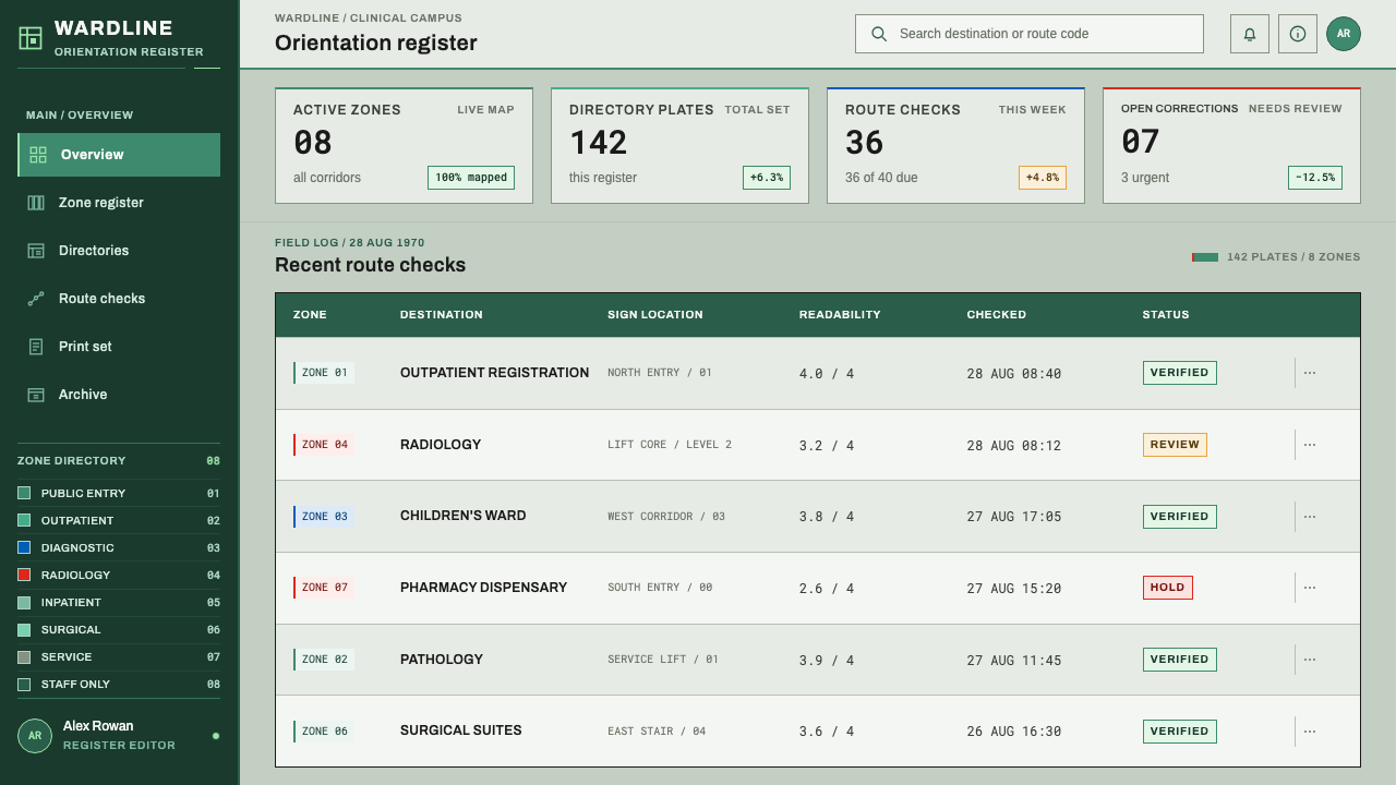
On slides, the cover works best as a calm field with one short uppercase title and a single arrow pointing into the deck; no imagery is needed. Treat each section of a talk as a zone, giving it its own color band along one edge so the audience always knows where they are in the argument. Content slides should carry one idea each, with one arrow at most. Data slides can borrow the guide stripe: a single colored line that threads through the chart, with labels set directly beside the marks in capitals instead of hidden in a legend.
On the web, the zone model maps cleanly to dashboards and product navigation. Give each product area one color that appears in its navigation item, its page header and its accents, so users keep their bearings as they move around. Onboarding and checkout flows benefit from the one-arrow rule: a single primary action per screen, never three equal buttons. Pricing pages can treat plans as zones, each with its own color and one clear next step, set on a quiet, undecorated ground with square-cornered cards and no drop shadows.
For editorial and marketing work, sections become zones and article labels become plates: a color band at the top of each section, short uppercase markers, and plenty of empty space around them. The style suits anything that must give directions to nervous people — healthcare, public services, transit, campus and civic tools — and brands that want to feel competent and unadorned. Its plainness reads as trustworthiness, so it pairs well with copy that is short, literal and calm.
The most common mistake is to treat the system as a mood. Pale green and uppercase will give a retro-clinical look, but the logic of the style is the zoning, and without a consistent color-to-meaning map it is just a green interface. A second mistake is relying on color alone: real wayfinding never trusts hue by itself, since some viewers cannot tell certain colors apart, so every color should travel with a word. The third is letting the arrow offer choices or adding accents that compete with the zone color; the moment a screen has several equal calls to action, the style has stopped working.
Hospital Wayfinding 1970 — FAQ
Why is the style built around green?
Because of the operating room. Green is the complement of blood red, and surgical settings use it to cancel the afterimage that staring at red tissue leaves in the eye. Moved into corridors, the same muted green carries a borrowed meaning of cleanliness, calm and clinical competence. It is a pale institutional green rather than a lively one, since the job is to recede and reassure, not to attract attention.
Is this the same as the International Typographic Style?
No, but they are close relatives. The International Typographic Style supplies the lettering: neutral, even, open grotesque capitals. Hospital Wayfinding 1970 adds what that style does not carry on its own — color zoning, painted enamel surfaces, guide stripes and the specific institutional context of frightened visitors in a hurry. You can think of it as the typographic tradition applied to a building and given a job.
Does the system need exactly eight colors?
No. Eight was Duke's answer for its own building. The principle is a small set of colors that can be told apart at a glance, each tied to exactly one meaning. A product with three areas needs three zone colors, not eight. What matters is that no two colors can be confused and that no color is ever reused for a second meaning.
Can it work in a dark theme?
The historic system is a light-ground, painted-wall style, and its calm depends on that surface. A dark version is possible, but it gives up the enamel association and the soft, even daylight feel that make the original reassuring. If you go dark, keep the same logic: restrained zone colors, uppercase labels, one arrow, and no glow or gradient effects to compensate for the missing painted surface.
Where does this style struggle?
It struggles wherever personality, delight or luxury is the goal. A fashion label, a playful consumer app or a premium hospitality brand would find its flatness and institutional tone cold. It also needs care around accessibility: color must always be paired with words, because a system that relies on hue alone excludes some viewers. Used where orientation and reassurance are the point, it is hard to beat.
Related design styles
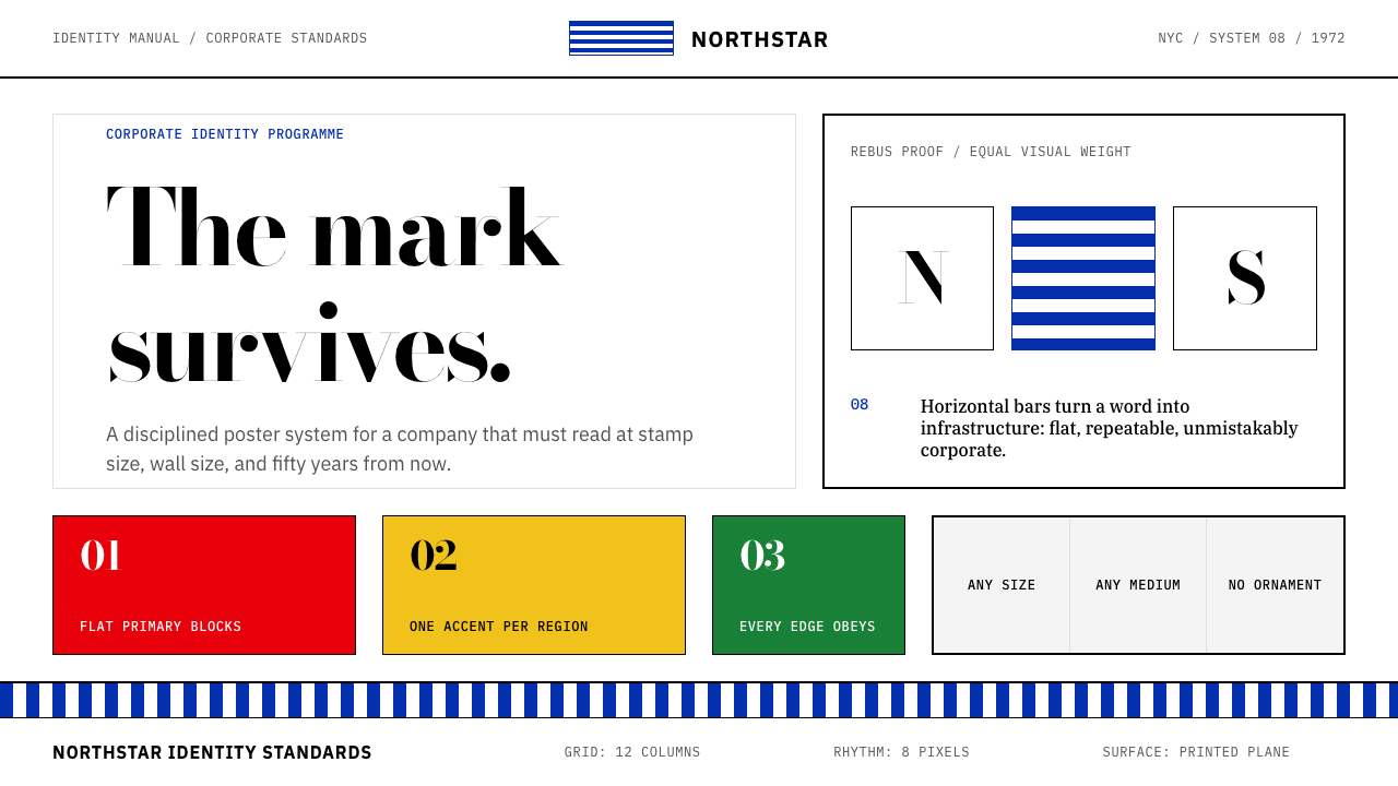 Paul Rand / IBM Corporate IdentityCorporate modernism stays exact. Blue 8-bar stripes, high-contrast serif, har…
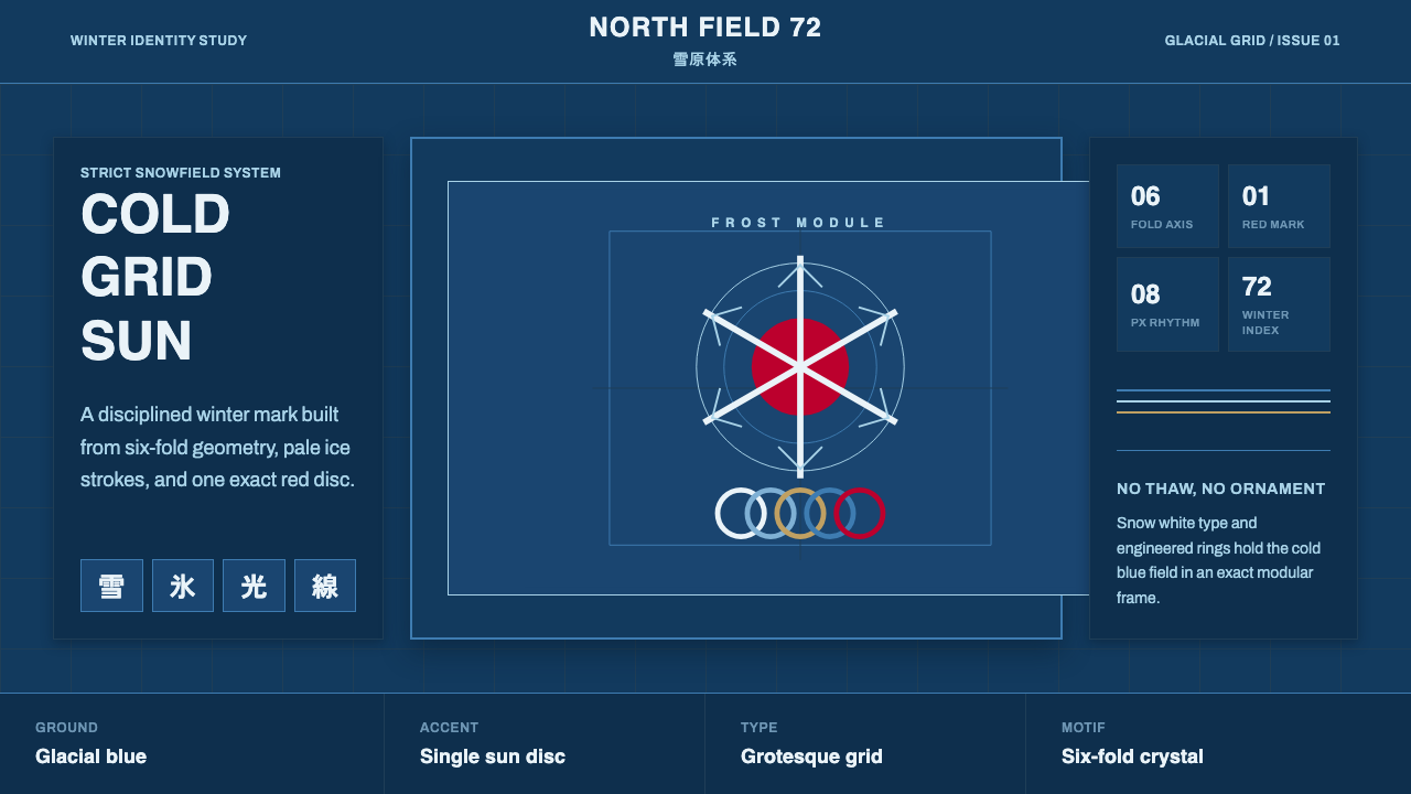 Sapporo Winter 1972Icy order, exact and calm. Glacial blue grid, snow-white type, one red sun di…
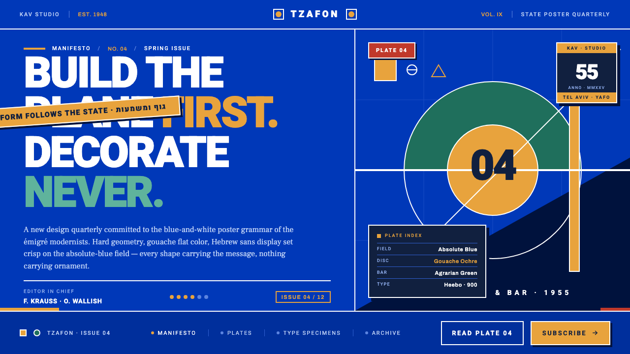 Israeli Bezalel ModernismForm follows the state. Hard Bauhaus discs and ochre bars on absolute blue, H…
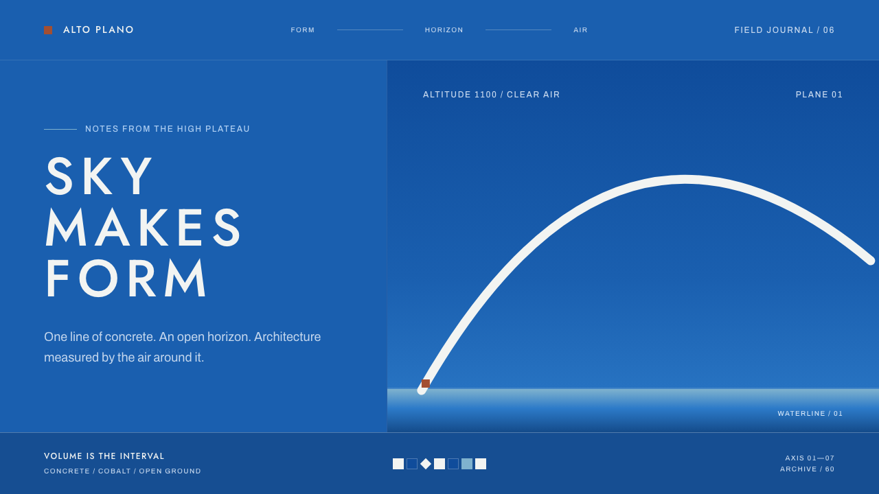 Niemeyer Brasília CurvesEmptiness makes the monument. Concrete-white arcs cut across a saturated coba…
 Tokyo 1964 (Kamekura)Ceremony reduced to a mark. Crimson disc and gold rings lock to a black axial…
 Yugoslav SpomenikMonumentality without figures. Concrete grey-green meets stainless geometry a…