What is Israeli Bezalel Modernism?
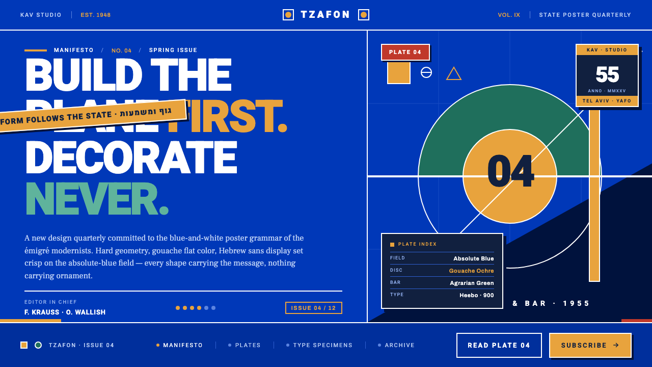
Bauhaus gave the new state a visual grammar: hard circles, ochre bars, and white Hebrew display type locked against an absolute-blue field.
Israeli Bezalel Modernism in brief
Israeli Bezalel Modernism is a post-statehood visual language formed after the 1948 declaration of statehood, when European-trained designers began building an identity for a new nation. It translated Bauhaus and European Functionalism into a distinctly Israeli poster grammar: saturated absolute blue, white type, hard geometric planes, and a restrained set of ochre and agrarian green accents.
The style is flat, high-contrast, and message-led. Circles, horizontal bars, and diagonals are not surface decoration; they are structural devices that frame, divide, point, or anchor information. A poster feels assembled from decisive planes rather than painted as an atmospheric scene. The image is intentionally gouache-flat, with crisp edges and no need for illusionistic depth.
Typography carries the national voice. Hebrew sans display lettering, described as ancestral to Frank-Ruehl and Narkis Block, places slogans and titles in white against the national blue. The result is forceful without being ornamental: imported modernist discipline becomes a screen language for tourism, civic identity, and national communication.
Where does Israeli Bezalel Modernism come from?
The style emerged from a specific historical condition: the creation of a new state in 1948. A generation trained in Europe had to help construct a visual identity for a country whose public image was still being formed. Their solution was not a decorative national folklore but a modernist system capable of making statehood feel immediate, organized, and forward-looking.
Bauhaus supplied the underlying grammar. Its geometric forms, functional logic, and rejection of unnecessary ornament offered a ready method for turning an idea of nationhood into a legible composition. European Functionalism provided the broader conviction that every shape should serve the message. In this context, modernism was not merely an international style; it became a practical language for communicating a new national presence.
Franz Kraus and Otte Wallish were émigrés who carried Central European functionalism into this post-statehood environment. Their tourism and national posters composed circles, bars, and diagonals as hard planes over an absolute-blue field. The imagery was economical and direct: geometry supplied movement and order, while blue and white established the dominant public atmosphere.
The Bezalel context gave this imported grammar a local direction. Hebrew sans display type placed the language of the new state at the center of the composition, while gouache ochre and agrarian green introduced warmth without weakening the blue-and-white structure. By the 1960s, the system had become recognizable as a distinctly Israeli modernism: flat, functional, and unapologetically contemporary.
What defines the Israeli Bezalel Modernism look?
Absolute Blue
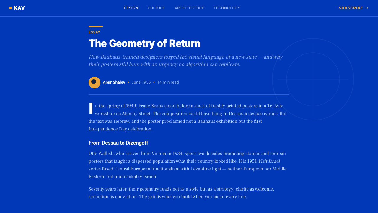
Blue is the dominant field rather than a passing accent. It establishes the atmosphere of the entire composition, giving white Hebrew type and warm geometric inserts a sharp, public contrast. The blue should feel saturated and declarative, closer to a national ground than to a neutral interface background.
Hard Geometry
The visual vocabulary is built from circles, bars, and diagonals. Circles create focal pressure, bars stabilize or divide the field, and diagonals introduce direction. These forms are flat and intentional, with crisp edges that make every compositional decision visible.
Gouache Flatness
Surfaces appear gouache-flat: solid, opaque, and free from atmospheric modeling. Depth comes from overlap and placement, not gradients or soft illumination. The effect is poster-like and tactile in concept while remaining highly controlled on screen.
Hebrew Display Type
Crisp Hebrew sans display type gives the system its linguistic identity. Lettering is large, direct, and structurally integrated with the geometric field, most often appearing in white against blue. The references to Frank-Ruehl and Narkis Block suggest a display voice that is clean, assertive, and unmistakably modern.
Restrained Warmth
Ochre and agrarian green warm the blue-and-white structure without competing with it. Their role is supportive rather than atmospheric: an ochre bar can activate a corner, while green can suggest the agricultural dimension of the national image. Warm color remains subordinate to the central blue field.
Message as Structure
Nothing is included merely to enrich the surface. A shape must frame, direct, separate, or reinforce the message; type must carry the slogan or title with immediate force. This is functionalism applied to national communication, where clarity is not a secondary virtue but the organizing principle of the image.
Who shaped Israeli Bezalel Modernism?
Kraus was an émigré designer who carried Central European functionalism into the visual culture of post-statehood Israel. Alongside Otte Wallish, he composed tourism and national posters from hard geometric planes, using circles, bars, diagonals, and the absolute-blue field to turn public communication into a modern national image.
Wallish helped establish the post-statehood poster language through the same disciplined vocabulary of geometry, contrast, and functional composition. His work with Kraus demonstrates how imported Bauhaus grammar could be adapted to national communication without falling into decorative symbolism.
The broader generation of European-trained designers supplied the movement's historical force. They brought Bauhaus and European Functionalism into a new national setting, then gave that grammar a local voice through Hebrew display type, blue-and-white public imagery, and restrained references to ochre and agrarian green.
How do you use Israeli Bezalel Modernism today?
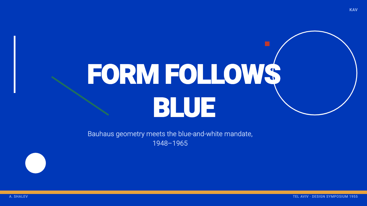
For presentation covers, use the absolute-blue field as the primary stage and let one hard geometric form establish the composition immediately. A large circle, ochre bar, or diagonal can carry the visual weight while a white Hebrew-style display title sits directly within the structure. The cover should feel like a national poster rebuilt for the screen: declarative, flat, and organized around the message.
Content and data slides should preserve the same discipline. Treat bars as structural dividers or chart bodies, use circles as focal markers, and reserve diagonals for direction or emphasis. Keep text in crisp sans display treatment, with white against blue wherever the message needs maximum authority. Data should read as geometry rather than decoration, and every shape should explain its presence.
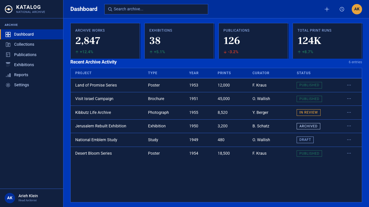
For web interfaces, the style suits dashboards and pricing pages that need a strong public voice and immediate hierarchy. A blue field can organize the page, white type can carry navigation and key labels, and ochre or agrarian green can distinguish states or categories. Panels should remain flat and sharply bounded; the interface should feel assembled from functional planes rather than softened into a neutral software surface.
Editorial and marketing work can use the style as a poster system. A feature page may open with a saturated blue field, a large geometric anchor, and a concise headline; subsequent sections can alternate blue, white, ochre, and green fields while preserving the same hard-edged vocabulary. Tourism, civic communication, and modern national identity are especially compatible subjects because the style already connects visual order with public messaging.
The common mistake is to treat the palette and geometry as decoration while abandoning the functional logic beneath them. Adding many circles, bars, and diagonals, or warming every surface with ochre and green, weakens the absolute-blue structure. The system works when one dominant field, a clear Hebrew-inspired typographic voice, and a small number of purposeful shapes make the message feel inevitable.
Israeli Bezalel Modernism — FAQ
Is Israeli Bezalel Modernism simply Bauhaus in Israeli colors?
No. Bauhaus and European Functionalism provide the imported grammar, but the post-statehood setting changes what that grammar is asked to do. The system must communicate a new national identity, so absolute blue, white Hebrew display type, tourism imagery, and national posters become central. Its modernism is therefore both international in form and specifically Israeli in public purpose.
Can the style work without Hebrew lettering?
It can, but the result will lose an important part of its identity. The crisp Hebrew sans display voice is not an incidental label placed on top of the geometry; it is one of the elements that turns a general Bauhaus composition into a national poster language. If another script is required, preserve the same directness, structural integration, and high contrast rather than adding ornamental lettering.
Why is absolute blue more important than ochre or agrarian green?
Blue establishes the dominant field and gives the system its public, national presence. Ochre and agrarian green are warm supports: they can activate a plane or introduce an agricultural association, but they should not compete with the central blue-and-white relationship. If every color speaks at once, the composition loses its hierarchy and its functional clarity.
Does the style need to remain completely flat on screen?
Flatness is the strongest and most faithful approach because the source language is gouache-flat, crisp, and high-contrast. Overlap, scale, and placement can still create depth and movement without atmospheric effects. The key is to let geometry do the work: depth should come from the relationship between planes, not from decorative illusion.
Related design styles
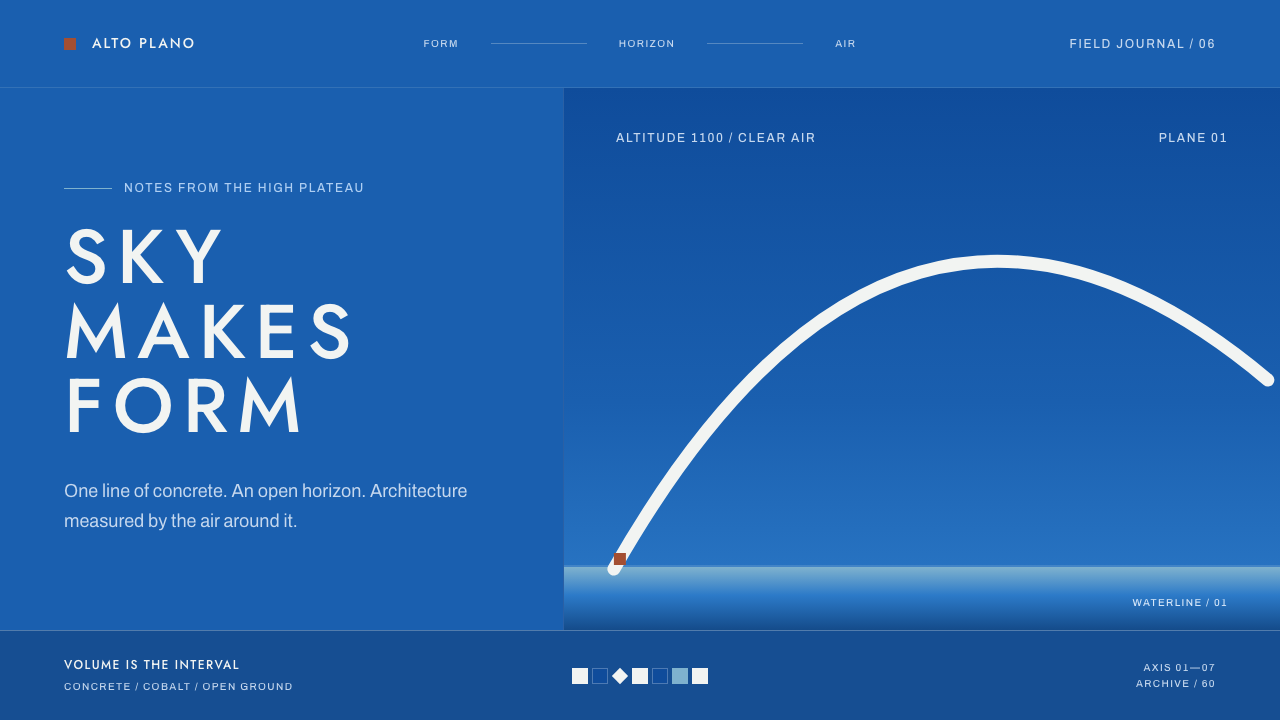 Niemeyer Brasília CurvesEmptiness makes the monument. Concrete-white arcs cut across a saturated coba…
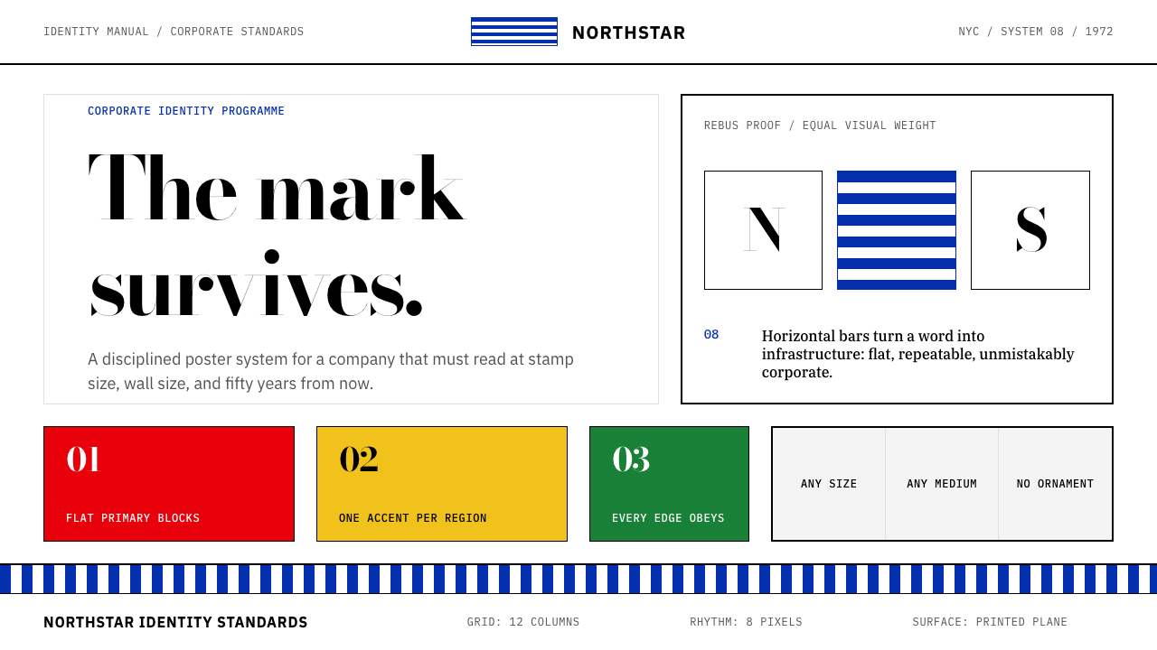 Paul Rand / IBM Corporate IdentityCorporate modernism stays exact. Blue 8-bar stripes, high-contrast serif, har…
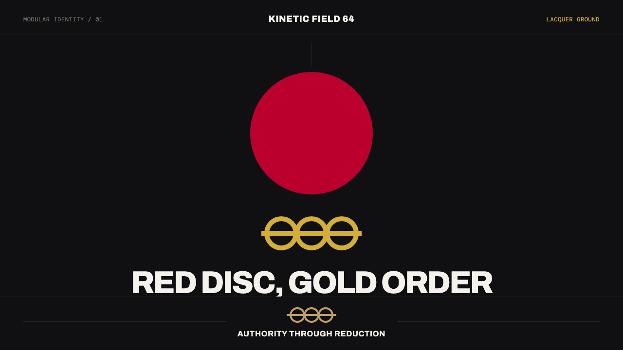 Tokyo 1964 (Kamekura)Ceremony reduced to a mark. Crimson disc and gold rings lock to a black axial…
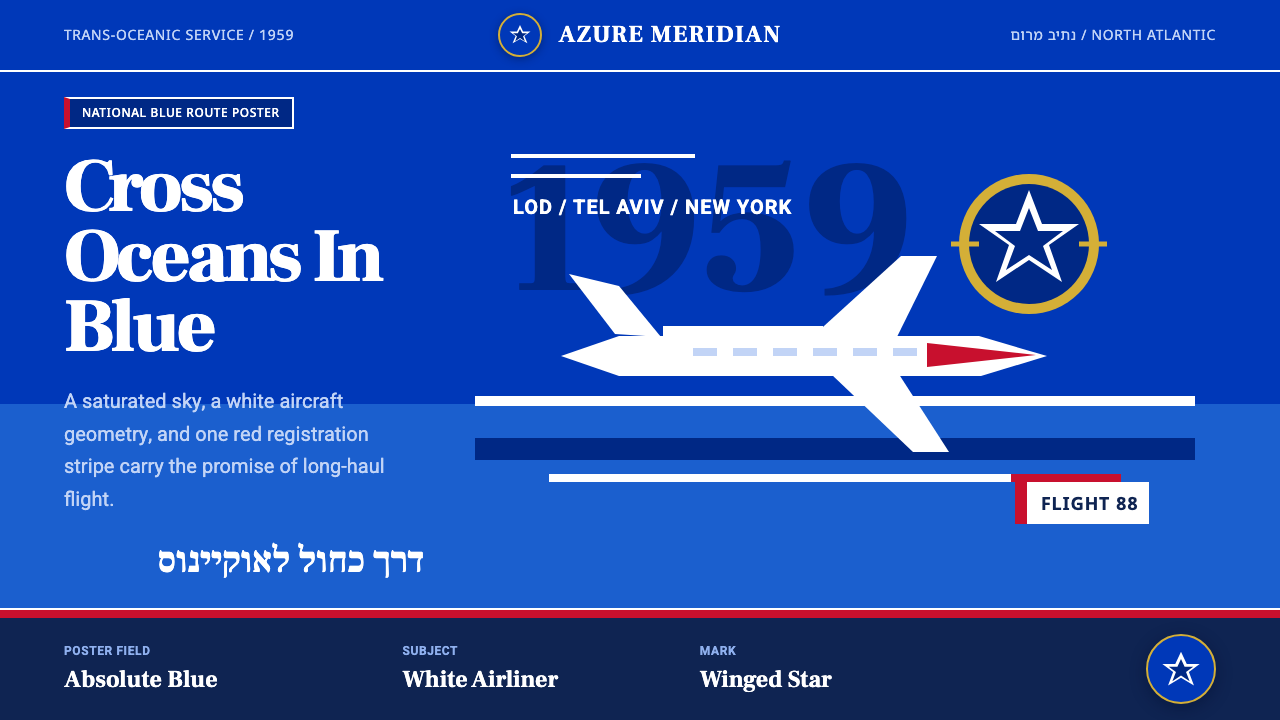 El Al Israel AirlinesNational blue takes command. White aircraft geometry cuts a flat jet-age post…
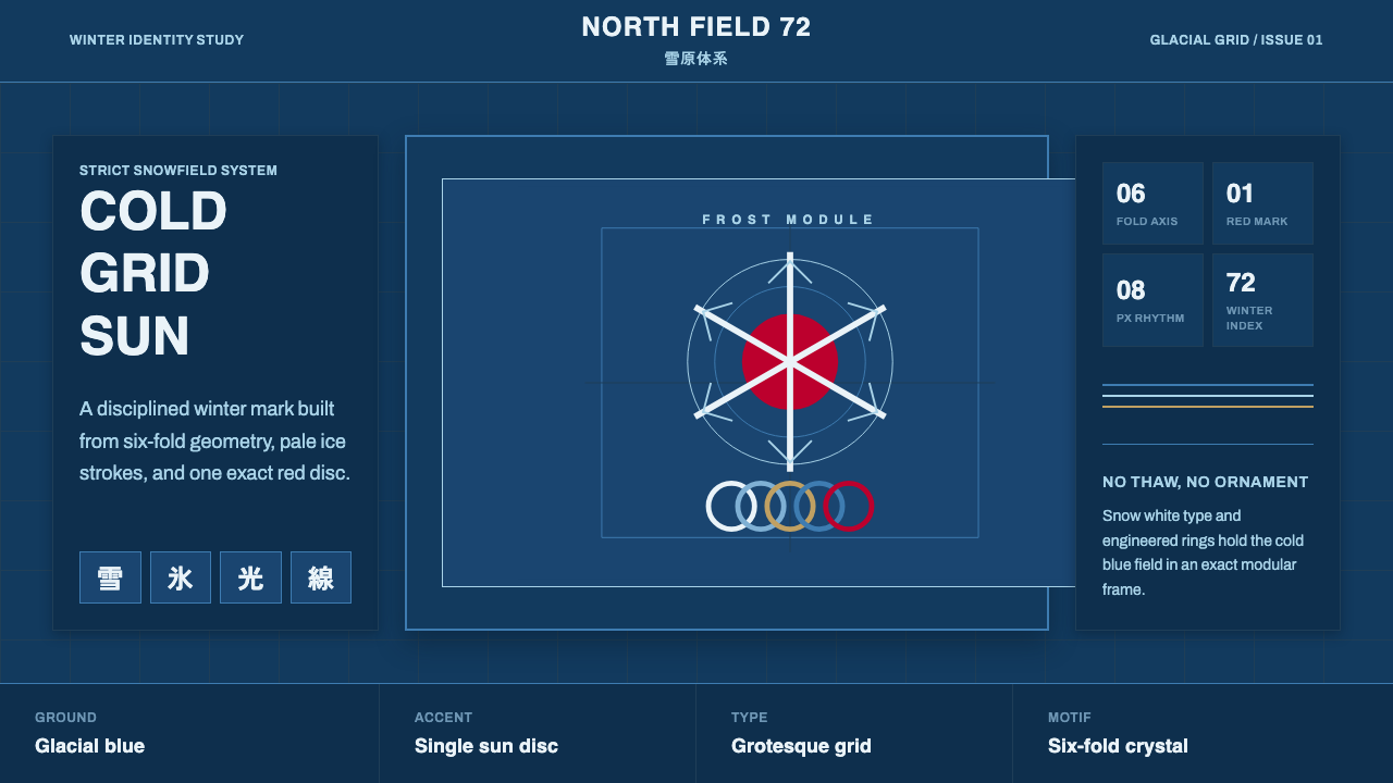 Sapporo Winter 1972Icy order, exact and calm. Glacial blue grid, snow-white type, one red sun di…
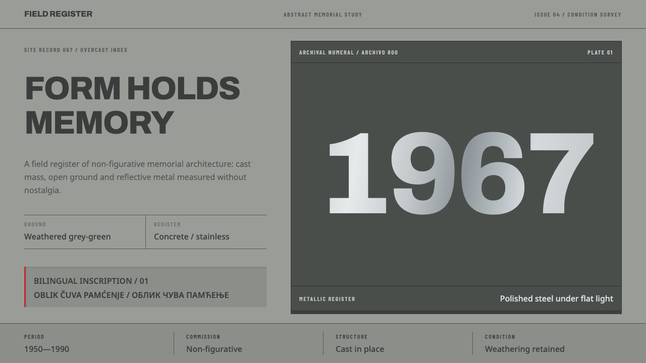 Yugoslav SpomenikMonumentality without figures. Concrete grey-green meets stainless geometry a…