What is Niemeyer Brasília Curves?

Brasília photographs as the same image over and over — a sweep of white concrete against a sky so saturated it reads almost as a solid colour — because Niemeyer's curves are designed to work only in near-total emptiness.
Niemeyer Brasília Curves in brief
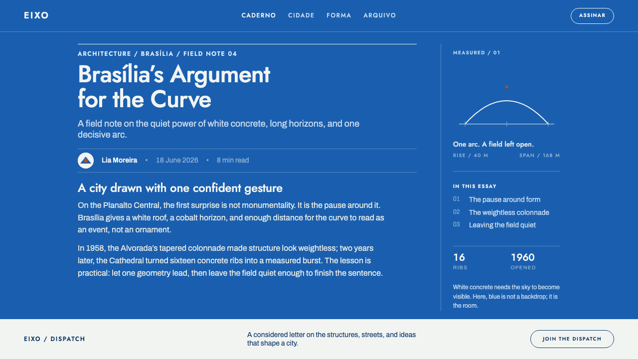
The defining move of this style is treating emptiness as the primary material rather than as leftover background. A vast, saturated field of blue occupies most of the frame, and within it sits one white concrete form — a curve, a colonnade, a ramp — with almost nothing else present to compete for attention. The building does not dominate the composition through scale or ornament; it dominates through being the only thing there. Remove the emptiness around it and the same curve reads as merely one shape among many rather than as a monument. This is a design system built on subtraction: every element not essential to the single relationship between form and sky is left out.
Niemeyer's specific vocabulary of curves recurs across Brasília's landmark structures: the sixteen hyperboloid columns that form the Cathedral's crown-like silhouette, the tapered colonnade of the Alvorada Palace, and the sweeping ramp at the Itamaraty Palace. Each is a single continuous curved gesture rather than a series of decorative details, and each is presented against open sky or open plaza rather than against other architecture, preserving the same one-form-against-emptiness relationship at building scale. None of these curves is load-bearing decoration layered onto a conventional rectilinear structure; the curve is the structure itself, which is part of why it reads as inevitable rather than applied.
Colour enters this system almost as a page inverted from ordinary practice: the sky itself functions as the ground colour, white concrete functions as the surface that carries type and content, and the handful of remaining colours — a cobalt blue drawn from ceramic tilework, a red drawn from the region's laterite soil, and a pale blue drawn from reflecting pools — appear only sparingly, as small accents rather than as backgrounds. A composition built this way stays deliberately close to empty: one arc, one long horizontal line, and a great deal of open air.
Where does Niemeyer Brasília Curves come from?
Brasília was conceived in 1956 as a purpose-built capital sited on the empty savanna, or cerrado, of Brazil's central highland plateau — a deliberate act of building modern nationhood from nothing rather than adapting an existing city. Urban planner Lúcio Costa designed the overall Pilot Plan that laid out the new capital, while Oscar Niemeyer designed the monumental government and religious buildings that would sit within it, and construction moved fast enough that the capital was formally inaugurated in 1960, only four years after the project began.
The site itself set the design condition that the style depends on. Built at roughly 1,100 metres of elevation on open plateau with no pre-existing dense urban fabric and no natural landmarks to compete with, Brasília's architecture had only the sky and the ground to relate to. Niemeyer's curved forms were conceived for exactly that condition: a building silhouetted against open sky reads clearly precisely because there is nothing else in the frame to blur its outline. Where an architect working in a dense historic city must design a facade to hold its own among neighbours, Niemeyer was designing for a frame that contained, by default, nothing but sky.
The curve vocabulary itself took distinct built form across several landmark structures completed through the late 1950s and 1960s: the Cathedral's sixteen hyperboloid columns rising to a narrow crown, the Alvorada Palace's tapered colonnade lining its approach, and the ramp at the Itamaraty Palace, each a single sweeping gesture rather than an assembly of smaller decorative parts.
Decoration and colour were added deliberately and sparingly by collaborating artists over the following decade. Athos Bulcão contributed the cobalt-blue ceramic tile patterns, or azulejo, found across the city's buildings; Marianne Peretti designed the Cathedral's stained glass, with its baptistery finished by 1970; and Albert Hollenstein is associated with the geometric lettering that gave the new capital a unified typographic identity, part of a broader current of Franco-Brazilian geometric type running alongside the architecture itself.
What defines the Niemeyer Brasília Curves look?
Void as Ground
A vast, saturated blue field — standing in for open sky — functions as the primary compositional element and background colour, occupying far more of the frame than any solid form.
Sweeping Curve
Form is expressed as one continuous curved gesture — a hyperboloid column, a tapered colonnade, a ramp — rather than as a series of smaller decorative details assembled together.
White as Surface
White concrete serves as the surface that carries type and content, functioning the way a page's foreground colour normally would, against the sky-blue ground behind it.
Sparse Accent Palette
Cobalt tile-blue, laterite red, and pale reflecting-pool blue appear only as small, precise accents, never as backgrounds or dominant fields.
Extreme Scale Contrast
A single, relatively small solid form sits within an overwhelmingly large open field — the same proportional logic at every scale, from a whole cityscape down to a single page.
Minimal Composition
A finished composition typically reduces to just one arc and one long horizontal line, with everything else left as open space rather than filled with additional elements.
Unified Geometric Type
Lettering follows a geometric, Franco-Brazilian typographic current developed alongside the architecture itself, giving the whole capital — buildings and signage alike — a single consistent identity.

Who shaped Niemeyer Brasília Curves?
Niemeyer designed Brasília's monumental government and religious buildings, developing the vocabulary of sweeping curves — the Cathedral's hyperboloid columns, the Alvorada's colonnade, the Itamaraty ramp — that depends on being set against open sky rather than dense surroundings.
Costa designed the Pilot Plan, the overall urban layout for the new capital, establishing the open, low-density arrangement of plazas and axes within which Niemeyer's individual curved buildings could each sit in relative isolation.
Bulcão contributed the cobalt-blue ceramic azulejo tile patterns found across Brasília's buildings, providing one of the style's few sanctioned colour accents against the dominant white-and-sky palette.
Peretti designed the Cathedral's stained glass, with the baptistery's tilework completed by 1970, adding one of the site's most concentrated uses of colour within an otherwise restrained white-and-blue architectural language.
Hollenstein is associated with the geometric lettering developed for Brasília, part of a broader Franco-Brazilian geometric type current that extended the architecture's unified visual identity into signage and typography.
How do you use Niemeyer Brasília Curves today?
For slide covers, this style works by committing fully to the sky-as-ground logic: a large field of saturated blue occupying nearly the whole slide, with one small white arc or curved shape placed off to one side and a short title set in white. Resist the temptation to add a second visual element — the entire effect depends on the sky staying empty around the single form. A deck built this way should feel almost uncomfortably sparse before it feels sparse enough.
Content slides should carry the same restraint into structure: a mostly white or pale field, one long horizontal rule organising the content, and colour accents — cobalt, laterite red, pale blue — reserved for single data points, tags, or callouts rather than spread across the page. Data visualisations read well as a small number of individual curved or arcing shapes against a large plain field, rather than as dense, multi-coloured charts, since a curve carrying one figure reads more like the style's architecture than a bar chart carrying twenty ever could.
In web interfaces, the logic suits marketing and landing pages built around a hero section: a large, saturated colour field with one clear curved graphic element and minimal text, functioning like the Cathedral silhouetted against open sky. It is a poor fit for dense dashboards, where the amount of information required to display works directly against the emptiness the style depends on; if a product genuinely needs this visual identity, confine it to the landing page and switch to a plainer system once the user is inside the working product.
For editorial and photography-led layouts, the style favours full-bleed images with a strong sky or open-field component and a single architectural or graphic focal point kept deliberately small relative to the frame, with captions and text set in the unified geometric lettering style rather than a decorative typeface.
The most common mistake is cluttering the "sky" field with multiple competing elements or using several accent colours simultaneously. The monumentality this style is built around comes specifically from emptiness and restraint; filling the space or combining cobalt, laterite red, and pale blue all at once collapses the hierarchy that makes any one element read as significant.

Niemeyer Brasília Curves — FAQ
Why does this style leave so much empty space?
Because in Brasília, the monumentality of a curved form depends entirely on there being nothing else in the frame to compete with it. Built at 1,100 metres on empty savanna with no pre-existing dense city around it, the architecture relates only to open sky and ground — remove that emptiness and the same curve reads as ordinary rather than monumental.
Why are so few colours used?
The core palette is really just white concrete against saturated sky blue. Cobalt tilework, laterite red, and pale reflecting-pool blue were added deliberately by collaborating artists as sparing accents, not as competing backgrounds, so the white-against-blue relationship stays dominant.
Does this style require a literal sky-blue background to work?
The logic is really about a small solid form against a vast, saturated, mostly empty field — sky blue is the historical example, but the same proportional relationship between one form and an overwhelming ground is what carries the style, not the specific hue.
Is this style suited to content-heavy products?
No. It works against density by design — the monumental effect requires open space that a data-dense dashboard or content-heavy page cannot afford to give up. It is far better suited to hero sections, covers, and marketing pages than to functional, information-rich interfaces.
Why does Niemeyer favour a single sweeping curve rather than several smaller decorative shapes?
A single continuous gesture — like the Cathedral's sixteen hyperboloid columns rising to one crown-like form — reads clearly at a distance against open sky, while several smaller shapes would fragment the silhouette and compete with each other for attention that the style depends on directing to one form at a time.
Related design styles
 Israeli Bezalel ModernismForm follows the state. Hard Bauhaus discs and ochre bars on absolute blue, H…
 Paul Rand / IBM Corporate IdentityCorporate modernism stays exact. Blue 8-bar stripes, high-contrast serif, har…
 Sapporo Winter 1972Icy order, exact and calm. Glacial blue grid, snow-white type, one red sun di…
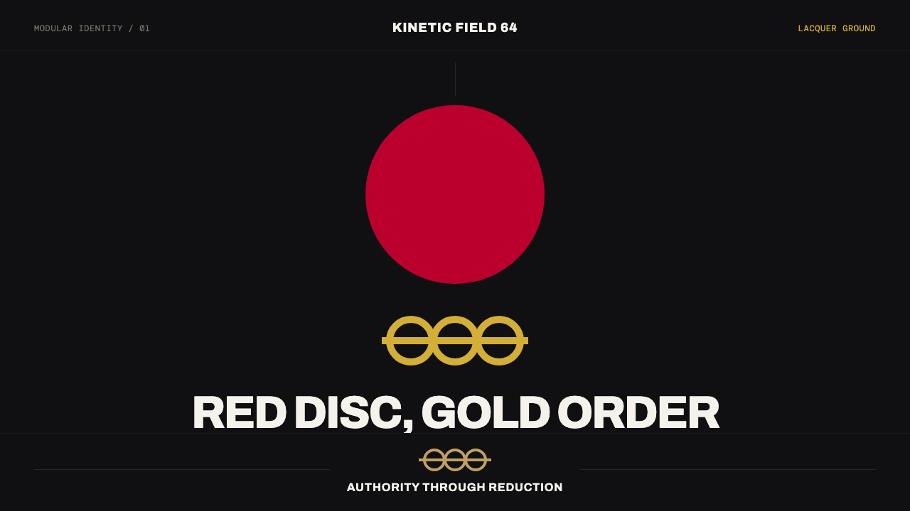 Tokyo 1964 (Kamekura)Ceremony reduced to a mark. Crimson disc and gold rings lock to a black axial…
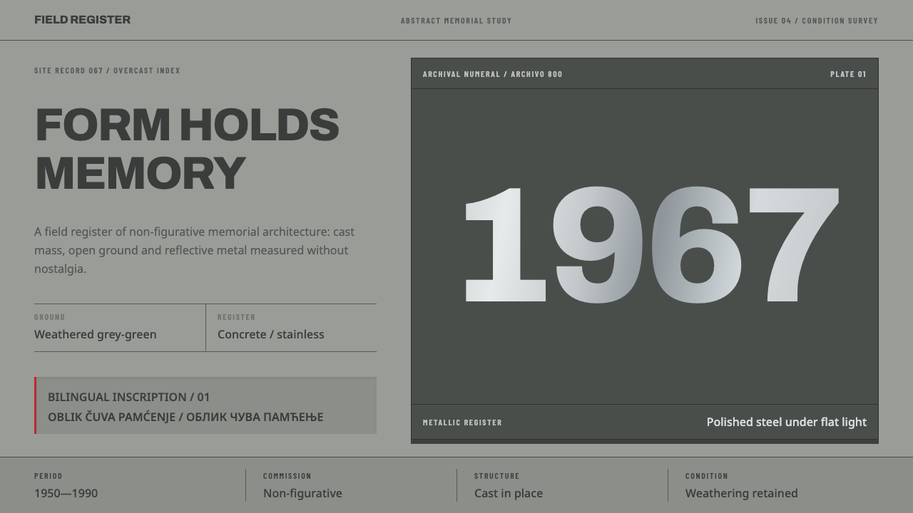 Yugoslav SpomenikMonumentality without figures. Concrete grey-green meets stainless geometry a…
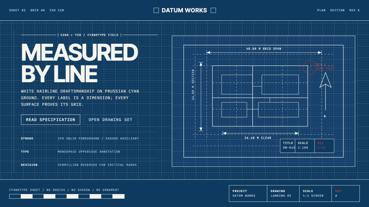 Architectural BlueprintMeasurement, not mood. Prussian cyan grid with white hairlines and vermillion…