What is Tokyo 1964 (Kamekura)?
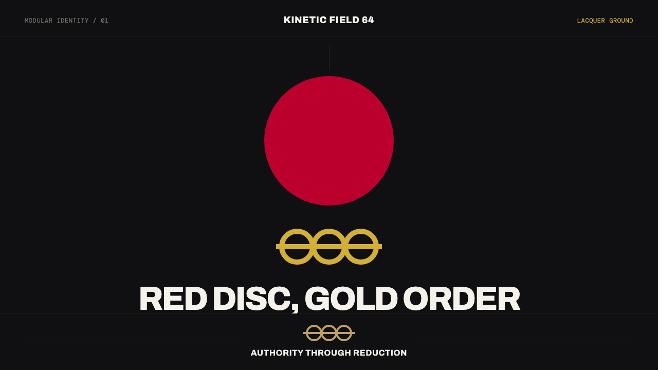
Tokyo 1964 reduces Olympic ceremony to a single mark — a solid crimson sun disc and gold rings locked onto a black axial grid by Yusaku Kamekura.
Tokyo 1964 (Kamekura) in brief
Tokyo 1964 refers to Yusaku Kamekura's identity for the 1964 Tokyo Olympic Games, widely regarded as the first fully systematized Olympic visual program — meaning the first Games identity designed as a coherent, rule-governed system rather than a loose collection of posters and badges. Its core mark is deceptively simple: a solid Hinomaru red sun disc positioned above a set of gold Olympic rings and a clean grotesque wordmark reading 'TOKYO 1964.'
What makes the identity notable as a design system is Kamekura's willingness to place that mark on a deep black lacquer field as readily as on plain white, treating both as equally valid grounds rather than defaulting to white as the neutral choice. This flexibility came from a deliberate fusion of two distinct design lineages: the mathematical, grid-based order of Swiss typography, and the radical, reductive minimalism already present in the Japanese national flag itself.
The result reads as restraint elevated to ceremony. Nothing about the mark shouts for attention through decoration; instead, a single perfect circle, a modest ring system, and a strict modular grid on a near-black ground carry all of the gravity the occasion demanded — proof that an Olympic identity could achieve monumental seriousness through precision and omission rather than visual abundance.

Where does Tokyo 1964 (Kamekura) come from?
The identity was designed for the 1964 Tokyo Summer Games, an event carrying enormous national significance as Japan's first Olympics hosted since the country's post-war recovery, and its first opportunity to present itself to the world as a modernized, forward-looking nation less than two decades after the end of the Second World War. The visual identity had to carry that weight without appearing either apologetic or triumphalist — a genuinely difficult brief that shaped the restraint at the core of Kamekura's solution.
Yusaku Kamekura worked within the broader context of Japanese postwar graphic design, a field that was itself absorbing and reinterpreting Western modernist design principles — particularly the Swiss International Typographic Style's grid-based order — while asserting a distinctly Japanese visual sensibility rather than simply imitating European models. The Olympic identity became a proving ground for this synthesis, applied at the highest possible visibility.
Kamekura worked alongside Masaru Katzumie, who served as a central figure in the broader design direction of the Games and helped coordinate the visual program's application across posters, signage, and printed materials, and Yoshiro Yamashita, who contributed to the identity's development within the same design team. Their collective effort extended Kamekura's core mark into a full, systematized program covering multiple applications rather than a single isolated poster design.
This identity sits within the broader lineage of Japanese postwar graphic design and the international spread of Swiss International Typographic Style principles, but its specific contribution — the systematized Olympic identity as a genre — is often credited as a turning point: subsequent Olympic Games identities, starting with Mexico City in 1968 and continuing through later Games, adopted the practice of a unified, rule-governed visual system rather than a loosely coordinated set of graphics.
What defines the Tokyo 1964 (Kamekura) look?
Color
The palette is minimal by design: a solid Hinomaru crimson red for the sun disc, gold for the Olympic ring system, and a near-black ground the mark can sit on as readily as white. No secondary colors appear; the restraint of the palette is itself a statement of confidence.
The Solid Sun Disc
A single perfect, unbroken circle in red stands as the identity's core form, drawn directly from the Hinomaru flag disc. Its perfection and solidity — no gradient, no texture, no outline variation — is what gives the mark its sense of absolute authority.
Gold Ring System
The Olympic rings appear in gold rather than their traditional multicolor scheme, subordinating them visually to the red disc above while still preserving their symbolic function as the Games' universal emblem.
Axial Grid
Every element — disc, rings, wordmark — is locked to a strict central axis and a modular grid governing scale and spacing. This grid discipline is what allows such a minimal set of elements to feel deliberately composed rather than merely sparse.
Ground Flexibility
The mark is designed to sit with equal authority on both a near-black lacquer field and plain white — a deliberate departure from the assumption that a light neutral is the only 'safe' ground for a formal identity.
Grotesque Wordmark
The 'TOKYO 1964' lettering uses a clean grotesque typeface with no serif ornament, matching the mark's overall commitment to reduction. The wordmark supports the disc-and-rings symbol rather than competing with it for visual weight.
Ceremonial Restraint
Every design decision favors omission over addition. There is no supplementary illustration, no decorative border, no secondary graphic device — the sense of occasion comes entirely from precision and the confidence to leave space empty.

Who shaped Tokyo 1964 (Kamekura)?
Kamekura designed the core Tokyo 1964 mark — the sun disc, gold rings, and wordmark — and is credited with fusing Swiss typographic order with the reductive minimalism of the Japanese flag into what is widely regarded as the first fully systematized Olympic visual identity. His broader body of work in Japanese postwar graphic design established him as one of the field's central figures.
Katzumie served as a central figure in the overall design direction of the 1964 Games, helping coordinate how the visual identity was applied across posters, signage, and printed materials, extending Kamekura's core mark into a coherent, multi-application system.
Yamashita contributed to the identity's development within the same design team, part of the collective effort that turned a single symbolic mark into a full Olympic design program.
How do you use Tokyo 1964 (Kamekura) today?
This style rewards content that wants to feel monumental and formal through restraint rather than abundance. On a presentation cover slide, a near-black field with a single centered circular mark and a modest gold accent communicates gravity immediately — resist the temptation to add supporting graphics or a busy background, since the entire power of the style comes from a lone, perfect form holding the composition. Content slides should keep the axial grid discipline: a single centered organizing line, with any supporting elements arranged symmetrically around it.
For web interfaces, the style suits institutional, ceremonial, or achievement-oriented products — award or certification platforms, formal event branding, heritage-focused institutions — more than everyday consumer software, where its severity could feel unapproachable. A hero section can use the near-black ground with a single circular focal element, echoing the sun-disc logic, while navigation and supporting UI stay strictly grid-aligned and free of decorative color.
In editorial and marketing contexts, the style suits retrospective features on design history, national identity, or major cultural events, where formality and restraint are appropriate to the subject. A pull-quote can be set as a single circular badge or centered mark against the black ground, echoing the sun-disc-and-ring logic without needing literal Olympic imagery.
The style struggles in contexts that need to feel casual, playful, or approachable — its entire visual argument depends on formal restraint, and loosening the grid or adding secondary colors dilutes the ceremonial weight that makes it work. Content-dense pages, such as long-form articles or data dashboards, should borrow only the axial grid discipline and restrained palette rather than the low-density, single-mark composition, which does not scale to large amounts of information.
A common mistake is treating this as simply 'a red circle and gold rings on black.' The style's power comes specifically from the axial grid discipline and the total absence of secondary ornament — scattering additional graphic elements around the mark, even in a similar palette, breaks the sense of singular, monumental focus the identity depends on.

Tokyo 1964 (Kamekura) — FAQ
Why is this considered the first 'fully systematized' Olympic identity rather than just a good poster design?
Earlier Olympic Games typically commissioned individual posters and emblems without a unified rule set governing how they related to each other across different applications. Kamekura's Tokyo 1964 identity established a coherent system — consistent grid, consistent color logic, consistent relationship between disc, rings, and wordmark — that could be applied consistently across posters, signage, and printed materials, which is what later Games identities, starting with Mexico City in 1968, adopted as standard practice.
Why does the identity work equally well on black and white grounds?
Because the mark's power comes from the contrast relationship between the solid red disc, the gold rings, and its background, rather than from any inherent connection to a specific ground color. As long as the ground provides enough contrast for the disc and rings to read cleanly, the mark retains its authority — a flexibility that was unusual for its time, when formal identities typically defaulted to a single canonical background.
How does this style relate to Swiss International Typographic Style, and how does it differ?
The identity directly borrows the grid-based, systematic order central to Swiss International Typographic Style, but fuses it with a specifically Japanese visual reference — the reductive minimalism of the Hinomaru flag disc — rather than simply importing Swiss conventions wholesale. The result is a hybrid: the structural discipline of Swiss design applied to symbolic content with a distinct national visual identity of its own.
Can this style be applied to a brand identity unrelated to sports or national events?
Yes — the transferable principle is not the literal sun-disc-and-rings symbol but the underlying strategy of achieving gravity through a single, perfect form on a strict grid rather than through decorative abundance. Any brand aiming for a sense of monumental seriousness — a heritage institution, a formal award, a flagship product launch — can apply the same restraint, provided it develops its own core symbolic mark rather than reusing Olympic-specific imagery.
Related design styles
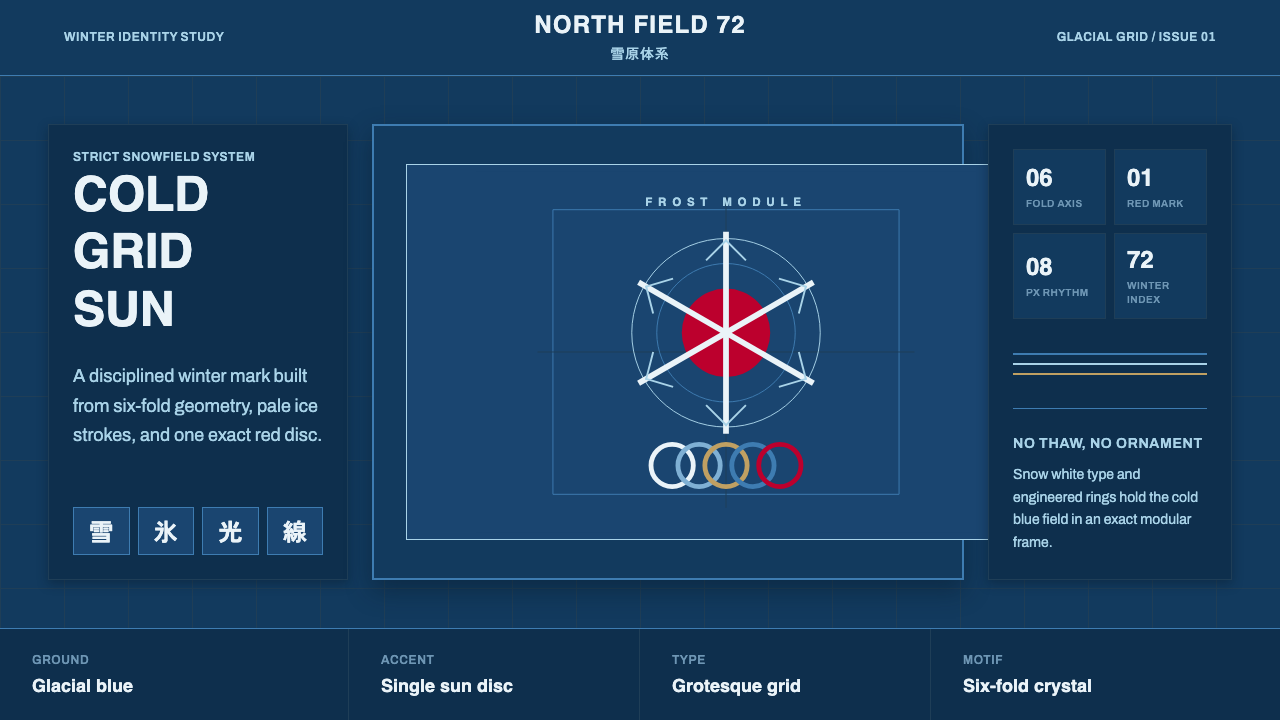 Sapporo Winter 1972Icy order, exact and calm. Glacial blue grid, snow-white type, one red sun di…
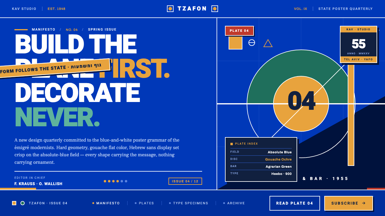 Israeli Bezalel ModernismForm follows the state. Hard Bauhaus discs and ochre bars on absolute blue, H…
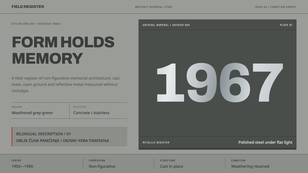 Yugoslav SpomenikMonumentality without figures. Concrete grey-green meets stainless geometry a…
 Hospital Wayfinding 1970Colour removes hesitation. Enamel green rails and open grotesque plates lead…
 Niemeyer Brasília CurvesEmptiness makes the monument. Concrete-white arcs cut across a saturated coba…
 Paul Rand / IBM Corporate IdentityCorporate modernism stays exact. Blue 8-bar stripes, high-contrast serif, har…