What is Yugoslav Spomenik?
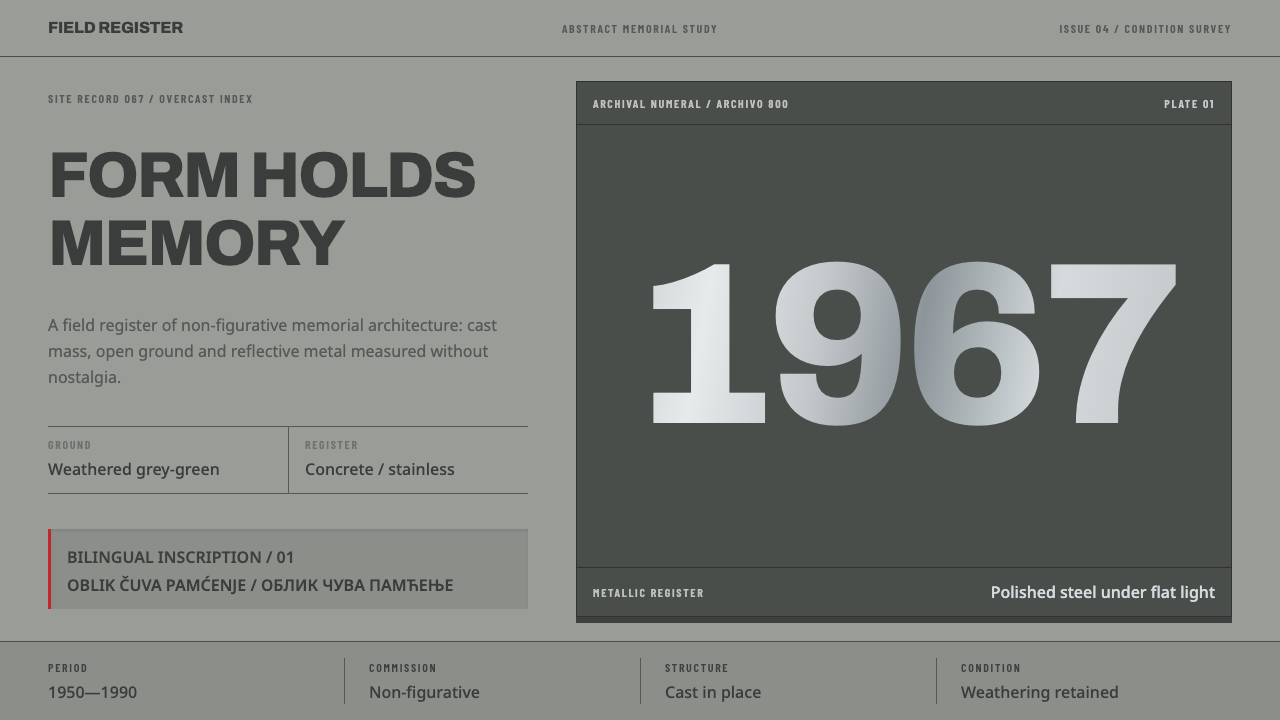
Yugoslav Spomenik refuses the human figure entirely, building monumentality out of weathered concrete and rationed stainless steel cut against a hard horizon line instead.
Yugoslav Spomenik in brief
Yugoslav Spomenik names the visual system carried by the abstract World War II memorials built across socialist Yugoslavia between the 1950s and 1980s — hundreds of them, cast in place on the ground where Partisan uprisings actually happened. The commissioning brief behind these monuments was explicit and unusual for war memorials of the era: no soldiers, no realistic figures, no narrative scene. Only geometry, built at a scale large enough to be monumental on its own terms.
The resulting forms read as crystals, starbursts, cantilevered wings, and hollowed cubes — abstract shapes with no representational content, yet unmistakably built to commemorate rather than to decorate. This system takes its material and color logic directly from that condition: weathered concrete in a grey-green tone serves as the base page, a darker shadowed value stands in for the marks a poured-concrete surface actually carries, and a separate metallic register is reserved for the rare structural elements — such as Vojin Bakić's Swedish stainless steel panels at Petrova Gora, or the aluminium eye-form at Podgarić — designed specifically to catch and reflect light against the otherwise matte concrete.
Rust bleed and lichen growth are treated as part of the palette rather than as damage to be cleaned up. These monuments have stood exposed to weather for decades, many of them now derelict, and their present, weathered condition is itself the documented visual fact the system records — not an idealized, freshly cast version of a structure that no longer exists in that state. Typography follows the same documentary instinct: inscriptions are set in a clean, modern sans-serif rendered bilingually in Cyrillic and Latin script, matching the actual lettering carved into the monuments' concrete faces rather than any historicizing or decorative alphabet.
Where does Yugoslav Spomenik come from?
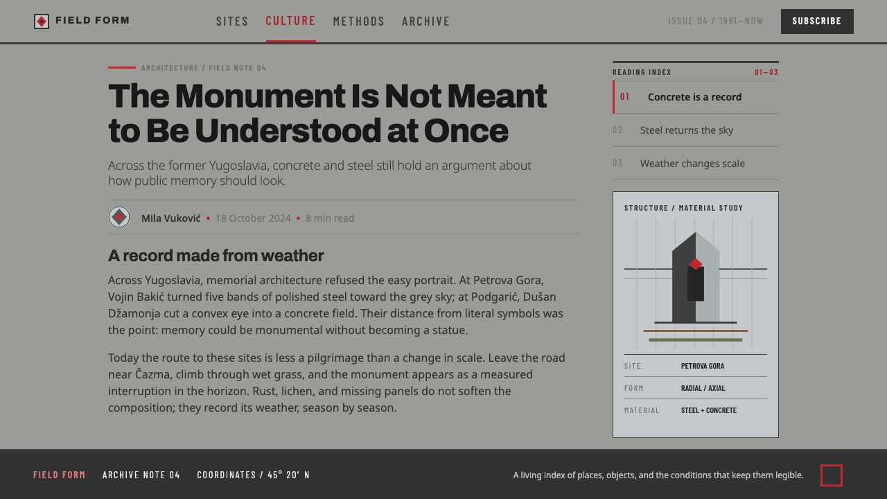
These monuments were built across socialist Yugoslavia from the 1950s through 1990, with the construction of the Podgarić monument in 1967 and the design competition for Petrova Gora in 1974 marking two documented points within that span. Since the 1990s, following the breakup of Yugoslavia, most of these structures have stood derelict — no longer actively maintained by any single successor state, which is part of why their weathered, rust-streaked, lichen-covered present condition has become inseparable from how the style is now recognized.
The monuments are spread across the former Yugoslavia's successor states — Croatia, Bosnia and Herzegovina, Serbia, and North Macedonia — a geography that reflects where the wartime Partisan uprisings the monuments commemorate actually took place. This system is named directly among three movements: Yugoslav modernism, béton brut, and abstract memorial sculpture, placing it at the intersection of a national modernist architecture program and the international raw-concrete building tradition known as béton brut.
Vojin Bakić designed the monument at Petrova Gora, working with engineer Berislav Šerbetić; its distinguishing feature is a cladding of Swedish stainless steel panels, a deliberate departure from bare concrete that gave the structure a reflective, light-catching surface unlike almost anything else in the wider movement. Dušan Džamonja designed the Podgarić monument, completed in 1967, whose aluminium eye-form set into the concrete mass functions as the single sharpest metallic accent in that structure — a small, rationed element against an otherwise weathered grey-green field.
Other named designers across the movement — Miodrag Živković, Bogdan Bogdanović, and Jordan Grabul and Iskra Grabul — extended the same non-figurative, monumentally scaled vocabulary into the additional successor states this system spans, including North Macedonia. Across all these separate commissions, spread over three decades and several republics, the shared discipline was consistent: abstract geometric form, cast concrete as the primary material, and metal reserved as a rare, deliberate accent rather than a structural default. That consistency across so many independent commissions, republics, and decades is itself notable — no single office or state design bureau dictated the visual language; instead, a shared brief, to commemorate an uprising without a figure using only concrete and geometry at monumental scale, produced a recognizable family of results across dozens of separate sites, which is why the style reads as one coherent system rather than a loose collection of unrelated modernist sculptures.
What defines the Yugoslav Spomenik look?
Weathered Grey-Green Ground
The base field is a weathered concrete tone, grey shifted toward green, treated as the current documented condition of decades-old exposed concrete rather than a fresh, uniform grey.
Shadowed Pour Texture
Structural elements carry a darker, shadowed value standing in for the marks and seams a cast-in-place concrete surface actually shows, giving flat shapes a sense of poured, physical mass.
Rationed Metallic Register
A separate metal tone — reflective stainless or aluminium — is reserved for a small number of deliberate accents, echoing the way real installations like Petrova Gora and Podgarić used metal cladding sparingly against bare concrete.
Weathering as Palette
Rust bleed and lichen tones are treated as legitimate, intentional palette colors rather than flaws to be corrected, reflecting the monuments' real, decades-long derelict condition.
Non-Figurative Geometry
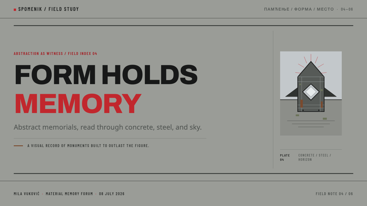
Forms draw from crystal, starburst, cantilevered-wing, and hollowed-cube shapes rather than any human figure or narrative scene, following the explicit non-figurative brief the original monuments were built under.
Bilingual Cyrillic and Latin Type
Inscriptions are set bilingually in Cyrillic and Latin script, in a clean modern sans-serif that matches the tone actually carved into the monuments' concrete faces, never in an ornamental or historicizing typeface.
Hard Horizon
Compositions are cut by a single hard, level horizon line, separating monumental form above from ground below, echoing how these structures are typically sited alone on open, elevated terrain with nothing else competing against the skyline.

Who shaped Yugoslav Spomenik?
Vojin Bakić designed the monument at Petrova Gora, working from a competition held in 1974. Its distinguishing feature — cladding in Swedish stainless steel rather than bare concrete — gave the structure a reflective, light-catching quality that this system treats as the model for how a rationed metallic register should behave against an otherwise matte, weathered field.
Dušan Džamonja designed the Podgarić monument, completed in 1967. Its aluminium eye-form, set into the concrete mass, functions as a single sharp metallic accent against the structure's weathered grey-green surface, establishing the precise ratio of rare metal to dominant concrete that this system follows.
Miodrag Živković worked within the same abstract memorial sculpture movement, extending the non-figurative, monumentally scaled vocabulary that defines this system across the former Yugoslavia's successor states in the decades this movement spans.
Bogdan Bogdanović contributed to the same wave of abstract, non-figurative war memorials that this system draws from, working across the movement's decades-long span and helping establish abstract geometric form as the region's standard visual response to commemorating the Second World War.
Jordan Grabul and Iskra Grabul are named among the designers who carried this movement's non-figurative, geometric memorial vocabulary into North Macedonia, one of the four successor states across which these monuments are now spread.
How do you use Yugoslav Spomenik today?
Yugoslav Spomenik transfers well anywhere a design needs to feel monumental, weathered, and historically grounded without relying on realistic imagery — but the discipline depends on keeping concrete grey-green dominant and metal strictly rationed rather than letting a shiny, uniform surface take over.
For presentation slides, a cover page should hold to a weathered grey-green field with a single large abstract geometric form — a crystal, wing, or hollowed shape — cut by a hard horizontal line, with a small metallic accent reserved for one focal point only. Content slides should use the shadowed-pour texture as a structural device for section headers, keeping the bulk of each slide in flat, matte concrete tones.
For web interfaces, the palette suits products that want to feel serious, historical, or institutionally weighty — archives, cultural or memorial platforms, or documentary content. A grey-green base with rationed metallic accent color for interactive states, and a hard horizontal rule separating navigation from content, echoes the monuments' own separation of form from ground. Card components should favor blunt, geometric silhouettes over rounded corners, and any hover or active state should introduce the metallic tone rather than a brighter version of the base grey-green.
For editorial and marketing layouts, the style supports a strong masthead built from bilingual-style typographic treatment (even when only one language is used) set in a clean geometric sans, a weathered grey-green field, and a single reflective accent color reserved for a logo mark or pull quote, never spread across the full layout.
A common mistake is cleaning the concrete tone into a uniform, modern light grey and losing the rust bleed and lichen variation entirely, or inversely, spreading the metallic accent color across large areas as if it were a primary brand color. Both errors erase the exact tension the system depends on: a dominant, weathered, documented material field, interrupted only rarely by something built to catch light.
Yugoslav Spomenik — FAQ
Is this the same as generic brutalist design?
It overlaps but is more specific. Generic brutalist design borrows raw concrete texture broadly, often on buildings with clear functional programs. Yugoslav Spomenik is drawn specifically from non-figurative war memorials with no representational content, adds a rationed metallic register absent from most brutalist work, and treats rust and lichen as an intentional, documented part of the palette rather than an incidental side effect of aging concrete.
Why is the palette allowed to include rust and lichen tones?
Because the monuments this system is drawn from have stood exposed and largely unmaintained since the 1990s, and their weathered present condition is the historically accurate state to represent — not an imagined, freshly built version. Treating rust bleed and lichen as legitimate palette colors keeps the system honest to its actual documented subject.
How should the metallic accent be rationed?
Reserve it for a single focal element per composition, the way Petrova Gora's stainless steel cladding or Podgarić's aluminium eye-form stand out as one deliberate metallic gesture against an otherwise concrete structure. If metal starts appearing across multiple elements at equal weight, it stops reading as a rare structural choice and starts reading as a generic shiny accent color.
Does this style require literal crystal, wing, or starburst shapes?
No. What matters is the underlying discipline — large-scale abstract geometric form with no figurative or narrative content, cast in a material treated as weathered concrete, cut by a hard horizon. Any abstract geometric shape that follows this logic can substitute for the specific forms the original monuments took, as long as it stays resolutely non-representational and avoids any hint of a recognizable figure, animal, or narrative scene.
What kind of products or contexts does this style not suit?
It struggles in contexts that need to feel light, warm, or consumer-friendly — hospitality, children's products, or casual social apps. The style's authority depends on weathered, monumental severity and a strictly rationed accent; forcing warmth or excessive polish into it removes the documented, historically grounded quality that distinguishes it from generic modernist geometry, and can come across as tonally mismatched given the real, somber commemorative purpose the source material serves.
Related design styles
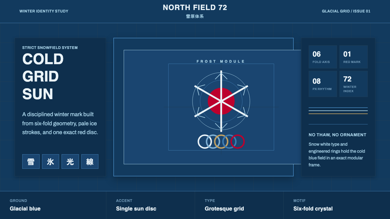 Sapporo Winter 1972Icy order, exact and calm. Glacial blue grid, snow-white type, one red sun di…
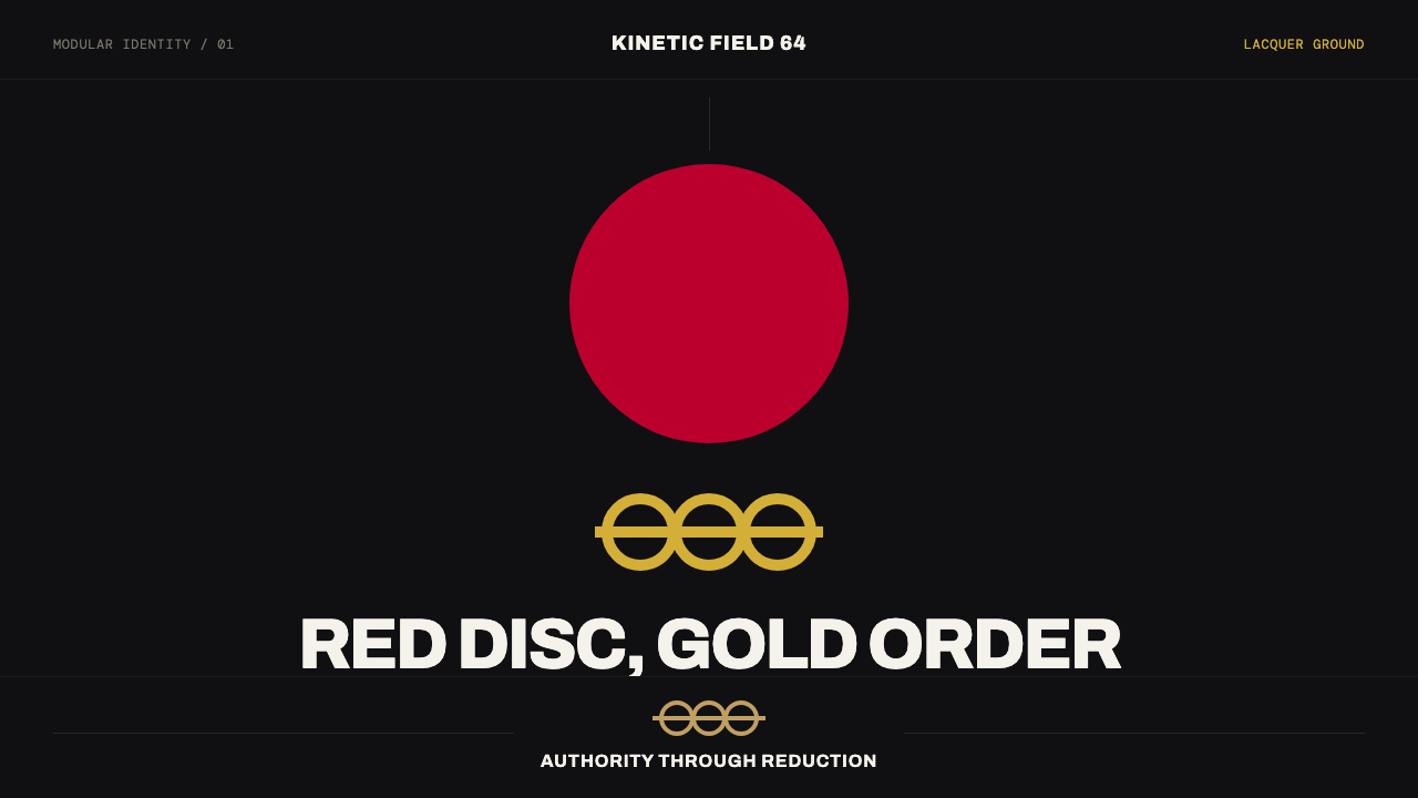 Tokyo 1964 (Kamekura)Ceremony reduced to a mark. Crimson disc and gold rings lock to a black axial…
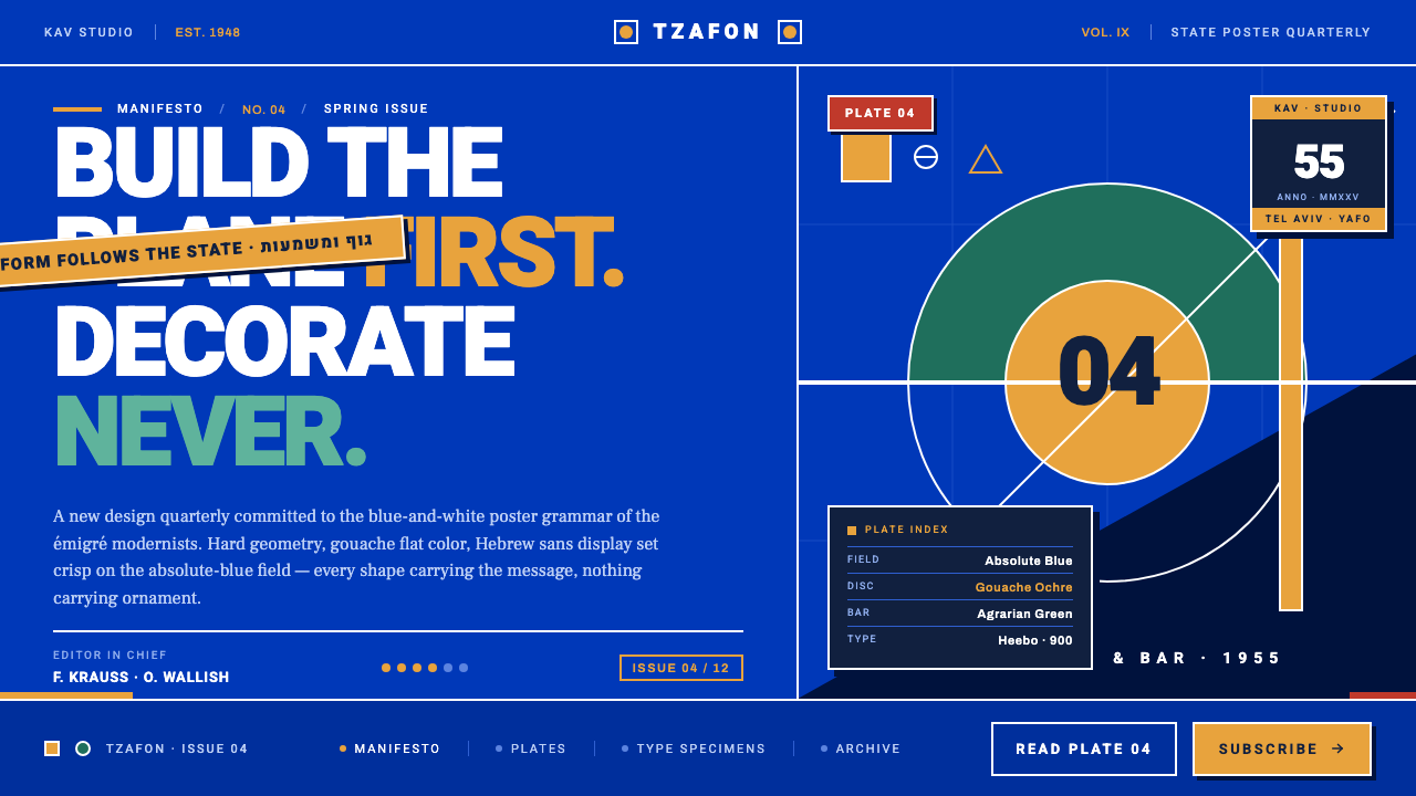 Israeli Bezalel ModernismForm follows the state. Hard Bauhaus discs and ochre bars on absolute blue, H…
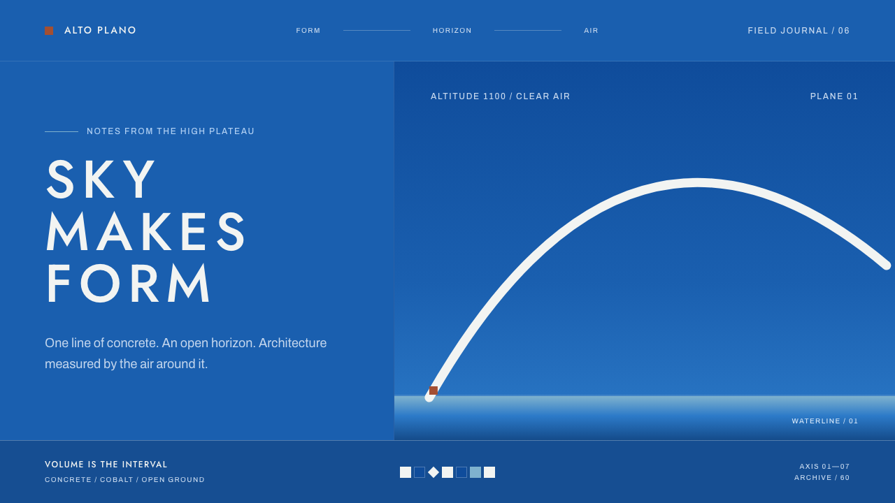 Niemeyer Brasília CurvesEmptiness makes the monument. Concrete-white arcs cut across a saturated coba…
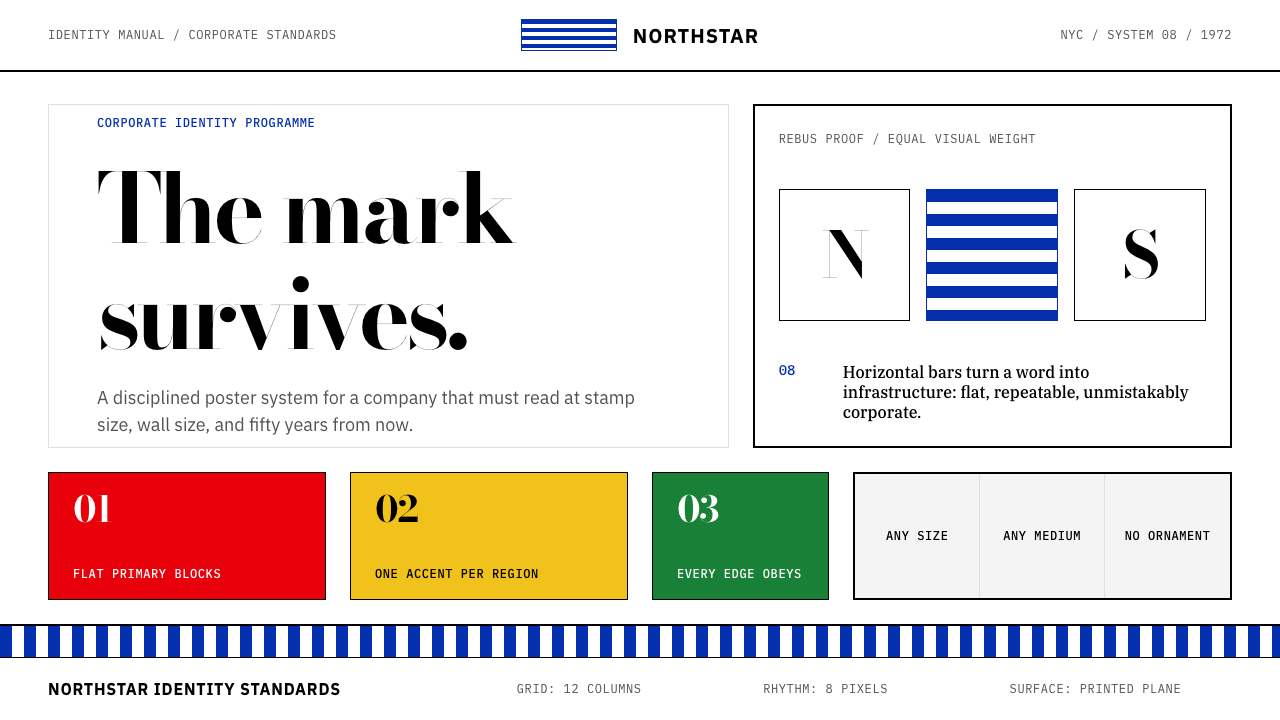 Paul Rand / IBM Corporate IdentityCorporate modernism stays exact. Blue 8-bar stripes, high-contrast serif, har…
 Akzidenz-Grotesk BertholdObjectivity in black ink. White grotesque type, hard grid, one rationed red b…