What is Sapporo Winter 1972?
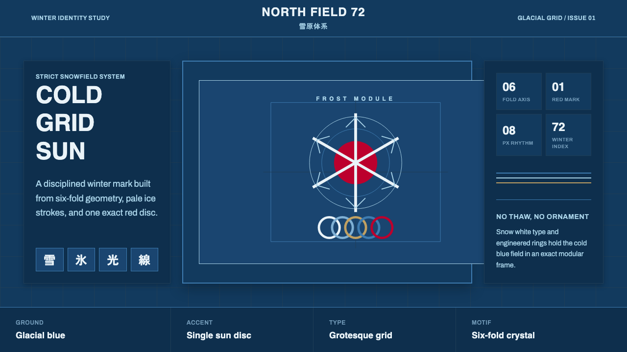
Japan's first Winter Olympics turned snow into a system — a six-fold snowflake, concentric ice rings, and one red sun disc set against a glacial-blue field.
Sapporo Winter 1972 in brief
This system is built from the visual identity created for the 1972 Sapporo Winter Olympics, Japan's first time hosting a Winter Games. That identity extended the systematic modernist design program Yusaku Kamekura had established for the Tokyo 1964 Summer Games — a stacked-circle emblem, the red Hinomaru sun disc, and the Olympic rings, all locked to a strict grid — but recast in a palette suited to snow and ice rather than summer sport.
Where Tokyo 1964 read as bold and warm, Sapporo 1972 reads as cold and exact. The dominant ground is a deep glacial blue, moving through paler ice tones toward snow white, with red held back and used only for the single signature sun mark — never spread across the composition. Geometry follows the six-fold symmetry of a snowflake and the concentric rings of crystalline ice, rendered with the same disciplined, grid-based precision Kamekura brought to Tokyo's identity four years earlier.
The overall effect is orderly rather than decorative: clean grotesque sans-serif type, generous whitespace, and forms built from mathematical symmetry rather than illustrative flourish. Nothing about it tries to look cozy or festive in the way winter imagery often does — it is Swiss-influenced structure, expressed entirely in the color and geometry of snow and ice.
Where does Sapporo Winter 1972 come from?
The 1972 Sapporo Winter Olympics were the first Winter Games ever held in Asia and the first Olympic Games of any kind hosted by Japan since the 1964 Tokyo Summer Games. That earlier event had been a watershed moment for Japanese design: Yusaku Kamekura's identity for Tokyo 1964, with its stark red Hinomaru disc set above the gold Olympic rings on a plain white ground, became one of the most studied pieces of Olympic graphic design in history, and it established Japan as a serious force in systematic, modernist visual identity work at the international stage.
When Sapporo won the right to host the 1972 Winter Games, Japan's Olympic design committee had both a template and a reputation to live up to. Rather than inventing an entirely new visual language, the committee extended Kamekura's systematic approach — grid-based construction, a restrained and symbolic use of red, and confident use of negative space — into a winter context, adapting it with imagery suited to snow and ice: a stylized snowflake and concentric ring motifs standing in for the more athletic, warm-toned motifs of the Tokyo identity.
This continuity mattered because it demonstrated that the modernist design language Kamekura had pioneered was not a one-off solution for a single event, but a genuinely systematic approach that could be adapted and reapplied. Sapporo 1972 proved the design system could flex to fit a completely different season, sport, and emotional register — cold, precise, and quiet rather than the more dynamic tokyo identity — while still reading unmistakably as part of the same design lineage.
The Sapporo Games themselves were also historically significant as Japan's entry into hosting large-scale international winter sport, and the accompanying design program helped set expectations for how future Olympic identities — winter and summer alike — would use systematic grids, symbolic single-accent color, and disciplined typography as a template for national visual identity on the world stage.
What defines the Sapporo Winter 1972 look?
Color
A deep glacial blue dominates as the primary ground, moving through paler ice-blue tones toward snow white for secondary surfaces. Red appears exactly once, in the signature sun-disc mark, and is never used decoratively or repeated across the composition — its rarity is what gives it weight.
Typography
Type is a clean, grotesque-style sans-serif set with disciplined, even spacing — legible and neutral rather than expressive. It functions as structural information, sitting quietly within the grid rather than competing with the geometric marks for attention.
Six-Fold Snowflake Geometry
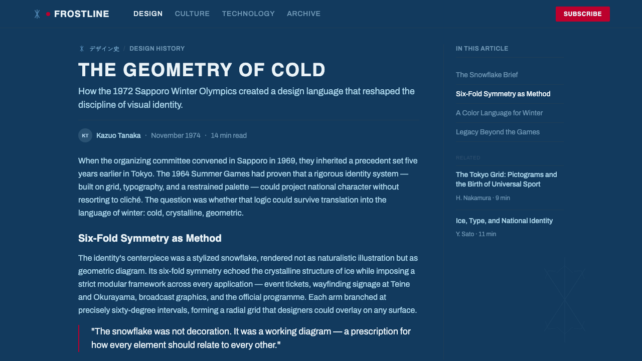
Marks and motifs draw on the natural six-fold symmetry of a snowflake, rendered as clean geometric construction rather than illustrative decoration. This symmetry gives every mark a mathematically balanced, crystalline quality.
Concentric Rings
Layered concentric circles, echoing both crystalline ice formation and the stacked-circle logic of Kamekura's earlier Tokyo emblem, recur as a structural motif — used for badges, dividers, and focal marks rather than purely as illustration.
Strict Grid
Every mark and every block of type locks to a rigorous underlying grid, in keeping with the systematic, Swiss-influenced approach Kamekura established for Japanese Olympic identity design. Nothing sits at a casual or arbitrary angle.
Generous Whitespace
Large areas of open ice-blue or white ground surround each mark, giving every element room to read clearly at a glance. This restraint keeps the system feeling crisp and cold rather than dense or ornamented.

Who shaped Sapporo Winter 1972?
Kamekura designed the landmark Tokyo 1964 Olympic identity — the red Hinomaru disc paired with the Olympic rings on a stark white ground — establishing a systematic, grid-based approach to Japanese Olympic graphic design. That template directly shaped the Sapporo 1972 identity, which adapted his structural discipline and restrained use of red into a cold, snow-and-ice palette.
The committee responsible for Sapporo 1972's visual identity extended Kamekura's Tokyo 1964 framework into a winter context, translating its grid discipline and symbolic color restraint into snowflake and ice-ring motifs — proof that Japan's systematic Olympic design approach could adapt across sport, season, and emotional register while remaining recognizably part of the same design lineage.
How do you use Sapporo Winter 1972 today?
This system reads as precise, cold, and disciplined, so it suits products and stories that want to project competence, order, and clarity rather than warmth or informality. It rewards restraint — one accent color used exactly once, a strict grid, and generous open space — over layering additional colors or decoration on top.
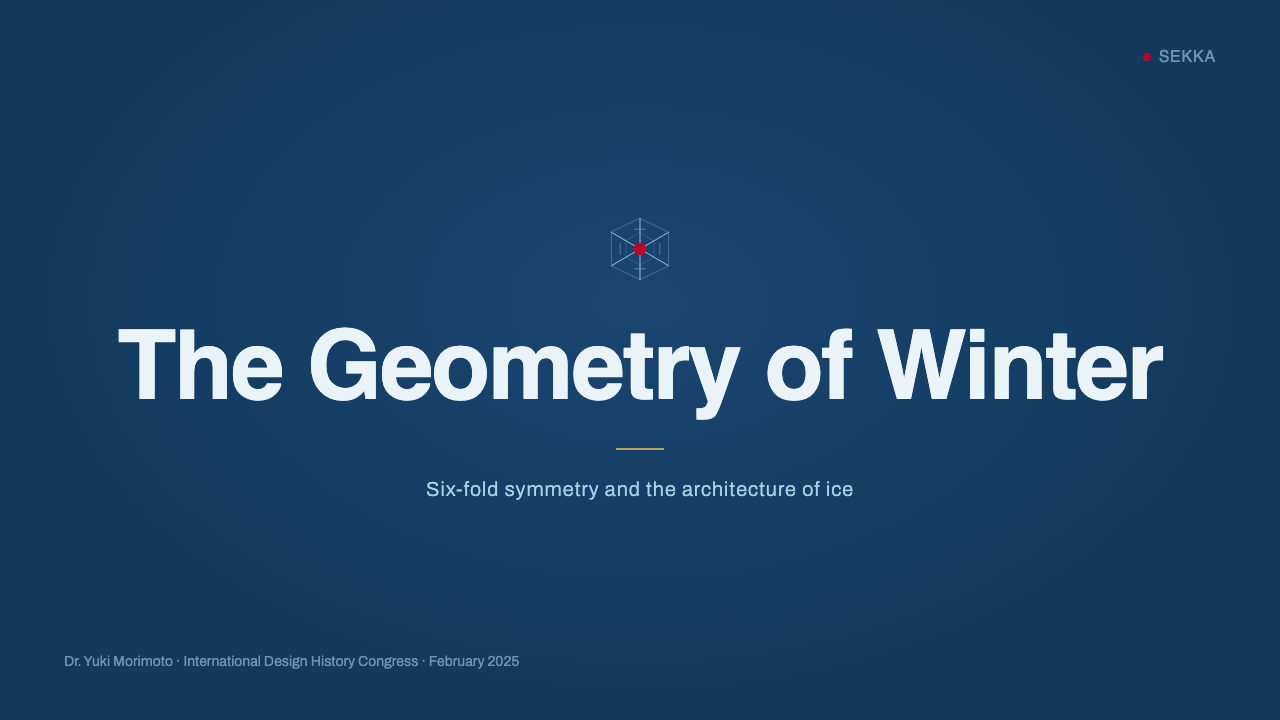
On a slide cover, a snow-white or glacial-blue field with a single concentric-ring or snowflake mark, positioned according to a strict grid, makes a confident and quiet title treatment; the sun-disc red, if used at all, should appear as a single small accent rather than a background color. Content slides should keep to the same grid discipline — consistent margins, a limited type scale, and generous whitespace between blocks — echoing how Kamekura's original identity used structure rather than ornament to create hierarchy. Data visuals suit this system well when rendered as clean, cold-toned charts with a single red highlight reserved for the one data point that matters most.
For web interfaces, the cold, ordered quality suits dashboards, analytics tools, and any product where trust and precision are the primary values communicated. Keep glacial blue and ice tones as the dominant surface colors, reserve red strictly for a single critical action or alert state, and hold to a visible, consistent grid in spacing and alignment rather than a looser, more organic layout.
In editorial and marketing contexts, this system suits stories about precision engineering, winter sport, systematic design, or Japanese modernism particularly well. A full-bleed glacial-blue section with a single snowflake or concentric-ring mark and a headline set in clean grotesque type can carry real authority without needing photography to do the work.
A common mistake is treating the winter palette as an excuse to add multiple cool accent colors — teal, purple, silver — alongside the core blue and red. The system's discipline depends on a genuinely restricted palette: glacial blue, ice tones, snow white, and exactly one red accent. Adding more colors dilutes the precision that makes this identity recognizable and pulls it toward generic 'winter' decoration rather than the specific systematic design lineage it comes from.
Sapporo Winter 1972 — FAQ
How does Sapporo 1972 relate to Tokyo 1964's Olympic design?
Sapporo 1972 directly extends the systematic modernist approach Yusaku Kamekura built for Tokyo 1964 — the grid-based construction, the symbolic use of the red Hinomaru disc, and disciplined typography — rather than starting from a different design language. The key difference is palette and mood: Tokyo 1964 read as bold and warm for a Summer Games, while Sapporo 1972 recast the same structural discipline in cold glacial-blue and ice tones suited to a Winter Games, with red reserved even more sparingly.
Why is red used so sparingly in this system?
Because the red Hinomaru disc functions as a singular, symbolic mark rather than a general accent color — it references the sun disc on the Japanese flag, and its power comes precisely from its rarity. Spreading red across a composition would turn a deliberate, singular symbol into ordinary decoration, undermining the exact discipline that made Kamekura's original Olympic design work as a system rather than a color scheme.
Is the snowflake motif meant to be literal, or a geometric abstraction?
It is a geometric abstraction built from the six-fold symmetry real snowflakes exhibit, constructed with the same grid discipline as the rest of the identity — not a naturalistic illustration of an actual snow crystal. Treating it as clean geometric construction, rather than adding icy texture or naturalistic detail, keeps it consistent with the disciplined, Swiss-influenced modernism the whole system is built on.
What kinds of products or brands does this style suit best?
It suits products and brands that want to project precision, order, and trustworthiness — analytics platforms, engineering and technical tools, winter sport brands, and Japanese-design-inspired identities. It is a poor fit for anything that needs to feel warm, playful, or informal, since the palette and strict grid are deliberately cold and exact rather than inviting.
Can this system work with a warm accent color instead of red?
Substituting a different warm accent would break the direct historical reference — the red is specifically the Hinomaru sun disc carried over from Kamekura's Tokyo 1964 identity, not an arbitrary warm color choice. If a different single accent color is genuinely needed for a specific brand context, it should still follow the same principle of extreme rarity — used once, as a singular signature mark, rather than distributed as a general accent throughout the layout.
Related design styles
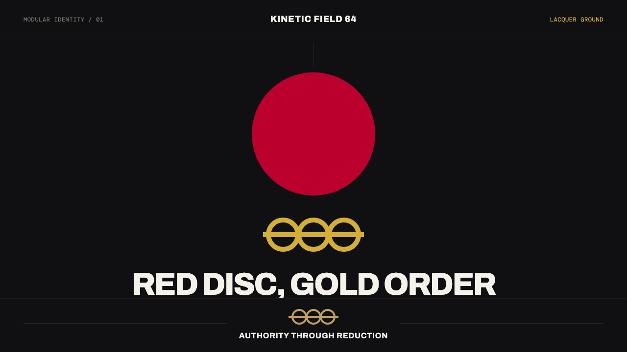 Tokyo 1964 (Kamekura)Ceremony reduced to a mark. Crimson disc and gold rings lock to a black axial…
 Hospital Wayfinding 1970Colour removes hesitation. Enamel green rails and open grotesque plates lead…
 Yugoslav SpomenikMonumentality without figures. Concrete grey-green meets stainless geometry a…
 Israeli Bezalel ModernismForm follows the state. Hard Bauhaus discs and ochre bars on absolute blue, H…
 Niemeyer Brasília CurvesEmptiness makes the monument. Concrete-white arcs cut across a saturated coba…
 Paul Rand / IBM Corporate IdentityCorporate modernism stays exact. Blue 8-bar stripes, high-contrast serif, har…