What is JAL Crane Mark?
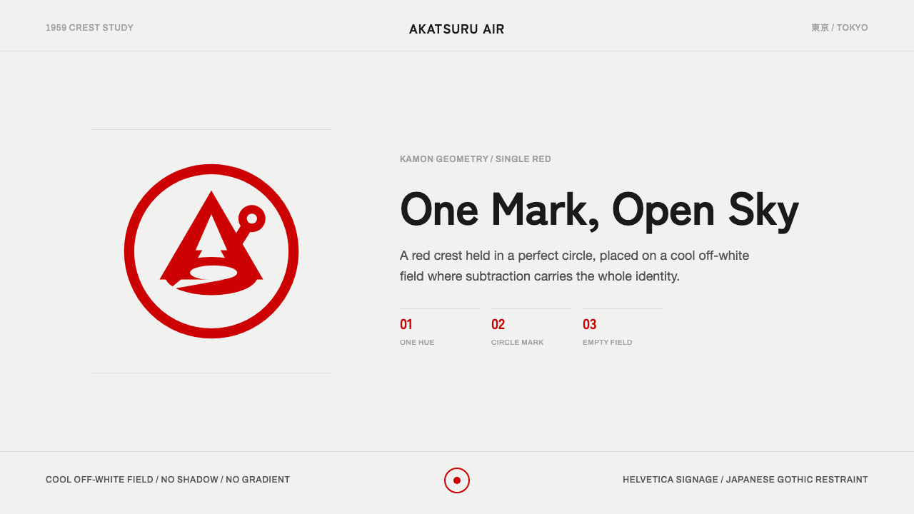
The JAL crane mark reduced an entire airline's identity to a single red bird inside a circle — proof that in mid-century corporate design, subtraction was the strongest possible statement.
JAL Crane Mark in brief
This style is built around a single emblem: a red-crowned crane, drawn in the negative-space logic of a Japanese family crest, folded into a perfect circle. It is not a palette in the way many design systems are palettes — it is closer to a discipline of restraint, in which one mark, one saturated red, and one cool, quiet field are treated as sufficient. Everything else in the system exists to protect that mark, not to compete with it.
The visual language that follows from this emblem favors flat, unmodulated color over gradients, hard geometric containment over loose illustration, and generous, deliberate emptiness over dense composition. Where many corporate identities of the same era leaned on multiple colors, mascots, or slogans stacked around a logotype, this one insists that a single figure, correctly drawn, needs no reinforcement. The red of the crane is not decorative — it functions the way a seal or a stamp functions, a mark of authenticity rather than an accent color.
Typography plays a supporting role rather than a starring one. Clean, geometric sans-serif letterforms carry Latin-alphabet labeling, while a parallel set of humanist Japanese sans-serifs carries native-language text, and neither is permitted to compete visually with the crane mark itself. The overall effect reads as calm, exact, and slightly formal — an aesthetic built for institutions that needed to look instantly recognizable at the scale of an airport tail fin and legible at the scale of a boarding pass, without ever changing its essential form.
Where does JAL Crane Mark come from?
The mark at the center of this style — known in Japanese as the Tsurumaru, literally the 'crane circle' — was designed by the American graphic designer Jerry Huff and adopted by Japan Air Lines in 1959, though the design itself dates to 1958. Its arrival came at a pivotal moment: JAL had been founded in 1951 and spent the 1950s expanding from domestic routes into an international carrier, and it needed an identity that could travel as far as its aircraft did — reading clearly on a runway in Tokyo and a ticket counter in San Francisco alike.
The choice of a crane was not arbitrary. The red-crowned crane, or tancho, holds a long-standing place in Japanese visual and cultural tradition as a symbol of longevity, good fortune, and grace, appearing in classical painting, textile pattern, and ceremonial crest design for centuries before this mark existed. By taking a culturally resonant bird and rendering it with the formal logic of a kamon, the hereditary family crest tradition of Japanese heraldry, Huff's design tapped into a visual grammar Japanese audiences already understood: a single creature, silhouetted and simplified until it reads as a clean emblem rather than a naturalistic drawing, held inside a perfect enclosing shape.
That kamon logic is worth dwelling on, because it explains why the mark works the way it does. Japanese family crests are built on radical reduction — a plant, an animal, or an object is abstracted into flat, symmetrical, high-contrast forms designed to be identifiable from a distance on a banner or garment, then disciplined further into a circular boundary. The Tsurumaru borrows that method whole: the crane's wings are stylized rather than anatomically rendered, the silhouette is built from negative space as much as positive space, and the circle does the work a crest boundary always did, turning a living creature into a fixed, repeatable, stamp-like sign.
The mark's introduction sits within a broader wave of mid-century corporate-identity minimalism, when airlines, broadcasters, and manufacturers worldwide began replacing descriptive, illustrative logos with single abstracted marks applicable consistently across media — a livery, a letterhead, a matchbook. What distinguishes the Tsurumaru is how openly it drew on a specific national craft tradition rather than the more geometric, Bauhaus-descended abstraction favored by many Western corporations of the same decades, giving JAL an identity modern in method and unmistakably Japanese in source.
What defines the JAL Crane Mark look?
The Single Mark
The entire system defers to one emblem — the crane inside its circle — treated as complete and non-negotiable. There is no secondary logo, no alternate mascot, no supporting icon set competing for the same visual role. Any application of this style should protect that hierarchy: one dominant mark, everything else subordinate to it.
Color
The palette is deliberately narrow: one saturated, warm red carried almost entirely by the mark itself, set against a cool, quiet off-white or near-white field. There is no second hue competing for attention and no gradient softening the red into anything less absolute. Color here behaves like ink on paper — a single decisive stroke against a calm ground, rather than a system of many coordinated tones.
Negative Space as Craft
The crane's form is built as much from what is left unfilled as from what is drawn — wings and body emerge from carefully cut absences within the circle, in the same manner a traditional crest silhouette resolves a creature from negative shape. Applying this style well means treating empty space as an active compositional tool, not as leftover background waiting to be filled.
The Enclosing Circle
The circle is not a frame added after the fact — it is structural, performing the same containment role a family crest boundary always performed: turning a living, irregular subject into a fixed, symmetrical, repeatable sign. Anything drawn in this style should feel like it has been disciplined into its container, not merely placed inside one.
Typography as Support
Type is present but deliberately quiet: clean geometric sans-serifs for Latin labeling, paired with humanist Japanese sans-serifs for native text, both kept restrained in weight and scale so neither competes with the mark. Labels sit near the emblem the way a caption sits near a photograph — informative, never decorative, never louder than the thing it describes.
Flatness, No Shadow
There is no drop shadow, no bevel, no simulated dimensionality anywhere in the system — the mark sits flat against its field the way a stamped seal sits flat against paper. This flatness is not an aesthetic default so much as a fidelity to the mark's origins as a crest: crests are printed and embroidered flat, and this style preserves that flatness even in digital contexts.
Generous Emptiness
The field surrounding the mark is treated as important in its own right, not as unused margin. Large areas of quiet off-white give the crane room to be read at a glance, at any scale, without visual noise nearby competing for attention. Compositions in this style should feel unhurried, even sparse, by design.

Who shaped JAL Crane Mark?
Huff is credited as the designer of the Tsurumaru mark, completing the design in 1958 ahead of its 1959 trademark registration by Japan Air Lines. Working as an American designer on a mark intended to represent a Japanese national carrier, he drew directly on the formal conventions of the kamon crest tradition rather than imposing an unrelated Western design vocabulary, producing an emblem that has remained in continuous use for decades with only minor refinement — an unusually long life for a piece of corporate identity design.
JAL, founded in 1951, adopted the Tsurumaru in 1959 as it transitioned from a domestic operator into an international airline, and the mark became one of the most recognized national-carrier symbols to emerge from postwar Japan. Its consistent use across aircraft livery, ticketing, and printed materials for decades demonstrates how a single, disciplined mark can outlast the design trends of any one era.
Though not a single individual, the centuries-old kamon system of Japanese heraldic design is the direct formal ancestor of this style. Kamon reduce plants, animals, and objects to flat, symmetrical, high-contrast emblems bounded by a simple enclosing shape, built for instant recognition from a distance — the exact set of formal problems the Tsurumaru had to solve for a modern international airline.
The bird itself functions almost as a co-author of the mark's meaning. Long associated with longevity, fidelity, and good fortune across Japanese painting, textile design, and ceremonial art, the tancho brought centuries of accumulated cultural resonance to the mark before a single line of the logo was ever drawn, giving the design an emotional register that pure geometric abstraction could not have supplied on its own.
How do you use JAL Crane Mark today?
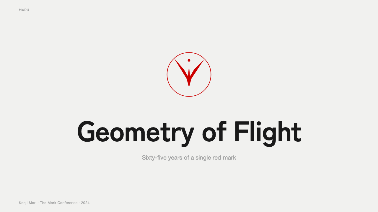
This style transfers cleanly into presentation design because its logic is already about hierarchy through restraint. A cover slide should carry one centered or off-center emblem-like mark on a calm, near-white field, with a title set in quiet, controlled type below or beside it — resisting the urge to add a second graphic for balance. Content and data slides should follow the same discipline: a single accent color, echoing the mark's saturated red, reserved for the one number or data point that matters most, while every supporting figure stays in a neutral ink tone. Charts should favor one flat, saturated accent against a quiet ground rather than a multi-color palette of segments.
For web interfaces, particularly dashboards and pricing pages, the style rewards the same single-accent approach: a near-white or warm-white background, black text for all body and label content, and the saturated red reserved exclusively for the one interactive element the interface most wants noticed — a primary call-to-action, an active tab, a highlighted pricing tier. Every other control should stay quiet, bordered rather than filled, so the red element keeps its authority instead of competing with a dozen equally loud buttons. Icons should stay flat and geometric, with no hint of depth that would break the system's stamp-like flatness.
In editorial and marketing contexts, the style suits any brand communicating confidence through economy rather than volume — a single strong mark on a generous field says more than a page full of supporting graphics. A marketing page might use one large-format emblem-like graphic as a hero image, paired with brief copy and a single red call-to-action, resisting the instinct to add secondary colors or decorative flourishes around it. Editorial layouts benefit from the same generous negative space seen in the mark itself: wide margins, one restrained column of body text, and a deliberate red accent for a pull-quote rather than color scattered throughout the page.
The style also suits any context needing a mark that must scale cleanly — recognizable whether reproduced enormous, as on an aircraft tail, or tiny, as on a favicon. Anyone borrowing this idiom for identity work should test the emblem at extreme size reduction; if it stops reading clearly at very small scale, it has likely kept too much detail and needs further reduction toward the flat, crest-like silhouette the style depends on.
The most common mistake is treating red as a general brand color sprinkled throughout a layout — on multiple buttons, in headers, in decorative bands — rather than reserving it almost entirely for the single mark or the one most important action on a page. This idiom's authority comes specifically from red's scarcity. A second common error is adding shadow or gloss to the emblem to make it feel more dimensional; doing so breaks the flat, stamped quality that is the entire point of drawing from crest tradition.
JAL Crane Mark — FAQ
Is this the same as minimalism in general?
It overlaps with minimalism but is more specific than that label suggests. General minimalism can mean many things — a reduced color count, a sparse layout, an absence of ornament. This style is minimalism in service of a single emblem drawn from a particular tradition, Japanese crest design, and it treats the emblem's clarity as the entire point rather than one design choice among several. A minimalist layout with no central mark at all is not really working in this idiom; the discipline exists to protect one specific figure, not emptiness for its own sake.
Why is only one color used so strictly?
Because the red functions as a seal of authenticity rather than a decorative accent, and a seal loses its authority the moment it is diluted across many surfaces. The historical logic comes directly from the crest tradition this style draws on: a family crest was typically rendered in a single ink or thread color precisely so it could be reproduced identically and recognized instantly, regardless of medium. Introducing a second or third color would undercut that function, turning a mark of authenticity into an ordinary decorative graphic.
Can this style work with imagery or photography?
Sparingly, and only if the photography itself stays quiet. Because the entire system is built to let one emblem dominate an otherwise calm field, any photography introduced alongside it should be desaturated or kept to a narrow tonal range, used in small, contained placements rather than as a dominant background. Busy, colorful, or high-contrast photography competing with the mark for attention works against the style's core logic and should generally be avoided in favor of restrained, documentary-style imagery if photography is needed at all.
Does this style suit every kind of brand, or are there contexts where it struggles?
It suits brands and products where trust, consistency, and instant recognizability across scale are the primary values — airlines, institutions, and any product that needs a single mark to remain legible from a tail fin to a favicon. It struggles in contexts that call for variety, playfulness, or frequent visual refresh, since the entire discipline depends on one mark staying essentially unchanged for a very long time. A brand that wants to experiment seasonally with color or imagery, or one whose personality depends on visual abundance rather than restraint, will find this idiom's rules constraining rather than useful.
What is the relationship between this style and Japanese kamon (family crest) design more broadly?
This style is best understood as a single, highly successful modern application of kamon principles rather than a kamon itself. Traditional kamon identify families and are passed down through generations attached to specific lineages; this mark instead identifies a modern commercial institution, applying the same formal method — reduction to flat silhouette, containment within a simple enclosing shape, use of negative space to resolve form — to a new kind of subject. Anyone drawing on this style is essentially borrowing a centuries-old formal discipline and pointing it at a contemporary brand problem.
Related design styles
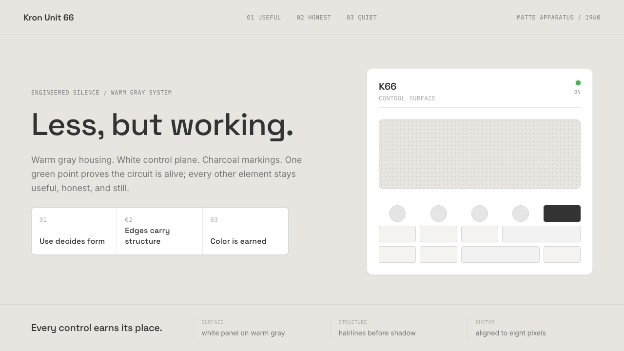 Dieter Rams / BraunQuiet by design. Warm gray, white panels, hairline grids, and one earned gree…
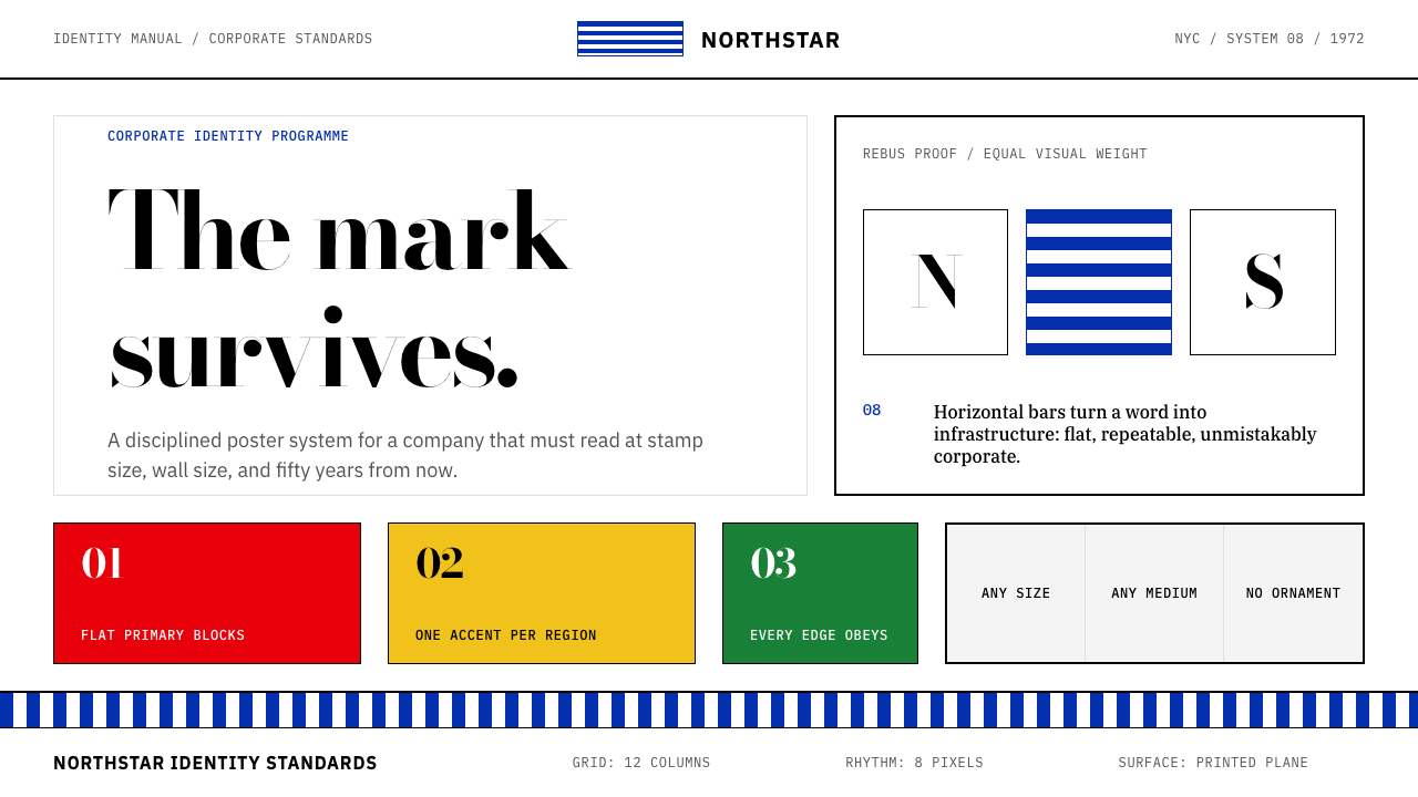 Paul Rand / IBM Corporate IdentityCorporate modernism stays exact. Blue 8-bar stripes, high-contrast serif, har…
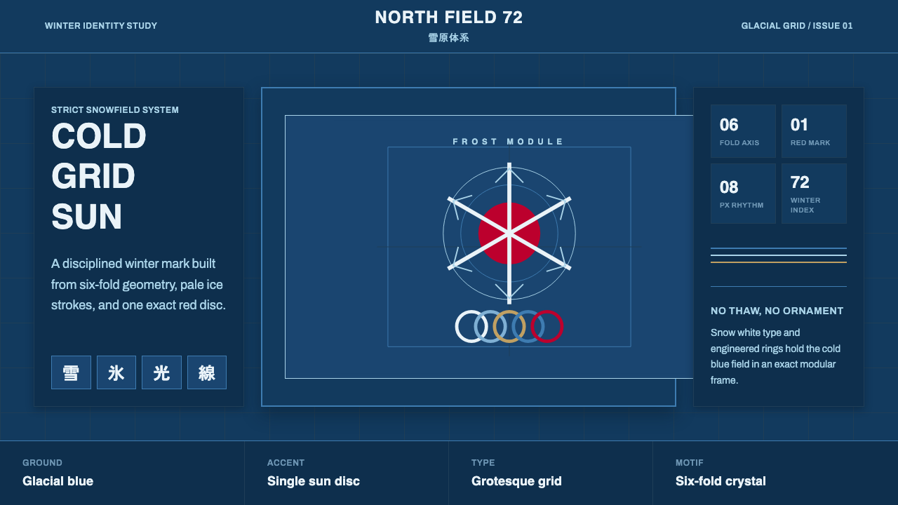 Sapporo Winter 1972Icy order, exact and calm. Glacial blue grid, snow-white type, one red sun di…
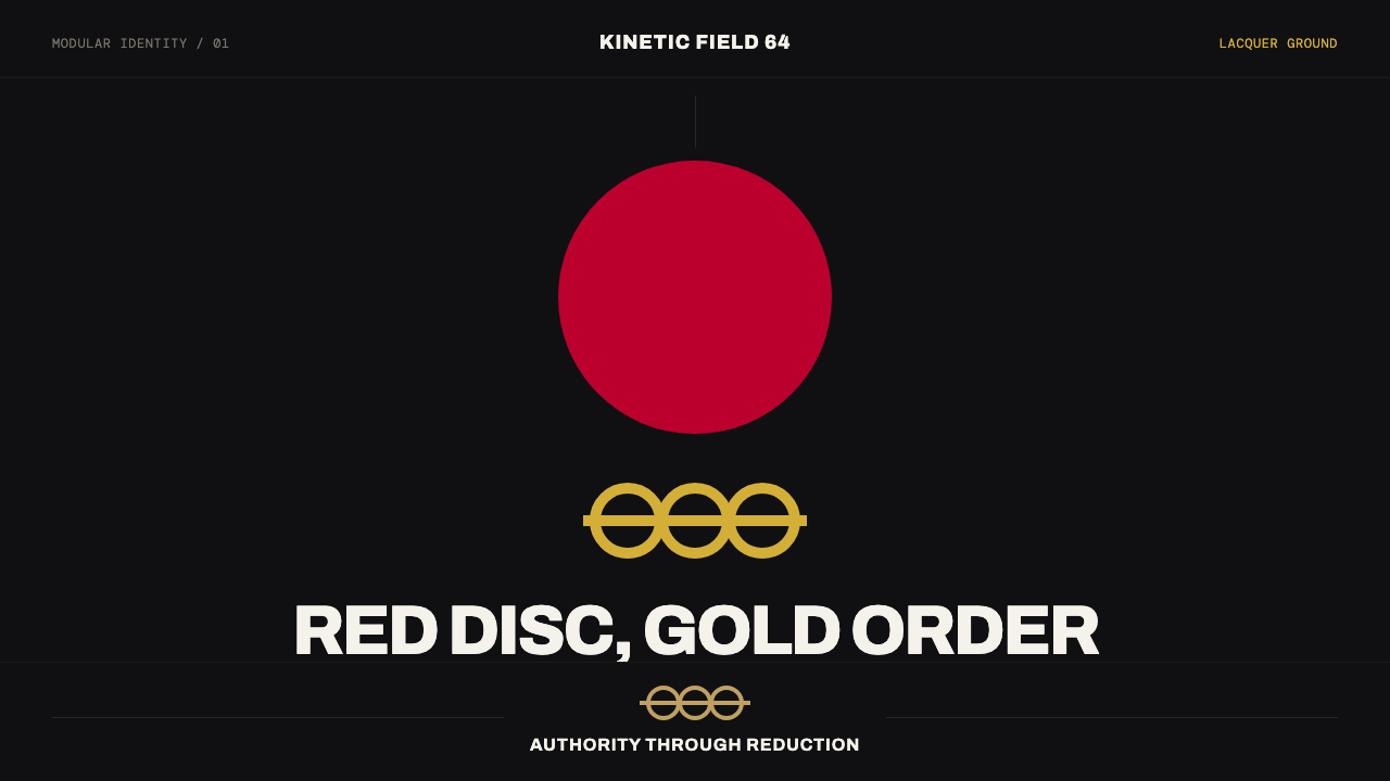 Tokyo 1964 (Kamekura)Ceremony reduced to a mark. Crimson disc and gold rings lock to a black axial…
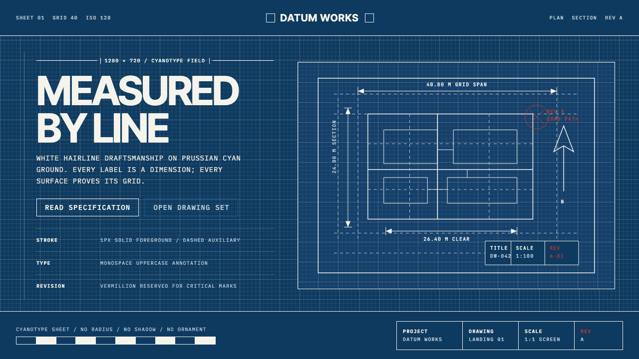 Architectural BlueprintMeasurement, not mood. Prussian cyan grid with white hairlines and vermillion…
 Doctor's Clinical Lab CoatSterile by design. Cool clinical white, teal signals, and seam-line grids enf…