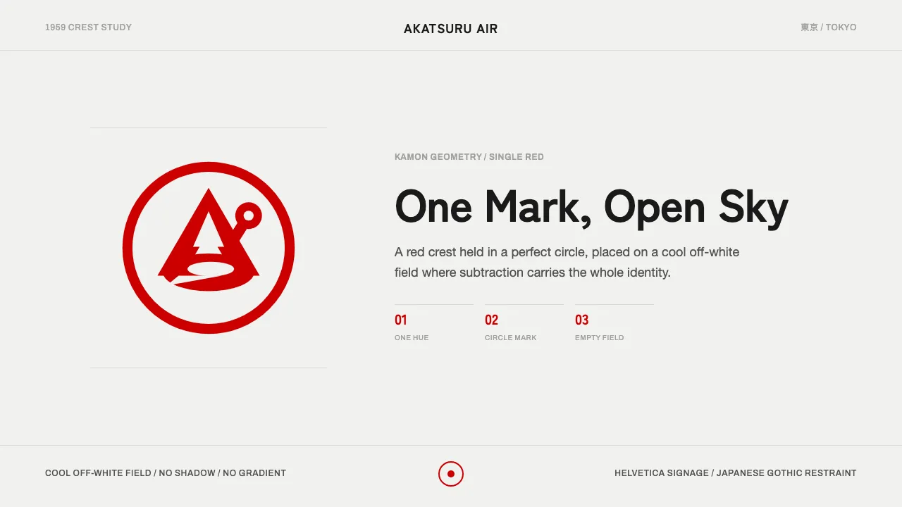
About JAL Crane Mark
The JAL Tsurumaru — the "crane circle" — is a single red red-crowned crane contained in a perfect ring, drawn with the negative-space discipline of a Japanese kamon family crest. Designed by Jerry Huff and trademarked in 1959, it is a study in subtraction: one mark, one saturated red, one cool off-white field.
This system inherits that restraint. There is no second hue, no gradient, no shadow to soften the geometry. Helvetica Neue and Archivo carry Latin labels; Noto Sans JP and Zen Kaku Gothic New carry the Japanese. Everything defers to the crane, and the empty field is treated as the most important element on the page.
- Origin
- Japan, East Asia
- Era
- 1950–1990 (Tsurumaru created 1958, trademarked Aug 1959)
- Key figures
- Jerry Huff
- Movements
- Japanese kamon crest geometry · Mid-century corporate-identity minimalism
JAL Crane Mark design spec
Colors
Typography
The other 11 sections — buttons, cards, spacing, motion, techniques and more — open once you unlock. Download the DESIGN.md or send it to your AI in one click. Unlock once, yours forever.
Sign up nowStyles similar to JAL Crane Mark
Also inspired by brands & products, with a close feel.
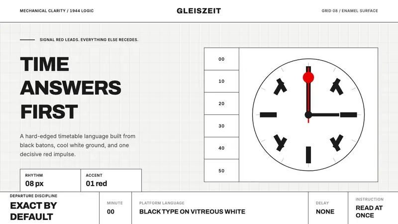 Swiss Railway ClockPrecision refuses decoration. Black batons and one red hand cut through enamel white.
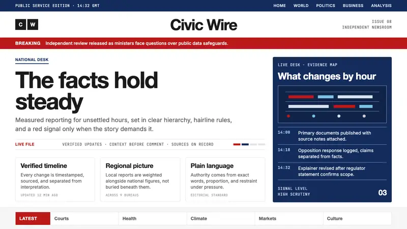 BBC NewsPublic trust, stripped bare. Red alerts, deep navy and hairline grids make urgency factual.
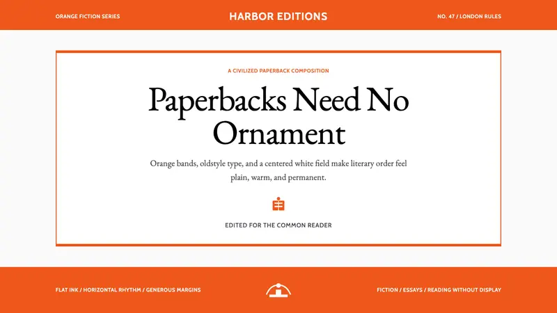 Penguin Classics OrangePaperback authority. Orange tri-bands, serif title panel, and flat ink enforce calm order.
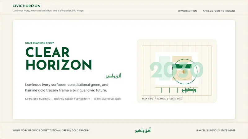 Saudi Vision 2030Measured ambition, made luminous. Ivory, green, and gold tracery on a civic grid.