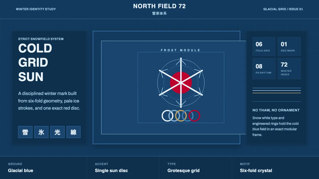
About Sapporo Winter 1972
Sapporo 1972 was Japan's first Winter Olympics, and its visual identity extended the systematic modernist program Yusaku Kamekura built for Tokyo 1964: a stacked snowflake, the red Hinomaru disc, and the Olympic rings on a strict grid. As a Winter Games it leaned cold — a deep glacial-blue snowfield, pale ice tones, and snow white, with red reserved for the single signature sun mark.
This system reads that lineage as crisp icy modernism. Six-fold snowflake geometry, concentric crystalline rings, and clean grotesque type sit on a cold blue ground with generous whitespace. No warmth, no kitsch frost — just disciplined Swiss-influenced structure rendered in the palette of snow and ice.
- Origin
- Sapporo, Hokkaidō, Japan
- Era
- 1950s–1990s (the 1972 Sapporo Winter Games)
- Key figures
- Yusaku Kamekura · Japanese Olympic design committee
- Movements
- Japanese modernist graphic design · systematized Olympic identity · Swiss-influenced minimalism
Sapporo Winter 1972 design spec
Colors
Typography
The other 11 sections — buttons, cards, spacing, motion, techniques and more — open once you unlock. Download the DESIGN.md or send it to your AI in one click. Unlock once, yours forever.
Sign up nowStyles similar to Sapporo Winter 1972
Also inspired by brands & products, with a close feel.
 Office Document (Calibri 2007)Quiet authority. White page sheet, muted blue rules, and humanist-sans rhythm.
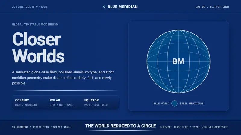 Pan Am Jet AgeJet-age confidence. Globe-blue field, steel type, meridian circle on a strict grid.
 Wikipedia (2001)Content needs no ornament. Black serif text, gray hairlines, and blue links expose the structure.
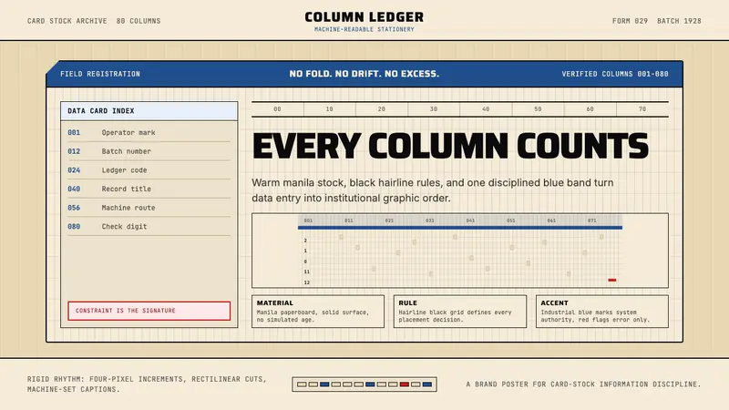 IBM Punchcard 029 (1928)Constraint becomes authority. Manila stock, hairline grid, industrial blue.